










Built-in refrigerator and freezer in one integrated design
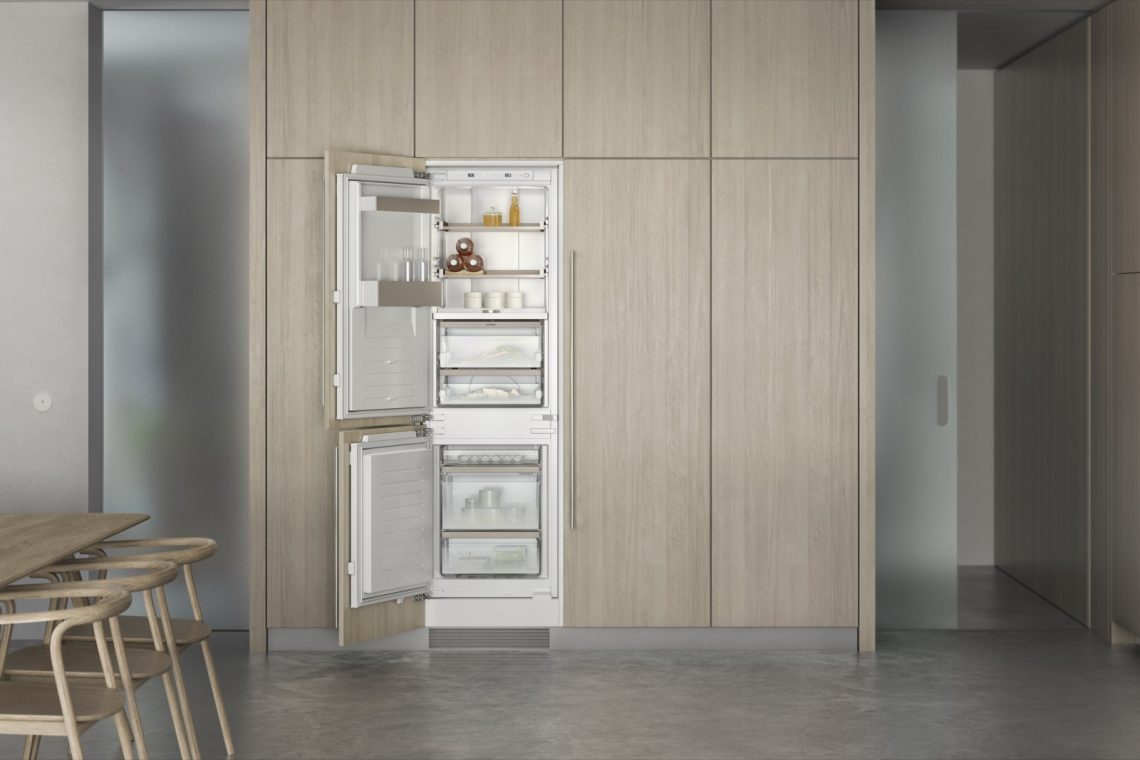
A flush run of doors, pale timber panels and a dark floor set the tone before the interior is even opened. Once the built-in fridge is in view, the emphasis shifts to glass, light and order. The refrigeration units sit inside the kitchen wall as part of the architecture, not as separate objects. That restraint is the point: the panel ready refrigerator blends into the room, while the open interior reveals clear shelving, soft light and a measured arrangement of storage.
A refrigerator interior that opens like a display
Inside the built-in fridge, the layout is stripped back to the essentials. Glass shelves stretch across the cabinet, framed by light bronze profiles that catch the light without drawing attention away from the food. The warm LED lighting reaches into the compartments and across the door bins, so the ingredients are easy to read at a glance. Even the 0°C freshness drawer is lit in the same subdued tone, giving the lower part of the refrigerator a calm, precise presence.
The detail work is visible in the transitions between materials. Satin-finished copper tones appear at the top edges, while the shelves remain clear and the surrounding structure stays quiet. A cast zinc control knob in matching light bronze sits where the hand naturally falls, and it is used to adjust humidity in the freshness drawers. It is a small part, but it marks the difference between a standard interior and an integrated refrigerator interior with a considered finish.
Built-in fridge freezer details that hold the composition together
The built-in fridge freezer composition reads as one continuous unit when the doors are open. The same glass shelves, the same warm light and the same restrained bronze accents recur across both sections, which gives the installation a steady rhythm. In the freezer, shelves are positioned at the top and drawers sit below, so the interior remains legible even when viewed quickly. The arrangement is practical in shape, but what stays with you is the clarity of the compartments.
That clarity is reinforced by the way the appliance is embedded in the kitchen wall. In the images, the surrounding joinery frames the unit tightly, with pale wood panels and straight lines running around the opening. The result is a built-in fridge freezer that feels aligned with the room’s geometry. Open doors expose the bright interior; closed doors return the wall to a quiet plane. The shift happens without visual clutter.
Maple bottle holders and clear shelving
One of the most distinctive elements is the magnetic bottle holder system. Made from solid maple, the holders introduce a natural grain among the glass and metal, and they are designed to connect magnetically so they can form a larger arrangement. Bottles of different sizes, including magnum bottles, can be supported in a row across the shelf width or set deeper into the cabinet. The material contrast is direct: wood on glass, held in place by a hidden magnetic connection.
The shelves themselves are made of crystal-clear glass and finished with light bronze anodised aluminium trims. That edge treatment keeps the shelves visually light while giving them a defined boundary. The open interior benefits from that precision. Nothing interrupts the view across the refrigerator, so jars, bottles and fresh produce remain easy to scan. In a panel ready refrigerator, that sort of shelving matters as much as the exterior alignment.
Warm LED lighting across the whole interior
Light is used to describe the space rather than dramatise it. The warm LED lighting is positioned to flatter the contents, but it also helps the interior read as a continuous volume. In the refrigerator, the light panel and the 0°C freshness drawer are softly tinted, while in the freezer the lamps are placed forward between the shelves. That placement brings the front edge of each level into view, which makes the storage structure easier to understand.
The lighting does not wash out the materials. Instead, it brings out the bronze tones on the shelf profiles, the pale sheen of the maple bottle holders and the copper-coloured satin finish on the upper points. Those surfaces respond differently as the doors open and close. A single built-in fridge can appear almost monolithic from the outside, yet inside it becomes a layered composition of light, glass and metal.
A freezer arranged for direct access
The freezer is organised with a clear split between upper shelves and lower drawers. That simple division gives each item a place without forcing the eye through a complicated grid. In the open images, the compartments read almost like trays stacked in sequence. The drawer section below stays easy to reach, while the upper shelves keep smaller items visible. It is a straightforward answer, but one that fits the overall language of the project: direct, measured and easy to read.
Because the freezer section uses the same restrained materials as the refrigerator, the two parts belong together even when seen separately. Glass, light bronze, clear fronts and pale interiors repeat across the composition. The result is less about contrast than continuity. In a kitchen where the joinery is already doing most of the visual work, that consistency lets the appliance support the room instead of competing with it.
When the refrigerator and freezer sit side by side
The paired refrigerator and freezer appear as one integrated design piece when combined in a cooling wall. The images show the doors open in a built-in run, framed by pale wood and set against a dark floor that keeps the composition grounded. Because both units share the same internal language, the wall reads as a single installation rather than two separate appliances. The visible effect is orderly, but not rigid. The shelves, lighting and bronze accents keep the scene from feeling mechanical.
That integrated character is strongest when the cabinet is viewed from across the room. The appliance disappears into the joinery until the doors open and the bright interior takes over. Then the glass shelves, magnetic bottle holder and 0°C freshness drawer become the main details in the frame. It is a built-in refrigerator project that works through proportion and restraint, not display. The surfaces stay calm, while the interior does the talking.
Materials that show up in the small details
Several materials repeat in small but noticeable ways: solid maple in the bottle holders, light bronze anodised aluminium on the shelf trims, cast zinc at the control knob and the satin copper tone on the upper points. None of these elements dominates the image. They work as markers that help the viewer read the appliance more closely. The refrigerator interior stays minimal, but it is not bare. Every detail has a place, and that makes the composition feel deliberate.
The open compartments, the glass shelves and the warm LED lighting all support that reading. Even in the close-up views, where a metallic label or front edge comes into focus, the impression is still one of quiet structure. This built-in fridge is not presented as a machine to admire from a distance. It is a piece of kitchen architecture, built to sit inside the wall and reveal its details only when the doors move apart.
For more information, visit the product page.
Want to see more of Gaggenau? View the page of Gaggenau for even more great projects and company information.





NEW 2026 Jubileum Edition The Best Interior Designers Benelux
Order Now €125


NEW 2026 Jubileum Edition The Best Interior Designers Benelux
Order Now €125


