Home renovation with a modern minimal interior and a glass-canopy patio
Light moves straight through the rooms here, picking out dark window frames, pale walls and the grain of the wood underfoot. The home renovation reads as a sequence of clear sightlines rather than a set of closed rooms. From the living area to the dining space and onward toward the garden, the layout keeps the eye open. Glass, timber and brick carry most of the story, while the darker frames and fireplace edge the plan with sharper lines.
Living spaces shaped by light and a dark fireplace surround
The living room fireplace with dark surround sits low and steady in a room that otherwise stays restrained. In the seating area, a U-shaped sofa in a light fabric faces the fire and the large window beside it. That window brings in a broad wash of daylight and keeps the room connected to the patio and garden beyond. The contrast is direct: pale surfaces around the room, a darker hearth at the center, and a clear view out through the glazing.
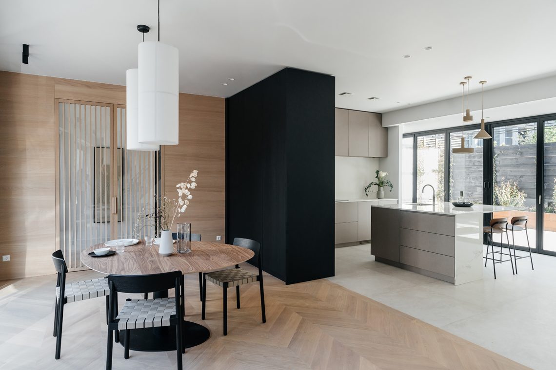
Across the living and dining areas, the plan stays open enough for the rooms to read as one continuous route. The dining room design lighting is made up of several round glass pendants that sit above the table without blocking the view behind them. Dark frames around the windows repeat the same visual line in more than one room, which gives the interior a consistent edge. Nothing is overworked. The furniture, light fittings and window divisions do their own separate jobs.
A kitchen arranged around a long worktop and bar seating
The kitchen is drawn as a practical strip of surfaces and storage. A modern kitchen island and a long worktop define the main working zone, while kitchen bar seating turns the edge of the counter into a place to pause. White cabinetry keeps the room visually light, and the black-framed openings next to it prevent the kitchen from feeling sealed off. From this angle, the house feels set up for movement: cooking, passing through, sitting down, looking back out.
One image catches the kitchen in relation to the stair, and that makes the spatial logic easy to read. The staircase with wooden steps rises beside the kitchen wall, with white surfaces wrapping around it and keeping the transition quiet. Wood appears again in the stair treads, which brings a warmer tone into a room otherwise dominated by white, glass and dark trim. The kitchen bar seating sits close enough to the worktop to feel integrated, not appended.
Frames, thresholds and the route through the house
Several openings are handled with dark window frames and steel-like details, especially where one room looks into another. A black-framed glazed door marks the move between spaces and gives the interior a sharper graphic line. That contrast matters in a house with so much daylight: the frames hold the glass in place visually, while the white walls around them keep the reflections from becoming too soft. The result is a sequence of thresholds that feel precise rather than decorative.
On the landing and along the stair run, the same light treatment continues. White walls lift the stair volume, and the wooden steps bring a steady rhythm as the route climbs. In some views, the stair appears beside a large opening toward the garden; in others, it sits close to the kitchen and dining zone. Either way, it acts as a hinge between the lower open-plan rooms and the quieter spaces above.
The patio under glass and the outdoor fire point
Outside, the glass canopy patio extends the living area with a roof of clear panels and slim supports. The structure keeps the view open to the brickwork and the darker framing around it, so the boundary between interior and garden stays readable. An outdoor fireplace in garden sits within that protected space, making the patio feel like a place to stop rather than just pass through. The glass above it changes the light without hiding the sky.
The patio image also shows how the house meets its outside edges. Brick, dark trim and glazed surfaces come together in a compact frame, with the interior visible through the opening. Because the canopy remains transparent, the patio does not flatten the garden into a background. It preserves depth. From inside, the view reaches through the glazing and back into the outer zone, so the transition between rooms and garden feels staged in layers.
Dining details and built-in storage with a muted green note
The dining area is not stripped bare; it carries a few deliberate accents that anchor the room. The round pendant lamps hover above the table, and their glass shades soften the ceiling line without taking over the space. Nearby, a built-in storage wall appears in a muted green tone, giving the seating area a heavier visual base. Against the white walls and dark frames, that color shift feels measured and specific, not decorative for its own sake.
Seen from this angle, the dining room design lighting also ties the house together with the rest of the interior. The same openness seen in the living room and kitchen continues here, but the table and fixtures give the room a more settled pause. The outdoor view stays present in the background, and the dark window frames keep that view crisp rather than blurred into the interior palette.
Private rooms with a bath in the bedroom and a long double vanity
In the bedroom, the freestanding bathtub sits in a corner by a large opening, turning the room into a place where bathing and sleeping share the same light. The tub stands against pale walls and a wooden floor, with soft curtains and a broad window making the corner feel separate without enclosing it. This is one of the clearest examples of how the home renovation uses simple gestures to connect spaces instead of dividing them too strictly.
The bathroom continues that same measured approach with a bathroom double vanity set into a long cabinet. The basins sit side by side under a clean wall line, and the length of the unit gives the room a horizontal emphasis. Light walls, restrained fittings and the wooden floor edge keep the room calm in tone, but the strongest impression is the way the vanity stretches the room visually. It reads as a practical surface first, then as a compositional line.
Taken together, the rooms rely on a few repeated elements rather than a large number of gestures: dark window frames, wooden steps, clear glazing, white wall planes and a small set of strong fixtures. That repetition helps the open-plan ground floor, the patio and the private rooms feel related without copying one another. The home renovation stays focused on what can be seen: a dark-surround fireplace, a kitchen island with bar seating, a glass canopy patio and the quiet shift from shared spaces to more private ones above.
Want to see more of Studio Wendy Mahieu? View the page of Studio Wendy Mahieu for even more great projects and company information.



NEW 2026 Jubileum Edition The Best Interior Designers Benelux
Order Now €125


NEW 2026 Jubileum Edition The Best Interior Designers Benelux
Order Now €125


NEW 2026 Jubileum Edition The Best Interior Designers Benelux
Order Now €125


NEW 2026 Jubileum Edition The Best Interior Designers Benelux
Order Now €125