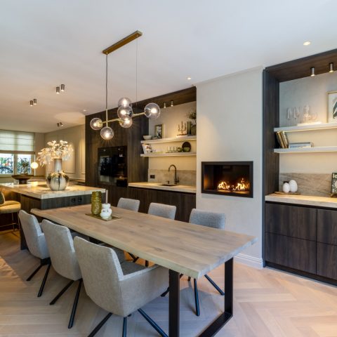
Modern kitchen in an open interior
Dark cabinet fronts pull the eye first. They line the L-shaped kitchen in a straight run, then turn toward the window wall where daylight enters across the ceramic tile floor. Integrated appliances sit quietly in the joinery, so the working zones read as one continuous composition rather than separate pieces. The result is a modern kitchen that uses restraint, not decoration, to shape the room.
L-shaped kitchen with a clear working edge
The layout is easy to read. One arm carries the cooktop and the main preparation zone, while the return gathers sink and storage into the same compact field. That L-shaped kitchen plan leaves the center of the room open and makes the perimeter do the work. Cabinet fronts stay flush, handles are kept discreet, and the darker finish keeps the eye on the line of the installation instead of on individual doors.
From the side, the kitchen looks built into the room rather than placed inside it. Tall units sit beside lower runs, and the integrated appliances disappear into the darker surfaces. The visual rhythm comes from horizontal breaks, the edge of the worktop, and the change from matte front panels to reflective glass nearby. It is a modern luxury kitchen in the sense that every visible element has been reduced to its essential line.
Storage that stays in the background
Custom cabinetry is doing most of the quiet work here. The front surfaces remain even, without extra pattern or relief, which helps the kitchen read cleanly against the white walls and ceiling. A darker green-grey tone appears in the joinery, adding depth without pulling attention away from the plan. Around it, black accents appear in frames, hardware details, and the inbuilt cooking zone.
The cooktop image makes the setup even clearer: a black in-built extractor sits above the hob, and the surrounding worktop stays uncluttered. The surfaces are spare enough for the lines of the room to remain visible. In a page about a modern kitchen, that clarity matters. It shows how the cabinetry, appliances, and work surface are coordinated around use, not only appearance.
Glass, steel, and the long view to the living area
Large glazing changes the pace of the room. A big glass partition with black steel window frames opens the interior toward the adjacent living and dining zone, and the sightlines keep moving past the kitchen rather than stopping at it. The frame grid gives the room a sharper outline, while the glass keeps the separation light. It is an open-plan living arrangement that still leaves each zone legible.
In the wider shots, the kitchen sits in the background while the living area takes up the foreground. That shift in depth makes the plan feel generous, even without adding ornament. The black profiles repeat in the window and door details, tying the room edges together. The modern kitchen becomes part of a larger interior sequence, where steel, glass, and tile define the passage from one zone to the next.
Daylight across tile and frame
Daylight is one of the strongest materials in the images. It lands on the ceramic tile flooring, lifts the darker fronts, and brings out the contrast between white ceiling surfaces and black trim. The floor has a quiet, practical surface that supports the rest of the room rather than competing with it. Near the glazing, the reflections are soft, and the light makes the black steel frames look even more precise.
Another image shows the glass opening to the terrace side, where the frame edges and exterior brightness reinforce the sense of depth. The room never feels closed in, even though the cabinetry and structural lines are strict. That balance comes from the amount of glazing, not from decorative intervention. In this modern kitchen, light is part of the layout: it marks the boundaries, shows the materials, and keeps the plan readable.
Recessed spotlights and a ceiling with texture
Above the kitchen, recessed ceiling spotlights set a measured grid into the white ceiling. They do not announce themselves, but they organize the room after dark and keep the work surfaces visible. The lighting follows the same logic as the cabinetry: practical, contained, and aligned with the architecture of the space. In the open area beyond, the same ceiling language continues, so the room reads as one connected interior.
One zone introduces a different overhead finish: a wood slat ceiling brings a warmer surface into the composition. The linear timber treatment softens the harder steel and glass around it, but it does so with the same disciplined rhythm. The slats run in parallel lines, echoing the cabinet fronts and the frame divisions nearby. It is a small shift in texture, yet it changes the feel of the surrounding space immediately.
Light fittings that stay close to the architecture
The spotlights are embedded in the ceiling rather than suspended below it, which keeps the sightline open between kitchen, living area, and the glazed edges of the room. In the hallway image, the same approach appears again: white surfaces, black-framed glass, and a steady row of recessed points. That repetition gives the interior a clear visual language without turning it rigid. Every fixture stays close to the surface, leaving the lines of the room intact.
The wood slat ceiling detail also appears in the seating or work zone, where dark joinery sits below it and window coverings add another horizontal layer. Here the room moves from technical precision to a quieter domestic scale. The material change is subtle, but it is enough to separate one part of the interior from another while keeping the broader open-plan living connection intact.
Mixed finishes, kept in a restrained palette
Hout, black steel, white plaster, grey tile, and dark cabinetry make up the visual palette, with a small green accent appearing in the joinery. None of the finishes asks for attention on its own; the interest comes from the way they meet. The tile floor runs through the space without interruption, the steel frames sharpen the openings, and the wood introduces a more tactile note near the ceiling and seating area. Together they give the modern kitchen a measured, grounded character.
What stands out most is not excess, but control. The room uses a limited set of materials and repeats them in different places: on the cabinet fronts, in the glazing, in the ceiling detail, and in the floor. That repetition makes the open interior easy to follow. The modern kitchen remains the central element, yet it is clearly part of a larger sequence of rooms, views, and surfaces shaped by daylight and straight lines.
Want to see more of RMR interieurbouw? View the page of RMR interieurbouw for even more great projects and company information.




NEW 2026 Jubileum Edition The Best Interior Designers Benelux
Order Now €125