Modern interior with large windows
Daylight across the living space
The first impression is the amount of glass. A full-height window wall pulls daylight deep into the room, while the black frames draw a clear grid around the view outside. On the floor, large tiles keep the surface calm and let the eye travel from the seating area to the terrace. Curtains soften the edge of the glazing without closing it off. In this modern interior with large windows, the room reads as one long sightline rather than a series of separate corners.
That openness is visible in the way furniture is placed. The dining table sits close to the window, so the outdoor view becomes part of everyday use rather than a backdrop. Light shifts across the tiled floor and the white walls during the day, and the darker frame lines keep the composition sharp. The result is a modern living with lots of light, where the glazing does most of the spatial work.
A steel staircase that stays visually light
Beside the kitchen, the steel staircase with open treads introduces a different rhythm. Its slim structure leaves space under and around the run, so the stair does not cut the room in half. The dark metal lines echo the window frames and repeat the same restrained palette seen elsewhere in the house. From the kitchen, the stair reads as a vertical element rather than a heavy block, which helps the ground floor stay open.
The open treads keep sightlines intact. You can see through the stair toward the back of the room, and that transparency makes the kitchen and living area feel connected even when they serve different functions. A few visible light fittings and small reflective accents pick up the metal surfaces, but the stair itself remains the clearest statement in the room. It is practical, yet it also acts as a visual hinge between levels.
Black frames, glass and a quiet contrast
The black window frames and glass facade establish the strongest contrast in the project. Against white walls and pale kitchen fronts, the dark lines create structure without making the space feel closed in. That contrast is especially clear where the openings widen toward the terrace. The glass reflects a little of the interior while still allowing a direct view outside, so the transition between inside and out stays easy to read.
In the images, the glazing is never treated as a single surface only. It works together with curtains, tiled floors and small pieces of furniture to frame the room in layers. The dark detailing also appears in the entry, where the glass door uses the same language as the larger openings. This repetition keeps the house visually consistent from one room to the next.
White kitchen fronts against darker details
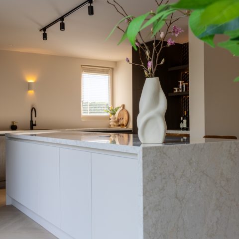
The kitchen with white cabinets sits quietly in the middle of the plan. Flat fronts run in a straight line, without decorative interruptions, so the composition stays focused on proportion and surface. The pale cabinetry reflects the daylight coming in through the nearby opening, and the darker elements around it prevent the room from turning flat. A worktop stretches along the wall, giving the kitchen a compact, practical profile.
Seen together with the stair, the kitchen becomes part of the larger interior sequence rather than a separate zone. White fronts, black metal and the nearby glass opening build a palette that repeats in the living area and the hall. The effect is not about display. It is about keeping enough visual order so the room can carry the amount of light coming in from the large windows. That is where the modern interior with large windows feels most direct.
Materials that keep the room grounded
Tiles, glass, steel and wood each have a clear role. The tile floor steadies the bigger rooms and continues into the entry, where darker tiles mark the arrival zone. Steel appears in the staircase and in the window detailing, while wood enters through the furniture and a few warmer surfaces. None of these materials compete for attention. They work by contrast, with the lighter surfaces catching daylight and the darker ones outlining edges, corners and transitions.
There is also a measured use of texture. One wall shows a lightly structured pattern, which breaks the flatness of the otherwise smooth rooms. Small ceiling lights and indirect light accents add another layer without changing the calm base. The interior stays restrained, but not bare. Each material is visible enough to explain how the rooms are built up around the light.
An entry that sets the tone immediately
The glass entry door gives the hall a direct visual link to the rest of the house. Black muntins and dark framing elements keep the door aligned with the larger glazing elsewhere, so the entrance feels part of the same composition from the first step inside. The floor is darker here, which anchors the space and separates it from the brighter living areas. The steel staircase is partly visible as soon as you enter, so the vertical route through the house is easy to read.
Because the entry is so spare, the details matter more. The door panel, the floor joints and the edge of the stair create a clear geometry. Nothing is overworked. That simplicity makes the shift from outside to inside legible, especially when daylight comes through the glass. It is one of the reasons the modern interior with large windows feels coherent without relying on decorative elements.
From the terrace back to the room
Outside, the large glass facade continues the same language. Dark frames stand against a grey masonry surface, and the terrace is finished with rectangular dark-grey tiles that echo the interior floor tones. The view back toward the house shows how much the glazing controls the relationship between inside and out. Even from the terrace, the interior remains visible through the opening, with the table and window wall drawing the eye inward.
That indoor-outdoor connection is straightforward rather than staged. The opening is large enough to make the terrace feel like an extension of the living space, but the materials still mark the change in use. Inside, the rooms are lighter and more reflective; outside, the darker paving and stone surface hold the composition down. Across both sides, the same black framing, steel elements and daylight define the project’s character.
Seen as a whole, the house relies on a few strong moves: large windows, dark frame lines, a steel staircase with open treads and a kitchen finished in white. Each element is simple on its own. Together they shape a house that is read through light, through open views and through the way one room connects to the next. The project never needs much ornament. The structure of the openings and the stair already provides enough visual order.
Want to see more of Exclusive Steel? View the page of Exclusive Steel for even more great projects and company information.



NEW 2026 Jubileum Edition The Best Interior Designers Benelux
Order Now €125