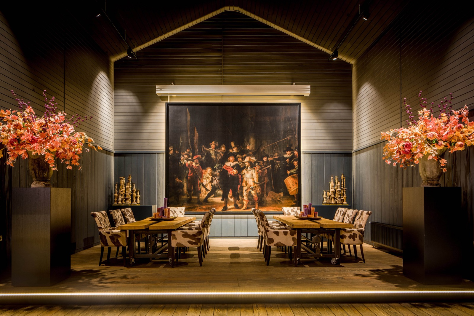
A room-by-room lighting plan for the right ambience
Light is one of the first things you notice here: it lands on the table, catches the wall, and softens the line where ceiling and room meet. A lighting plan by room does that work quietly. It gives each space a role, whether that means settling in at the end of the day or staying alert at a desk. The room looks complete only when the light matches what happens there.
Why the right light changes a room
In this interior, lighting is not treated as an afterthought. The images show how ceiling spots, pendants, and wall lights each take on a different task. Some layers wash the room evenly. Others draw attention to a surface, a route, or a change in material. That difference matters in rooms where the same space may need to feel calm one moment and more focused the next. Light color and ambiance are part of that shift, along with the way a fixture sits against the ceiling or wall.
The source text is direct about that point: a room can be beautifully finished, but if the lighting is wrong, the result still feels unfinished. The point is not only brightness. It is the match between atmosphere and use. A dining table needs another kind of light than a corridor or a workspace, and the project shows that each setting asks for its own lighting plan by room. When the right layer is missing, the material palette reads differently, and the space loses depth.
Ceiling spots as the quiet base layer
Several images show recessed spots and downlights built into the ceiling. They sit back from view and keep the room readable without calling attention to themselves. Around the arched and beam-like ceiling forms, that placement becomes important. The ceiling is not a flat lid; it has movement, and the small points of light follow that shape rather than fighting it. In the living areas and corridors, this creates a base layer that supports the rest of the scheme.
This is where recessed spots vs pendants becomes a useful distinction. The ceiling spots establish the overall field, while pendants and accent fixtures sharpen the focus. In a long room, that separation keeps the light from feeling heavy. In a smaller passage, it helps guide the eye forward. The result is less about decoration than about reading the room correctly. Lighting for different room functions starts with this kind of placement: broad where the room opens out, concentrated where the task changes.
Pendant lighting for dining and gathering
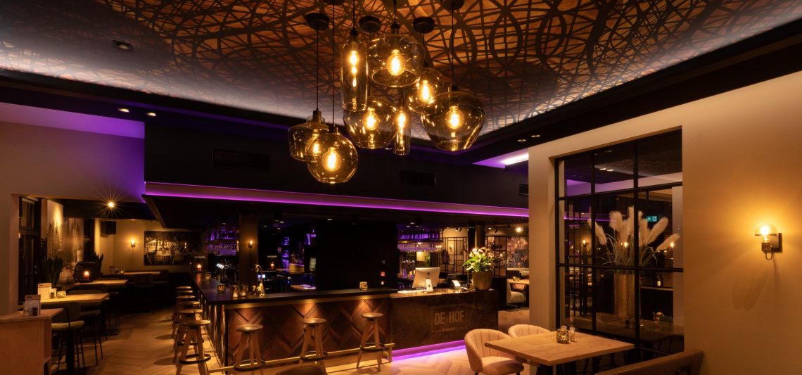
Above the dining table, the pendants do more than mark the center. In one scene, a multi-light fixture hangs over the table like a small cluster of points, each one helping define the surface below. In another, a long row of hanging lamps stretches over a bar or shared table. These fixtures bring the eye down to table height and give the space a clear focal point. Pendant lighting for dining works well here because the room already contains strong lines from the windows, floor, and ceiling.
The material contrast makes the pendants read even more clearly. Dark frames, pale walls, and wood flooring create a restrained backdrop, while the lamps pick out the area where people gather. That same logic returns in the bar and reception setting, where accent color appears at the counter and the pendants hover above it. The light does not just brighten the room; it separates zones without adding partitions. In a plan like this, the luminaire is part of the room structure.
Choosing the right luminaire for the setting
Choosing the right luminaire is not only a matter of appearance. It is about scale, position, and what the fixture needs to do against the surrounding materials. A pendant over a table can carry focus because it hangs into the room. A wall light works differently, grazing plaster, paneling, or a darker surface and giving it depth. In the images, the fixtures are chosen to suit the room’s purpose rather than to repeat one form everywhere. That keeps the scheme flexible from one space to the next.
Wall lights and accent lighting along the edges
Several walls are not left flat and silent. They are grazed by light, or punctuated by fittings that pick out the surface and make the room feel deeper. Wall lights and accent lighting are especially visible in the lounge-like spaces and along the corridor, where the route matters as much as the seating. A lit wall can slow a passage down. It can also make the transition between open room and narrower connection feel deliberate instead of abrupt.
That effect becomes stronger where materials change. Plaster, steel, textiles, and wood each react differently to the same source. A soft wall wash reveals texture on a light surface. A darker panel absorbs light and pushes the glow forward. In the bar and reception areas, coloured accent light adds another layer without taking over the room. It sits low, close to the counter, and gives the whole setting a more defined edge. The project uses that contrast carefully, room by room.
Light color and ambiance in rooms that do different jobs
The source content makes one clear point: lighting has a function. A room for relaxing does not ask for the same treatment as a room for working. That is why light color and ambiance matter so much in a lighting plan by room. The images suggest this through the shift from living area to office, from dining space to bedroom, and from open gathering areas to more enclosed corridors. Each setting asks the light to support a different pace.
Dimmable lighting for comfort belongs to that idea. The room does not need to stay fixed at one level. A lounge can feel softer in the evening. A dining area can become more focused during use. A workspace needs clearer light than a corner used for sitting. The project does not rely on one dramatic gesture. It relies on adjustment. That flexibility is what gives the interior its range, especially when the same palette of wood, plaster, and dark framing runs through several rooms.
From living room lighting to a clearer workspace
Ambient living room lighting in this project sits close to the architecture. It follows the ceiling lines, the window openings, and the main furniture groupings. In the office image, the same restraint helps the room stay usable without becoming visually busy. The light remains tied to the desk and the circulation path, so the surface reads clearly and the room can support concentration. That is where lighting for different room functions becomes visible, not theoretical.
Materials, ceiling shape, and the way light lands
The rooms show a mix of wood flooring, plaster, steel, and textiles. Those materials do not compete for attention, but they change what the light does. On the floor, wood picks up warmth in a narrow band. On the curtains, light becomes softer and less defined. Dark frames around the large windows cut the opening into strong edges, while the lighter walls catch a wider spread. The ceiling shape matters too: the arched and slatted surfaces give the light more to work against, especially where the spots are set into the structure.
In the bedroom, the same approach turns quieter. A bed, curtains, and wall-mounted or ceiling-based light points sit in a room that needs a calmer reading than the dining area or reception space. Yet the logic is the same. The light is placed to support the room’s use, not to compete with the furniture. Across the project, the lighting plan by room remains legible because the fixtures respond to the architecture first and the mood second. That sequence is what makes the interior feel resolved.
Seen as a whole, the project is a clear reminder that light finishes a room in a way furniture alone cannot. The table lamps, recessed spots, pendants, and wall lights each take on a separate role, and the effect is strongest when those roles are kept distinct. Where a room opens wide, light spreads. Where a function changes, it narrows. That is the structure behind the lighting plan by room, and it is what gives every space its own reading.
Want to see more of MoreSenz? View the page of MoreSenz for even more great projects and company information.




NEW 2026 Jubileum Edition The Best Interior Designers Benelux
Order Now €125