Custom interior in a modern villa
Dark front panels, slim framing, and a marble-look countertop set the tone before the eye reaches the seating area. Across the rooms, the same custom interior language keeps returning in different forms: a built-in wall cabinet that runs into a low TV unit, open niches that break up closed storage, and fixed lines that carry from living room to kitchen, bedroom, bathroom, and workroom. The house reads as a sequence of fitted pieces rather than a set of loose rooms.
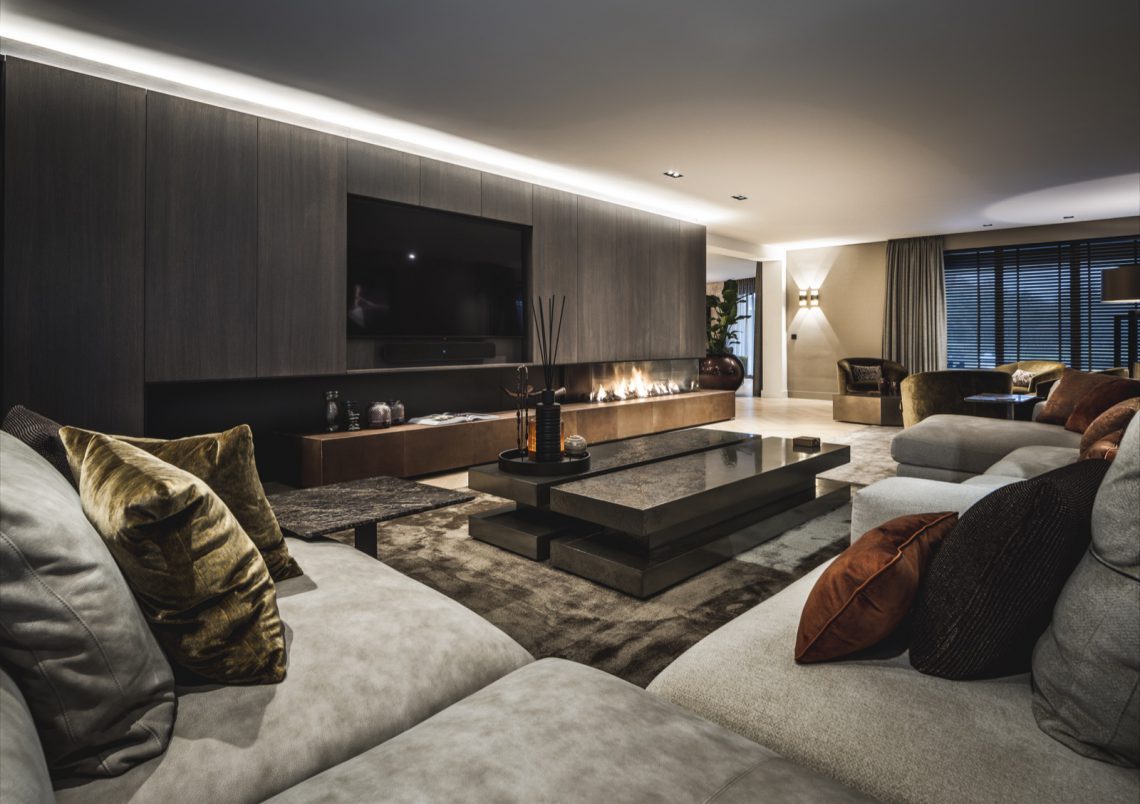
Built-in wall cabinet and custom TV unit in the living room
In the living room, the wall cabinet keeps its presence quiet by staying flat and close to the wall. Closed panels take up most of the frontage, while a few open niches interrupt the rhythm and leave space for books or small objects. The custom TV unit sits low, leaving the ceramic tile floor visible and giving the dining table with its wooden top more breathing room. A soft textured wall finish sits behind it all, but stays in the background.
Daylight enters through large windows with dark frames, and the curtains soften the edges without hiding the structure. Green accents in the chairs and accessories loosen the neutral palette. What matters here is the amount of furniture that disappears into the joinery. The custom interior in this room does not add layers for the sake of filling space; it removes visual noise so the wall, floor, and window openings can do more of the work.
Open niches that keep the front from closing in
The open niches do more than interrupt a cabinet run. They give the wall a measured depth and keep the closed sections from reading as a single block. That difference is easy to miss at first glance, but it changes the room’s scale. The cabinet line stays long, yet the lighter openings stop it from feeling heavy. In the same view, the low TV unit keeps sightlines open across the room and leaves the furnishings around it easy to read.
Dark kitchen fronts with a marble-look countertop
The kitchen works with dark fronts and a light marble-look countertop, a contrast that stays clear beside the white tiled wall behind the work area. A long work surface or island becomes the central horizontal line, catching the daylight that comes in through the large window. The appliance zone is tucked into a niche, which keeps the composition compact. Nothing protrudes unnecessarily, so the eye stays on the countertop, the fronts, and the wall finishes.
That restraint makes the kitchen read as part of a wider custom interior rather than a standalone statement. High cabinets sit tightly beside the work zone, while the appliances remain integrated. The marble-look kitchen avoids visual clutter and lets the material shift do the talking: dark panels, pale worktop, white tile, and the darker edge of the window framing. It is a clean sequence, built from fixed lines and repeated surfaces.
A worktop that draws the room together
The countertop runs across the view like a line drawn to connect the cabinet wall with the lighter background. That simple move stretches the kitchen visually and keeps the room compact at the same time. Window coverings reduce the glare on the surface, which makes the grain-like pattern in the marble-look finish easier to see. In this setting, the custom kitchen does not separate itself from the rest of the house; it keeps feeding the same interior language.
Bedroom storage built into the window wall
In the bedroom, storage sits inside the wall instead of around it. A built-in window bench uses the strip beneath the window, with drawers or storage compartments hidden below the seat. Around it, a paneled bedroom wall frames the bed zone and gives the niche a clearer outline. Curtains fall to either side and leave the fitted construction visible. The window becomes part of the composition, not an interruption in it.
Another room shows how the custom interior continues under a pitched roof. The cabinets follow the sloping line and use the wall height without wasting the lower edge. Beneath them, a desk is placed as a compact work surface, with two pendant lamps hanging above it. Patterned wallpaper on the back wall adds a different kind of surface tension. The result is a room with more than one use, but no sense of overflow.
Panel lines, drawers, and a seat under the window
The built-in window bench does most of its work through proportion. It holds the lower part of the wall, sets a place to sit, and conceals storage at the same time. The panel wall behind it keeps the bedroom’s geometry steady, so the eye moves from vertical lines to the horizontal seat and back again. Because the bench and wall are tied together, the window reads as a fitted opening rather than a free-standing gap in the room.
Surface details in the bathroom
The bathroom appears in close detail, but the fragment is telling. A round basin sits on a marble-look countertop in a green tone that stands out against the pale surface. The metal tap is positioned close to the window, so daylight slides across the basin edge and the stone-like top. In the close-up, the surface shows a blue-green patina near the rim, and the texture makes the material feel more tangible.
These smaller pieces matter because they repeat the same discipline seen in the larger rooms. The basin, tap, and top form a tight composition with no extra layers. The window keeps the wall light, and the countertop remains readable from edge to edge. Even in a compact view, the custom interior approach stays visible: fitted elements, clear lines, and materials that are allowed to show their own surface character.
Working beneath the slope with built-in storage
The workroom under the pitched roof uses the full length of the wall with a built-in cabinet and open shelves. Closed sections hide the practical side, while the open parts keep the wall from becoming block-like. A central desk leaves space for use, and the large windows bring in plenty of light. Curtains or screen-like coverings keep reflections under control so the surfaces stay legible. The room feels measured, not crowded, even with storage running along the slope.
Because the cabinet follows the roof line, the room avoids the awkward empty strip that often appears under a sloping ceiling. The desk sits in the open zone where the eye can settle, and the hanging lamps define the work area without adding bulk. The same custom interior strategy appears again: use the wall, hide what can be hidden, and leave the visible parts to carry the room. The result is a practical layout that still reads as one carefully fitted composition.
Light, curtains, and dark frames across the rooms
Across the project, the windows are treated as part of the interior, not as separate openings. Dark frames set a firm edge, while curtains soften that edge and filter the daylight. In the living room, the dining area, the kitchen, and the workroom, this keeps the bright surfaces from becoming harsh. It also helps the cabinet fronts, tiled floor, and wooden table top stay readable in the same view. The light is not decorative; it shows the joinery and the materials.
That same logic links the rooms together. Green chairs, dark frames, white tile, and pale stone-like surfaces recur in different scales, but always with the fitted elements leading the composition. The built-in wall cabinet, the custom TV unit, and the custom kitchen carry the strongest line through the house, while the built-in window bench and paneled bedroom wall bring the bedroom into the same family of details. This is a custom interior built from repeated structure, not from isolated gestures.
Want to see more of Ecker? View the page of Ecker for even more great projects and company information.




NEW 2026 Jubileum Edition The Best Interior Designers Benelux
Order Now €125


NEW 2026 Jubileum Edition The Best Interior Designers Benelux
Order Now €125