










Luxury modern interior with marble-look stone and wood accents
Black marble-look stone sets the tone as soon as the eye moves through the rooms. It appears in the kitchen as a dark island and wall surface, then returns in the bathroom and again near the living area, where white walls and wood floors keep the surfaces from feeling heavy. The result is a luxury modern interior that relies on clear contrasts rather than decoration: black against white, stone against timber, glass against solid planes.
Kitchen surfaces cut in dark stone
The kitchen is built around a black marble-look kitchen element that reads as one continuous block, with a matching dark wall behind it. Linear cabinet fronts keep the composition quiet, while integrated appliances disappear into the darker plane. White ceiling strips and recessed lighting pick up the crisp edges of the room, and the wood-look floor softens the transition underfoot. It is a space where the materials do most of the work.
Seen from closer range, the island and back wall show a clear stone pattern with a strong veining effect. That texture gives the room depth without adding extra profile or ornament. Around it, the cabinetry stays restrained, so the dark surfaces remain the main gesture. This is where the luxury modern interior becomes especially readable: the kitchen is not treated as a separate showpiece, but as part of a wider palette that continues through the house.
Minimal cabinetry around the black marble-look kitchen
Handles are kept out of sight, which leaves the front lines straight and uninterrupted. The black surfaces sit against lighter ceiling and wall finishes, so the room never closes in visually. Even the built-in appliances feel folded into the architecture. For a project page, that makes the kitchen easy to read as part of a full interior rather than a single room shot: the same dark stone, white finish and wood tone return elsewhere, creating repetition without monotony.
An open staircase framed in black
The open staircase black frame is one of the clearest structural elements in the project. Dark supports outline the stair run, while the wood-look treads add a lighter band across the span. Because the staircase sits against white walls, every line stands out: the edges of the steps, the verticals of the frame and the shadow below each tread. It is a strong visual pivot between levels, but it never feels isolated from the rest of the interior.
Daylight and built-in lighting work together in the hall, where the staircase is seen beside a glazed opening and a clean white wall plane. That mix keeps the space open and legible. In the wider sequence of rooms, the stair repeats the project’s material logic: black structure, pale background, wood surface. The effect is practical first, but it also gives the eye a clear route through the house.
Bathroom walls wrapped in marble-look panels
The luxury marble-look bathroom continues the same dark-and-light contrast, but in a quieter register. Marble-look wall panels cover the room with a veined surface that reflects the light differently from the kitchen stone. A glass shower enclosure sits in front of the wall, edged in black so the partition stays visually sharp. The shower niche and shelf detail are tucked into the wall rather than added on, which keeps the surface clean and readable.
At the basin, the finish shifts to a darker vanity and a more compact composition of tap, sink and mirror. The fittings stay minimal, letting the stone texture remain visible behind them. In close-up images, the wall pattern and the metal tap line up neatly, so the bathroom feels composed from a few precise moves instead of many separate gestures. The space reads as calm, but not blank.
Glass, stone and a restrained washstand
The bathroom works because each material has a clear role. Glass keeps the shower enclosure light. Stone gives the room its weight and surface detail. The darker vanity anchors the lower part of the room so the wall panels can remain prominent. Nothing is overdrawn. The room still feels connected to the rest of the luxury modern interior through the same palette of black, white and wood, even though the mood is softer here.
A living room shaped by light and one dark niche
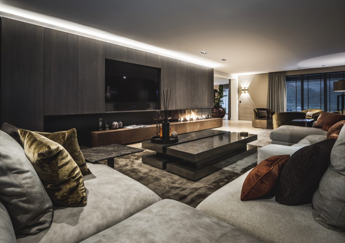
In the living room, the eye goes first to the fireplace niche set into a wall. The opening is dark, almost recessive, and that makes the surrounding white surface appear brighter. Next to it, a large window brings in a wide field of daylight and opens the room toward the outside without drawing attention away from the interior. The furniture stays low and quiet, so the architecture and the light remain the main subjects.
A second view of the room shows soft seating, long curtains and the same fireplace wall in a darker finish. The large window living room setup gives the room a broader reading, with daylight spreading across the pale floor and picking up the edges of the furnishings. Nothing interrupts the line between the seating area and the wall niche. The room feels composed around two fixed points: fire and glass.
Wood floors and white ceilings tie the rooms together
What links the kitchen, stair hall, bathroom and living space is not one dramatic gesture, but a repeated set of surfaces. The wood-look flooring runs through the project and keeps the darker stone from taking over. White ceilings and walls create the frame around it, while indirect lighting softens the junctions and adds depth at the edges. Because the surfaces are so clearly separated, the materials remain easy to read from room to room.
That clarity is especially visible in the open-plan sightlines, where the staircase, kitchen zone and dining area appear in one view. Dark stone accents sit beside the timber floor, and the white ceiling above holds the lighting in a clean line. The project does not rely on ornament to connect the spaces. It uses repetition, proportion and a controlled palette, which is exactly what gives this luxury modern interior its steady rhythm.
Details that keep the interior grounded
Small elements matter here: the profile of the stair treads, the black edge around the shower screen, the line of the kitchen fronts, the recessed light in a white wall. Each one is visible, each one supports the larger composition. Even the bedroom wall detail, with its pale surface and built-in niche, follows the same restrained approach. The project keeps returning to the same idea in different rooms, and that consistency is carried through by the materials rather than by decoration.
As a whole, the interior is defined by contrast and repetition. Black marble-look stone gives the rooms a clear anchor, wood introduces a softer register, and white surfaces leave space around both. The staircase, the kitchen, the bathroom and the living room each show a different part of that language, but they never break away from it. That makes the project read as one carefully considered interior sequence, not a collection of isolated rooms.
Want to see more of Ecker? View the page of Ecker for even more great projects and company information.




NEW 2026 Jubileum Edition The Best Interior Designers Benelux
Order Now €125


NEW 2026 Jubileum Edition The Best Interior Designers Benelux
Order Now €125


NEW 2026 Jubileum Edition The Best Interior Designers Benelux
Order Now €125


