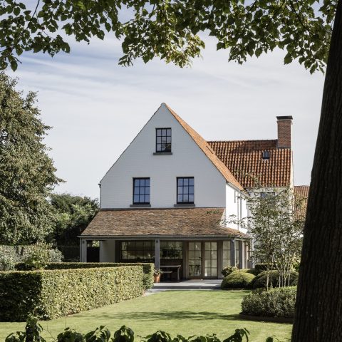
Townhouse renovation with marble and herringbone parquet
The marble at the entrance sets the tone straight away: ten different kinds of stone laid in a herringbone pattern, underfoot before the rooms open up. Inside, the old office layout has given way to a house renovation that had to work for a young child, dogs and daily family life. The former ceiling panels and small rooms are no longer the focus. What stands out now is the way the interior moves from one pocket of space to the next, with surfaces, colour and fabric doing most of the work.
From office-like rooms to a warmer family home
The building started as a roomy 1920s townhouse that had been turned into a sterile office environment. Low suspended ceilings and a maze of smaller rooms once broke up the volume. The renovation took 2.5 years, giving time for each room to settle into a different rhythm. Instead of a series of closed-off spaces, the plan now allows for sightlines, pauses and corners where someone can sit down with coffee or a glass of wine. That shift changes how the house is used every day.
Small seating nooks are threaded through the interior rather than added as afterthoughts. They appear beside larger rooms, tucked into edges of circulation, and near windows where light lands on upholstery and wood. The effect is practical without becoming blunt. A chair, a bench or a low table can claim a little territory without closing off the room. For a house renovation like this, those smaller gestures matter as much as the larger structural changes.
Green and blue accents soften the larger surfaces
The colour palette leans into greens and blues, but never in a flat way. Some surfaces read cooler and calmer; others carry a deeper note, especially where textiles and wall finishes take over. The palette is mixed, yet restrained enough to sit alongside the marble, timber and darker joinery. It gives the rooms a steady base, then lets the more vivid notes appear in smaller doses. That is how the house avoids feeling overworked despite the number of materials in play.
Rich textures are doing a lot of quiet work here. Fabric, wood grain, stone and painted surfaces each hold their own level of detail, so the rooms do not rely on ornament alone. Crystal pieces are mentioned in the source material as part of that layered approach, and they fit into the broader interest in surfaces that catch light rather than reflect it uniformly. In a warm family home, texture often reads before colour does, especially when daylight shifts across the room.
Layered curtains and large windows
Layered curtains frame the windows with more than one surface at a time. White sheers sit behind darker drapes in several of the images, which lets the rooms shift from open daylight to a more enclosed evening setting. The fabric softens the edge of the glass and keeps the larger openings from feeling severe. In combination with the wall treatments and the timber floor, the curtains become part of the architecture rather than decoration added later.
Some rooms use a darker horizontal wall finish that runs beneath the windows and anchors the lower half of the space. Against that band, the lighter upper walls and the curtain layers create a clear division of weight. It is a simple move, but an effective one. The eye reads the room in sections: window, wall, floor, then the furniture placed close to the light. That sequencing helps the interior feel measured without becoming formal.
Herringbone parquet and marble across the rooms
Herringbone parquet appears repeatedly in the project, tying the rooms together with one consistent floor pattern. The timber gives the large rooms a clearer direction, especially where the furniture is kept low and the walls carry more texture. In the entrance, marble takes over instead, with the herringbone pattern translated into stone. That change from wood to marble marks the threshold sharply. It is one of the strongest visual moves in the house renovation, and it gives the arrival space its own identity.
Marble also shows up in the interior furnishings and kitchen surfaces seen in the images. The veining is active enough to stand beside the wood floor and the darker wall finishes, while still feeling anchored by the calmer palette around it. This is not marble used as a single statement material. It is placed where it can register against other textures, which is why the interior feels assembled from parts rather than decorated all at once.
A decorative entrance with 10 kinds of marble
The entrance floor is the most intricate surface in the project. Ten types of marble are set into a herringbone pattern, turning the threshold into a piece of craft rather than a simple passage. That level of detail echoes the wider respect for making that runs through the house. It also gives the first few steps a different tempo. Before the rooms open out, the floor already signals that the house renovation was handled with patience and a close eye for material change.
The marble entrance floor is not isolated from the rest of the interior. It prepares the transition into the quieter rooms beyond, where timber, textiles and painted surfaces take over. Seen this way, the stone at the door is part of the whole sequence: hard surface first, softer layers later. It is an effective way to lead a family through the house without relying on grand gestures or oversized features.
Crafted details, measured colour and everyday use
A colourful artwork brings another note into the rooms, but it does not override the architecture. Instead, it sits among the natural materials and the green and blue accents, adding a sharper point of contrast. The overall style is described in the source as almost classic, with a few bolder interventions. That seems accurate in the images too: there is restraint in the layout and material palette, but also moments that take a clearer line, especially where pattern or colour breaks the surface.
What makes the house renovation feel complete is the way the materials repeat without becoming repetitive. Marble appears in more than one place, parquet links the rooms, and the curtains pull the windows into the same visual language as the upholstery and wall finishes. Small seating nooks keep the plan useful for everyday life, while the layered textures and deeper colours stop the interior from feeling flat. It is a house shaped by use, but also by the pleasure of looking closely at stone, fabric and wood.
Want to see more of Atelier ND Interior? View the page of Atelier ND Interior for even more great projects and company information.



NEW 2026 Jubileum Edition The Best Interior Designers Benelux
Order Now €125