


Museum-like apartment interior with a white minimalist base and art accents
White walls set the tone at once. In this museum-like apartment interior, the room reads as a sequence of calm planes, framed by art, a restrained palette and a clear view through the windows. The white minimalist design leaves space for objects to stand out, while muted warm accents in the furniture keep the room from feeling flat. It is an interior built around looking, not filling.
museum-like apartment interior as the architectural starting point
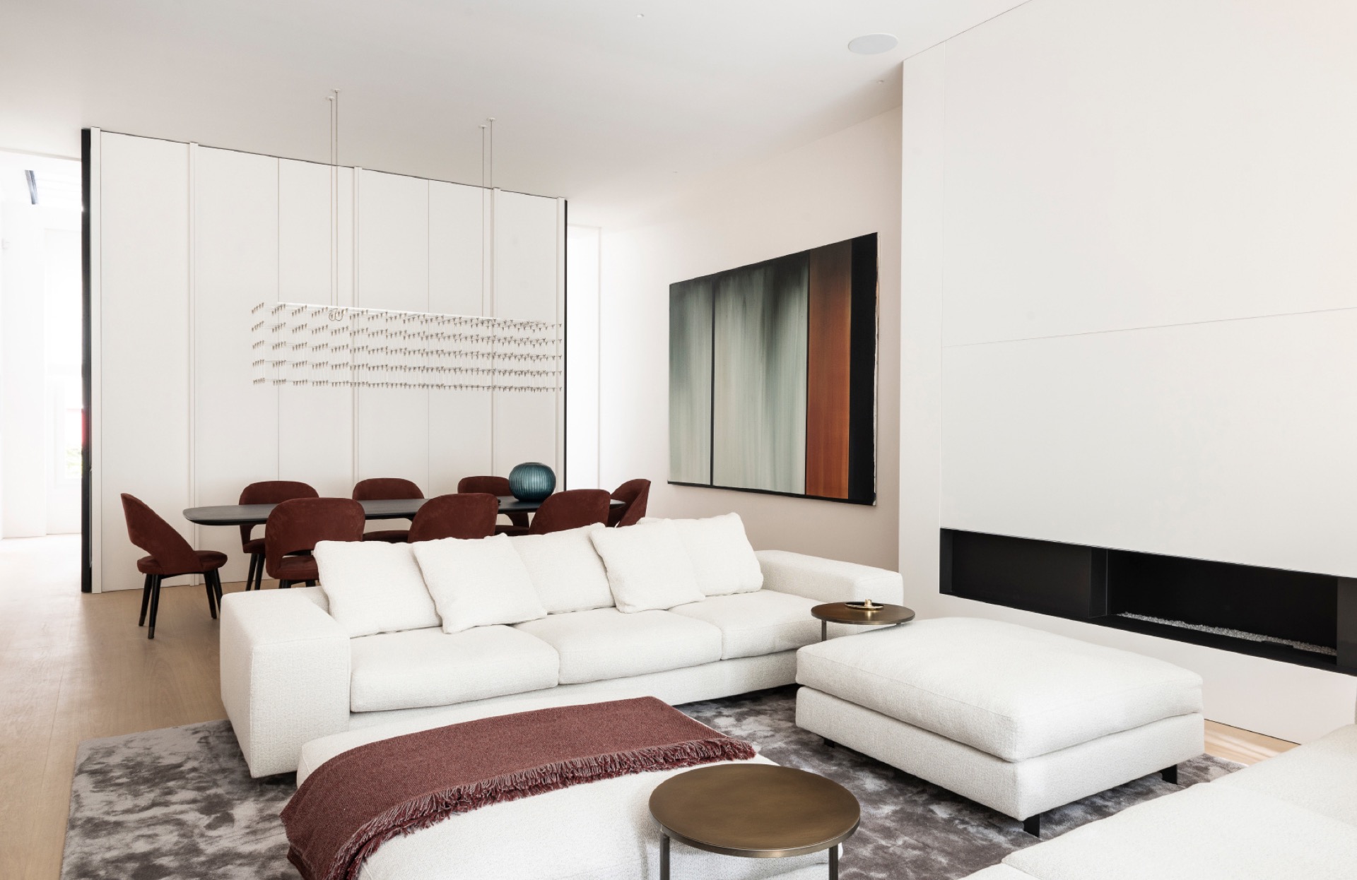
The living room art wall comes forward before the furniture does. Layered paintings and panels sit against the pale background, so the wall works almost like a display surface. Nearby, a low seating arrangement in light fabric keeps the volume close to the floor. The effect is quiet but not empty: the eye moves from artwork to sofa, then to the bright edge of the window.
That window edge matters. Sheer curtains warm light as it enters the room and soften the contrast between the white surfaces and the darker details. The fabric does not hide the opening; it filters it. Across the day, the room shifts with that light, which makes the muted red and grey accents feel less decorative and more structural. In a museum-like apartment interior, those small colour notes carry real weight.
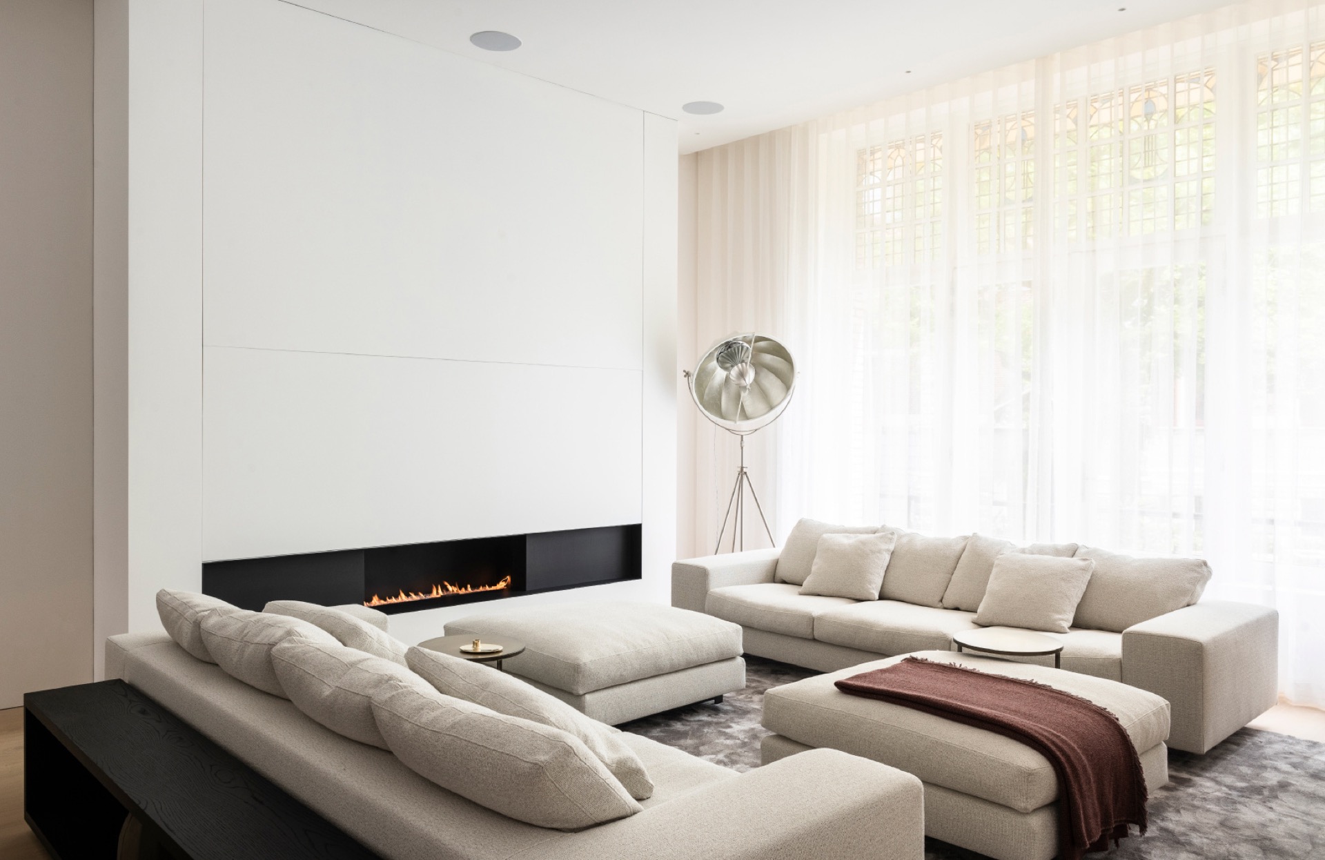
A black fireplace holds the room together
Set into a wall niche, the built-in black fireplace gives the living space a clear anchor. The dark frame cuts into the white shell and creates a sharp line that the rest of the room can orbit around. In one view it sits beside the sofa; in another, it reads as a graphic break in the wall. The flame is visible, but the insert stays visually contained, which keeps the focus on the architecture of the opening rather than on ornament.
The white minimalist design around the fireplace sharpens that contrast. Painted walls, smooth joins and a light floor keep the background consistent, so each black edge is deliberate. Even the seating arrangement stays low and linear, letting the fireplace niche, the art and the windows define the room’s rhythm. This is where the apartment feels most edited: a few elements, clearly spaced, without visual noise.
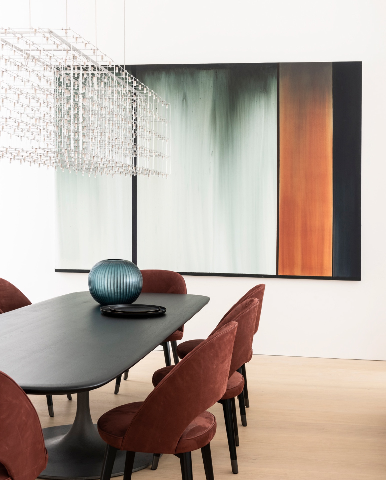
Dining details as part of the same composition
The dining area continues the same language, but with a different set of lines. A table and chairs sit beneath an abstract wall composition made of vertical colour fields, which breaks up the white surfaces without crowding them. The artwork is large enough to register from across the room, and the surrounding wall stays plain, so the image can breathe. The space feels measured, with furniture placed close enough to connect, yet open enough to keep sightlines clear.
Here the muted warm accents shift into a slightly more tonal register. Rust, soft grey and warmer hues appear in the furnishings and the wall art, not as decoration layered on top, but as part of the room’s palette. A light floor reflects that balance back into the space. The result is a dining corner that belongs to the same museum-like apartment interior, while still having its own pace and visual weight.
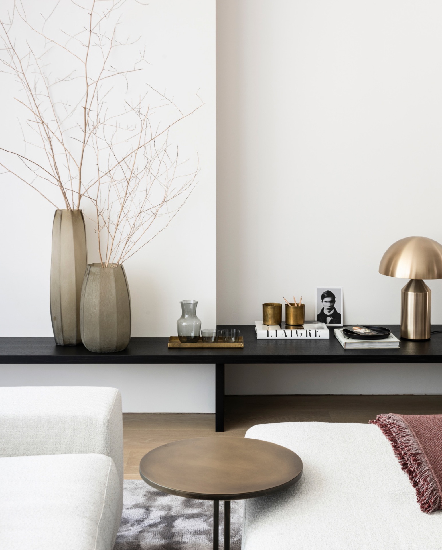
Details are handled like gallery pieces
A small console scene shows how the project treats objects. A bronzed lamp, a few vessels and a clean tabletop sit against the white wall with the kind of spacing usually reserved for display. Nothing is over-arranged. The objects are allowed to cast small shadows, and that is enough to give the corner depth. Against the plain paintwork, even a narrow baseboard line or a slim ledge becomes part of the composition.
The same restraint appears in the wall finishes. Strips and joins are kept tight, and the surface read is smooth rather than busy. In a project like this, that precision matters because the art has to stay visible from multiple angles. The apartment does not rely on elaborate materials or dramatic colour shifts. It depends on the way each edge meets the next, from wall to floor, from panel to opening, from console to blank wall.
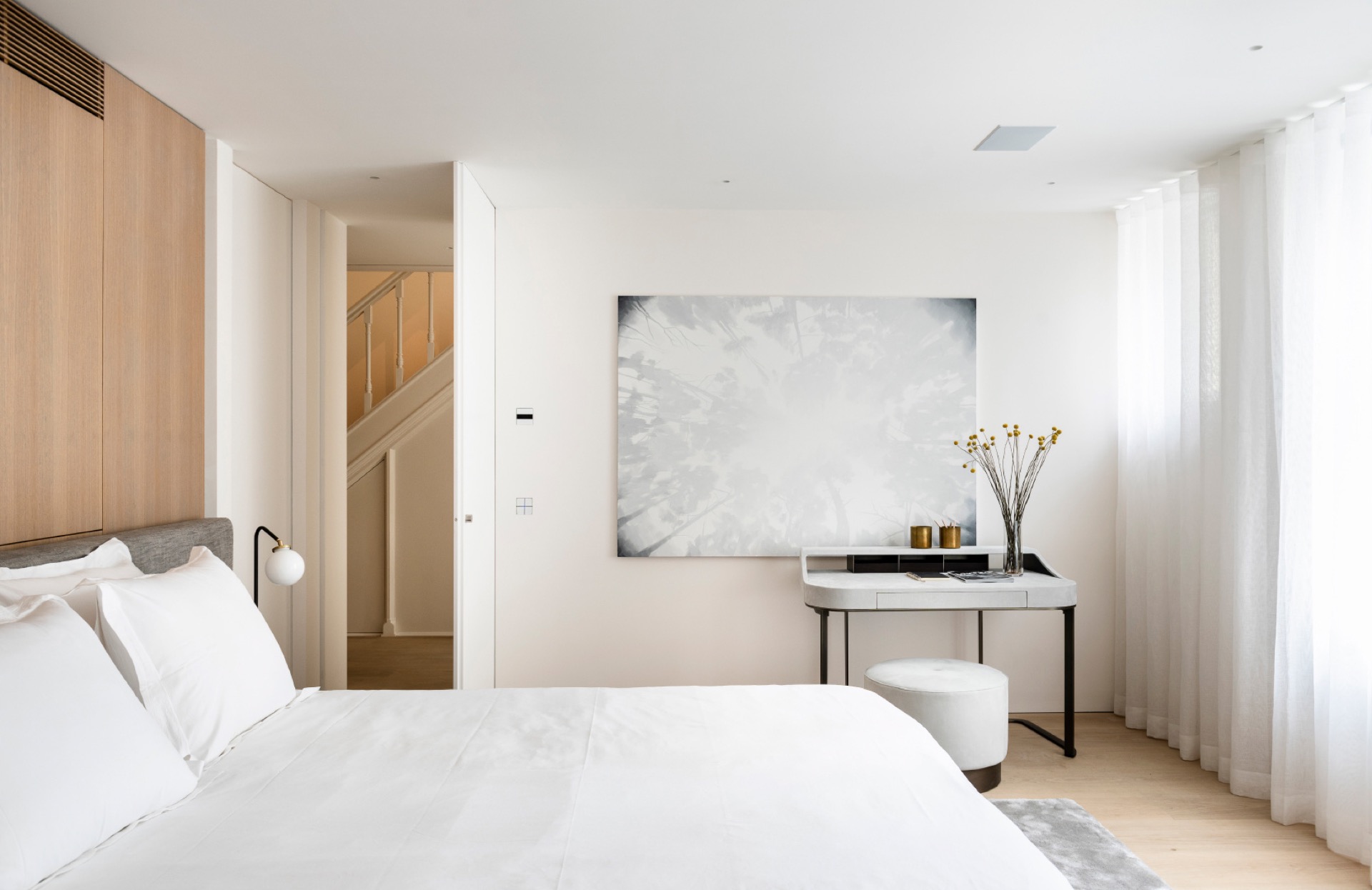
The bedroom repeats the calm, with wood adding depth
In the bedroom, built-in wooden wardrobes bring a warmer note into the mostly white setting. The panels are flush and orderly, so they read as part of the architecture rather than as separate storage. A light bed and pale textiles keep the room quiet, while the wood grain gives it a slower, softer texture. It is a change in material, not in tone.
Art above the console keeps the room connected
A slim console carries a piece of art at eye level, which ties the bedroom back to the rest of the apartment. The arrangement is modest: one surface, one image, a few careful edges. Sheer curtains near the window bring in the same filtered daylight seen in the living room, so the room never slips out of the project’s visual language. The black, white and wood notes remain distinct, but they are handled with the same restraint.
Across the apartment, that consistency is what stays with you. White walls, a black fireplace, art on the walls, transparent curtains and measured colour accents shape the experience room by room. Nothing pushes for attention, yet every surface contributes to the whole. The museum-like apartment interior stays focused on light, art and proportion, with enough warmth in the furniture and materials to keep the rooms from turning cold.
Photography: Marc Heldens + Verne Photography
Contributors: Sofa: De Padova; Dining table and chairs: Baxter; Pendant: Quasar; Carpet: Frankly Amsterdam; Studiolight: Fortny; Fireplace: Boley That makes the museum-like apartment interior part of the architectural character rather than a loose finish.
Want to see more of Ruud van Oosterhout Design? View the page of Ruud van Oosterhout Design for even more great projects and company information.

.png)


