


Trowel-finished concrete floor spanning kitchen and living area (sunken seating feel)
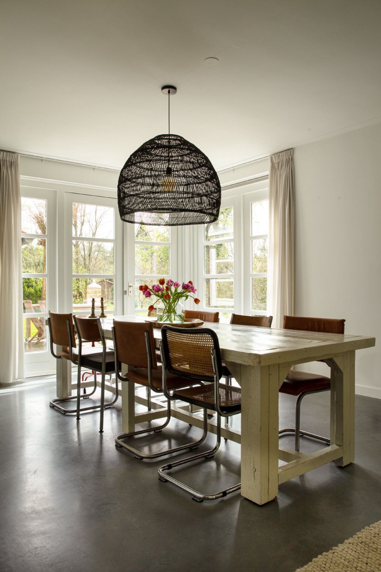
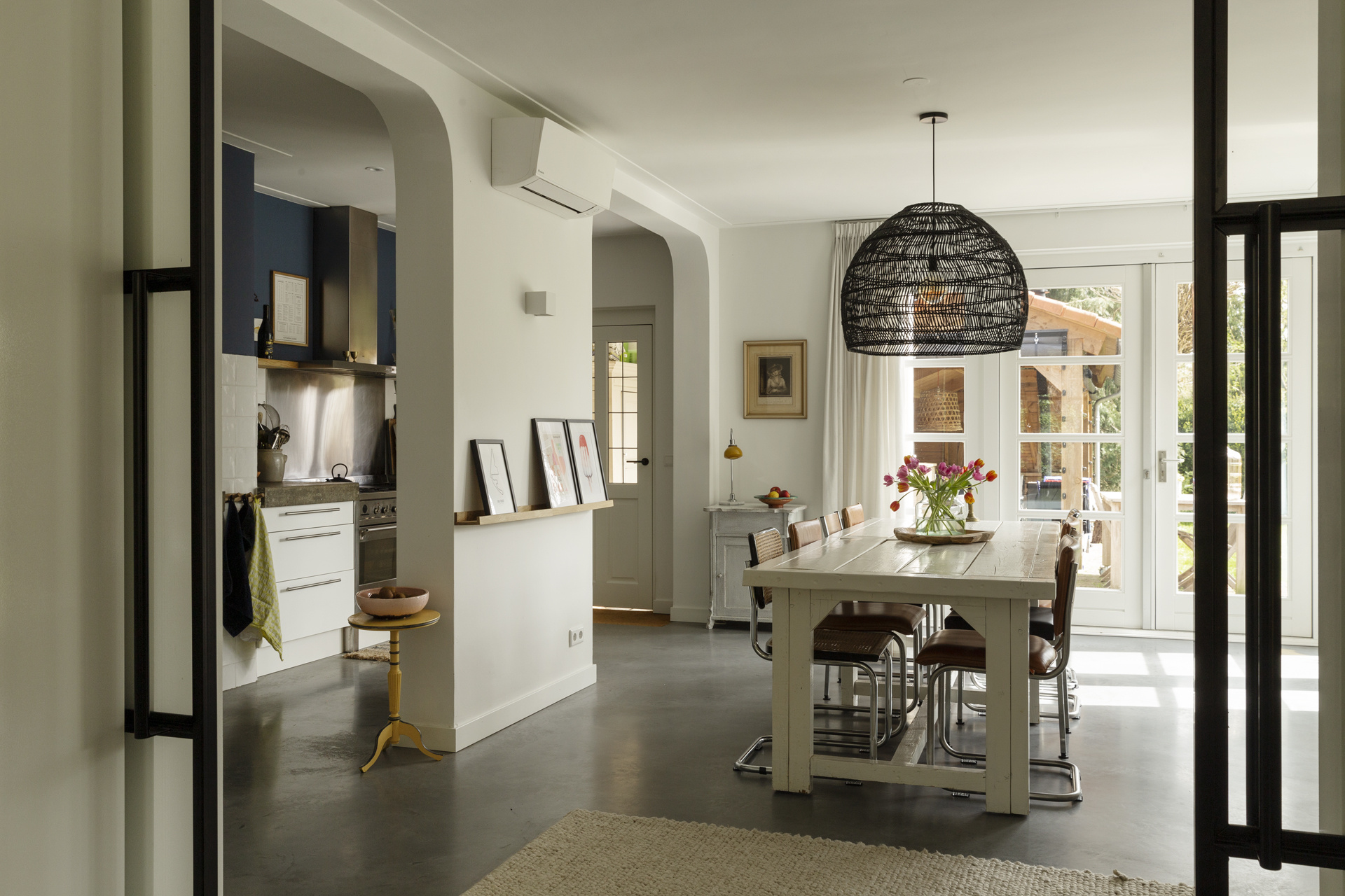
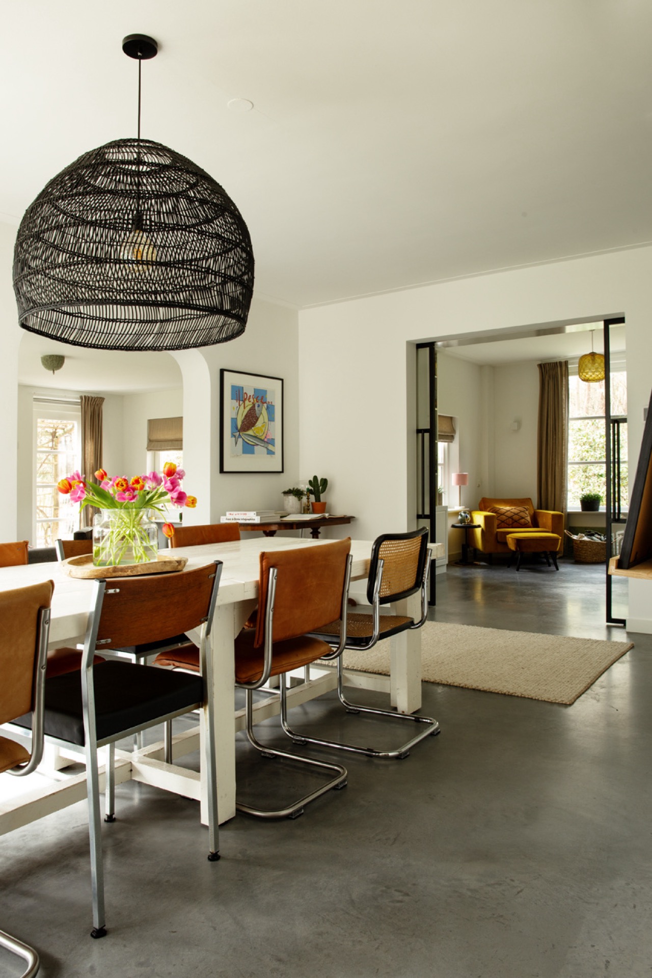
The trowel-finished concrete floor for a continuous kitchen and living space is immediately visible in the way the project is framed. The mid-gray trowel-finished concrete floor is the first thing that ties this renovated semi-detached house together. It runs from the kitchen into the living room without a break, so the eye keeps moving across the full interior. White walls and black window frames sharpen that line, while the large windows pull daylight deep into the space. The result is calm in tone, but never flat; every shift in level or material is visible at once.
trowel-finished concrete floor for a continuous kitchen and living space as the architectural starting point
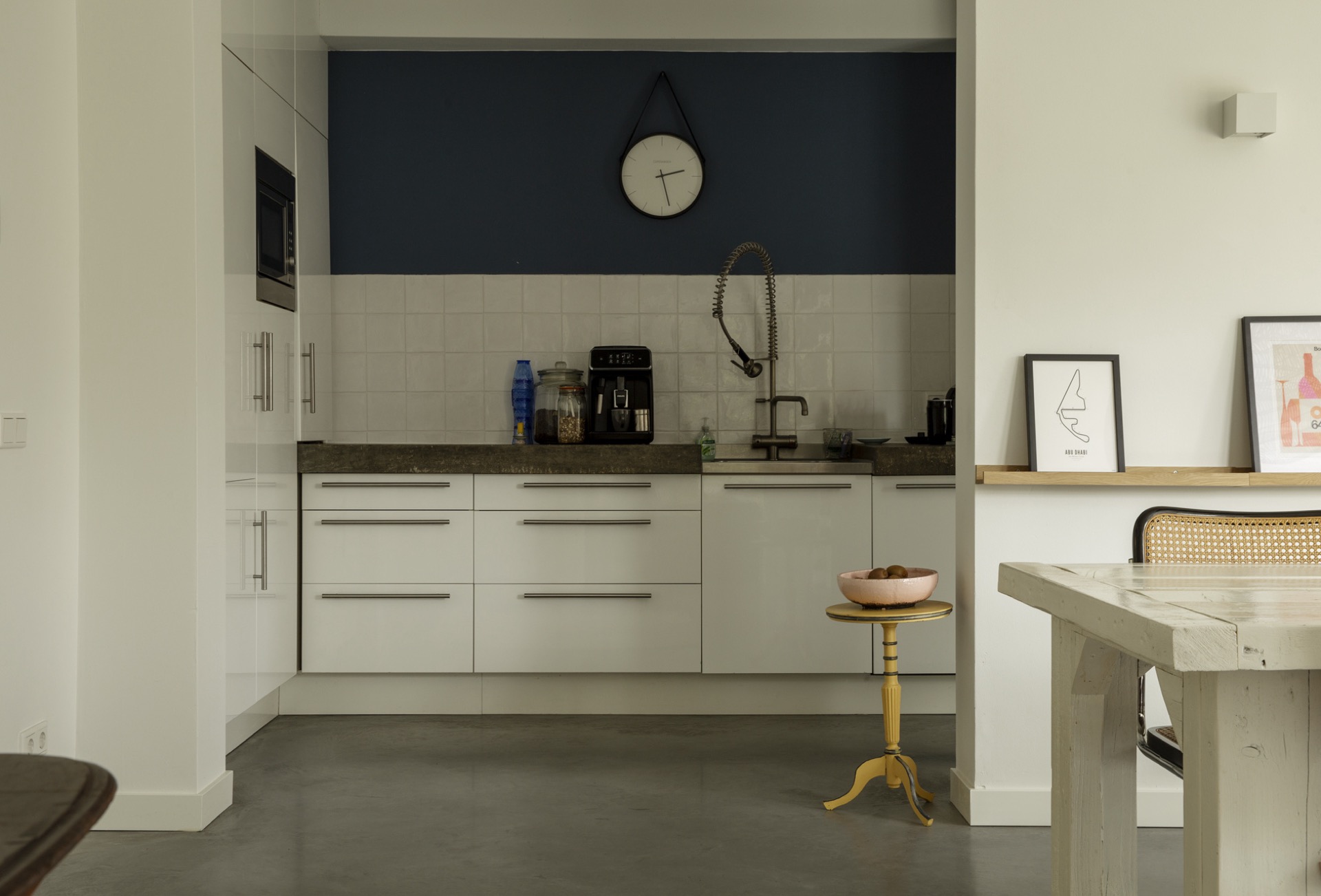
What makes the trowel-finished concrete floor for a continuous kitchen and living space work here is its restraint. The surface stays matte and even in a mid-gray shade, letting the furniture and openings take over the view. In the kitchen, the floor starts beside white cabinetry and a dark splashback area, then continues toward the dining zone and living room. Because the flooring never changes, the rooms read as one sequence rather than separate parts.
That continuity matters most in the transition between cooking and sitting. The concrete floor does not interrupt the layout with thresholds or shifts in texture. Instead, it draws a direct path past the dining table, under the hanging lamp with its wire-like shade, and into the lower living area. The effect is practical, but also visual: the room feels larger because the same surface holds the full length of the plan.
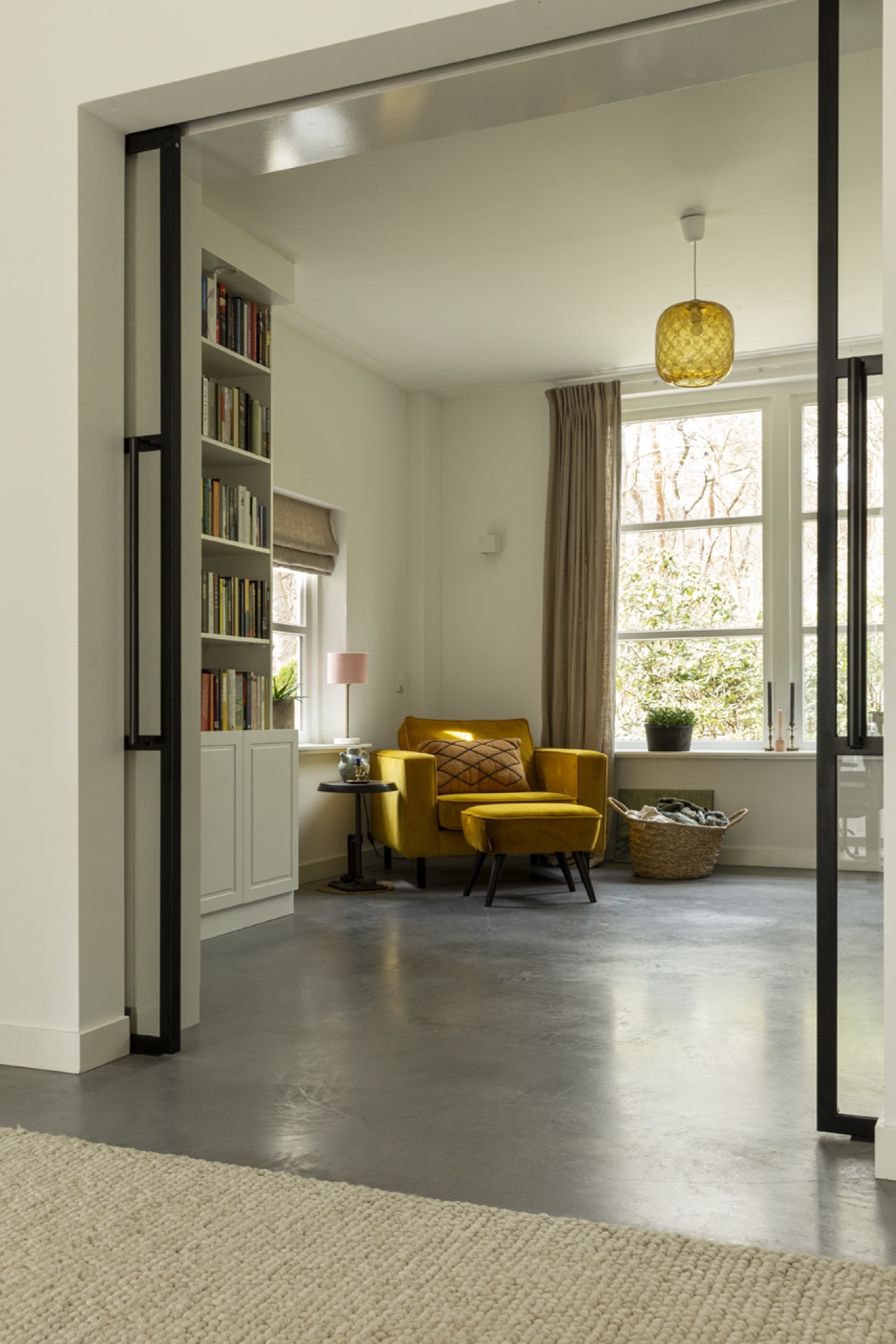
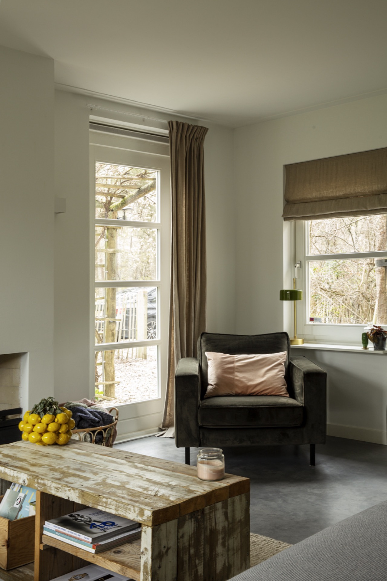
The lowered living room changes the mood
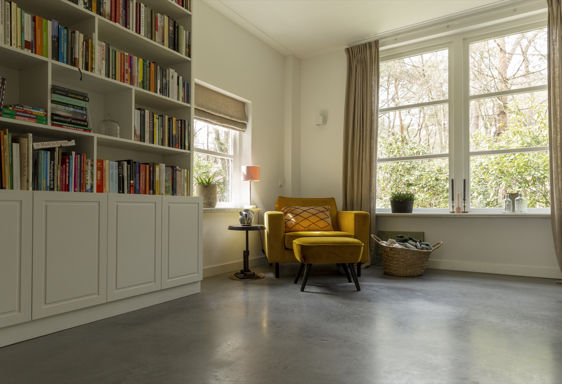
The living room sits slightly lower than the kitchen, and that small change does a lot. It creates a subtle edge where the floor drops away, enough to suggest a separate zone without walls or partitions. From the kitchen side, the living area reads as a seating nook. From the sofa, it feels tucked in, almost cupped by the surrounding lines. The slightly sunken living area gives the room its quieter character.
This lower level also helps the seating arrangement settle into the space. A sofa and armchairs sit beside the open hearth, and the lowered floor places them more closely to the window line. Light lands across the gray concrete, then reaches the textiles and wood pieces in the room. The scene is simple, but the difference in height gives it a clear frame. It is a small move with a strong spatial effect.
A cozy seating nook effect without extra decoration
The cozy seating nook effect comes from proportion, not from styling tricks. The lowered zone gathers the furniture naturally, while the concrete floor keeps the room visually open. Open shelving and built-in niches add depth to the white walls, and they break up the larger surfaces without cluttering them. Because the room is kept light and direct, the sunken feel is easy to read even in a single glance across the interior.
Black window frames sharpen the edges around the glazing, especially where the curtains soften the openings. The contrast is plain and effective: dark lines at the perimeter, pale walls inside, gray floor below. In the living room, that combination keeps the eye on the level change and the seating group rather than on decorative extras. The room earns its atmosphere from spacing, light, and the floor beneath it. That makes the trowel-finished concrete floor for a continuous kitchen and living space part of the architectural character rather than a loose finish.
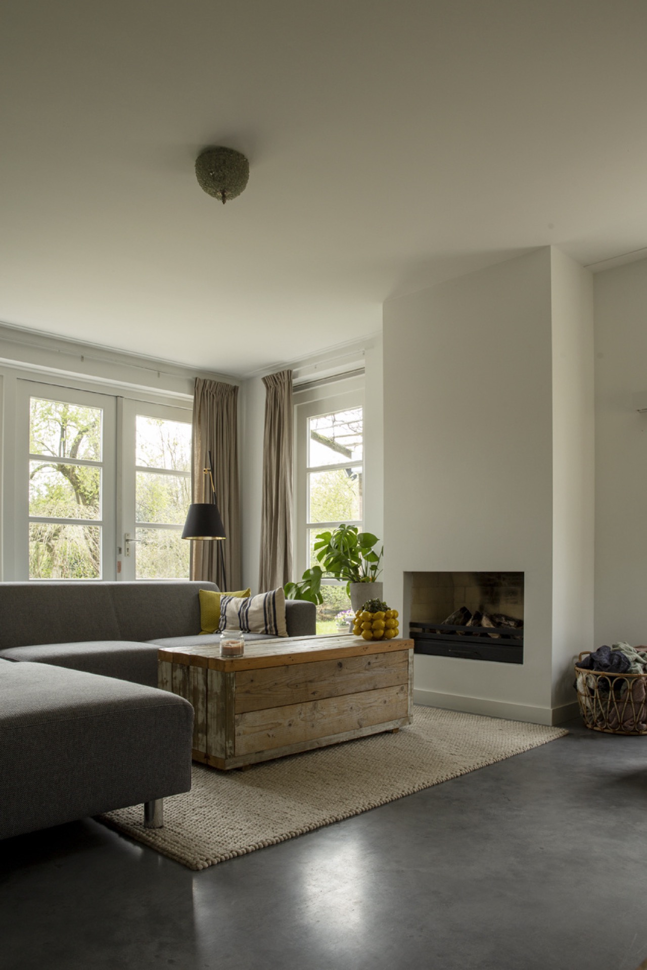
Vintage country style against a gray concrete surface
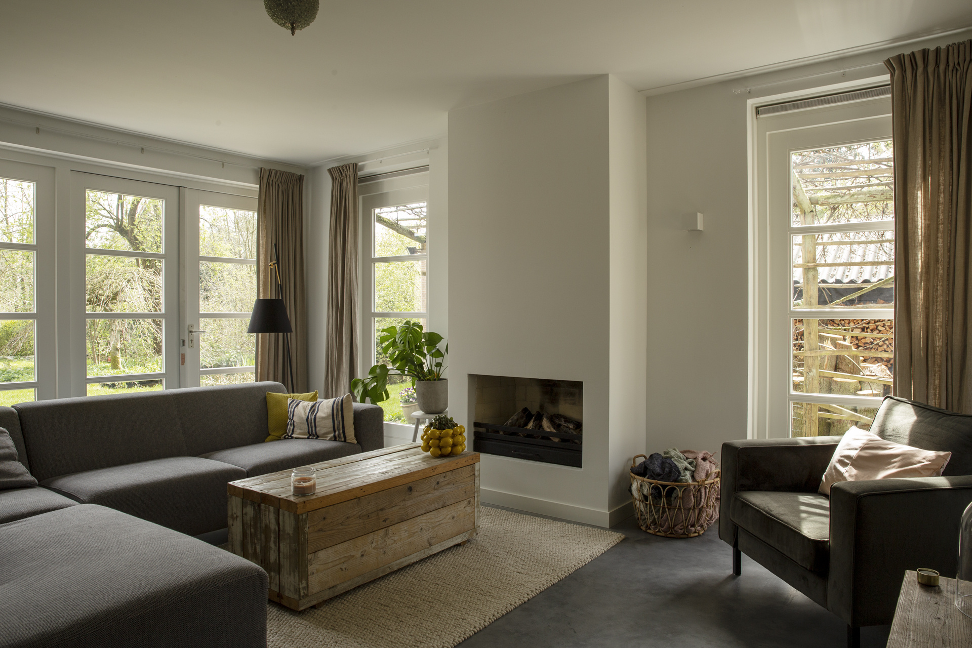
The interior leans on vintage country style cues, but it avoids turning those details into a stage set. Wood pieces, upholstered seating, and the open hearth bring a familiar, lived-in register. Against that, the mid-gray concrete floor looks more precise and cool. The two parts do not compete. Instead, the older country references sit more visibly against the floor’s smooth, trowel-finished surface, which gives the whole room a firmer base.
That contrast is strongest where the living room opens to the daylight. Large windows bring in a broad wash of light, and the pale walls reflect it back into the room. The concrete floor absorbs some of that brightness, which keeps the lower zone from feeling overstated. It becomes a quiet backdrop for the furniture and the built-in storage, both of which remain clearly visible in the frame.
Large windows and black frames shape the light
The glazing does more than brighten the room. It sets the pace for how the interior is read. With large windows for natural daylight, the kitchen, dining area, and living room can be seen in one sweep, and the black frames act like thin outlines around the view. Their contrast is especially clear beside the white walls and neutral curtains, which soften the opening without hiding it.
From one side of the room to the other, the daylight reveals the surface changes that matter: the matte finish of the concrete, the straight edges of the cabinetry, and the slight step down into the living area. In the evening, the hang lamps and the hearth would likely take over, but in these views it is the daylight that explains the layout best. The structure of the room is visible because the light is allowed to move freely through it.
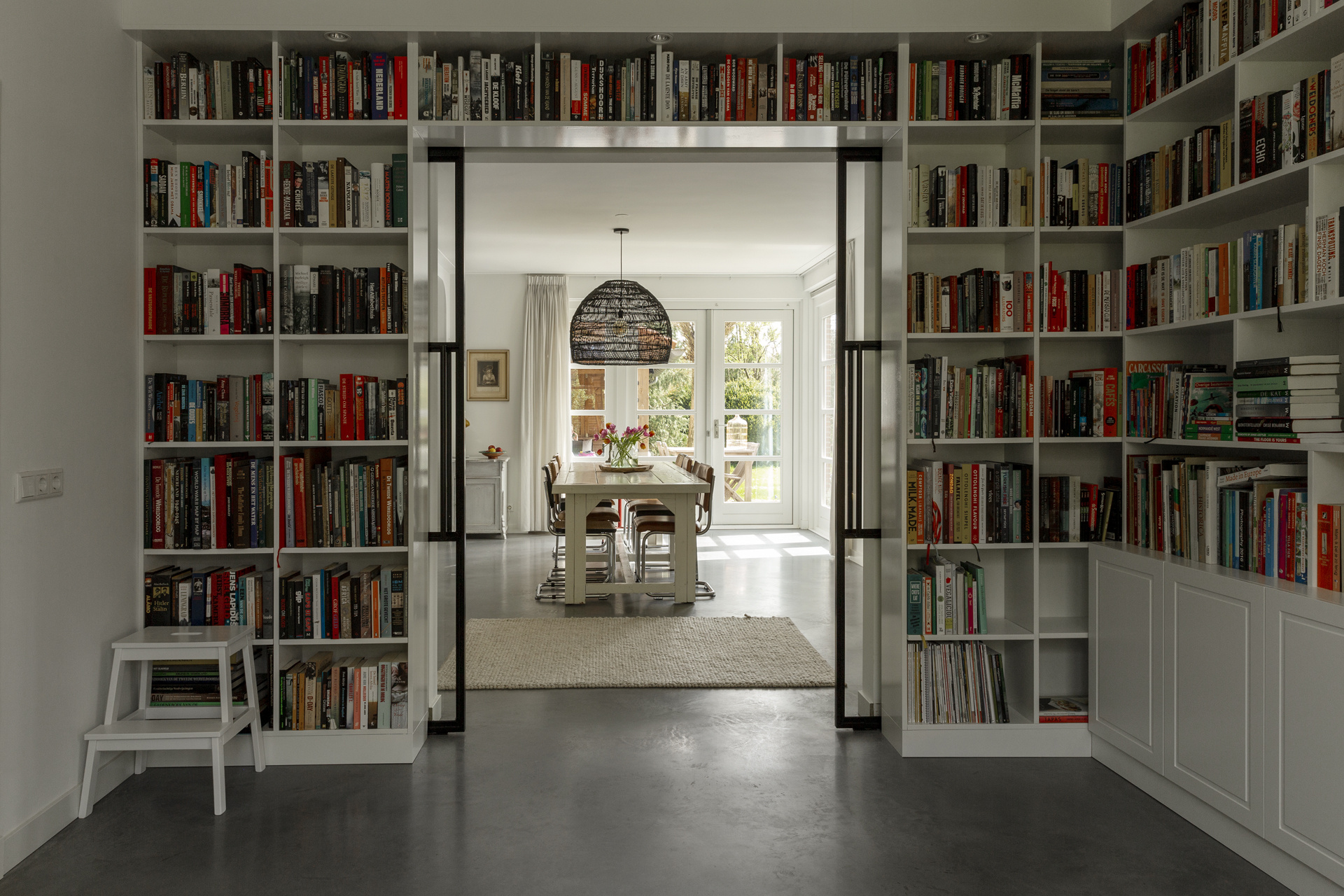
Built-in niches, open shelves and a restrained palette
White built-in niches and open shelves add a measured rhythm to the walls. They hold books and objects without breaking up the room into smaller fragments. In the living area, those recessed sections sit beside the window openings and reinforce the sense of depth. The overall palette stays close to white, gray, black, and a few wood notes, which keeps attention on the floor and the level shift rather than on surface decoration.
The kitchen follows the same line. White cabinets and a darker backsplash zone keep the composition clear, while the continuous concrete flooring carries the eye past the work area. Because the material does not stop at the kitchen edge, the space feels planned as one interior sequence. That is why the floor is not simply a background element here; it is the part that explains how the rooms relate to each other.
This renovated semi-detached house shows how a single surface can organize an interior. The continuous concrete flooring links the kitchen and living room, and the slightly lower seating zone gives that surface a second reading. What could have been a straightforward open plan becomes a quieter composition of steps, edges, and views. The result is easy to follow because every part of it is visible: the floor, the frames, the light, and the lowered room all work in the same direction. That makes the trowel-finished concrete floor for a continuous kitchen and living space part of the architectural character rather than a loose finish.
Want to see more of Willem Designvloeren? View the page of Willem Designvloeren for even more great projects and company information.


.png)


%20-%20)
%20-%20)
%20-%20)
%20-%20)
%20-%20)
%20-%20)
%20-%20)
%20-%20)
%20-%20)
%20-%20)
%20-%20)