Modern villa with large glazing and a minimalist interior
Large panes set the tone from the first view. Black window frames cut clean lines into the light exterior, while the concrete volumes keep the composition firm and measured. The result is a modern villa with large glazing that opens carefully toward the outside instead of dissolving into it. In the evening, the lit openings make the structure read almost like a series of framed rooms, each one set back behind the solid parts of the house.
Concrete surfaces and sharp openings
The exterior works through contrast. Smooth concrete walls meet wide glazed sections, and the rectangular openings stay deliberately clear, without extra framing or decoration. That restraint makes the mass of the house more legible. A side view shows the terrace edge, the overhang above it, and the glass railing that keeps the line of sight open across the full width of the platform. It is a direct way of shaping the approach to a covered terrace with glass railing.
From another angle, the building reads as a sequence of solids and voids. The dark window profiles sharpen the white and pale surfaces around them, while brick, concrete, and glass appear in distinct fields rather than mixed into one finish. That clarity continues in the night image, where the illuminated openings bring depth to the façade and reveal how the interior sits behind the concrete shell. The project keeps returning to the same visual logic: cut, frame, open.
A white interior that lets the rooms breathe
Inside, the palette shifts to white walls, white ceilings, and pale surfaces that reflect light across the corridors and living spaces. Rail lights and spot fittings run along the ceiling and keep the rooms visually calm, even when the plan turns. White curtains soften the large window openings without blocking them, so the minimalist white interior stays bright and open to the outside views. Dark accents only appear where they are needed, usually in the fireplace wall or a piece of joinery.
The living area is arranged around those contrasts. A round dining table sits in the middle of the room, close to a dark wall that anchors the seating zone, while the glazing brings daylight deep inside. The space avoids clutter and relies on proportion instead: broad openings, low furniture, and clear circulation between the seating and dining parts. Because the surfaces stay quiet, the windows and the black accents take on more weight in the room.
Light, corridors, and the shift between spaces
The corridor images show how the house handles transitions. White plastered walls, pale ceilings, and a line of spotlights create a narrow but readable route through the interior. Doors and openings are kept simple, so the eye is drawn forward toward the brighter living space beyond. This is where the project’s minimalist white interior becomes most apparent: not as a style statement, but as a way of letting light move without interruption from one room to the next.
The kitchen keeps everything in straight lines
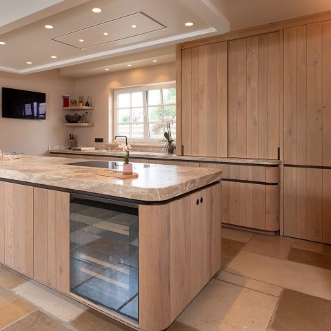
The kitchen is built from flat white fronts and tall storage walls, with built-in ovens set into dark recesses that break the white surfaces at precise points. An island sits in the center and carries the cooking zone, giving the room a clear working core. The arrangement keeps appliances visually contained while the surrounding room remains open to the rest of the house. It is a measured example of a kitchen island with built-in zones, where the layout is visible at a glance.
What stands out here is the way the cabinetry recedes. The white fronts do not compete with the room; they flatten the background and allow the darker niches to register as intentional cuts in the wall. That is also where the built-in ovens in kitchen become part of the composition rather than separate objects. The island, the tall units, and the surrounding openings work together through line and proportion, not through ornament.
Dark niches against white cabinetry
The contrast between white cabinetry and the darker built-in zones gives the kitchen its structure. Open shelving is not the point; instead, the room depends on large plain surfaces and a few precise interruptions. The result is a kitchen that reads clearly in plan and in elevation. Even the view toward adjacent rooms stays unobstructed, so the kitchen belongs to the living level without turning into a closed-off working zone.
Bathroom details kept close to the wall
The bathroom uses a darker floating vanity that seems to lift away from the floor, leaving the lower line visually open. A rectangular mirror sits above it, and the white wall finish keeps the room spare and direct. Nothing in the frame is decorative for its own sake. The sink area is defined by the cabinet volume, the mirror edge, and the clean junctions around them. It is the kind of detail that suits a floating dark vanity in bathroom without overemphasizing it.
The surfaces stay restrained so the furniture can do the work. Dark wood or dark finish tones appear in the vanity and in some of the room accents, while the surrounding walls remain light and plain. The bathroom does not try to appear larger than it is; instead, it uses the floating piece, the mirror, and the straight wall lines to keep the composition clear. In a house with many glazed openings, this room offers a more contained pause.
Terrace edges, overhangs, and open views
Outside again, the terrace extends the interior lines without breaking them. The glass railing keeps the edge visually light, and the overhang above the platform creates a sheltered strip along the house. From the side, the terrace reads as part of the architectural mass, not as an add-on. The covered terrace with glass railing allows the view to stay open while the structure above defines the zone beneath it.
The same discipline appears in the facade views. Large windows, black frames, and the monolithic concrete sections hold the composition together, while the openings reveal glimpses of the rooms behind. In daylight, the contrast is crisp; after dark, the illuminated interior makes the volumes feel deeper. Across the exterior, kitchen, living spaces, and terrace, the house keeps using the same language of edges, surfaces, and openings. That consistency gives the project its quiet clarity without turning it into a display of effects.
Photography: Tim van de Velde
Want to see more of OOA | Office O Architects? View the page of OOA | Office O Architects for even more great projects and company information.





NEW 2026 Jubileum Edition The Best Interior Designers Benelux
Order Now €125


NEW 2026 Jubileum Edition The Best Interior Designers Benelux
Order Now €125


NEW 2026 Jubileum Edition The Best Interior Designers Benelux
Order Now €125


NEW 2026 Jubileum Edition The Best Interior Designers Benelux
Order Now €125