


Washable panoramic wallpaper for offices and hospitality spaces
A broad stretch of wall shifts the rhythm of an interior long before you notice a chair, a desk, or a reception counter. In this series, washable panoramic wallpaper for offices turns that wall into a readable image—wide enough to feel like a view, and structured enough to hold its place in everyday traffic.
Across the project images, the same promise keeps returning: these panoramic designs are fully washable and intended for public, intensively used spaces. That makes them relevant for offices, hospitality environments, and reception areas, where a wall has to look intentional while still being practical in day-to-day use.
Washable panoramic wallpaper for offices as a spatial starting point
In several scenes, large windows bring daylight into the room. The wall image benefits from it: contrasts sharpen, and the panoramic scale reads cleanly from a distance. You can see how the print changes with the light—an abstract composition feels more dimensional when the room is bright, while calmer color fields hold steady when the surrounding furniture stays neutral.
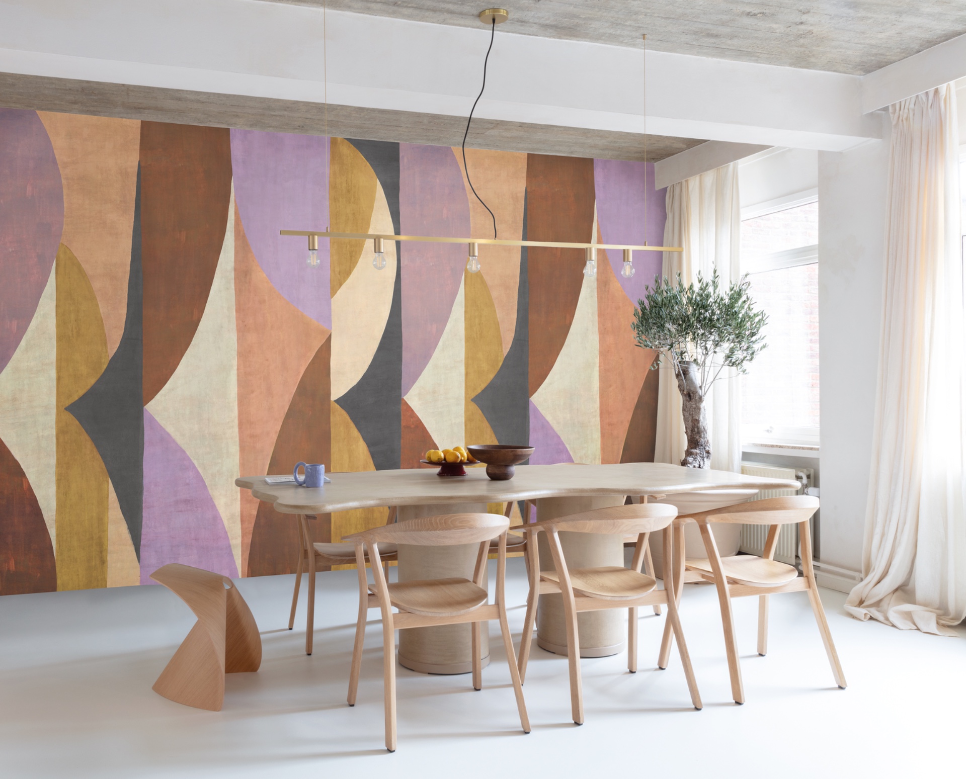
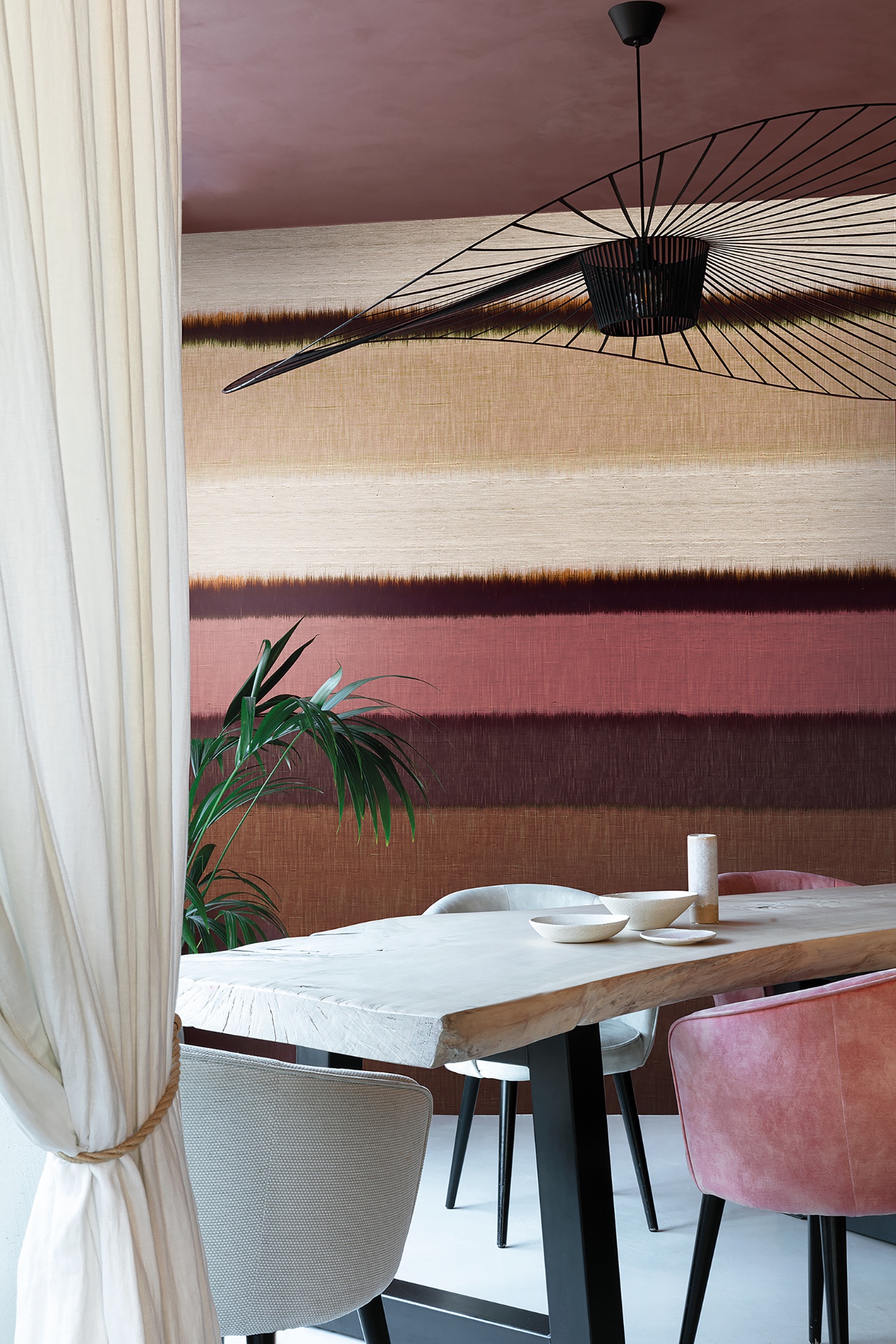
One interior shows the wallpaper running behind a dining setup. The table and chairs stay simple, so the wall takes on depth and becomes the “front” of the room. Another scene is more office-like, with a stronger sense of planning: the panoramic wall extends across the full surface without breaks, which helps define the space instead of fragmenting it into smaller visual zones.
Abstract motifs with clear structure
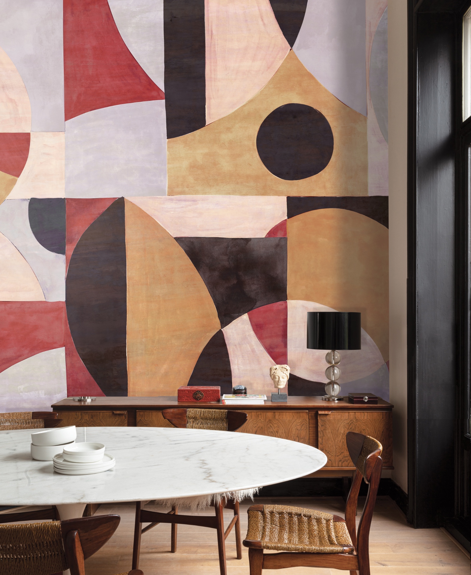
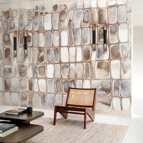
Abstract forms appear early in the series, built from large shapes and a controlled palette. The visual language isn’t decorative noise. Instead, it behaves like room layout: darker fields create grounding, lighter shapes open up space, and the overall composition gives the interior a clear direction.
In the dining image, pale forms sit against a darker ground. That contrast pulls the wall forward and makes the room feel deeper without adding extra elements. It also shows how a graphic statement wallcovering can be confident without being loud—especially when the rest of the furnishings keep to straightforward lines.
Elsewhere, the abstract pattern tightens and moves toward restrained greys and anthracite tones. A curtain edge, a pendant light, and a band of daylight are enough to show the wall’s behavior in context. The wallpaper isn’t treated as a separate “sample”; it’s part of the room’s scale, positioned so it can sit behind desks, near an entrance, or alongside circulation routes.
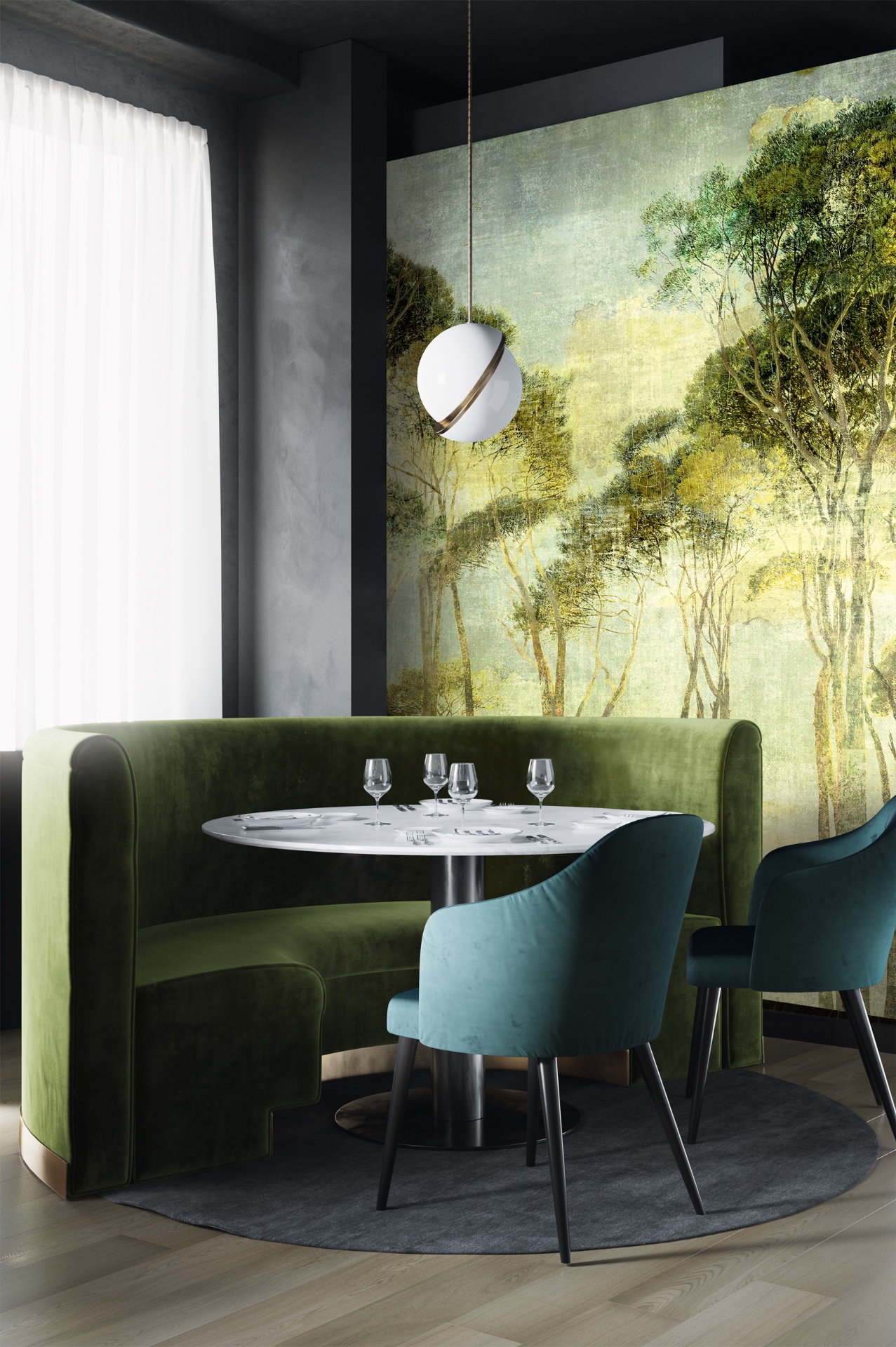
Nature panoramas that bring depth without clutter
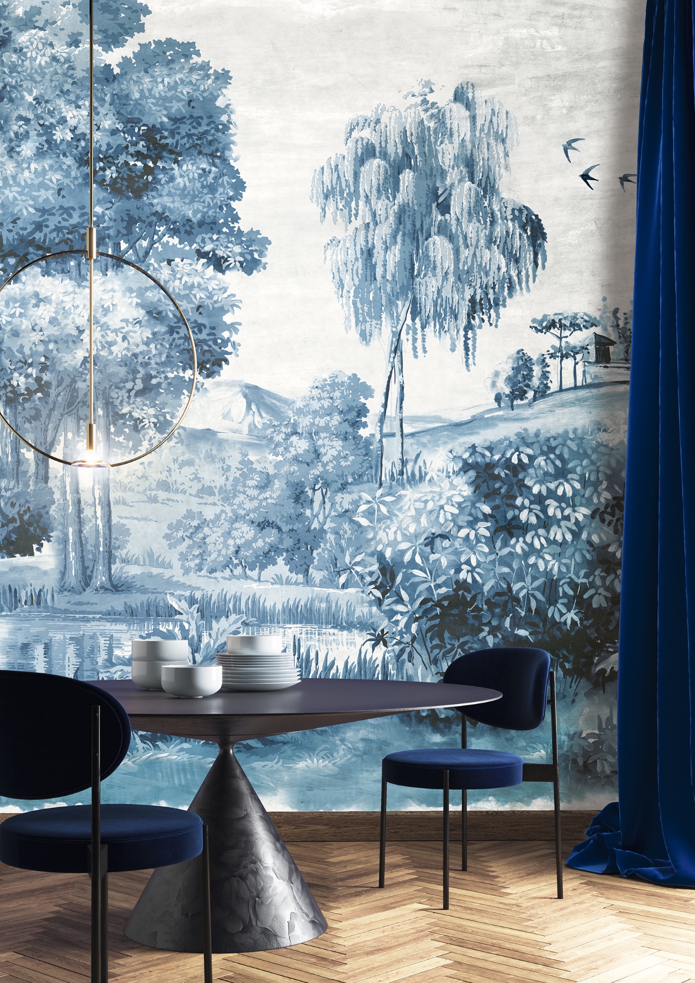
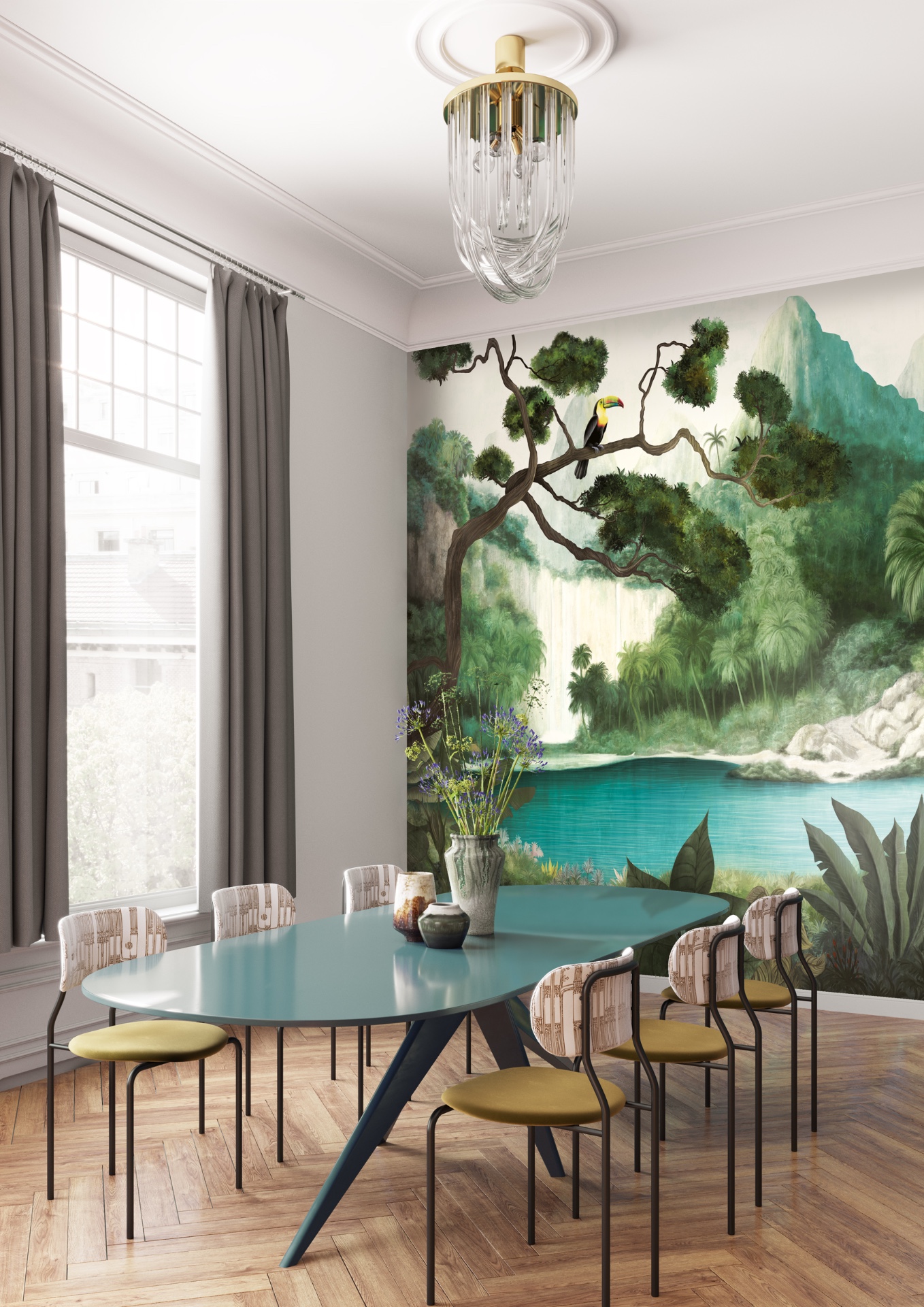
Nature panoramic wallpaper shows up through trees, foliage, and horizon-like compositions. The scenes soften the interior, but they remain legible—an important factor in hospitality and reception, where visitors need to orient themselves quickly.
One panorama reads like forest depth. Darker verticals at the sides of the composition help the wall feel taller, framing the room rather than flattening it. Another option shifts into blue-green tones with botanical forms that repeat through leaves and branches instead of geometric steps. In both cases, the wall becomes a view that can sit behind seating, around a dining moment, or at the end of a hallway line. Washable panoramic wallpaper for offices remains connected to the layout, materials and daily use of the home.
Because the series is washable, these landscape images aren’t presented as only “private-room” decoration. They can work in public-facing project spaces where the wall still has to take daily contact and remain visually crisp from the first glance to the close-up details.
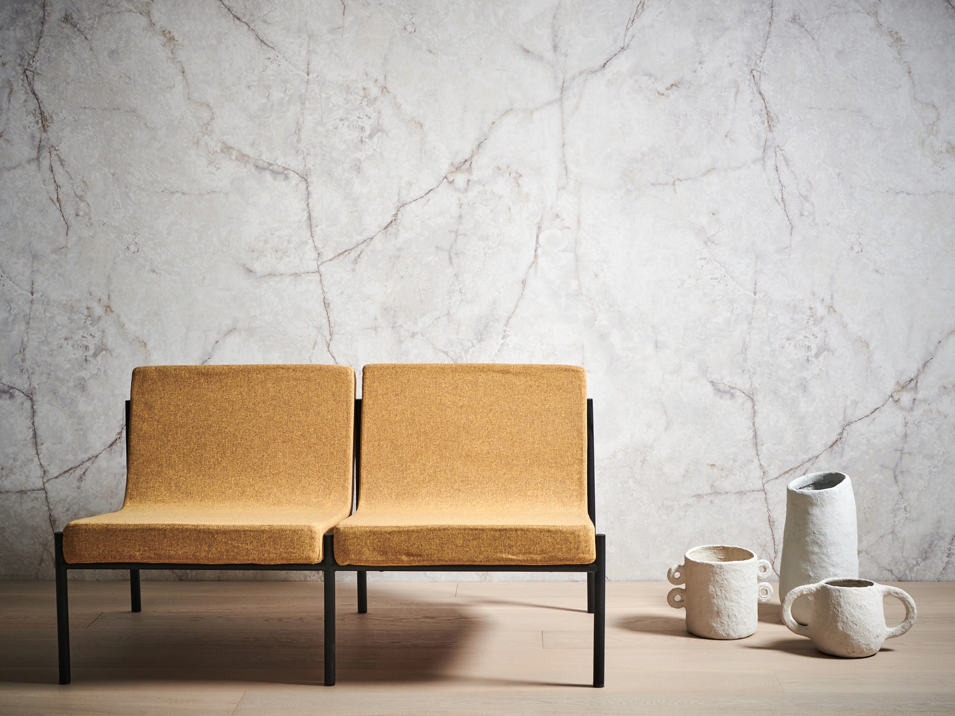
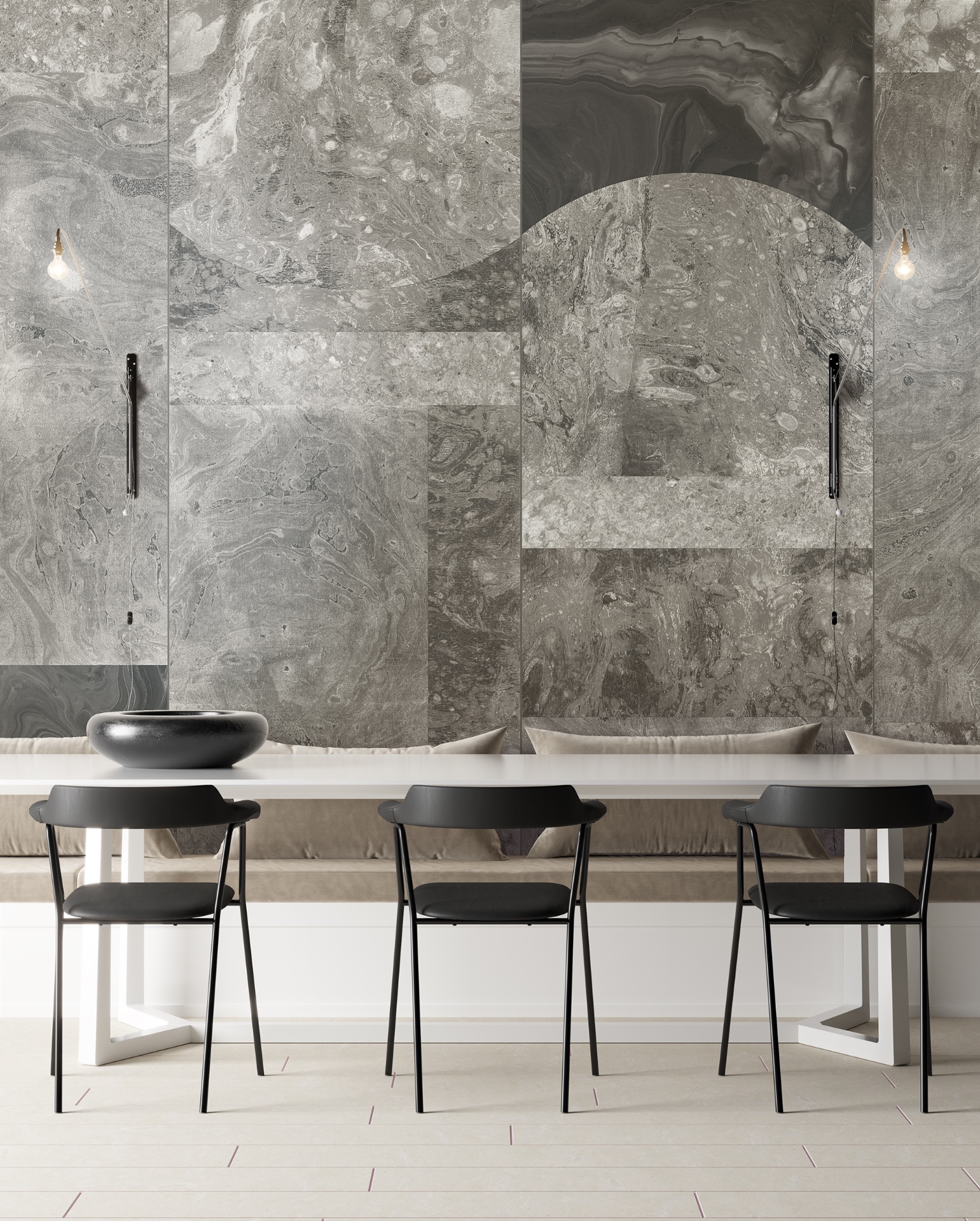
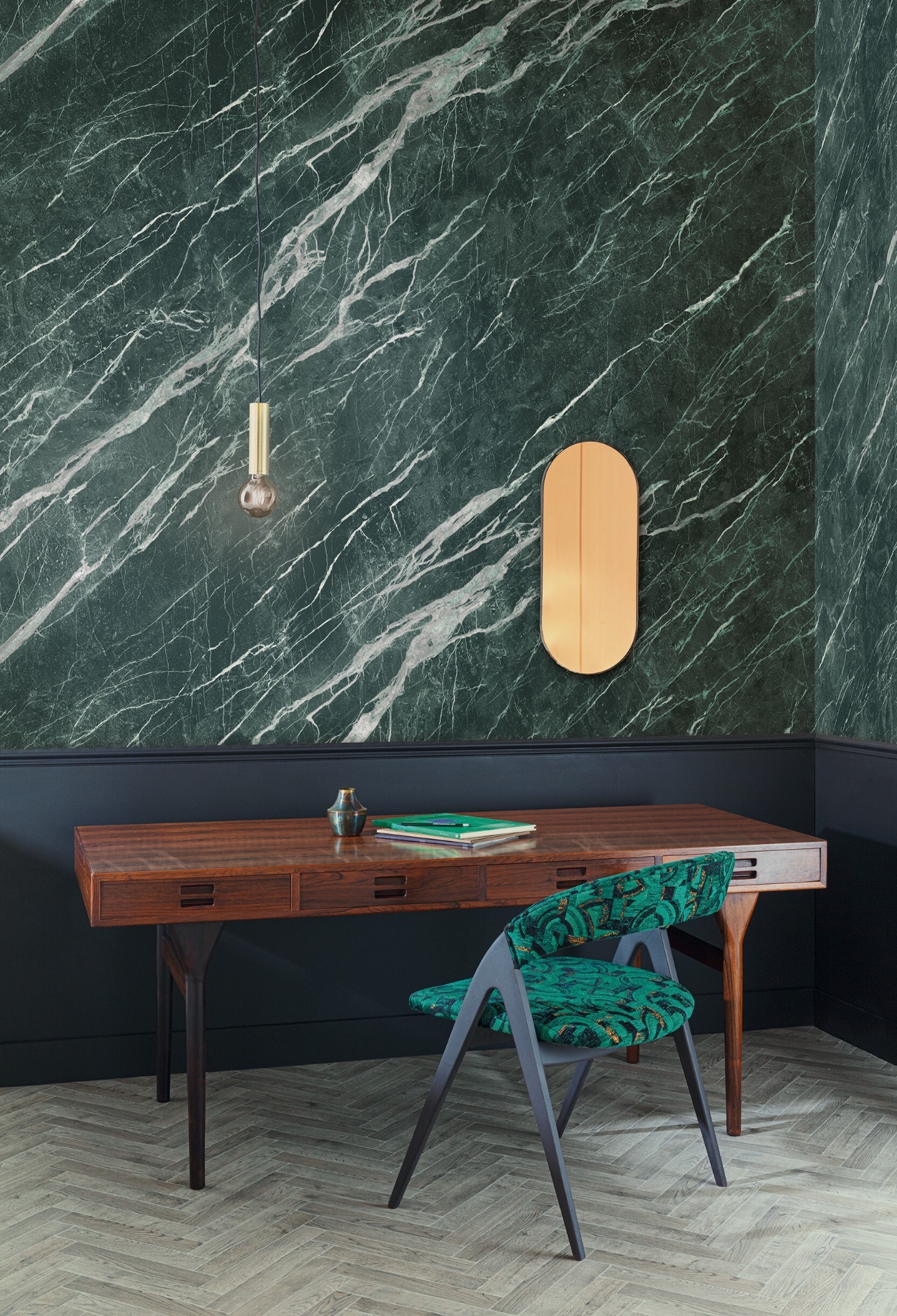
Marble look panoramic wallpaper in mineral close-up
The marble look panoramic wallpaper appears most convincingly in the close-up images. Brown veining, green-stone tones, and soft mineral transitions create the feeling of a large surface material rather than a small repeat pattern. Up close, you can read movement in the pattern—enough to feel architectural, not restless.
In one setting, the stone-like wall sits behind a low seat, helping show proportion and how the print scales to real furniture. In another, the same material language is presented more as texture and tone: wide bands carry the veining across the surface, which makes the detail useful for project teams comparing how different finishes might behave in an office or hospitality interior.
A palette that shifts the mood from panel to panel
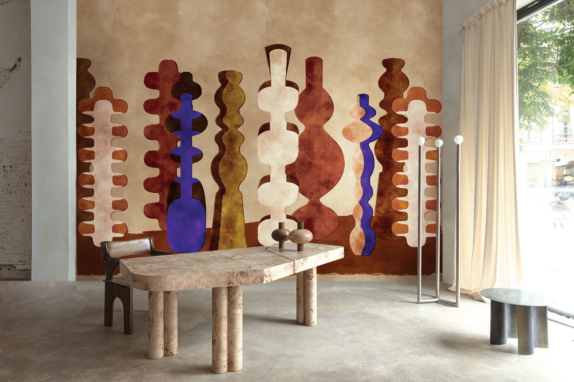
What ties the selection together is the variety of color. Some panoramas stay close to white, ecru, and grey. Others introduce forest green, blue, purple, red, or yellow-gold accents. Even within the broader graphic language, a softer striped motif feels quieter than the botanical panels, while still giving the wall a sense of direction.
The images also suggest how lighting can change the reading. Under brighter, spotlit conditions, textures can flatten while certain edges look sharper. With daylight from large windows, the depth in the printed surface becomes more noticeable. In a corridor-like view, the wall can read as one long band; in a dining area, furniture breaks that band into smaller frames, letting the wallpaper support the room instead of dominating it.
Where reception, meeting, and hospitality spaces need more than decoration
The practical baseline is clear: these are washable panoramic wallcoverings for offices and other demanding public interiors. That’s why the project set works as a visual selection tool. It shows how one wall category can deliver different outcomes—abstract contrast, nature depth, stone-like veining, or graphic structure—without forcing the room to choose between “image” and “use.”
A panoramic wallcovering for hospitality can do several jobs in one surface. It can mark a threshold as people enter, support a seating zone visually, or create a consistent backdrop across shared spaces. In offices and contract business settings, the wall also helps guide movement and frame what matters at desk height or along a passing route.
Motif variety, unified by panoramic scale
Across all the images, the same idea is presented in different visual languages. Panoramic wallpaper is used as a statement wall, but the statement can be restrained or direct. Abstract compositions bring contrast. Nature scenes add greenery and depth. Marble-look designs introduce mineral veining and a stone rhythm. Graphic panels organize space through line and shape.
Taken together, the series makes a case for wallcovering as part of interior planning—not an afterthought. The furniture can stay spare in office-leaning and dining scenes, while hospitality settings may feel more layered. Either way, the wallpaper remains the leading surface: washable panoramic wallpaper for offices that carries scale, image, and everyday readiness in one wide, panoramic format.
Want to see more of Masureel? View the page of Masureel for even more great projects and company information.
NEW 2026 Jubileum Edition The Best Interior Designers Benelux
Order Now €125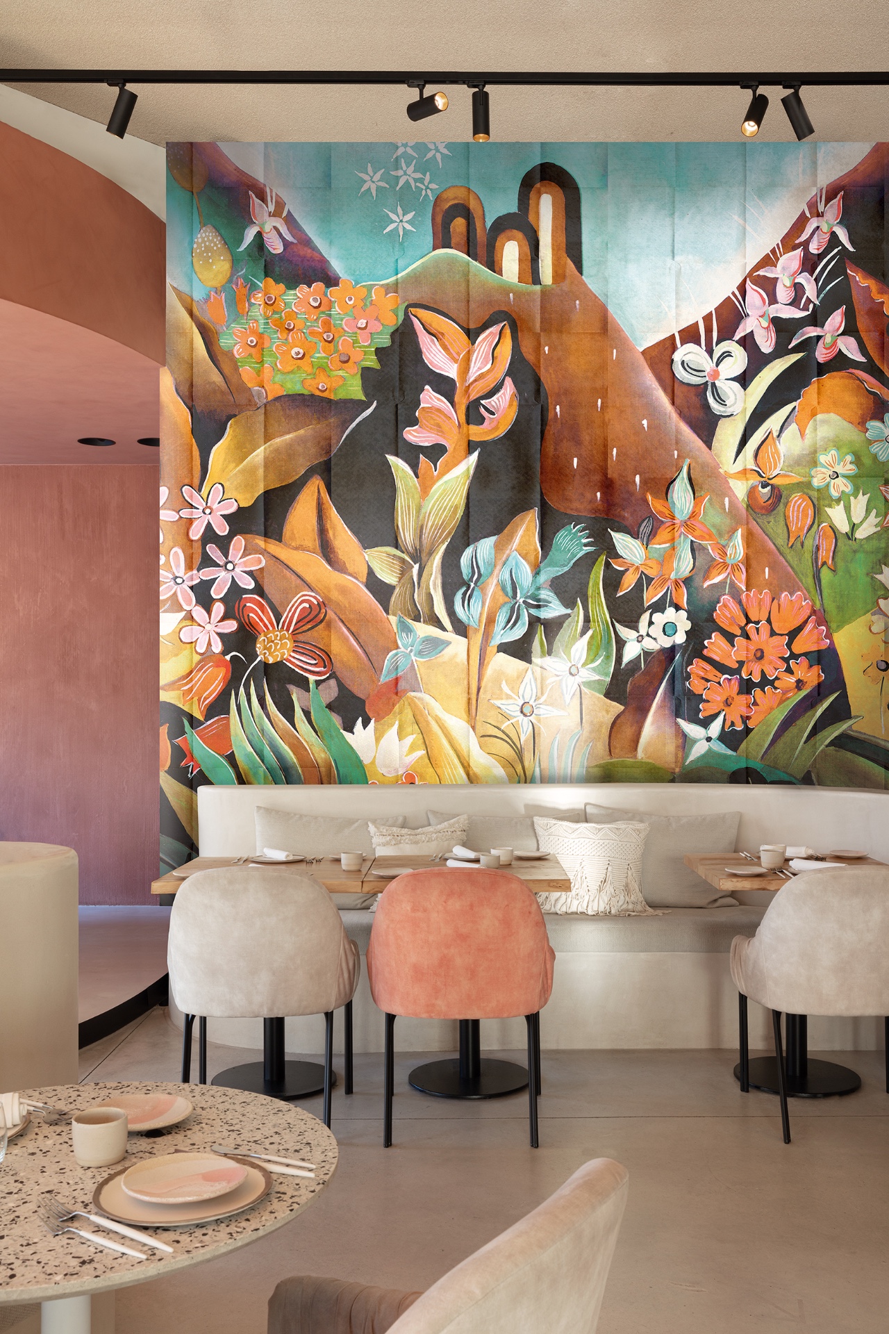
NEW 2026 Jubileum Edition The Best Interior Designers Benelux
Order Now €125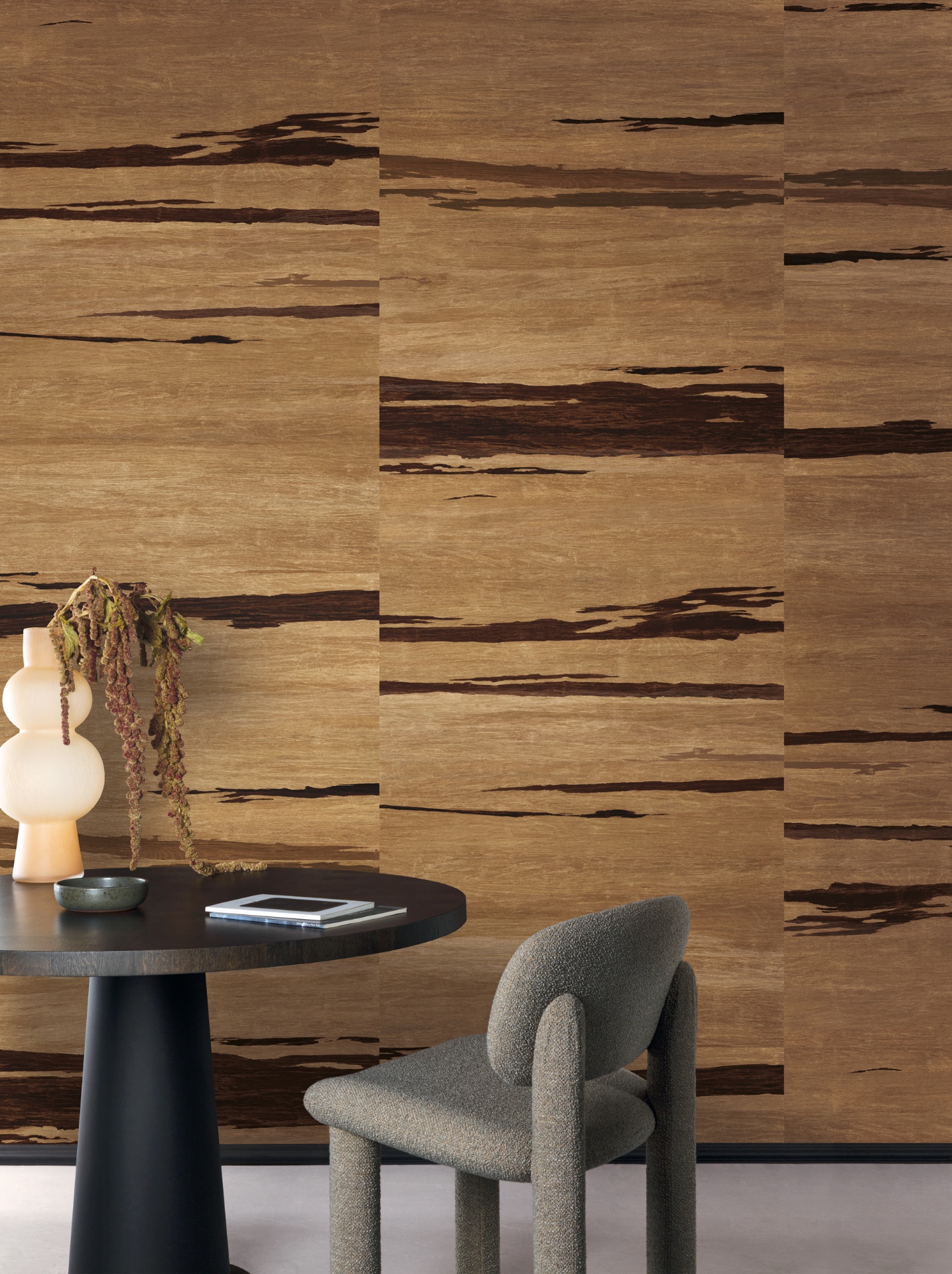
NEW 2026 Jubileum Edition The Best Interior Designers Benelux
Order Now €125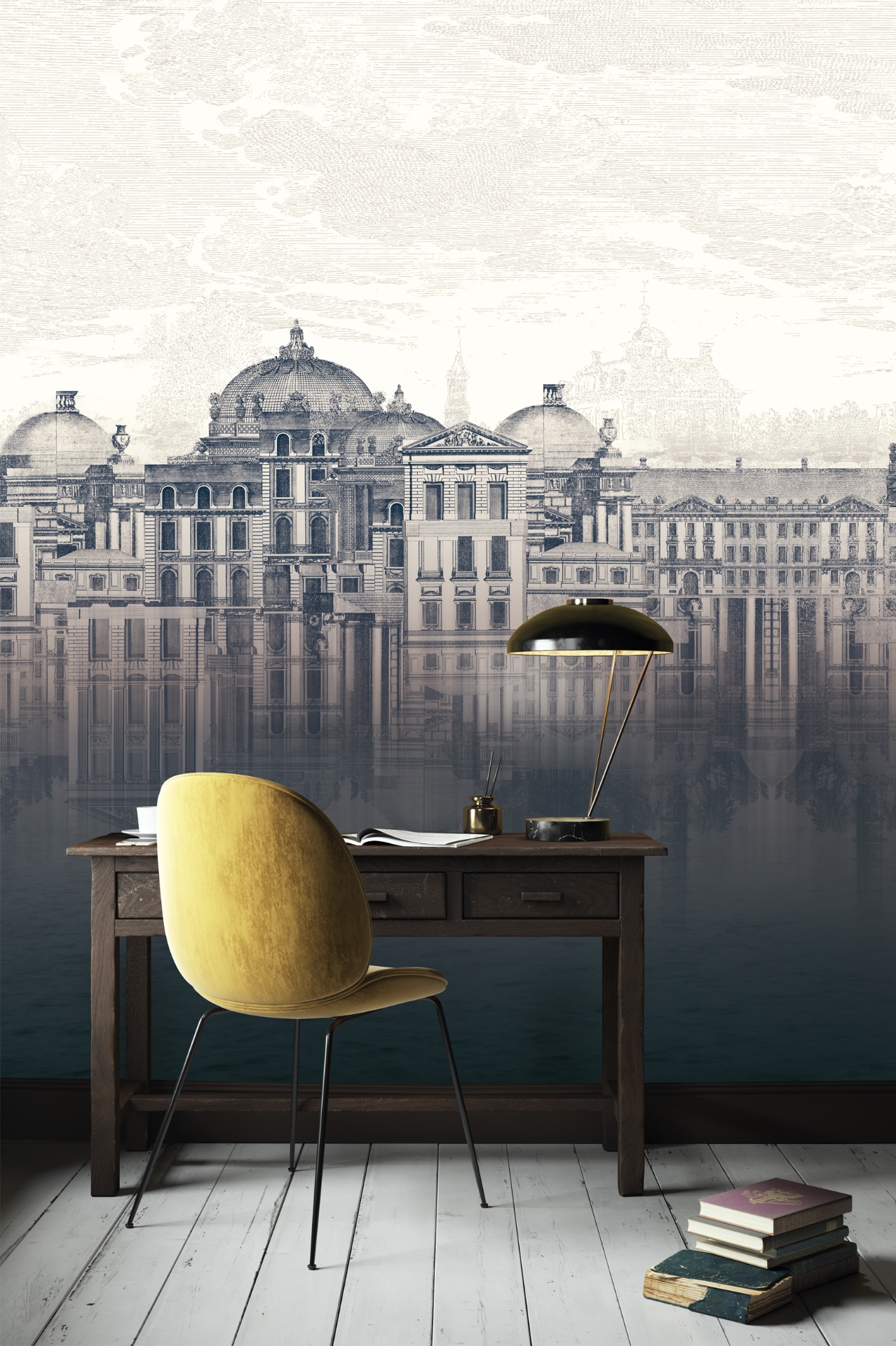


