Kitchen wall with natural stone look and brass accents in a calm, cohesive new-build interior
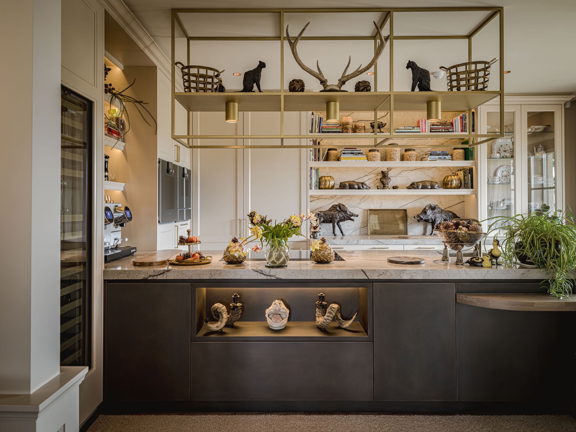
The kitchen wall sets the tone at once: warm white cabinets, stone-like surfaces, and brass details pull the eye across a measured composition. The first impression comes from contrast rather than excess. Light fronts sit beside a darker island, while open niches cut into the storage wall and add depth without breaking the calm rhythm of the room. It is a kitchen wall with natural stone look and brass accents, but it also reads as part of a larger interior that relies on proportion, restraint, and carefully placed light.
Light cabinets, dark island
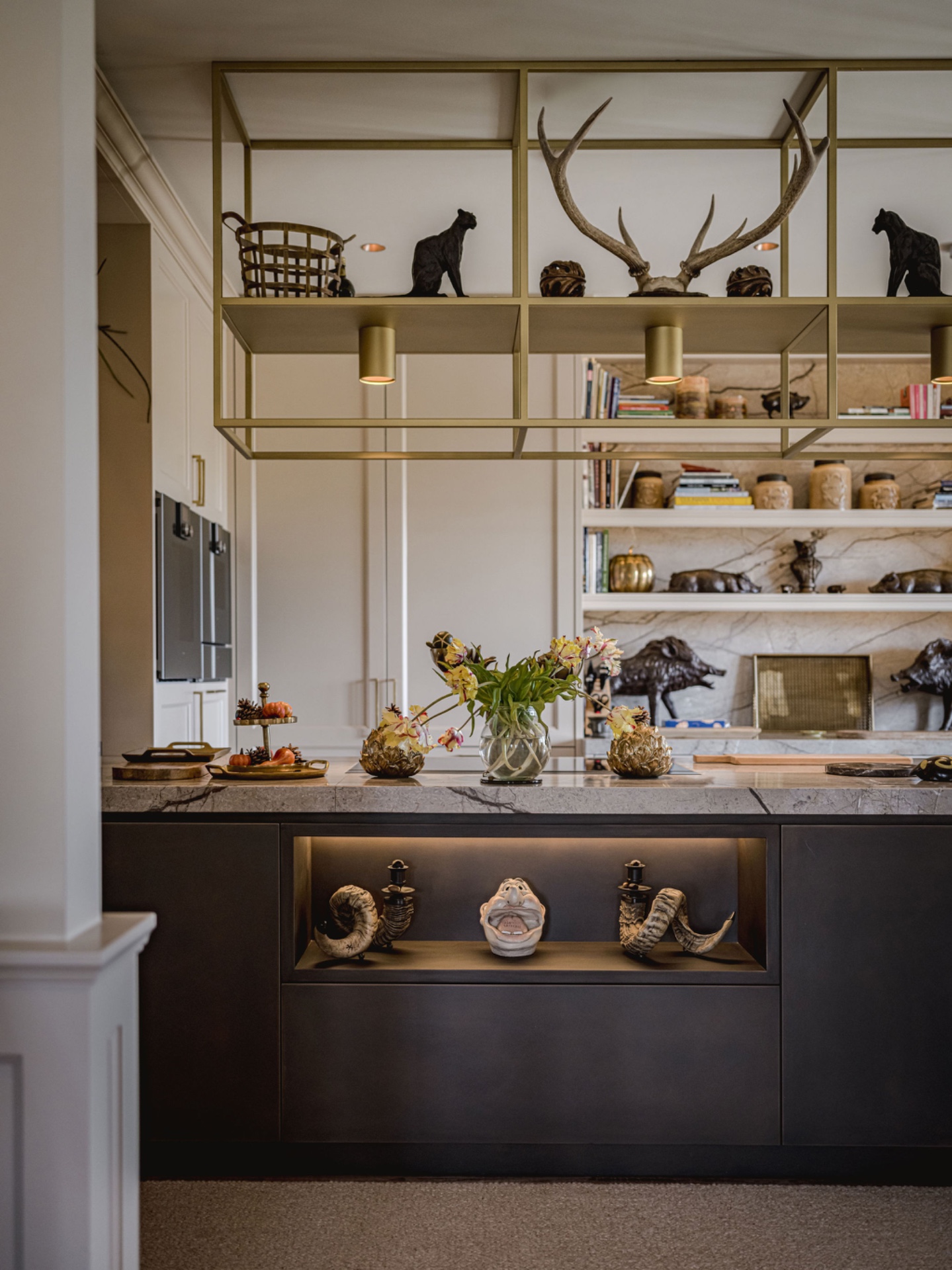
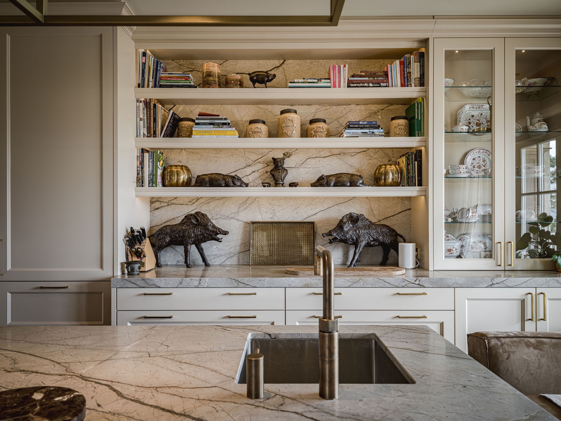
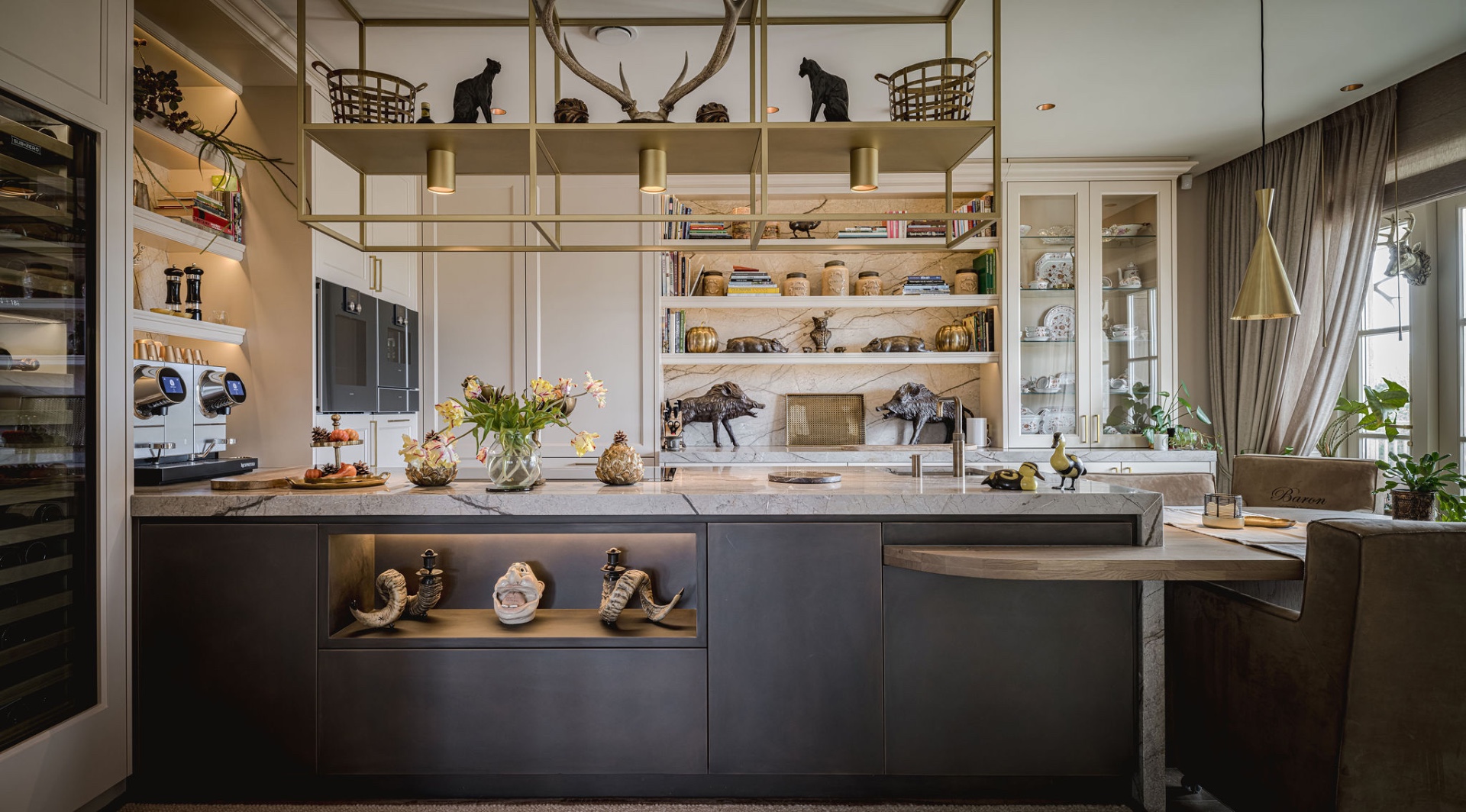
The storage wall stretches across the room as a built-in backdrop. Paneled cabinet doors and subtle mouldings give it a quiet architectural profile, but the surface stays light enough to keep the room open. Recessed niches interrupt the wall and create small pockets of light, where shelves and display objects sit behind warm illumination. That detail keeps the wall from becoming flat. Instead, it works like a layered screen, with openings, frames, and shadow lines giving the composition depth.
Facing that calm backdrop, the dark-front kitchen island takes on a more sculptural role. Its bronze-toned fronts and slim brass frame make the island feel grounded, almost like a separate object placed within the room. The contrast is clear, yet not harsh. The island does not fight the storage wall; it anchors it. Together they form a light-dark contrast kitchen interior where each side sharpens the other. The result is easy to read from across the room, especially where the island’s edges catch the light.
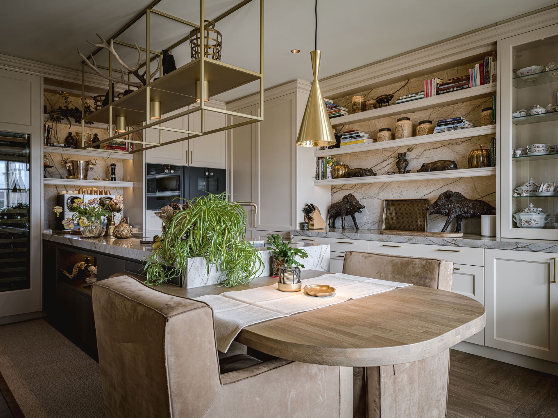
Seating at the island changes how the kitchen works in daily use. It is not only a place for preparing food. The extended top and nearby stools bring the island into the lived part of the home, where a quick meal or a conversation can happen without moving away from the kitchen. That shift is important in an open layout. The kitchen wall with natural stone look and brass accents becomes more than a backdrop for cooking; it shapes the way the room is occupied.
Storage that holds the room together
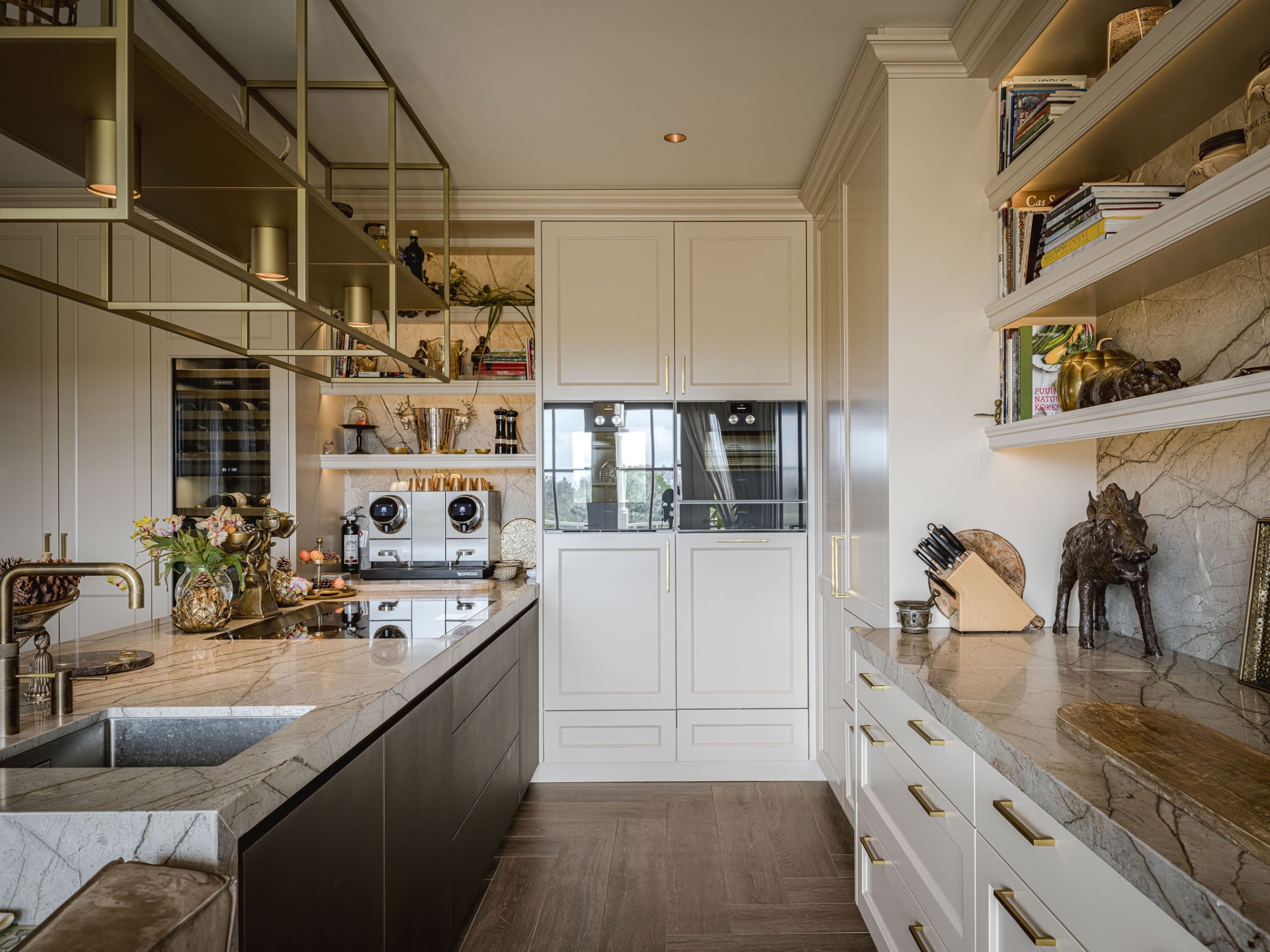
Built-in cabinets carry most of the visual weight on the long wall, but they do it quietly. The integrated storage wall kitchen is organized as a sequence of closed fronts and open compartments, so the surfaces never read as a single block. A glass-front section on the right adds another layer, catching reflections and softening the stronger panel rhythm. The proportions are tight and deliberate. Nothing feels overdrawn, and that discipline gives the kitchen wall its calm structure.
Light also works as a building material here. The illuminated niches are set into the cabinet wall rather than added on top of it, which keeps the composition neat while drawing attention to the recesses themselves. In the wider view, the warm glow inside the niches repeats the brass accents on the island and the cabinet hardware. That visual echo ties the room together without forcing symmetry. It is one of the reasons the kitchen wall with natural stone look and brass accents feels composed rather than decorated.
Recesses that change the wall’s depth
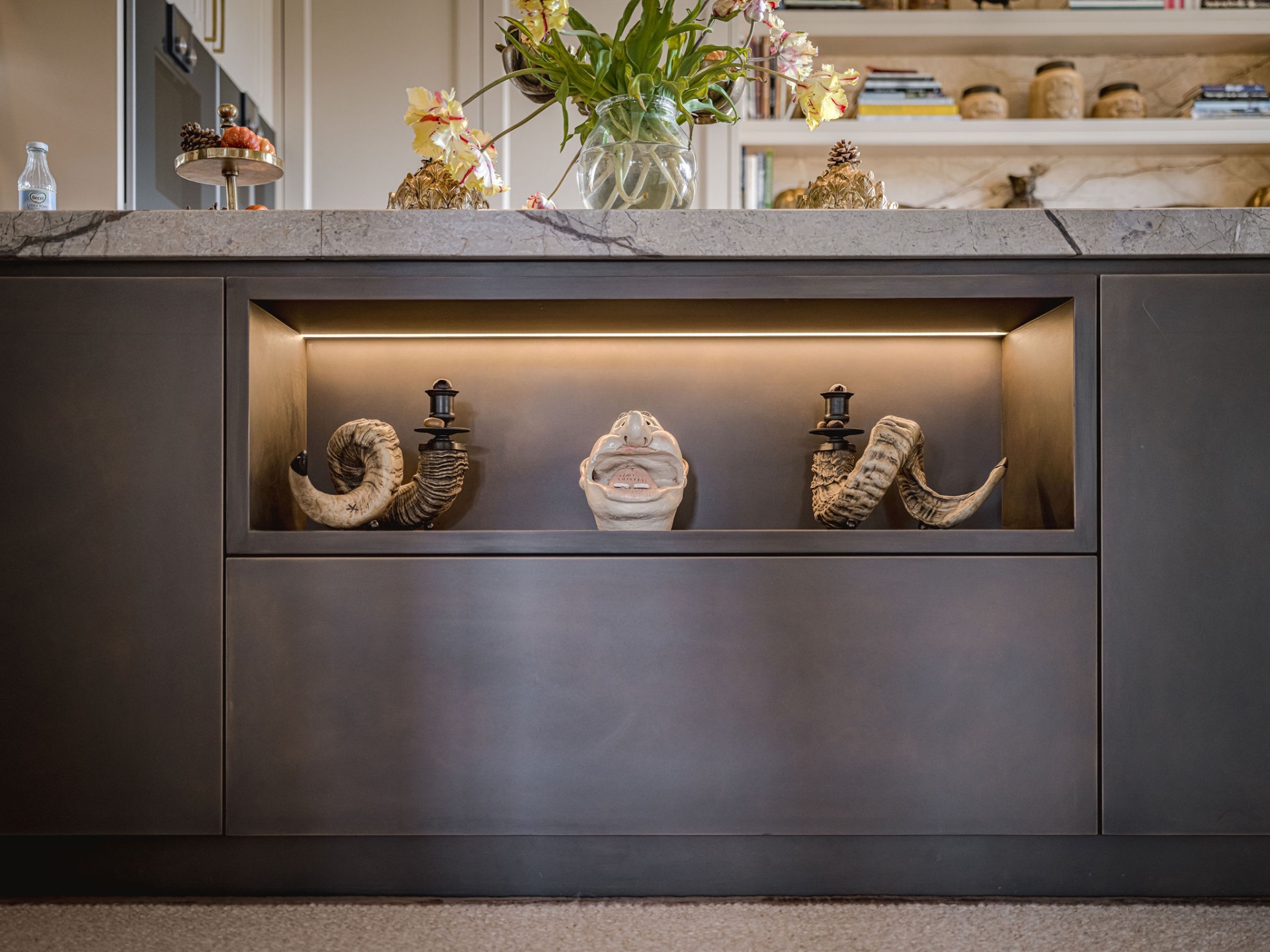
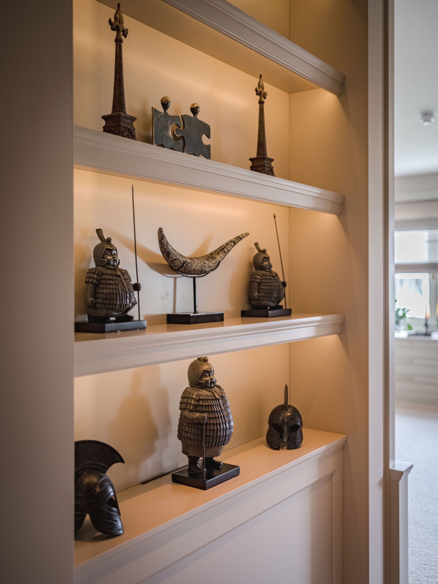
Seen up close, the niches do more than display objects. Their rectangular openings cut through the wall and give the built-in cabinets a measured depth that can only be sensed when the light catches the frame. Some openings are bright and direct; others sit deeper in shadow. That variation keeps the wall lively even when the finishes stay controlled. The result is a storage wall that behaves almost like a piece of joinery architecture, where each recess has a clear function in the overall composition.
The natural stone look surfaces support that effect by adding grain and texture. The stone-like finish has enough movement to keep the eye engaged, but it never pulls attention away from the cabinetry. Instead, it gives the background a quiet density that works well with the warm white fronts. This is where the warm white kitchen interior becomes convincing: the pale cabinetry, the stone-like plane, and the brass trims all stay within a narrow palette, yet each material plays a distinct role. The room feels deliberate because nothing is repeated without reason.
Materials that stay close to the surface
The kitchen does not rely on a heavy material story. What matters is how each finish behaves in light. The warm white fronts reflect softly and keep the room bright without glare. The darker island absorbs more of the surrounding light, which makes its outline easier to read. Brass and gold-toned details appear in the frame, handles, and hanging fixtures, adding a metallic edge that stays warm rather than reflective in a sharp way. Those choices give the room a measured depth that fits a new-build interior with clean lines.
Close detail shots show the same logic at a smaller scale. The framed open shelves, the visible grain in the natural stone-look back panel, and the warm-lit niches all sit inside a controlled grid. Even the transitions between closed storage and open display are handled with care, so the kitchen never feels scattered. The eye moves from panel to recess, from matte surface to lit opening, then back to the island in the center. It is a clear sequence, and that clarity is what holds the room together.
A central kitchen, not a separate zone
The kitchen reads as the middle of the apartment rather than a side room set apart from the rest of the plan. The island acts as a visual anchor, and the surrounding storage wall gives it a strong counterpart. Because the room is open and carefully proportioned, the kitchen needs to do several jobs at once: define space, store daily items, and shape the atmosphere of the interior. Here, those roles are folded into one composition. The island marks the center, while the wall behind it keeps the view composed and grounded.
That central placement is reinforced by the way the kitchen handles transitions. Open shelves, closed cabinets, illuminated niches, and the broad island surface all create a sequence of different depths. The room never turns static. A detail appears, then a recessed section, then a wider stretch of fronting. This layered arrangement makes the kitchen wall with natural stone look and brass accents feel active without becoming busy. It supports the architecture of the apartment while leaving enough visual quiet for everyday use.
Why the contrast works
The strength of this project lies in its clear contrast between light and dark, soft and structured. The built-in wall softens the room with its pale fronts and recessed light, while the island adds weight through bronze-toned surfaces and brass framing. Yet the contrast never becomes a clash. Both parts share the same measured approach to proportion and finish, which lets them speak the same language in different tones. That is why the space feels resolved without appearing overworked.
Across the room, the eye keeps returning to the same elements: the natural stone-look plane, the illuminated openings, the framed shelves, and the island with its darker fronts. Those details are practical, but they are also what give the kitchen its presence. The composition shows how a kitchen wall with natural stone look and brass accents can define an entire interior through storage, light, and material placement alone. Nothing here depends on excess. The room speaks through clear lines, subtle surfaces, and the way each element is set against the next.
Want to see more of Martin Van Essen exclusieve keuken? View the page of Martin Van Essen exclusieve keuken for even more great projects and company information.


NEW 2026 Jubileum Edition The Best Interior Designers Benelux
Order Now €125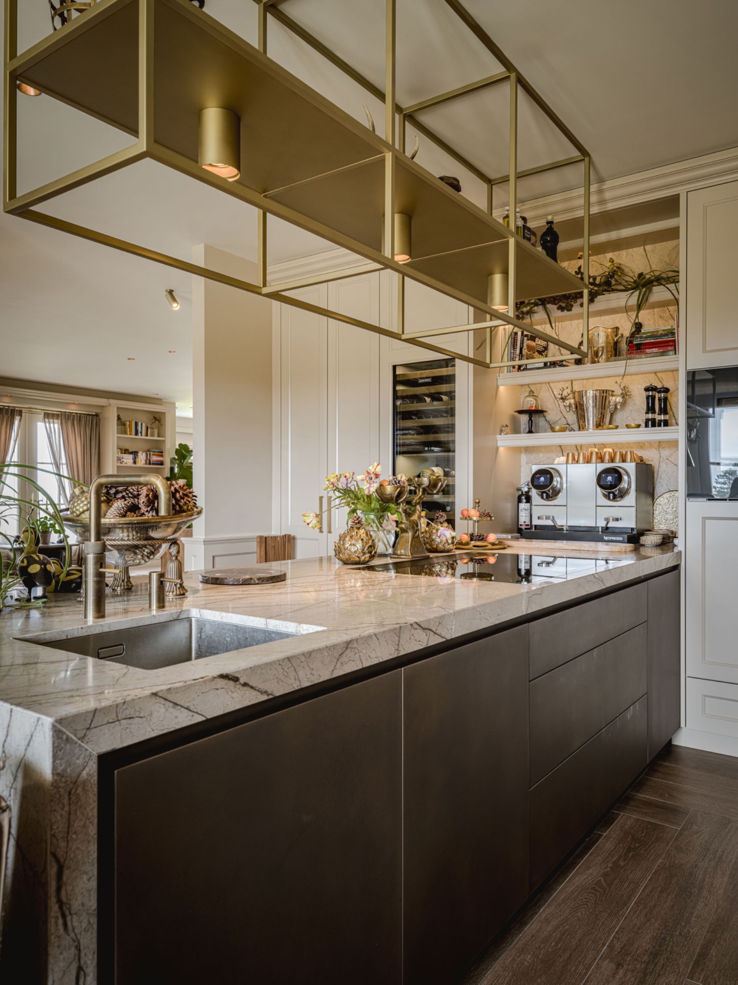
NEW 2026 Jubileum Edition The Best Interior Designers Benelux
Order Now €125