Heritage townhouse interior with Bohemian Bold character
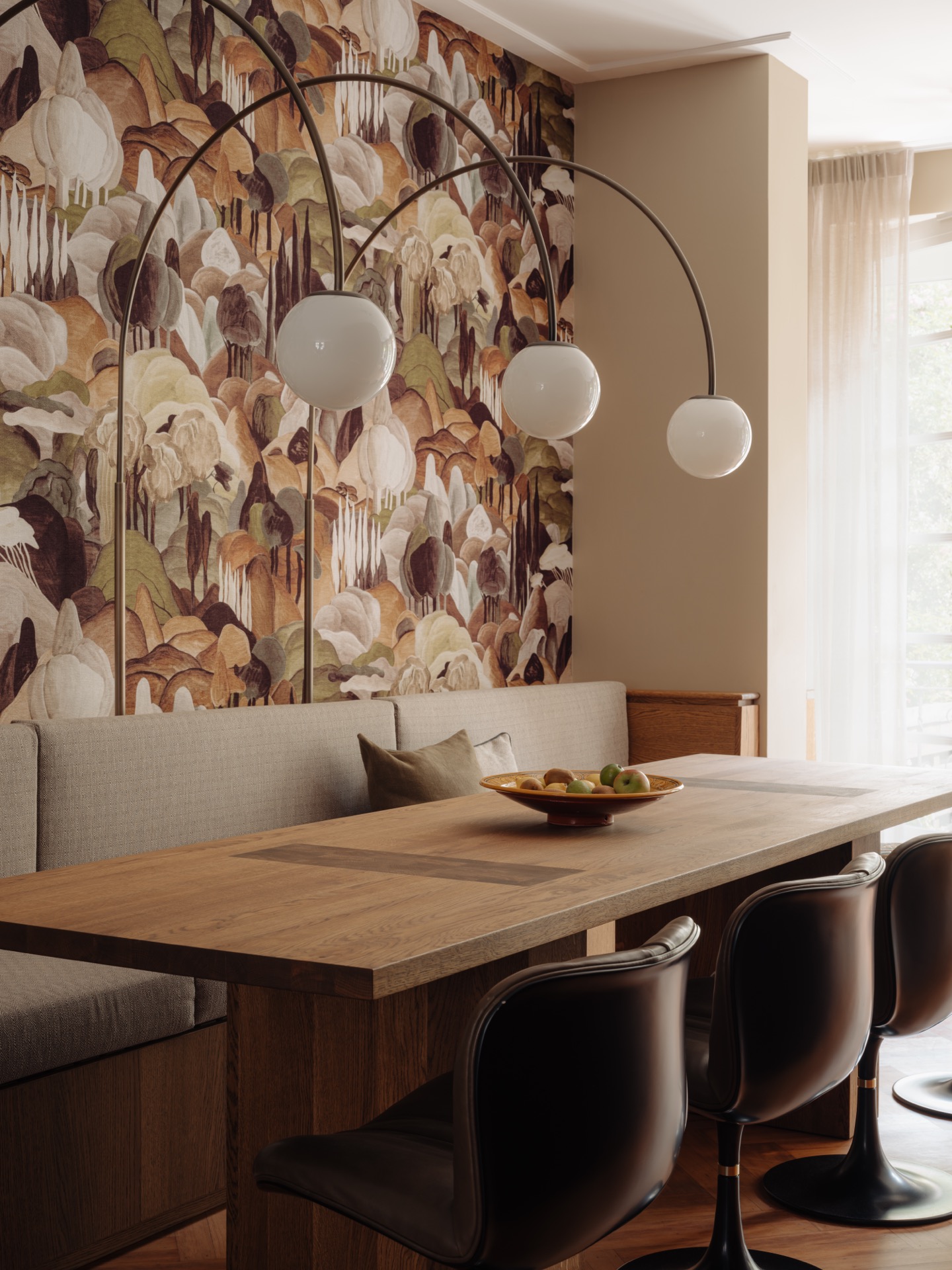
The first thing you notice is the way the light settles on the wood, marble and soft fabric surfaces. In this heritage townhouse interior, the palette stays close to the material itself: oak veneer, pale tiles, marble and deep green paint on the stair hall. The result is a Bohemian Bold interior that feels layered rather than decorated, with art, plants, textiles and custom joinery doing most of the work. A statement pendant light hangs over the living area, while the rooms keep the original structure visible instead of hiding it behind a full reset.
Original features kept in view
Rather than stripping the house back completely, the design builds on what was already there. That approach keeps the original features readable: walls, transitions and proportions still guide the plan, but they are sharpened by new insertions. Classical detailing appears in the joinery, yet the overall mood shifts through colour, texture and lighting. It is a heritage townhouse interior that does not treat the past as decoration. The existing fabric becomes the framework for a new domestic rhythm, with worn edges and fresh finishes sharing the same rooms.
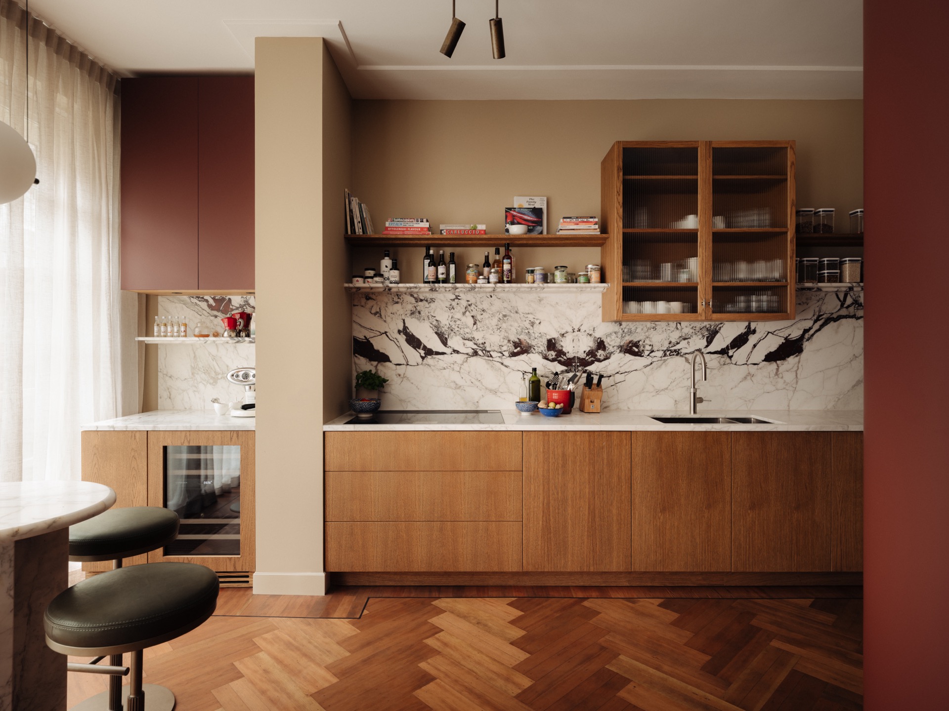
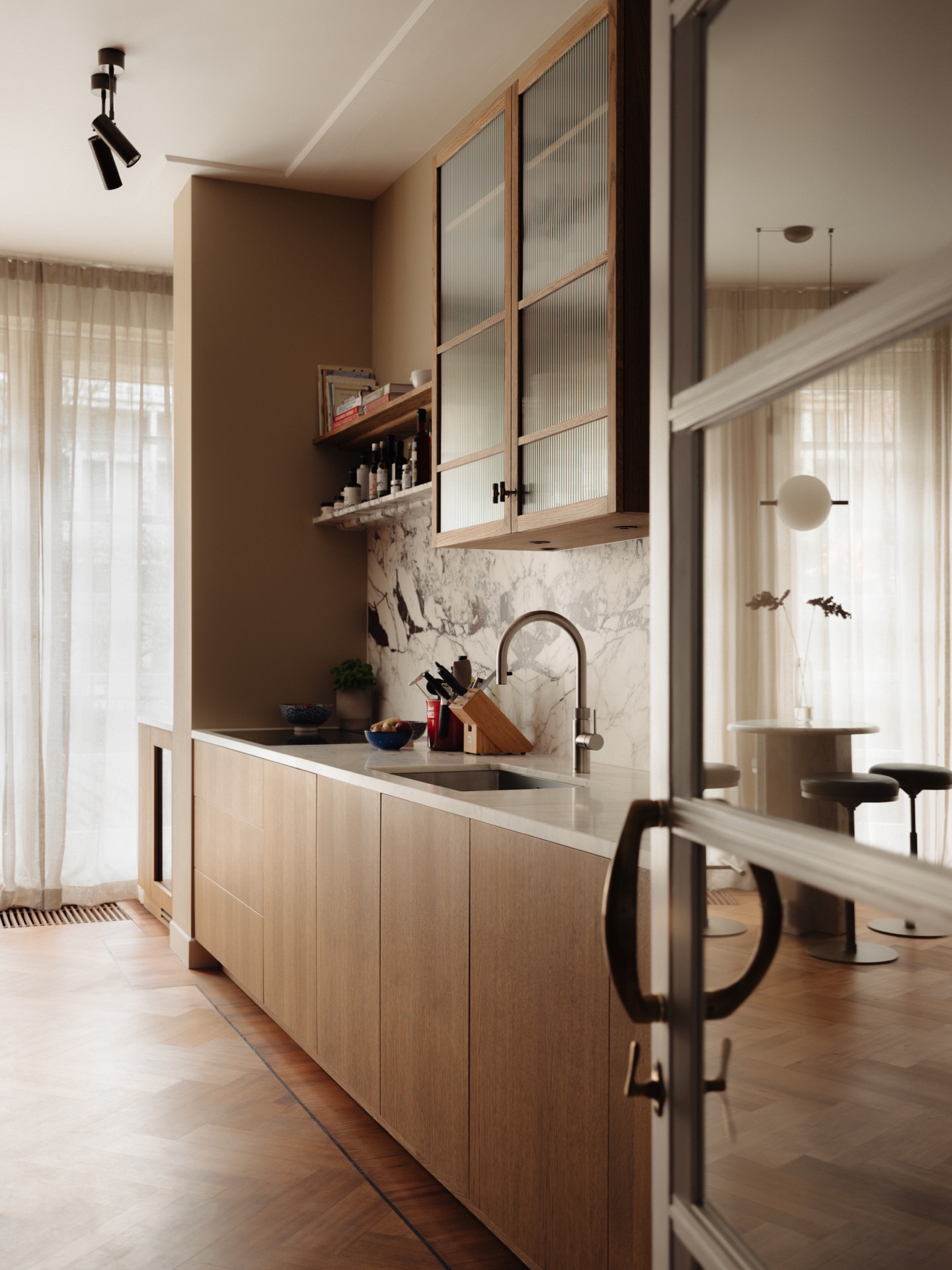
That decision is most visible in the kitchen, where a custom cabinetry element rounds off the line between cooking and dining. Instead of stopping at the original wall, the joinery wraps around the structural core and softens the split between spaces. A loose bar turns the kitchen into a living kitchen, not just a place to prepare food. Marble appears on the kitchen surfaces, catching the light against the oak and the deeper tones of the surrounding furniture. The shape does quiet work here: it redirects movement, opens sightlines and makes the room feel continuous without losing its structure.
Custom cabinetry that follows the house
The cabinetry is designed to follow the curves and edges of the building rather than fight them. In the hall, a bespoke wardrobe with a rounded front sits neatly against the wall and echoes the route through the house. It is practical, but it also sets the tone for the rest of the project: storage is not hidden away as an afterthought. The same attention to line returns in the larger joinery pieces, where built-in niches and clean edges break up the planes of wood. These elements keep the rooms calm in use while giving them a stronger spatial profile.
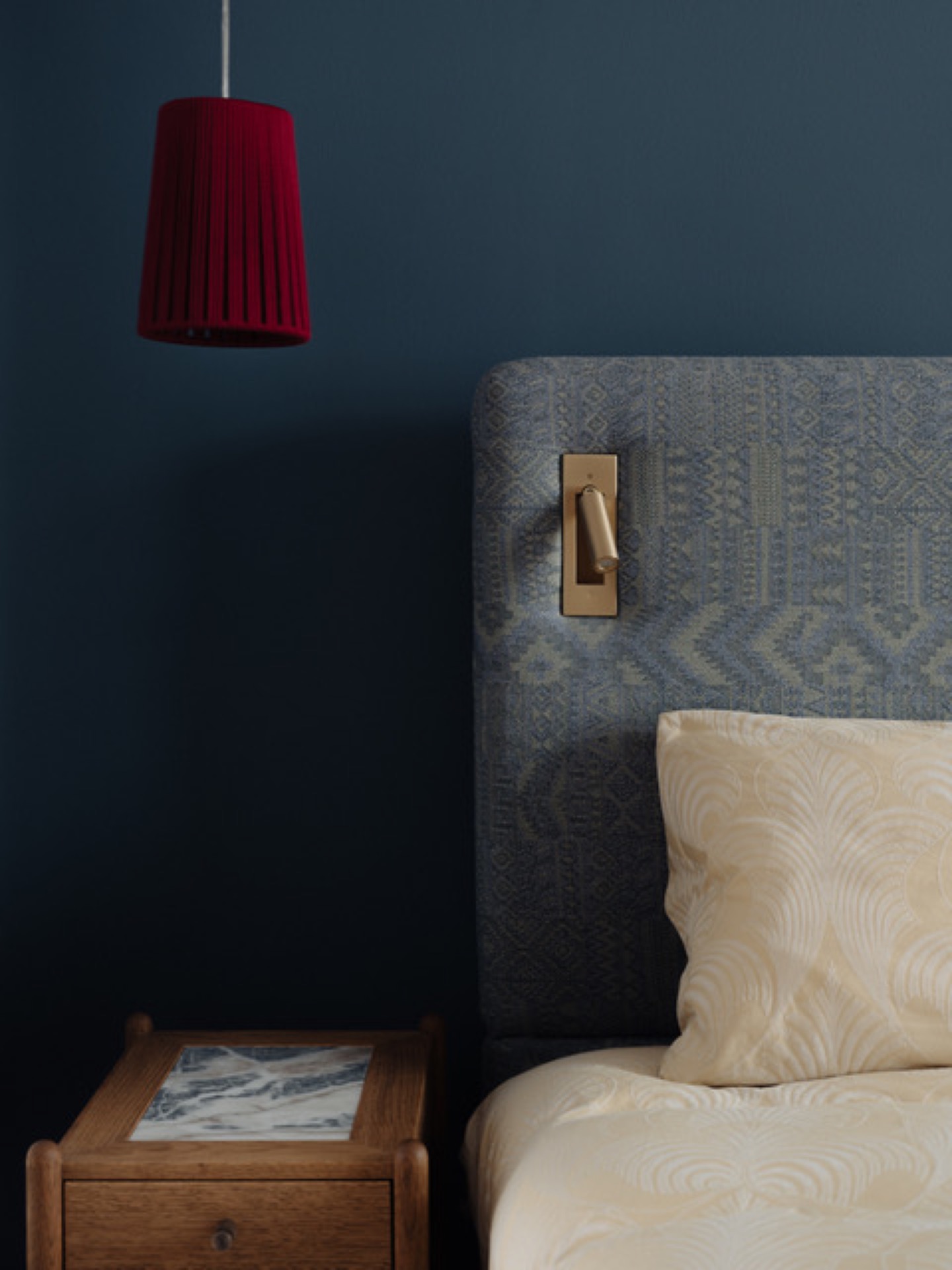
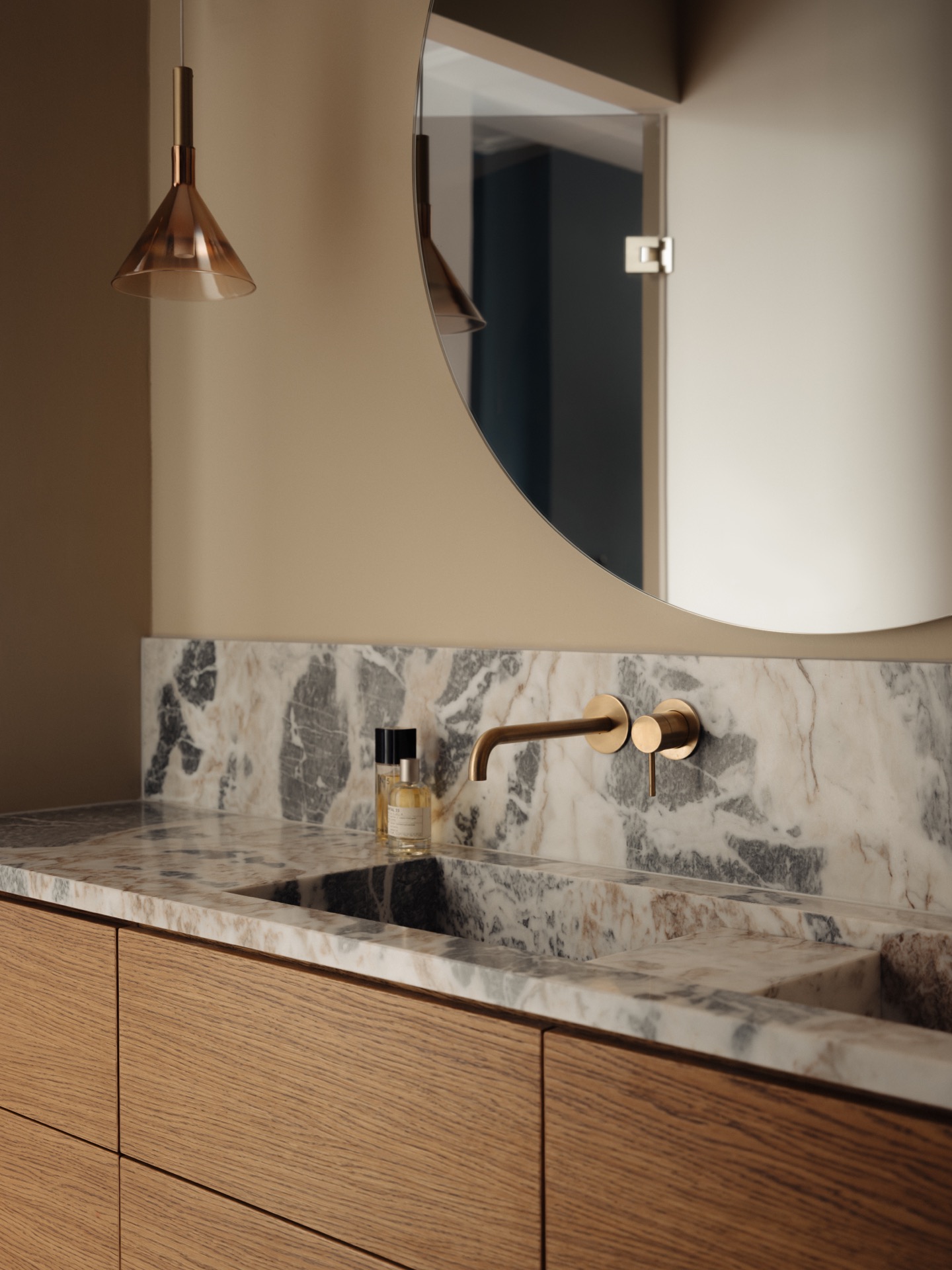
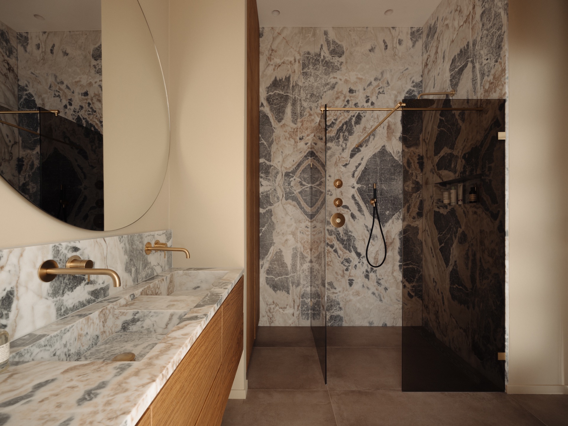
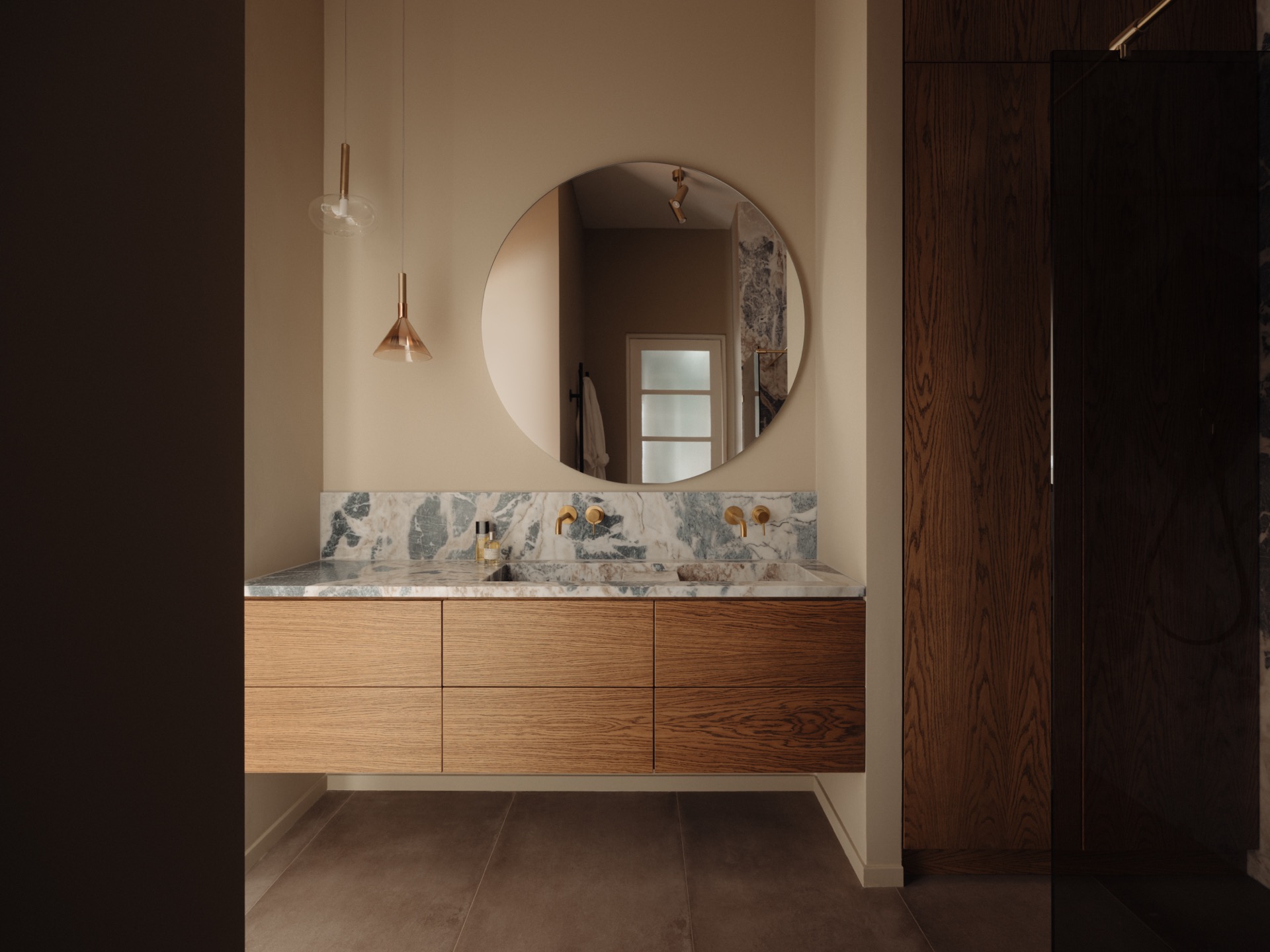
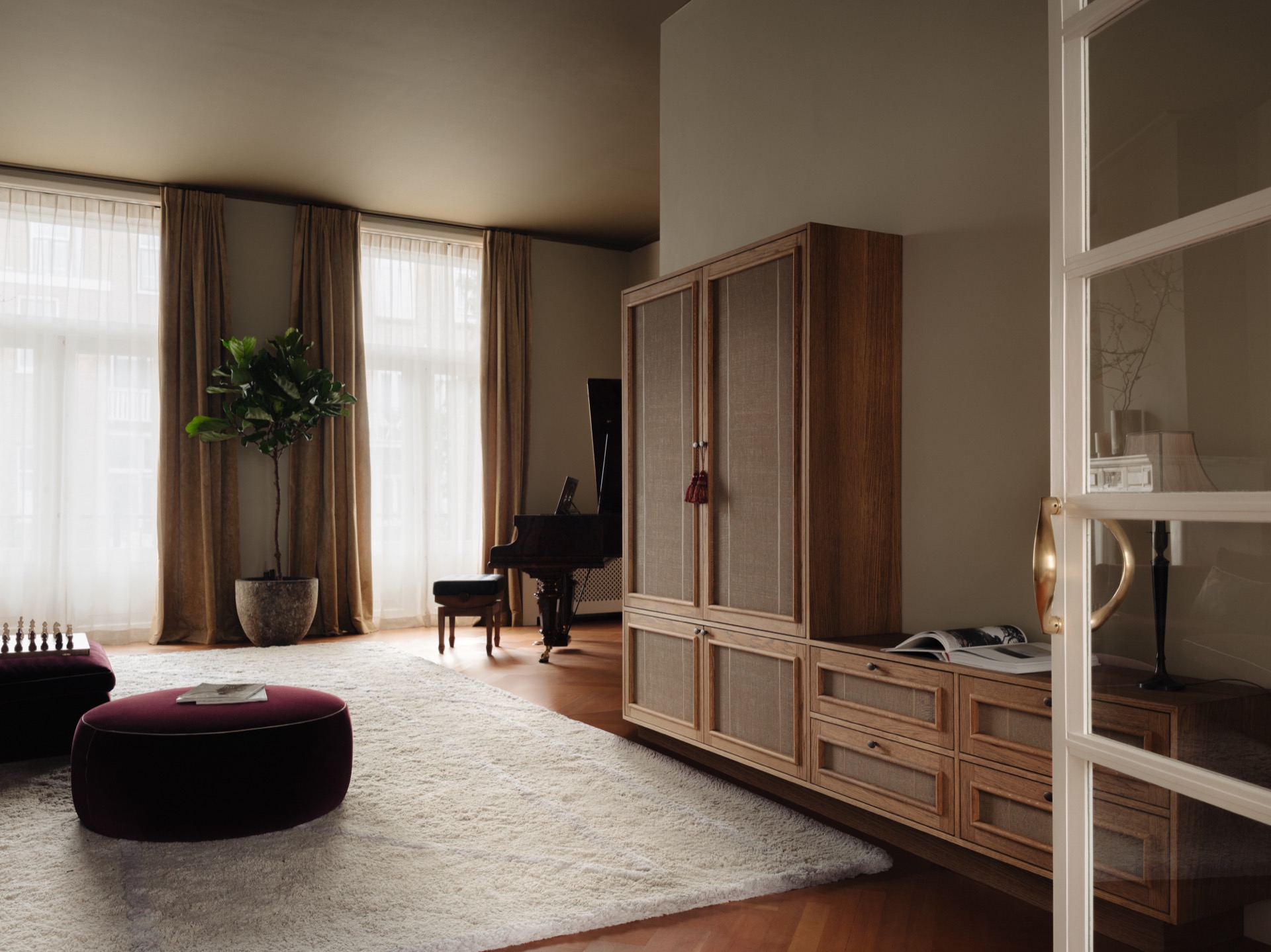
Materials do much of the visual work. Oak veneer brings a soft grain to the cabinetry, while marble introduces a cooler surface in the kitchen and bathroom. Fenix appears as a useful counterpoint, adding a matte finish that sits well beside the more reflective stone. The mix is not loud, but it is specific. Each material has a different way of handling light: the wood absorbs it, the marble throws it back, and the painted surfaces give the eye a pause. That variation keeps the heritage townhouse interior from flattening into a single tone.
Statement pendant light and layered lighting
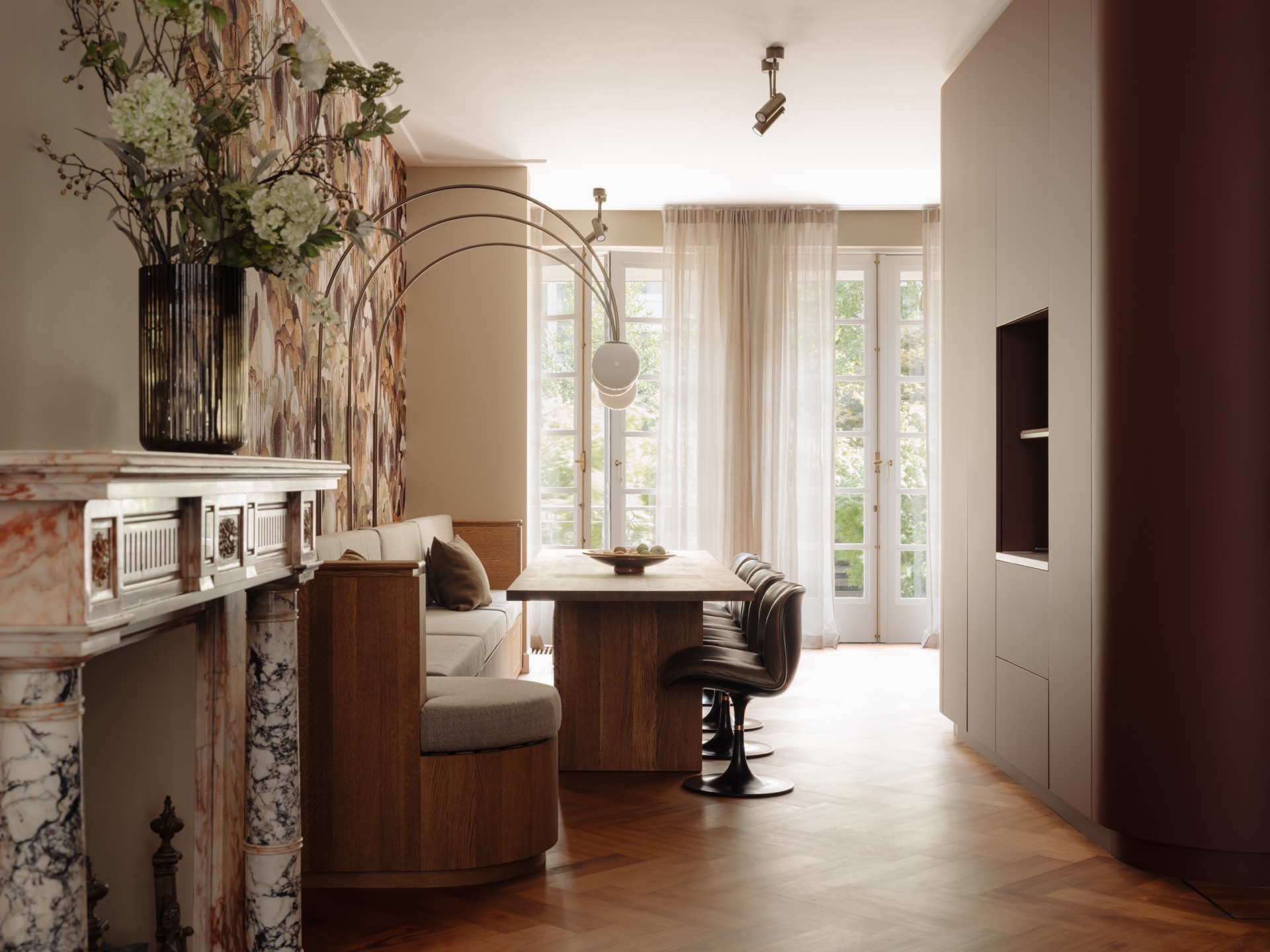
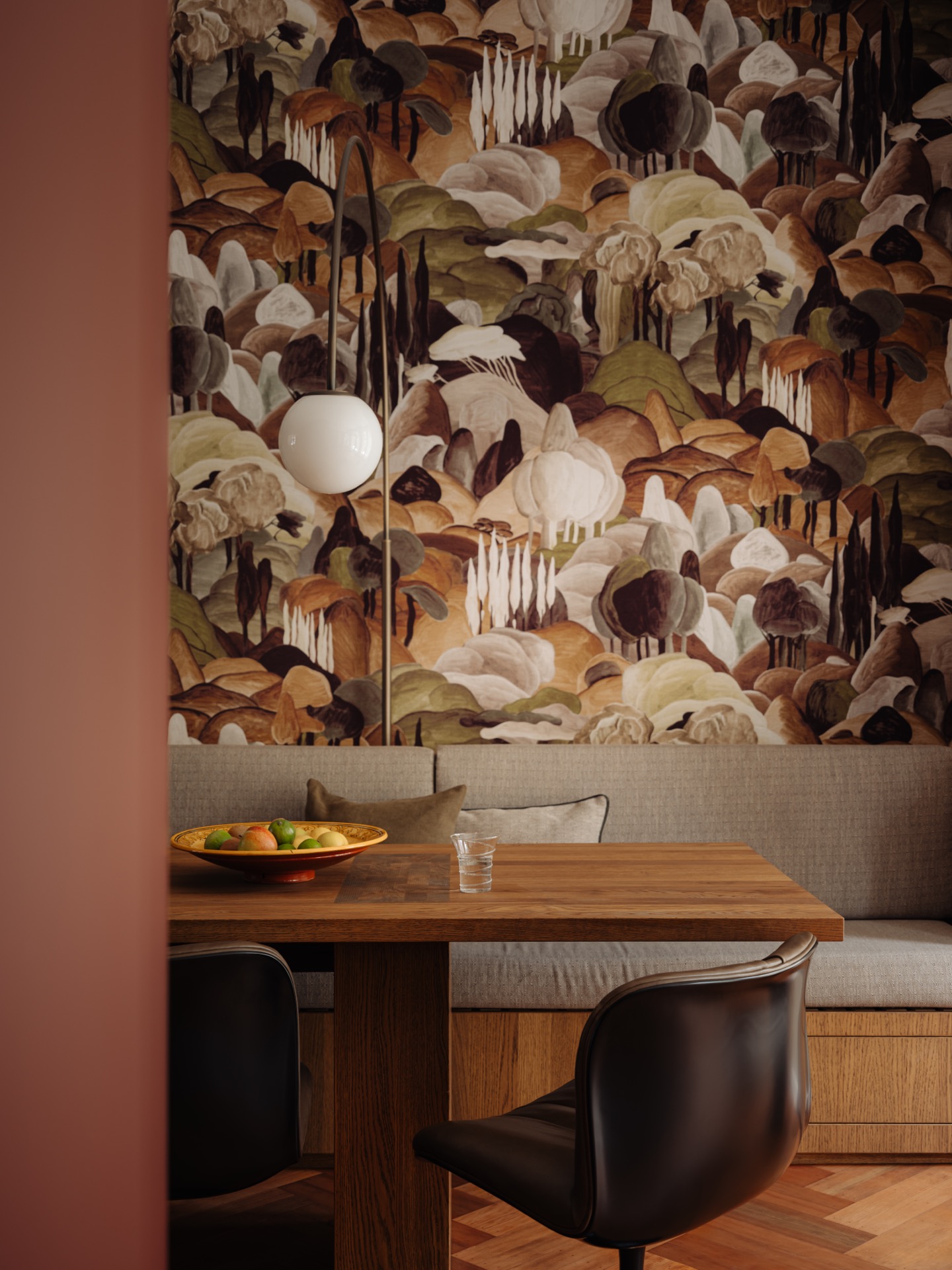
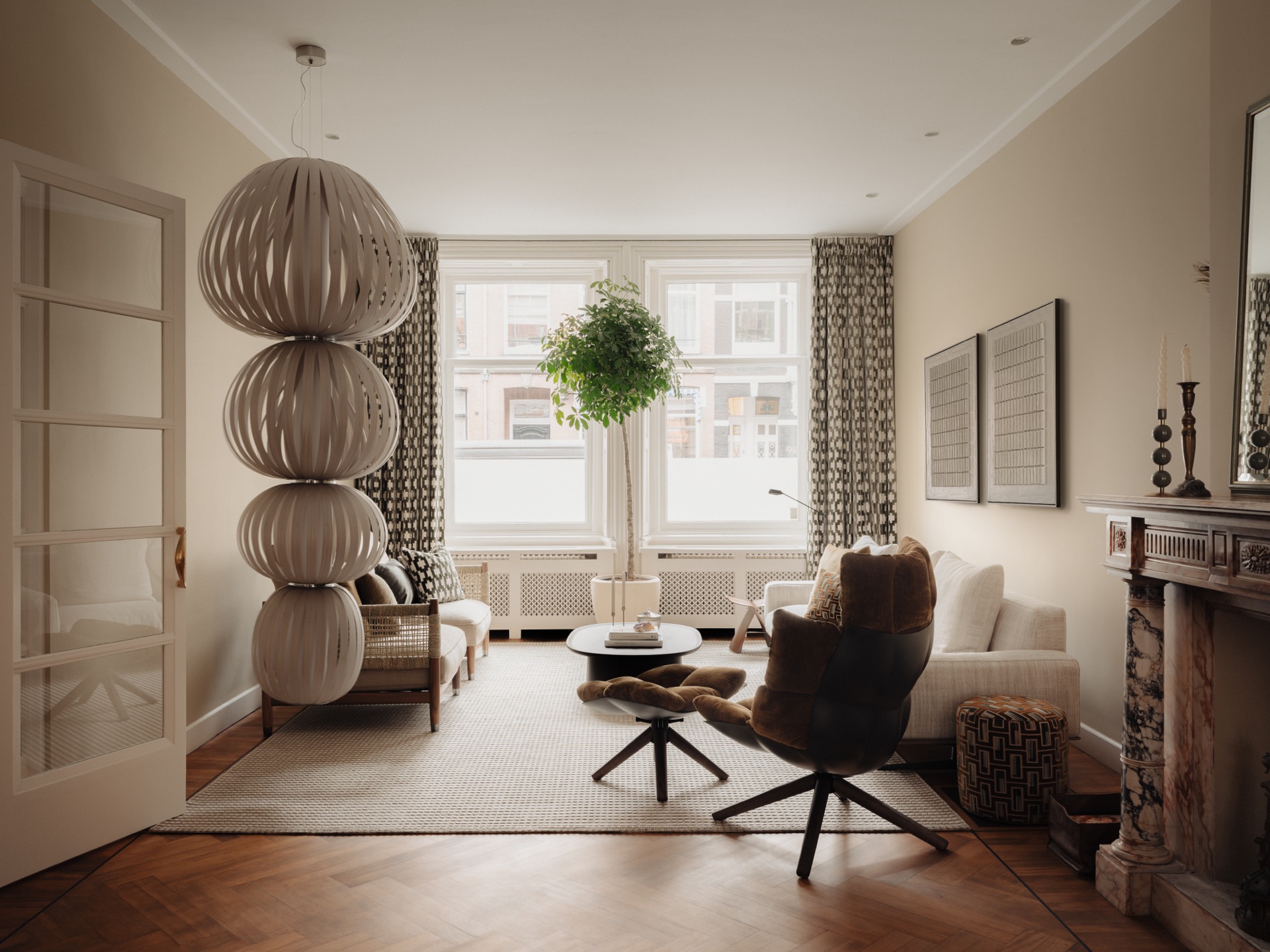
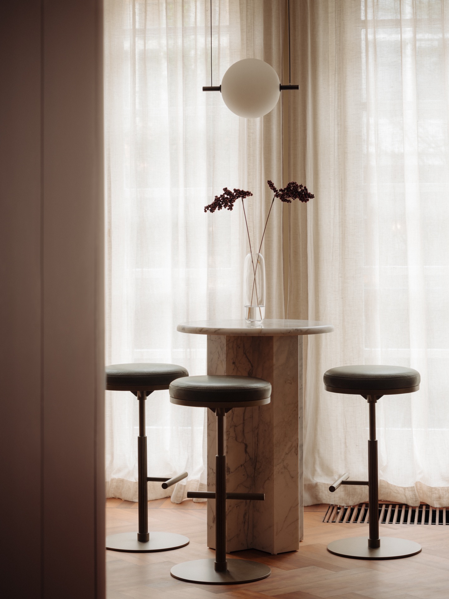
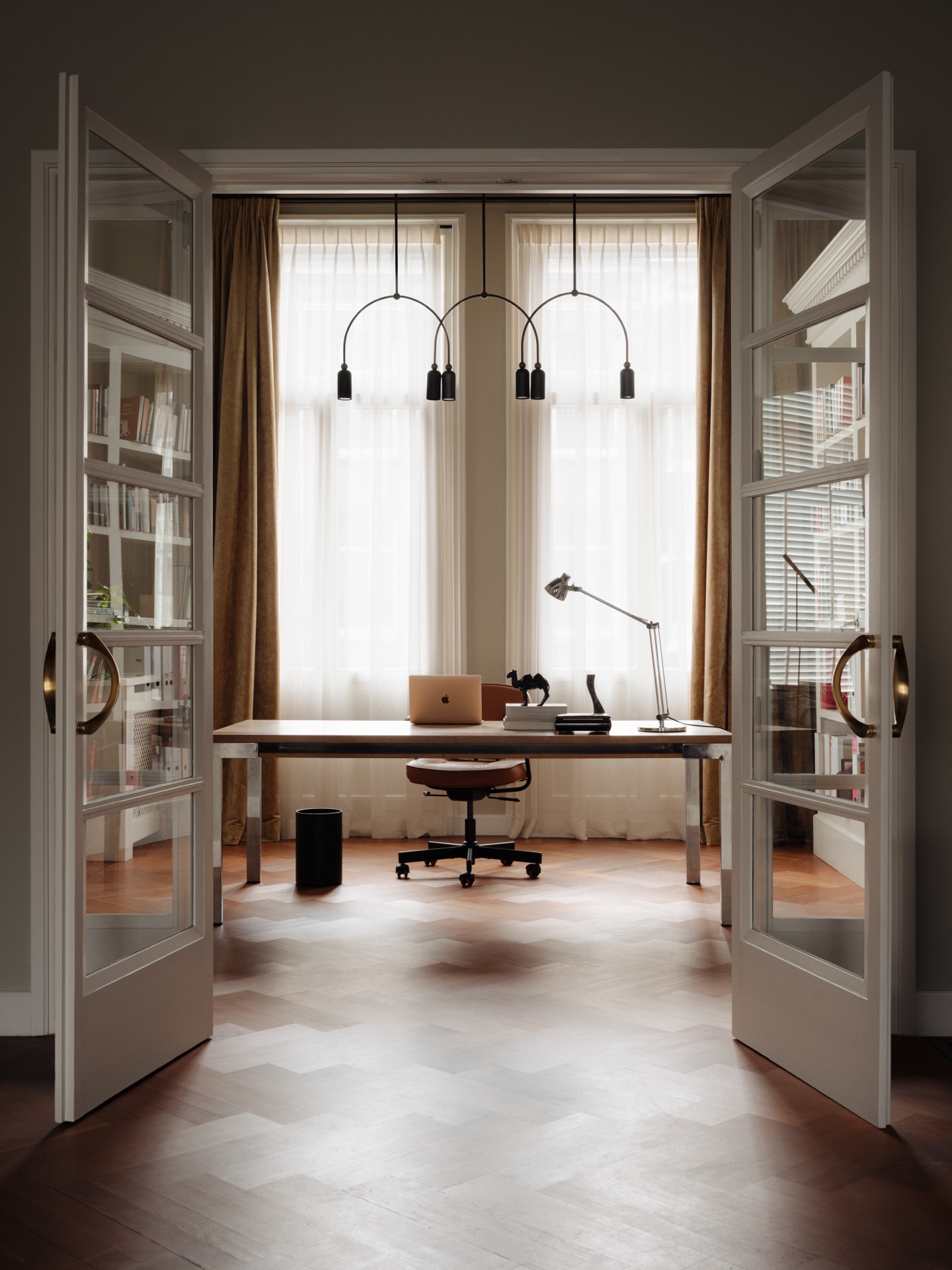
Lighting is used as architecture rather than finishing. A statement pendant light marks the living area and cuts across the house’s more traditional lines. It gives the seating zone its own centre without closing it off. Elsewhere, wall lights repeat through the green stair hall and continue all the way up to the fourth floor, turning the stair route into a visible thread. The effect is practical, but it also makes the vertical movement of the house legible at night, one landing leading directly into the next.
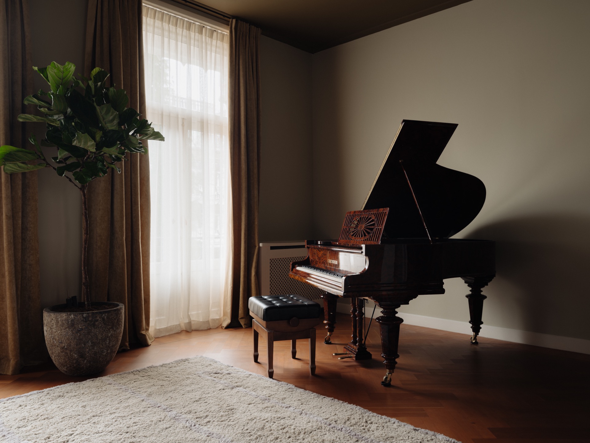
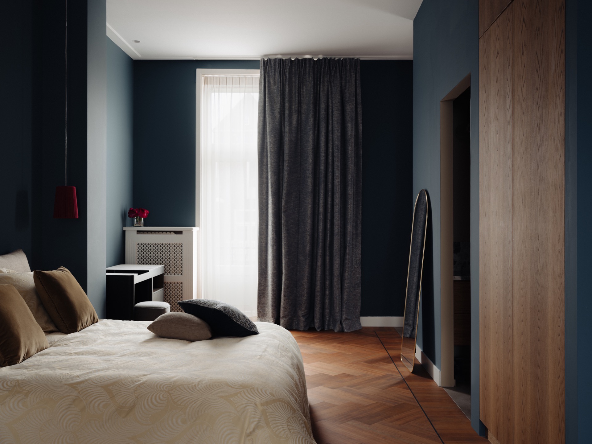
There is no single source of light that explains the whole interior. Instead, spots, pendants and wall lights work in layers, each one serving a different surface. The large windows are softened by light curtains, which diffuse daylight and keep the rooms from feeling sharp. In the living spaces, the fabric also frames the view outward, so the windows read as part of the composition rather than as empty openings. This careful use of light supports the bohemian bold interior without pushing it into excess.
Textiles, art and plants as part of the layout
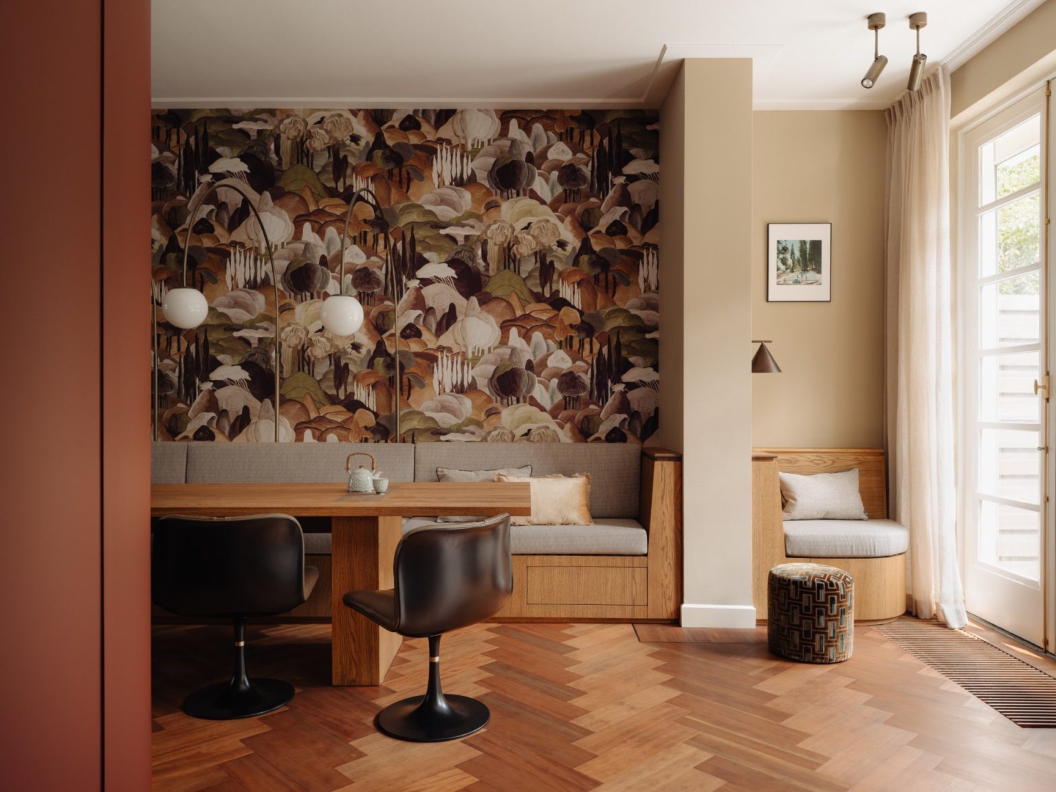
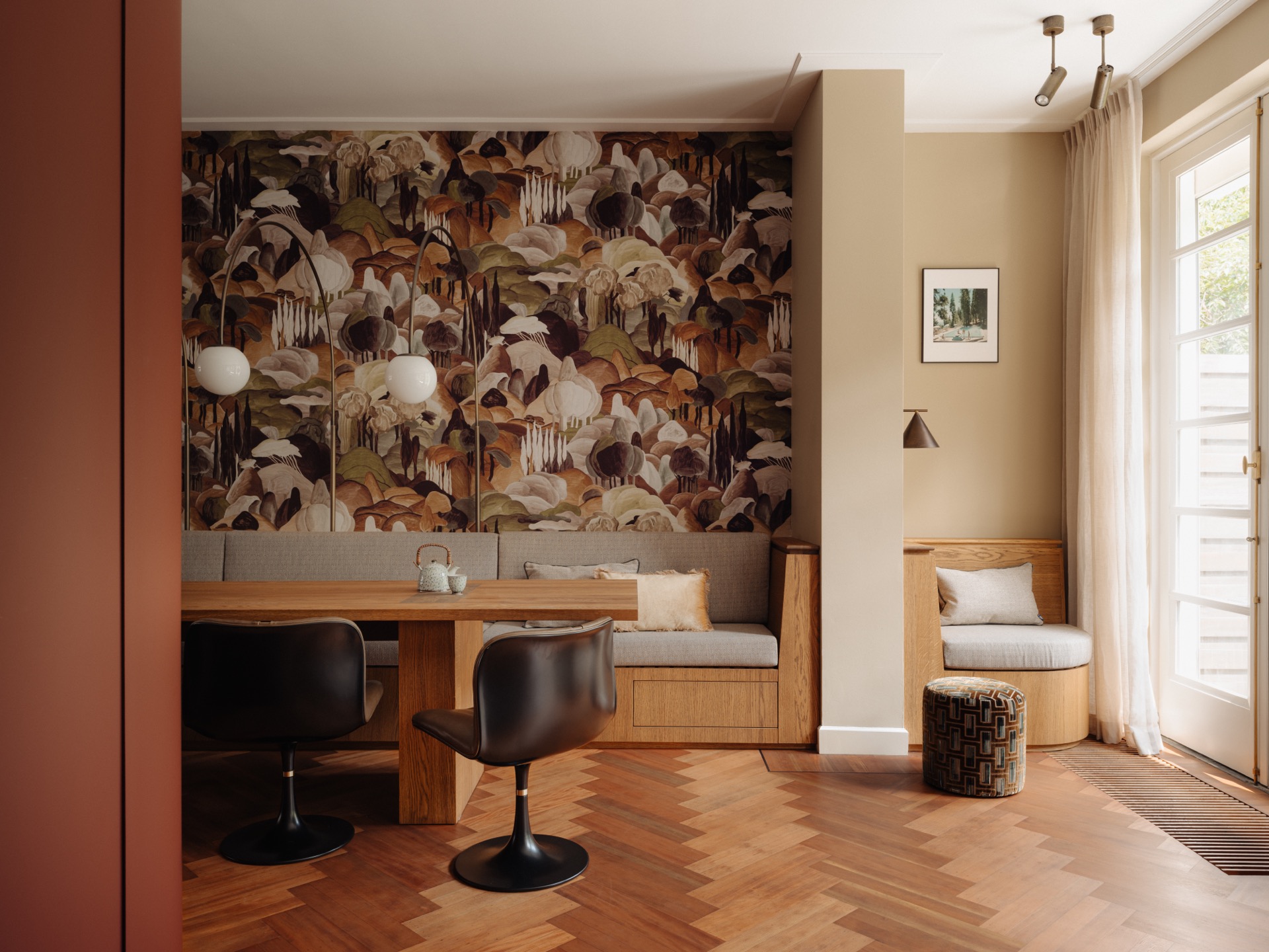
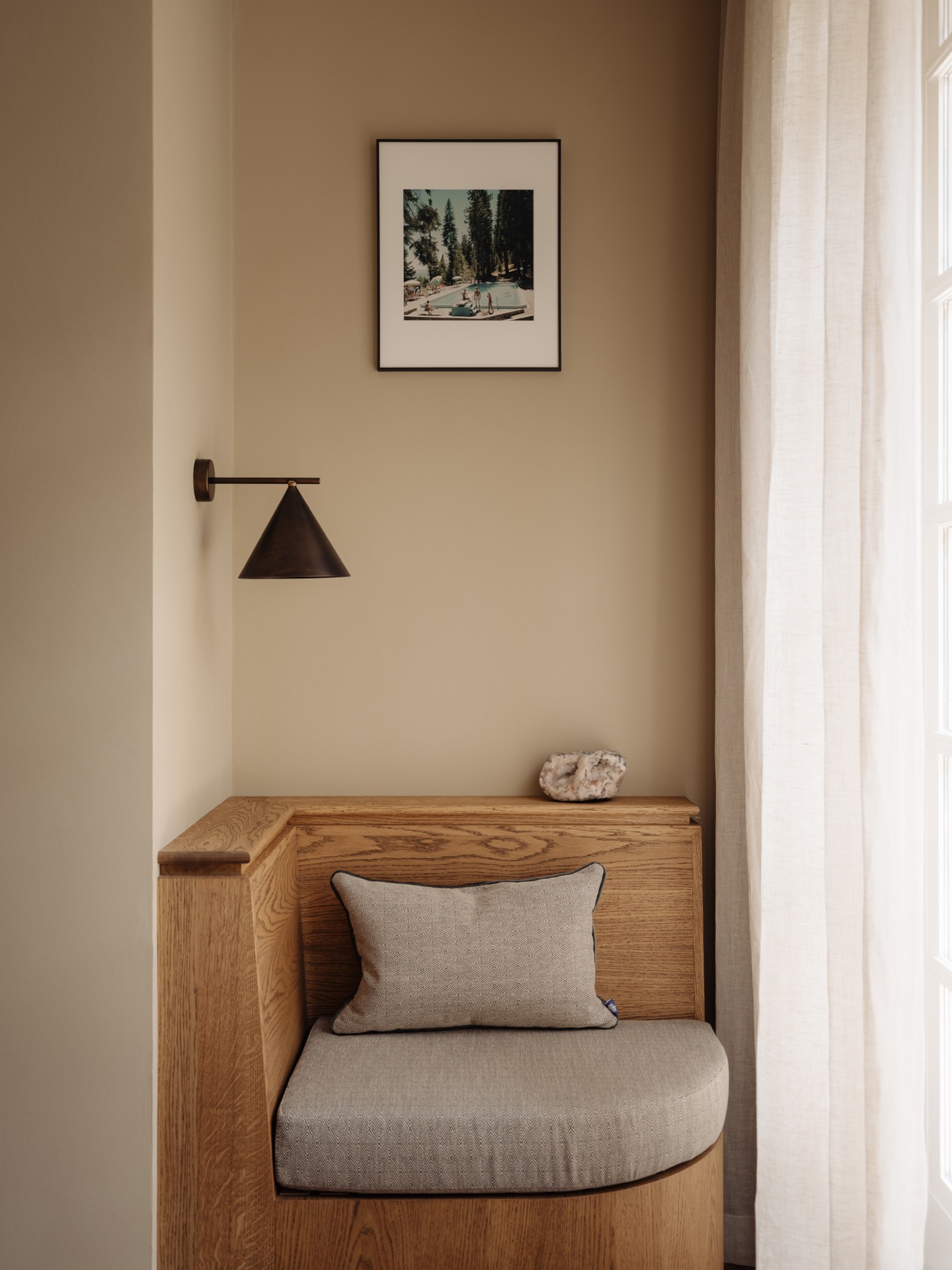
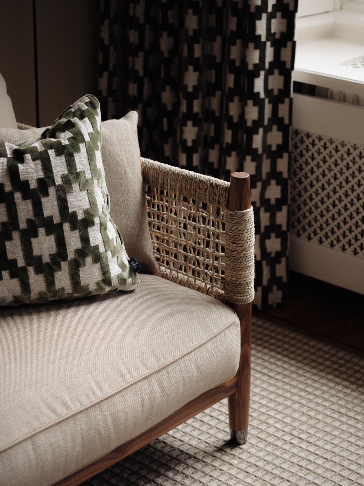
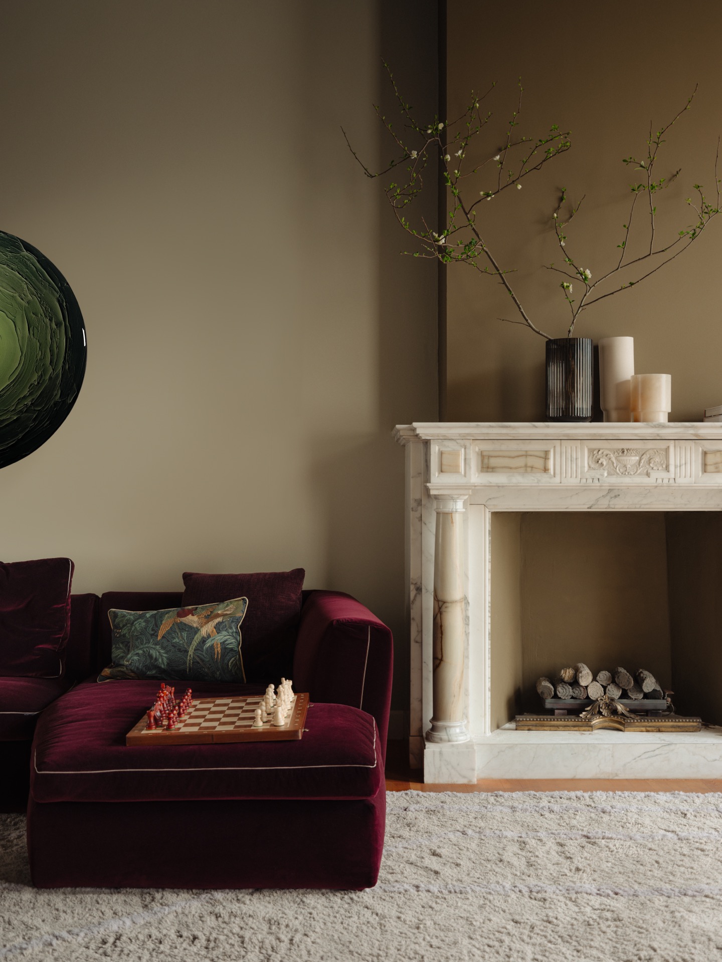
The rooms are full of objects, but they are not crowded. Curtains hang in long folds beside the windows, a patterned wall brings colour into one of the main rooms, and art pieces stand out against pale surfaces. Plants are used as part of the arrangement, not as extras placed at the end. They sit near the joinery and along the edges of the living areas, where their shape breaks up the stronger architectural lines. That mix of textile, art and greenery gives the project its layered register.
Colour works in the same measured way. Warm beige, white, dark grey and deep red-brown appear across the rooms, with green pulling through the stair hall and into the adjoining spaces. The palette never stays static for long; it shifts with the surface it lands on. A bordeaux sofa on one floor, a patterned wall nearby, and the green stair hall above all create different pauses in the route through the house. The heritage townhouse interior gains depth from those shifts, not from decoration alone.
A marble kitchen that opens toward dining
The kitchen and dining area are linked through movement as much as through material. The round kitchen unit guides the eye into the next room, and the dining table sits in a clearer line with the cooking zone because the wall no longer reads as a hard break. That change makes the plan easier to move through. The round form is important precisely because it removes the sense of a blocked threshold. What was once separated now opens into one connected room, with the bar and the joinery doing the quiet structural work.
In the kitchen, the marble surface stands out against the oak fronts and the lighter background. The stone carries a visible pattern, which gives the room a sharper edge without making it feel cold. Nearby, the seating and storage are kept to measured proportions, so the room can work as a living kitchen rather than a display of fixed elements. This is where the project’s reuse original features approach becomes tangible: existing lines are respected, but the layout is redirected where daily use needs it.
Bathroom surfaces and a sharper graphic note
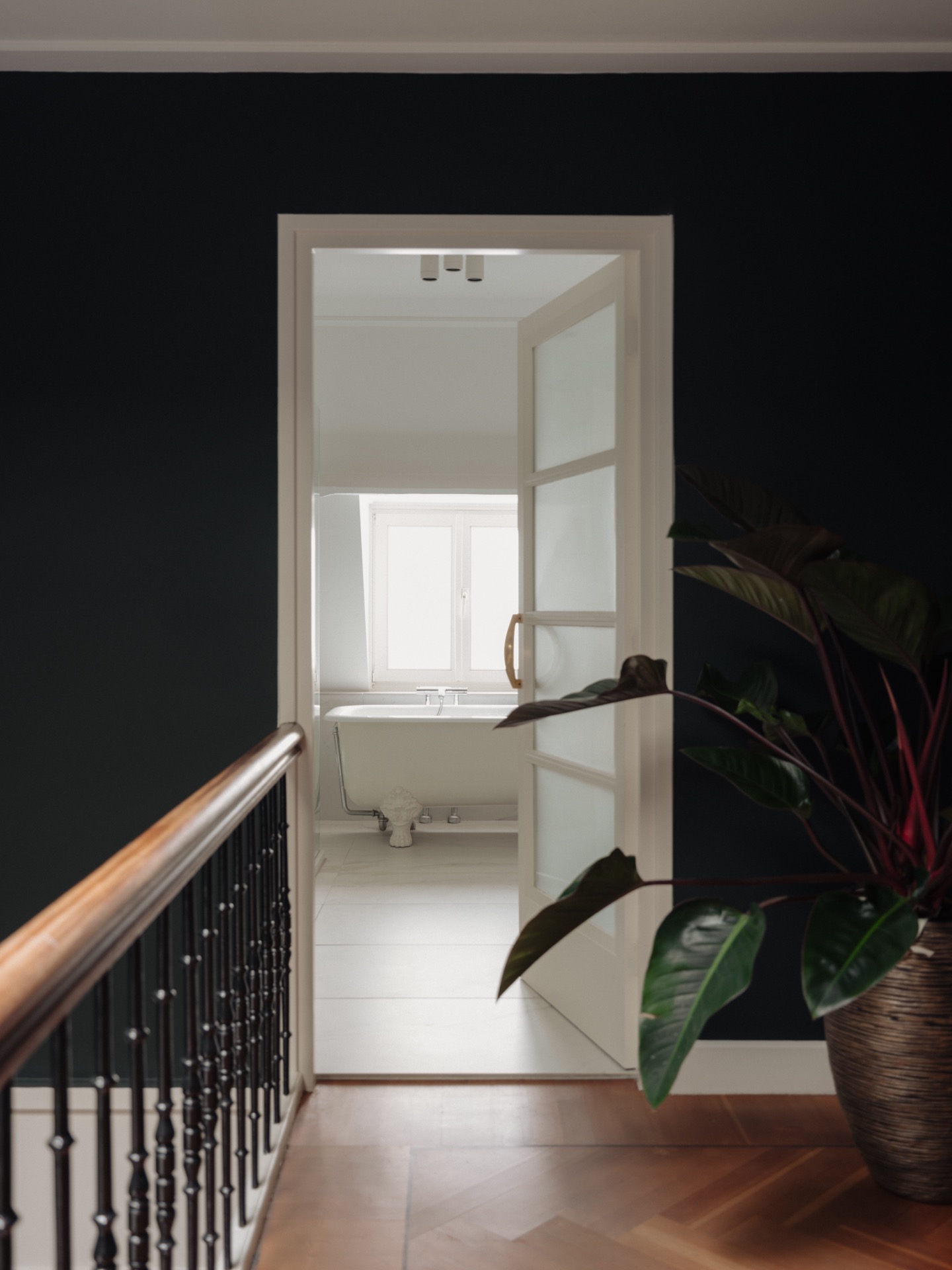
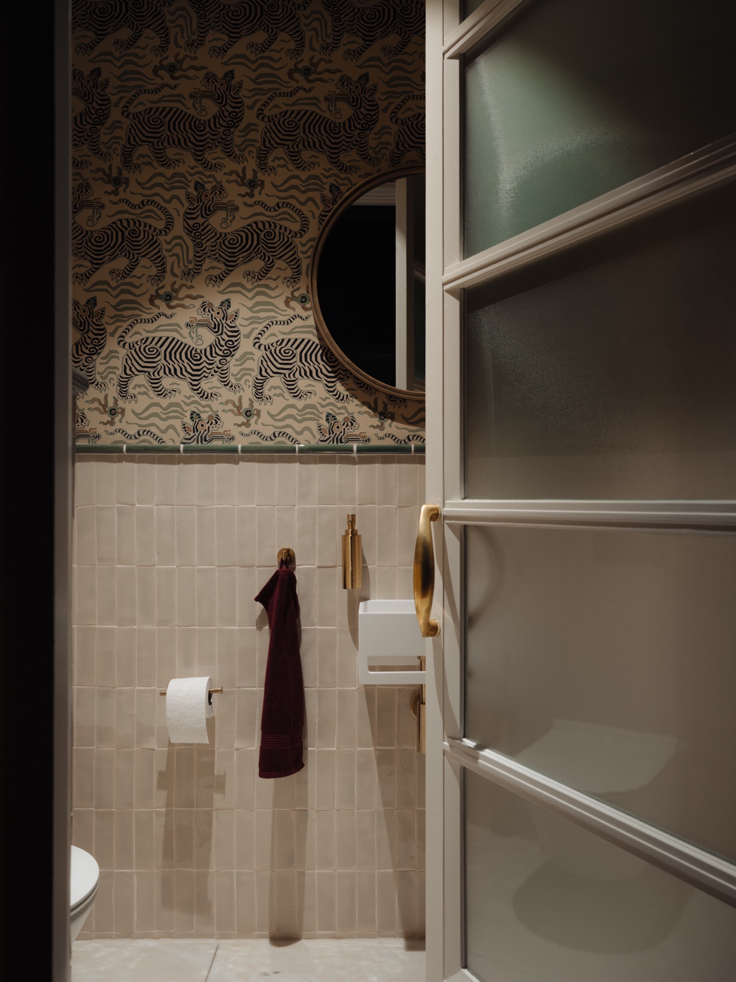
The bathroom shifts the tone again. Light tiles cover the main surfaces, and above them a graphic pattern adds a more assertive note. The contrast is clear, but it is controlled by the tile layout and the clean edges of the room. Marble appears here too, linking the bathroom back to the kitchen in material terms. The room does not rely on ornament; instead, it uses surface and pattern to hold attention. That makes it read as part of the same house, even though its mood is more direct.
Across the house, the project keeps returning to the same set of moves: preserve the structure, add rounded joinery, use statement lighting, and let natural materials carry the rest. It is a heritage townhouse interior shaped by visible decisions rather than a single gesture. The original house remains legible, but the daily route through it now feels more open, more layered and more clearly defined by use. The bohemian bold interior comes through in the details, not in any one room trying to dominate the whole.
More projects by Holistic Interiors can be found on their project overview.
Want to see more of Holistic Interiors? View the page of Holistic Interiors for even more great projects and company information.


NEW 2026 Jubileum Edition The Best Interior Designers Benelux
Order Now €125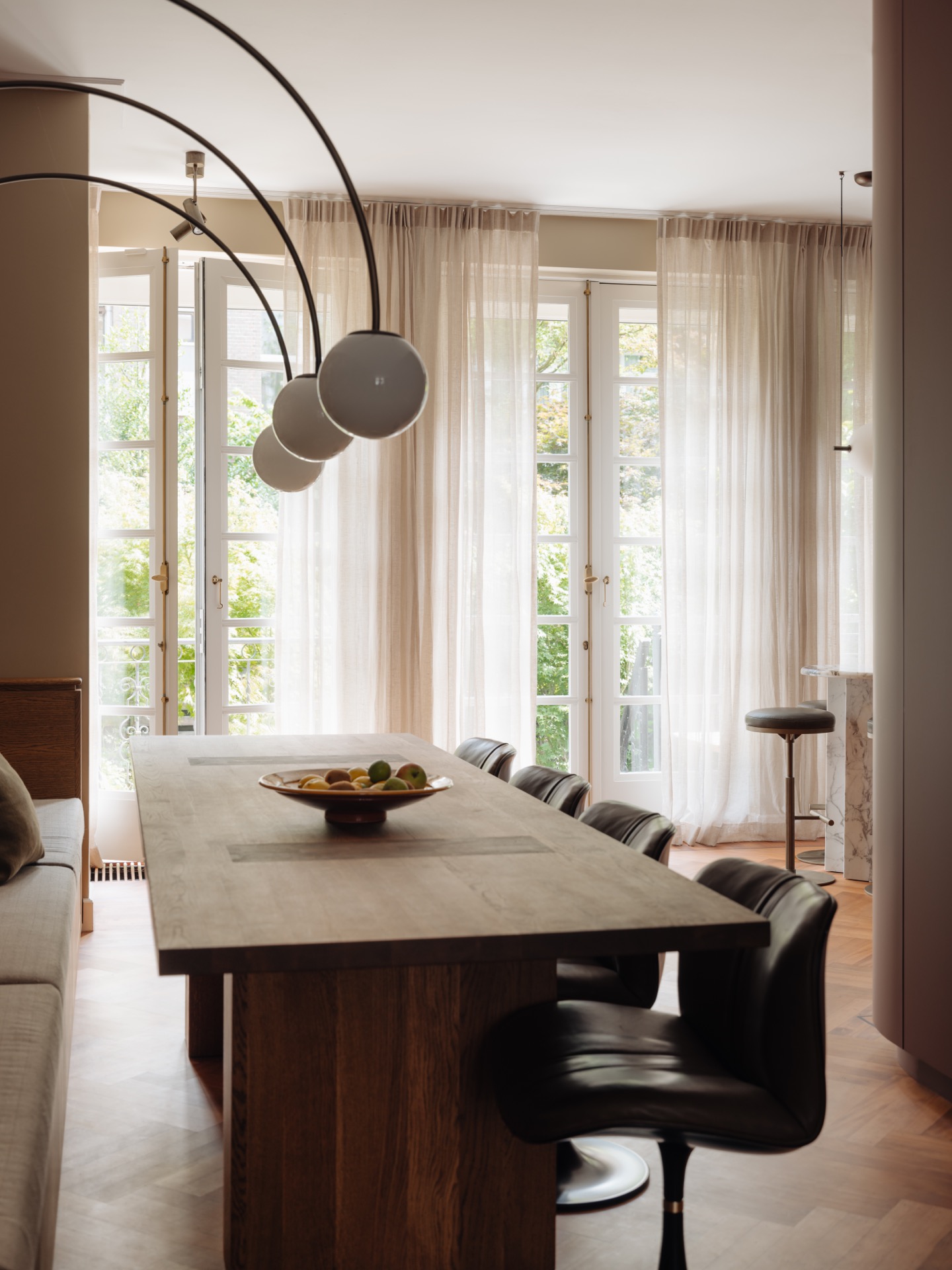
NEW 2026 Jubileum Edition The Best Interior Designers Benelux
Order Now €125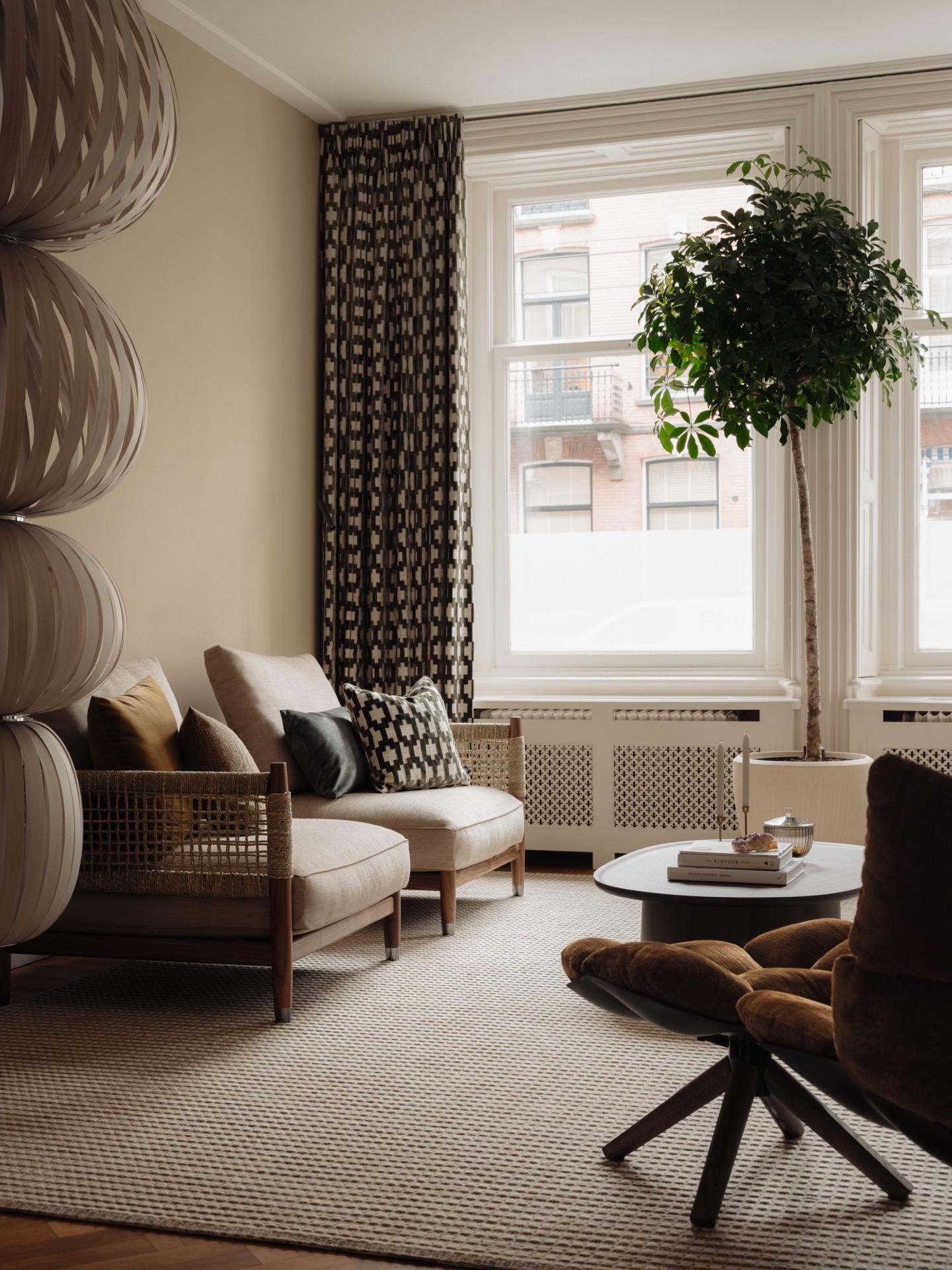
NEW 2026 Jubileum Edition The Best Interior Designers Benelux
Order Now €125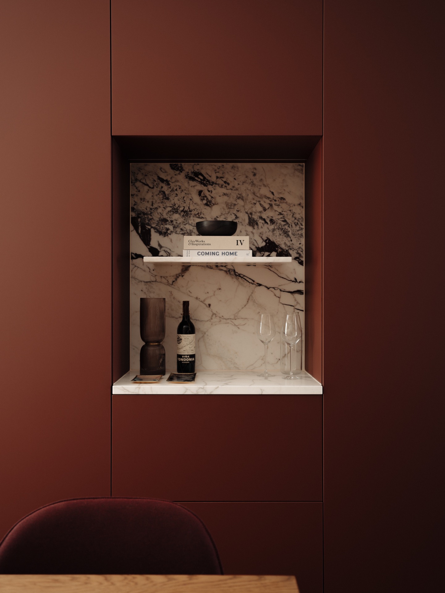
NEW 2026 Jubileum Edition The Best Interior Designers Benelux
Order Now €125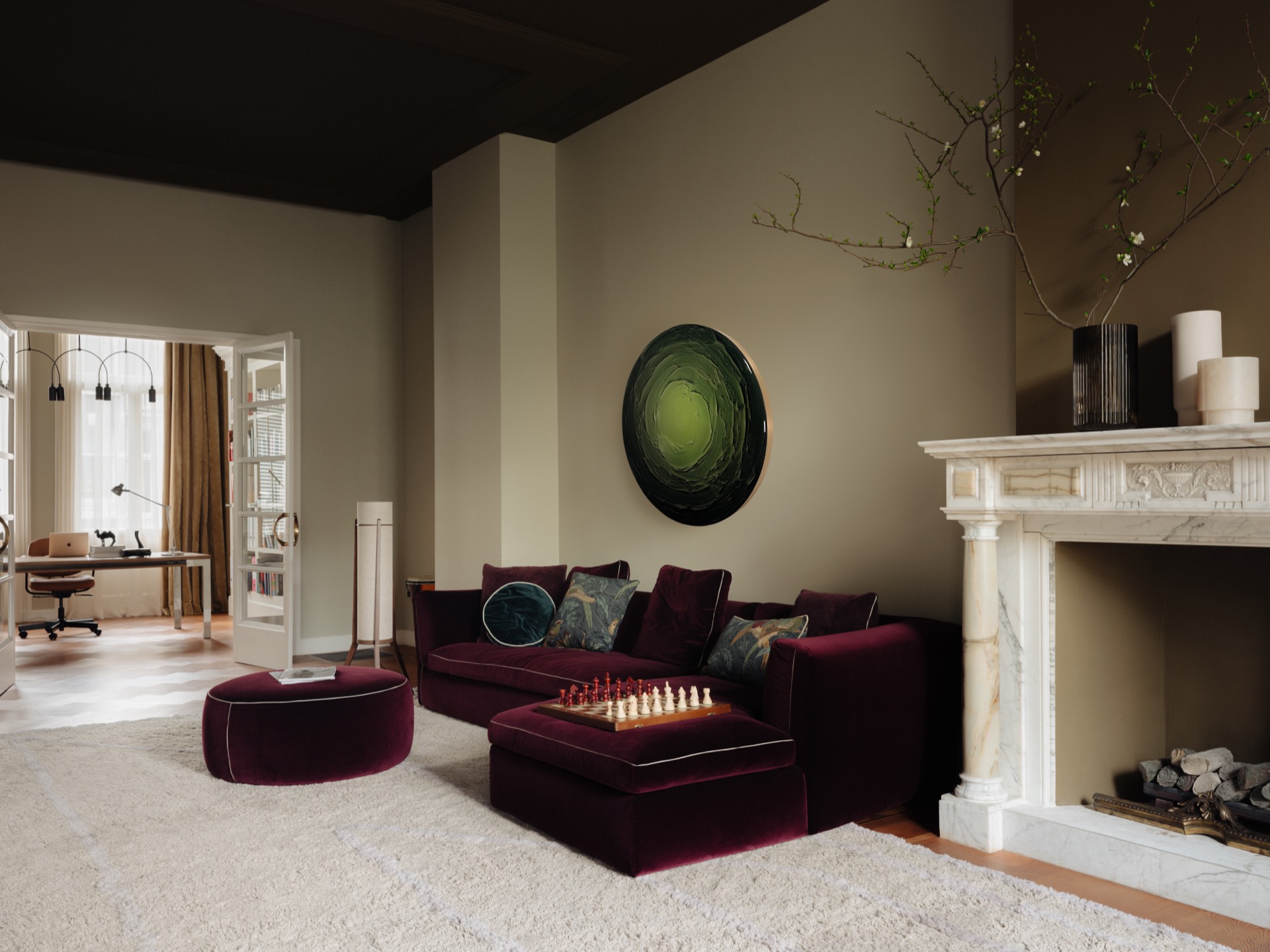
NEW 2026 Jubileum Edition The Best Interior Designers Benelux
Order Now €125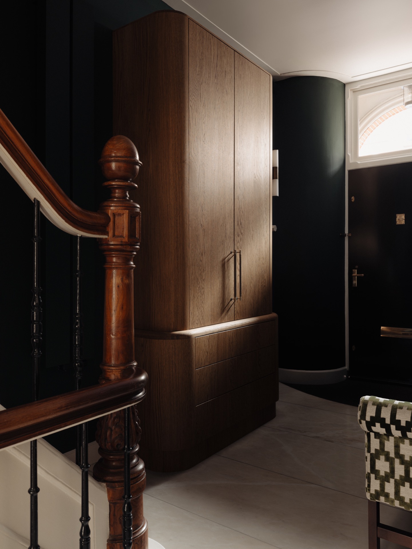
NEW 2026 Jubileum Edition The Best Interior Designers Benelux
Order Now €125