Modern interior project with open-plan living, dark kitchen island cabinetry and wellness
Glass doors pull the eye straight through the living space to the courtyard, where large planters sit against pale paving. Inside, the palette stays restrained: white walls, dark frames, charcoal joinery and wood panels that interrupt the smooth surfaces at key points. The result is a modern interior project built around clear sightlines and a sequence of rooms that open and close without losing their connection.
Living areas shaped by light, glass and a visible fire line
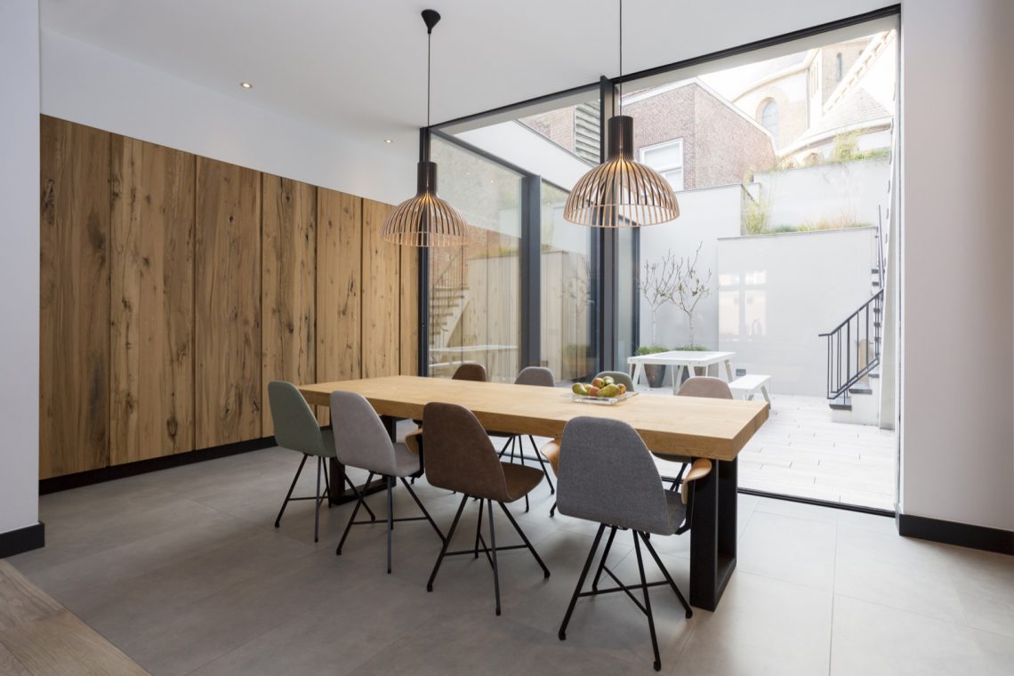
The living room does not rely on ornament. A wooden accent wall runs beside the seating area, while the dining table sits under hanging lamps that mark the center of the room. In another view, a built-in fireplace and TV niche are set into a wall with a dark surround; the recessed composition keeps cables and equipment out of sight and leaves the fire line as the main horizontal element. Large-format floor tiles and curtain panels soften the hard edges without breaking the room’s clear geometry.
Across the open-plan living area, the glazing does more than admit daylight. It sets up the transition between the interior and the courtyard patio planters, and it lets the furniture read against a shifting exterior backdrop. That opening is repeated in different views, from the broad sliding glass door beside the dining table to the darker framed window wall that catches the curtains and the adjacent door panel. The spaces stay linked, but each one holds its own edge.
A kitchen defined by dark cabinetry and a long working line
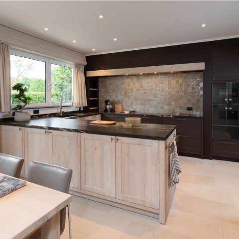
The kitchen uses dark kitchen island cabinetry and full-height storage to pull the room into a single vertical band. Tall fronts rise to the ceiling, broken only by open shelves with wood inserts and by the built-in appliances stacked into a darker column. In one view the island carries the cooktop; in another, the hood appears as a lit object above the cooking zone. The emphasis is on line, height and reach rather than display.
Linear ceiling lighting reinforces that order. A straight light band runs above the cooking area, while spotlights pick out the wall planes and the shelving. The composition leaves the worktop visually clean, even when the cook zone is in use. The kitchen also looks toward the dining area and the glass opening beyond it, so the room reads as part of the larger modern interior project rather than as a separate enclosure.
Built-in storage, open shelves and a controlled contrast
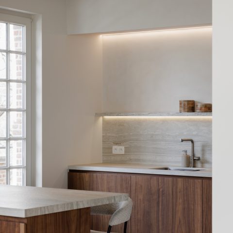
Close to the sink and appliance wall, the dark fronts are interrupted by lighter wood details that sit inside the shelving and recesses. Those warmer inserts prevent the cabinetry from becoming flat. They also echo the wood used elsewhere in the residence, especially in the accent walls and the seating details near the wellness zone. The contrast is sharp but limited to a few materials, which keeps the kitchen legible from multiple angles.
Courtyard and patio details that keep the interior open
The courtyard patio planters are not treated as decoration at the edge of the plan. They stand in large dark containers beside the light paving, with shrubs and a small tree giving the outdoor space a measured height. Seen from inside, the planters align with the glazed openings and extend the room’s axis outward. In another image, the terrace appears as a clean strip of flooring framed by straight walls and a doorway back into the house.
That outdoor edge matters because it gives the whole project a second depth. The interior does not terminate at the glass; it continues in the patio surface, the planters, and the view back through the openings. Even when the camera focuses on the inside, the courtyard remains part of the composition. It is a quiet, functional extension of the living areas, shaped by paving, container planting and the repeated use of glass.
Wellness spaces built from tile, water and enclosure
The wellness spa tub with mosaic tile is one of the strongest visual anchors in the project. The dark mosaic surface wraps the built-in tub and the surrounding wall, catching blue and purple light in one view and a more neutral glow in another. A wooden bench sits into the same zone, giving the room a place to pause between the tiled planes and the water. The level changes around the tub are carefully drawn, so the area feels carved into the plan rather than placed on top of it.
Beside that bath area, a glass wellness cabin and wet zone appear as separate but connected elements. The glass enclosure holds the steam or shower function visually in place, while the darker mosaic wall continues behind it. The materials remain sparse: tile, glass, wood and light. Because the surfaces are so controlled, the reflections and shadows take over and give each panel a clear role in the room.
Tile, wood and reflected light in the wet rooms
The tiled bathroom with wood accents shifts the palette toward lighter stone-look surfaces. A vanity with a wood top sits against a tiled wall, and a bathtub with a shower fitting appears in the same field of view. The shower zone carries a similar stone-like finish, with a small wooden shelf or niche cut into the wall. In the toilet room, pale tiles run to the ceiling around a white toilet and a small ceiling spotlight, keeping the room visually continuous from floor to top edge.
The wet rooms rely on texture more than color. Smooth tile, pale grout lines, wood grain and glass doors give each room a different tactility without introducing many new materials. That restraint keeps the bathroom and shower areas connected to the larger modern interior project, where dark joinery, light walls and wood accents already set the tone. The effect is consistent, but each room still reads through its own surfaces and proportions.
A fitness room that uses reflection instead of decoration
The fitness room is stripped back to what it needs: a mirror wall, a light stone-look floor and a row of machines set in front of the reflection. The mirror doubles the depth of the room and makes the equipment appear lighter than it is. Nothing distracts from the straight lines of the floor and the wall, so the room feels edited rather than filled. It is the most direct space in the sequence, and that directness suits the rest of the interior.
Seen together, the living areas, kitchen, wellness rooms and training space form a clear domestic route. Glass marks the transitions, lighting draws the lines, and the material palette stays focused on wood, tile, dark fronts and pale walls. This modern interior project uses those elements repeatedly, but never in the same way twice. The living room opens toward the courtyard, the kitchen compresses storage into tall planes, and the wellness zone shifts the emphasis to water, reflection and mosaic surfaces.
Want to see more of Thomas de Gier? View the page of Thomas de Gier for even more great projects and company information.





NEW 2026 Jubileum Edition The Best Interior Designers Benelux
Order Now €125


NEW 2026 Jubileum Edition The Best Interior Designers Benelux
Order Now €125


NEW 2026 Jubileum Edition The Best Interior Designers Benelux
Order Now €125


NEW 2026 Jubileum Edition The Best Interior Designers Benelux
Order Now €125


NEW 2026 Jubileum Edition The Best Interior Designers Benelux
Order Now €125