Renovated 1930s Detached House with Open Kitchen
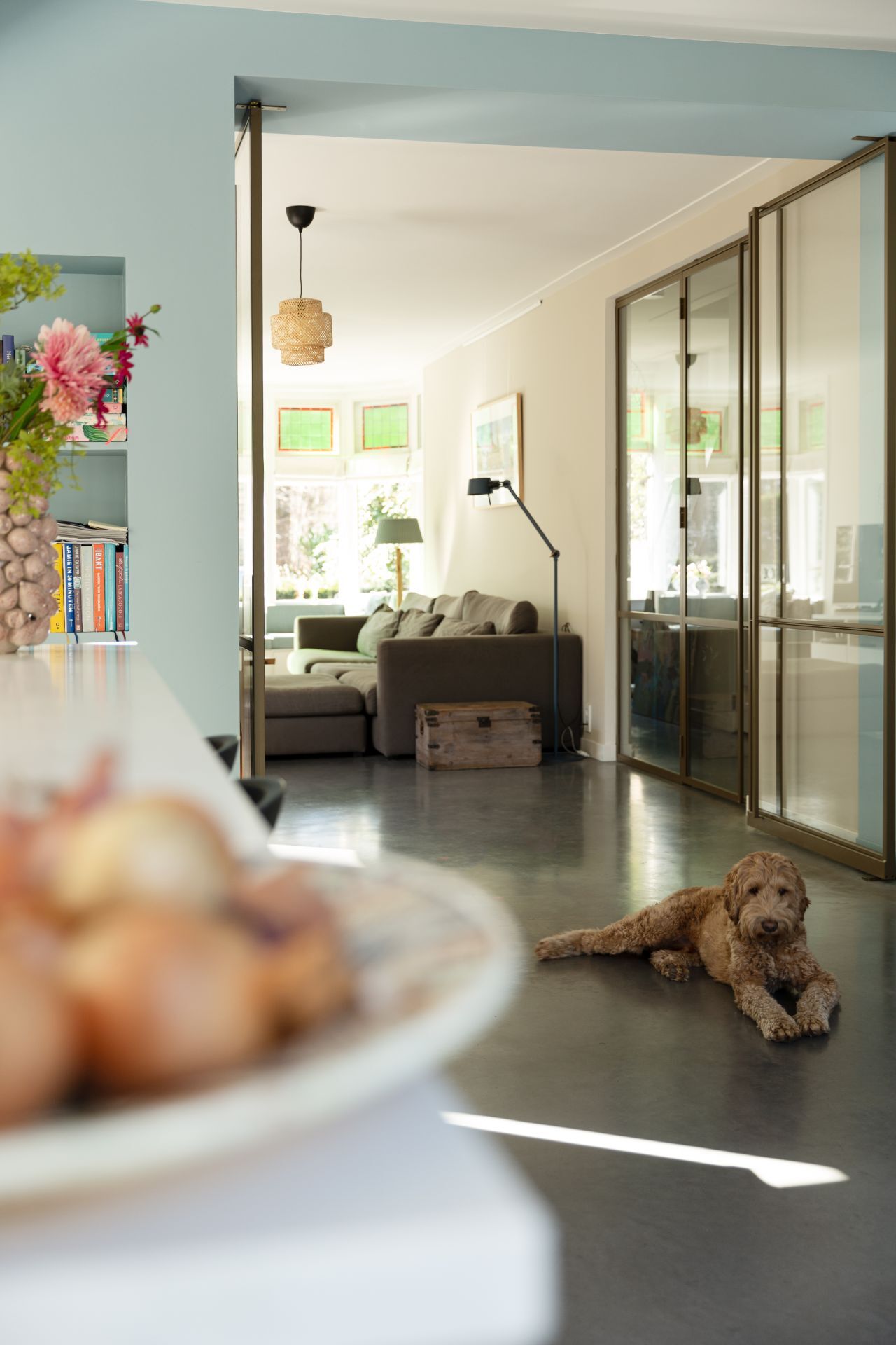
The dark grey floor sets the tone as soon as you enter. It runs through the open living kitchen and gives the renovated 1930s detached house a steady base for the lighter walls, glass doors and wood-look kitchen fronts. The owners wanted a clear view to the garden, and that decision is visible in the long sightlines from the cooking area into the rest of the house.
Dark grey floor across the living level
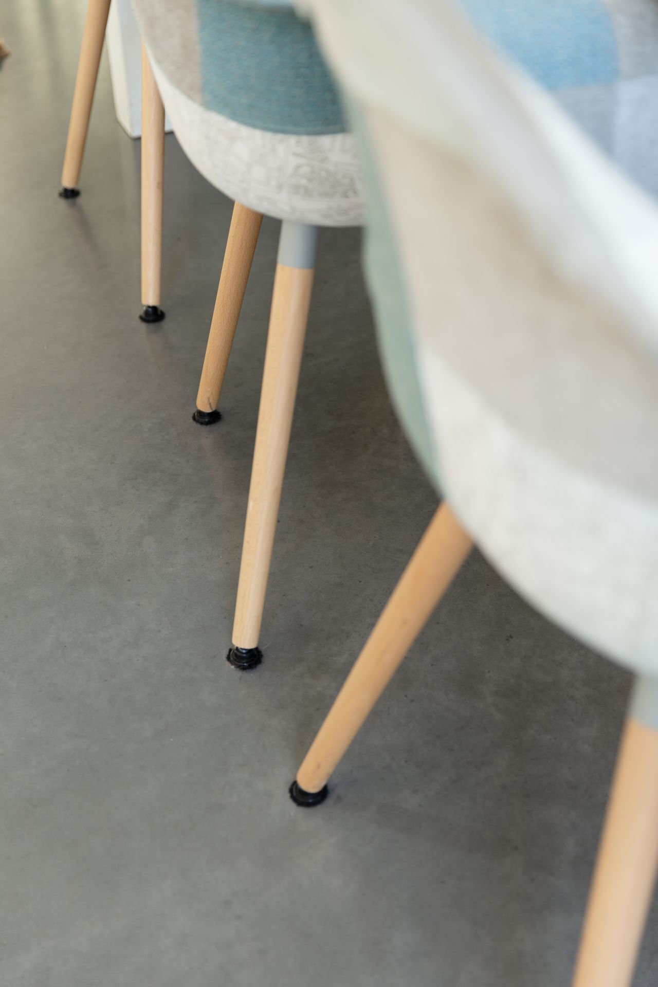
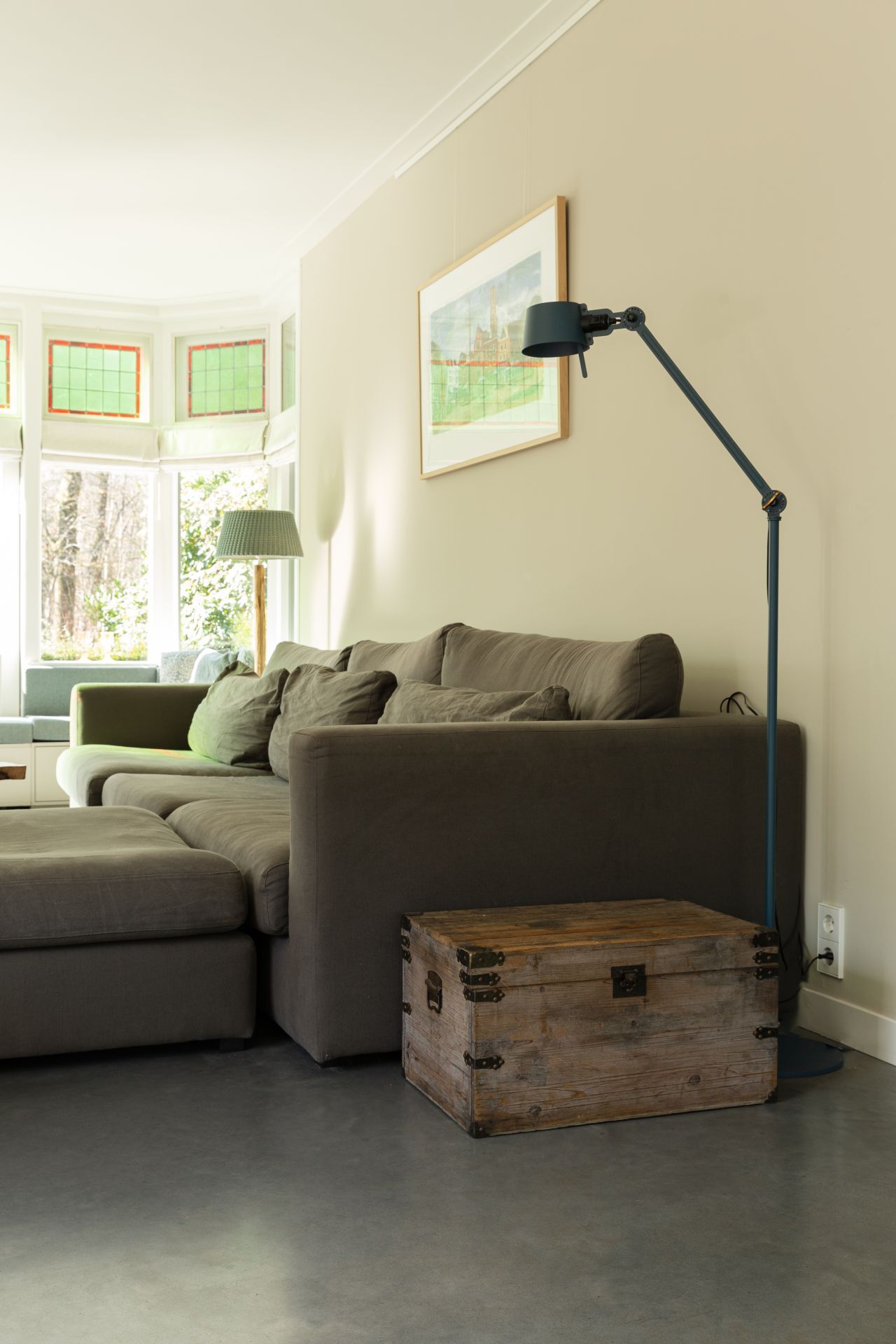
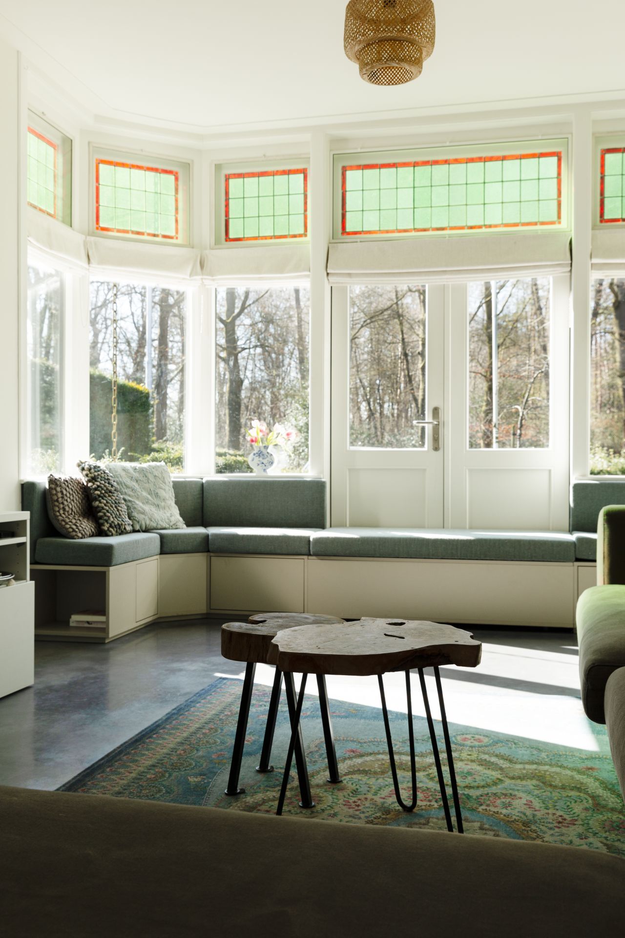
The floor is the first material that holds the rooms together. Its matte, even surface stretches from one zone to the next and lets the furniture sit quietly against it. The owners said the house should be lived in, and that attitude shows in the choice of a dark grey floor rather than a decorative finish that would demand more caution. In the living spaces, the surface also sharpens the contrast with the pale walls and the glazed openings.
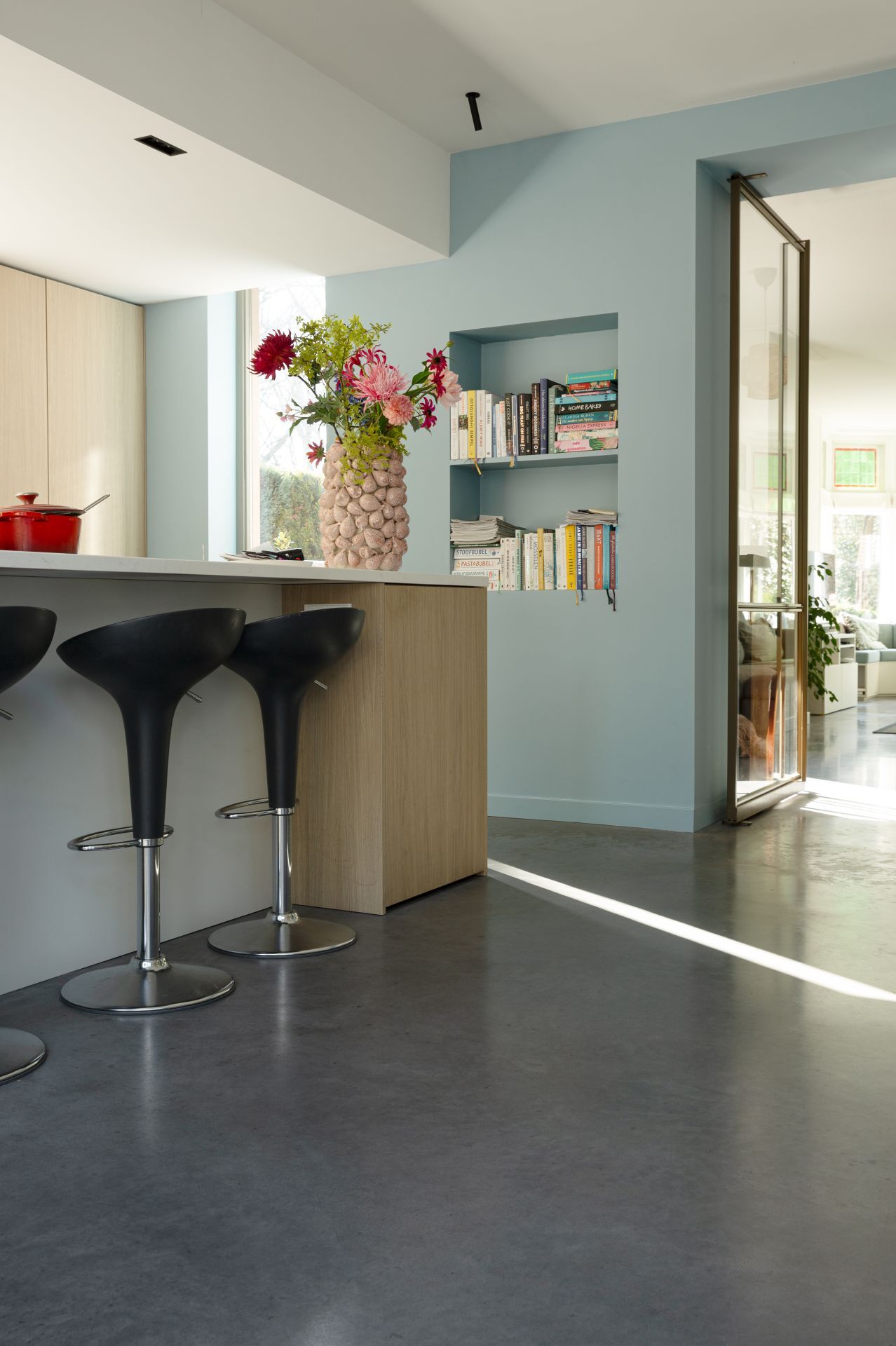
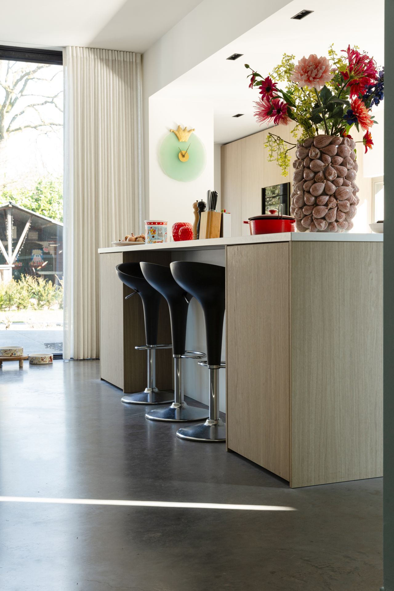
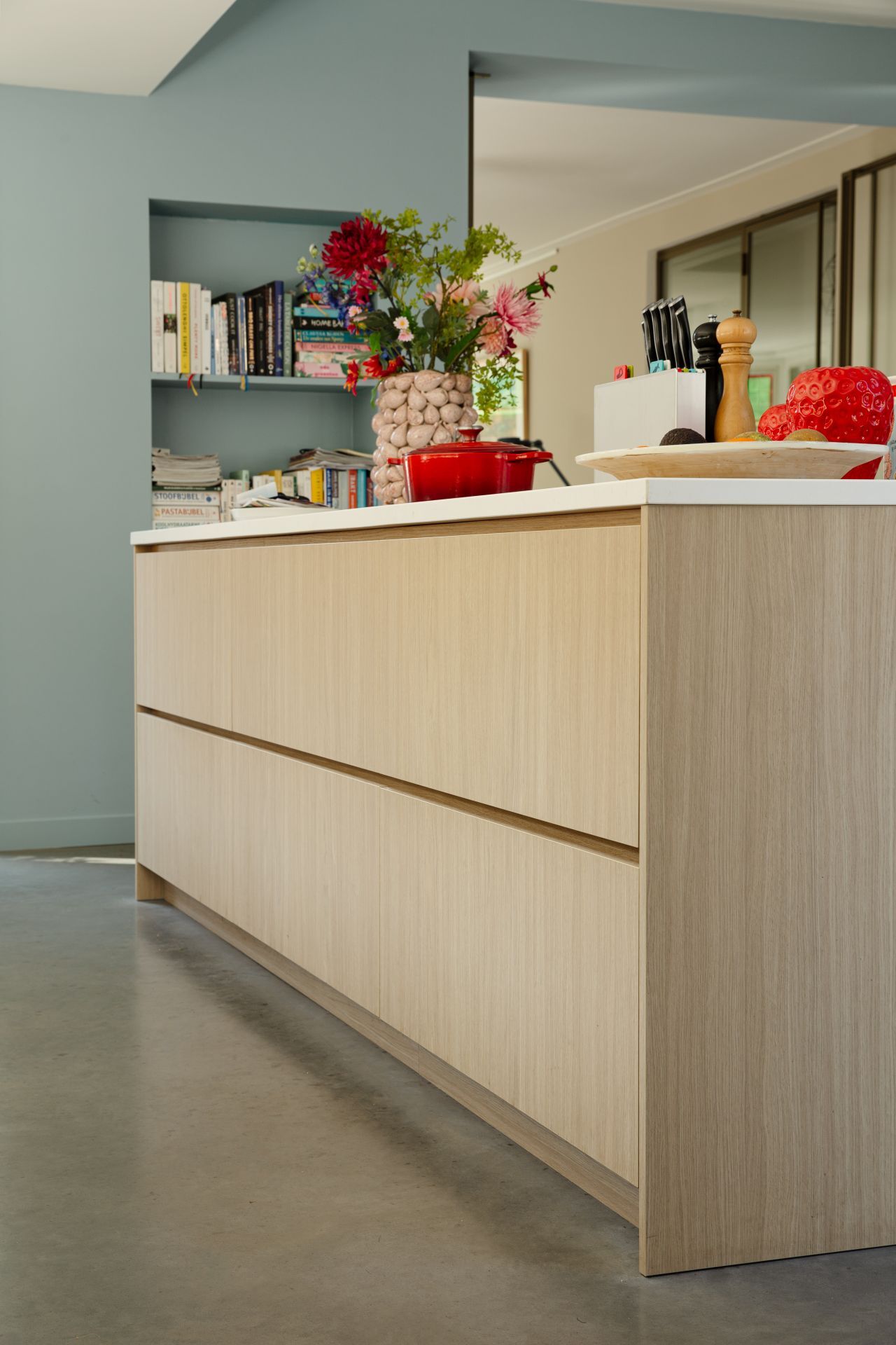
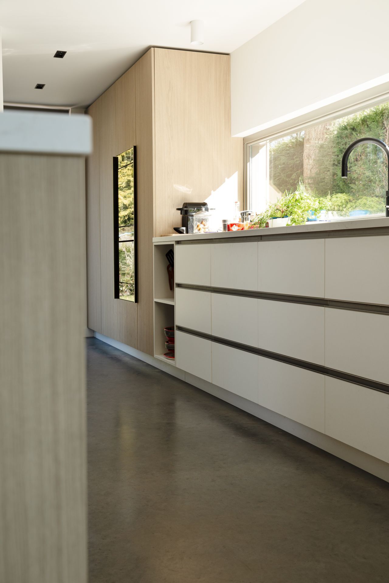
Seen beside the kitchen fronts, the floor pulls the wood-look elements forward without competing with them. It gives the open kitchen living space a grounded feel, while the continuous flooring keeps the route between cooking, dining and sitting areas visually calm. The effect is practical, but it is also clear in the photographs: the darker plane makes the daylight seem brighter where it reaches the room.
An open kitchen living space with a direct line to the garden
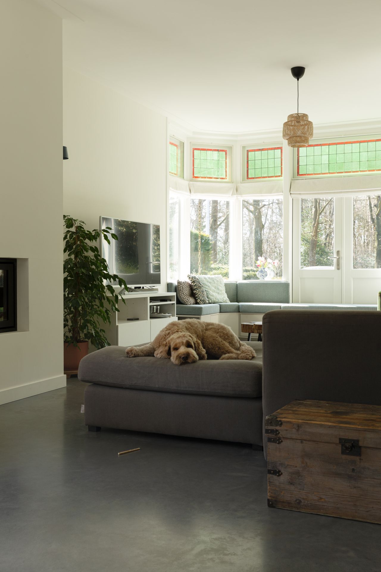
The renovation opened the lower level into a kitchen-led living space. Instead of separate rooms with closed thresholds, the plan now moves through glass doors and wide openings, so the eye travels from the worktop to the seating area and on toward the garden. That view to the garden is not an extra gesture; it shapes the layout. The kitchen is placed so that cooking and looking out happen at the same time.
Light walls keep the room from feeling heavy despite the strong floor colour. They reflect the daylight that comes in through large panes, and they give the darker materials space to stand out. In the open living kitchen, the relationship between the surfaces is straightforward: glass, plaster, wood-look cabinetry and the dark grey floor each have a clear role, and none of them needs to do too much.
Glass doors as a quiet divider
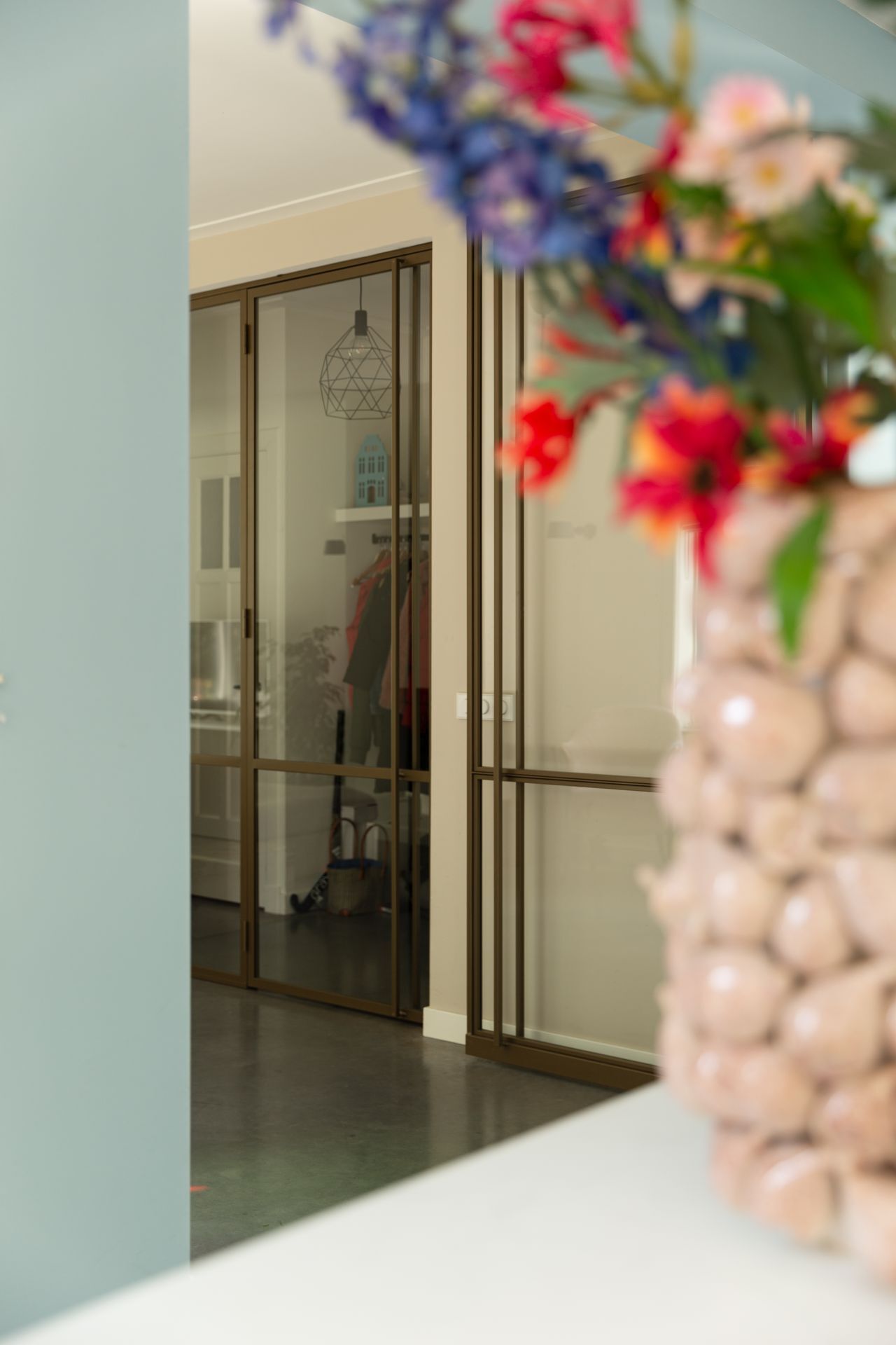
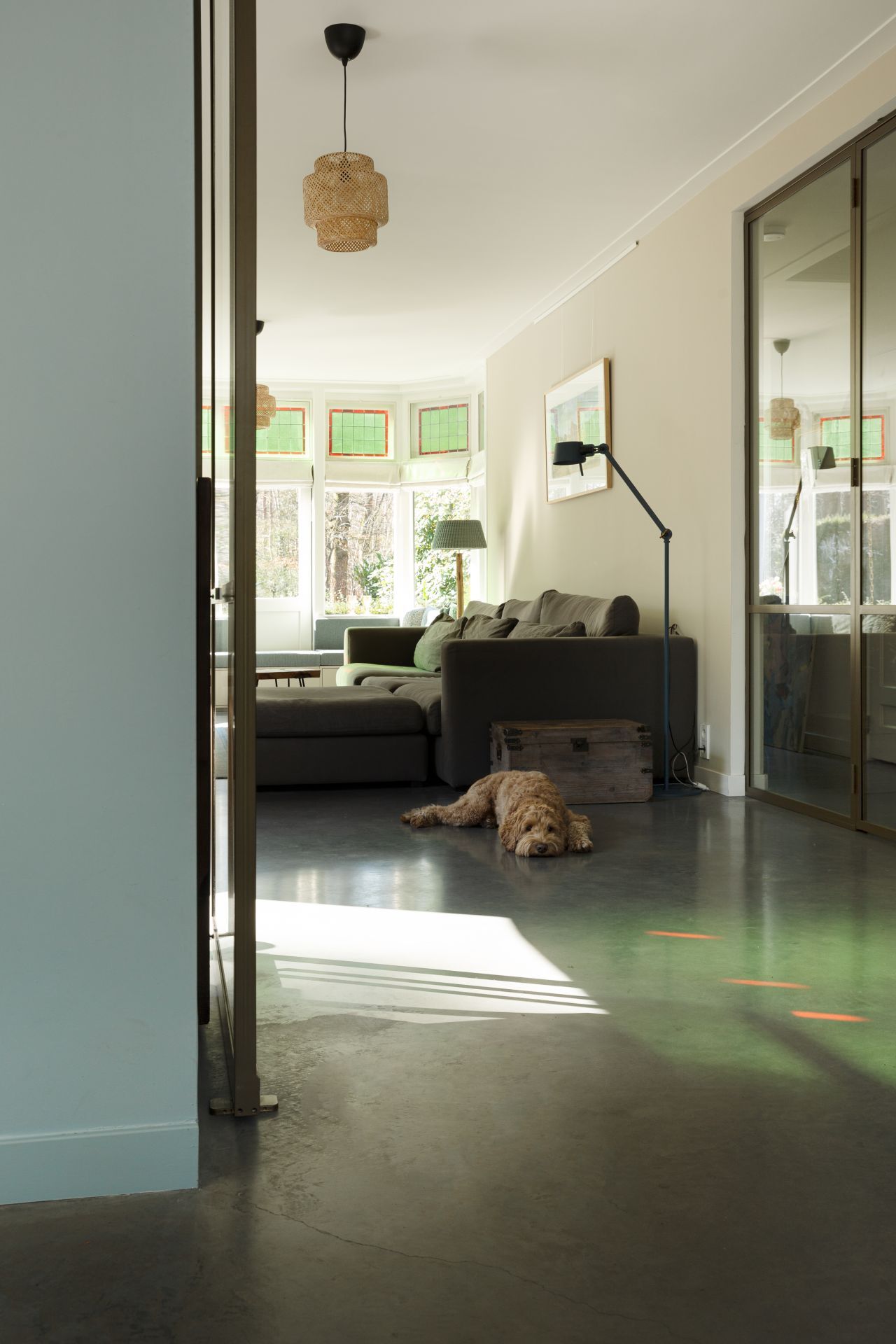
Between the kitchen and the adjacent room, the glass doors provide separation without cutting off the view. They read almost like a frame, letting the next space remain visible while still marking the shift in use. This detail matters in a detached house renovation, where one room often has to support several functions. Here, the doors keep the rooms connected while still giving the layout some definition.
The same clarity appears in the larger glazed surfaces around the living area. Reflections shift across the panes, and the dark floor anchors those brighter planes. Rather than hiding the change between old house and new layout, the renovation makes that transition readable. The result is an interior that feels opened up without losing the structure of the original house.
Wood-look kitchen fronts against a restrained backdrop
Along one wall, the kitchen introduces a warmer note through light wood-look finishes. They sit neatly against the pale wall and the dark grey floor, so the grain becomes visible without taking over the room. This is where the project gets most specific: the kitchen does not shout for attention, but its surface treatment breaks up the larger field of glass and plaster in a useful way.
The cabinetry also helps to define the open kitchen living space. Instead of a hard division, the kitchen reads as part of the room’s wider rhythm. The continuous flooring carries that rhythm forward, and the glazed openings keep the whole level visually open. In a renovated 1930s detached house, that is a careful shift in scale: the plan feels wider, but the materials remain modest and legible.
Light walls, daylight and a stronger sense of depth
Daylight becomes more noticeable because the room is not fighting with busy finishes. The light walls do much of that work. They catch the incoming light and let the darker floor drop back, so the room gains depth rather than visual noise. At the edge of the living area, the glazing and the darker base plane create a simple but effective contrast that repeats from one view to the next.
This is also where the renovation feels most connected to the daily use of the house. The floor is made for movement, the open kitchen living space is arranged for sightlines, and the glass doors keep the adjacent room part of the conversation. Nothing is overstated. The interior relies on what is visible: a dark ground, pale walls, wood-look kitchen fronts and a direct view to the garden.
Details at the entrance add colour without crowding the plan
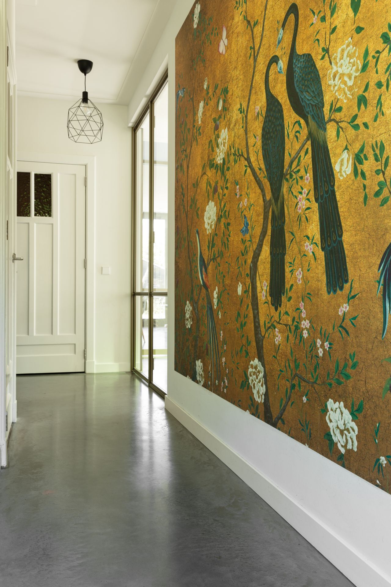
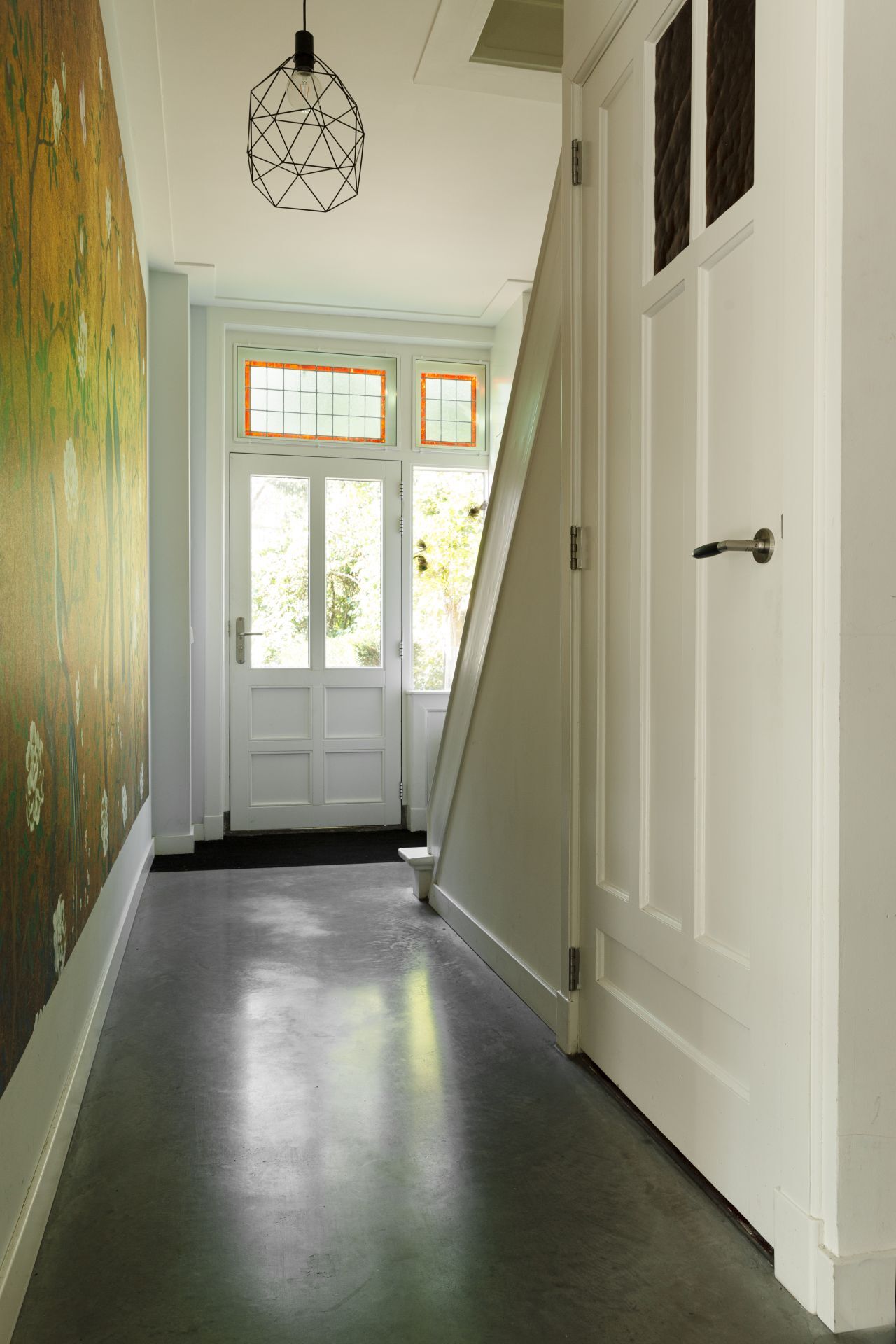
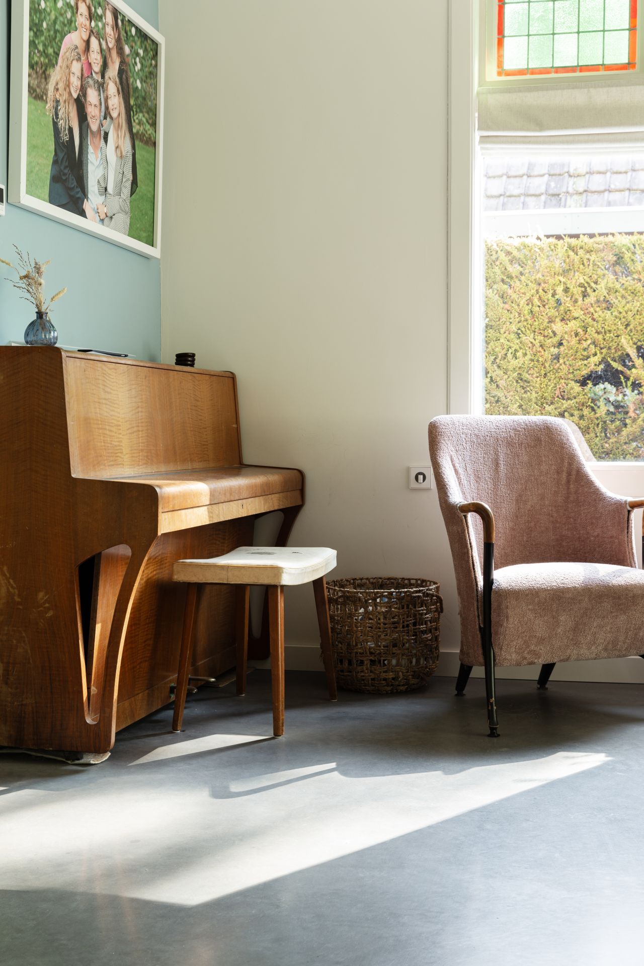
The entrance zone introduces a different mood through a wall with a bird illustration and a few sharper colour notes. It is a clear shift from the quieter living spaces, but it stays within the same restrained palette. Nearby, built-in niches and clean-lined joinery give the area a useful function without turning it into a display wall. The details are compact, and that keeps the circulation space clear.
A window detail with a grid-like pattern and an orange edge adds another small interruption in the otherwise calm shell. It is the kind of element that reveals how the renovation handles contrast: not through large gestures, but through measured changes in texture and line. Even here, the dark grey floor remains the constant link back to the rest of the house.
A renovated 1930s detached house shaped by everyday use
The strongest impression comes from how direct the house now feels. The living kitchen is open, the glass doors keep the rooms visually linked, and the view to the garden reaches deep into the plan. The dark grey floor makes that openness readable from the first step inside. It is a renovation that relies on clear moves rather than decorative layering, and that is exactly what gives the project its character.
What stays with you is the way the materials are allowed to do ordinary work. The floor carries daily movement. The light walls reflect daylight. The wood-look kitchen breaks up the larger surfaces. Together they make the renovated 1930s detached house easy to read, room by room, without flattening its details. The photograph of the interior shows that logic plainly: a lived-in floor, open sightlines and a steady link between house and garden.
Want to see more of Willem Designvloeren? View the page of Willem Designvloeren for even more great projects and company information.



NEW 2026 Jubileum Edition The Best Interior Designers Benelux
Order Now €125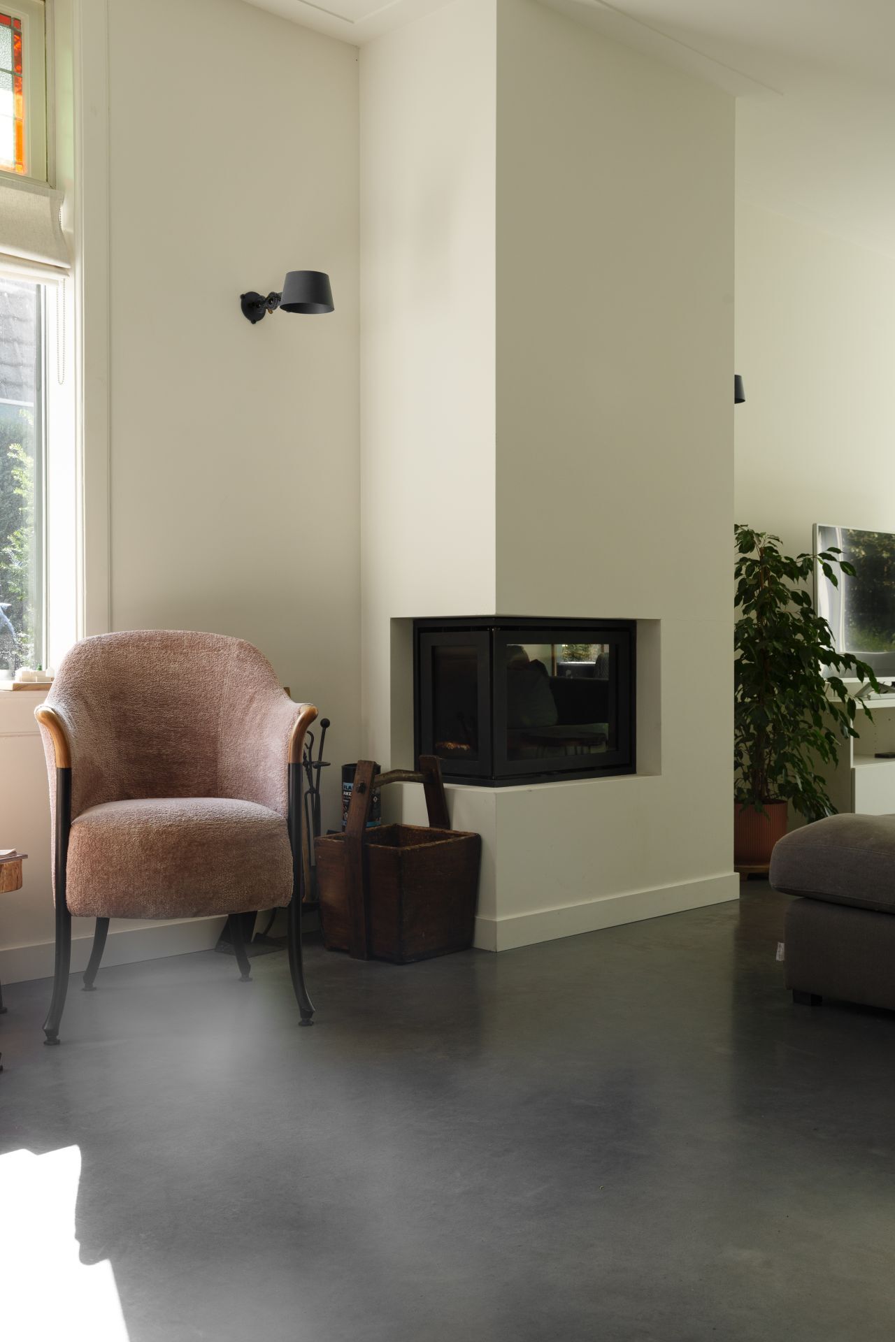
NEW 2026 Jubileum Edition The Best Interior Designers Benelux
Order Now €125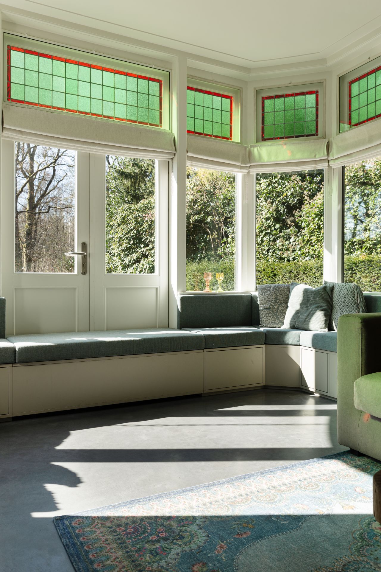
NEW 2026 Jubileum Edition The Best Interior Designers Benelux
Order Now €125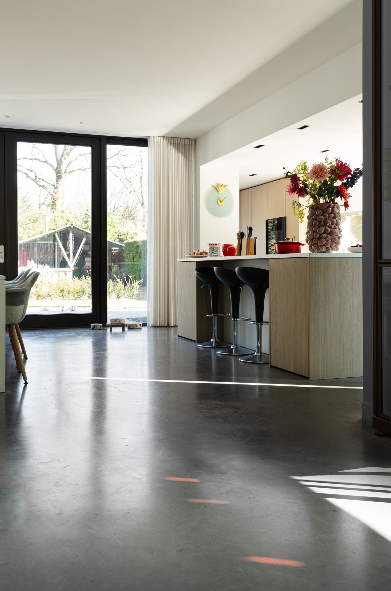
NEW 2026 Jubileum Edition The Best Interior Designers Benelux
Order Now €125