Apartment renovation with a warm, open-plan interior
A pair of partly removed walls changed the way this compact 1940s apartment reads: rooms now draw into one another, but the original structure still leaves its trace in the plan. The apartment renovation keeps that tension visible. Light walls, a restrained palette and natural textures set the tone, while a fireplace in marble and decorative paneling anchor the older fabric of the home. The result is less about show and more about how the rooms open, pause and connect.
Light walls and a measured use of texture
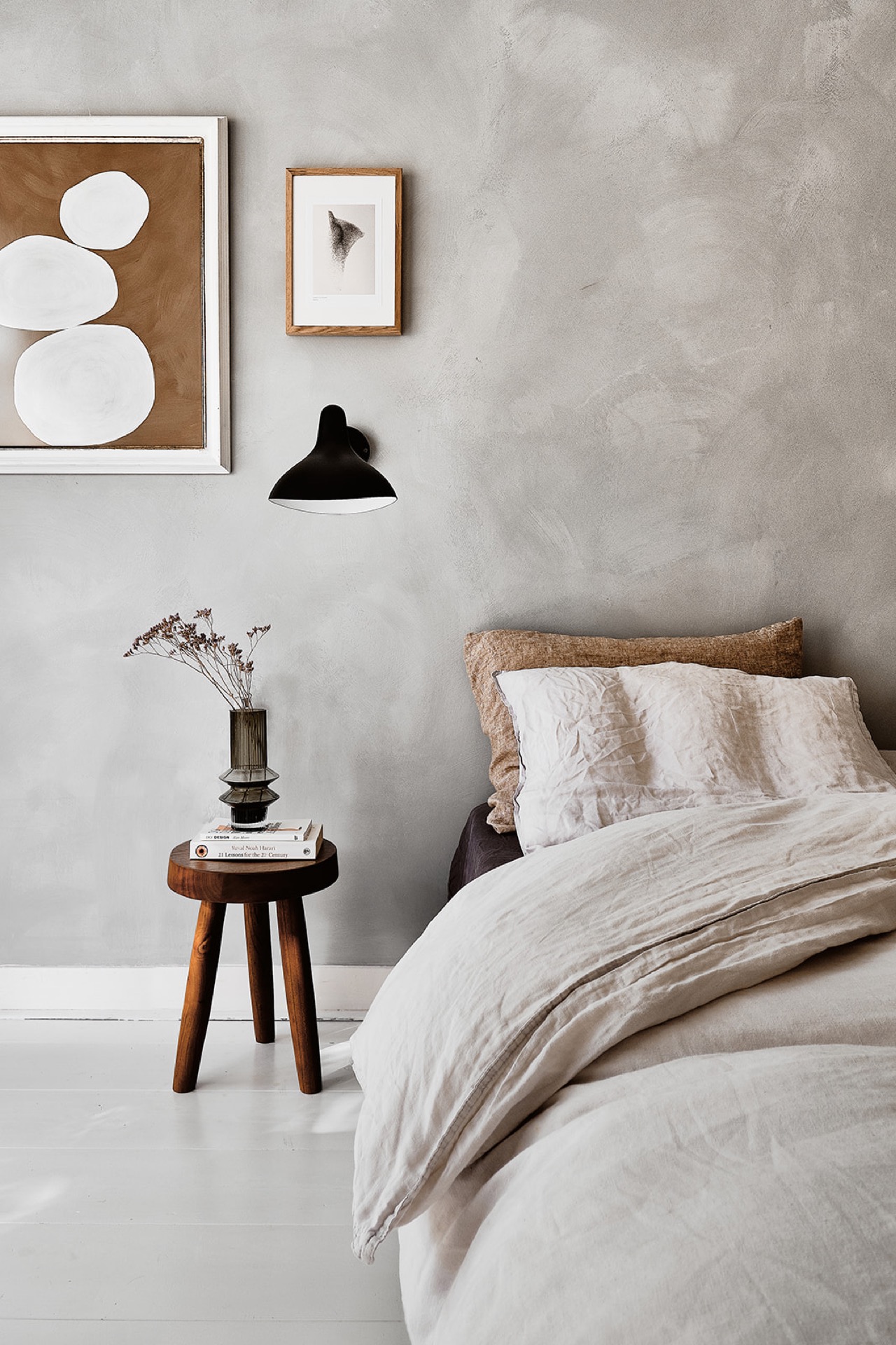
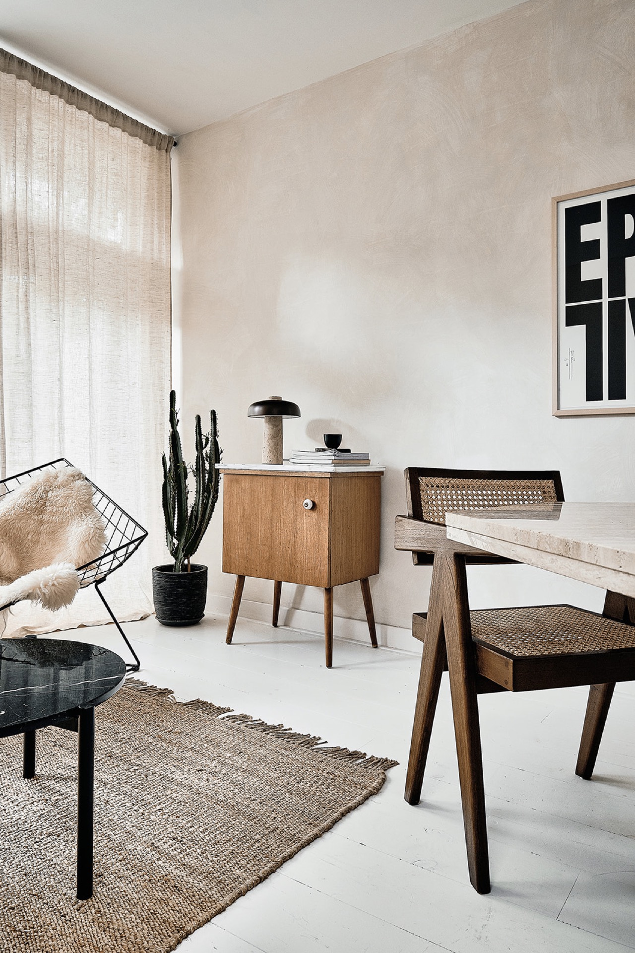
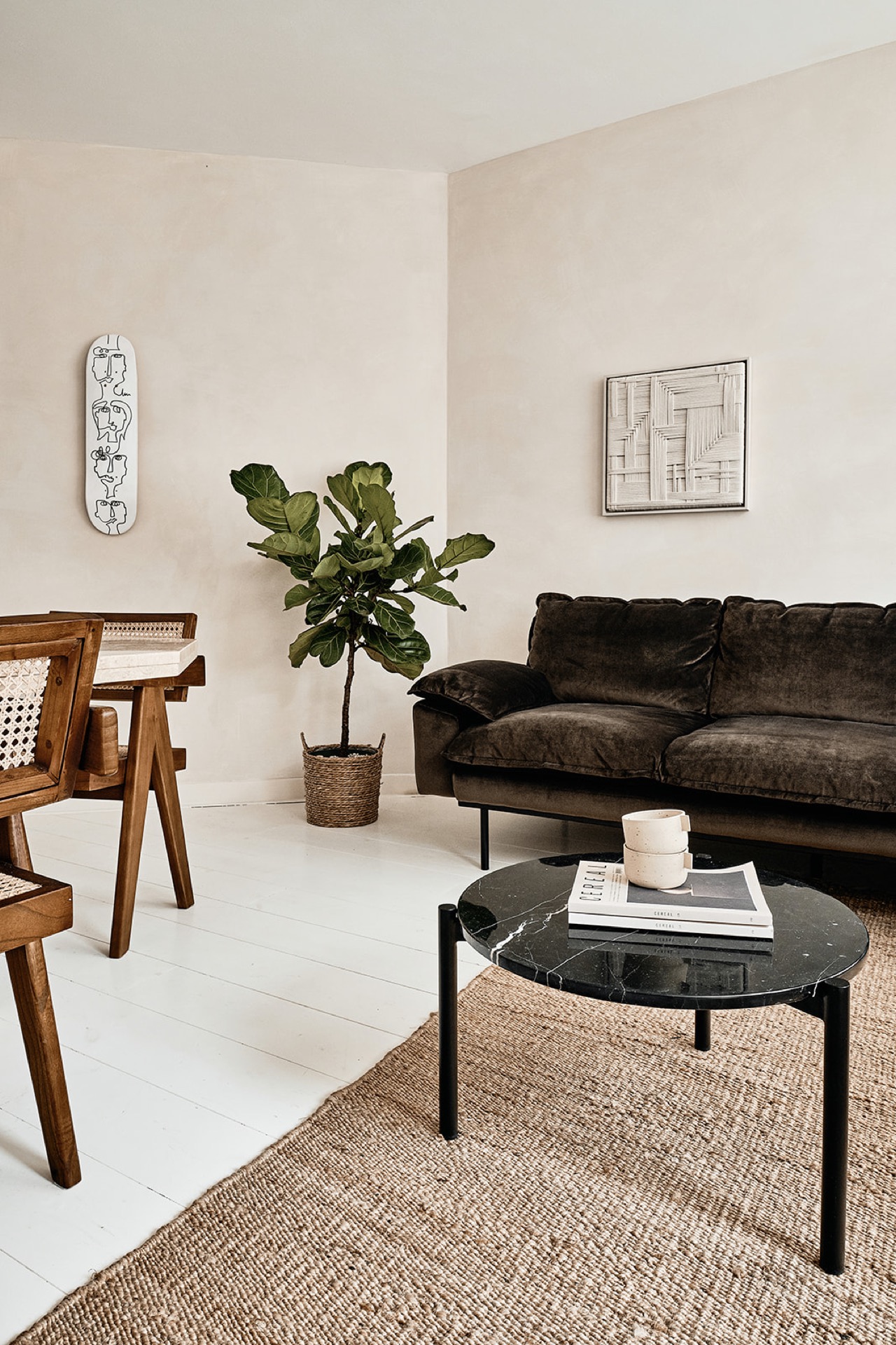
The first impression comes from the surfaces. Pale limewashed walls soften the edges of the rooms and let daylight travel farther than the apartment’s compact footprint would suggest. Against that quiet background, the textures do the work: linen on the bed, a woven rug underfoot, a velvet-like sofa in the living area and wood used where the eye naturally lands. This apartment renovation depends on those shifts in touch rather than on strong color contrasts, even though black details appear at several key points to sharpen the composition.
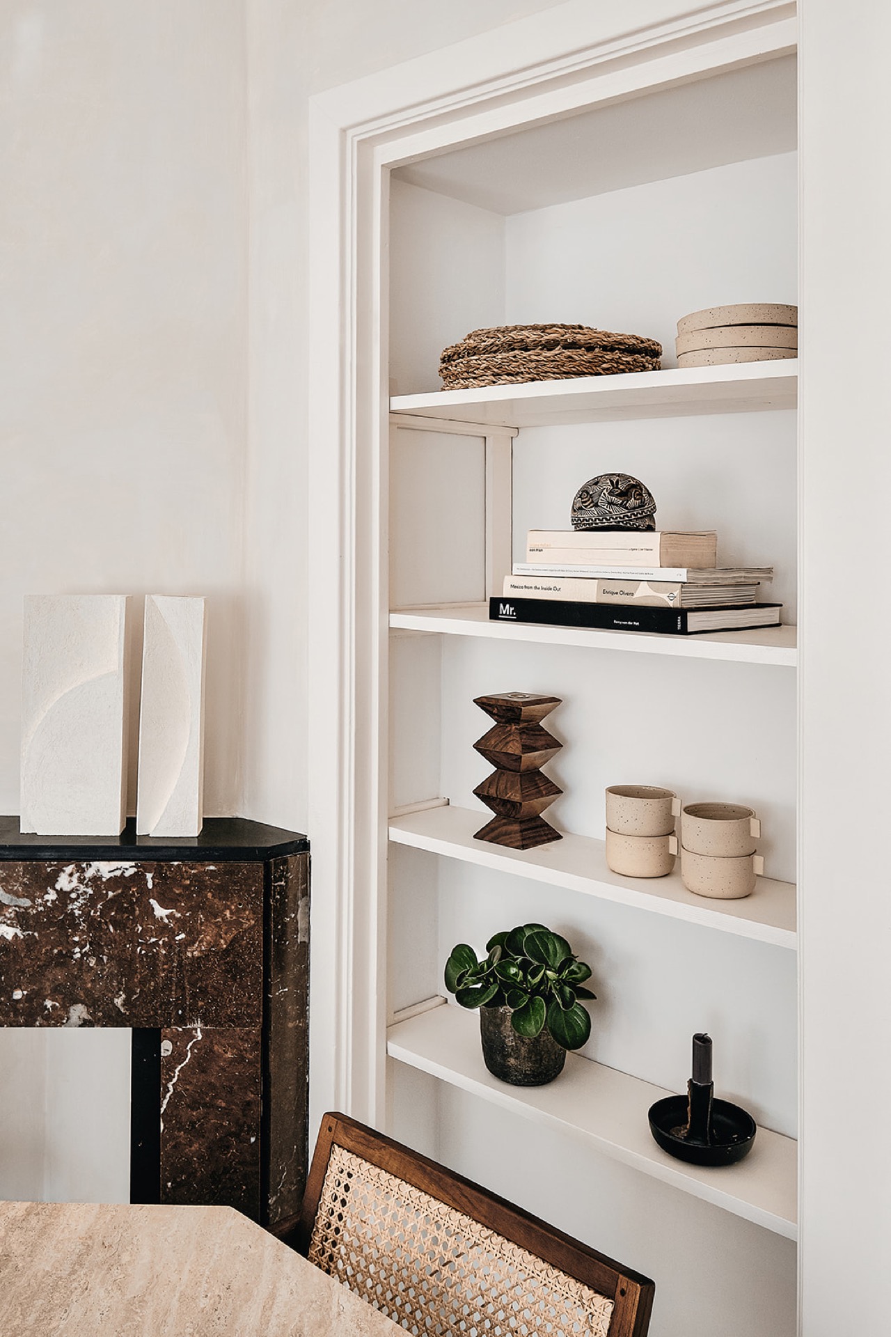
Original elements remain part of the story. The fireplace, finished in marble, and the decorative panels keep the apartment from feeling newly assembled. They read as fixed points in a layout that has otherwise been opened up. That balance gives the home its specific character: the walls have been adjusted, but the building’s age is still legible. It is a warm minimal interior, yet one with enough variation in surface and grain to avoid flatness.
An open-plan renovation shaped by daylight
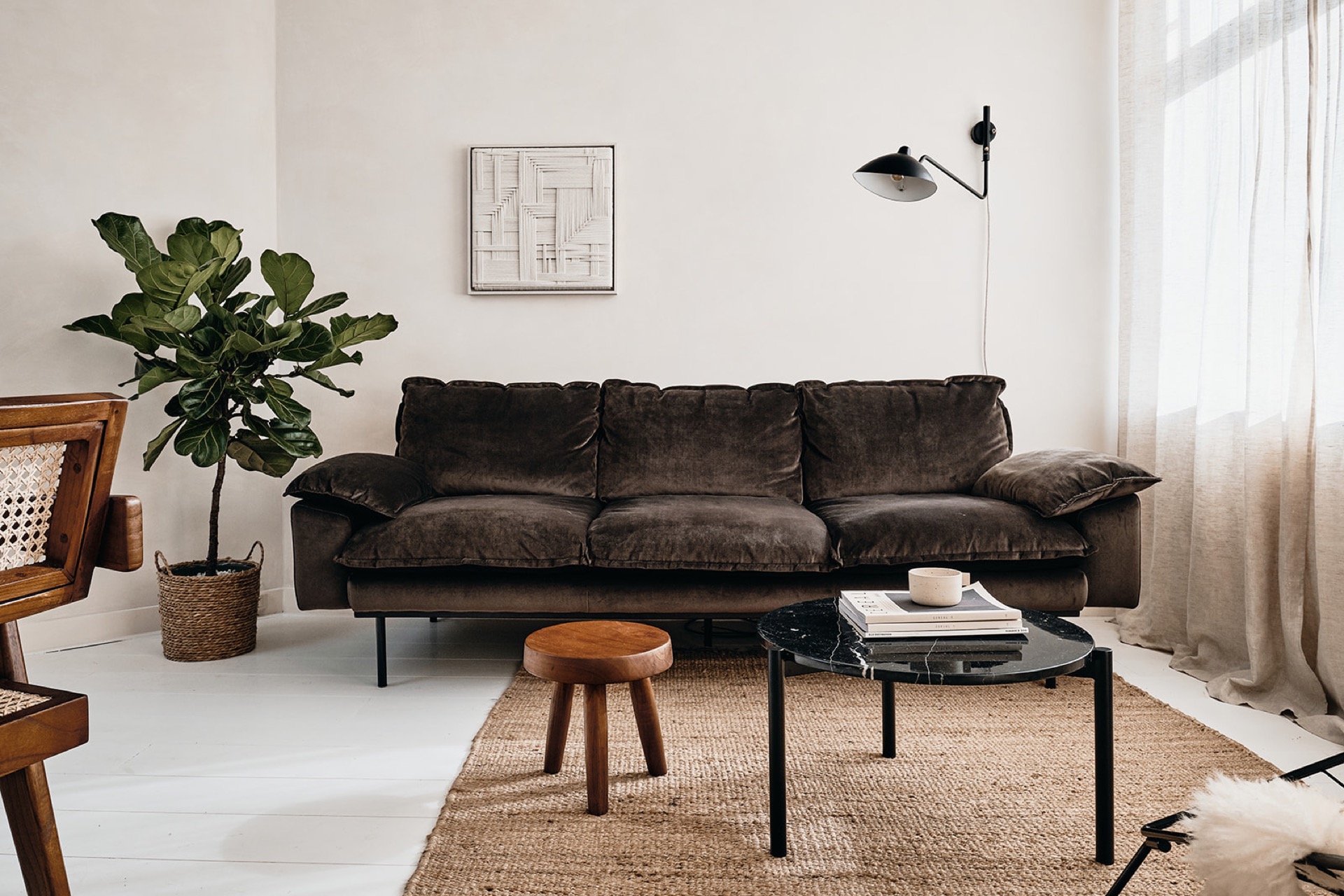
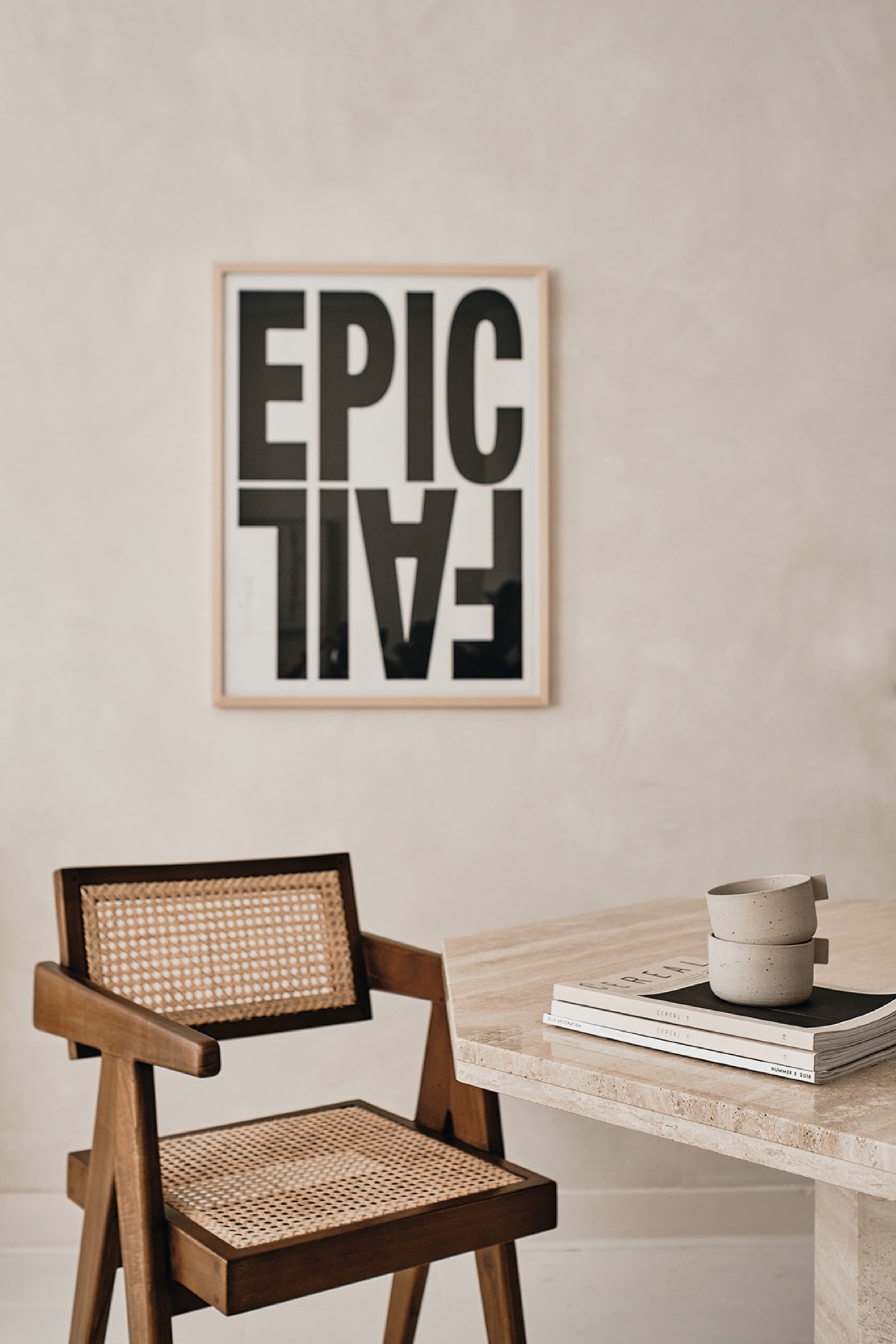
Daylight now runs through the living and dining area, with windows lining the room and reflecting off the soft wall finish. The opening between the zones is not dramatic; it is practical and calm, letting the apartment behave as one sequence instead of a set of closed-off rooms. The dining table in travertine, the mix of vintage chairs and modern seating, and the framed art on the wall give the space a collected look without crowding it. This is where the open-plan renovation becomes visible in daily use: a wider path, fewer interruptions, and a clearer view from one end of the apartment to the other.
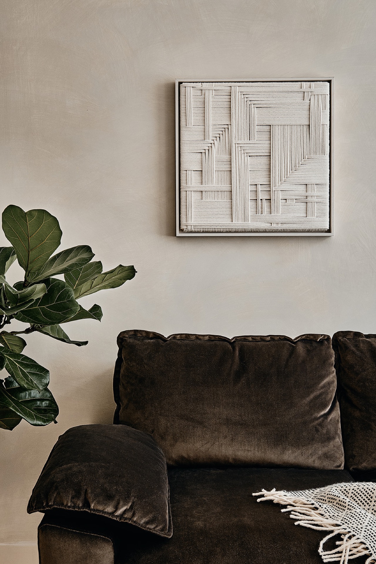
Furniture plays an important role in that reading. A dark sofa sits low against the pale wall, with a simple floor lamp and a large rug holding the seating area together. Nearby, a wooden chair with a woven seat adds another texture and keeps the room from becoming too smooth. The arrangement feels edited rather than staged. Vintage pieces sit beside newer forms, and the room carries that mix through scale, material and spacing instead of through decorative excess. It is an apartment renovation that trusts the plan as much as the objects placed inside it.
Kitchen joinery in wood and stone
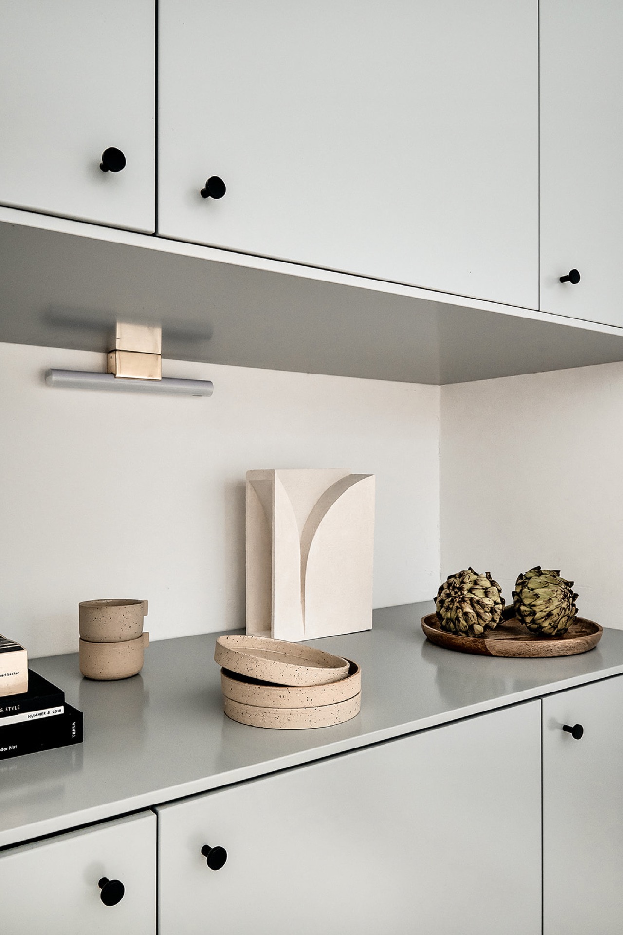
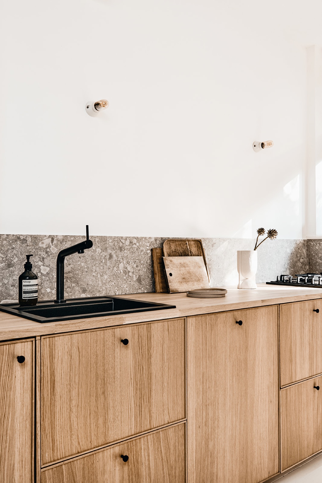
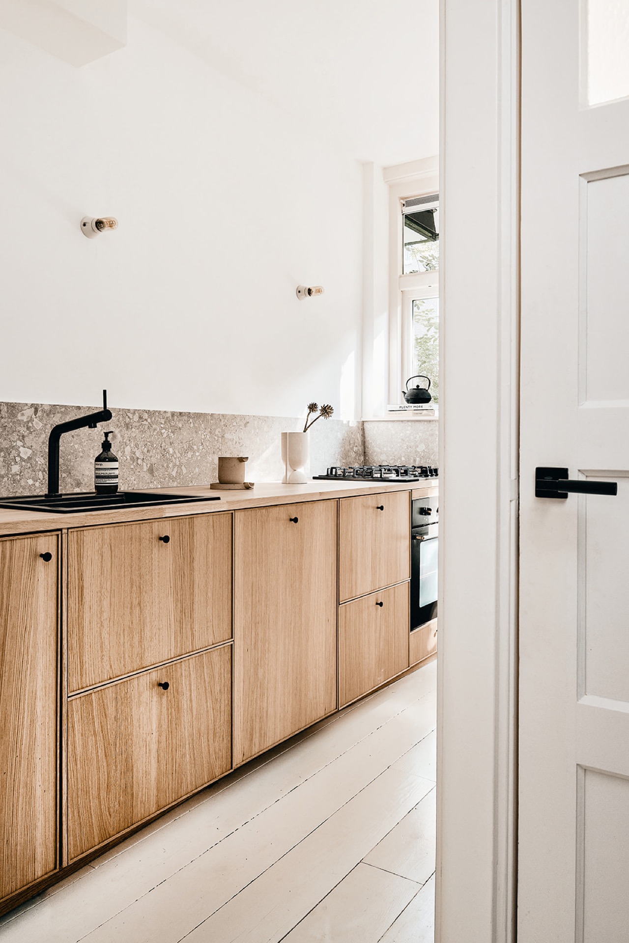
The kitchen was enlarged and given a solid center of gravity through a volume in oak. Its presence is immediate: the wood reads as one continuous block, then breaks into fronts, drawers and a work zone that feels built in rather than added later. Stone appears alongside it in a darker, speckled surface that gives the room weight and resists the lightness of the painted walls. Together, the materials form a wood and stone kitchen that relies on clean edges and clear junctions. Black tapware and small hardware details sharpen the lines without taking over the room.
What makes the kitchen work is the way it sits in daylight. The cooking area is close to the windows, so the cabinetry and the stone surface are seen in changing light across the day. In some views the wood fronts dominate; in others, the stone and the black fittings become the focus. Open shelving and recessed storage keep everyday objects close at hand while preserving the straight profile of the joinery. The materials stay legible, which matters in a compact apartment renovation where every surface has to earn its place.
Built-in storage without visual noise
Several details keep the kitchen from feeling crowded: round black knobs, slim cabinet lines, and a built-in niche that extends storage without adding bulk. The arrangement shows how much can be done with a small footprint when the joinery is precise. Even the tiled floor supports that reading, because it gives the kitchen a slightly cooler base while the wood cabinet faces hold the room together. In this context, the natural materials interior is not about abundance. It is about choosing a few surfaces and letting them carry the whole space.
A bathroom reduced to the essentials
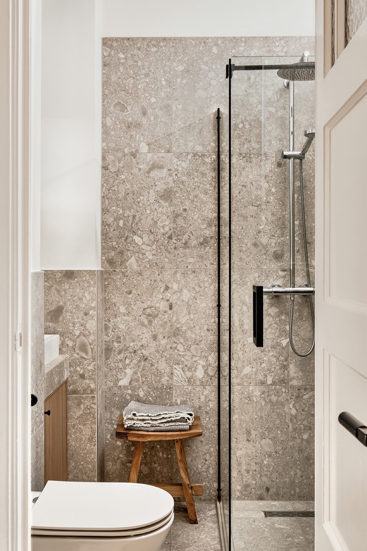
The bathroom follows the same discipline. It is compact, pared back and set up around a limited number of elements: stone-like surfaces, a vanity in solid oak, and matte black fittings that cut through the lighter background. A large glass shower screen with black profiles keeps the room visually open, even though the footprint remains small. That clear framing gives the bathroom a precise look and avoids any sense of overfilling. The apartment renovation carries its logic all the way into this room, where the materials are few but carefully placed.
Here, the contrast between stone and wood matters most. The vanity brings a warmer note to the harder finish of the walls and floor, while the dark tapware and shower framing draw attention to the edges rather than the volume. It is a restrained room, but not an empty one. Each element has a visible task: supporting the sink, defining the shower, or marking the line where one surface meets another. In a timeless apartment interior, that kind of clarity matters more than decoration.
Stone, wood and black hardware in close view
The bathroom also shows how the project uses contrast without overplaying it. The stone surface reads softly, not glossy; the oak vanity adds a grounded note; the black hardware introduces a sharper contour. Because the room is small, those differences are easy to read. Nothing competes for attention. Instead, the materials shift the eye from one plane to the next, from wall to basin to shower. That is what gives the room its quiet strength and ties it back to the rest of the apartment.
A collected mix of old and new pieces
The apartment’s final layer comes from the furniture and artwork. A curated mix of vintage and contemporary pieces keeps the rooms from feeling too fixed, and the selection works best where it meets the natural daylight and pale walls. A woven chair, a dark sofa, a travertine table and framed art each mark a different register: handmade, upholstered, stonelike, graphic. The mix is deliberate, but it never overwhelms the architecture. Instead, it sits inside the apartment renovation as another material layer, one that can change over time without undoing the plan.
That flexibility is part of what makes the interior feel settled. The home does not rely on one visual trick. It depends on light on limewashed walls, the grain of oak, the texture of stone, and the measured shift from closed rooms to a more open layout. Read that way, the project is a study in how a compact 1940s apartment can be opened up without losing its older references. The spaces remain clear, the materials stay honest, and the apartment moves with an easy rhythm from room to room.
Want to see more of Studio &Space? View the page of Studio &Space for even more great projects and company information.



NEW 2026 Jubileum Edition The Best Interior Designers Benelux
Order Now €125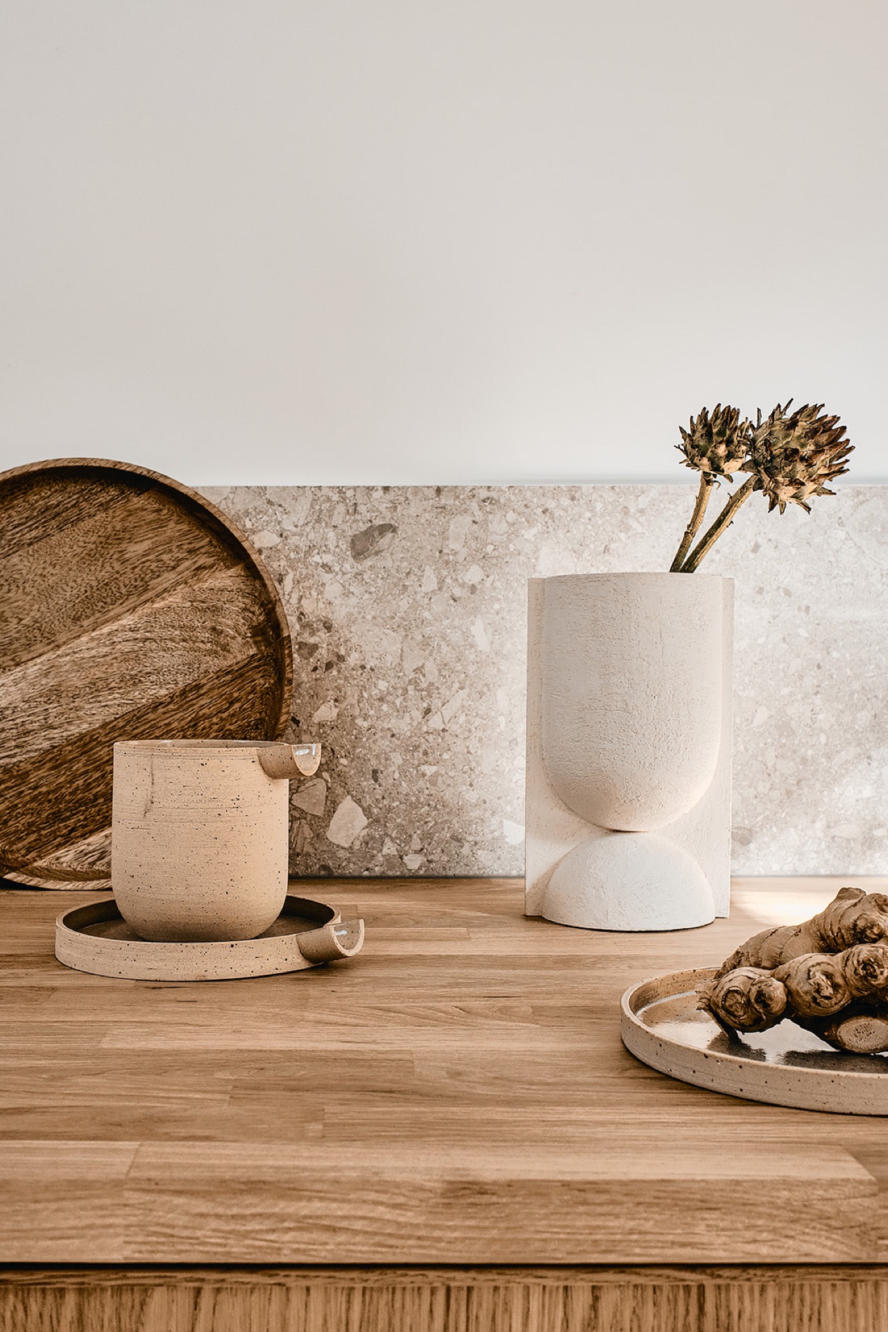
NEW 2026 Jubileum Edition The Best Interior Designers Benelux
Order Now €125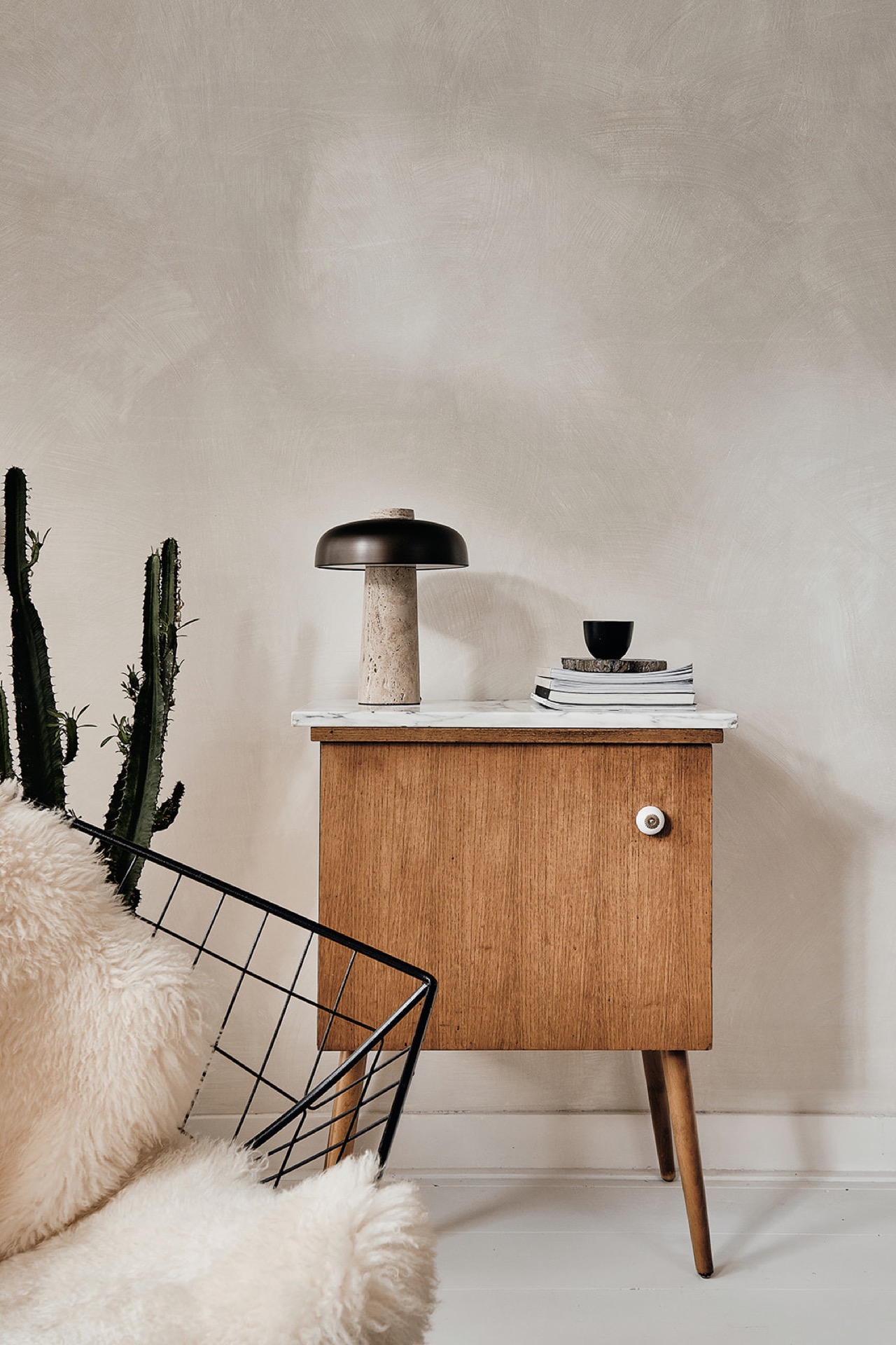
NEW 2026 Jubileum Edition The Best Interior Designers Benelux
Order Now €125