










Authentic home with British and Flemish accents
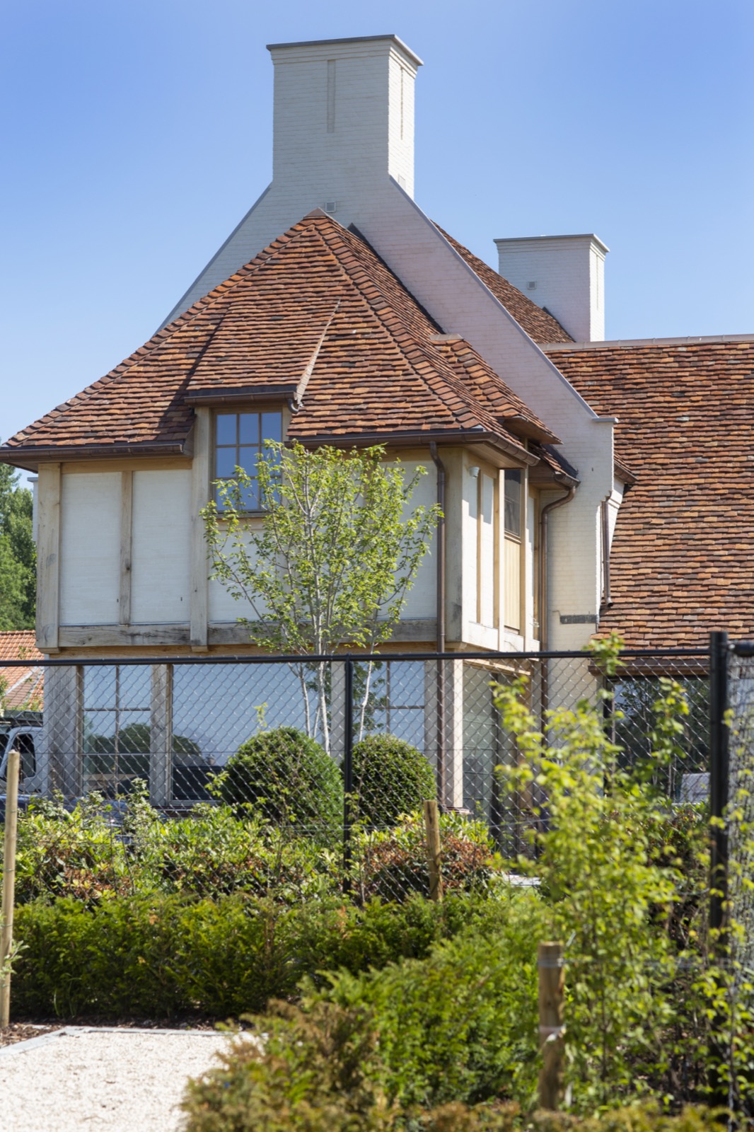
The first thing you notice is the contrast: white masonry, dark window frames, and a roofline softened by thatch. In this authentic home, the British Flemish style reads through the exterior in measured layers rather than loud gestures. Afrormosia appears in the joinery and gate work, while the black frames sharpen the openings and give the façade a firmer rhythm. The result is a house that looks settled into its plot, with each material placed where it can do its part visually.
Thatched roof sections and masonry with brick accents
From the street side, the thatched roof sections sit above white walls with brick accents at the base and around the openings. The material shift is clear: pale render, reddish brick, and the textured roof edge. That combination gives the house its British Flemish style without relying on ornament. The roof profile is broken up by chimneys and smaller roof elements, which makes the silhouette feel layered. It is a strong composition, but the materials keep it grounded.
The brickwork does more than frame the walls. It marks thresholds, grounds the façade, and gives the larger white surfaces something to lean against visually. Seen together with the thatch, it creates a house that moves between rural references and a sharper exterior finish. The eye travels from the roof down to the openings, then back to the garden edges, where the same sense of order continues in the paving and planting.
Black window frames against large glazed openings
Black window frames draw a precise line through the elevations. Against the white render, they read almost like drawn contours, especially where large glazed openings take in the garden view. The frames are not there to disappear. They set the proportions of the house and make the openings feel deliberate. In several views, the dark joinery also ties the lower brick band to the upper roofscape, so the eye moves through the whole façade instead of stopping at a single detail.
Custom windows and doors in Afrormosia and black lacquer
The custom windows and doors are where the house becomes more specific. The project text refers to natural Afrormosia and black lacquered finishes, and that pairing is visible in the joinery language: warm wood next to dark painted surfaces, then back to glass. Afrormosia brings a distinct timber grain to the exterior details, while the black finish gives the openings a cleaner edge. Rather than competing, the two materials separate functions clearly. One carries warmth in the woodwork; the other keeps the outline sharp.
This is also where the house’s British Flemish style feels most resolved. The joinery is not decorative add-on work. It shapes how the house is read from the garden, from the terrace, and from the access points to the site. Doors, windows, and gate elements repeat the same material discipline, which makes the exterior feel consistent from one side of the property to the other. The effect comes from repetition of parts, not from a single showpiece.
Afrormosia sliding gate and wooden garden gate details
The Afrormosia sliding gate closes the composition with the same timber tone used elsewhere. In the images, the gate appears as vertical slats with dark accents, a piece of joinery that has to carry both access and enclosure. Nearby, a wooden garden gate works with the same language of slim uprights and measured spacing. The darker hardware and technical elements stay visually secondary, which lets the timber surface remain the main reading from a distance.
Seen up close, the gate work is about proportion as much as material. The vertical rhythm of the slats echoes the narrow black frame lines in the house itself. That echo matters. It links the perimeter to the building and keeps the entry sequence visually aligned with the rest of the property. The timber does not try to imitate the masonry or the roof; it simply gives the access side its own clear presence.
Terrace edges, paving, and the in-ground pool
The garden opens onto a terrace with a firm, paved surface and a clear edge around the in-ground pool. The pool sits low in the landscape, surrounded by trimmed lawn and hardscape that keeps the setting legible. Steps, paving joints, and changes in level give the outdoor space a practical order, but the most striking part is how the water plane reflects the darker openings of the house. The house and garden read as one route, linked by line and surface rather than by decoration.
Stone-like paving appears around the terrace, with textures that sit comfortably beside the grass and the timber elements. The palette stays restrained: white wall, black frame, natural wood, pale paving, green lawn, blue water. Because the materials are limited, the difference between them becomes sharper. The pool is not tucked away as an afterthought; it occupies the central garden zone and gives the exterior views a clear focal point when seen from the house and from the access side.
Covered terrace and arch-shaped opening
The covered terrace introduces another layer to the exterior sequence. A timber roof structure marks the sheltered zone, and an arch-shaped opening nearby softens the more rectilinear parts of the elevation. That curve matters because it interrupts the straight lines of the frames and roof edges without breaking the overall order. The opening reads as part of the building, not a separate gesture, and the timber structure above it adds depth to the terrace edge.
Photographing the house from different sides makes that layering clear. One view emphasizes the roof and the black frames; another focuses on the pool and terrace; a third brings the gate work into the foreground. Across all of them, the same vocabulary repeats: thatch, brick, white masonry, dark joinery, Afrormosia, and glass. It is this repetition that gives the authentic home its clarity, with the British Flemish style carried through the exterior, the access points, and the garden edge.
Want to see more of Pouleyn? View the page of Pouleyn for even more great projects and company information.

Contributors



NEW 2026 Jubileum Edition The Best Interior Designers Benelux
Order Now €125


NEW 2026 Jubileum Edition The Best Interior Designers Benelux
Order Now €125


NEW 2026 Jubileum Edition The Best Interior Designers Benelux
Order Now €125


