










Black metal glass wall in a luxury interior
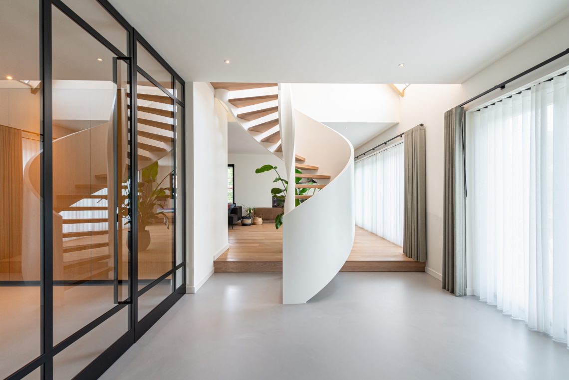
The black metal glass wall sets the pace the moment you enter. Its slim profiles divide the glazing into clear panes, so the room reads in layers rather than as one open sweep. Behind it, a brown-toned natural stone accent wall and warm pendant light give the scene a grounded backdrop, while the wood floor carries the view forward. The result is not loud. It is exact, with every line visible.
Large glazed partition with a measured grid
The central element is a glass partition wall built from narrow black metal members. The muntin-like divisions break up the large panels into smaller fields, which gives the wall a calm rhythm without making it heavy. Seen from different angles, the structure acts almost like a frame for the rooms beyond. In the wider shots, it also sets up a clear contrast between dark profiles, pale walls, and the continuous wood flooring beneath.
That contrast does most of the work. The glass stays transparent enough to keep sightlines open, yet the black grid gives the partition presence. In one view it reads as a barrier; in another, as a connector between adjacent living zones. The detail shots make the profile depth visible, along with the way the horizontal and vertical bars meet. It is the kind of glass partition wall that shapes a room by line rather than by bulk.
Profile lines that stay visible
The muntin detail is one of the strongest visual cues in the project. Instead of disappearing into the background, the black metal lines draw a precise framework across the glass. That structure is especially clear where the light catches the reflections in the panes. The composition feels measured, but not rigid, because the glazing keeps the surface light and the lines remain narrow. It is a restrained way to introduce a steel-like interior element without overwhelming the rest of the room.
Classic ceiling ornament above a contemporary frame
Above the glass wall, the ceiling brings another register into the room. Plaster ornament, perimeter molding, and a decorated edge give the upper surface depth. The ceiling does not compete with the partition; instead, it extends the room upward and makes the proportions feel more deliberate. In several images, the ornamental trim runs cleanly across the frame, so the meeting point between old-style detailing and the black metal structure becomes part of the composition.
The ceiling detail is important because it changes how the partition is read. Against the ornamented surface, the black frame looks sharper and more graphic. Under warmer lighting, the same frame becomes less severe and more architectural. The project relies on that shift. The glass wall and the classic ceiling ornament work in separate languages, yet they share the same discipline of line, edge, and repetition.
Stone, wood, and warm light in the same view
The natural stone accent wall introduces a brown, textured surface beside the glazed division. Its tone is deeper than the surrounding walls, and that depth gives the room a clear anchor. In the photographs it sits close to the glass wall, so the smooth transparency of the panels meets the more solid reading of stone. That pairing matters. It keeps the interior from becoming visually flat and gives the room a clear foreground and background.
Wood flooring runs through the scenes and softens the sharper geometry above it. The floorboards are visible in every overview, which helps the room feel continuous even when the glass wall splits the plan. Warm pendant and chandelier light adds another layer. The fittings reflect in the panes and lift the darker frame, especially where the stone wall and ceiling trim are both visible. The light does not wash everything out; it leaves the materials legible.
Material contrast at eye level
At eye level, the project is built from opposition. Glass stays open, metal draws the edge, stone holds the background, and wood carries the base. None of these surfaces are decorative on their own, but together they create a room with depth and clear boundaries. The black metal glass wall becomes the organizing line, while the stone accent wall and the ceiling ornament give the interior a more layered reading. The camera records those shifts clearly in both the wide views and the close-ups.
How the partition changes the room
Because the partition is glazed, it separates without shutting down the view. That is visible in the way one room can still be read from another, even when the black frame stands between them. The layout feels more structured, but not closed. Furniture glimpsed beyond the glass sits in a quieter field of view, which makes the partition do more than divide space. It organizes what you notice first, then what you discover second. That sequence gives the interior its pace.
The widest images show the partition as part of a larger living setting, while the detail images focus on the grid itself. Together they explain the project well. One set of photographs shows atmosphere and proportion; the other shows joinery, profile width, and pane division. Taken together, they point to a bespoke glass wall rather than a simple screen. The finish is carried by the precision of the metalwork and the way it sits against the ceiling trim and wood floor.
A layered interior built from clear lines
What stays with you is the sequence of surfaces. Black metal. Glass. Plaster ornament. Brown stone. Wood underfoot. The room moves between those materials without losing its clarity. The black metal glass wall is the sharpest element in the composition, but it works because the surrounding details are equally specific. The classic ceiling ornament keeps the upper edge busy, the natural stone accent wall gives the room weight, and the light reflects softly across the glazing. Nothing is overdrawn, yet every part has a role in the view.
Seen as a whole, the project is less about one feature than about how that feature sits inside the room. The glass partition wall defines the circulation and the sightlines. The black grid gives the interior a clear profile. The ceiling decoration and stone surface add texture without clutter. It is a measured interior, built from visible joins, direct material contrasts, and a layout that lets each surface read on its own.
Want to see more of Preferro? View the page of Preferro for even more great projects and company information.




NEW 2026 Jubileum Edition The Best Interior Designers Benelux
Order Now €125


NEW 2026 Jubileum Edition The Best Interior Designers Benelux
Order Now €125


