Classic custom kitchen in white and dark tones
Dark granite cuts a steady line through the room, while white paneled cabinets lift the walls and keep the long runs from feeling heavy. The contrast is immediate, especially around the island, where a darker base and worktop anchor the centre of the space. This classic custom kitchen is built from those two tones, then sharpened with gold hardware, crown molding, and the sort of framed doors that make the cabinet fronts read almost like furniture.
A kitchen layout built around contrast
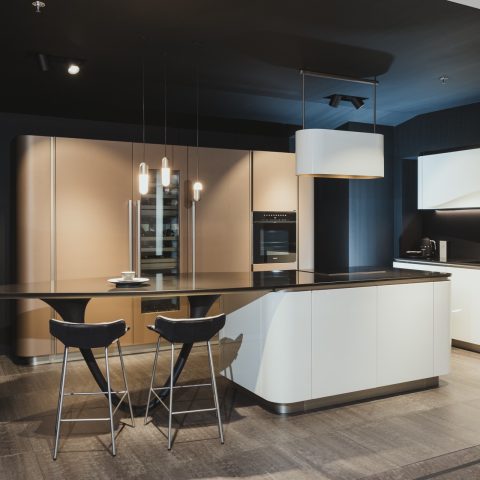
The eye moves from the island to the surrounding wall cabinets in one sweep. On one side, black side gloss defines the Fairmont model and its buffet cabinets; on the other, the Long Island kitchen keeps the palette lighter with a white side gloss finish. The shift between dark and light is not decorative noise. It helps separate functions: cooking, storage, serving, and the glazed cabinet sections that break up the longer walls.
Seen as a whole, the room feels composed through repetition rather than excess. Paneled cabinet doors appear across the main runs, then return in the buffet cabinets with their glazed upper sections. The same language is used again in the pilasters and crown molding, which frame the tall units and draw the cabinetry upward. It is a classic custom kitchen, but one that stays grounded in the actual shape of the room, with a clear island centre and measured wall composition around it.
The island as a dark centrepiece
The kitchen island carries the darker finish and gives the room a clear anchor. Its granite countertop reads as a single, solid plane, and the overhang creates a practical edge for seating without interrupting the block-like presence of the island itself. Above it, a row of pendant lights with white shades adds a lighter band at eye level. The contrast between the hanging glass, the dark top, and the painted cabinetry below keeps the middle of the kitchen visually active.
That island also sets up the circulation. It leaves a generous passage around the work zone and creates a direct view toward the main cabinetry and the glazed buffet sections. In the images, the island sits comfortably between the cooking wall and the room beyond, where the floor’s brown wood look softens the harder lines of stone and paint. It is one of the clearest signs that this classic kitchen with island has been planned as a working room rather than a display of isolated pieces.
Buffet cabinets with glass and framed doors
The buffet cabinets are not treated as an afterthought. They extend the cabinetry language into a storage wall with glass fronts and paneled doors, using the same dark model as the island and the same classic framework around each opening. Glass inserts lighten the larger volumes and offer a pause between the solid cabinet runs. In the wider photographs, these units help balance the kitchen’s scale, especially where the wall height meets crown molding and the upper trim lines.
At the same time, the buffet cabinets work visually with the rest of the room. Their darker tone repeats the island, while the framed fronts keep them in step with the white cabinetry elsewhere. The effect is not symmetrical, but it is deliberate. The room uses repetition, not mirroring, to hold itself together. That makes the classic custom kitchen feel tailored to the architecture of the space rather than assembled from separate sets.
Paneled cabinet doors and gold hardware
Close up, the details do most of the work. The paneled cabinet doors have defined borders that catch the light differently from the flat paint surfaces, and the gold hardware adds small points of reflection across the run of cabinets. Handles and knobs are used consistently, which gives the kitchen a clear visual rhythm. Even when the eye passes the oven and the cooktop, the hardware keeps the cabinet fronts from flattening into a single field of color.
The same attention to trim appears in the crown molding kitchen detail above the tall units. Those upper lines pull the cabinetry into the room’s height and frame the classical proportions of the kitchen. Pilasters reinforce that reading, especially where the cabinets are grouped into taller compositions. Nothing here feels exaggerated. The detailing is there to describe edges, corners, and transitions, and that is what gives the room its strong outline.
Cooking wall, granite and built-in appliances
The cooking zone is built into a dark-backed wall where the granite countertop continues its line beneath the appliances. The La Cornue range sits within that composition as a solid block, while the Miele appliances are integrated into the surrounding cabinetry. Their dark fronts keep them visually close to the rest of the room. In the images, this area reads as a compact work wall with enough trim and framing to make the equipment feel embedded rather than added on.
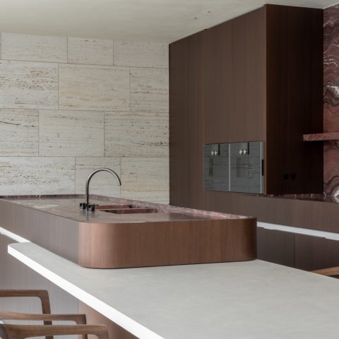
Granite surfaces appear again at the sink area, where the worktop meets the window niche and the lowered line of the cabinetry. That repetition of stone gives the kitchen a steady horizontal axis. It is especially visible in the images where the countertop turns at the corner and holds the sink below the window. The kitchen with granite countertop uses that material not as a highlight, but as a continuous surface that links the separate zones together.
Window niche with shutters and a framed sink wall
The window niche brings in another layer of structure. Shutters sit within the opening, and the surround is built up with moulded trim that matches the rest of the room. Below it, the double sink sits in a dark worktop, with the faucet placed centrally against the light from the window. This is one of the quieter parts of the kitchen, but it carries some of the clearest detailing. The niche softens the wall without losing the strict cabinet geometry around it.
The same framed approach appears in the surrounding cabinetry, where the upper and lower units hold the opening in place. The shuttered window is not left bare; it is treated as part of the composition, with the trim and the stone edge tying it back to the rest of the room. That makes the kitchen with buffet cabinets and the adjacent sink wall read as one connected sequence, even though the functions change from storage to preparation to washing.
A classic custom kitchen shaped by light and finish
Light has a practical role here, but it also alters how the finishes are read. The white cabinetry lifts the long walls, the darker model pulls the island and buffet units into focus, and the pendant lights break the ceiling plane with soft circles below them. In the images, the white shades sit above the island like a second, lower rhythm, while the framed cabinet doors and crown molding keep the upper edges controlled. The room depends on that layering of surfaces, not on decoration alone.
What remains after the eye has moved through the room is the structure of the kitchen itself: contrasting cabinet colors, an island with a dark top, glazed buffet cabinets, and a sink wall set into a window niche. This classic custom kitchen uses those elements to build a clear, readable interior. Every part has a visible role. Nothing is hidden by flourish, and nothing is left without a frame.
More information about this project
Want to see more of Tieleman Keukens? View the page of Tieleman Keukens for even more great projects and company information.




NEW 2026 Jubileum Edition The Best Interior Designers Benelux
Order Now €125


NEW 2026 Jubileum Edition The Best Interior Designers Benelux
Order Now €125