Converting a GP practice into a home with a minimalist white-and-wood interior
A clinical shell turned into a lived-in interior
The first thing you notice is the white surface holding the light. It sits against the continuous wood parquet flooring and makes the former practice feel much more like a home than a medical interior. In this convert GP practice into a home project, the shift is not made with decorative gestures. It comes through proportion, surface, and the way one room leads into the next. The result is a practice-to-home conversion where the structure stays calm, but the reading of the space changes completely.
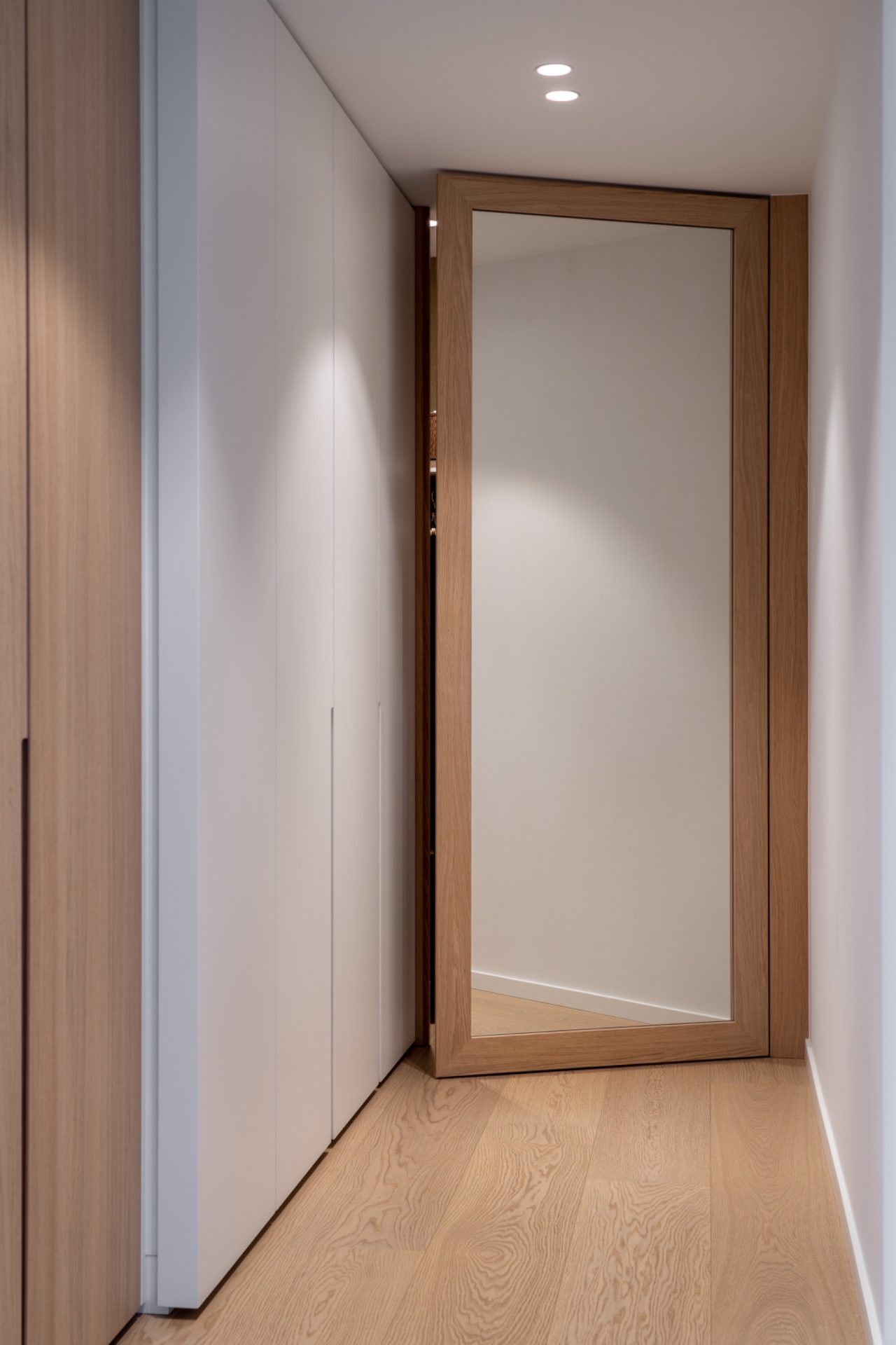
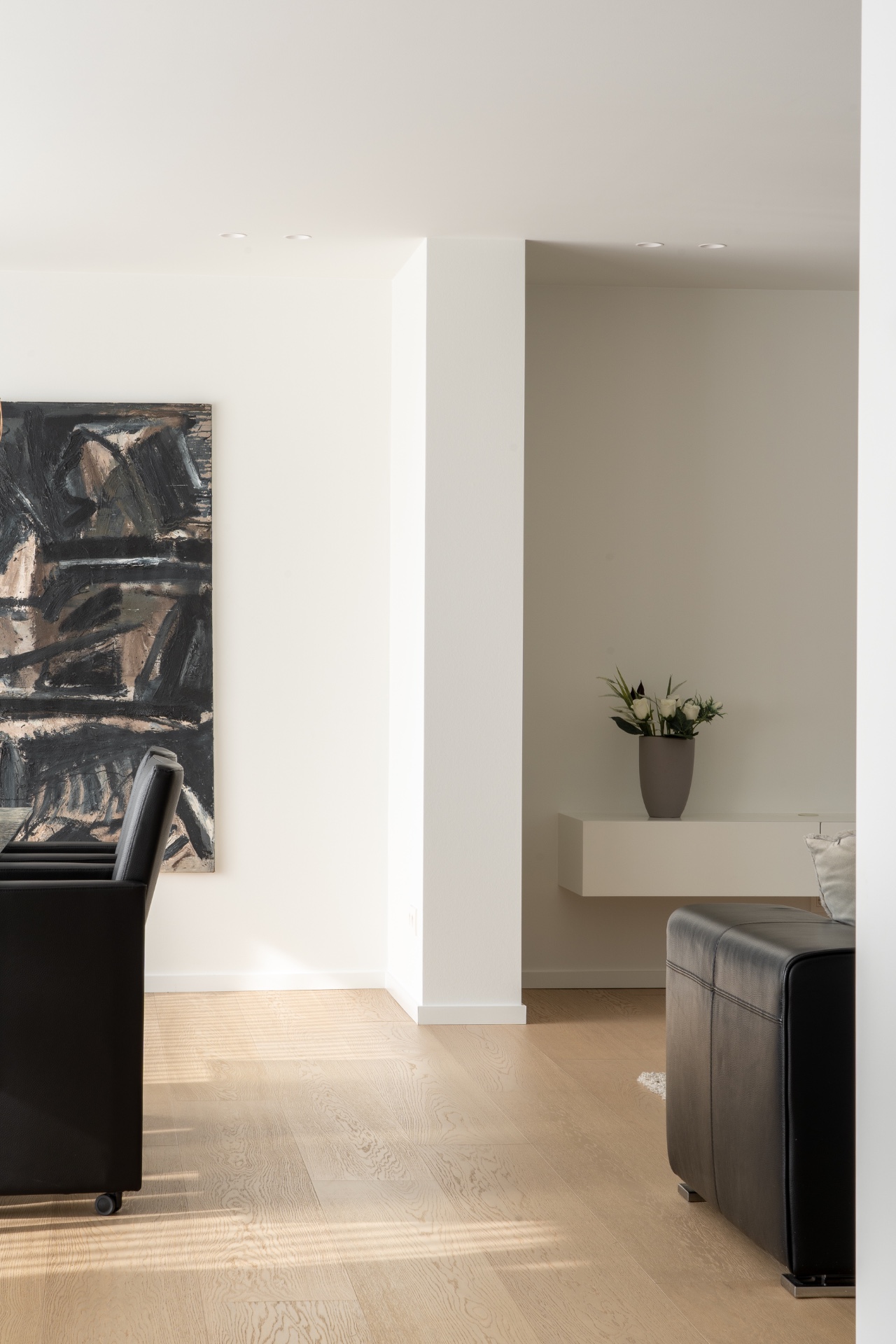
White walls set the tone, yet they never feel empty. Their role is to sharpen the edges of the room, catch daylight, and leave enough quiet around the furniture and wall openings. Against that backdrop, the wooden floor softens each passage. The grain runs through the plan without interruption, so the rooms do not read as separate units. Instead, the floor ties the interior together while adding a visible texture underfoot.
White walls and wood that carry the day-to-day rhythm
The material palette is spare, but it is not flat. White painted walls define the larger surfaces, while the wood floor introduces a warmer register at ground level. That contrast does most of the work here. It gives the interior a clear order and lets the rooms remain bright without feeling severe. In this minimalist home white and wood are not treated as a style label; they are the visible tools that turn a former clinic into a domestic sequence of spaces.
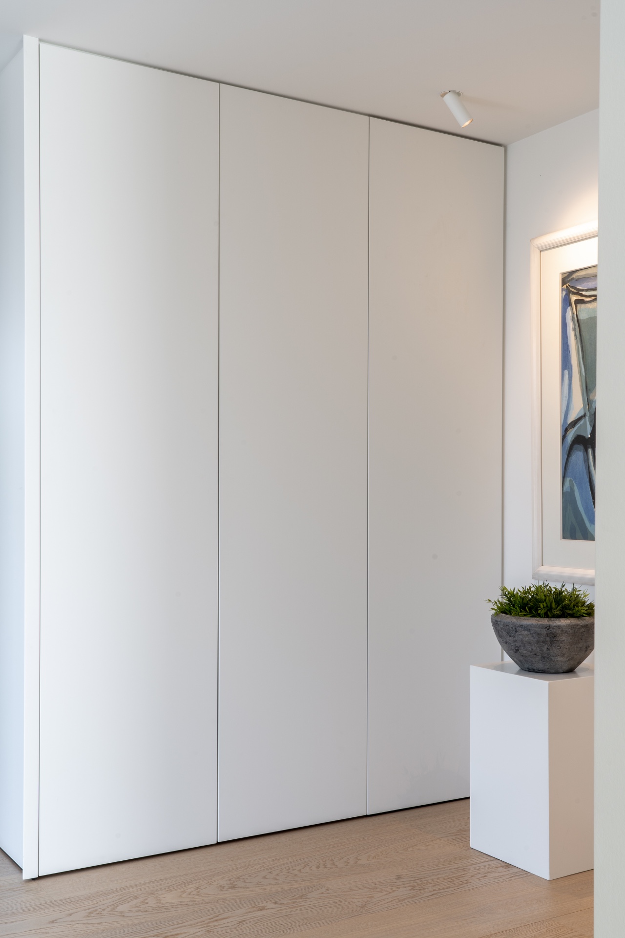
Several rooms use white built-in cabinets to hold storage close to the wall. Their vertical joints and flush fronts keep the surfaces disciplined, especially in the areas where the ceiling lights and openings might otherwise add visual noise. The cabinetry blends into the room rather than standing out as furniture, which leaves more of the wall plane intact. That is important in a plan where the eye is guided by long lines, solid volumes, and open passages instead of ornament.
Hidden openings, fewer interruptions
Concealed doors in interior walls help the plan stay readable. When a door sits flush with the wall, the surface extends farther and the room feels less broken up. Here that choice reinforces the quiet rhythm of the interior. It also keeps attention on the larger gestures: the long wall planes, the floor that runs on, and the openings that frame the next space. The building’s former clinical logic disappears from view without the need for dramatic alteration.
This kind of detailing matters because the house depends on visual continuity. A concealed opening does not ask for attention every time someone passes through it. It simply allows movement to happen without interrupting the wall. That restraint gives the rooms a measured pace. The architecture remains present, but it stays in the background while art objects, furniture, and the shifting daylight take the lead.
A kitchen anchored by stone-look surfaces
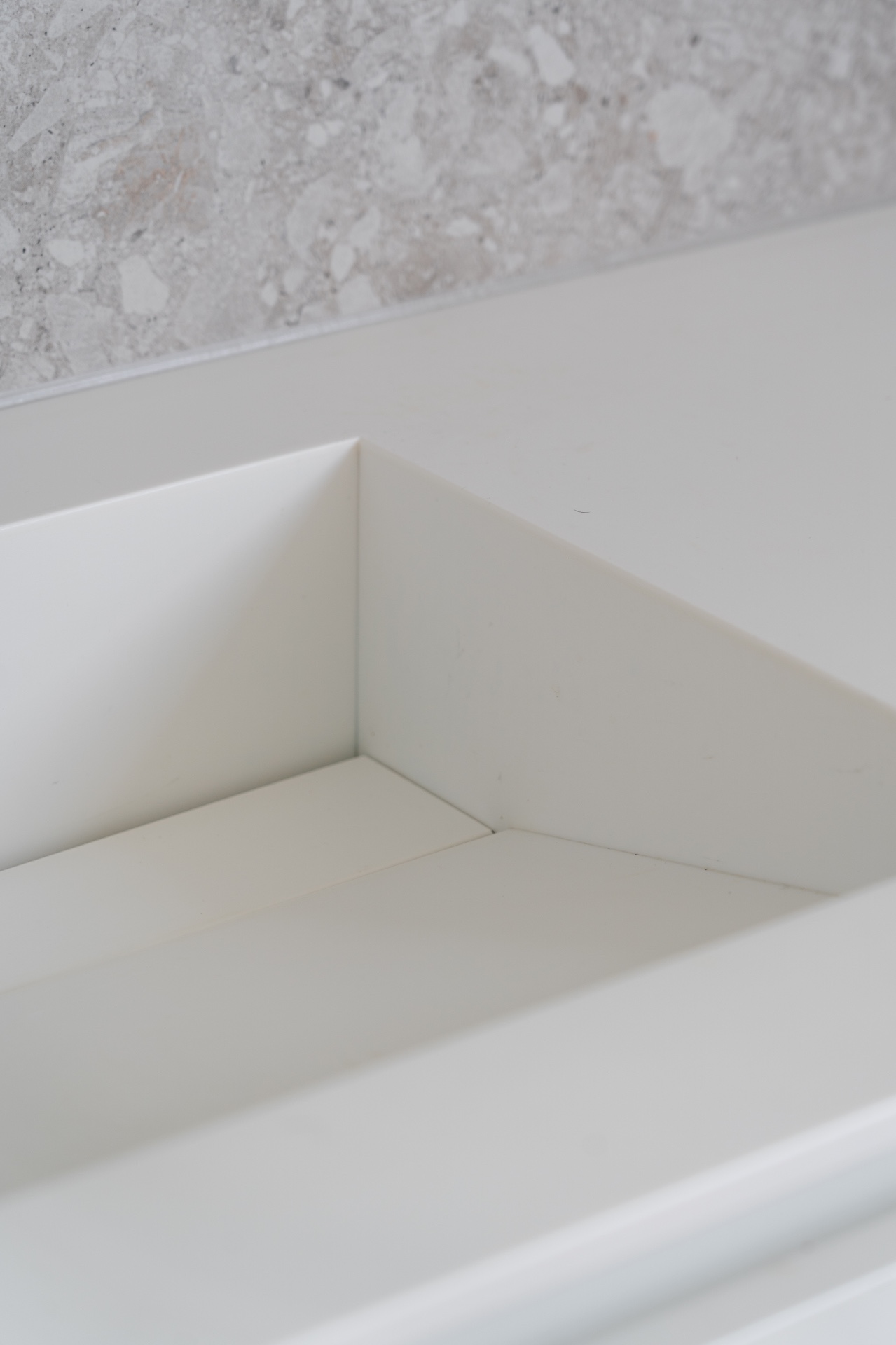
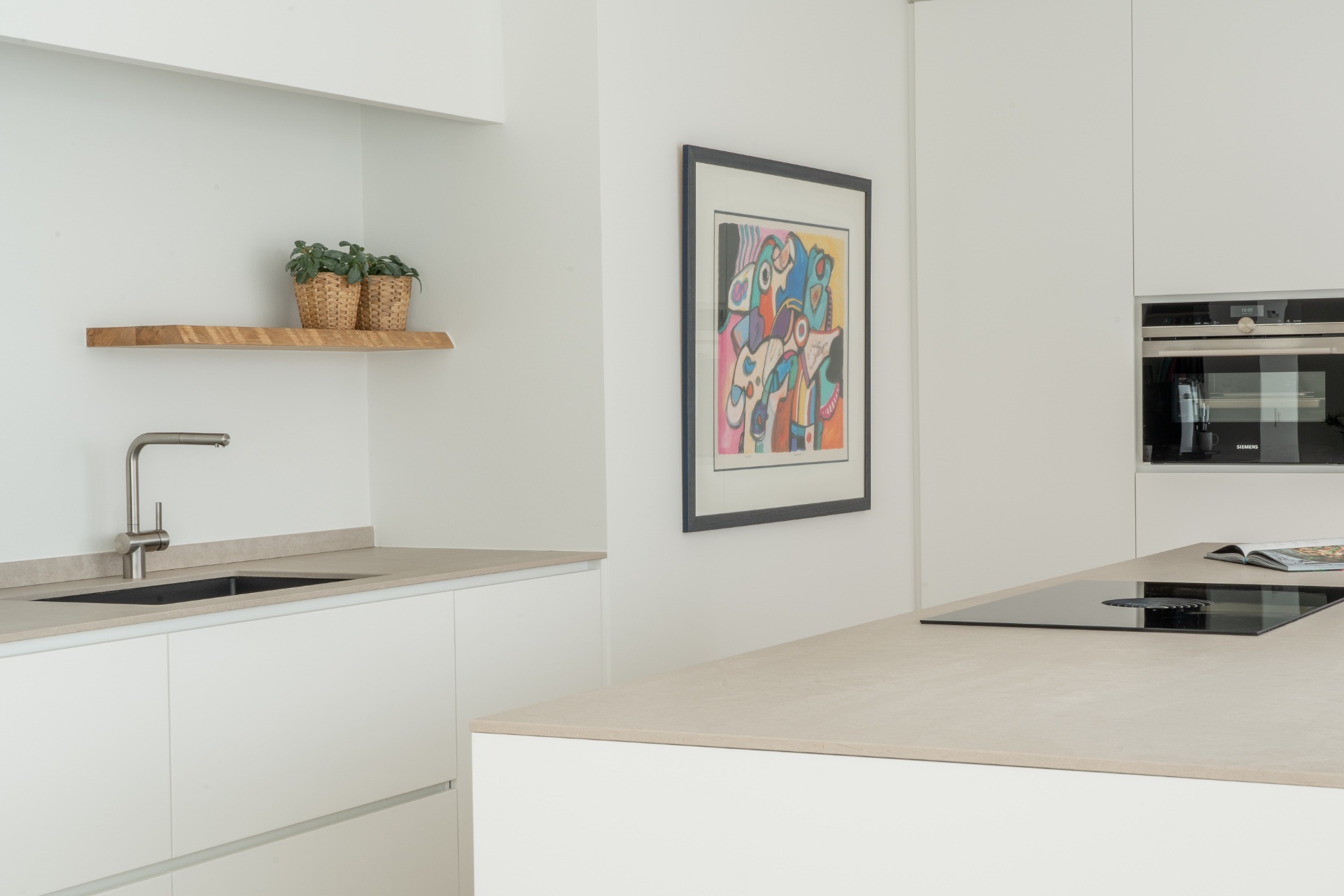
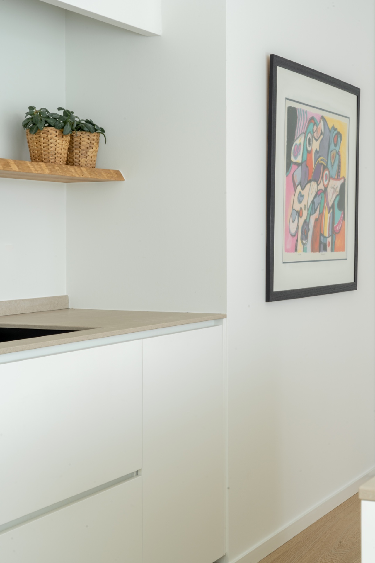
One of the clearest visual anchors is the kitchen. The work zone is defined by a modern kitchen stone-look countertop, paired with a stainless-steel sink area and crisp white cabinetry. The stone-like surface gives the room a denser note than the floor below it, especially where the tap and sink break the plane. It is a practical zone, but it also acts as one of the few places where the material contrast becomes more concentrated.
The kitchen wall treatment stays calm, with white panels and a small shelf line carrying just enough detail to avoid a blank surface. Because the fronts are kept plain, the countertop and sink become the main focus. The edge of the worktop, the line of the basin, and the reflection in the metal fittings give the room a clear graphic order. It is a kitchen that sits easily inside the wider interior rather than standing apart from it.
Storage walls and framed views
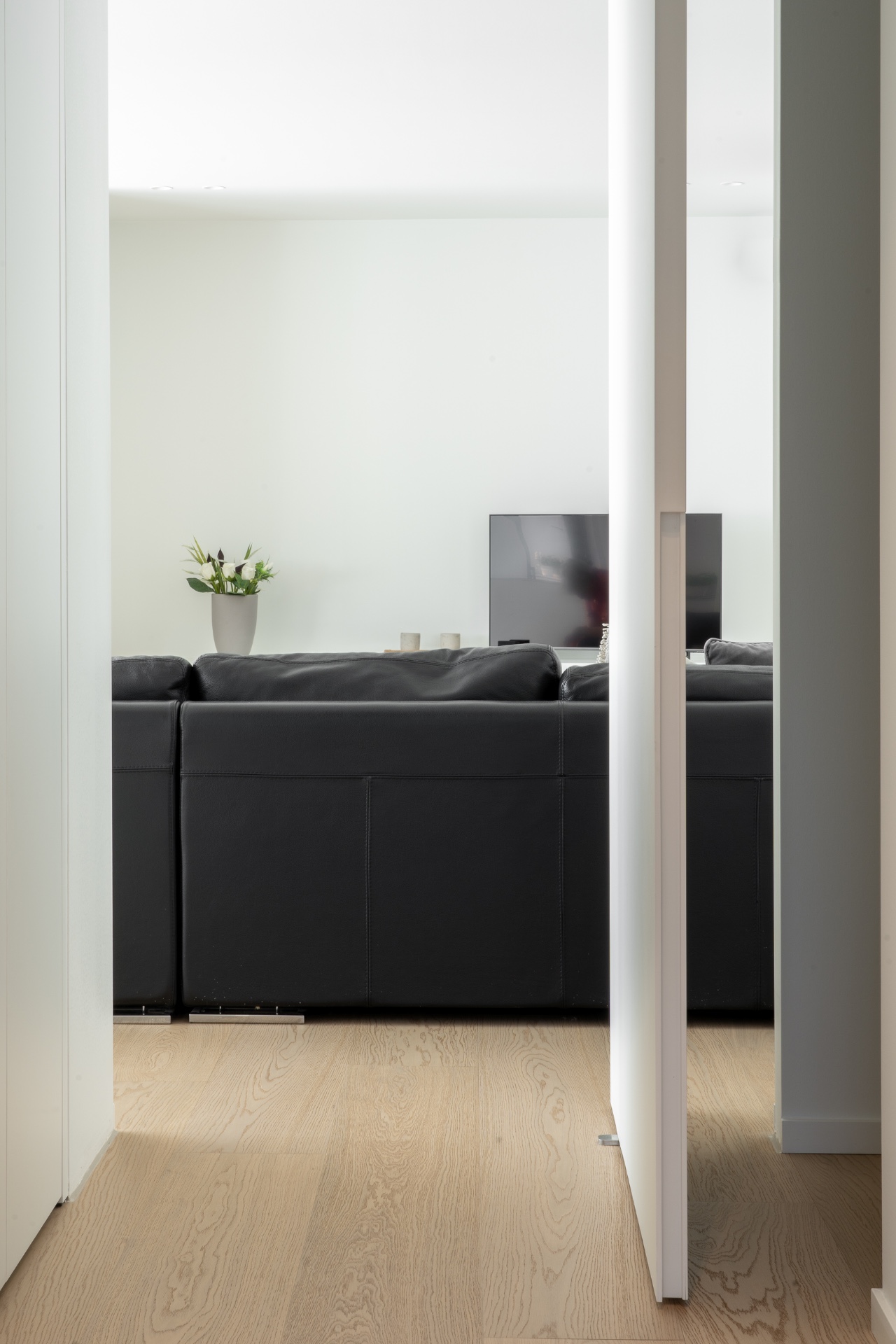
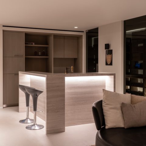
White built-in cabinets return in the living areas, where they form a backdrop for the television niche and other wall recesses. These fitted elements make use of the wall depth instead of competing with it. In the images, their vertical joints line up with the room’s proportions, which keeps the composition steady. The effect is especially noticeable where a recess or opening cuts through the wall: the cabinet planes hold the room together while allowing the route to remain open.
That same control appears in the planned sightlines. From one zone to another, the view often lands on a white plane, a wood floor, or a framed opening. Nothing is overdesigned to grab attention. The room sequence is allowed to unfold gradually, and that makes the interior feel larger than its individual parts. The former GP practice becomes a home through these controlled transitions, not through a single dramatic gesture.
Bathroom details kept in the same visual language
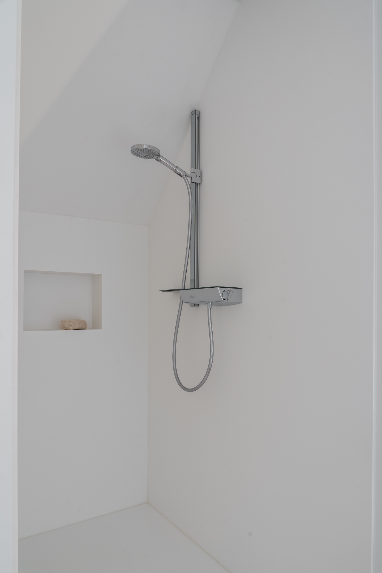
The wet zones stay consistent with the rest of the house. A shower area with a rain shower and light stone-look tiling introduces a cooler surface, but the tone remains restrained. In the close-ups, the tiles sit beside smooth white planes and clean corner details. The fittings are compact and metallic, which keeps the shower area visually light. Even here, the design refuses to break away from the house’s broader language of white surfaces and measured material shifts.
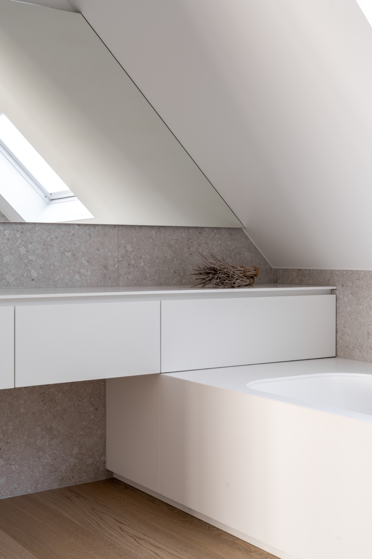
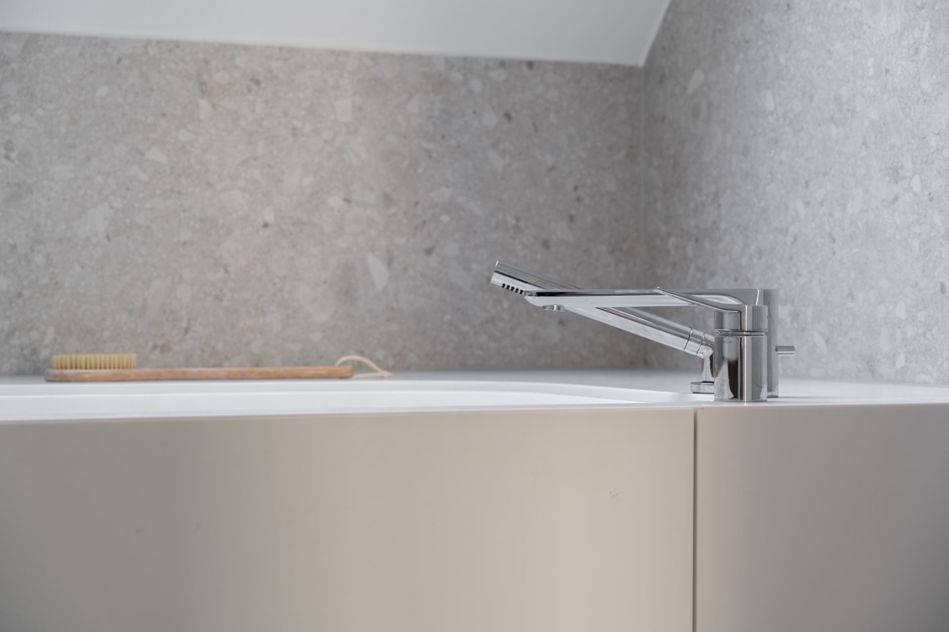
Another image shows the bathroom under a sloping ceiling, where gray stone-look walls and white storage elements meet in a tight composition. The angled roofline gives the room its shape, while the cabinet fronts and tile surfaces follow that line without extra decoration. It is a small room, yet the surfaces are handled with the same discipline as the larger living spaces. That consistency is what lets the whole practice-to-home conversion feel believable from room to room.
What the conversion leaves behind
What remains from the building’s past is not a clinical mood, but a disciplined framework. The white surfaces, the continuous wood parquet flooring, and the concealed doors all work together to reduce friction between rooms. The house does not try to erase every trace of its former use. Instead, it redirects that structure toward domestic life, with enough openness for art, furniture, and everyday movement to sit comfortably inside it. Seen that way, the white built-in cabinets, the stone-look kitchen counter, and the quiet wall planes are not separate features. They are the elements that let the building settle into its new role.
Across the interior, the strongest moments are often the quietest ones: a flush door in a white wall, a run of parquet that carries from one room to the next, a sink cut into a stone-like surface, a TV niche held inside a fitted wall. Each detail is modest on its own. Together they give the house its direction and explain why this continuous wood parquet flooring matters so much in the overall composition. It is the line that holds the conversion together.
Want to see more of Studio Raeymaekers? View the page of Studio Raeymaekers for even more great projects and company information.

Contributors

NEW 2026 Jubileum Edition The Best Interior Designers Benelux
Order Now €125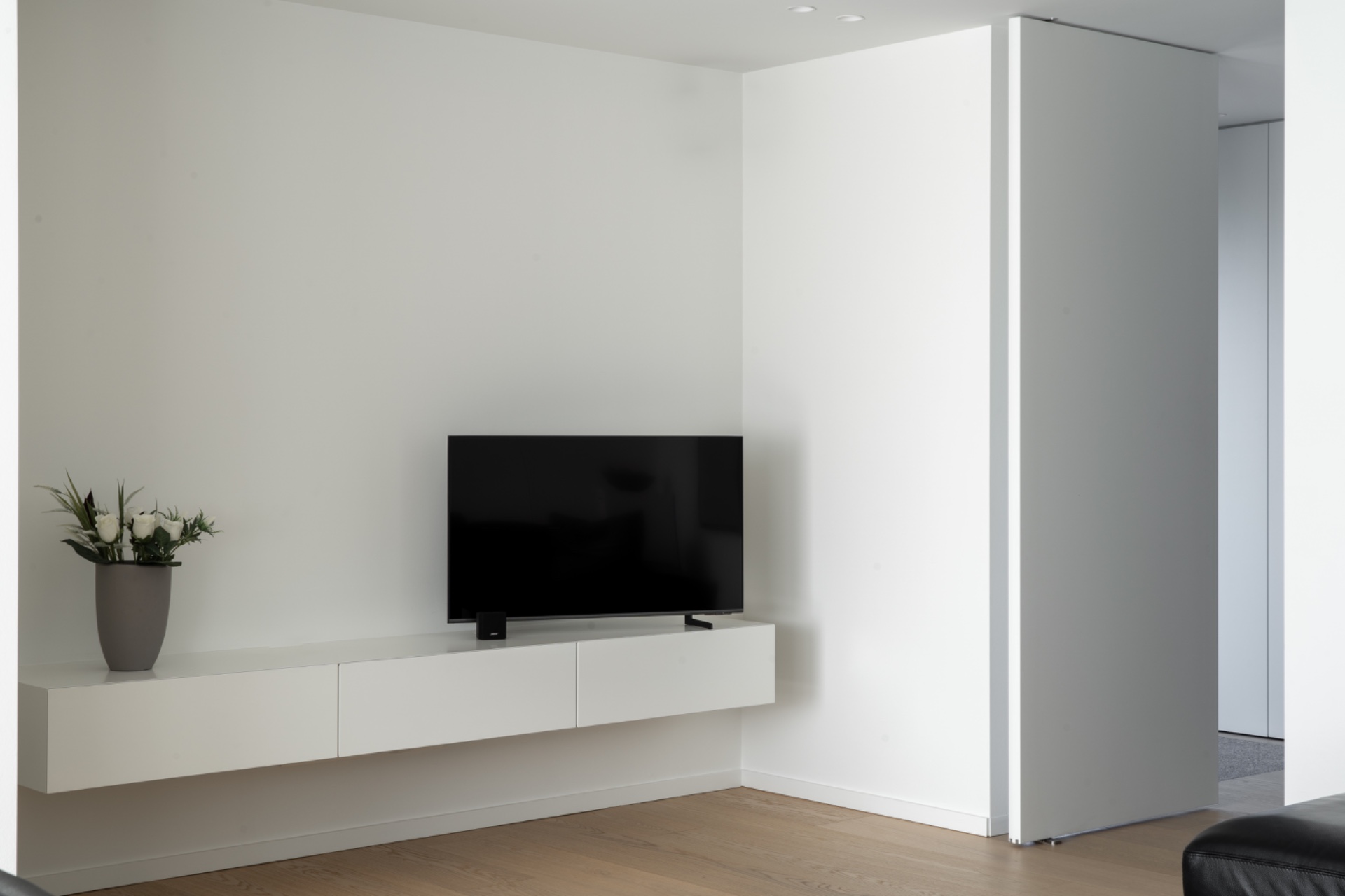
NEW 2026 Jubileum Edition The Best Interior Designers Benelux
Order Now €125