










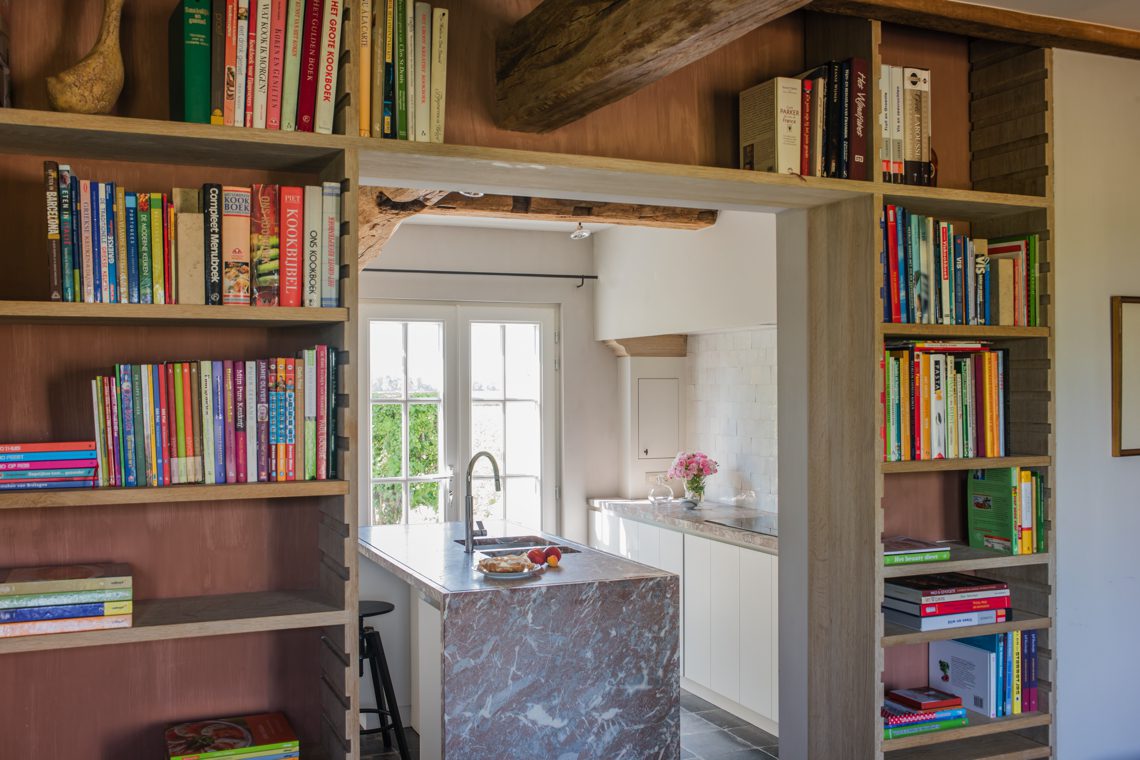
Country luxury kitchen with natural stone countertop and rustic wood accents
The stone surface catches the light first. Across the central run of the room, the country luxury kitchen with natural stone countertop sets the tone with a dark marble-look top, white cabinetry, and timber details that do not fight for attention. The look is direct and measured: clean cabinet lines below, textured wood above, and enough open space between the elements to let each material read clearly.
What stands out next is the ceiling. Heavy wooden beams cross overhead and frame the kitchen like a visible structure rather than a decorative layer. They draw the eye along the room and give the white fronts a stronger edge. The kitchen with wooden ceiling beams feels anchored by that timber frame, while the dark tile floor below keeps the palette grounded.
White cabinets, dark floor, and a clear central axis
The white kitchen cabinets with clean lines run in a long, even band along the wall. Small black hardware pieces break the white surface only where needed, so the fronts remain calm and graphic. In the same view, the darker floor tiles spread across the room with a more practical, grounded presence. Their tone picks up the shadows under the base units and prevents the pale cabinetry from feeling too light.
The central work area uses the same disciplined approach. The country luxury kitchen with natural stone countertop brings pattern into the room through the stone itself, not through ornament. Dark veining moves across the surface, and the broad top gives the kitchen block a solid, tactile edge. Seen from different angles, that worktop becomes the main horizontal line in the room, tying together the white fronts, timber elements, and the openings beyond.
Openings that make the kitchen feel deeper
A series of openings and built-in recesses keeps the layout from becoming closed off. The most distinct detail is the arched niche in the kitchen wall, finished in white with a wooden trim that gives the curve a sharper outline. It is small, but it changes the wall from a flat surface into a point of pause. Nearby, a doorway-like opening lets the kitchen connect visually with another zone, so the room reads as part of a larger interior sequence.
Alongside that, the wooden storage wall in the kitchen adds another layer of depth. Open shelves and fitted sections sit within the timber field, making storage visible rather than hidden. The wood absorbs light differently from the painted cabinets and gives the room a more layered rhythm. These built-in elements appear again from another angle, where the openings line up with the work zone and the wall behind it.
How the arched niche changes the wall
The arched niche in kitchen wall is one of the quietest gestures in the project, but it does a lot of work. Its curved opening softens the straight cabinet run nearby, while the wooden edge gives it a frame that keeps it from disappearing into the wall. Because the niche sits within a field of white surfaces, every shadow around the curve becomes visible. That contrast is what makes the detail memorable, not size or decoration.
The same logic appears in the open storage sections around the room. Rather than filling every wall with closed units, the design leaves room for voids, shelves, and sightlines. Those pauses give the kitchen a steadier pace. You move from a white cabinet block to an open recess, then to a timber-wrapped section, then back to the stone worktop. The sequence keeps the eye moving without making the room busy.
The sink zone keeps the texture low and practical
At the sink zone with tiled/stone-look backsplash, the materials become more utilitarian. The wall behind the basin is clad in a light surface that reads like stone or tile, and it sits neatly behind the tap and sink without pulling focus from the rest of the room. The backsplash catches less glare than a polished finish would, so the work area feels calm even when seen close up. It also links visually to the stone top below it.
That area is one of the clearest examples of how the kitchen balances smooth and textured surfaces without overstatement. The white cabinetry stays in the background, the counter carries the stronger stone pattern, and the backsplash holds the vertical plane in place. In one view a black-framed window sits nearby, its dark outline echoing the hardware on the cabinets and the shadows in the floor tiles.
From one view to the next, the kitchen keeps its structure
Seen from the entrance side, the room opens into a series of aligned surfaces: beam, cabinet wall, stone counter, and dark floor. Seen closer to the work area, the focus shifts to the sink, the backsplash, and the arc of the niche. Seen from the opposite angle, the timber storage wall and open passage reappear, proving that the composition works from more than one viewpoint. That consistency comes from the materials and their proportions, not from symmetry.
The project also leaves room for a more service-like zone in the background, suggested by the visual presence of a utility-style sink and related fittings. Nothing is over-explained; the read is enough. What matters is that the main kitchen and the adjacent working area share the same language of wood, white paint, stone, and tile, so the transition between them feels deliberate when you follow the openings through.
Materials that carry the whole room
Across the project, the same few materials do the heavy lifting. Wood appears in the ceiling beams and in the storage wall, giving the room its structural rhythm. White paint covers the cabinets and the arched niche, keeping the planes bright and letting the shadows collect in corners and recesses. The natural stone countertop brings depth and movement, while the dark tile kitchen floor settles the composition beneath it.
That combination is why the kitchen reads as a country luxury kitchen with natural stone countertop rather than as a purely decorative interior. Every surface has a visible role. The beams mark the ceiling, the cabinets line the wall, the stone anchors the centre, and the openings break the mass into smaller, readable parts. Even the black window frame and small hardware details matter because they sharpen the larger gestures around them.
For readers looking for related ideas, this project sits naturally alongside country kitchens, natural stone countertops for kitchens, and built-in storage and niches in kitchens. It also connects with layouts that keep the kitchen linked to another living zone rather than sealing it off completely, which is why the openings and sightlines are such an important part of the composition here.
Want to see more of Natascha Persoone? View the page of Natascha Persoone for even more great projects and company information.





NEW 2026 Jubileum Edition The Best Interior Designers Benelux
Order Now €125


NEW 2026 Jubileum Edition The Best Interior Designers Benelux
Order Now €125


NEW 2026 Jubileum Edition The Best Interior Designers Benelux
Order Now €125


