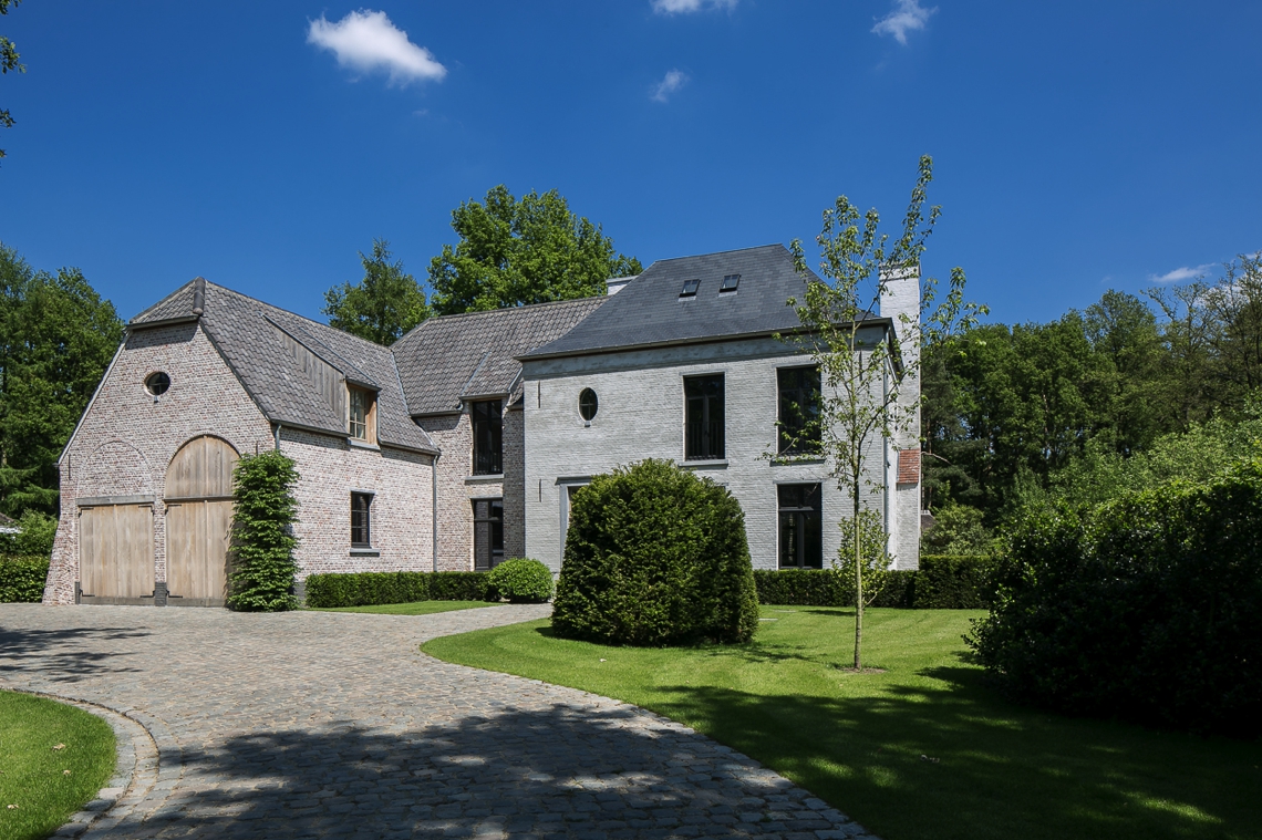
Country villa exterior with white and red brick and black windows
The country villa exterior is set by a cobblestone driveway that leads the eye straight to the house. White and red brick divide the facades into clear planes, while the black windows cut clean rectangles into the wall surfaces. Low clipped planting and a lawn frame the base of the building, so the masonry, paving, and greenery each keep their own place in the composition.
A broad first view across brick, lawn, and paving
The full exterior view shows the villa as a sequence of rooflines, wall surfaces, and garden edges. The cobblestone driveway sits in front like a rough-textured foreground, giving weight to the lighter brickwork behind it. Dark roof planes and slate details sit above the pale walls, and the garden stays low, with trimmed shrubs running along the façade instead of rising in front of it. That keeps the main volume visible from the approach.
Seen from a distance, the contrast between white brick, red brick, and dark openings does most of the work. The windows are large, and their black frames sharpen the façade without adding noise. Their scale also ties the ground floor and upper level together, so the house reads as one solid composition rather than a collection of separate openings.
Black windows set against white and red brick
The most direct reading of the house comes from the white and red brick facade. The white sections brighten the wall, while the red brick adds depth where the surface turns or breaks around openings. Against that background, the black windows stand out with a graphic edge. A few of the openings include muntin window detail, which breaks the glass into smaller parts and softens the scale of the larger panes.
Grey stone-like surrounds appear around several openings, adding a tighter line between masonry and glass. Those frames make the façade feel more layered. They also help the wall read in sections: brick field, stone edge, then window opening. The result is plain to read from the street, but full of small transitions when you move closer.
Facade openings that change the wall rhythm
Round arch facade opening forms interrupt the more rectangular window pattern. Some are set high in the wall, while others appear as ovals or rounded niches that pull the eye upward. These openings do not act as decoration alone; they break the long brick surfaces into measured parts and give the wall a slower rhythm. In the same view, the black windows and the rounded voids keep the façade from feeling repetitive.
Near the entrance zone, the masonry shifts again around the door and adjacent openings. The wall is still the main surface, but the cutouts, frames, and small changes in depth give it relief. The detail is understated, yet it is what keeps the exterior from becoming flat.
A wooden double gate under a curved opening
The wooden double gate is one of the clearest details in the project. Its vertical boards sit beneath a round arch facade opening, so the gate feels anchored by the wall rather than added onto it. The timber introduces a warmer surface among the brick and stone, but the tone stays restrained. It is the shape that matters first: two leaves, a broad opening, and a curved top that repeats the softer lines seen elsewhere on the façade.
In close view, the gate reads together with the surrounding brickwork and dark window frames. The opening above it creates a thicker threshold, and the wall around it feels deeper than a standard flat entrance. That depth gives the façade a stronger sense of entry, especially when seen alongside the larger glazed openings nearby.
Entrance details and grey surrounds
Several details around the door and windows are finished in a grey stone-like material. These borders do not compete with the brick; they draw a neat line around each opening and sharpen the junction between materials. The front door sits within that framework, with the surrounding wall kept simple so the opening remains legible from a distance.
The muntin window detail appears again in the smaller openings near the entrance. It gives a finer scale to the façade and links the larger glazing to the more compact wall openings. That repetition is quiet, but it ties the whole front elevation together.
Slate roof edge detail and visible timber work
Above the brick walls, the roof edge detail becomes visible in dark slate and exposed timber. The roofline is not overly thick; it sits neatly on the walls and leaves the façade clearly defined beneath it. The slate surface darkens the top of the composition, which helps the lighter brick below read more clearly. That contrast is repeated in the black windows below, so the house carries a strong horizontal line from roof to openings.
Timber at the eaves introduces another layer. It is visible enough to register as part of the exterior finish, but it stays secondary to the masonry. Together with the slate, it gives the upper edge a more worked look, especially when the light catches the change from stone to wood to roof material.
Garden edges that keep the house in view
The surrounding garden is kept low and precise. A lawn stretches across the foreground, and clipped shrubs run along the base of the façades. That planting choice matters because it leaves the brick and window layout visible from the ground up. The cobblestone driveway also stays in view, so the outdoor setting is not hidden behind planting; instead, the paving, grass, and masonry all stay readable at once.
What stands out in the overall exterior is the way the materials meet without blending into one another. Brick remains brick, timber remains timber, and the stone paving keeps its own rougher texture. The villa is photographed as a sequence of edges, openings, and surfaces, and that is what gives the project its clear presence.
Want to see more of D’ Architectural Concepts? View the page of D’ Architectural Concepts for even more great projects and company information.





NEW 2026 Jubileum Edition The Best Interior Designers Benelux
Order Now €125


NEW 2026 Jubileum Edition The Best Interior Designers Benelux
Order Now €125


NEW 2026 Jubileum Edition The Best Interior Designers Benelux
Order Now €125


NEW 2026 Jubileum Edition The Best Interior Designers Benelux
Order Now €125


NEW 2026 Jubileum Edition The Best Interior Designers Benelux
Order Now €125


NEW 2026 Jubileum Edition The Best Interior Designers Benelux
Order Now €125


NEW 2026 Jubileum Edition The Best Interior Designers Benelux
Order Now €125


NEW 2026 Jubileum Edition The Best Interior Designers Benelux
Order Now €125


NEW 2026 Jubileum Edition The Best Interior Designers Benelux
Order Now €125


NEW 2026 Jubileum Edition The Best Interior Designers Benelux
Order Now €125


NEW 2026 Jubileum Edition The Best Interior Designers Benelux
Order Now €125


NEW 2026 Jubileum Edition The Best Interior Designers Benelux
Order Now €125


NEW 2026 Jubileum Edition The Best Interior Designers Benelux
Order Now €125


NEW 2026 Jubileum Edition The Best Interior Designers Benelux
Order Now €125


NEW 2026 Jubileum Edition The Best Interior Designers Benelux
Order Now €125