Custom interior design for a warm-luxury home transformation
Natural stone, leather and pale wood set the tone from the first step inside. The home opens as a sequence of built-in elements rather than a chain of loose rooms, which is where the custom interior design becomes visible immediately. A long wall unit runs through the living area and toward the dining zone, while the lighting stays low and deliberate. The result is a warm luxury interior shaped by joinery, surface and light, not by decoration.
Rooms reworked around the way the house is used
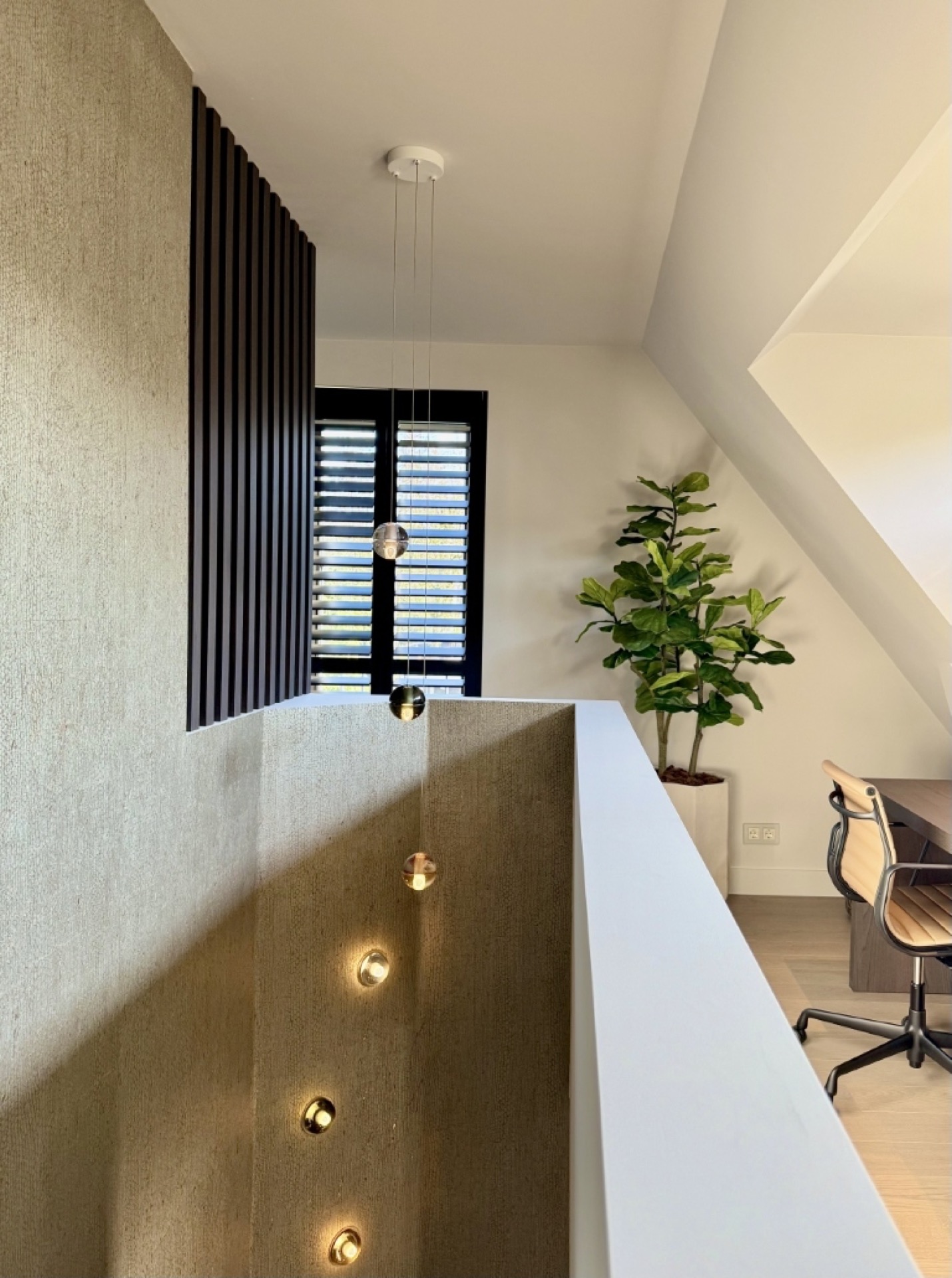
The original interior was stripped back and rebuilt, with walls removed to make the plan work harder. The ground floor now carries the main living functions, so the route through the house feels direct and open. Upstairs, the layout shifts to quieter uses: a work zone for two beneath a new dormer, a guest room and an extra guest bathroom. That change in programme is one of the clearest signs of the custom interior design approach here. Space is not filled; it is assigned.
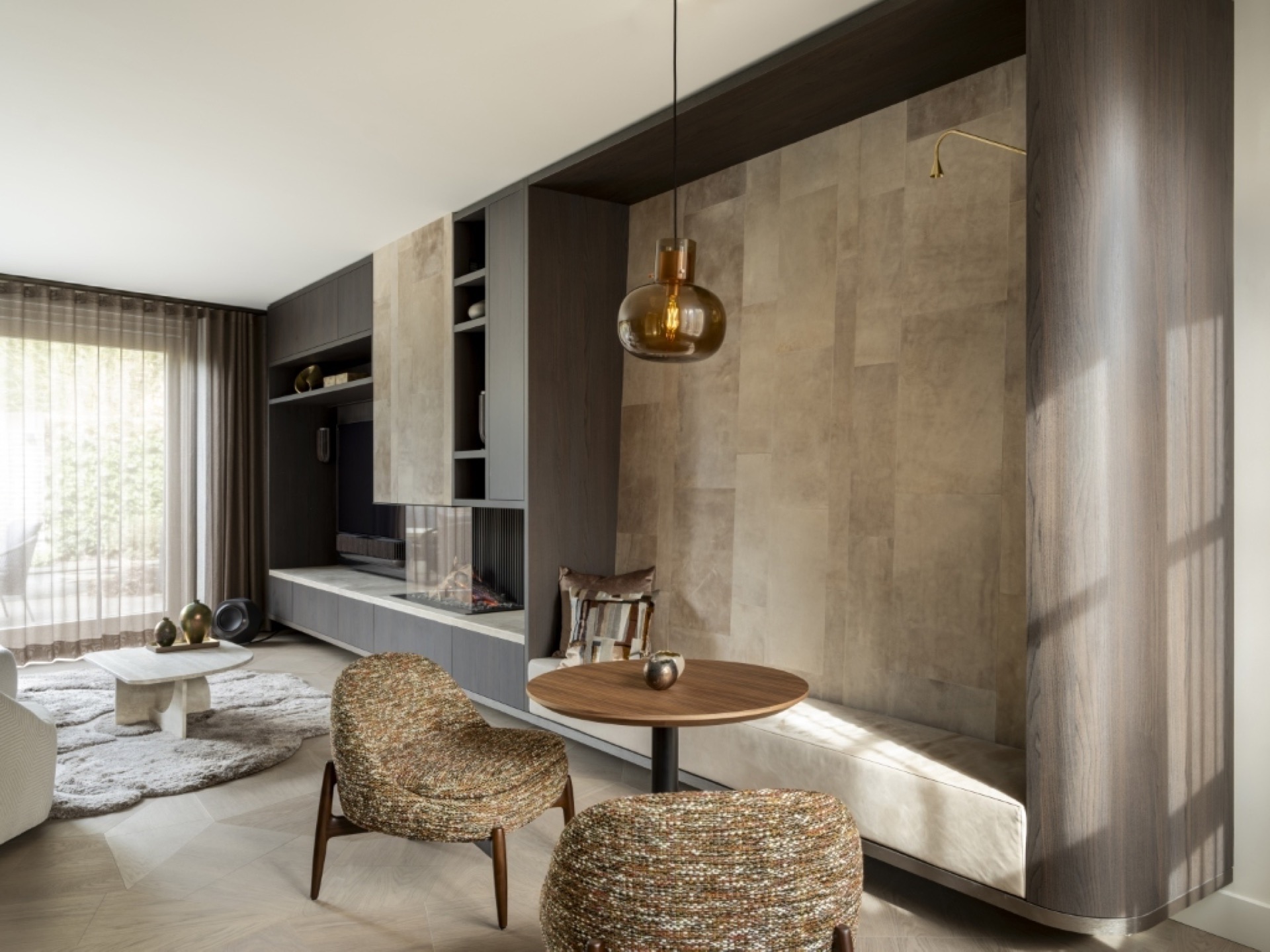
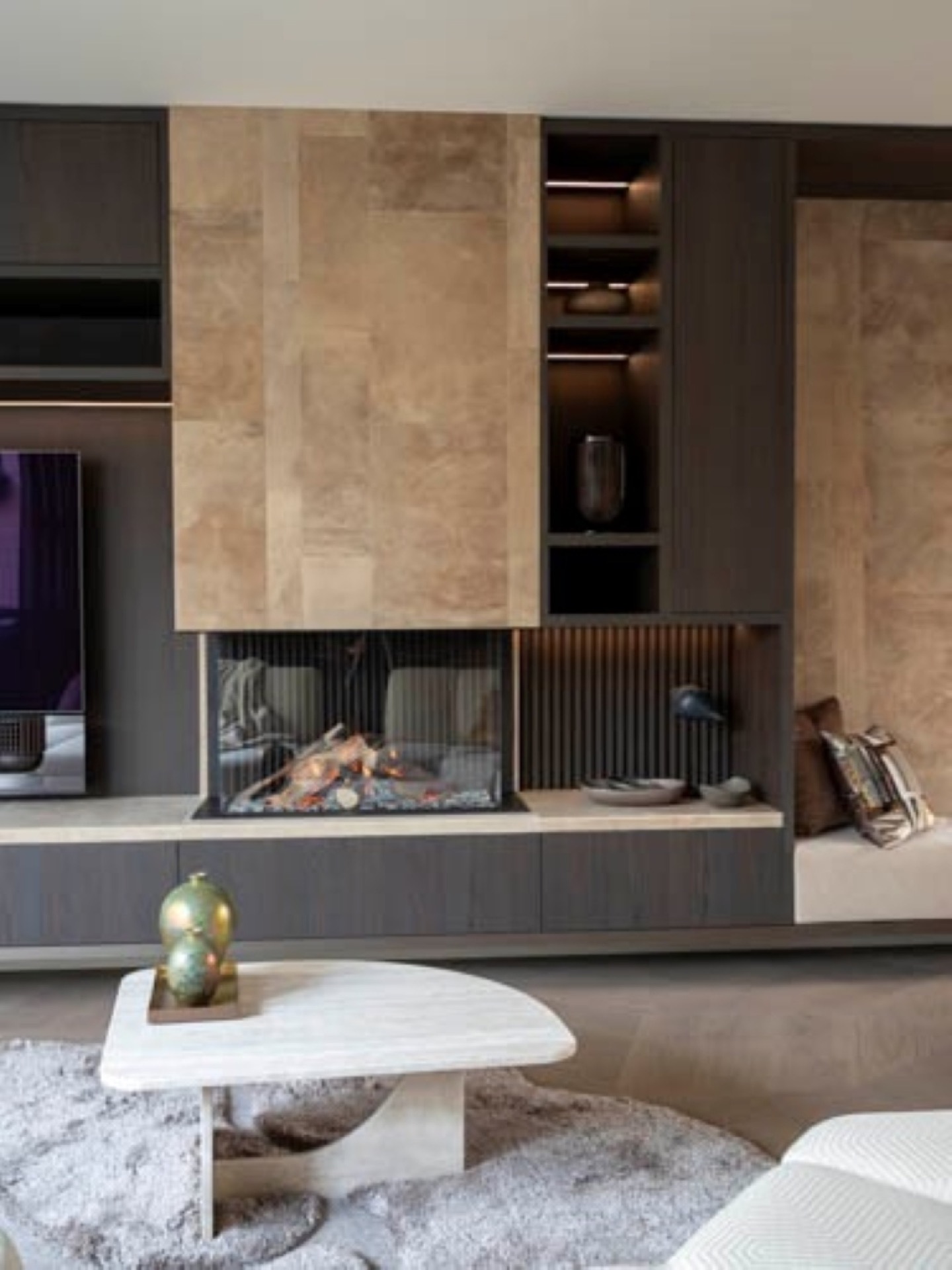
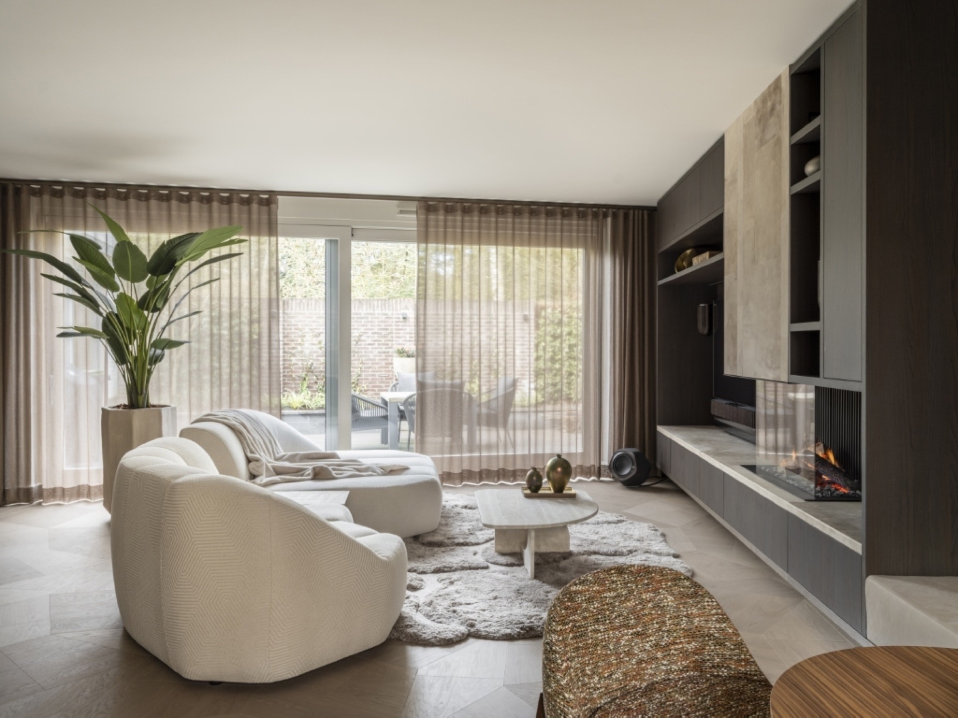
What stands out in the living area is the way the storage wall continues without breaking the room into pieces. The custom wall unit is finished in leather and includes open niches, closed fronts and a run toward the seating area. The built-in fireplace sits within that line-up, framed by a stone surface that picks up the same beige and brown notes seen across the images. It is a measured composition, with the fireplace reading as part of the wall rather than as a separate object.
Lighting that changes the atmosphere without showing itself
A full interior lighting plan was drawn for the house, and the effect is most visible in the layers of light rather than in the fittings themselves. Recessed spots trace the ceiling edges, small wall lights pick out the stair area, and the dining and kitchen zones are lit by suspended pieces with a soft glow. Smart home lighting control was built into that system, so the house can shift between working, dining and evening use without changing the arrangement of the room. The technical part stays in the background; the light does the work.
That same careful approach extends to the wiring for audio and television, which was revised so the equipment could sit within the interior instead of competing with it. In the images, the clean lines of the wall furniture and the glass transitions around the kitchen make that coordination easy to read. Nothing feels added at the last minute. The surfaces, the openings and the concealed services have been planned as one interior sequence.
A bespoke kitchen built around rounded edges and strong material contrast
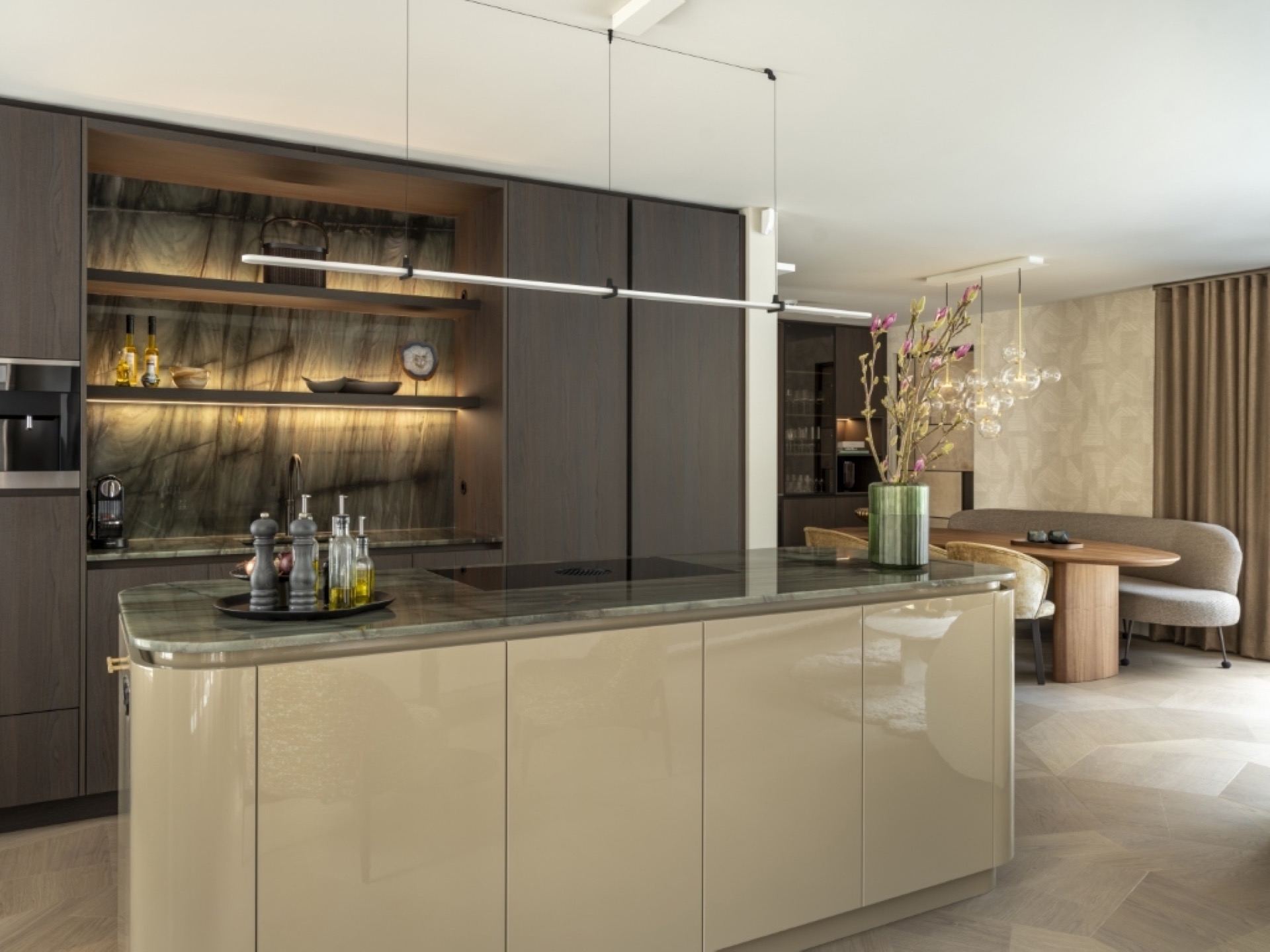
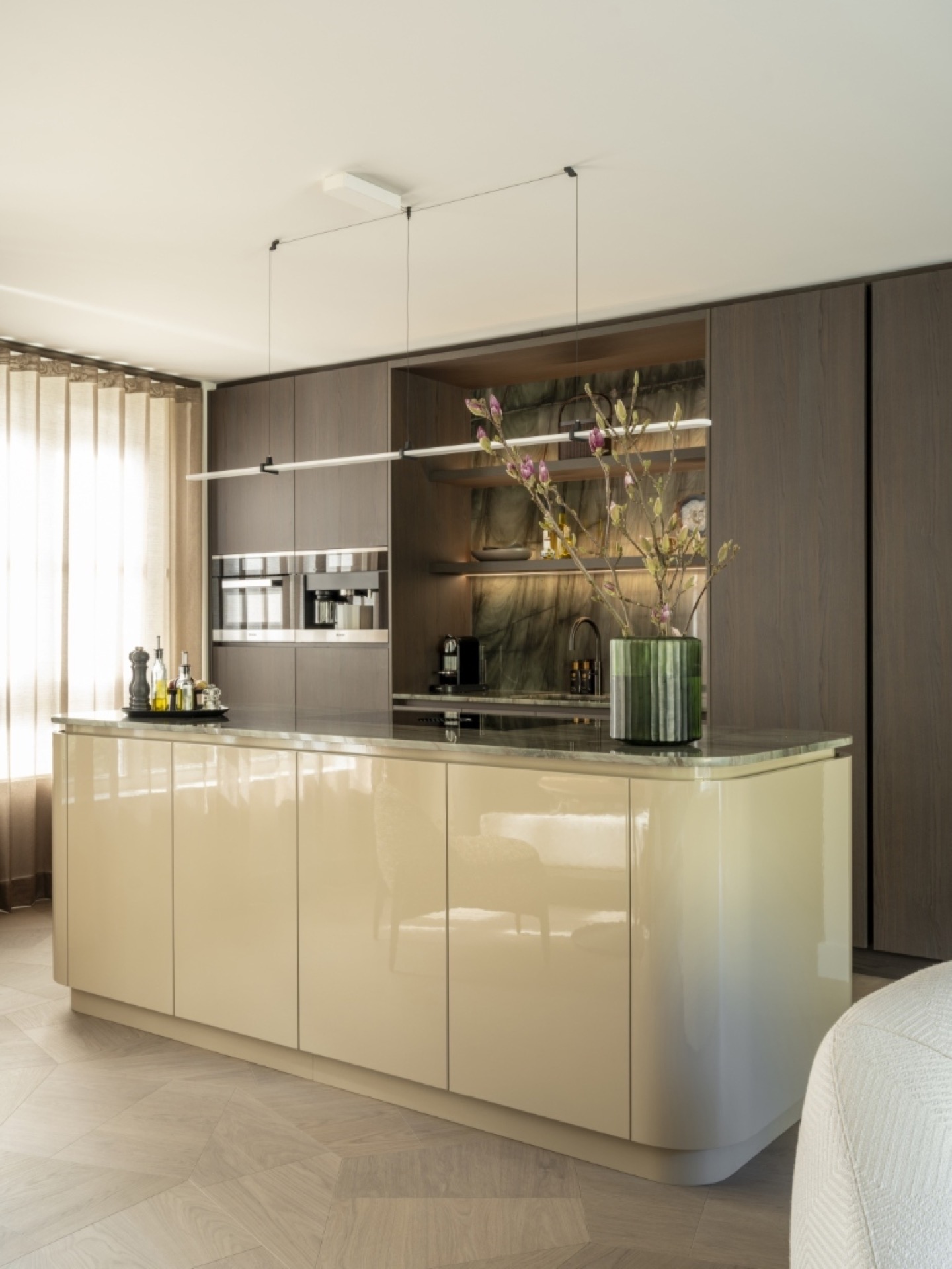
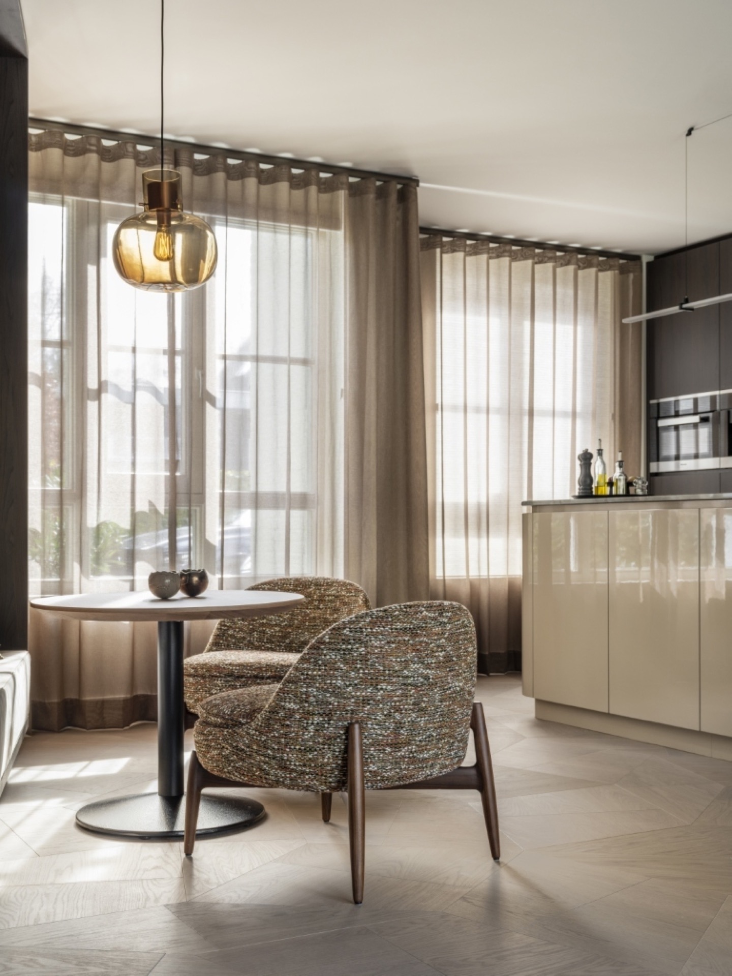
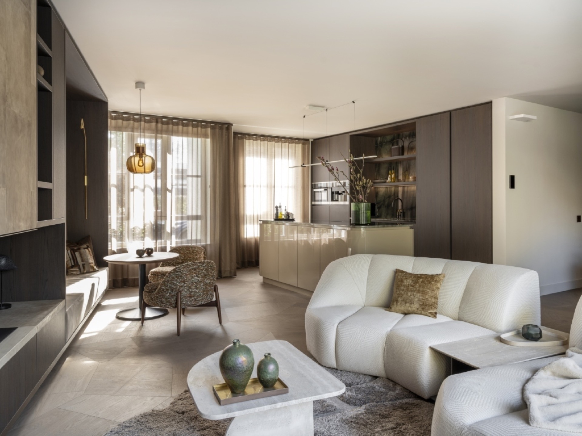
The bespoke kitchen uses two clear gestures: a dark quartzite worktop and a sand-coloured glossy island. The island’s rounded corners are echoed in the ends of the long storage wall, which keeps the room visually connected. A glass partition kitchen detail appears in the visual material as a transparent division beside the cabinetry, allowing the kitchen to remain open while still defining its edge. Above it, linear pendants stretch the light across the work surface and dining side.
Material changes are handled with restraint. The stone surface, leather finish and pale cabinet fronts sit against one another without crowding the room. The kitchen does not rely on extra ornament. Instead, the shape of the island, the opening in the wall and the reflected light from the glass do the visual work. In one view, the cabinetry reads almost architectural, with the joinery acting like a built-in frame for daily use.
Low dining as part of the kitchen plan
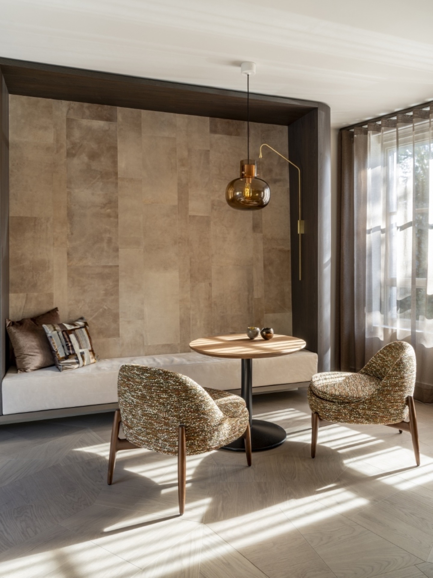
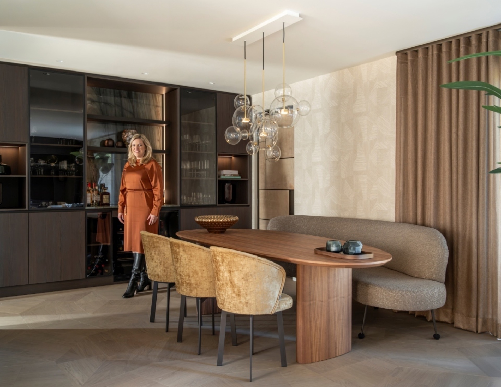
Rather than placing bar stools at the island, the plan introduces a lower seating area with armchairs. That choice changes how the kitchen is used. Breakfast, coffee or an evening drink can happen at the edge of the cooking zone without turning the room into a passage. The dining wall continues the same materials and includes a bar and wine climate cabinet, so the kitchen and meal area remain linked through finish, height and colour. A walnut table with an organic shape softens the harder lines around it.
The living zone beside it keeps the same rhythm. A Galotti & Radice lounge sofa and a textured rug shape a place for film nights around the built-in fireplace, while the tall windows and curtains pull daylight across the floor. This is where the warm luxury interior becomes most legible: not through excess, but through the way each piece holds its place in relation to stone, timber and light.
Bedroom and bathroom surfaces with a stronger edge
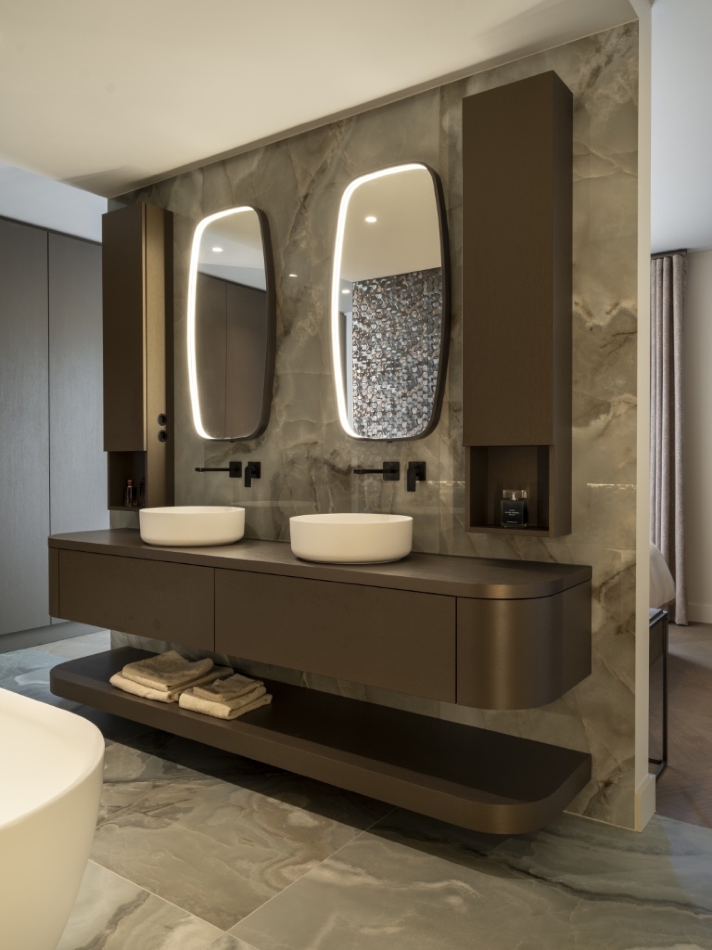
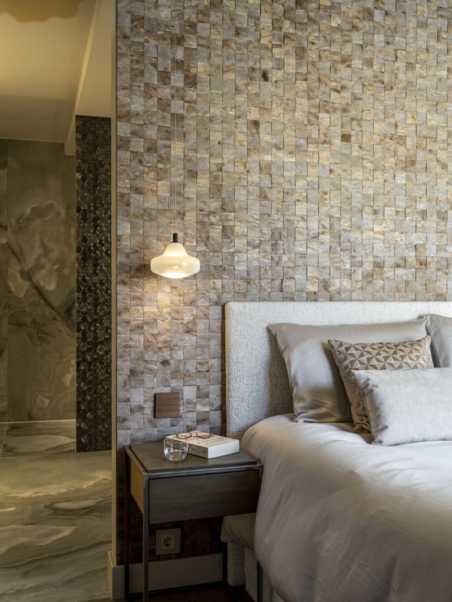
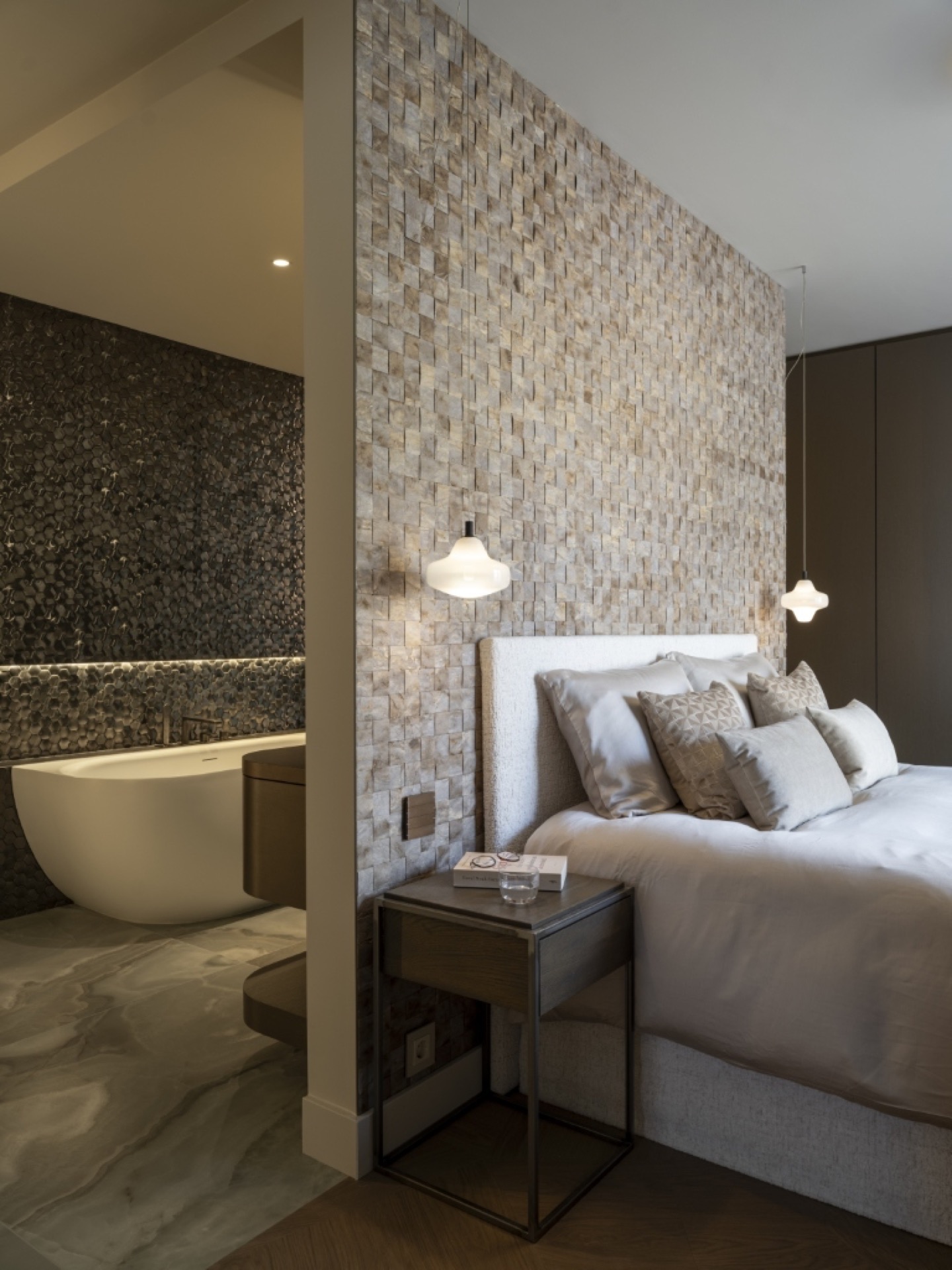
Upstairs, the main bedroom was rethought with a walk-in bathroom and a custom wardrobe wall. The bed area is backed by woven root walnut, which gives the room a textured focal point without adding colour noise. The wardrobe and bathroom joinery use a bronze-toned finish that carries the same subdued palette seen elsewhere in the house. These pieces keep the room calm while still giving it a clear material identity. The custom interior design here is precise about proportion and storage.
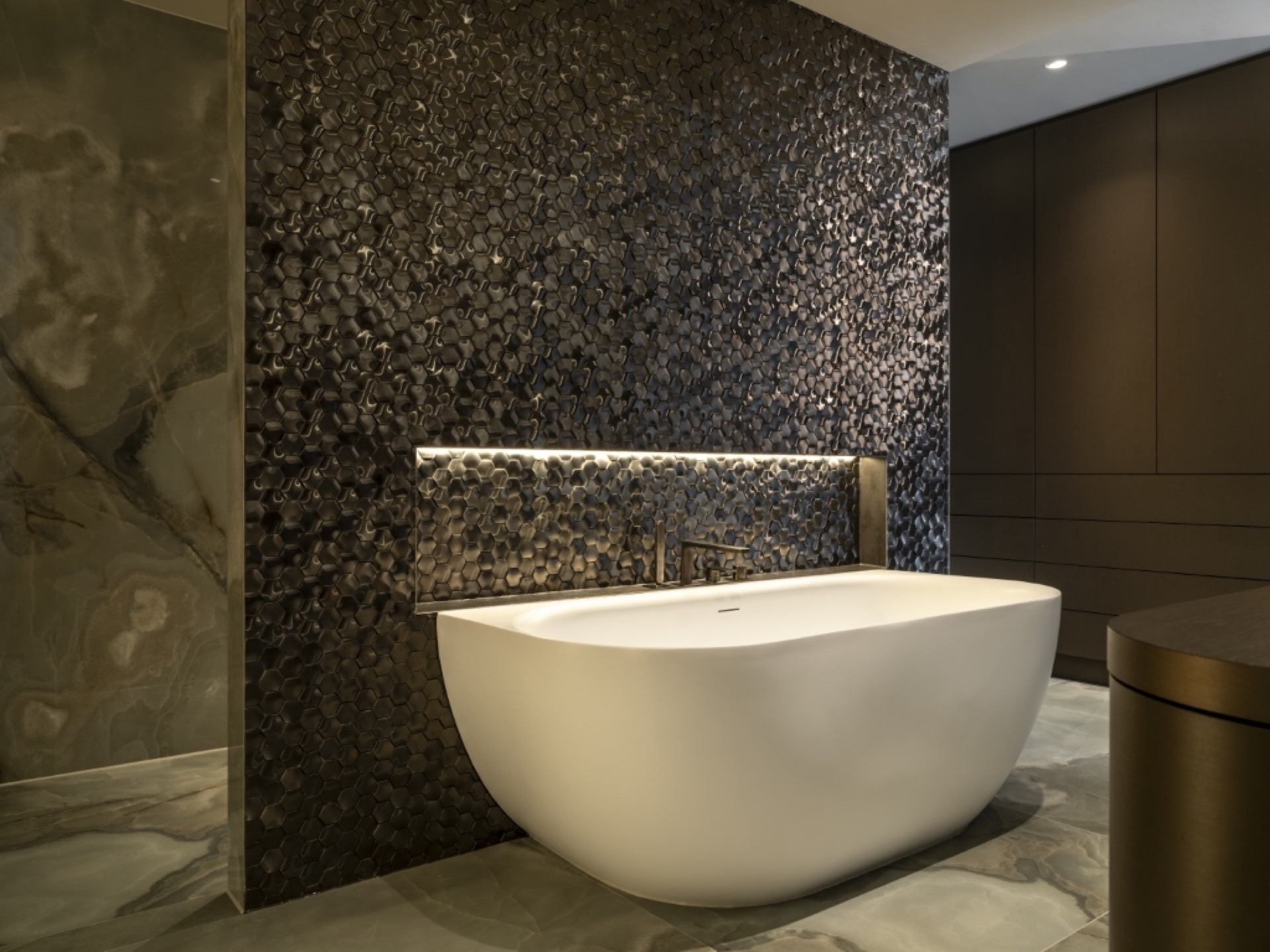
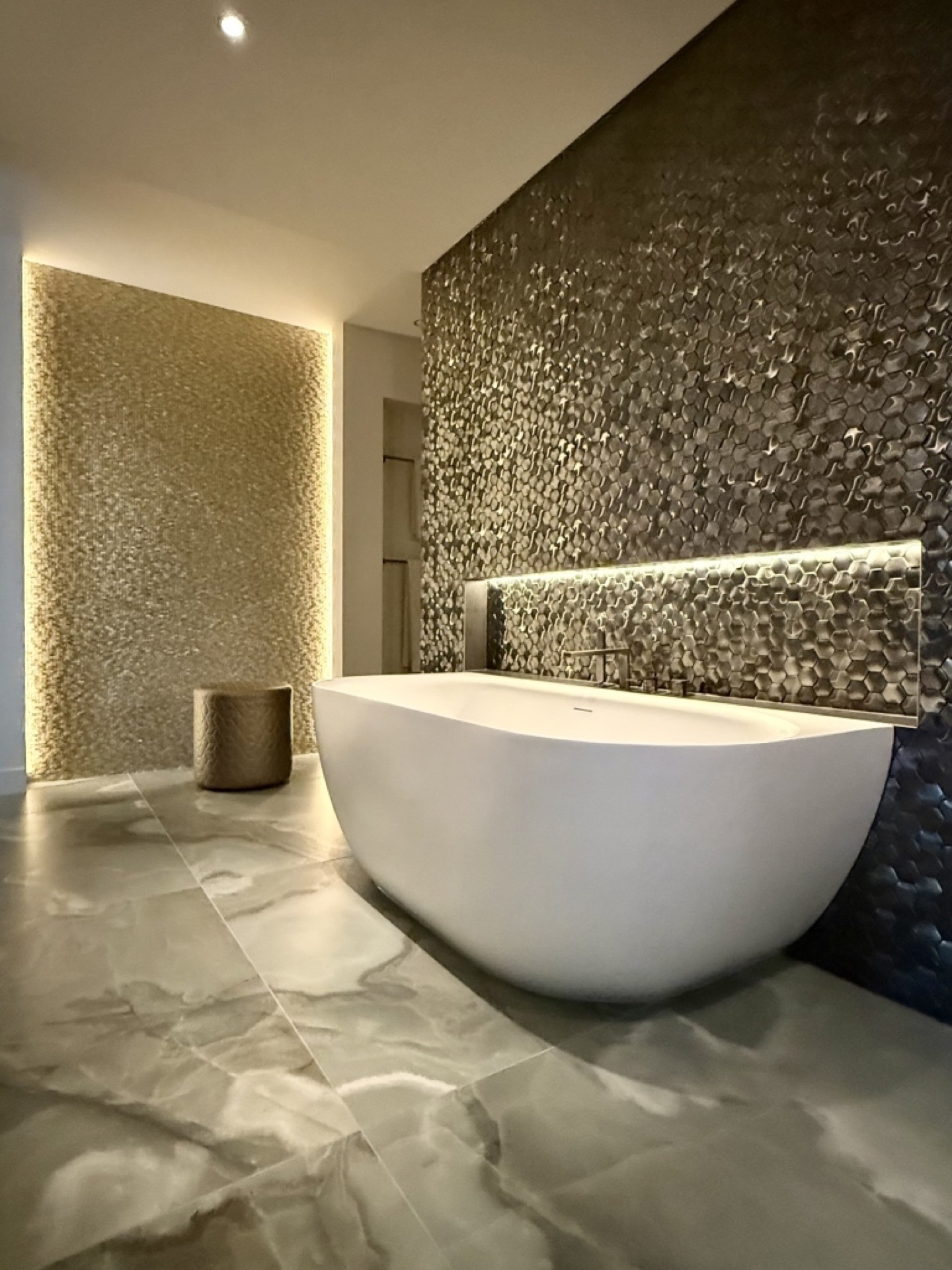
The bathroom takes a firmer line. Large stone-look slabs, a hexagonal metal mosaic behind the bath and a gold mosaic feature wall introduce more contrast than the rest of the house. In the images, the shower and wash zones are partly separated by glass, so the stone surfaces stay visible through the room. This is a stone accent bathroom in the true sense: the material is not a decorative extra, but the main way the room is composed.
Stairs, hall and guest toilet in the same material language
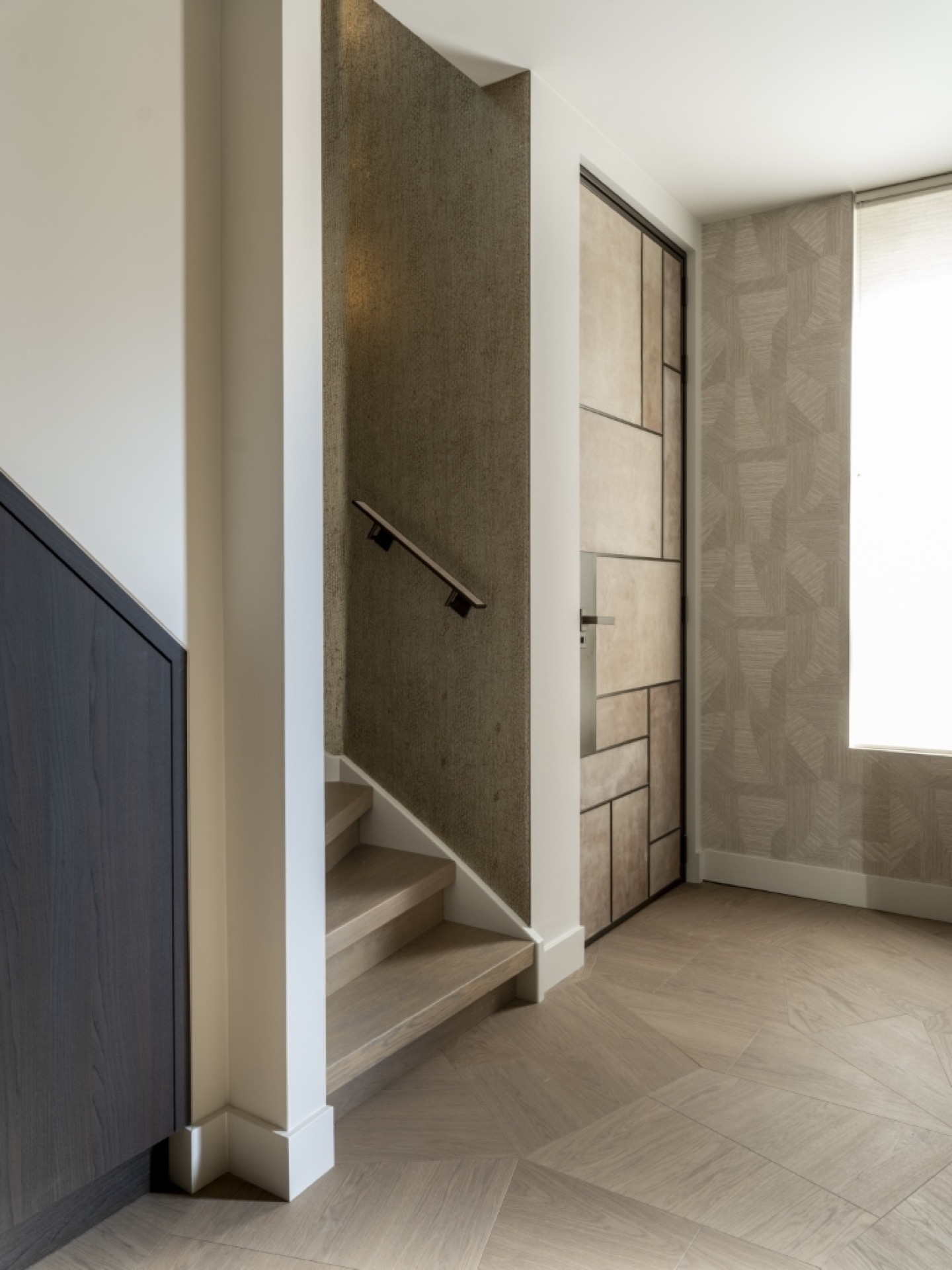
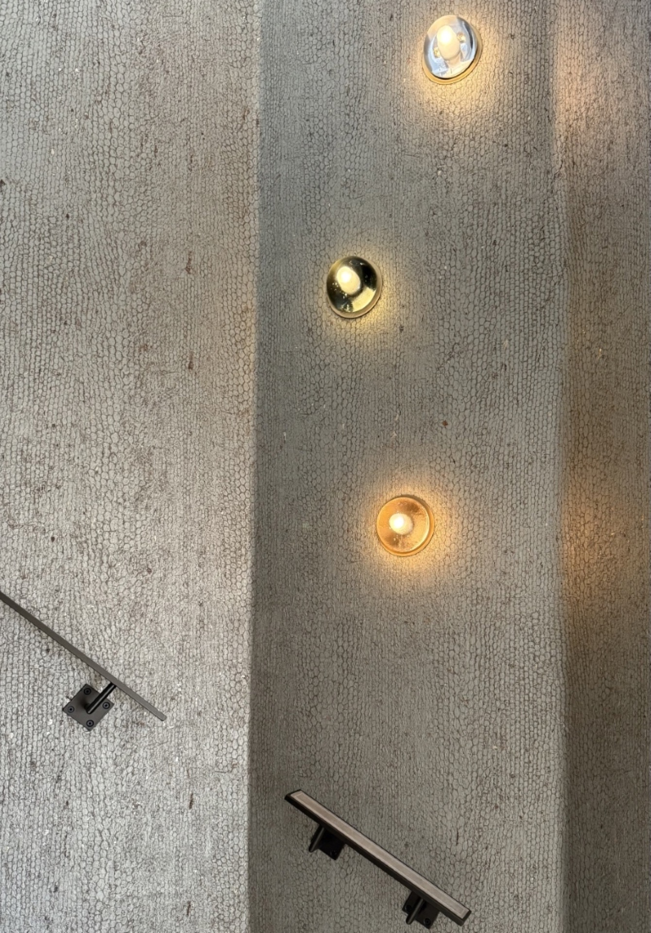
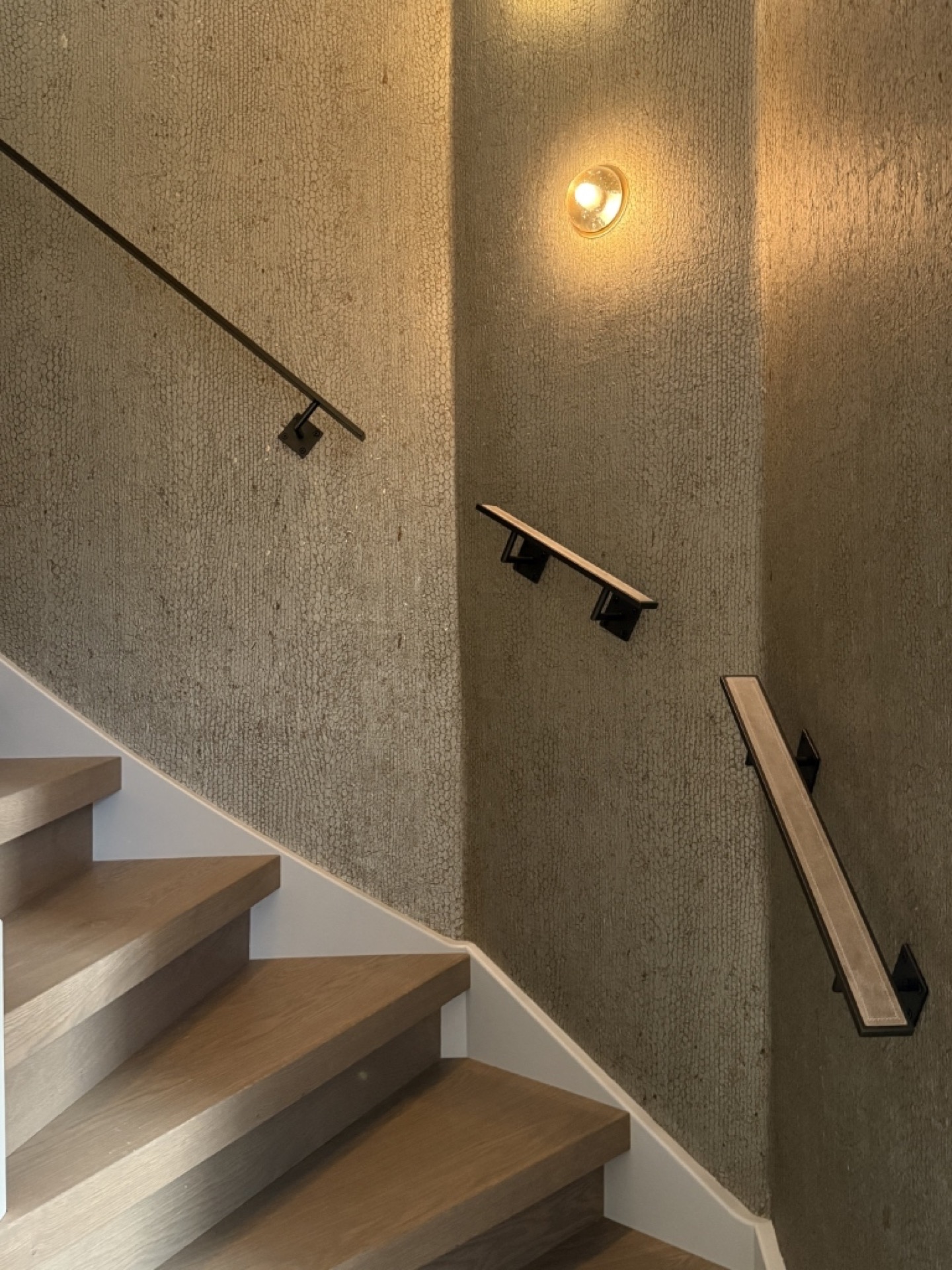
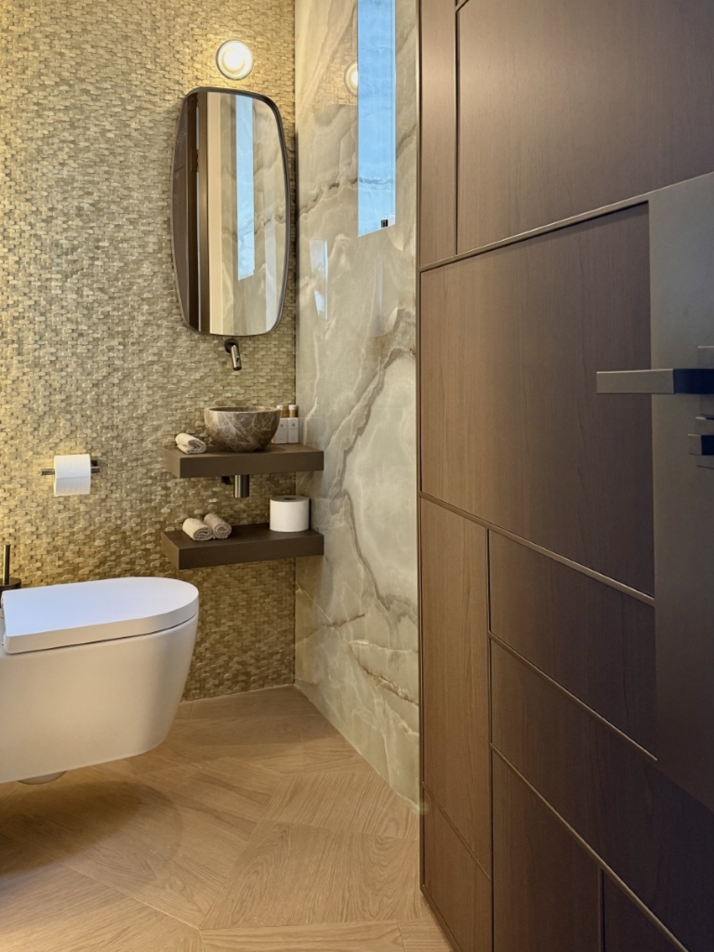
The floor continues into the hall and even into the guest toilet, where the visual story is reduced to a few strong elements: green stone behind the toilet, a gold mosaic near the basin and a stone bowl at the sink. The staircase is finished in solid oak in the same tone as the floor, with a custom handrail inset with leather. Small Bocci wall and pendant lights lift the height of the stairwell and make the vertical route readable after dark. The interior lighting plan here is not just functional; it shapes how the transition spaces are experienced.
Across the whole house, the strength of the scheme lies in repetition without sameness. Stone, leather, glass and wood return in different scales, from the wide kitchen island to the narrow stair detail. The built-in fireplace, the custom wall unit and the glass partition kitchen all work within that same language, so the house feels thought through from one room to the next. It is a compact transformation, but the spatial reading is clear at every turn.
Photography – Denise Zwijnen Photography
Want to see more of Inge van Poppel Interieurarchitectuur? View the page of Inge van Poppel Interieurarchitectuur for even more great projects and company information.



NEW 2026 Jubileum Edition The Best Interior Designers Benelux
Order Now €125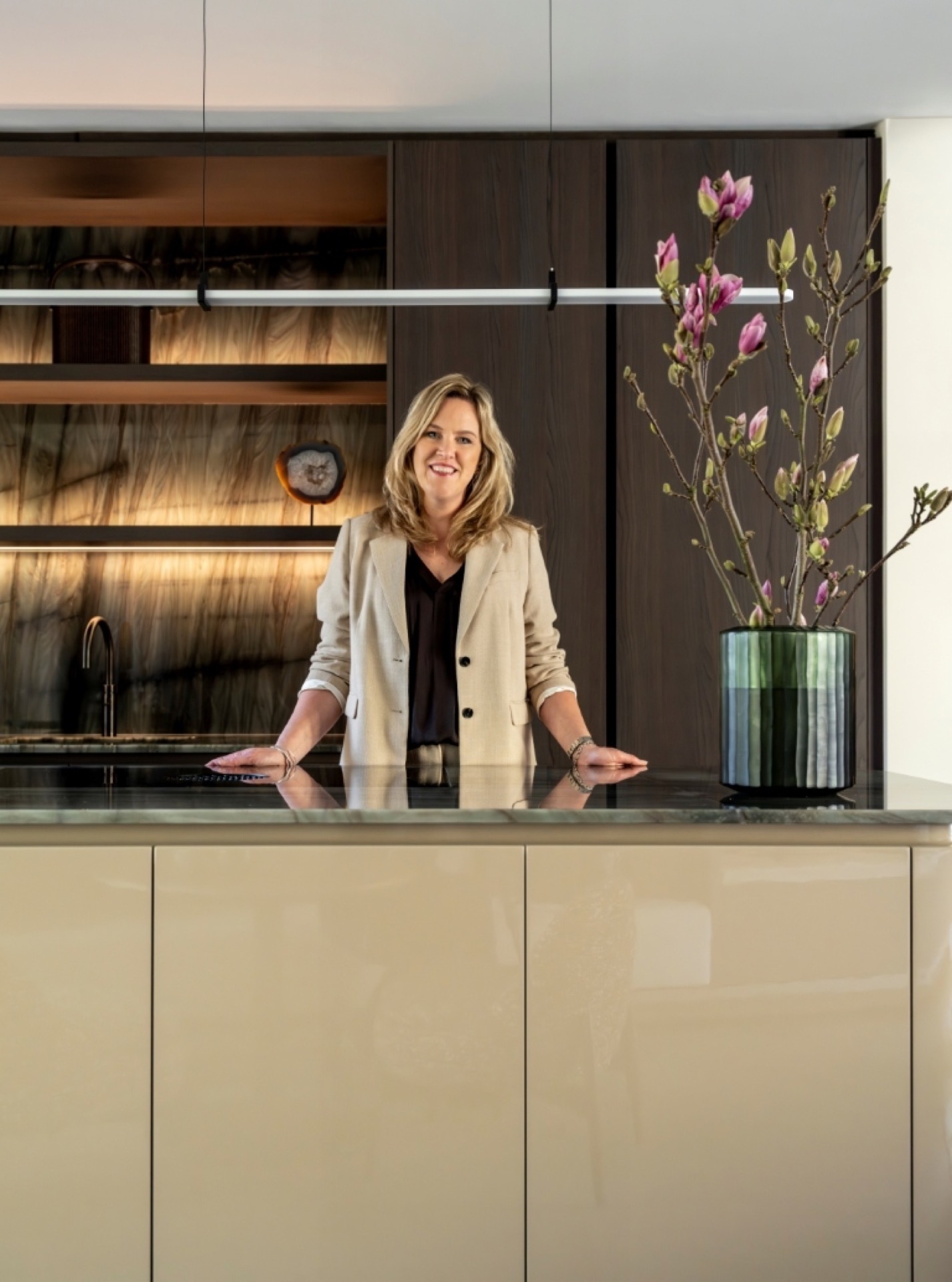
NEW 2026 Jubileum Edition The Best Interior Designers Benelux
Order Now €125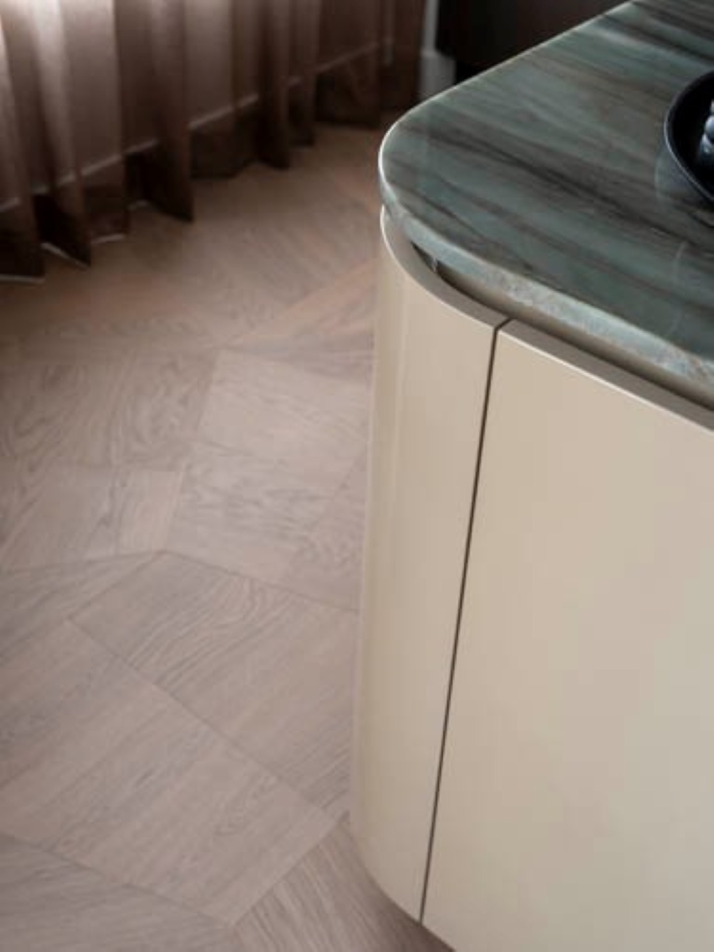
NEW 2026 Jubileum Edition The Best Interior Designers Benelux
Order Now €125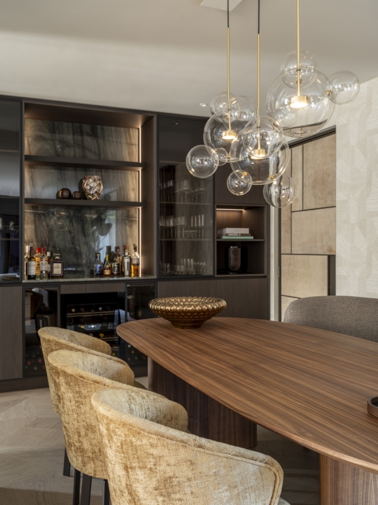
NEW 2026 Jubileum Edition The Best Interior Designers Benelux
Order Now €125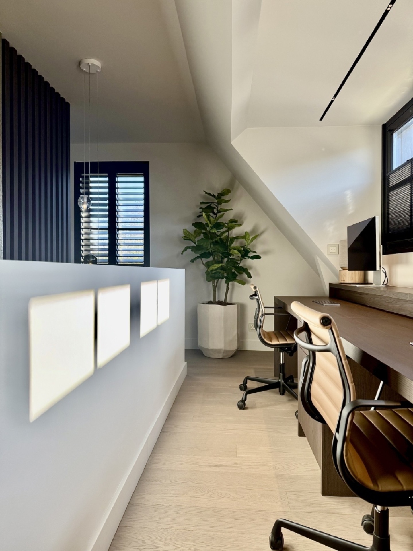
NEW 2026 Jubileum Edition The Best Interior Designers Benelux
Order Now €125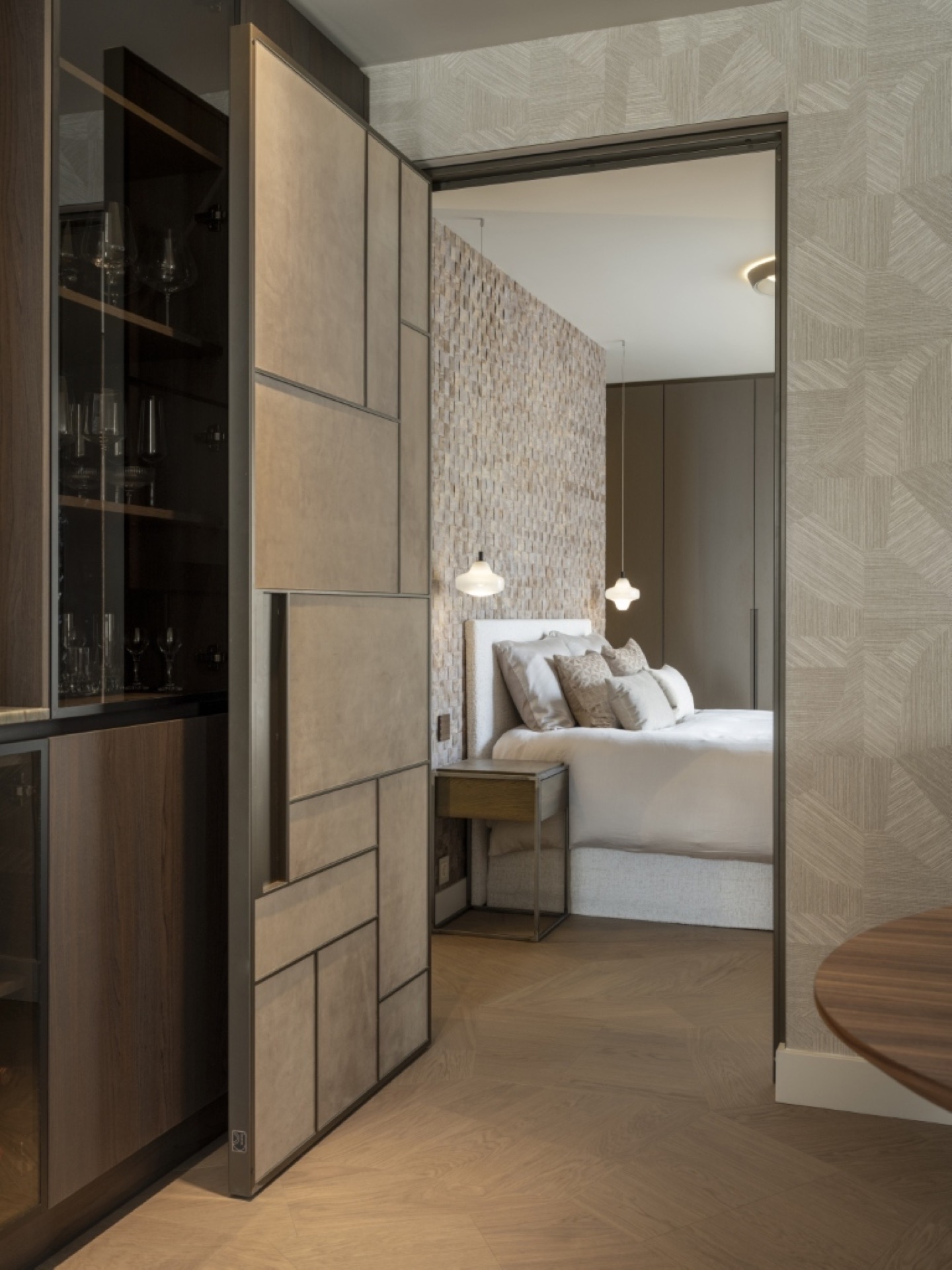
NEW 2026 Jubileum Edition The Best Interior Designers Benelux
Order Now €125