Home renovation for a luxury family home by the water
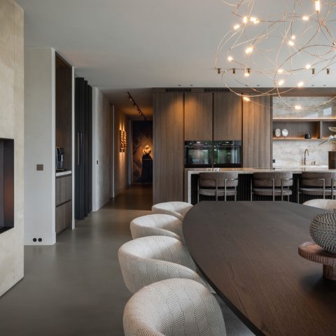
A stone back wall gives the kitchen its anchor. In this home renovation, that surface sits against a generous cooking and dining zone with long views to the garden and the water beyond. The room reads as the centre of the house, not because it is oversized, but because circulation gathers here and the other spaces open from it in clear steps.
A kitchen that holds the plan together
The kitchen is the most exposed room in the house. Large openings pull in daylight and keep the sightline open across the interior and out toward the water. The layout gives the room a practical role, but it also sets the tone for the rest of the scheme: dark joinery, pale walls, timber flooring and a stone surface that adds weight without making the room feel dense.
The island sits at the middle of the working zone and gives the room a clear direction. Around it, the finish choices stay restrained. That restraint matters, because the project depends on transitions rather than isolated statements. The palette continues into the adjoining rooms and keeps the larger plan legible, even after the house was extended and fully reconfigured.
Rooms that shift with family life
Just off the kitchen, the children’s chill room changes the pace of the house. It is set up for gaming and for friends to drop in, which gives the plan a more layered use than a standard open plan family home. The adjacent sitting room moves in the opposite direction. Here the furniture is arranged for quieter use, and the open fireplace in wall niche adds a fixed point in a room that otherwise stays visually calm.
Those two spaces do not compete with the kitchen; they extend its reach. The house moves from social cooking and dining to a more enclosed lounge zone and then to the dedicated children’s room, without abrupt shifts in scale. That sequence is one of the clearest results of the home renovation: each room now has a distinct task, but the connections remain obvious in plan and in sightlines.
Lighting that follows the new layout
The interior and lighting design were developed together, which shows in the way the ceiling lighting tracks the use of each room. Rail spots sit over the cooking area and give the kitchen precise task lighting. Elsewhere, the light is quieter and recedes into the architecture, allowing the timber surfaces, stone wall and dark details to stay readable at different times of day. The lighting does not fight the plan; it supports the movement through it.
Because the layout was rebuilt from the ground up, the lighting could be positioned to suit the new routes through the house. The result is a space where the evening atmosphere is shaped by the architecture itself: the niche with the fire, the island surface, the glass openings and the deeper seating areas all catch light in different ways. That layered reading is central to the project’s interior work.
Built around extension and reorganisation
The house was enlarged and then arranged again from within. That matters, because the renovation was not limited to finishes. The spatial changes created room for a broader family programme and gave the interior the proportions it needed for a more open way of living. What once may have been a more fragmented 1980s house now reads as one connected sequence, with the kitchen leading and the other rooms following in a measured rhythm.
Construction guidance formed part of the brief as well, handled partly alongside the contractor. That collaboration shows in the details that usually disappear into the background: the clean joinery lines, the way surfaces meet, and the consistency between the new volumes and the renewed interior finish. The result is less about showing construction and more about making the new structure feel settled into daily use.
Material choices that stay consistent
Across the house, the colour and material palette was carried through with care. Timber, stone, glass and darker built-in elements repeat from room to room, so the eye is not interrupted by abrupt changes. The same discipline appears in the kitchen and in the sitting room, where the materials are allowed to repeat rather than compete. That repetition gives the renovation its quiet order.
The stone behind the kitchen is especially important because it does more than frame the cooking zone. The same character returns subtly in the garden design, which creates an indoor outdoor material match without copying the interior literally. It is a restrained move, but an effective one: the house and garden speak to each other through surface and tone rather than through a decorative gesture.
From the terrace canopy to the garden edge
The transition outside continues that same logic. Large glazed openings connect the interior to the terrace, where a modern terrace canopy gives shelter and defines the edge of the outdoor room. Black window frames and brick surfaces give the exterior a crisp outline, while the stone accents tie back to the interior reference points. The shift from inside to outside is direct, but not abrupt.
What makes this renovation convincing is the way each part reinforces the next. The kitchen island, the wall niche with the fire, the children’s room, the sitting room and the terrace all belong to one family layout, yet each room keeps a clear identity. The design work and lighting plan hold those differences together, while the extension and new plan make the house work as a complete sequence rather than a set of separate parts.
Want to see more of Studio MBC? View the page of Studio MBC for even more great projects and company information.

Contributors



NEW 2026 Jubileum Edition The Best Interior Designers Benelux
Order Now €125


NEW 2026 Jubileum Edition The Best Interior Designers Benelux
Order Now €125