Custom interior home: new layout, built-ins, and a color & material plan
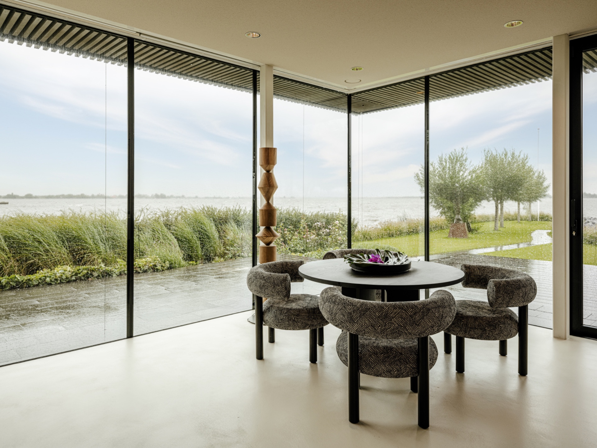
Warm wood, dark surface panels, and long views through the house set the tone for this custom interior home. The ground floor was completely reorganized, with the living room and kitchen exchanging places and the connection spaces given a clear role. That shift is visible in the way circulation now works around built-in cabinets and wall finishes, while large glazing keeps sightlines open and lets daylight run deeper into the rooms.
A new ground floor layout shaped by movement
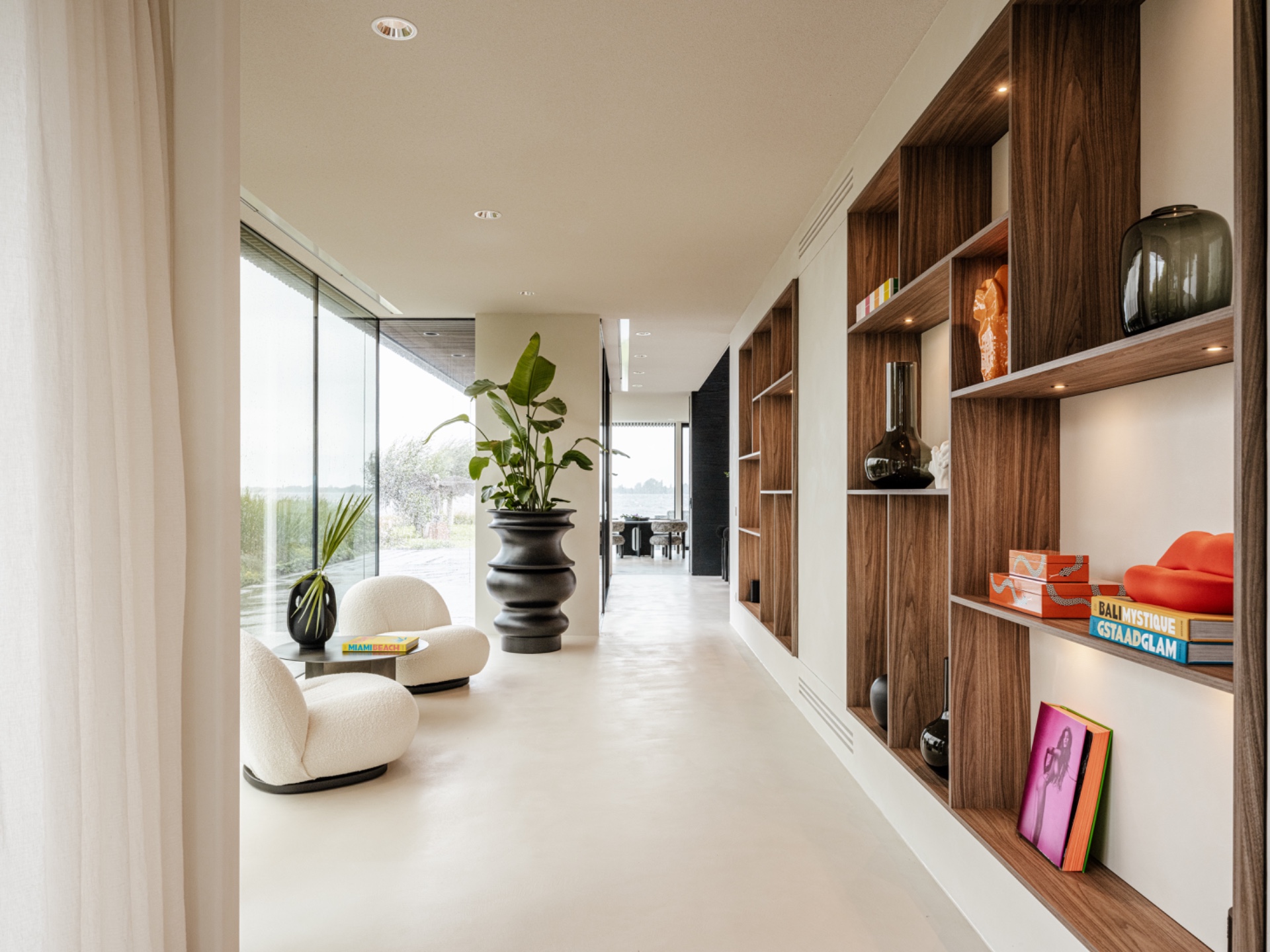
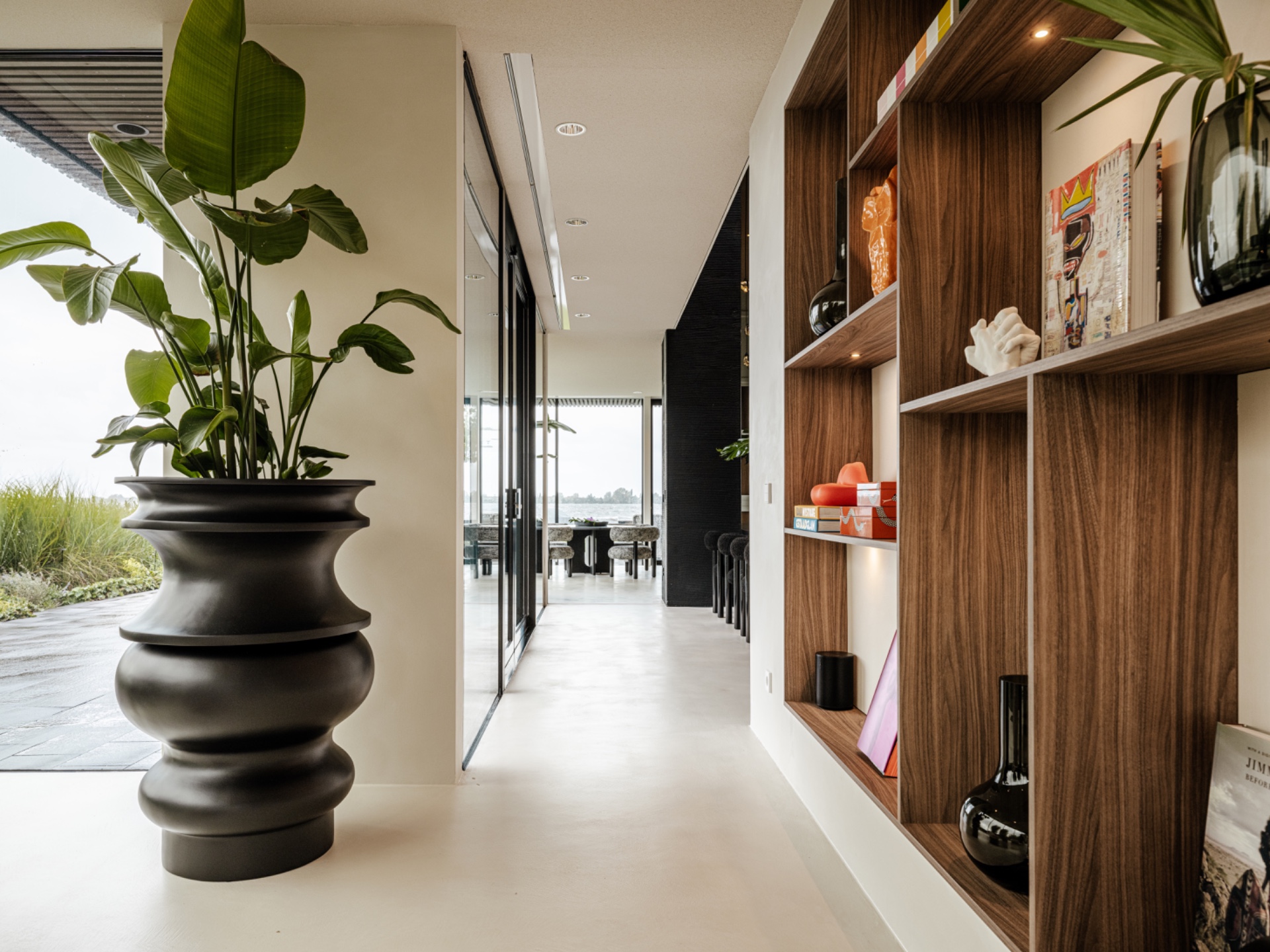
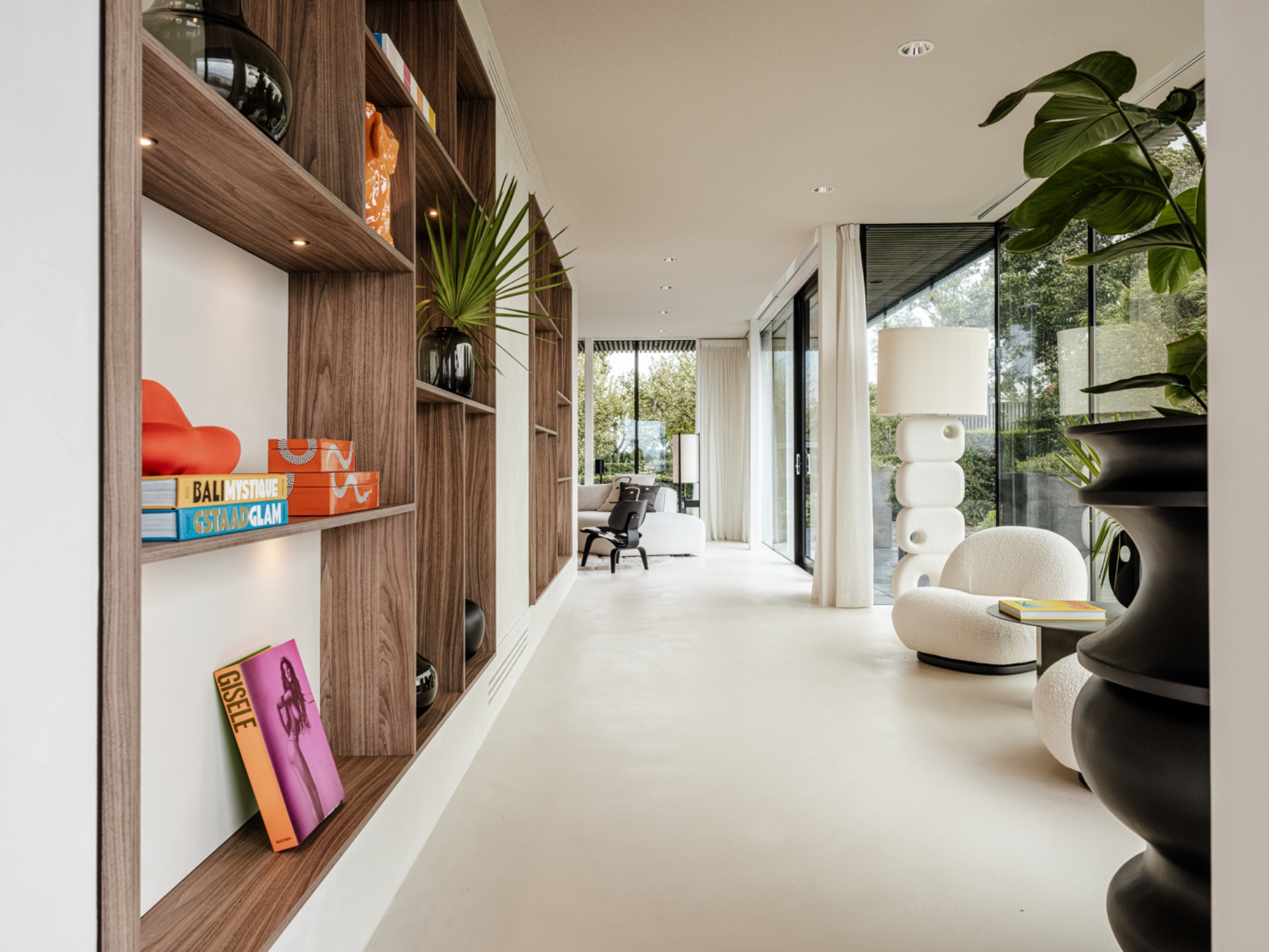
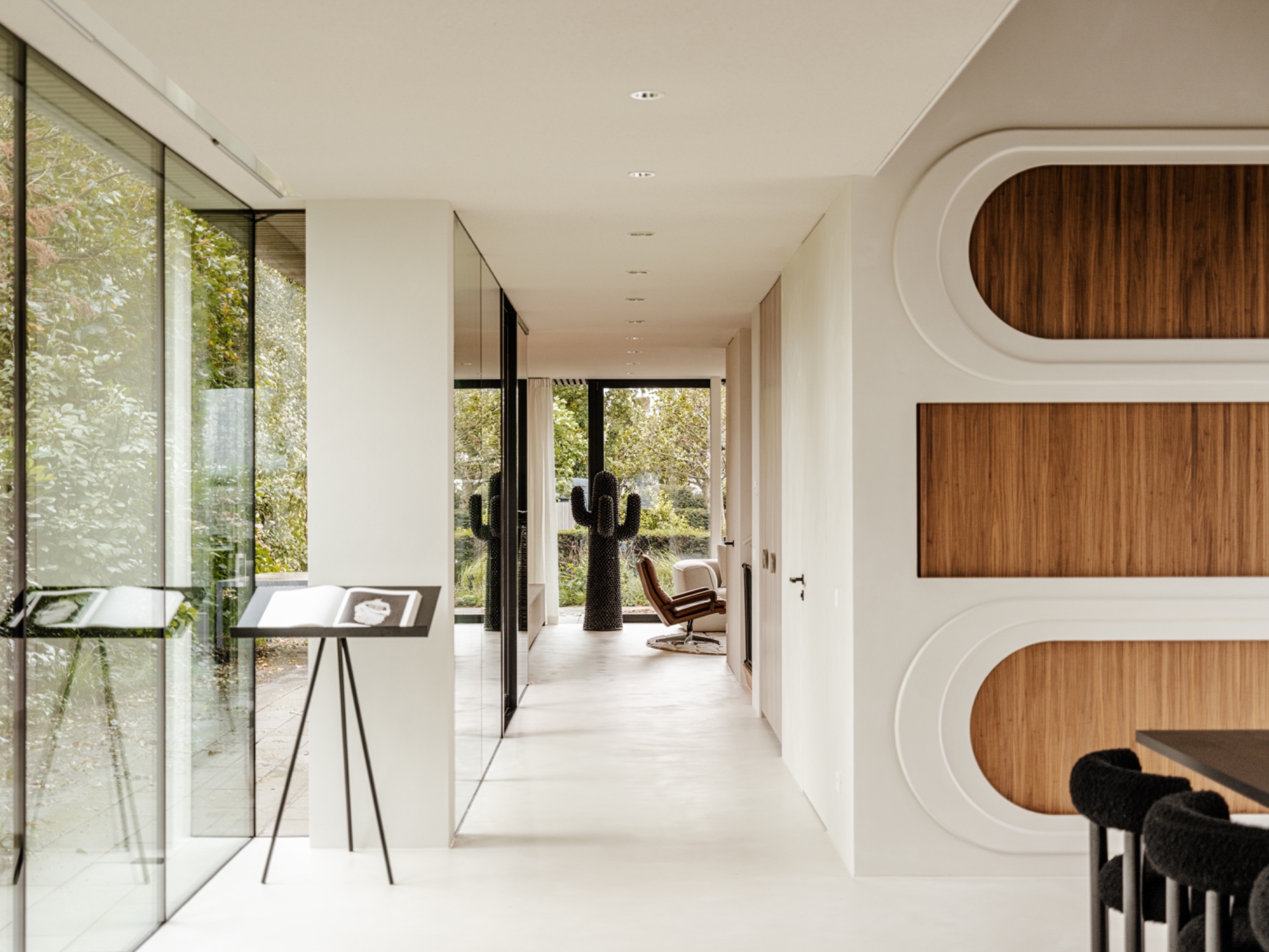
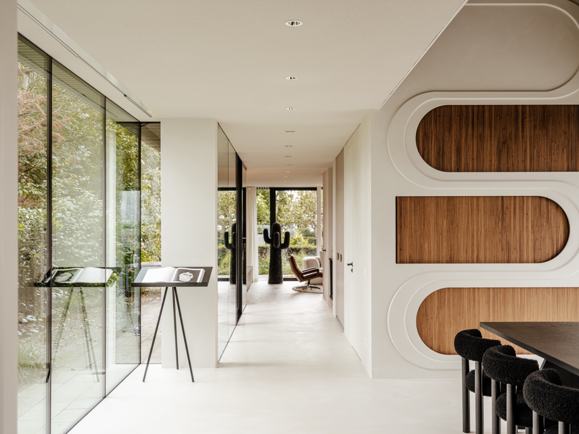
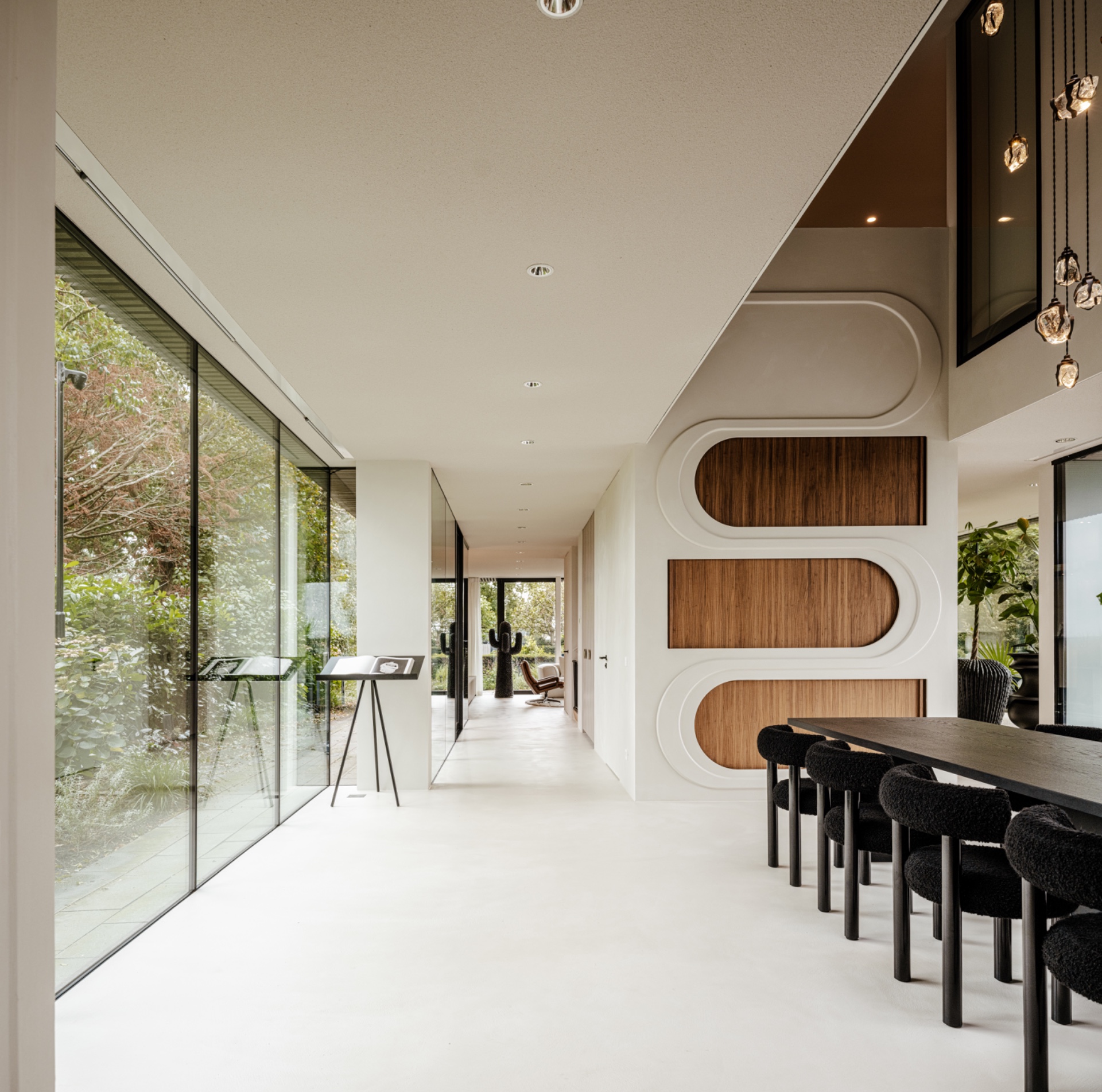
The new ground floor layout starts with a practical move: spaces that once felt secondary were assigned a function. Hallways and transitions no longer read as leftover areas. They carry the route through the house and link one room to the next. In the photos, that approach is reinforced by straight lines, inset lighting, and fixed joinery that guides the eye instead of breaking the plan into fragments. The result is a layout that reads clearly from the first step inside.
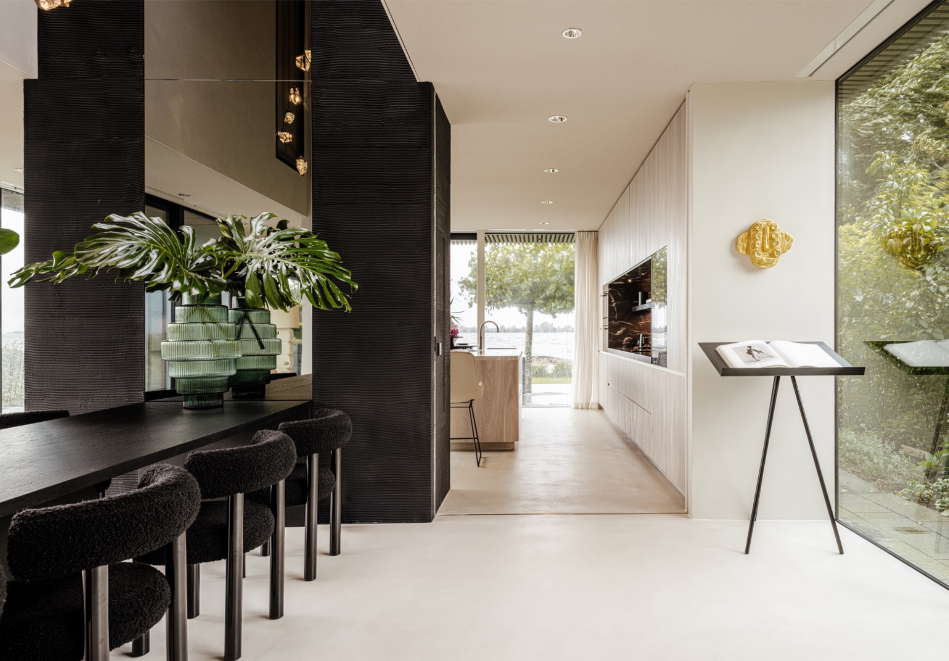
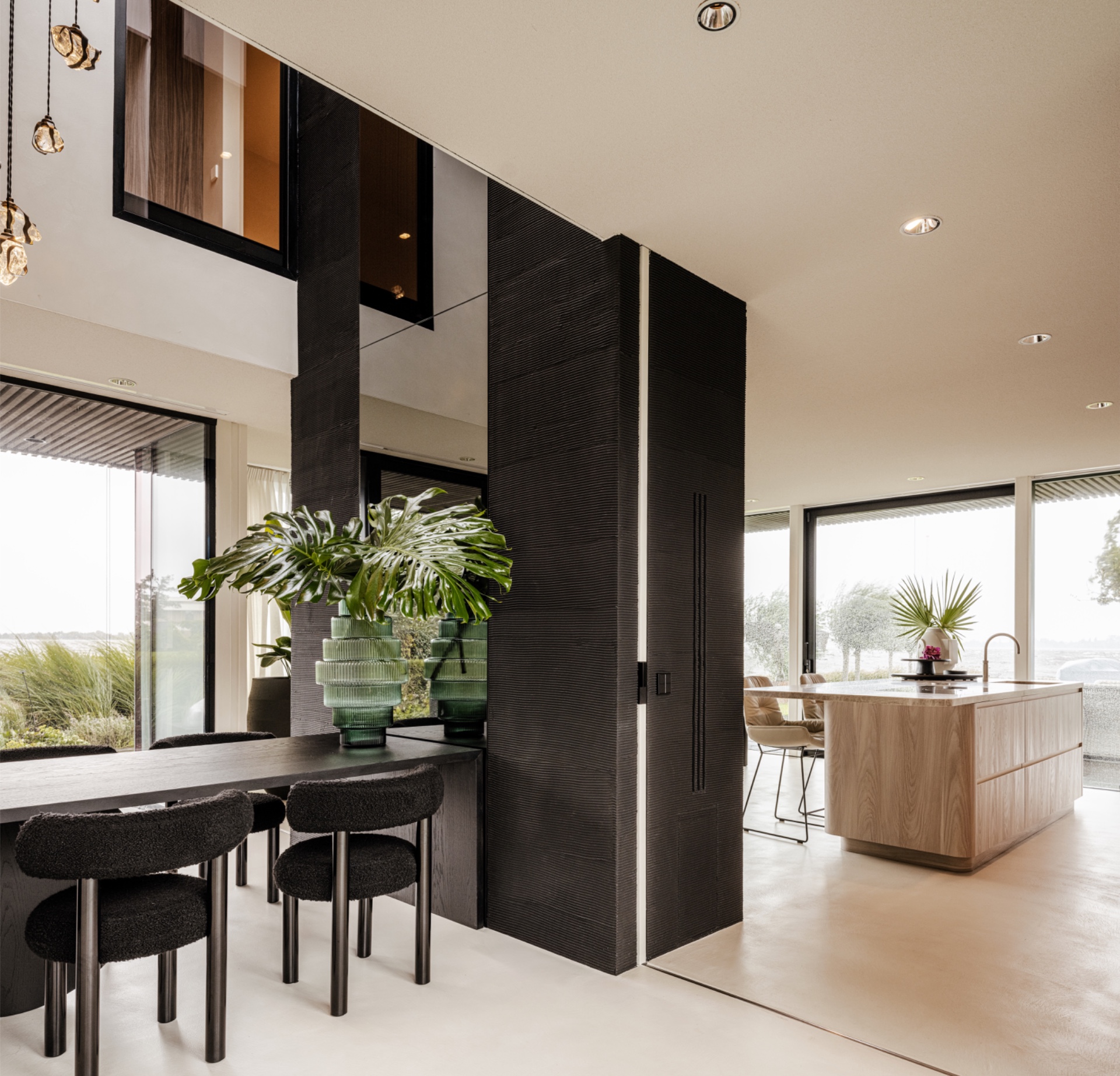
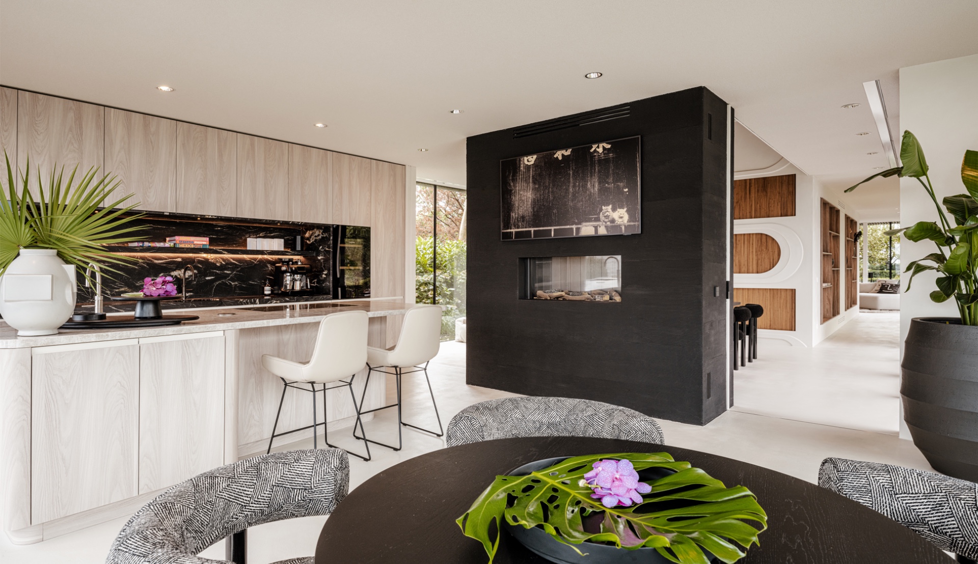
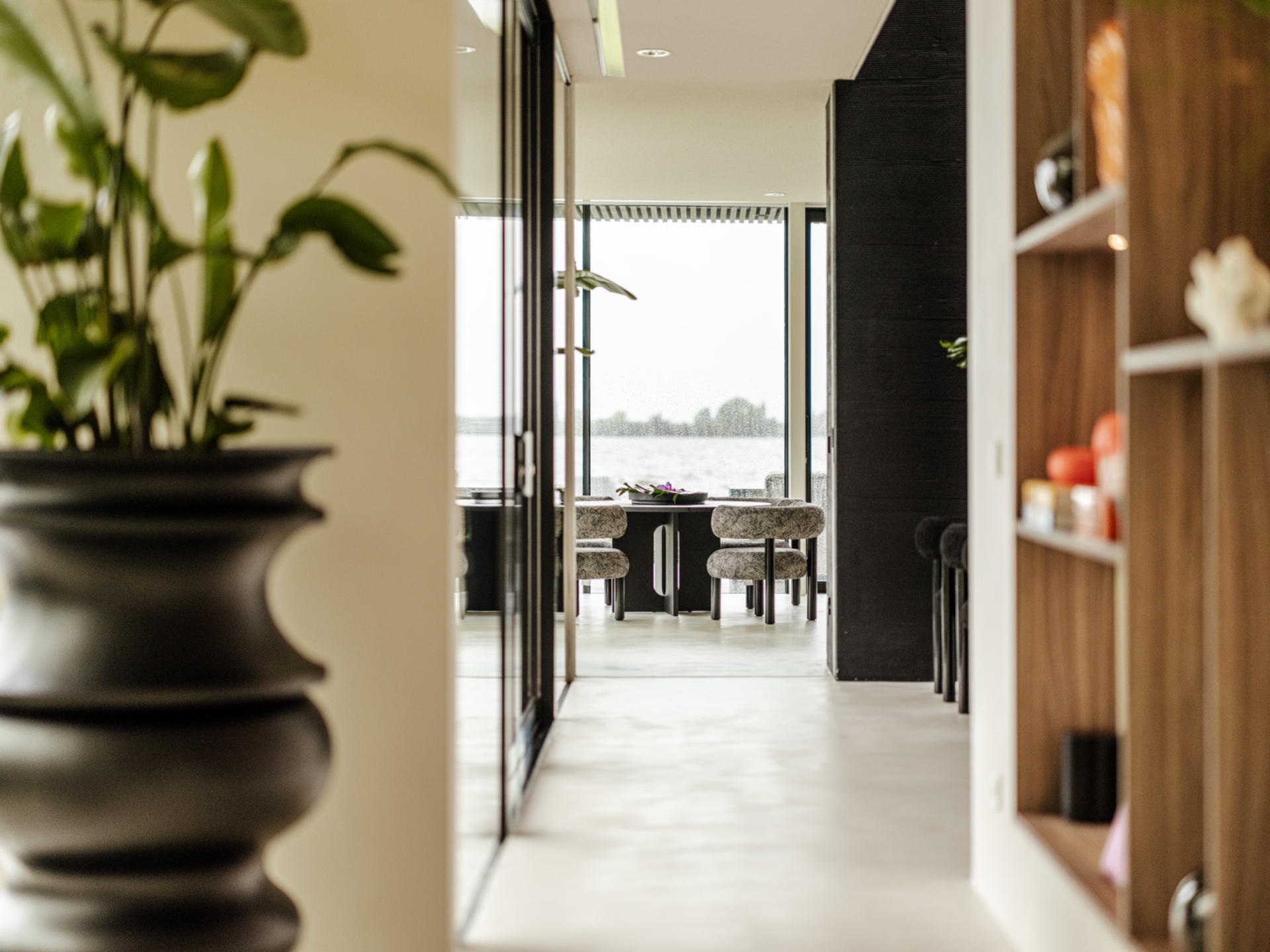
Swapping the living room and kitchen changed more than the order of the rooms. It altered how daily movement passes through the house and how the open areas relate to one another. The living kitchen reconfiguration brings the kitchen into a different position in the plan, while the adjacent zones remain visually connected through glass, pale plastered surfaces, and repeated wood detailing. The change is legible in the long views and in the way each zone now has its own place without closing off the floor.
Built-in cabinets and niches that carry the walls
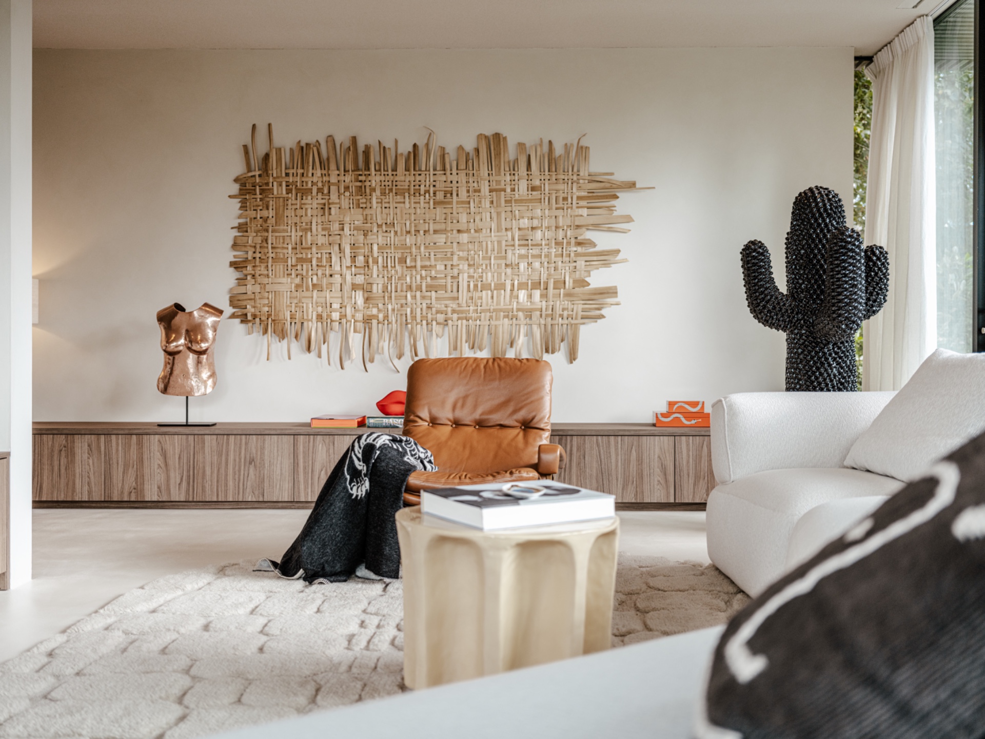
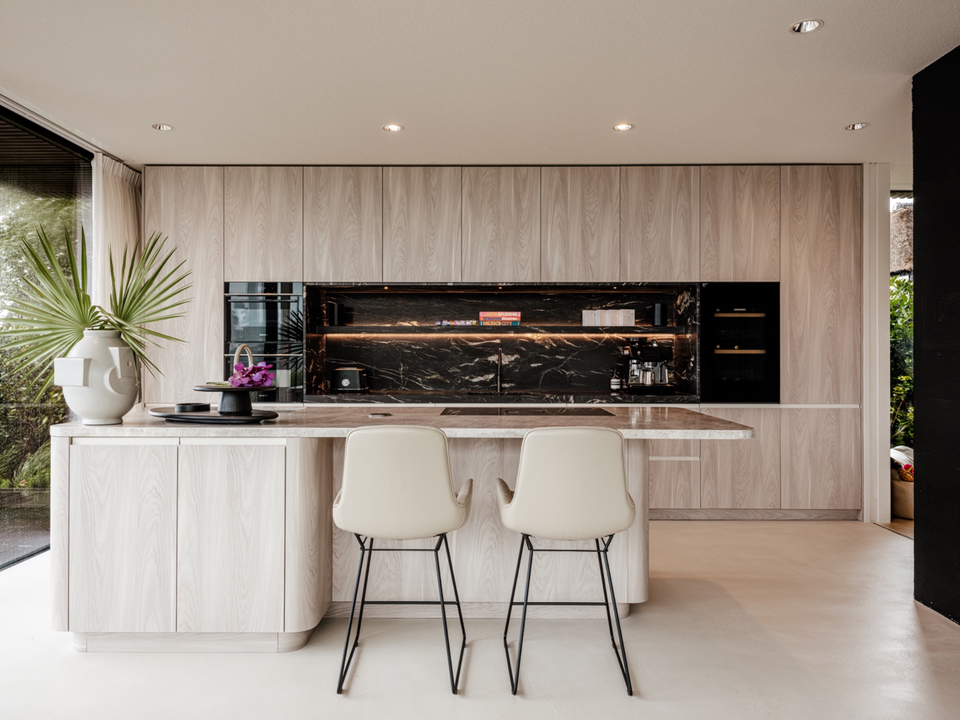
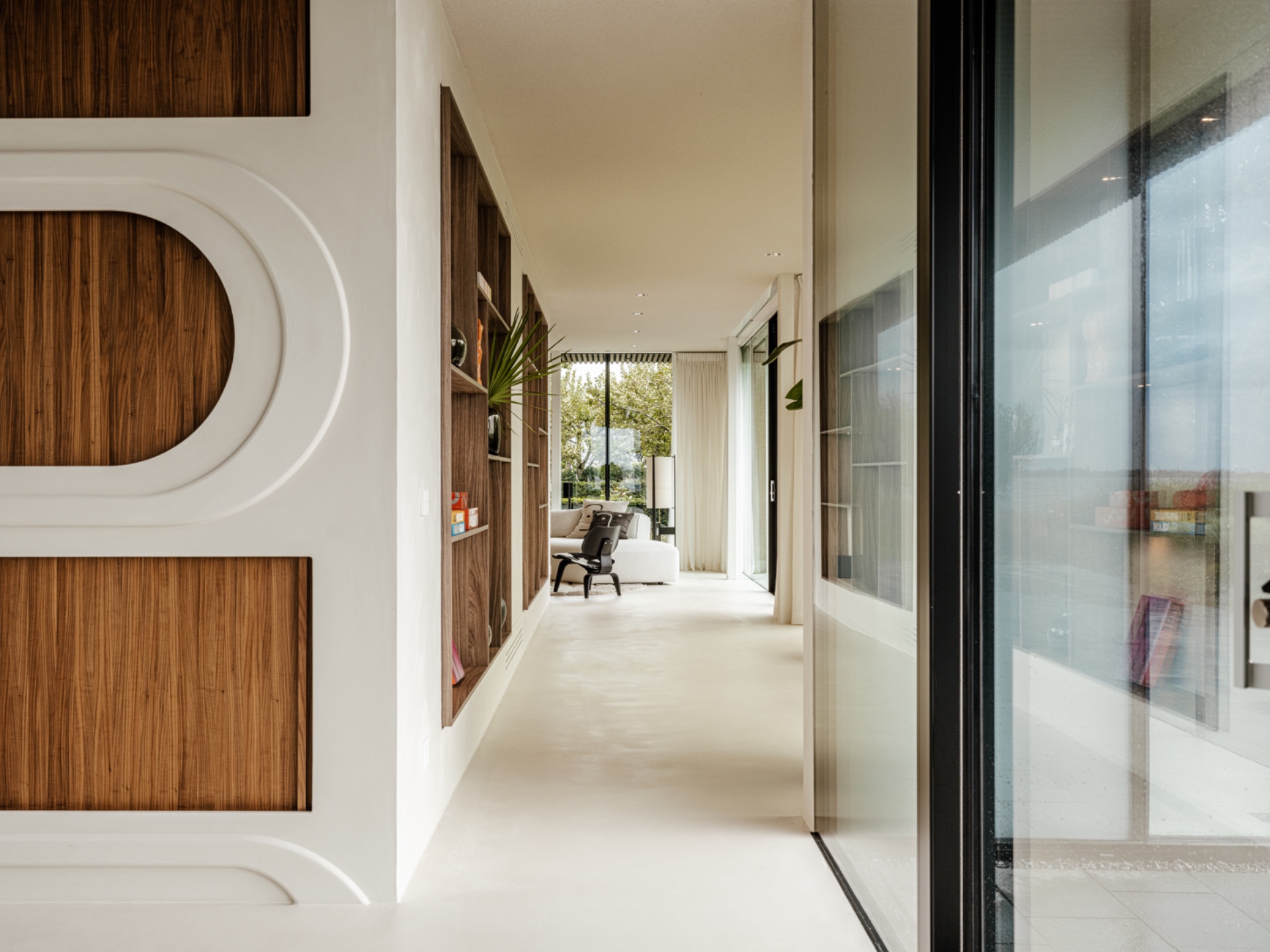
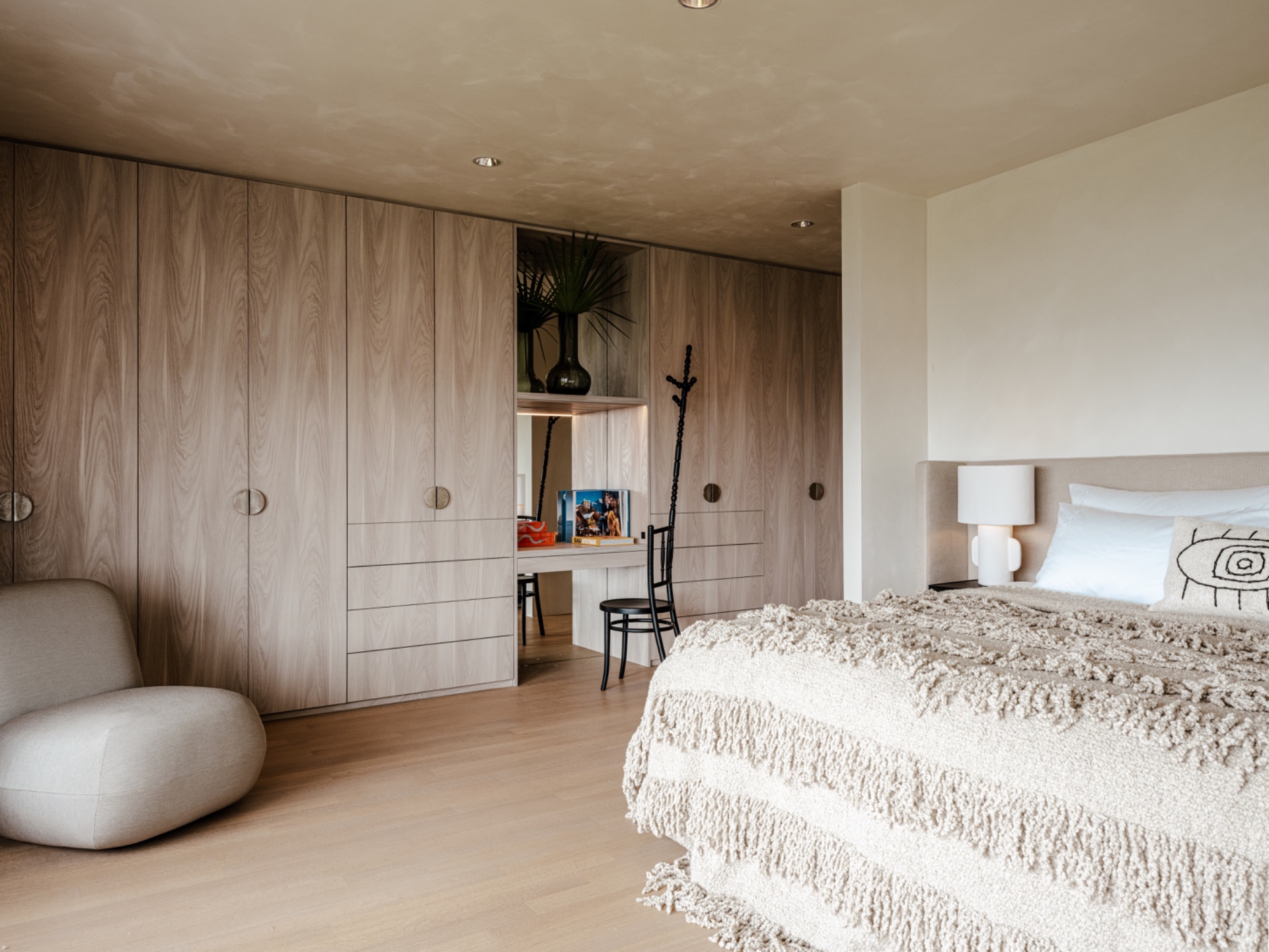
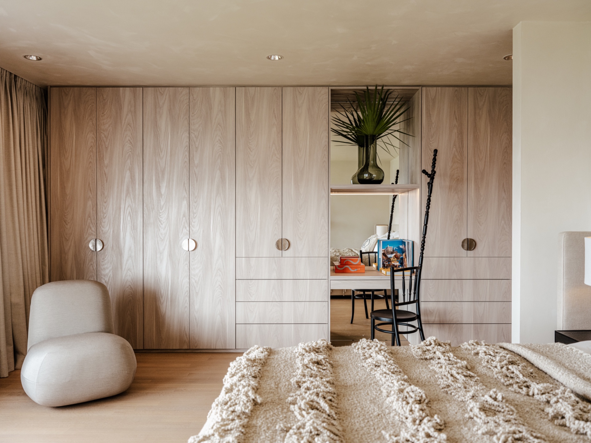
Much of the project is defined by built-in cabinets and niches drawn specifically for the house. Horizontal divisions in the woodwork, open compartments, and recessed sections appear throughout the interior, giving storage and wall finishes the same level of attention as the larger rooms. In several images, the cabinetry sits flush against white walls, so the joinery reads as part of the architecture rather than an added layer. That keeps the surfaces calm, even when the details are elaborate.
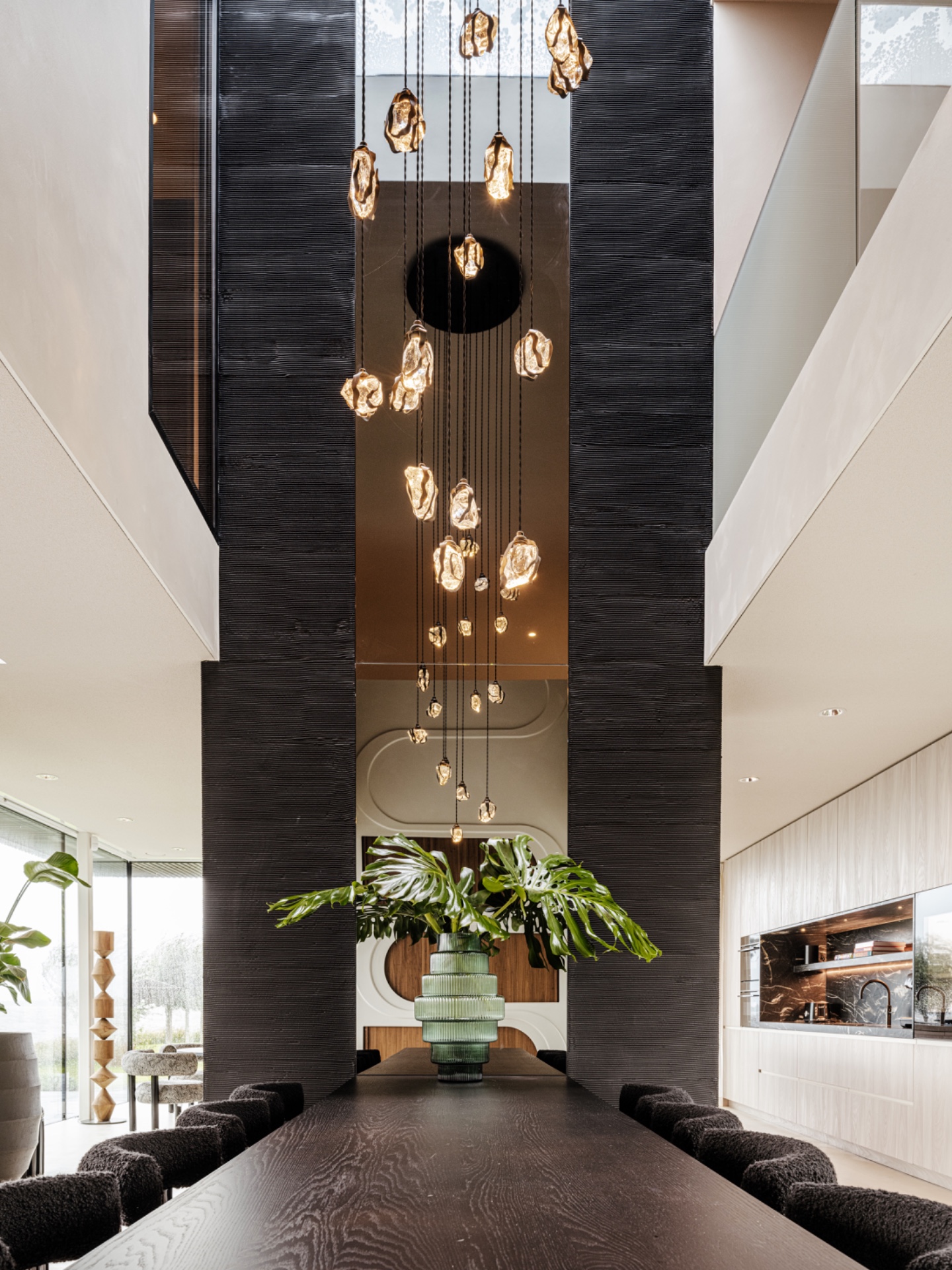
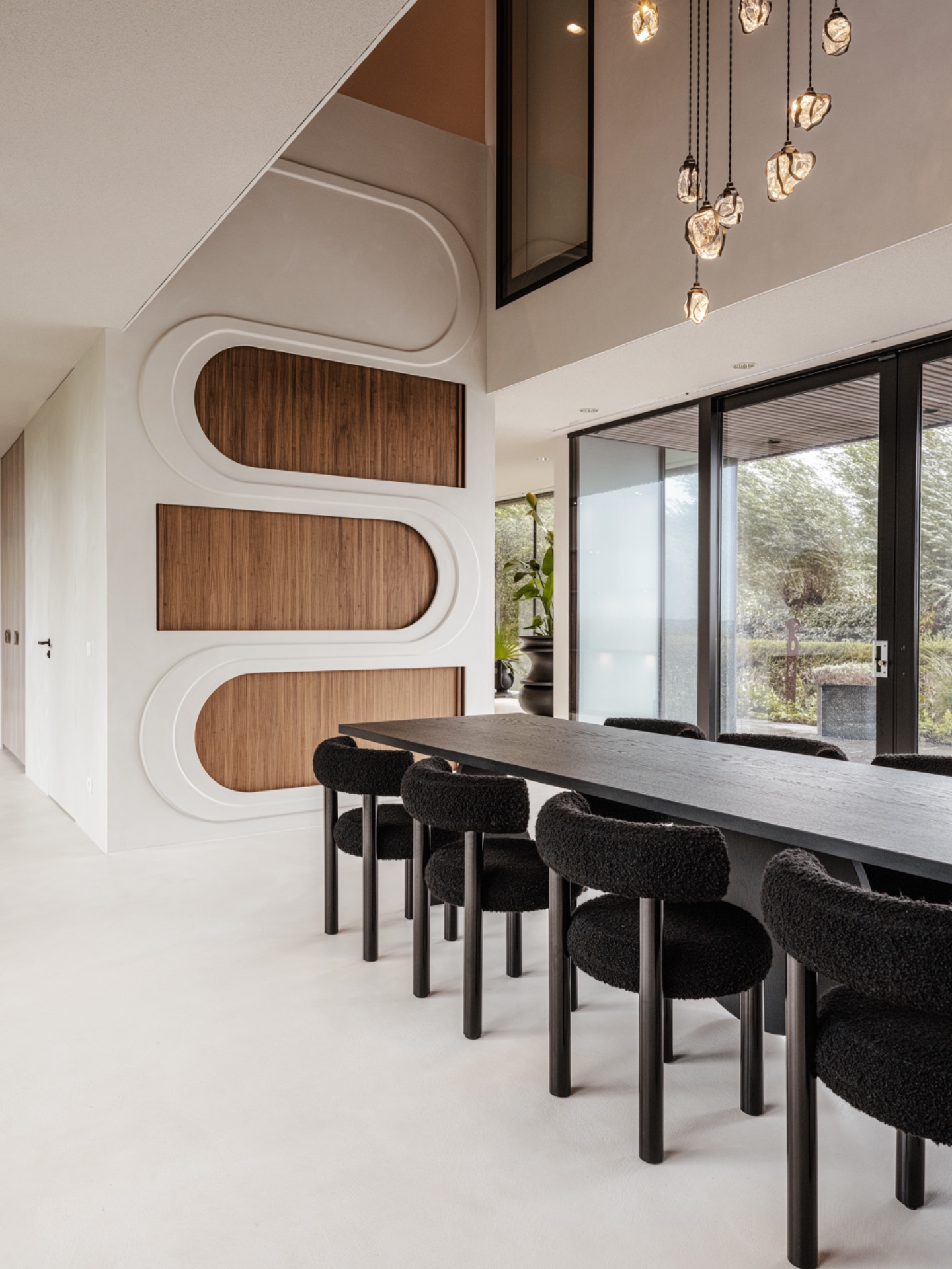
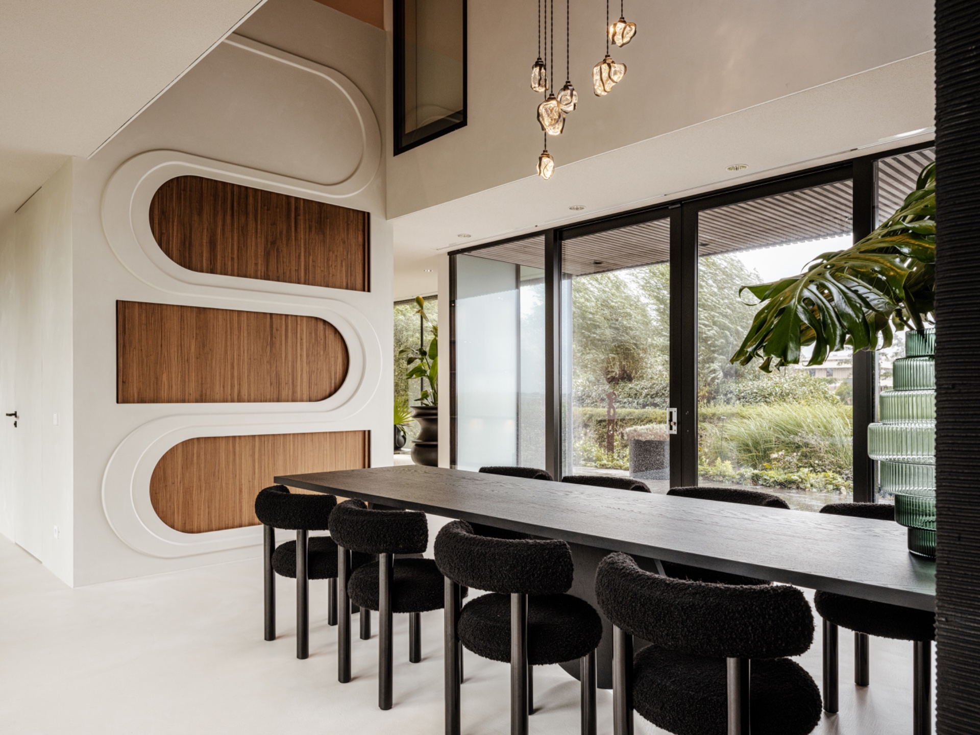
Rounded cut-outs in white custom millwork soften the more rigid lines of the plan. They break up the straight edges of the walls and introduce a different rhythm in the circulation areas. The contrast between those organic openings and the darker textured core wall is important: one side pulls light across smooth plaster, the other anchors the space with depth and shadow. Together they show how custom interior home planning can shape both storage and atmosphere through the same set of elements.
Wood, stone, glass, and plaster in one interior language
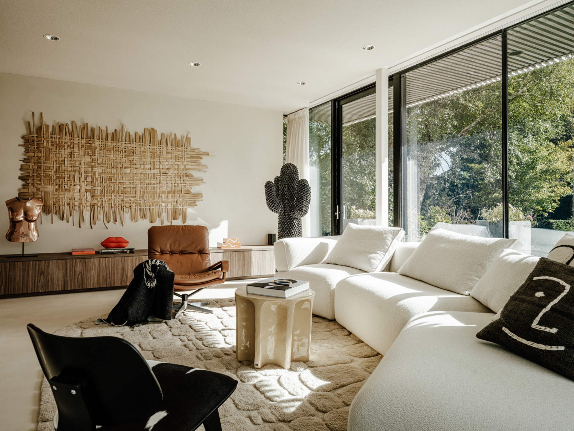
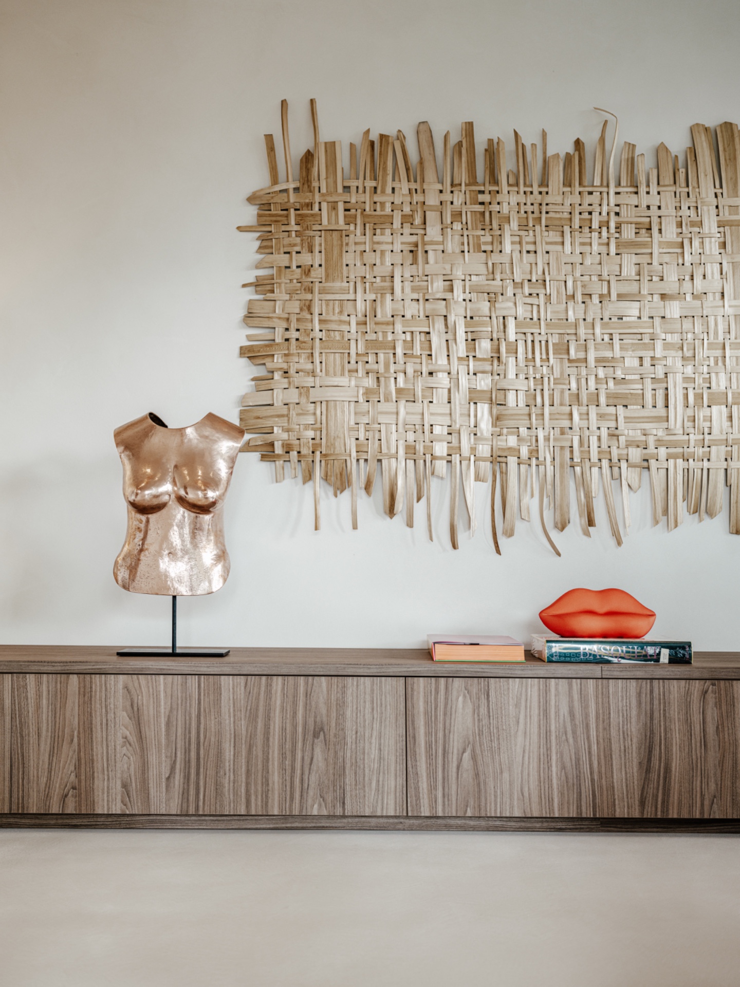
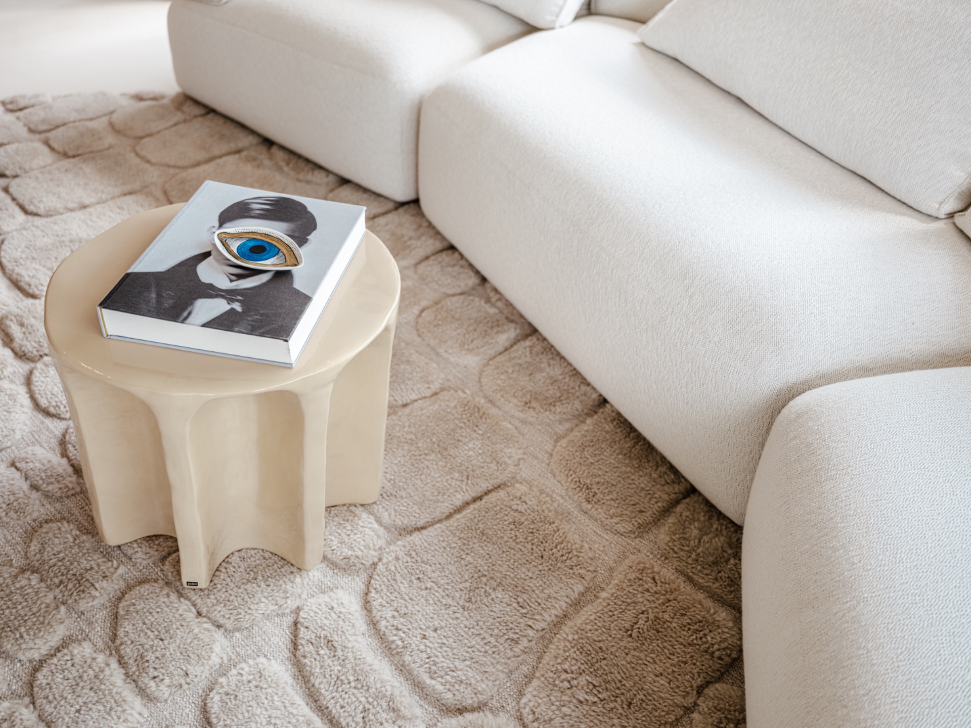
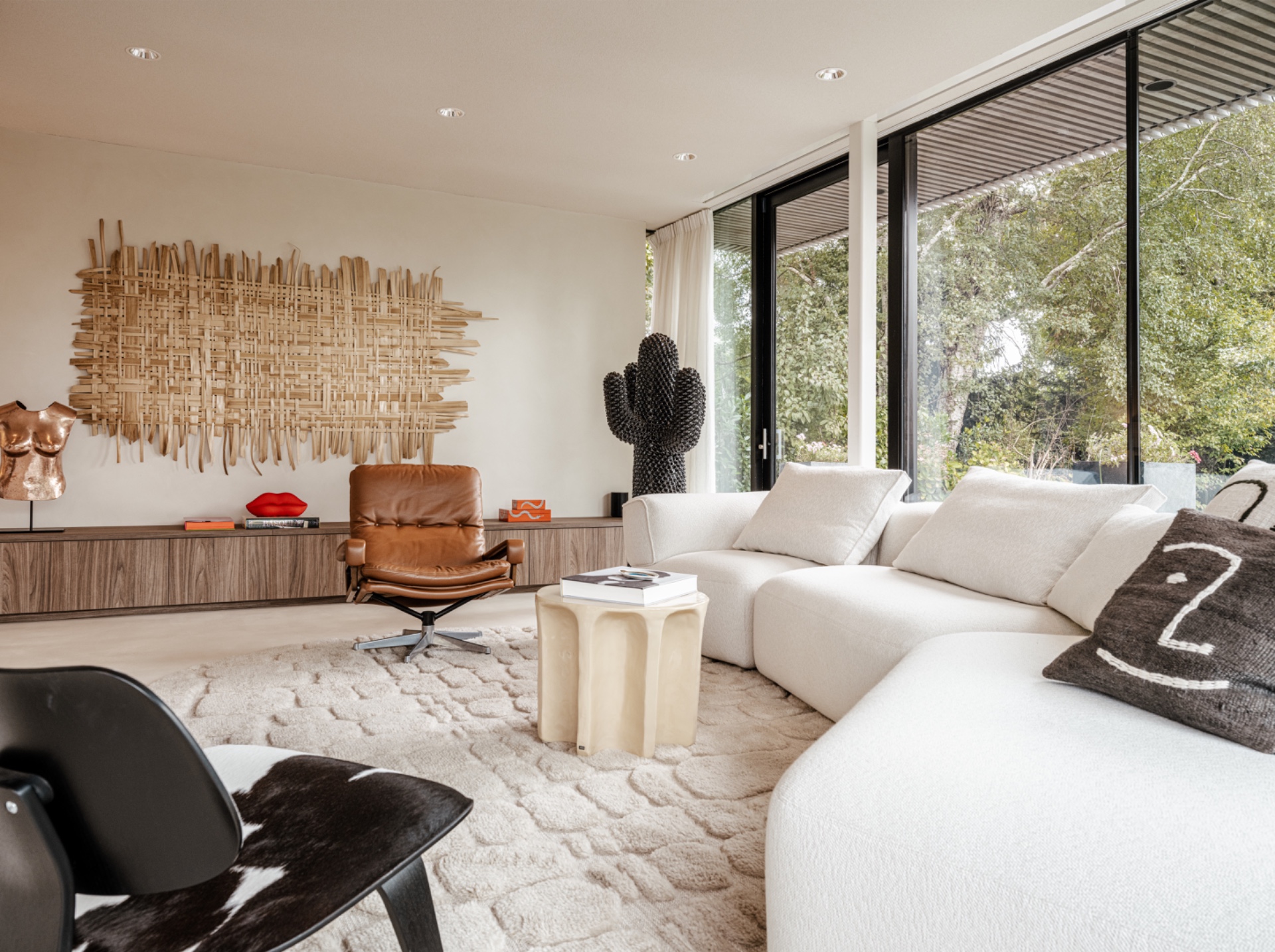
The materials in this home stay close to wood, stone, glass, and plaster. Wood brings the strongest visual presence, especially in the built-in furniture, wall panels, and console-like elements that appear in the living spaces and along the transitions. Stone appears more restrained, used as part of the broader material palette rather than as a dominant surface. Glass opens up the plan through large windows and sliding openings, while plaster keeps the larger wall fields quiet and readable.
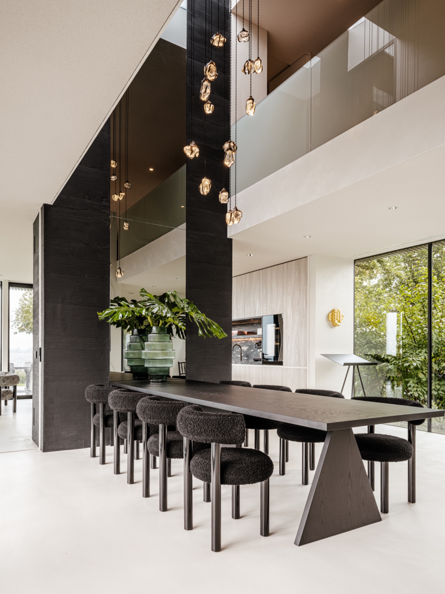
Color follows the same logic. White and beige provide the background, brown wood panels add depth, and black appears in the darker accent zones that interrupt the lighter rooms. Green enters as a visible accent in the interior, not as decoration but as part of the overall palette. The color and material plan ties those tones together so they do not compete. Instead, each surface supports the next, from the lightest wall to the darkest core.
Living room and kitchen reconfigured around the same sightline
Because the living room and kitchen were swapped, the house now reads differently from the shared spaces. The kitchen no longer sits where it did before, and the living area takes up a position that better suits the way the rooms connect. What remains consistent is the emphasis on sightline. A glance can move from the open room toward the glazing, across a wall with joinery, and back toward the darker architectural core. That is where the reconfiguration becomes tangible: the plan is not just new on paper, it is visible in how the house allows you to look through it.
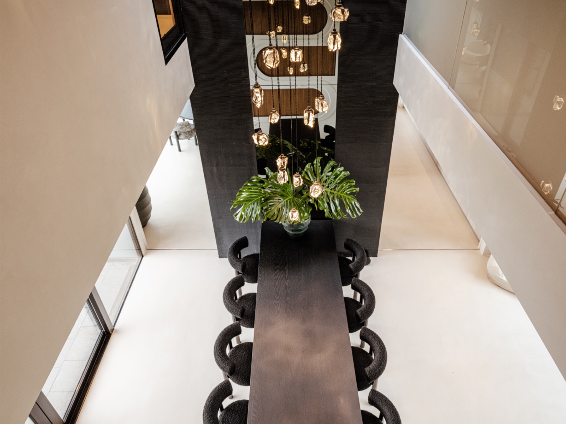
The ceiling lighting supports that reading. Inset spots trace the edges of the rooms and pick out the built-in zones without interrupting the surfaces. In one of the darker areas, hanging lights sit against a textured wall, giving the space a defined center. The mix of direct light, concealed light, and reflected daylight keeps the ground floor from feeling flat, even though the finishes stay controlled and consistent.
An extra room upstairs and a revised master bedroom
On the first floor, an additional room with its own sanitary space was created. That addition changes the use of the upper level without overcomplicating the plan. It gives the floor a clearer separation between rooms and services, which is especially important in a house where the layout has already been carefully reorganized below. The master bedroom was also redrawn, showing the same attention to sequence and fit that shaped the ground floor. The room is not described through excess detail, but through the way the plan was adjusted around it.
What matters here is the consistency between levels. The upper floor follows the same design logic as the floor below: functions are assigned deliberately, transitions are not wasted, and the finishes remain tied to the wider interior language. Even without seeing every room in full, the photographs show how the house uses opening, closure, and built-in elements to support a clear domestic route.
From approval to aesthetic construction guidance
Once the plans were approved, aesthetic construction guidance kept the interior aligned with the design intent. That stage matters in a project with many custom elements, because details such as panel joints, niche edges, lighting positions, and the relationship between surfaces need to be read consistently on site. The built-in work in this home depends on that attention. A cabinet line that shifts by a few millimeters, or a wall finish that stops too soon, would change the entire reading of the room.
The project ended with turn-key interior delivery, which brings the design process back to a finished domestic setting. By that point, the new ground floor layout, the living kitchen reconfiguration, the color and material plan, and the custom joinery all had to work together in the completed house. The photographs show that outcome through a steady palette, clear routing, and details that continue from one room into the next without forcing themselves forward.
What the photographs reveal about the finished house
The images make the project legible through smaller decisions. A dark textured wall rises behind hanging lights. A long glass opening brings the outside into view. A wooden console repeats its horizontal rhythm along a white wall. Elsewhere, open niches are cut into paneling so the storage reads as architecture rather than furniture. These are not isolated gestures. They explain how the custom interior home was built around measured changes in layout and material use.
Read together, those details show a house that was not simply refreshed but reordered. The plan on the ground floor changed, the upper level gained a new room, and the master bedroom received a new arrangement. Across the whole home, the custom interior work connects the rooms through one material language and one clear set of interventions. The result is a house where the layout, the joinery, and the finish plan all point in the same direction.
Want to see more of Studio des Bouvrie? View the page of Studio des Bouvrie for even more great projects and company information.



NEW 2026 Jubileum Edition The Best Interior Designers Benelux
Order Now €125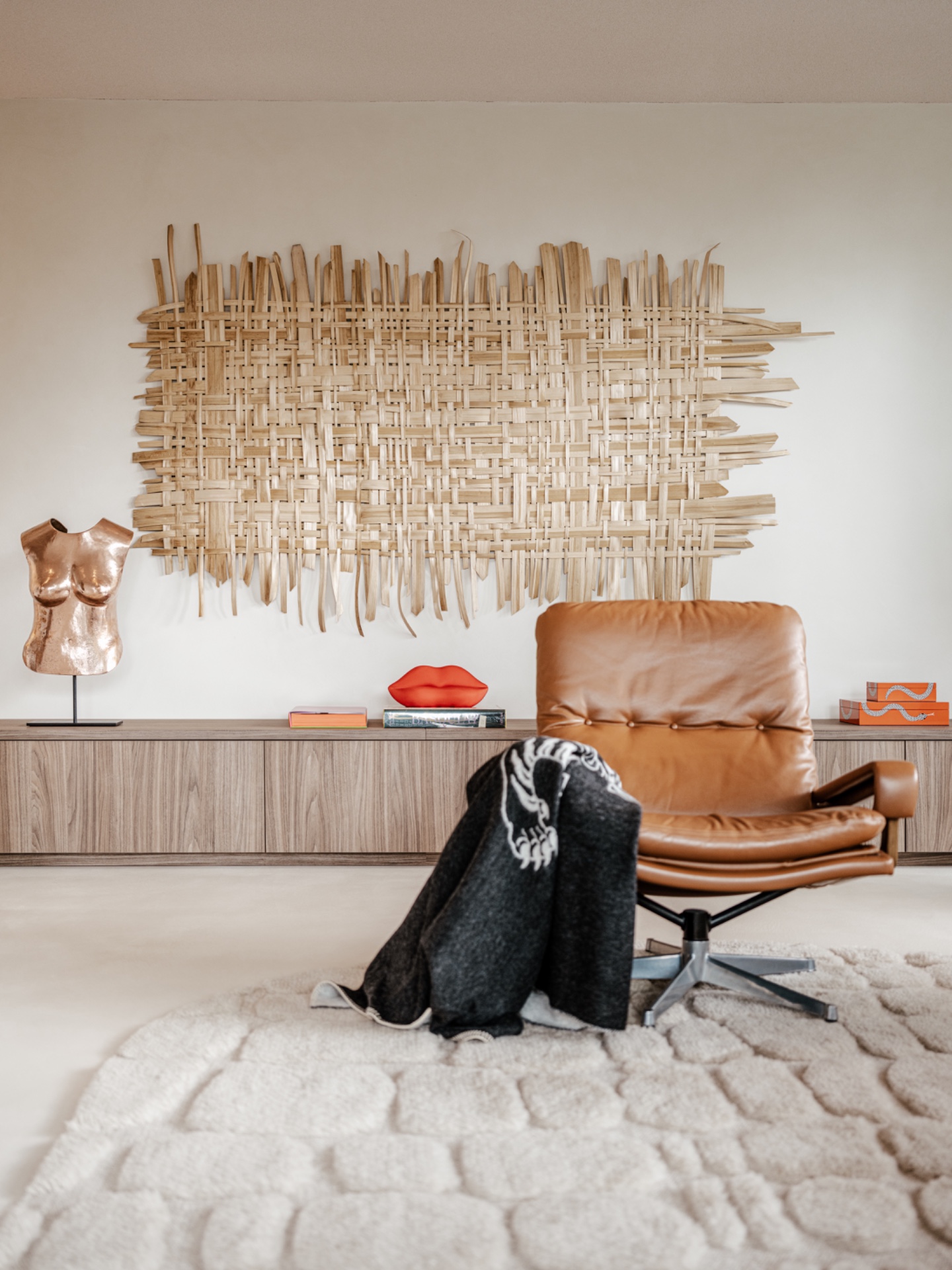
NEW 2026 Jubileum Edition The Best Interior Designers Benelux
Order Now €125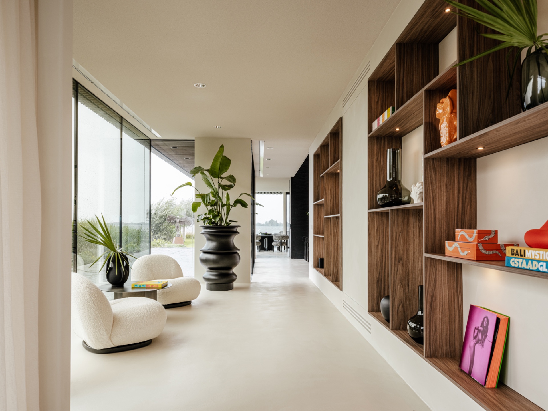
NEW 2026 Jubileum Edition The Best Interior Designers Benelux
Order Now €125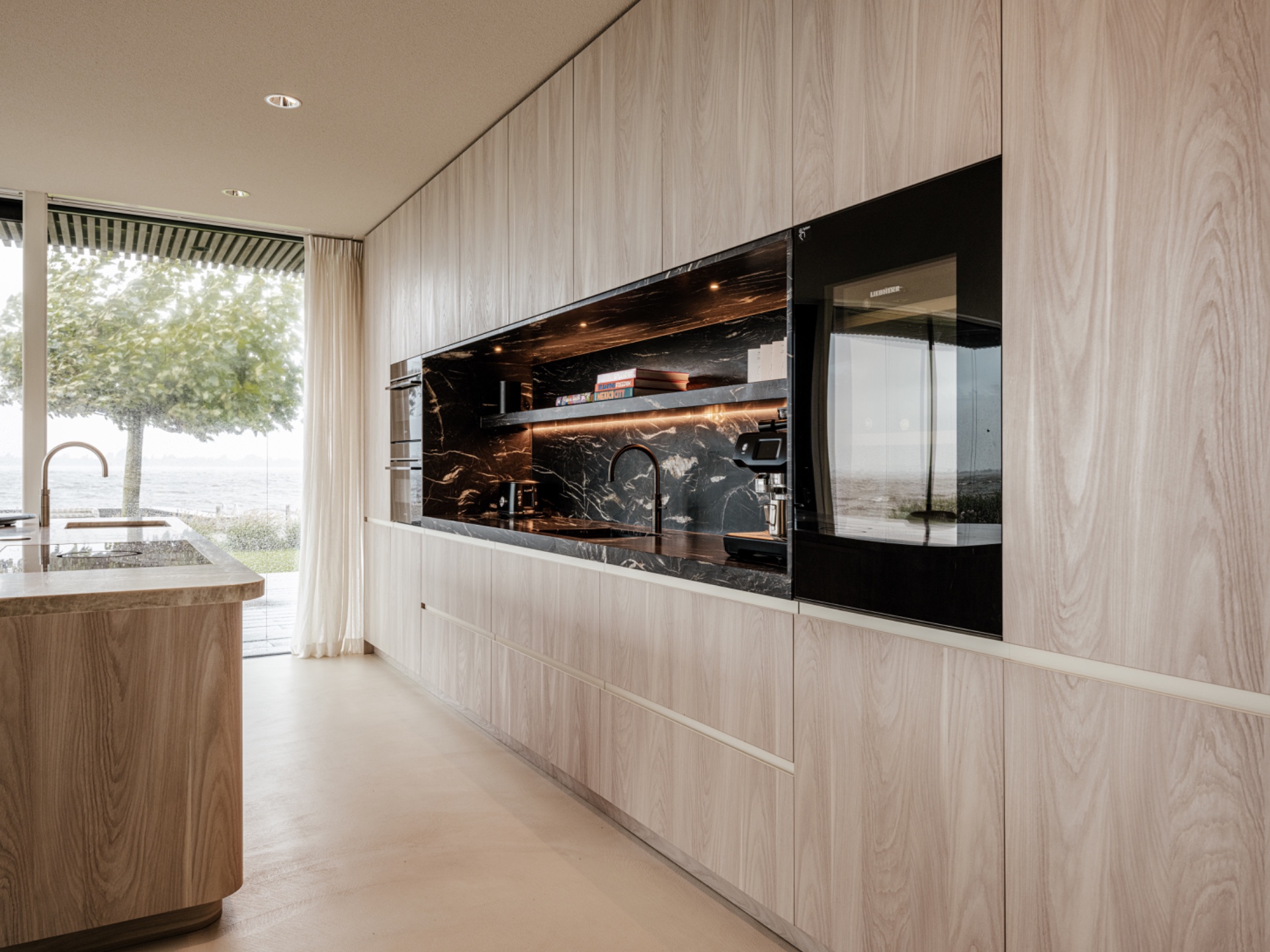
NEW 2026 Jubileum Edition The Best Interior Designers Benelux
Order Now €125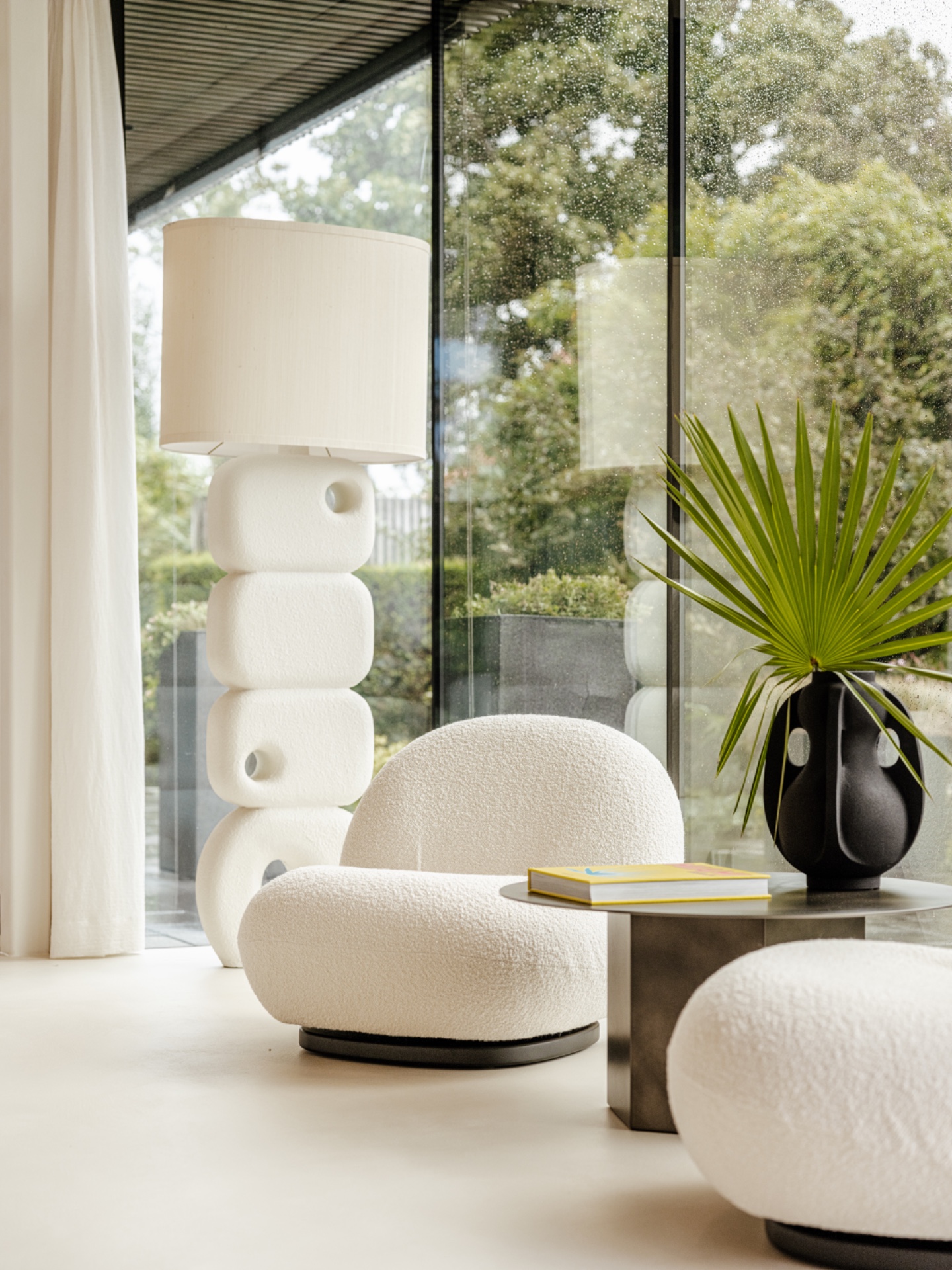
NEW 2026 Jubileum Edition The Best Interior Designers Benelux
Order Now €125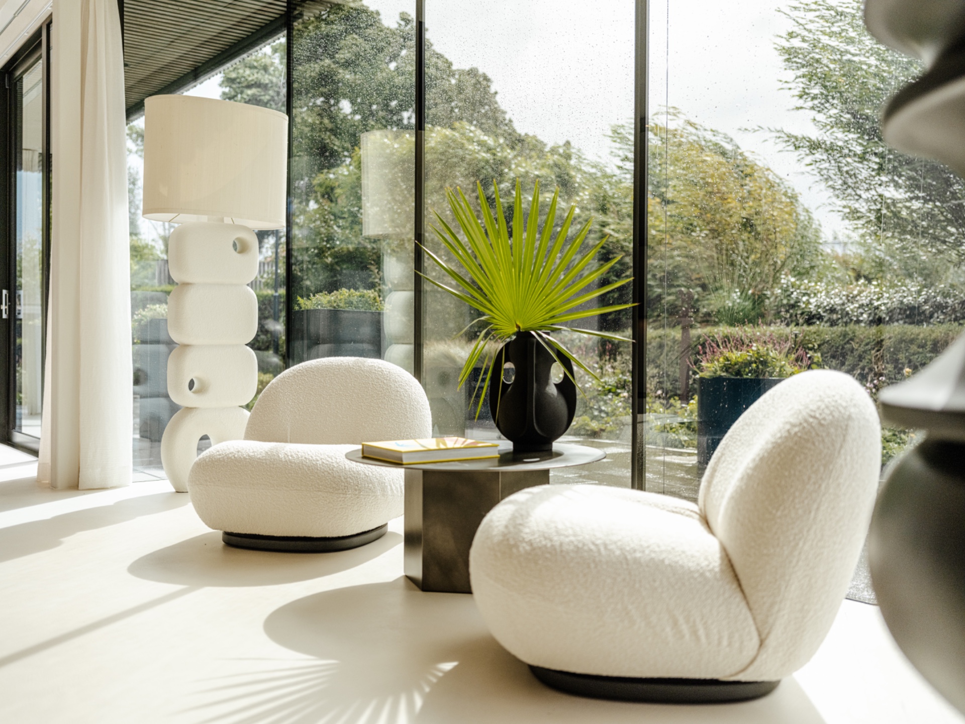
NEW 2026 Jubileum Edition The Best Interior Designers Benelux
Order Now €125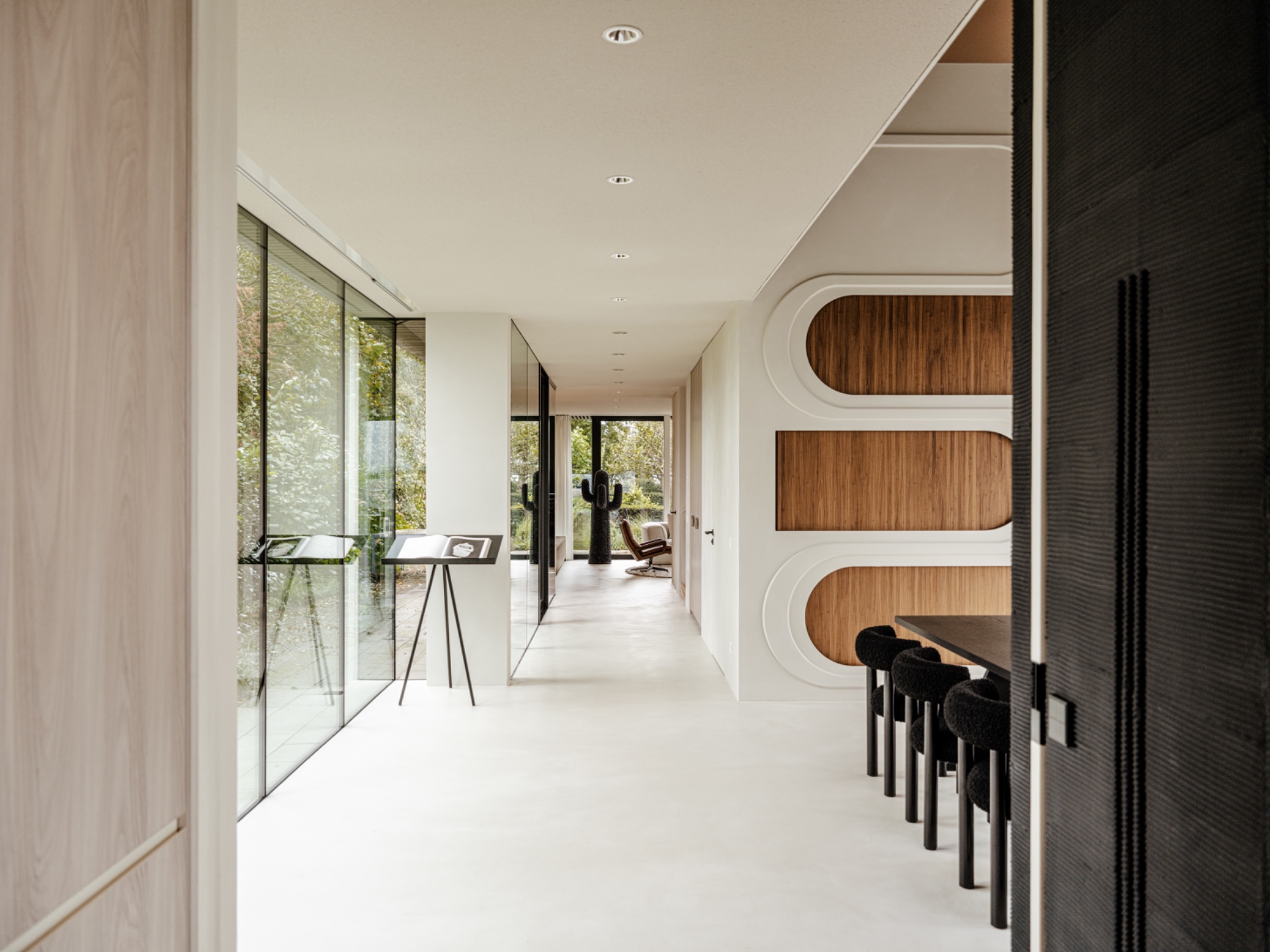
NEW 2026 Jubileum Edition The Best Interior Designers Benelux
Order Now €125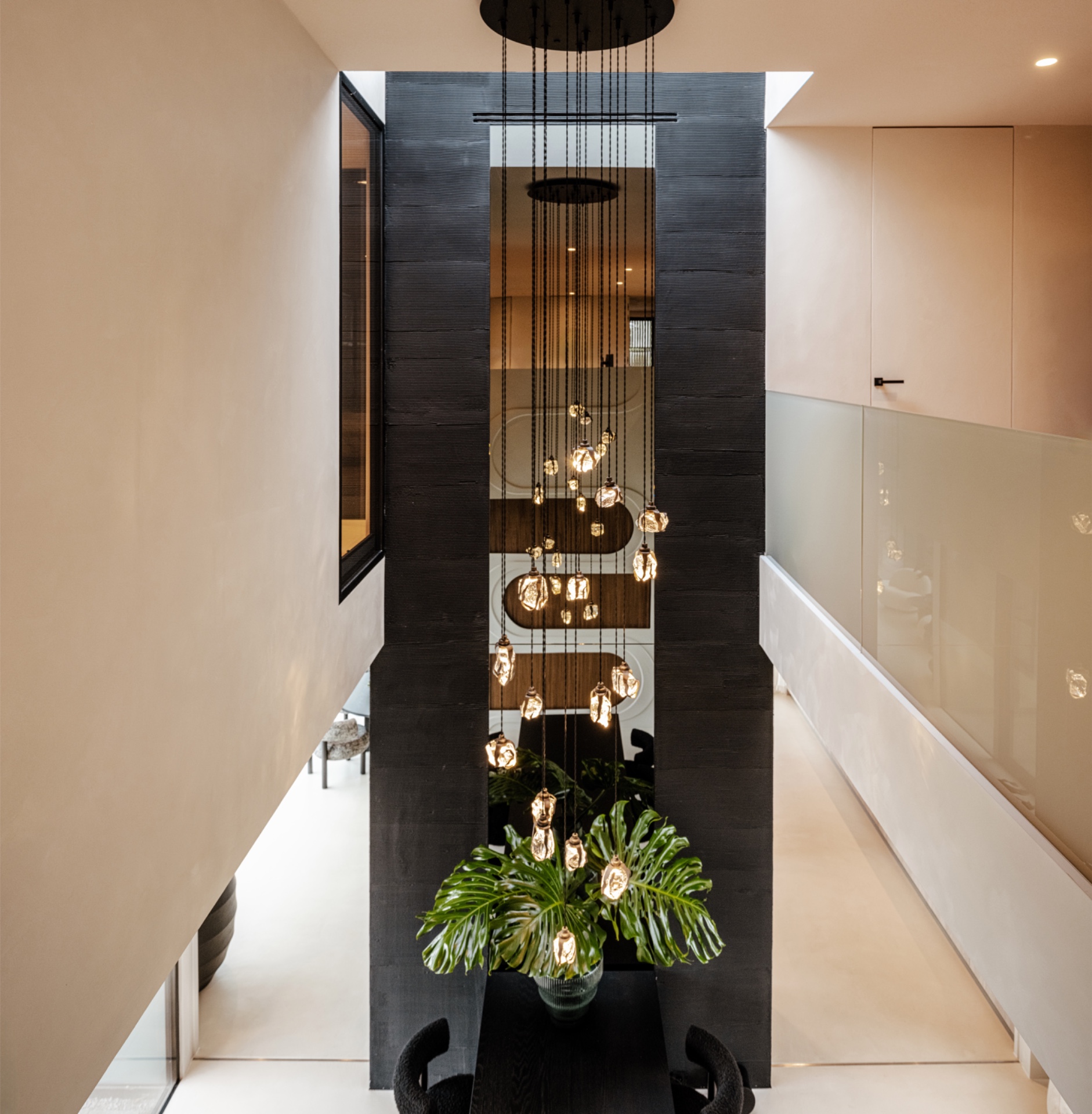
NEW 2026 Jubileum Edition The Best Interior Designers Benelux
Order Now €125