Custom interior with oak beam ceiling and wall paneling
Oak beams set the rhythm from the first glance. They cross the ceiling, meet pale floors, and pull the eye through a sequence of rooms shaped by custom joinery and wood paneling. The material palette stays restrained: oak, light stone-like surfaces, soft textiles, and glass framed in black. Nothing shouts for attention, yet the round oak-and-glass cabinet does exactly that, breaking the straight lines with a single curved gesture.
Oak beams, paneling, and a room that stays close to the material
The oak beam ceiling gives the interiors their strongest line. It is visible in the living areas, over the dining space, and again near the kitchen, where the timber structure brings the rooms together without flattening them into one open plan. Wall paneling follows that same logic. Instead of acting as decoration, it shapes the walls and adds depth to the pale surfaces. The result is a setting where grain, joints, and shadows matter as much as color.
Light works quietly here. Large glazed openings sit inside timber frames, with curtains in earthy tones softening the edges of the glass. In the living room, a black-framed glazed partition introduces another layer, while the panelled walls and wooden ceiling keep the space grounded. The images do not rely on large gestures; they rely on proportion, the way a doorway is framed, and the way a beam lands above a room.
Custom wall paneling and the round oak cabinet
The custom joinery is what gives the project its precision. A round cabinet in oak and glass stands out from the straight run of walls and built-ins. It reads almost like a small object placed inside the architecture, not pasted onto it. Around it, wood paneling and fitted doors keep storage calm and legible. The craftsmanship is visible in the divisions, the edges, and the way the timber surfaces sit flush with one another.
That attention to detail continues in the hall, where paneled doors and a glass divider in a black frame create a measured transition between spaces. The composition is simple, but not plain. A low wooden ledge, the repetition of vertical divisions, and the dark metal frame add structure without crowding the room. It is the sort of interior that rewards a slower look, because the strongest elements are often the ones that are easiest to miss at first.
Wood paneling that shapes the route through the house
Wood paneling appears as a binding element rather than a single feature wall. It wraps storage, marks thresholds, and keeps the palette consistent from room to room. In the bedroom under the sloped ceiling, the built-in joinery follows the roofline and makes use of the available height. Another sleeping area shows a bunk-like construction set beneath visible roof beams, where the geometry of the ceiling becomes part of the room layout. The timber surfaces keep those tighter spaces from feeling abrupt.
Across the project, custom joinery is used to solve different rooms with the same discipline. Beds are designed to fit the architecture. Wash units are built to sit with the surrounding finishes. Cabinet fronts remain subdued so the eye can move from one material to the next: oak to tile, tile to stone-like surfaces, stone back to timber. That sequence is what gives the interior its calm pace.
A custom kitchen built around tile, timber, and a worked surface
The kitchen shifts the palette slightly. Yellow-gold cabinetry brings a warmer note to the room, while the white grid tile backsplash keeps the surface crisp and patterned. A central island anchors the space, with pendants hanging above it and a worktop that reads as stone-like or terrazzo-like in the images. The cabinetry includes open niches, so the storage does not become a solid block. There is breathing room between the closed fronts and the open bays.
This is where the custom kitchen feels most tactile. The backsplash catches the light in small squares, the island stands out as a separate mass, and the timber ceiling above keeps the room tied to the rest of the interior. The materials are not competing for attention. They are layered so that the eye moves from the soft sheen of a front to the rougher reading of the tile and then back to the grain of the oak overhead.
Open niches and a backsplash with clear grid lines
The open niche in the kitchen cabinetry is small, but it changes how the whole wall reads. It breaks the frontage and gives the joinery a more tailored look. Nearby, the grid tile backsplash adds a stricter rhythm. Each tile is part of the surface, but together they create a pattern that sets off the smoother cabinet fronts. On the worktop, the darker cooking zone and light stone-like surface introduce another layer of contrast without leaving the room visually busy.
The kitchen also shows how the project handles color. The yellow-gold fronts are not loud; they sit against oak and white tile so that the tone feels grounded rather than decorative. Hanging lights above the island echo the vertical lines of the timber structure. Even in this more functional part of the home, the same principles remain in place: measured joins, clear surfaces, and enough variation to keep the room alive.
Bathroom details kept clear and spare
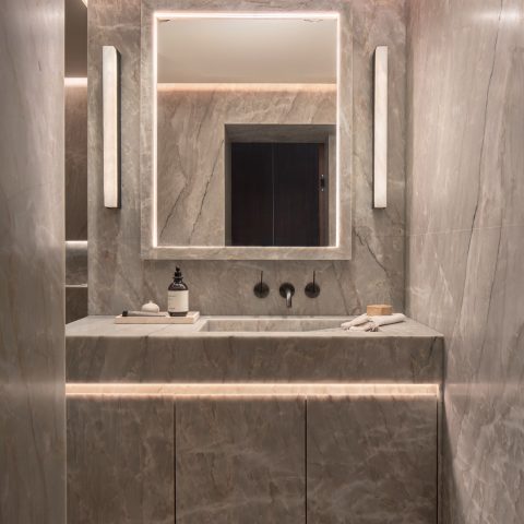
The bathroom uses the same language of restraint. A freestanding bathtub sits in the room rather than being pushed to the edge, and a window niche brings in daylight through a soft layer of fabric. In another view, a double basin setup appears with dark mirror frames and wall fittings, while a separate corner shows a stone-like vanity surface with a rectangular mirror. The fittings stay dark and linear, which lets the lighter walls and pale floor finish do most of the work.
These bathroom scenes are not treated as a separate world. They carry the same timber logic as the rest of the interior, even when the surfaces change to tile and stone. The bathroom window niche, the basin lines, and the freestanding bathtub all sit within a composition that still feels connected to the oak ceilings and custom wall paneling elsewhere in the home. It is a quieter room, but not an isolated one.
Bedrooms fitted into the roofline
The bedrooms make the most of the sloped ceiling. One space uses a low, built-in arrangement that follows the roof and leaves the floor open. Another shows a raised sleeping structure under exposed beams, where the timber above is left visible instead of being concealed. Those choices matter because they turn the roof form into part of the plan. The joinery does not fight the architecture; it accepts it and gives it a clear use.
What stays consistent is the tone of the materials. Pale flooring, oak surfaces, and soft fabrics keep the rooms quiet, while the built-in beds and storage elements make the spaces look resolved rather than improvised. The project is strongest where that logic is most visible: in the ceiling beams, in the panelled walls, in the fitted kitchen, and in the smaller pieces of custom joinery that hold the interior together without overstatement.
Want to see more of Mint Interieur? View the page of Mint Interieur for even more great projects and company information.



NEW 2026 Jubileum Edition The Best Interior Designers Benelux
Order Now €125


NEW 2026 Jubileum Edition The Best Interior Designers Benelux
Order Now €125


NEW 2026 Jubileum Edition The Best Interior Designers Benelux
Order Now €125


NEW 2026 Jubileum Edition The Best Interior Designers Benelux
Order Now €125