









Custom interior renovation in a historic apartment
The first impression comes from the glass. A new entry with double steel doors opens the apartment to daylight and draws the eye straight through to the kitchen beyond. From there, the route rises through a renewed stair hall, where the dark lines of the balustrade and the oak treads set the tone for the rest of the interior. The custom interior renovation is visible already in this sequence: opening, turning, and pausing before the next room comes into view.
Glass entry with a direct line to the kitchen
The new entrance was introduced as part of a complete reworking of the apartment. Glass in the double steel doors keeps the threshold open, while the framed panels pull light deeper into the plan. That clarity matters in a building where the structure is not level; the floor line shifts by 19 cm from front to back. Instead of masking that condition, the layout responds to it with measured transitions and a stronger spatial read. The result is less about grand gesture than about control over how each room meets the next.
This is also where the project’s sightlines begin to do real work. Standing at the entry, the stair hall is no longer a closed connector but part of the interior sequence. The view passes the glazing, catches the kitchen, and then continues toward the brighter rooms beyond. That approach makes the historic apartment renovation feel deliberate without leaning on heavy intervention. The old shell remains present in scale and proportion, but the circulation now has a clearer rhythm.
Two oak Z staircases shape the stair hall
The stair hall was renewed with two new solid oak Z staircases. Their folded profile gives the steps a crisp edge, while the wood softens the darker detailing around them. In the images, the stairs read as more than a route between floors: they bring structure to a narrow vertical space and mark the change from one level to the next. White walls and ceiling spots keep the hall legible, so the timber and black accents remain the main visual points.
Because the building is split into a front and rear house, movement through the apartment matters as much as any single room. The stair hall ties the three levels together and gives the plan a clear order. It is the kind of intervention that is easy to overlook at first, but it changes how the whole home is read. This is where a light-filled interior with sightlines becomes more than a phrase: it is built into the route, the glazing, and the way the stairs open the space upward.
A long kitchen run stretched across the rear house
The kitchen occupies the full length of the rear house, turning one long wall into the main working surface of the home. The layout is linear, but it is not visually flat. White fronts, dark accents and a continuous countertop give the room a clear horizontal line, while the built-in fireplace detail at the dining side adds a pause in the sequence. Seen from the dining area, the run of cabinetry reads almost like a wall of furniture rather than a separate room.
The bespoke kitchen layout is the most grounded part of the renovation. It handles storage, cooking and dining in one continuous arrangement, and the eye moves along it without interruption. A Bora cooktop and Gaggenau appliances are part of the fitted specification, while the kitchen itself is by Boffi. In editorial terms, the value lies not in listing equipment, but in how the elements sit in the room: slim lines, flush fronts and a fireplace detail that holds the dining end in place.
Dining side, fire line and built-in storage
From the dining side, the kitchen gains a second reading. The wall-mounted composition, hanging lights and dark-edged niche give the space a stronger vertical counterpoint to the long base units. A round table softens the geometry and keeps the room from feeling too rigid. It is a useful reminder that this custom interior renovation was not only about opening rooms, but also about adjusting the scale of each one so the large length of the rear house feels usable at close range.
Upper floors arranged with clearer domestic layers
The first floor holds the living room, a separate guest room and a bathroom. The top floor shifts into the master bedroom, an en-suite bathroom and a loggia roof terrace. That distribution gives the apartment a clear rise in privacy as one moves upward. The living room on the middle level benefits from large windows and strong daylight, while the upper rooms borrow a quieter atmosphere from the roof level and the terrace beyond. The plan now reads in layers rather than as a string of leftover spaces.
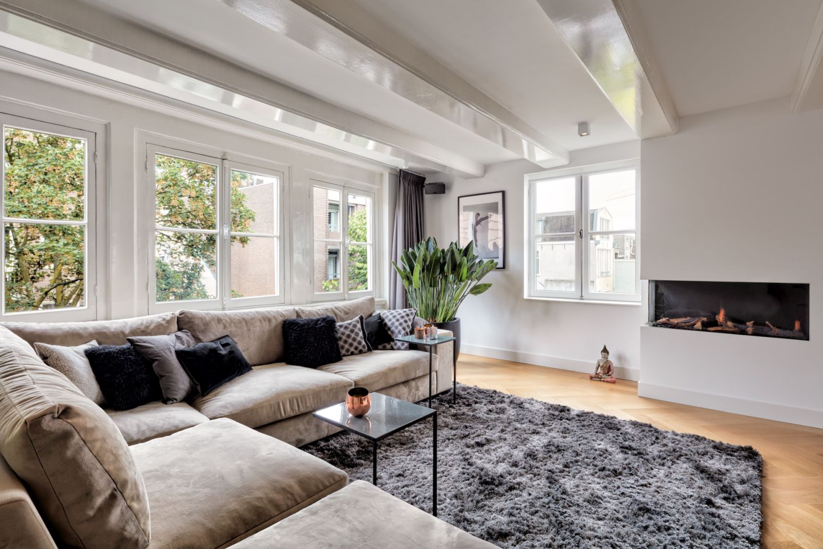
In the living room, the built-in fireplace sits in a wall of pale surfaces and dark trim, and the large windows bring in the green outlook from the rear. The room stays visually calm because the main elements are kept close to the walls: seating, fireplace, glazing. That restraint lets the eye move easily, which is exactly what the new layout needs after a full strip-out. The apartment may still carry traces of its older shell, but the day-to-day use has been reorganized around clearer volumes and lighter crossings.
Materials that keep the shell visible
Oak, glass and black detailing do most of the visual work here. The rear house still carries high beamed ceilings and the proportions of a historic interior, yet the new interventions sit cleanly inside that frame. Glass doors, timber stairs and smooth white surfaces keep the rooms bright without erasing the older structure. In the bathrooms, marble-look wall tiles and a glass shower screen introduce a cooler surface change, while the bath and built-in joinery keep the space ordered rather than busy.
That mix of old volume and new elements is what gives the project its character. The apartment was completely stripped, but the renovation does not try to hide the fact that it sits in a historic building with uneven levels and a long spatial history. Instead, the design uses fitted pieces, sharper thresholds and clear sightlines to make the interior easier to read. In that sense, the project is less about decoration than about editing the plan until each move through the apartment feels considered.
Photography: Anne van Houwelingen
Want to see more of Maxim Winkelaar | Design Follows Personality? View the page of Maxim Winkelaar | Design Follows Personality for even more great projects and company information.





NEW 2026 Jubileum Edition The Best Interior Designers Benelux
Order Now €125


NEW 2026 Jubileum Edition The Best Interior Designers Benelux
Order Now €125


