Custom Japandi Kitchen with a Round Island
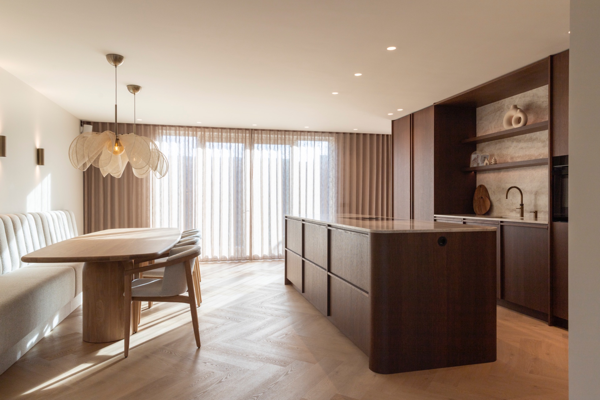
Soft edges set the tone here. The round kitchen island sits at the center of the room like a carved block, with rounded corners that soften the route around it. Around that main volume, the palette stays restrained: oak veneer, wood-look cabinet fronts, and a stone-look surface that carries across the countertop and up the wall. The result is quiet, but never flat. Every line seems to have been trimmed back to let the shapes and materials do the work.
A central island with room to move
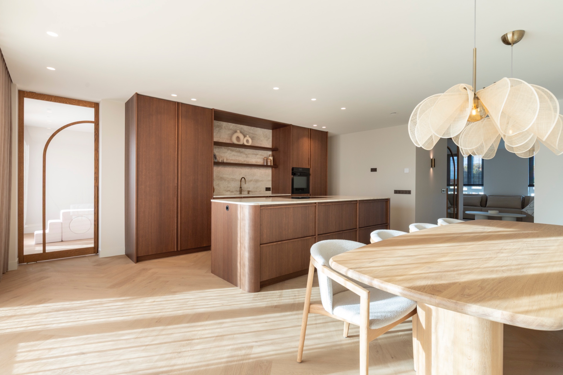
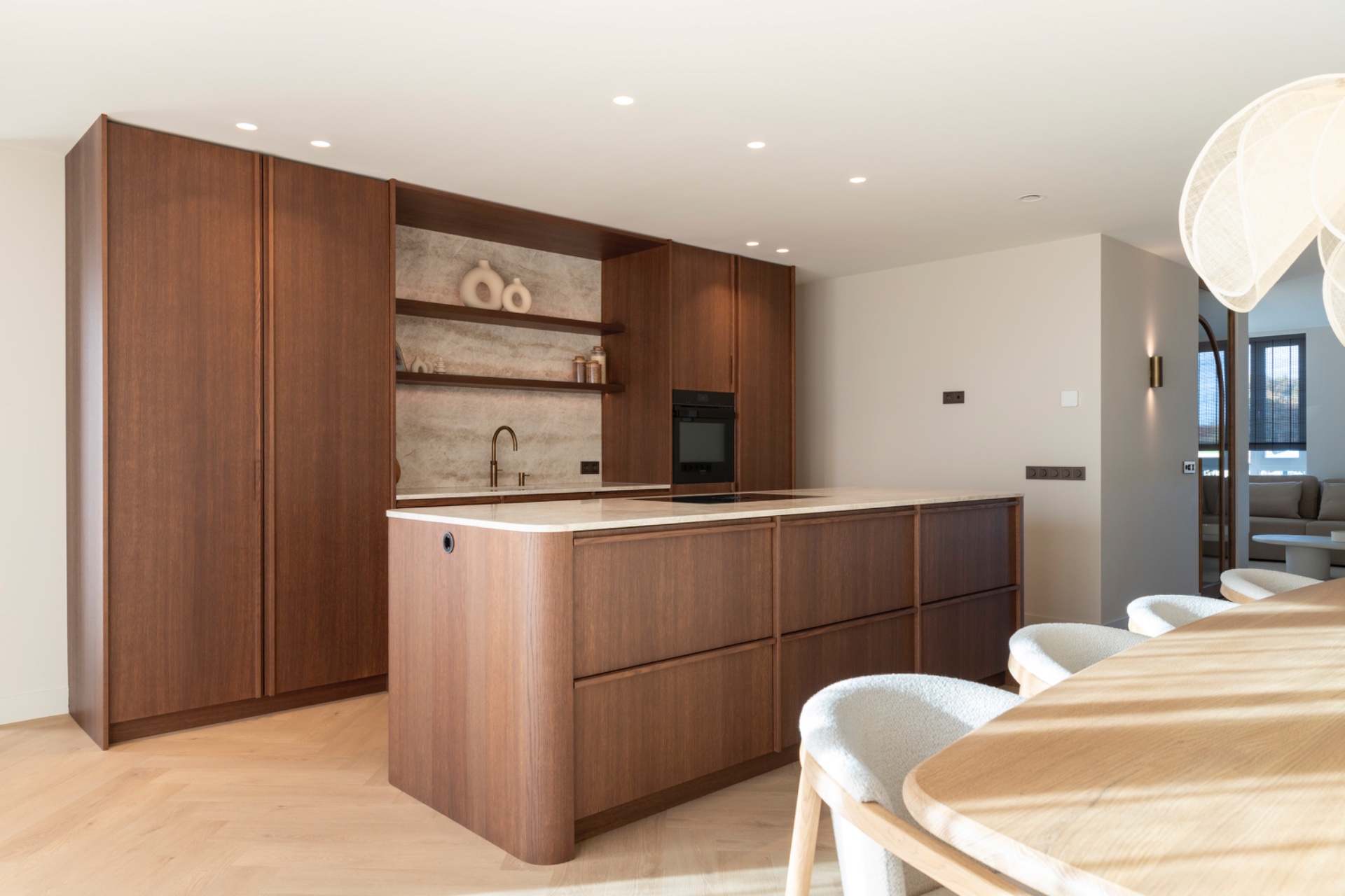
The island does more than anchor the plan. Its curved perimeter changes the way the kitchen is used, opening the circulation around the work zone and giving the eye a clear point of rest. In the wider room view, it reads as the main piece of furniture, while the taller cabinetry recedes into a more architectural backdrop. That contrast between low volume and vertical storage keeps the composition legible. It also gives the kitchen a measured rhythm, with the island acting as the pause between cooking, washing, and serving.
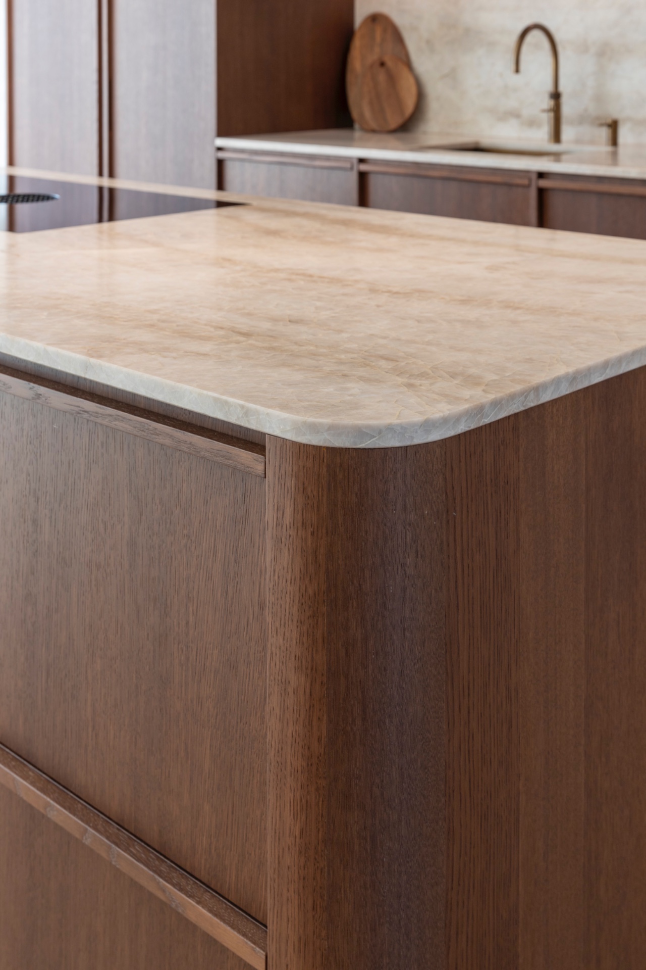
Seen up close, the rounded joinery matters. The edges are not treated as decoration; they are part of the structure of the design. The curved kitchen island carries the same calm language as the rest of the room, with softened corners that avoid hard breaks in the material flow. That choice makes the island feel tailored rather than imposed. It also allows the stone-look countertop to read as one continuous plane, instead of a set of separate parts.
The sink zone stays visually light
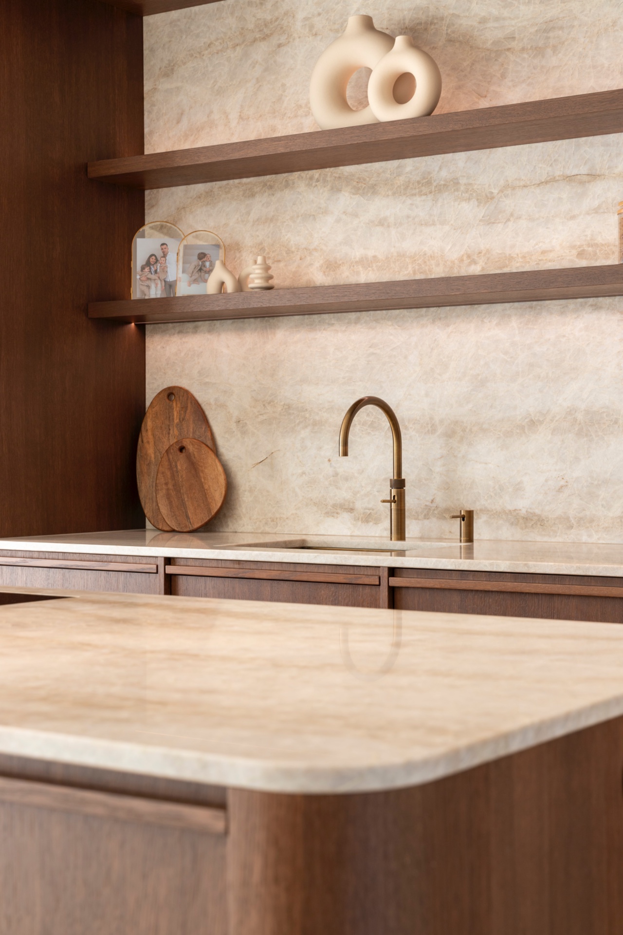
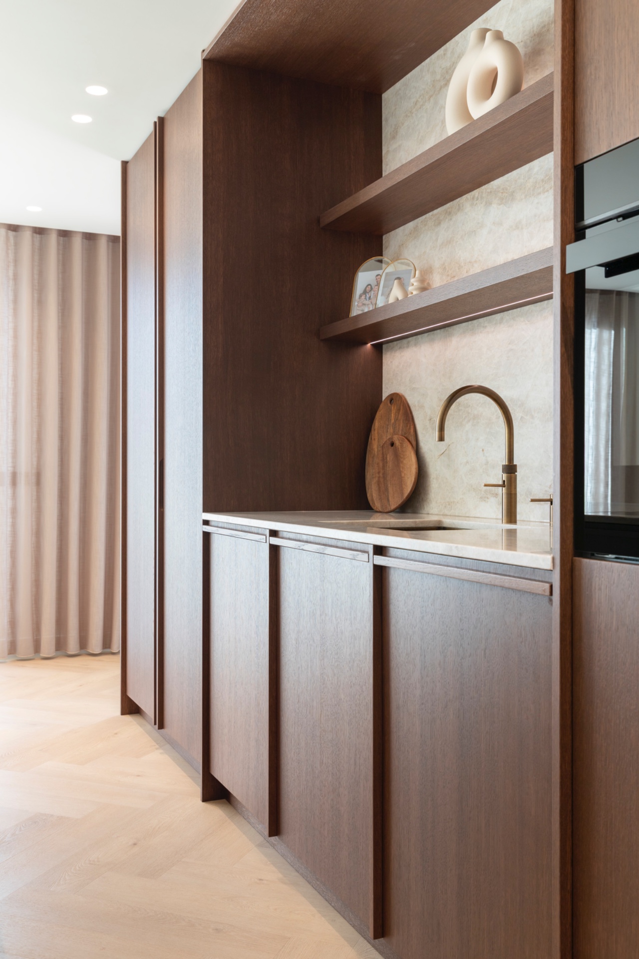
At the sink wall, the arrangement is stripped back to the essentials. A stone-look countertop runs into the backsplash, creating a single surface that holds the water zone without visual interruption. Against that pale mineral tone, the wood elements appear warmer and more tactile. The tap and basin sit neatly within the composition, while the surrounding planes keep the workspace clear. In a kitchen with so many rounded moves, this more restrained area gives the room its sense of order.
The continuity of the stone-look surface is what makes this part of the kitchen feel settled. It extends the logic of the main worktop into the wall, so the sink zone reads as one deliberate gesture rather than a collection of separate finishes. The stone-look countertop is also what links the storage wall to the island. That visual thread keeps the room from breaking into parts, even as the materials shift between wood and stone. It is a simple move, but a decisive one.
Wood, height, and a line of storage
The storage wall rises to the ceiling, giving the kitchen its most vertical note. These ceiling-high custom cabinets are finished in a wood tone that warms the room without pulling focus from the island. Their flat fronts and minimal detailing let the grain and proportion do the talking. Integrated appliances sit within the run, so the wall reads as built-in architecture rather than freestanding furniture. That restraint suits the project: nothing is overdrawn, and nothing competes with the rounded center.
Oak veneer brings a softer grain to the larger planes, especially where the cabinet fronts meet the stone-like surfaces. The material does not try to imitate the texture of the countertop; instead it gives the kitchen a second register, one that feels quieter and more matte. That contrast between the oak veneer kitchen and the mineral wall surface helps each finish stay distinct. It also keeps the room from becoming too polished. The effect is controlled, but still visibly warm in its material choices.
A niche for coffee, framed like a small room
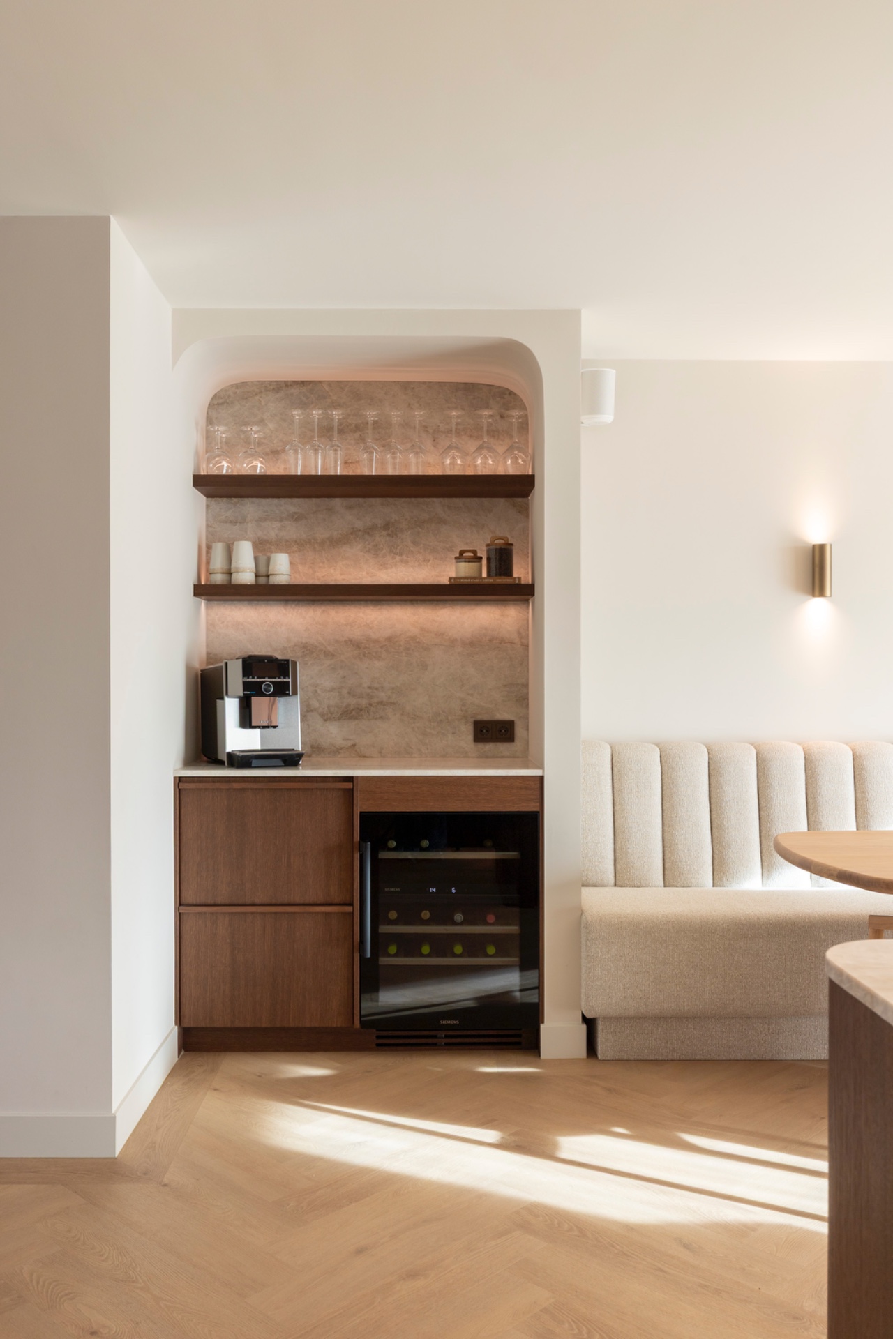
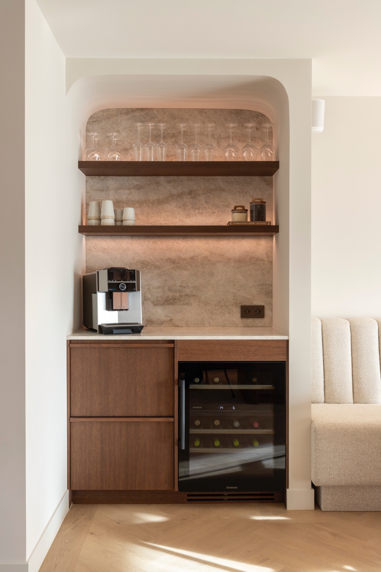
One of the most distinct moments in the plan is the coffee corner niche. Rather than tucking it away as an afterthought, the design turns it into a shaped opening with a rounded arch. The curve at the top gives the niche a softer outline, while the shelves inside keep the arrangement practical and open. Glasses and the coffee equipment sit within that smaller frame, making the detail feel settled into the wall. The opening is compact, but it has enough depth to read as its own zone.
The lighting inside and around the niche changes the mood of that corner. It does not flood the wall; it traces the shape and lets the shelves sit in a lighter pocket. That subtle glow is what gives the coffee corner niche its definition, especially where the arch meets the stone-look backdrop. The form is straightforward, yet the curved top and the light together create a quieter, more precise moment in the room. It is the kind of detail that reveals itself after the larger layout has already made its point.
Rounded arch niche lighting and the small transitions that matter
In the closer views, the transitions are what stay memorable. The arch opening over the coffee niche, the soft edge of the island, and the narrow shelf lines around the sink all keep the kitchen from feeling abrupt. This is where the project’s more subtle language becomes clear. The finishes are not simply placed next to one another; they are adjusted to meet at softer junctions. That gives the room an ease of movement, especially in a plan where storage, preparation, and a separate coffee spot all sit close together.
The rounded arch niche lighting also adds depth to the wall without demanding attention. It outlines the niche rather than spotlighting it. Combined with the built-in shelving, it turns a small functional recess into one of the kitchen’s strongest visual cues. The light catches the edges of cups, the shelf fronts, and the inside curve of the opening, so the detail is read in layers. It is a small intervention, but it sharpens the entire composition.
A kitchen made of measured parts
What holds the project together is not excess, but repetition with variation: rounded forms in the island, a calmer sink wall, a shaped coffee niche, and tall cabinetry that lifts the room upward. Each piece has its own role, yet the materials keep moving through the space in a controlled sequence. Wood-look surfaces soften the larger volumes. The stone-look elements hold the working parts of the kitchen in place. Together they form a custom japandi kitchen that is quiet in tone and precise in layout, with nothing left hanging loose.
The room also benefits from its measured contrast between open and closed storage. The tall cabinets suppress clutter, while the niche and the island keep the useful parts visible and accessible. That balance is practical, but it also shapes how the kitchen feels when seen from across the room. The center is rounded, the wall is linear, and the small recesses add relief. In that sequence, the round kitchen island remains the main reference point, but it is the surrounding details that complete the picture.
From the broad room view to the close-up of the joinery, the kitchen stays consistent in its use of shape and surface. Nothing is noisy. The visual interest comes from the way the stone-look countertop continues into the wall, the way the oak veneer cabinet run rises to the ceiling, and the way the coffee niche cuts a soft opening into the storage wall. It is a project built on restraint, but one with enough crafted detail to reward a slower look.
Photography: Nathalie Brugman
Suppliers/materials: Taj Mahal worktop and wall cladding: Grillo Natuursteen
Want to see more of Rhijnart Keukens? View the page of Rhijnart Keukens for even more great projects and company information.



NEW 2026 Jubileum Edition The Best Interior Designers Benelux
Order Now €125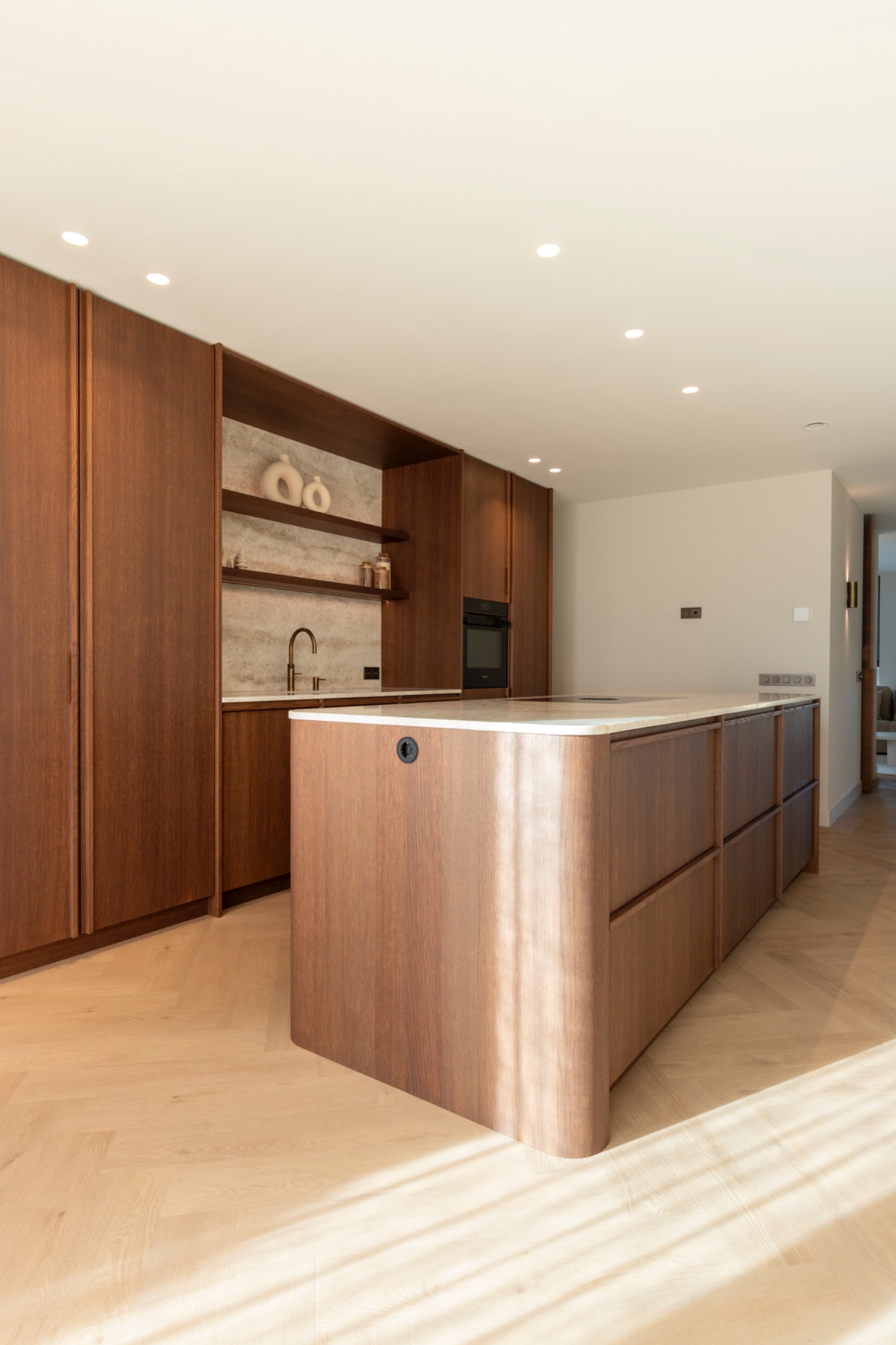
NEW 2026 Jubileum Edition The Best Interior Designers Benelux
Order Now €125