Custom kitchen interior with anthracite fronts
Matte anthracite fronts set the tone at once. In this custom kitchen interior, the cabinet wall reads as one calm band, broken only by linear handles and tight joints. The continuous kitchen worktop wraps around the cooking area, keeping the sink, hob, and built-in appliances close together. Behind that dark block, a lit niche draws the eye forward, while the wood accent wall in the kitchen introduces a rougher grain beside the smooth fronts.
Matte dark fronts, cut by a straight handle line
The cabinet wall is built from matte fronts without ornament, so the proportions do the work. Wide surfaces, narrow gaps, and handles pulled into the plane create a measured rhythm across the joinery. That is what gives this modern kitchen with anthracite fronts its clear outline. White wall surfaces keep the composition from closing in, and the darker cabinetry stays readable rather than heavy. An integrated oven zone sits within the same clean cabinet build, so the appliance line follows the furniture instead of interrupting it.
Seen up close, the joinery depends on restraint. The front lines remain straight, the plinth stays visually quiet, and the cabinet openings are kept close to the same colour family as the surrounding panels. That makes the custom kitchen interior read as a single piece of furniture, even though the images show several zones working together. The effect comes from the front plane more than from decoration: the darker surfaces absorb light, the white background releases it, and the structure of the cabinetry becomes easier to trace.
The continuous kitchen worktop pulls the cooking zone together
At the centre of the room, the hob sits on a broad continuous kitchen worktop. The surface runs past the cooking area and ties the neighbouring cabinet parts together, so the layout reads in one sweep from left to right. Underneath, the base units continue without a visible break in the line. That horizontal run is reinforced by the plinth and the long front edges, which keep the block low and precise. The integrated oven zone is kept within that same field, allowing the technical parts to stay close to the furniture.
This is where the kitchen’s order becomes most visible. The worktop does not act as a separate island or a decorative cap; it carries the use of the space. The continuous kitchen worktop gives the cooking area width, but it also links the appliance zone to the surrounding storage. Because the front colours stay consistent, the eye follows the line of the surface rather than jumping between separate elements. The result is a compact sequence of planes: dark fronts below, a stone-like surface across the middle, and a lighter background behind.
Integrated oven zone kept within the cabinet rhythm
The integrated oven zone appears in the same cabinet stack as the rest of the joinery, which keeps the appliance visually contained. It is visible, but not pushed forward as a separate feature. That matters in a custom kitchen interior like this, where the furniture itself carries most of the expression. The appliance openings follow the same vertical order as the doors and panels around them, so the whole wall holds together from a distance and still remains legible when you step closer.
A lit niche above the sink changes the wall’s pace
By the sink, a lit niche breaks the darker plane behind the worktop. Light lands directly on the tap and the surface below it, making that part of the room read faster than the matte fronts beside it. The lit niche above the sink is small, but it changes the wall’s pace. It separates the backsplash from the work surface and creates a clear pause in the run of dark cabinetry. In the images, the niche sits against the darker oven stack and a pale ceiling, which sharpens the contrast around it.
The lighting itself stays discreet. Rather than throwing brightness across the room, it focuses on the niche and the working surface below it. That choice sharpens the edges of the tap, the counter, and the meeting point between the wall and the cabinet plane. It is a narrow intervention, yet it gives the sink area its own identity inside the larger composition. In the custom kitchen interior, the lit niche works almost like a marker, showing where the work surface is most active without breaking the calm front view.
Light on the tap, shadow on the darker fronts
The contrast around the sink is built from very simple moves: one illuminated niche, one dark cabinet stack, one white ceiling plane above. That is enough to make the sink zone stand apart. The tap catches the light; the fronts beside it hold their matte finish. Around them, the worktop surface stays level and uninterrupted. The careful use of light is one of the few moments in the room where the eye is pulled away from the long horizontal line and into a tighter detail.
Wood beside the kitchen block softens the hard surfaces
At the side of the kitchen block, a wood accent wall introduces texture. The visible grain, whether read as slats or fine veneer strips, sits in clear contrast to the smooth cabinet fronts and the stone-like top. The wood accent wall in the kitchen is not placed as a separate decorative panel; it follows the length of the block and works with it. That alignment matters. It lets the material change happen at the edge of the furniture, where the eye already expects a transition.
Colour also stays disciplined. Anthracite, black, white, brown, and soft grey appear across the images, but none of them dominates for long. The wood is what stops the composition from becoming flat. It catches the light differently from the lacquered or matte fronts, so the surface shifts as you move. In one view, it reads almost as a vertical texture; in another, it sits quietly beside the cabinet run and simply marks the boundary of the kitchen block. That variation gives the bespoke interior joinery a more tactile edge.
A wide furniture wall and a black screen surface
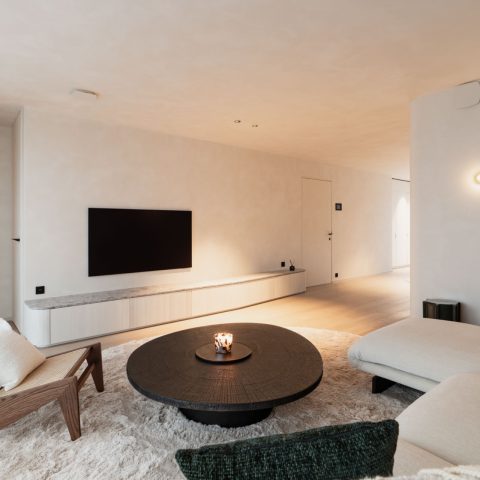
One of the images shows a long horizontal furniture wall with dark fronts and a broad niche holding a black screen surface. The composition stretches the room sideways. Floor lines and the window side with blinds continue that effect, so the furniture appears even longer than it is. Here the interest lies less in individual parts than in how the cabinet wall claims a zone. The large opening, the dark fronts, and the low profile turn the wall into a clear architectural band inside the room.
That image also helps explain the project’s visual logic. The dark joinery is not isolated to the main cooking area; it appears as a wider system of built-in elements. The black screen surface sits inside the niche like a deliberate pause, while the surrounding fronts keep the block closed and measured. Because the furniture remains low and horizontal, the room feels organised by lines rather than by objects. It is a good example of bespoke interior joinery used to define space without adding visual noise.
What the three views reveal together
Together, the images show three parts of the same custom kitchen interior: the cooking run with its continuous kitchen worktop, the sink area under the lit niche above sink, and the wider cabinet wall with the integrated oven zone. Each view isolates a different detail, but the logic stays consistent. Matte dark fronts hold the room together, white surfaces open it up, and wood changes the pace at the edge of the block. The kitchen depends on these shifts, not on ornament or excess.
The craftsmanship is most visible in the joins and the lines. Handles follow the furniture plane, front gaps stay narrow, and the cabinet stack keeps the same discipline from one zone to the next. That is what makes the modern kitchen with anthracite fronts easy to read from a distance and still interesting when you stand close. Light marks the sink area, the worktop carries the cooking zone, and the wood accent wall in the kitchen interrupts the dark run at exactly the right point.
What remains is a kitchen that reads through material and proportion. The matte fronts set a dense base, the continuous surface links the working areas, and the integrated appliances stay within the cabinet rhythm. The lit niche adds a bright cut in the wall, while the wood brings texture beside the block. In this custom kitchen interior, every visible move serves the same purpose: to keep the joinery clear, controlled, and easy to follow.
Want to see more of Strakk Interior Design? View the page of Strakk Interior Design for even more great projects and company information.