Full home interior with dark custom kitchen and island
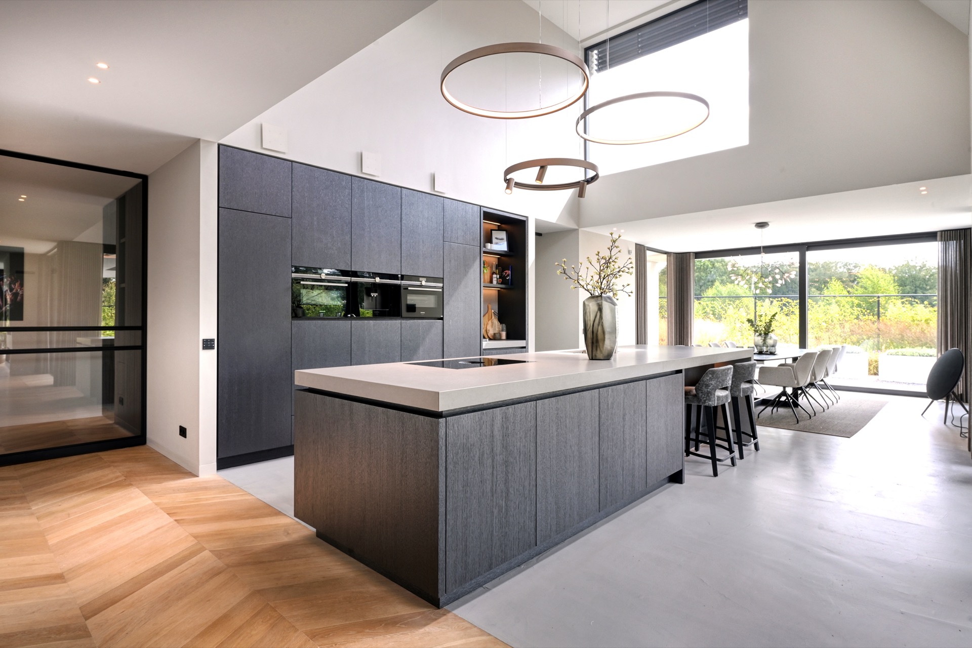
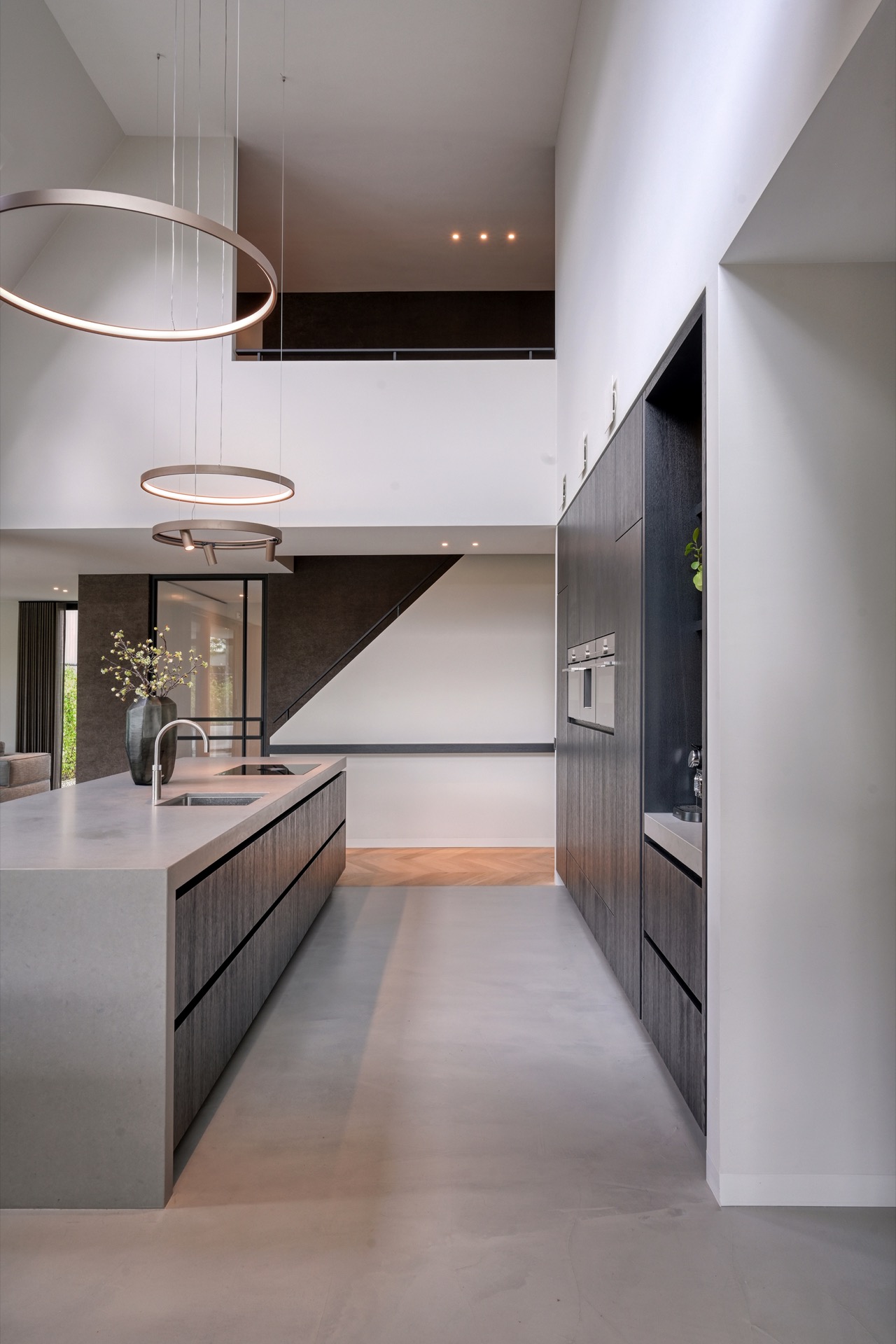
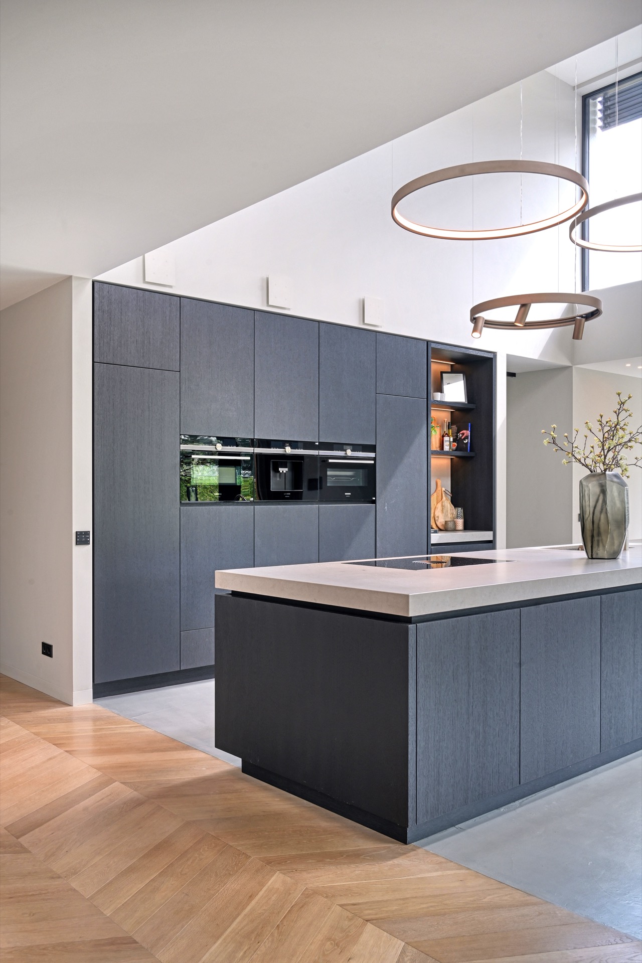
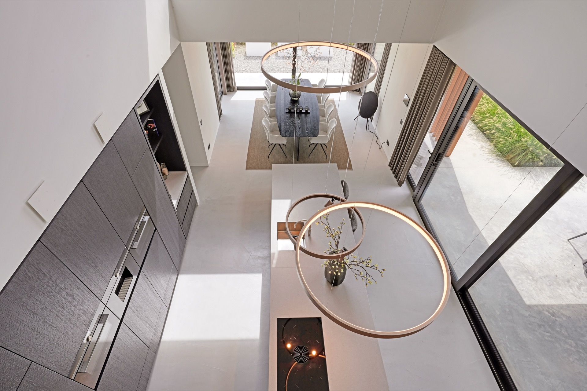
Dark kitchen cabinetry sets the pace before the rest of the house comes into view. The wall of flat fronts reads as one long surface, broken only by the built-in appliance zone and the pale edge of the custom kitchen island. A light composite countertop lifts the centre of the room, while oak veneer on nearby kitchen cabinets softens the darker planes without interrupting the line. The result is a full home interior that starts with the kitchen and keeps that visual logic running through the house.
The island holds the room together
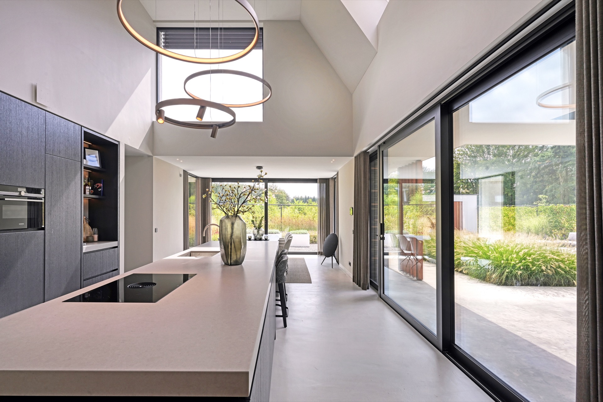
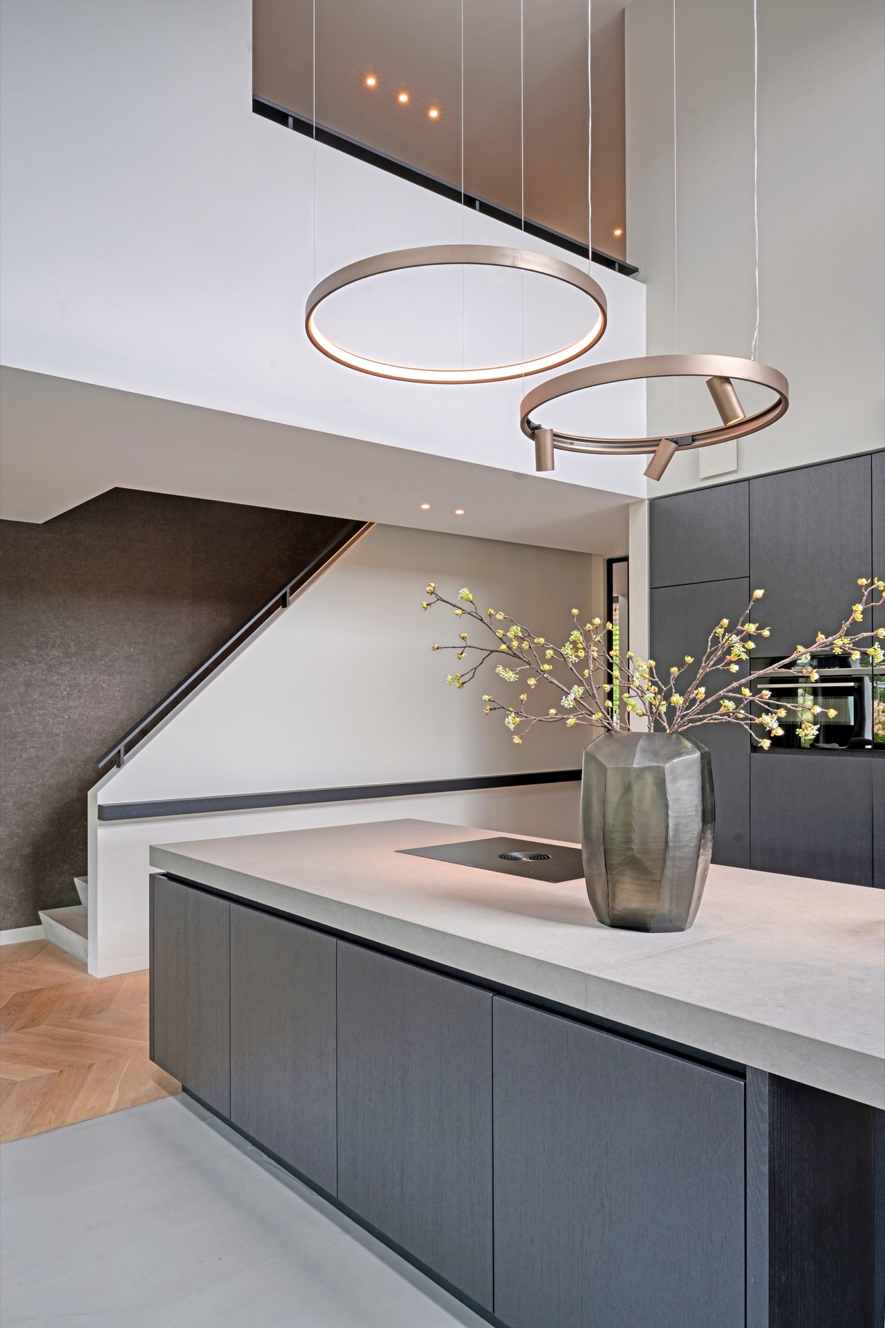
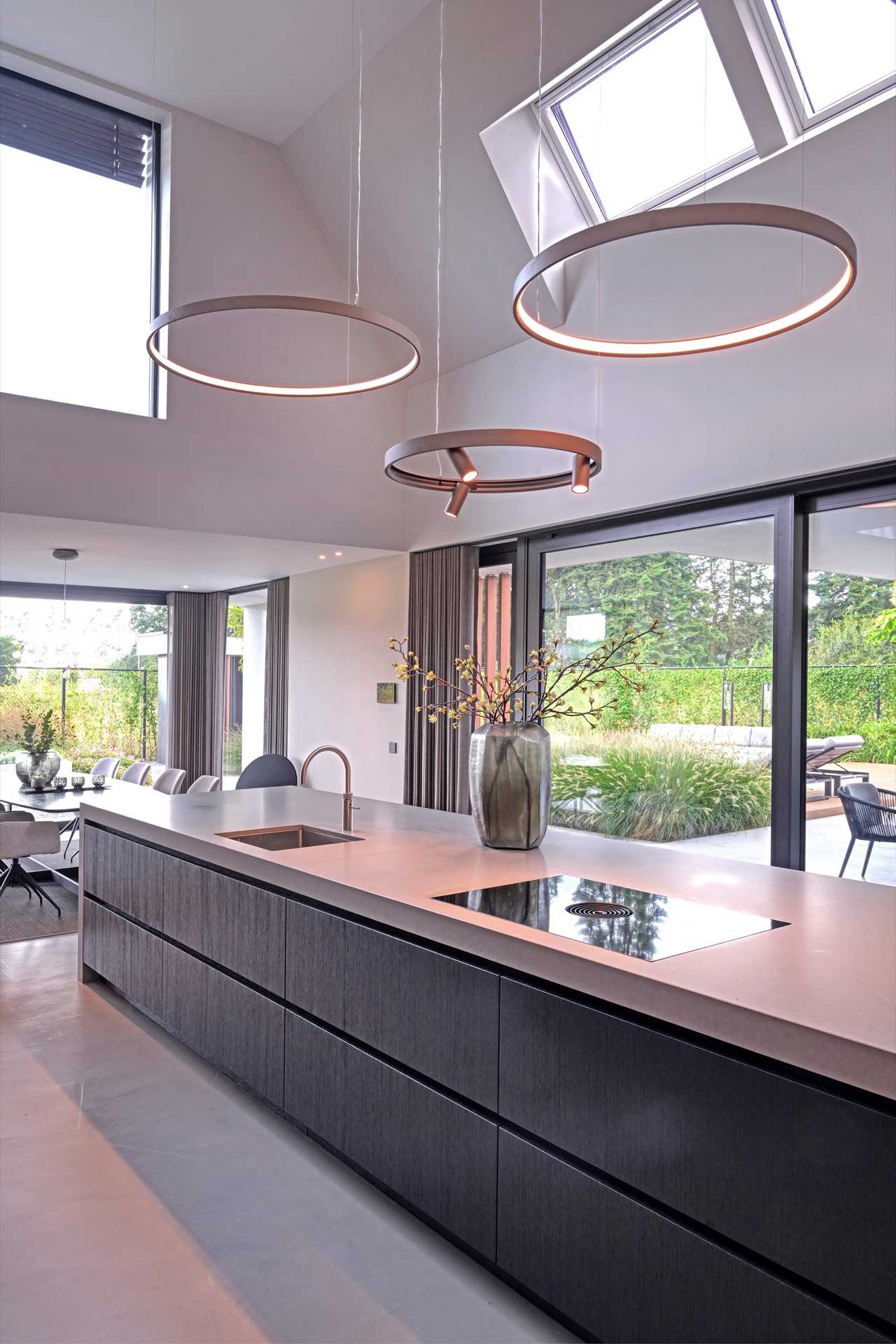
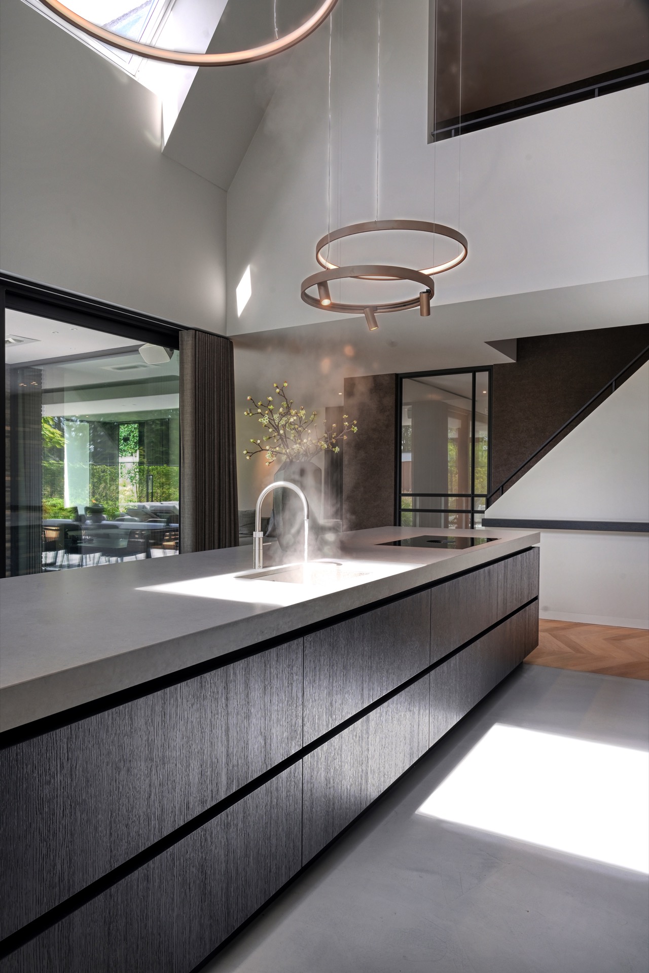
The custom kitchen island sits in the middle as a working surface, not a showpiece. Its light top catches the daylight that comes through the large glass windows, and that reflection keeps the dark cabinetry from closing in on the space. Round ring pendants hover above the work zone and mark the island clearly from above. Their warm light sits against the straight edges of the joinery, so the room reads in planes and lines rather than in decoration.
What makes the kitchen convincing is the way the storage wall stays quiet. Built-in appliances disappear into the cabinetry, so the back wall remains legible as one continuous composition. The flat-front doors and narrow joints keep the surface calm, while the oak veneer introduces a softer grain in the same measured rhythm. In this full home interior, the kitchen carries the strongest visual weight, but it does so by staying disciplined.
Dark kitchen cabinetry with a lighter centre
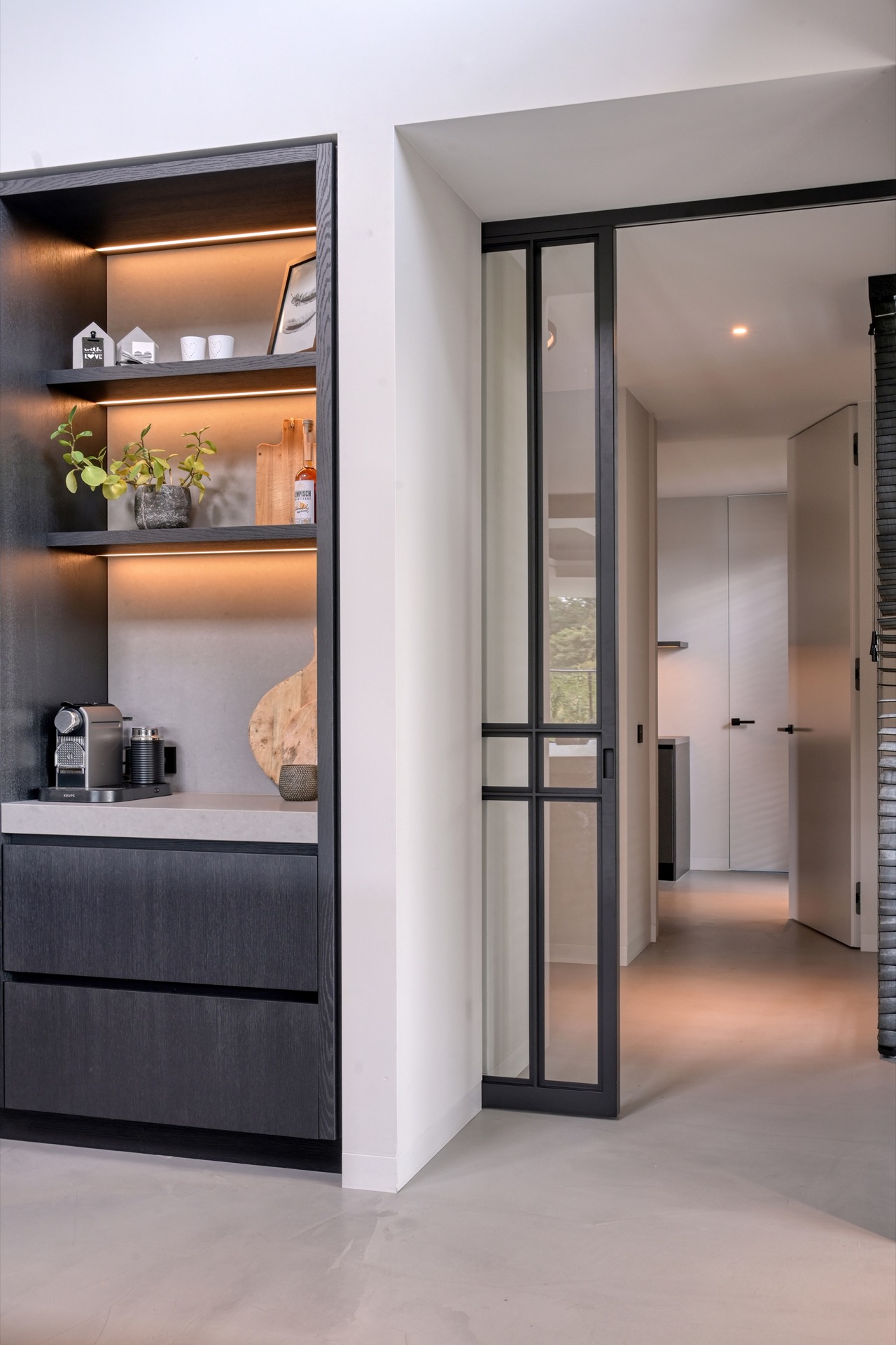
Seen close up, the contrast is not dramatic for its own sake. Dark kitchen cabinetry anchors the perimeter, and the light composite countertop gives the island a clearer outline. That shift in tone is enough to separate working zones from storage without adding extra parts. The appliance run sits flush in the wall, and the open niches beside it keep the composition from becoming flat. Even the black frames around the glazing sharpen the room, turning daylight into another material layer.
The island works with the floor rather than against it. A warm timber surface runs beneath the kitchen and continues toward the living areas, linking the rooms without a visible threshold. Light walls leave space for the darker joinery to read clearly, and the whole kitchen feels set inside a larger plan instead of isolated from it. That continuity matters here: the kitchen is not treated as a separate object but as the first move in the full home interior.
Daylight, glazing, and the edge of the plan
Large glass windows bring an open view to one side of the kitchen and stop the room from becoming inward-looking. The black frames draw a sharp border around the openings, which makes the cabinetry appear even more precise. Above the island, the round ring pendants add a second circle of light to the hard geometry of the room. The mix of glass, stone, timber, and dark fronts keeps the space readable from every angle.
That clarity continues when the view moves beyond the kitchen. Open sightlines lead toward the living zone and then to the hall, where dark surfaces and overhead daylight change the atmosphere without breaking the material line. The same floor continues under the transitions, so the rooms are joined by movement as much as by finish. In a full home interior like this, the eye does not stop at one room; it travels from surface to surface, light to light.
A material line that keeps moving
Composited surfaces, oak veneer, glass, and timber do most of the work. None of them speaks loudly on its own. Together they create a clear hierarchy: dark storage, lighter worktop, transparent edge, warm floor. Because the cabinet fronts are kept flat, small changes in light become visible across the wall and island. The kitchen therefore shifts through the day without changing its character. It is precise, but not rigid.
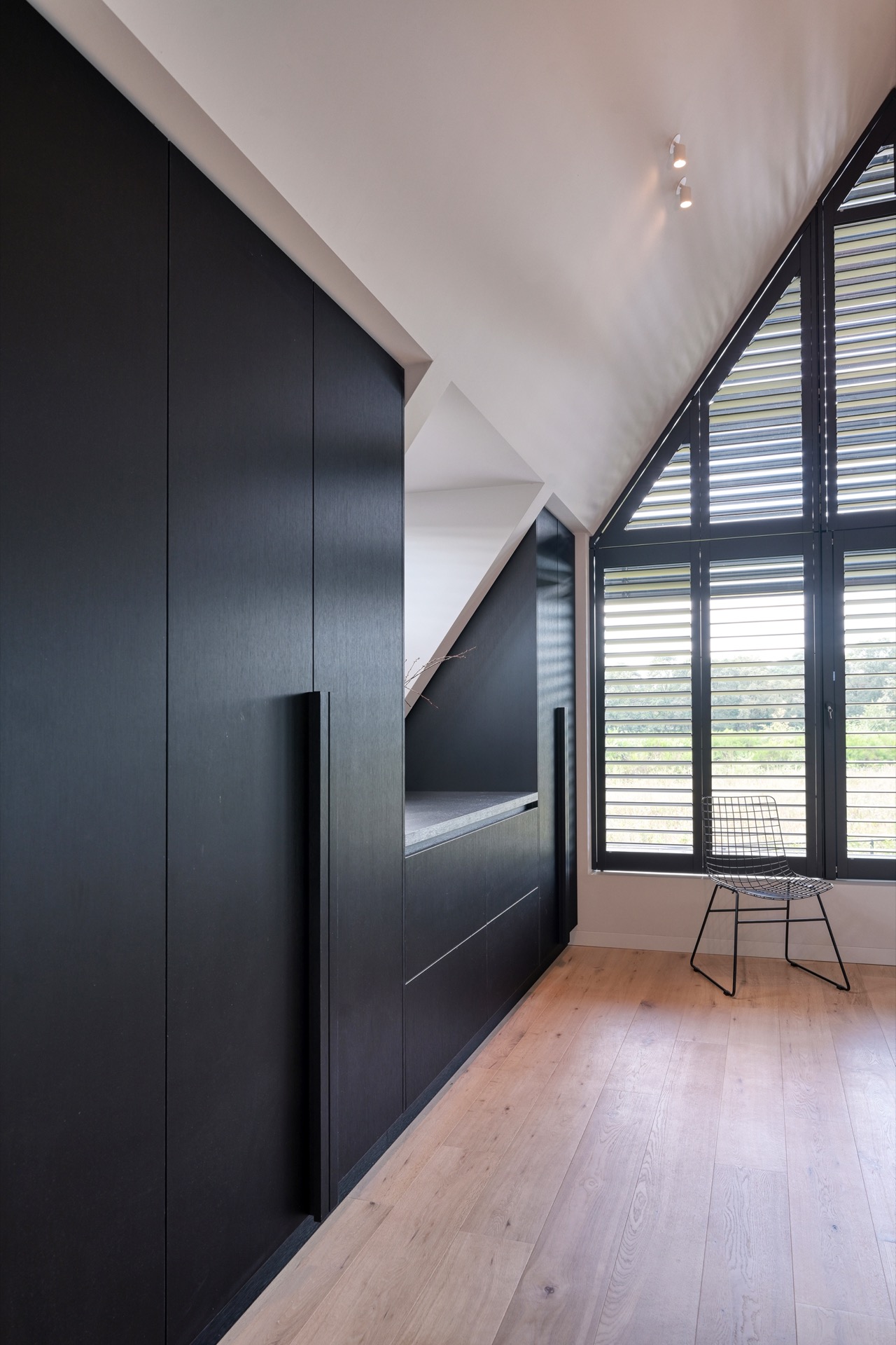
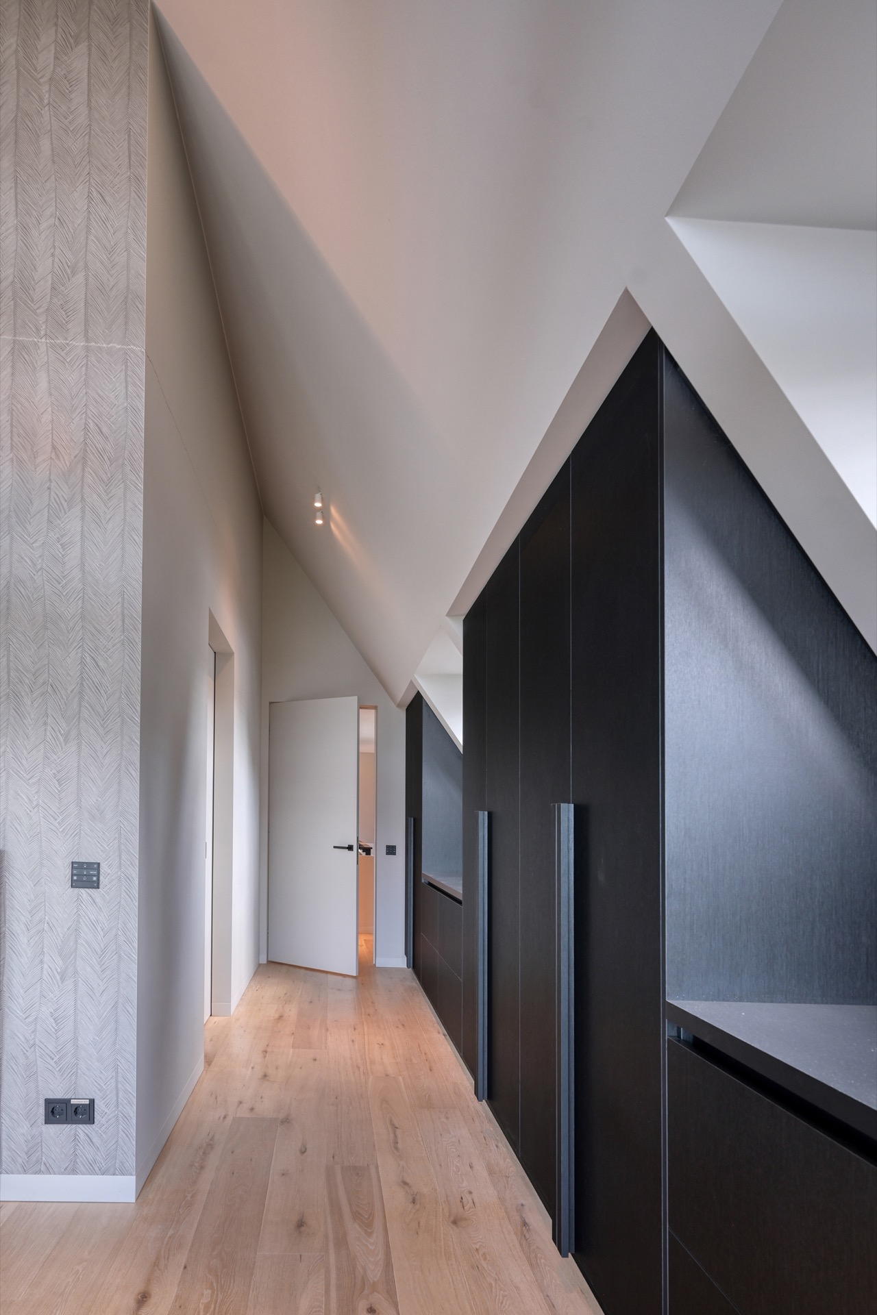
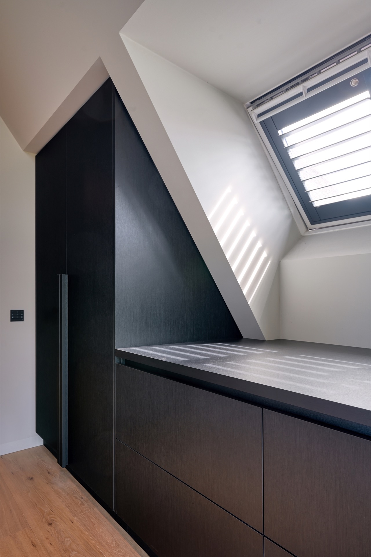
That precision is especially evident where the kitchen meets the hall. Dark built-in panels continue along the sloped walls, and a skylight daylight opening cuts a bright pause into the ceiling plane. The passage is not treated as a leftover space. It becomes part of the same composition, with the skylight bringing a strong patch of light onto the darker finish and the built-in panels keeping the route visually ordered.
The hall repeats the same measured language
In the hall, the surfaces are quieter but no less deliberate. Dark hallway built-in panels run along the angled planes and absorb the narrow light from the skylight. That contrast between shadow and opening makes the corridor feel more than a connector. It becomes a visual continuation of the kitchen’s logic, with the same restraint in the joinery and the same attention to line. The timber floor carries on beneath it, keeping the transition direct.
Round ceiling lights appear again in the adjoining zones, tying the rooms together through shape rather than repetition of furniture. Their soft circles sit against straight wall edges and square openings, so the architecture remains dominant. The full home interior relies on that kind of linking detail: not a theme repeated everywhere, but a series of carefully related parts that hold together through light, surface, and proportion.
A bathroom with tiles that catch the light
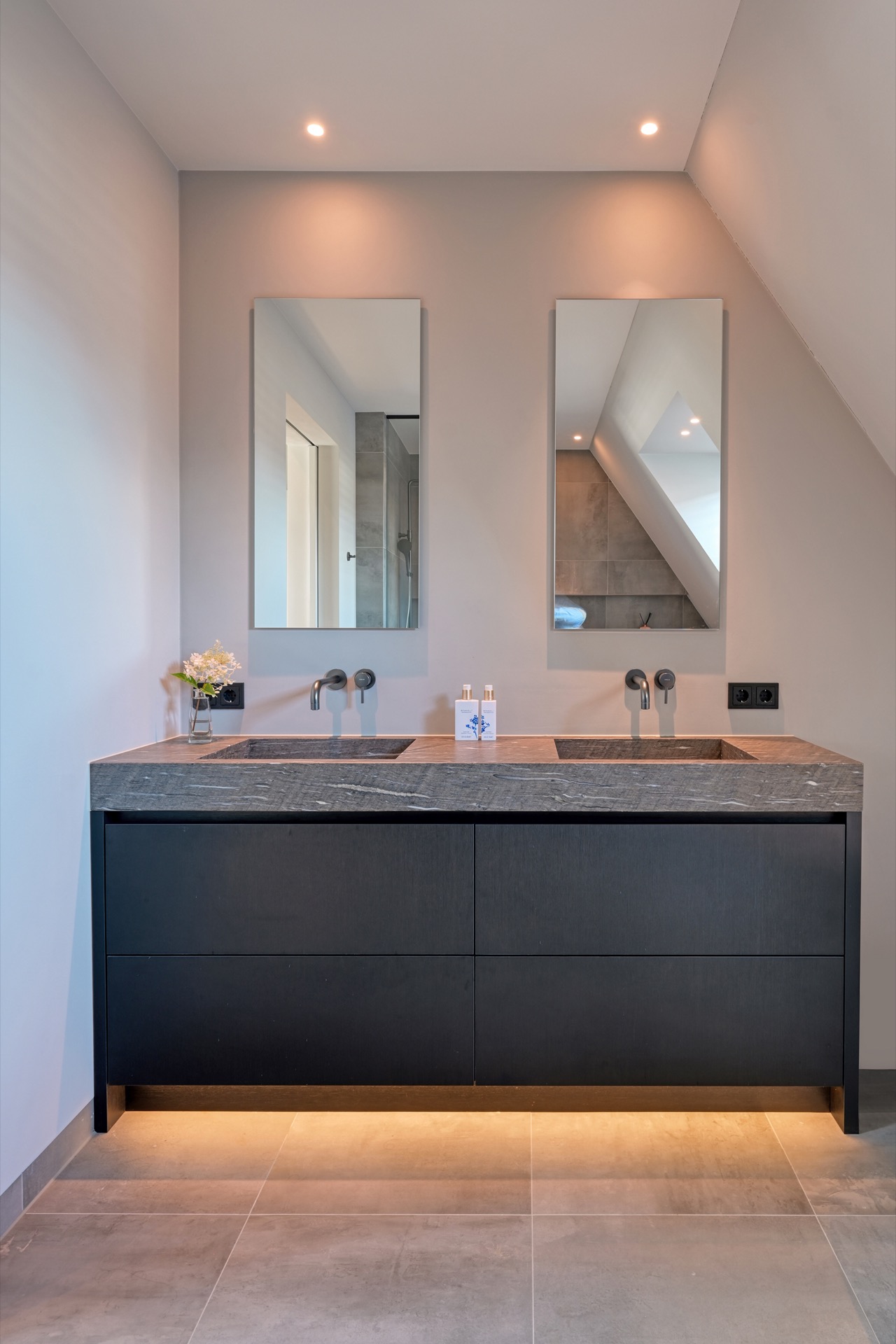
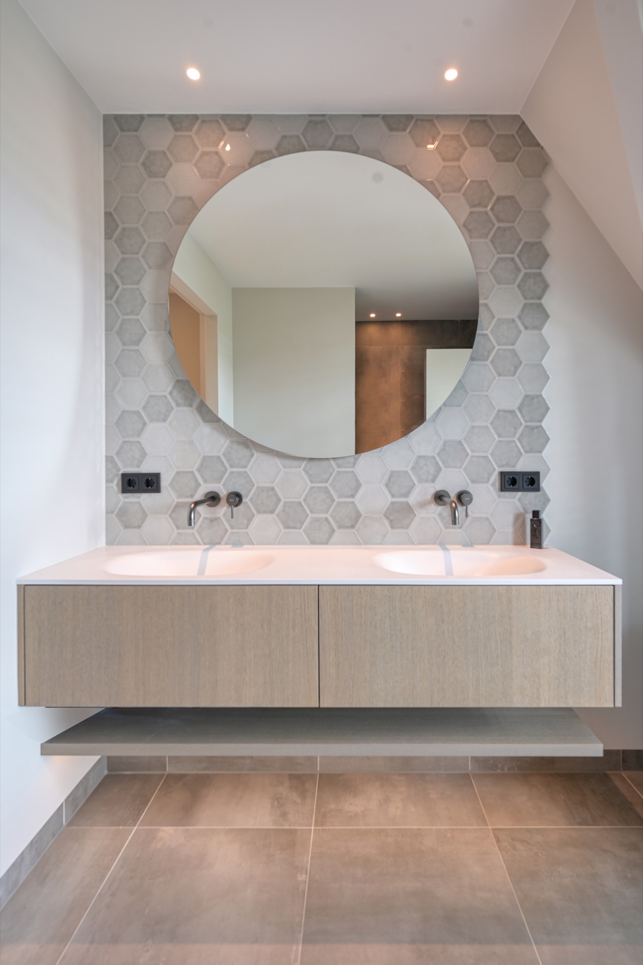
The bathroom shifts to a smaller scale, but the same restraint remains visible. Hexagon bathroom tiles cover the wall around the washing zone and add texture without breaking the room into many fragments. Beneath them, a double vanity is built into the furniture, keeping the floor clear and the basin area contained. The mirrors sit in recessed niches, which gives the wall depth and avoids a simple flat reflection above the sink.
Those round mirrors echo the shape of the lights elsewhere in the house, but the room never feels repetitive. The tile pattern does the main work here, catching light unevenly across the wall and changing tone from one facet to the next. The vanity stays close to the architecture, and the recessed niches frame the mirrors as part of the wall rather than as add-ons. It is a compact room, yet the construction reads clearly in every joint and edge.
From kitchen to bathroom, one interior language
Seen together, the kitchen, hall, and bathroom follow the same material logic. Dark kitchen cabinetry sets the tone, the custom kitchen island introduces a lighter centre, and the hall carries that discipline forward with built-in panels and skylight daylight. The bathroom brings the sequence to a quieter finish through hexagon bathroom tiles and the double vanity. Each space has its own function, but none of them is isolated from the others. Surfaces continue, light shifts, and the house reads as one composed interior.
The photographs make that sequence easy to follow. They show the dark cabinet wall, the light composite countertop, the round ring pendants above the work zone, the large glass windows, and the bathroom wall with its hexagon pattern and recessed mirrors. What stays with you is not a single standout element, but the way the full home interior is held together by joinery, daylight, and a consistent line from room to room.
Want to see more of Strakk Interieurbouw? View the page of Strakk Interieurbouw for even more great projects and company information.



NEW 2026 Jubileum Edition The Best Interior Designers Benelux
Order Now €125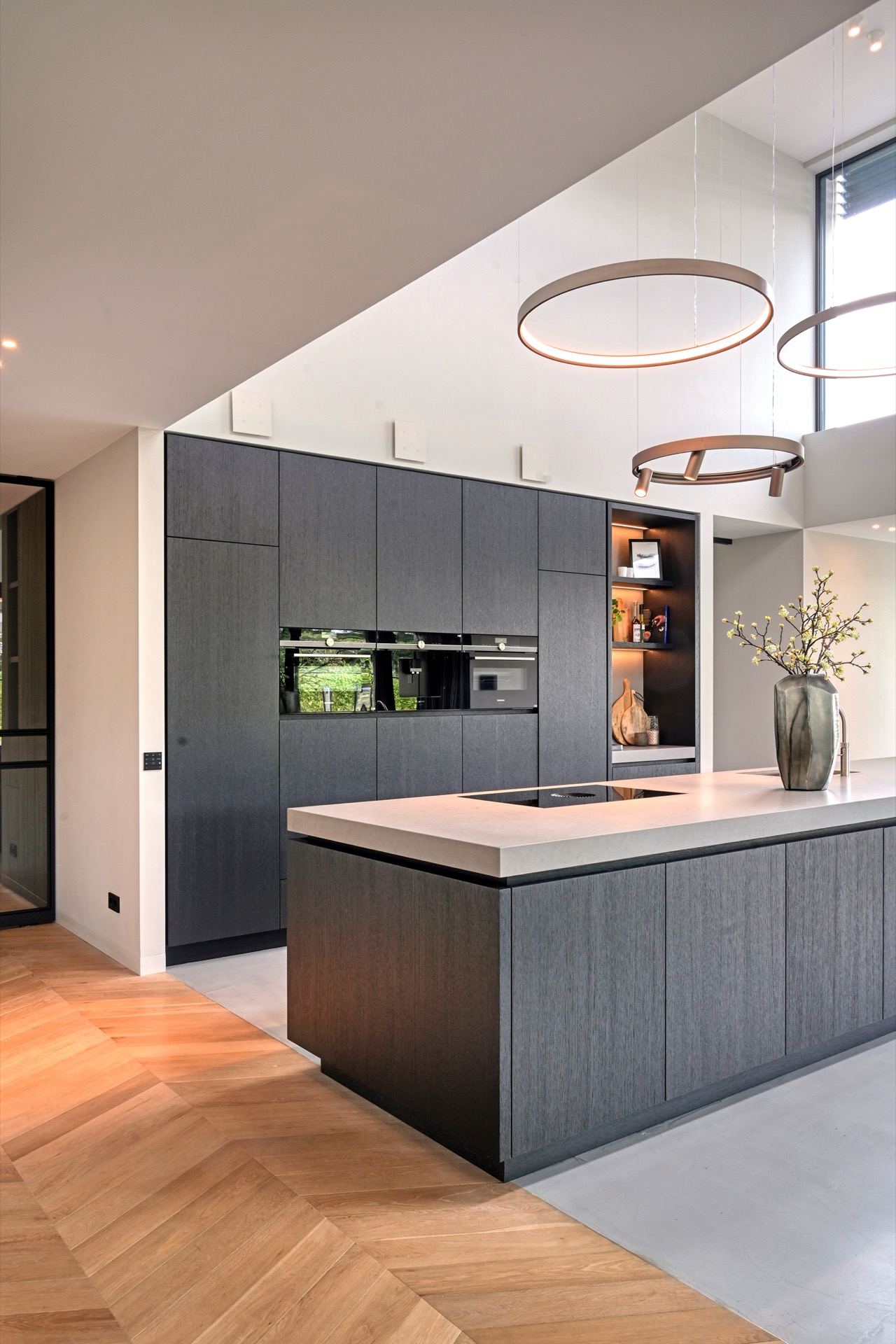
NEW 2026 Jubileum Edition The Best Interior Designers Benelux
Order Now €125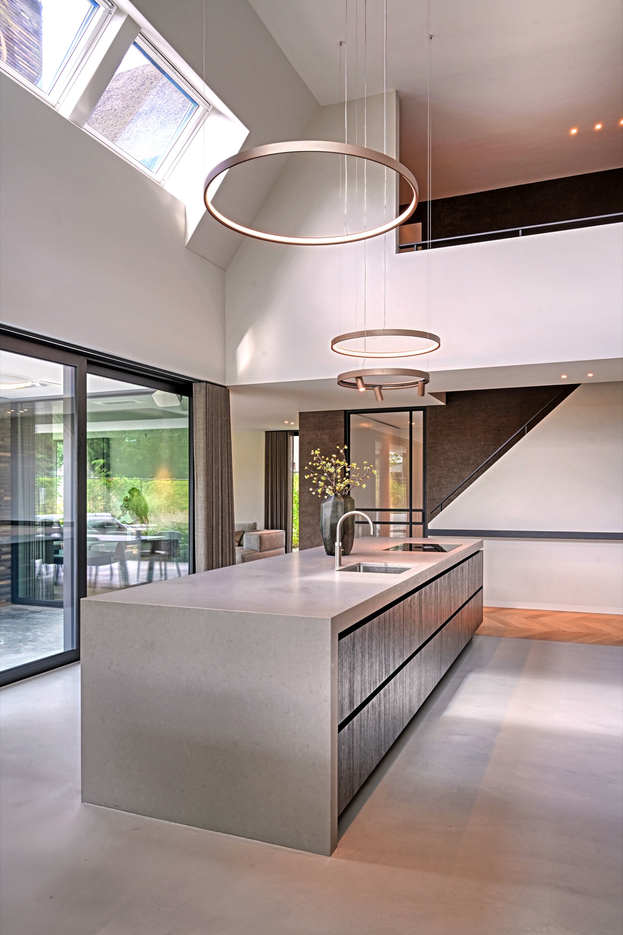
NEW 2026 Jubileum Edition The Best Interior Designers Benelux
Order Now €125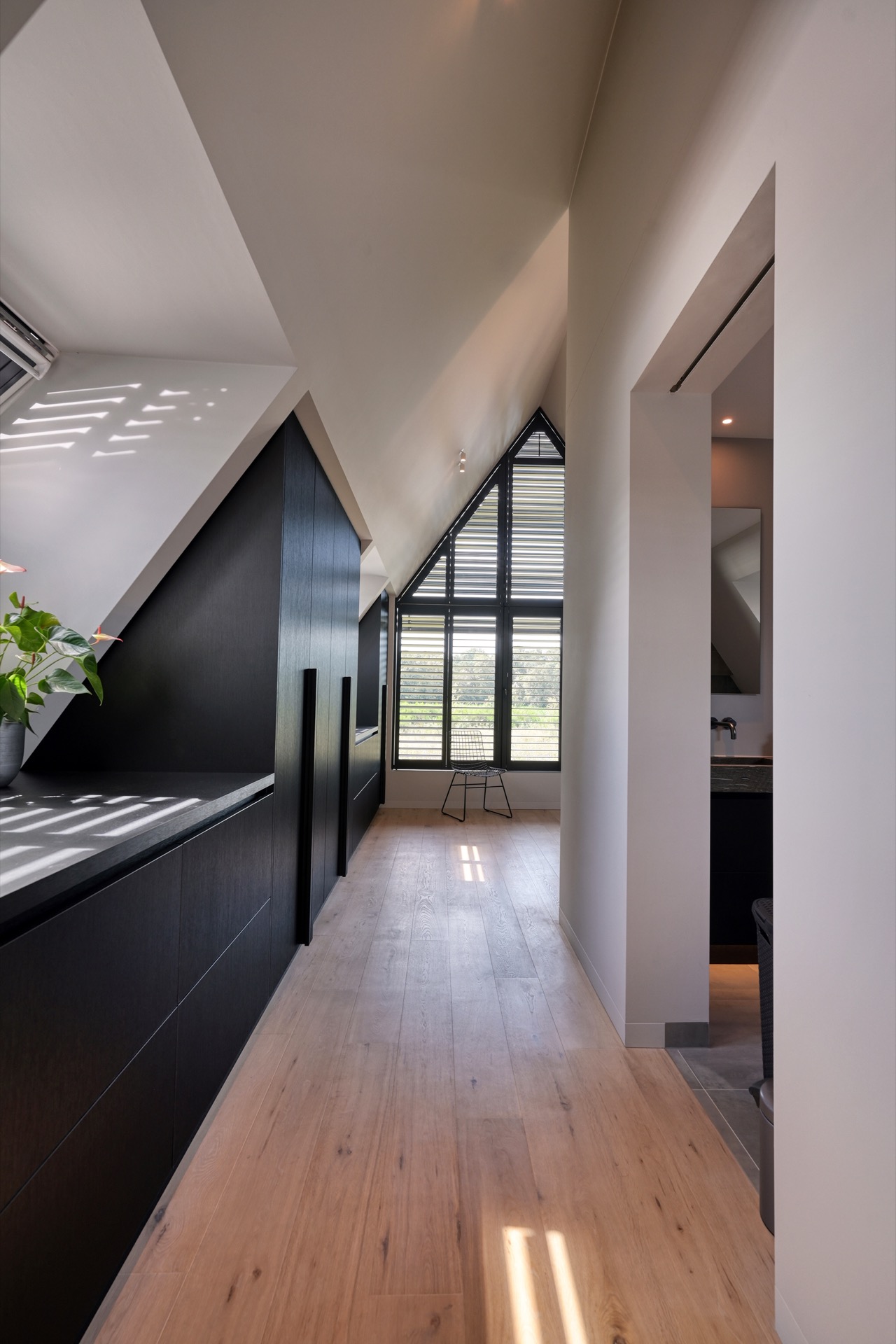
NEW 2026 Jubileum Edition The Best Interior Designers Benelux
Order Now €125