










Custom Wine Shop Interior with Illuminated Wine Racks
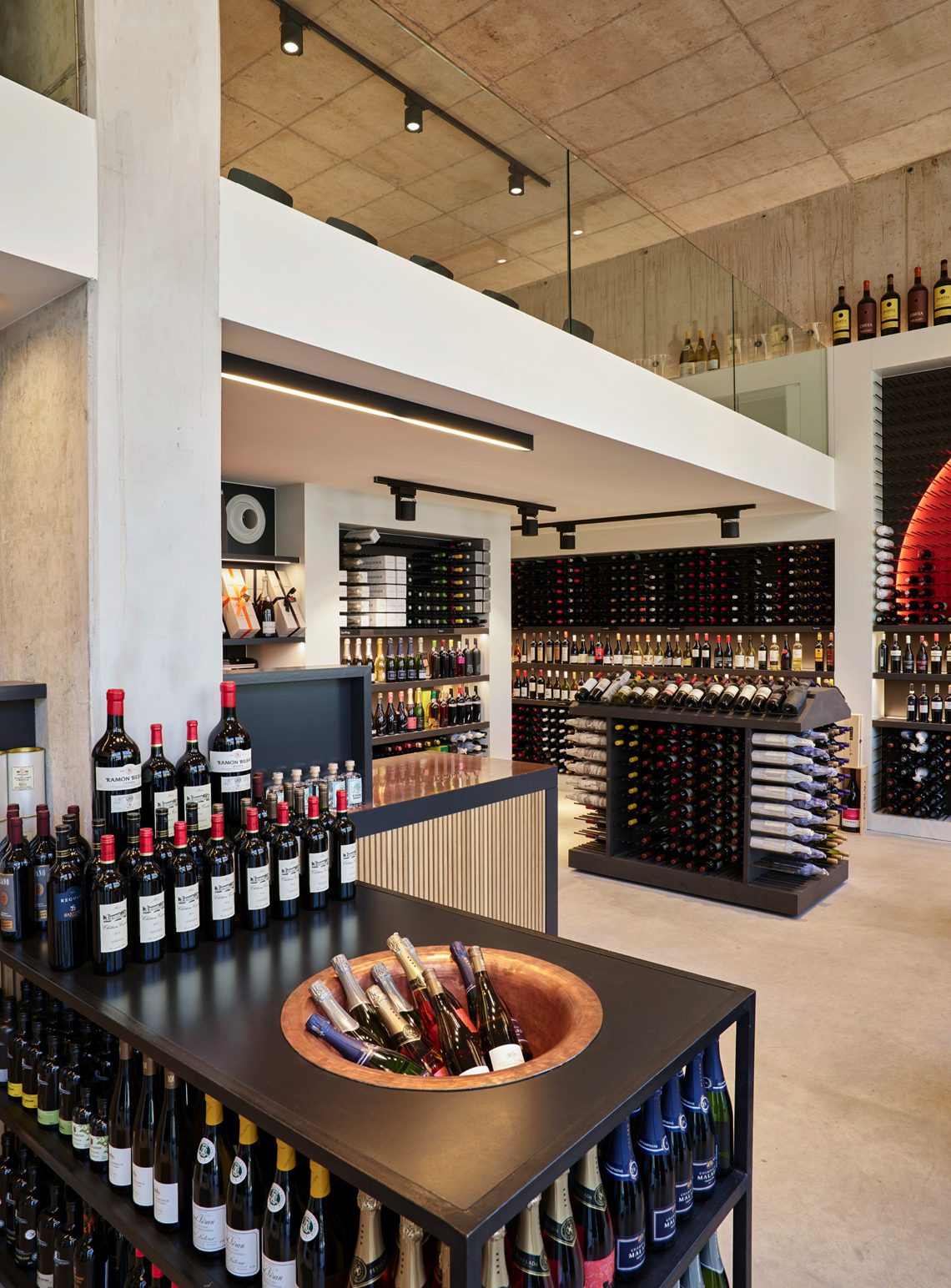
A row of bottles catches the light before the shelves do. In this custom wine shop interior, the storage runs along several walls and turns the inventory into the main spatial order of the room. Vertical bottle bays, narrow ledges, and deep recesses create a graphic grid that is easy to read from the entrance. Beton, pale plaster, light wood, metal, and glass keep the palette restrained, while red accents and black framing sharpen the outline of the wine wall.
Wine storage that sets the plan
The custom wine racks are not treated as a back-of-house element. They shape the whole layout. Long runs of shelving line the perimeter, and the sightlines remain open between them, so the room reads almost like a measured sequence of walls and openings. Some sections sit in straight lines; others curve into arched wine feature wall moments that interrupt the grid and pull the eye toward the center. The result is a wine display wall that feels built into the architecture rather than added after it.
Across the walls, the flasks are stored vertically, packed in repeated rows that give the interior its rhythm. That repetition is softened by the variations in depth, the stepped shelf levels, and the occasional cut-out that lets one zone borrow light from another. Instead of hiding the stock, the shelving uses the bottles as part of the composition. The effect is strongest where the shelving meets the plastered surfaces, because the matte wall finish makes the dark rack frames and labels stand out immediately.
Light lines that draw the eye through the room
Wine rack lighting does more than mark the shelves. It traces the edges of niches, washes the back walls, and picks out the curves inside the arched wine feature wall. In several places the light sits low and indirect, so the shelves appear to hover rather than sit heavily against the wall. That approach is especially clear along the longer runs, where LED lines guide the gaze from one section to the next and keep the interior legible from end to end.
The ceiling adds another layer of control. Rail spots and suspended fixtures break up the overhead plane, while a larger hanging light with a clustered form drops into the room like a lantern. Its shape contrasts with the straight rack modules below. In the darker zones, the lighting turns the red and black arch patterns into a graphic backdrop, and the shelving in front of them reads as a second skin over the wall.
Arches, glass and the central counter
A central counter anchors the interior without closing it off. The top includes a round wooden element that sits above a basin-like detail, which gives the counter a more crafted profile than a standard retail desk. It stands in the open middle of the room, with the wine walls visible on several sides, so the route through the shop feels deliberate rather than loose. The counter also acts as a pause point between the heavier shelving runs and the lighter glazed elements.
The glass partition wine shop detail is subtle but important. It lets the storage remain visible even when a zone is separated from the main walkway, and it prevents the room from feeling boxed in. Near it, a round opening with a transparent curtain veil softens the harder lines of the shelving. That circular void, together with the arched wall sections, brings a different geometry into the plan. Straight storage modules, curved openings, and glass edges keep moving against one another.
A red and black pattern behind the racks
The arched wine feature wall is one of the most recognisable parts of the project. Red and black illuminated lines trace the curve of the wall, creating a repeated pattern that sits behind the bottle storage like a graphic frame. Because the light follows the arch, the surface reads as both architecture and display. The bottles are arranged in a grid in front of it, which makes the contrast between the warm red glow and the darker rack structure more pronounced.
This visual move works because it does not compete with the product. The bottles remain the focus, but the background gives them a clear setting. From several angles, the arc appears again and again, sometimes broader, sometimes cropped by shelving or a fixture. That repetition gives the room a visual memory: a curve, a line of light, then the next rack bay. It is a simple sequence, yet it carries the whole interior.
Material surfaces and seating along the edge
The material mix stays grounded in what is visible: concrete, plaster, light timber, glass, metal, and stone or terracotta tile. Pale walls keep the room open, while darker framing and antracite details sharpen the wine storage. Light wood appears in the counter, table, and selected shelf elements, giving the interior a dry, tactile finish. Nothing here relies on decorative layering. The surfaces are used to separate zones, catch light, and make the shelving feel precise.
At the side of the shop, a long wooden table marks a seating area with views back toward the wine wall and the round niche. It sits close enough to the display to remain connected to the retail layout, but far enough away to slow the pace. The table, the dark chairs, and the visible rail spots above it turn this corner into a quieter point in the route. It is one of the few places where the room widens rather than tightens around the racks.
How the interior stays readable from every angle
One reason this custom wine shop interior works is the way it preserves clear sightlines. The racks run deep, yet they do not block the view from one zone to another. Glass, open passages, and curved openings keep the interior legible, even where the shelving becomes denser. The symmetry helps, but it never becomes rigid. Instead, it gives the room a structure that can hold the arches, the counter, the lighting, and the storage without making any one element disappear.
From the entrance zone to the back wall, the eye keeps picking up the same signals: rows of bottles, a line of light, a curved edge, a glazed break in the wall. That repetition is what holds the interior together. It gives the wine display wall a clear architectural role and lets the custom wine racks read as part of the room’s construction, not just its furnishing. In a space like this, that distinction matters more than ornament.
Why the shelving carries the whole room
The project is built around storage, but it never treats storage as neutral. The shelving becomes the main visual surface, and the lighting gives it depth. Vertical bottle bays, repeated shelf levels, and arched illuminated inserts build a dense but controlled backdrop for the shop. Even the simpler walls depend on the rack system, because the pale plaster and concrete only make sense in relation to the darker, more active display surfaces.
That is what gives the interior its specific character: the racks are functional, but they also organise the view, the movement, and the light. The custom wine shop interior remains focused on the bottles, yet every detail around them — the glass partition wine shop element, the central counter, the round niche, the clustered pendant, the light lines in the wall — supports that focus. Nothing feels isolated. Each part is visible because of the others.
Want to see more of Themenos? View the page of Themenos for even more great projects and company information.





NEW 2026 Jubileum Edition The Best Interior Designers Benelux
Order Now €125


NEW 2026 Jubileum Edition The Best Interior Designers Benelux
Order Now €125


