Design-led interior with seamless floor and staircase continuity
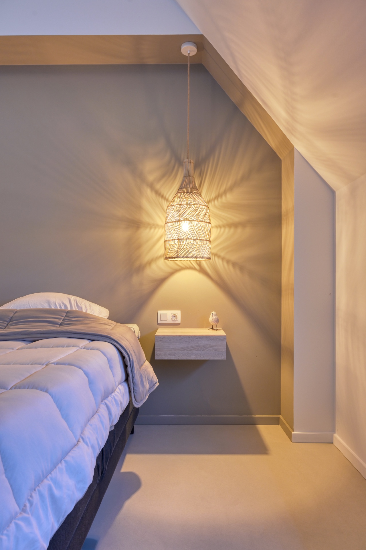
A light floor sets the tone as soon as you step in. Its muted stone-like surface runs through the kitchen, dining area and living room without a break, so the eye moves across the house in one line. The palette stays close to sand, mushroom and pale wood, with round recessed lights sitting quietly in the ceiling. It is a measured interior, built from surfaces that do not compete with one another.
A floor that carries the open plan interior
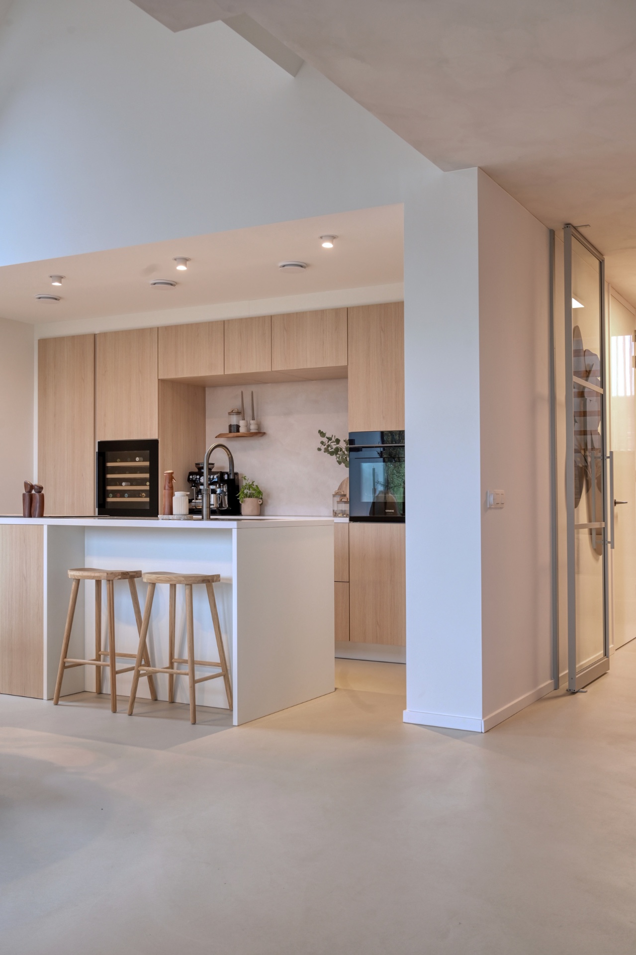
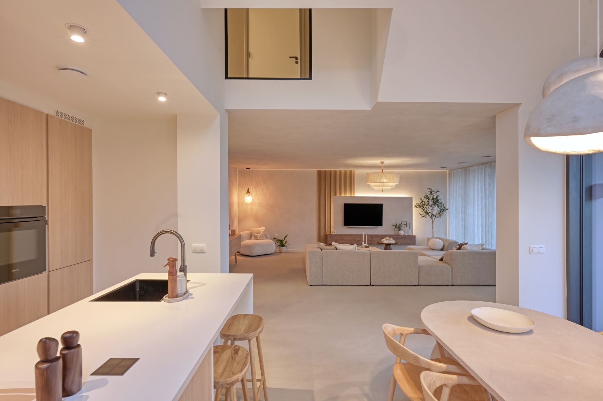
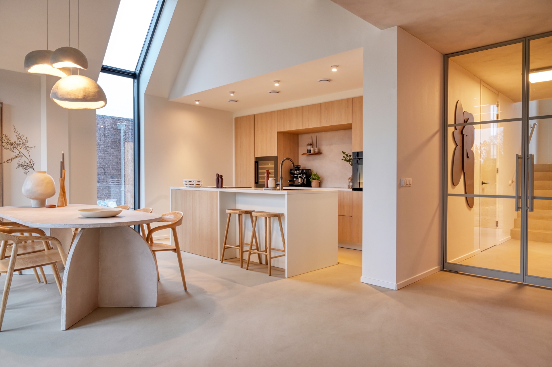
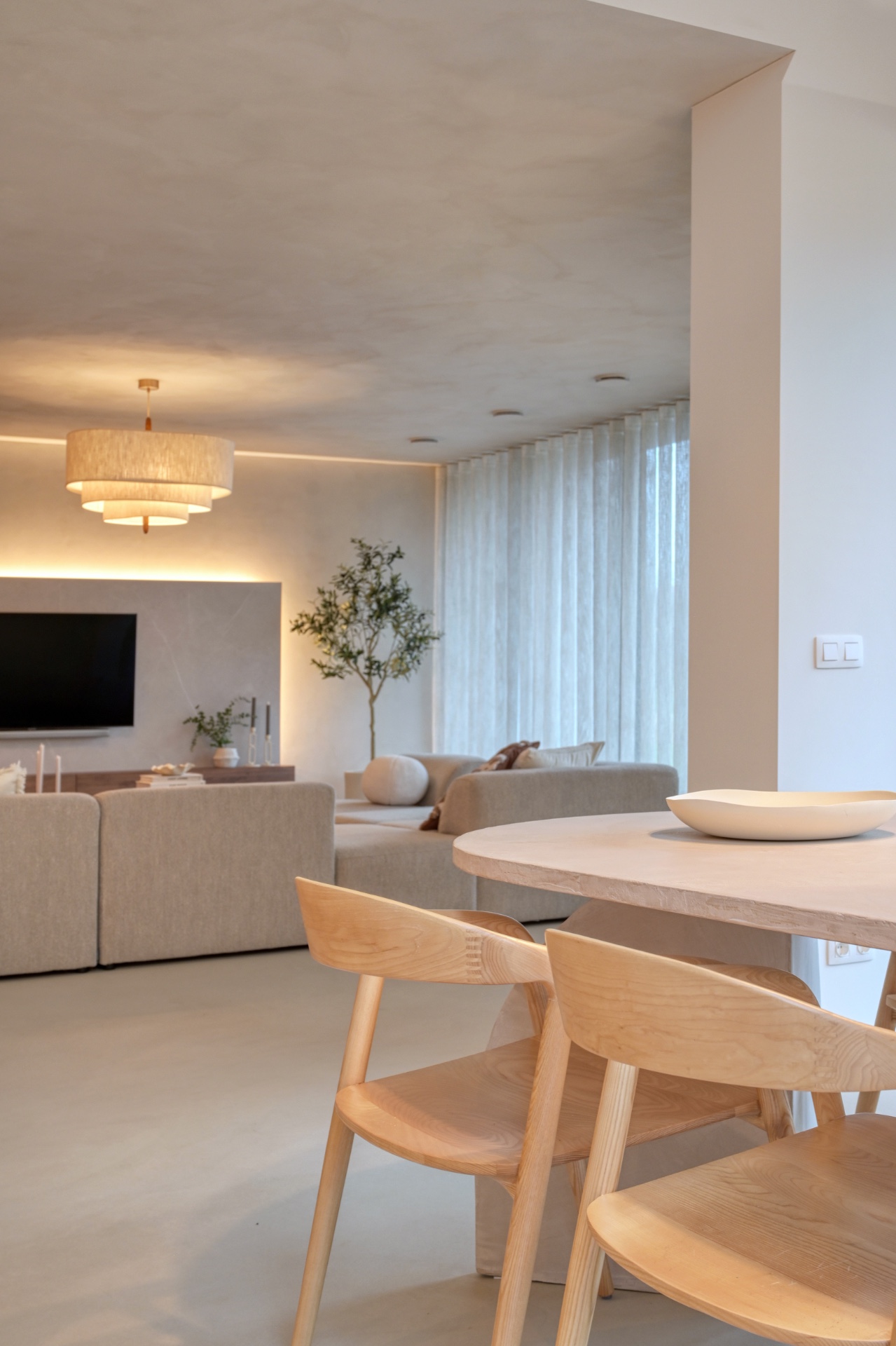
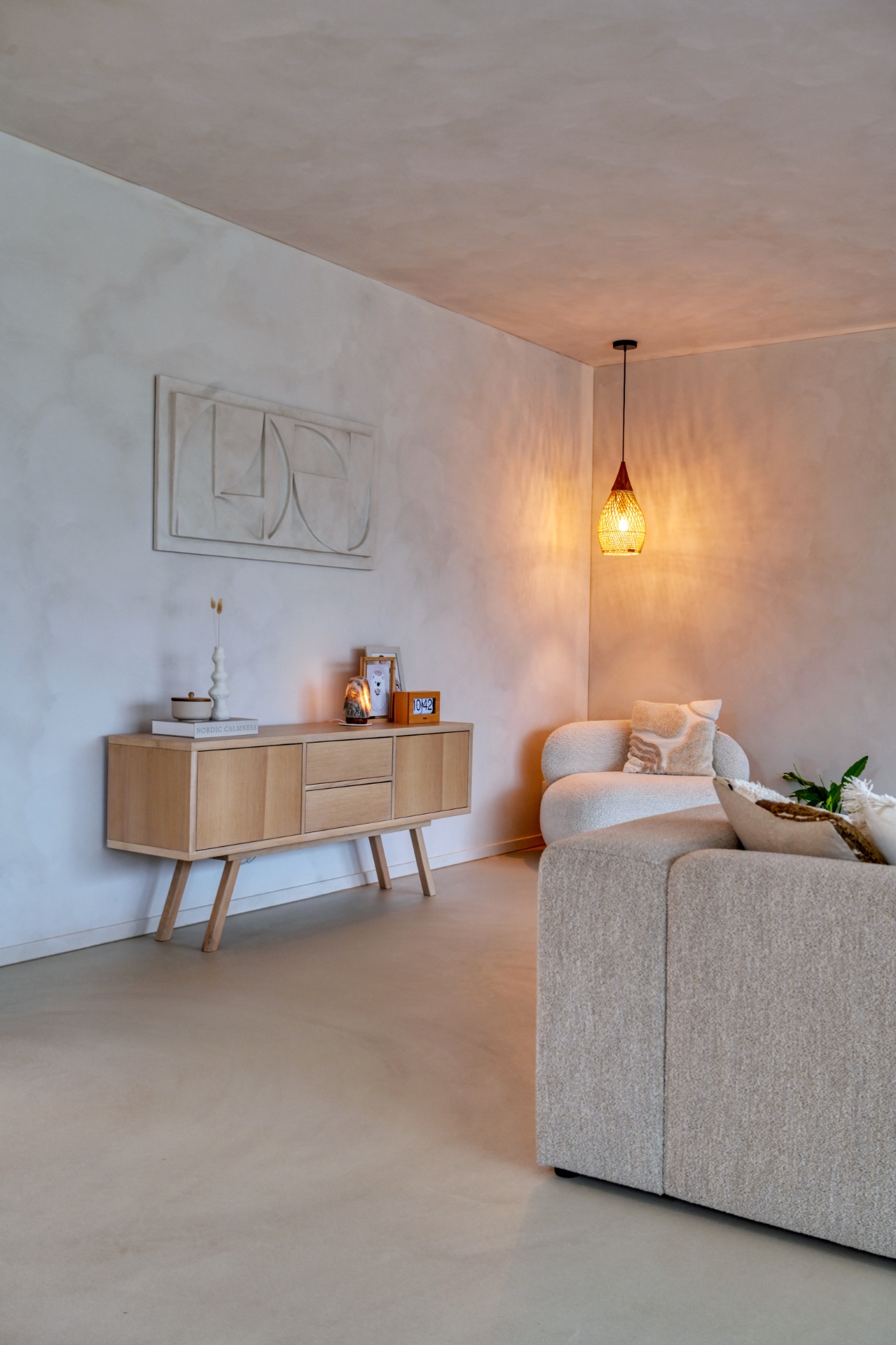
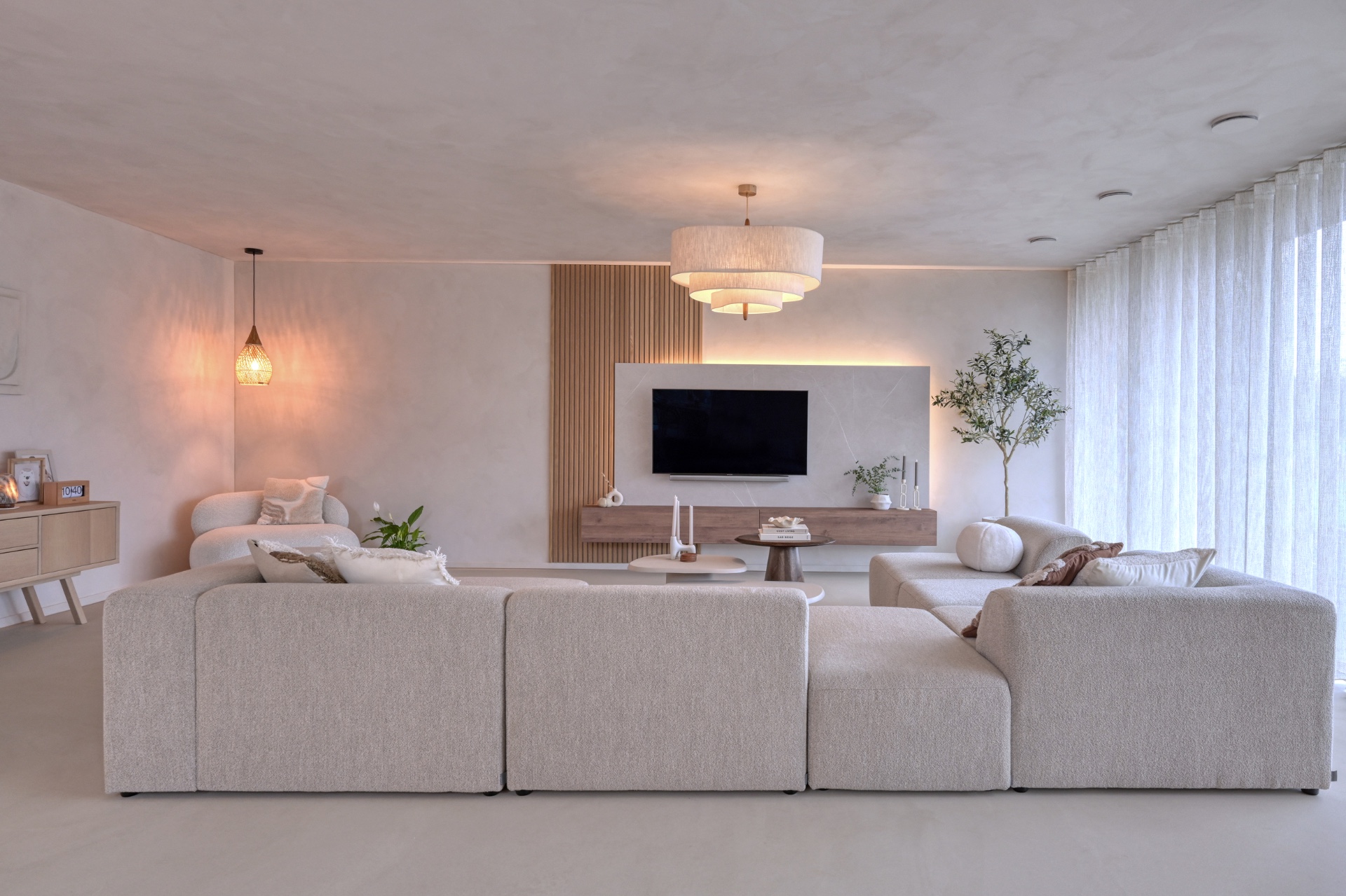
The most visible gesture is the floor itself. In this open plan interior, the seamless floor links the main living zones and keeps thresholds visually low. Cabinet fronts in wood tone, soft wall colour and dark window profiles work against that calm base. The result is not empty or stark; it is simply clear, with each object easy to read against the matte surface below.
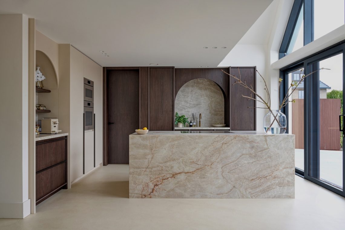
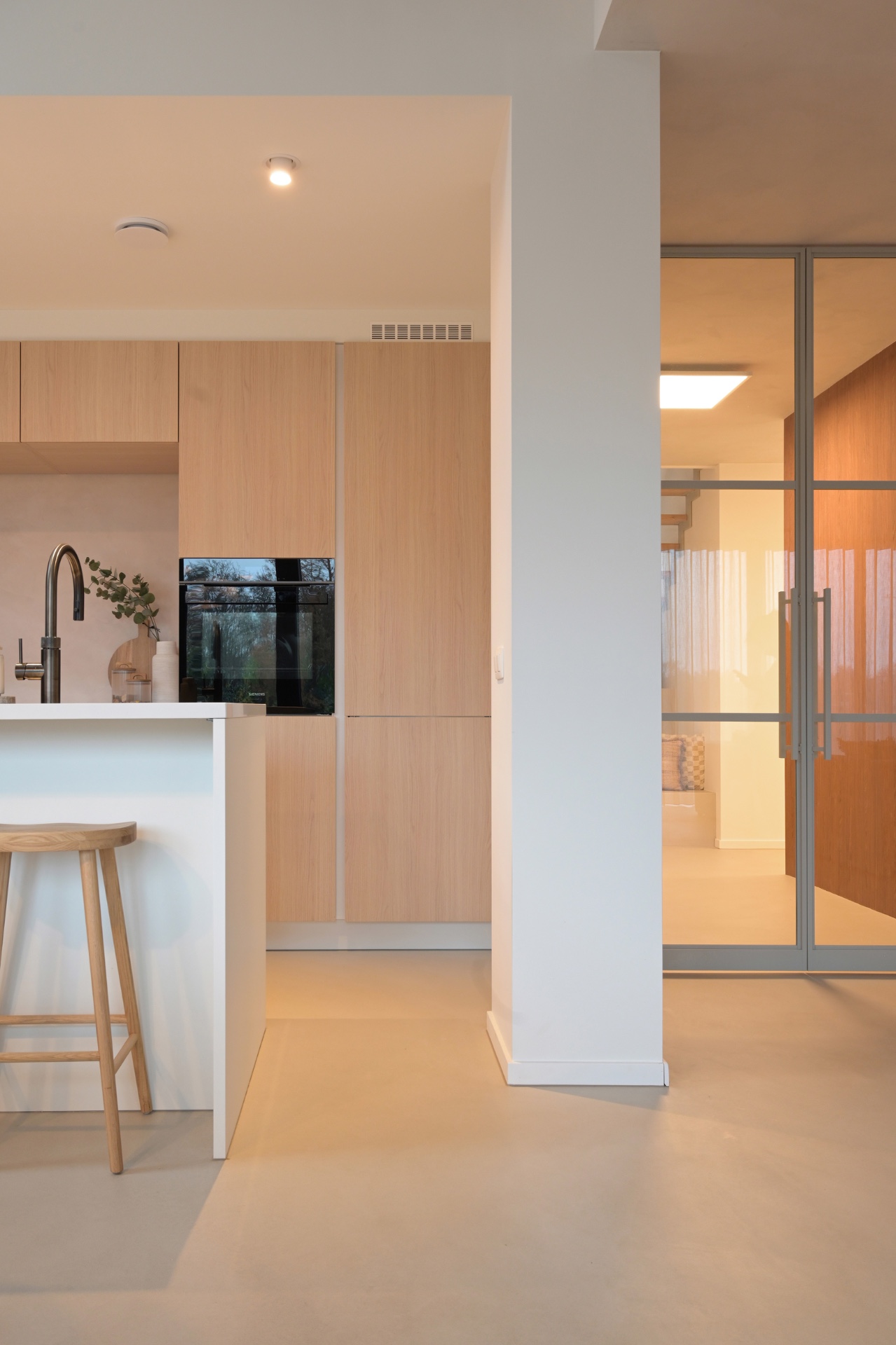
That clarity is especially apparent near the kitchen island, where the flooring slips past seating, storage and integrated appliances in one unbroken sheet. The lighter tone softens the stronger lines of the cabinetry, while the recessed lighting above keeps the ceiling visually light. Every move in the room returns to the same ground plane, which gives the space a steady rhythm.
Floor continuity to staircase, carried through in the same tone
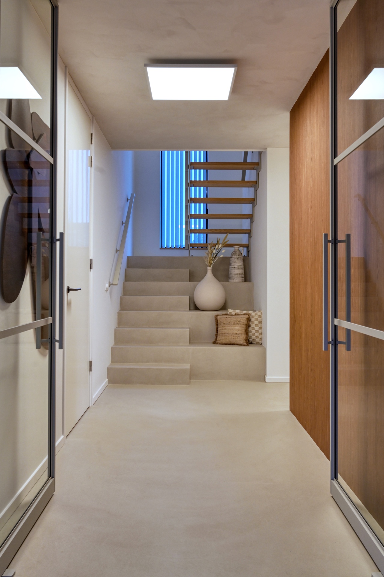
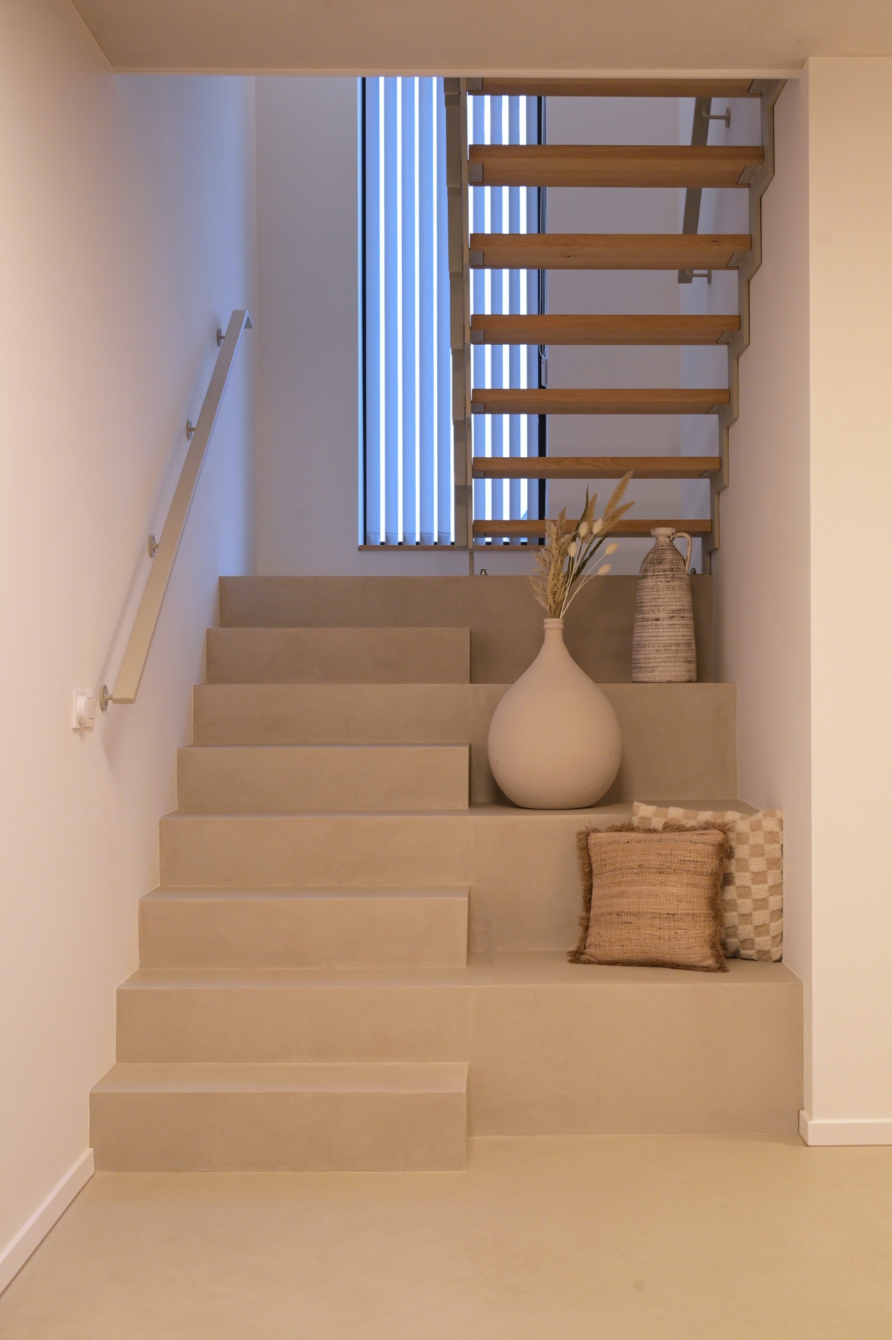
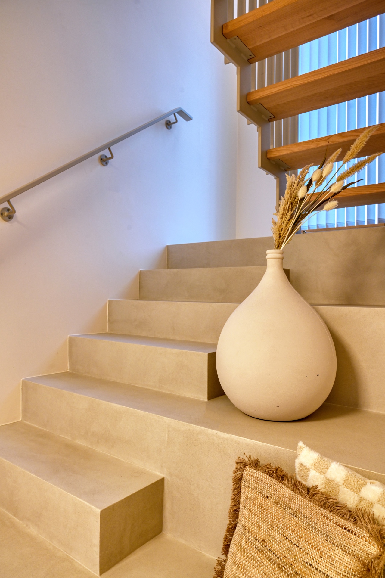
The staircase does not read as a separate element here. It is finished in the same material and colour as the floor, so the transition to the upper level feels direct rather than interrupted. That floor continuity to staircase creates a clear route through the house, and it also lets the stair sit within the interior instead of standing apart from it. The lighter treads and matching side surfaces keep the whole run visually compact.
From the hall, the stair is framed by vertical timber elements and a railing with a darker handhold. The contrast is modest, but it sharpens the profile of the steps. Light from above reaches the landing and the adjacent corridor, where the same floor surface continues underfoot. This is where the project’s design language becomes most legible: one finish, repeated carefully, across moving levels.
Wood accents that soften the straight lines
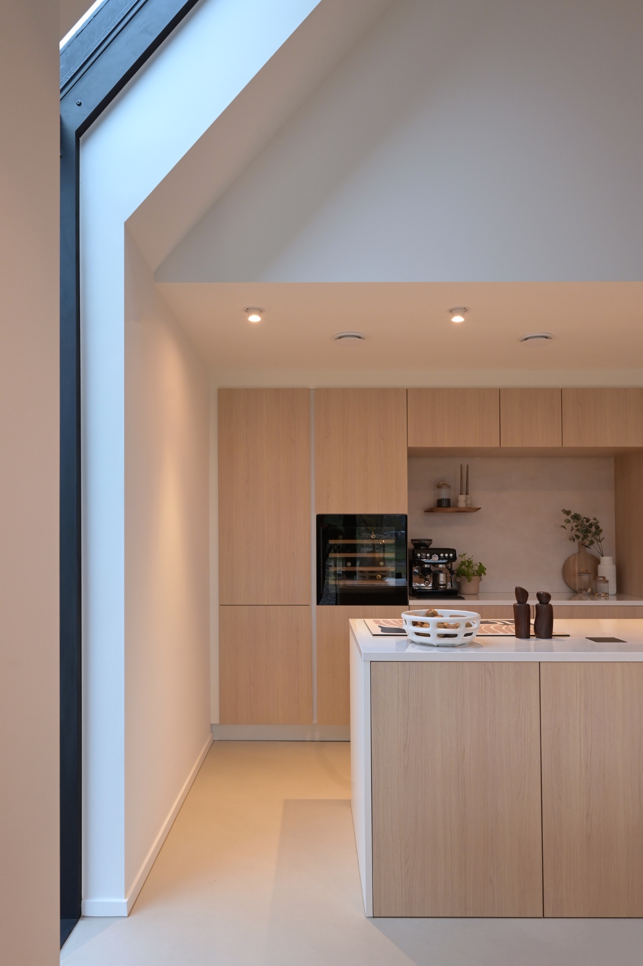
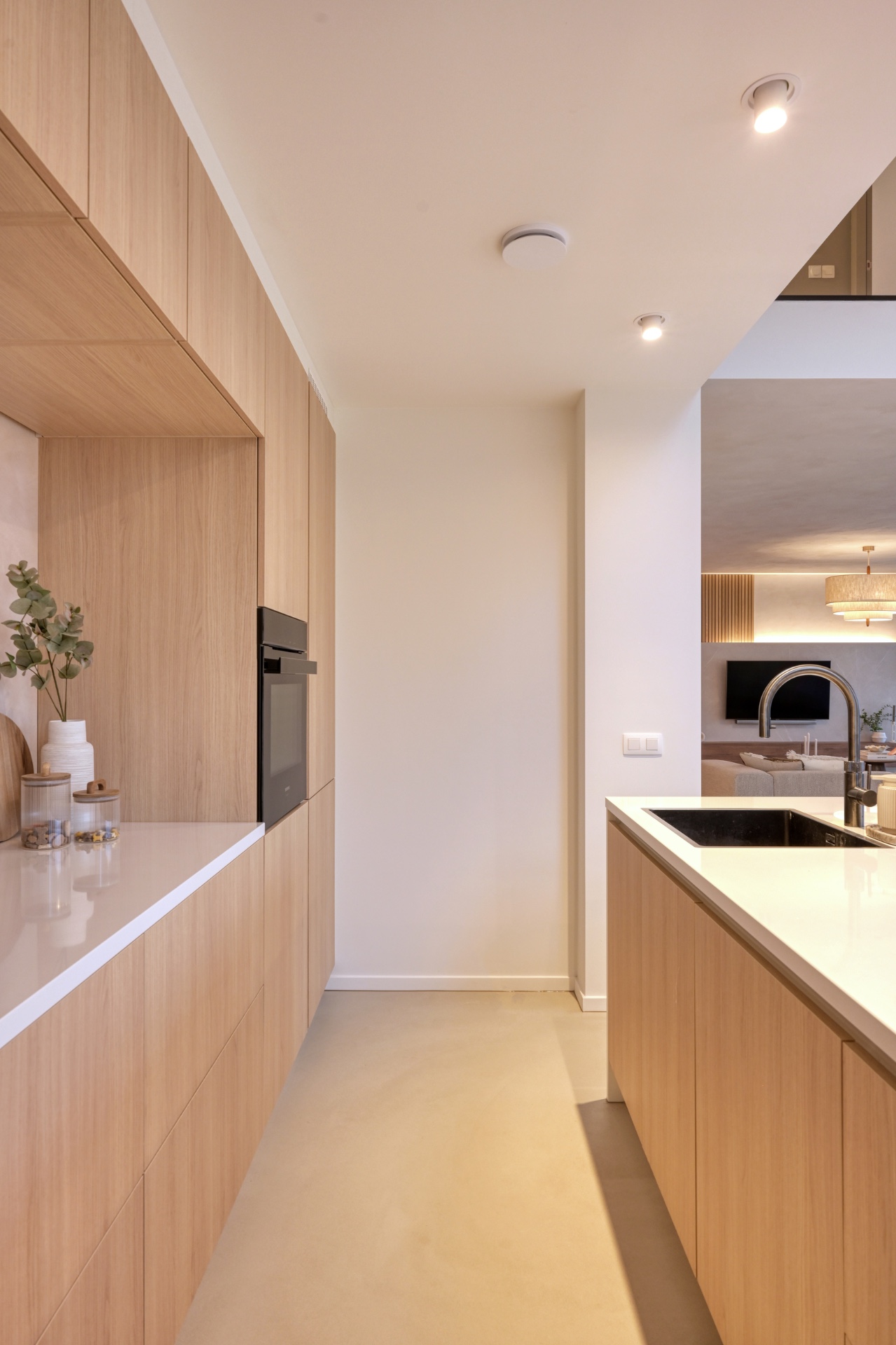
Wood accents appear in the kitchen fronts, built-in niches and furniture pieces, adding grain and warmth to an otherwise restrained palette. The cabinetry has a flat, calm face, while the niches break it up with depth and shadow. A column in the centre line and dark window frames bring a cooler note, so the wood reads more clearly. Nothing is overdone; the materials are left to do their own work.
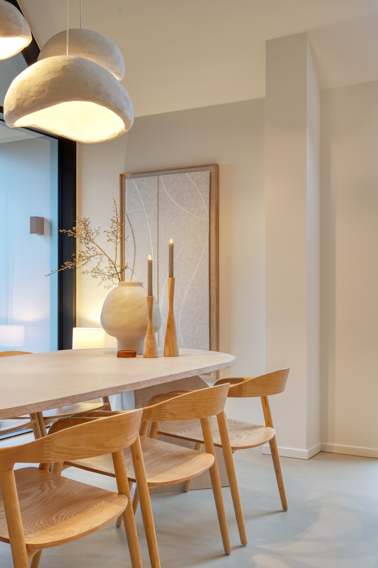
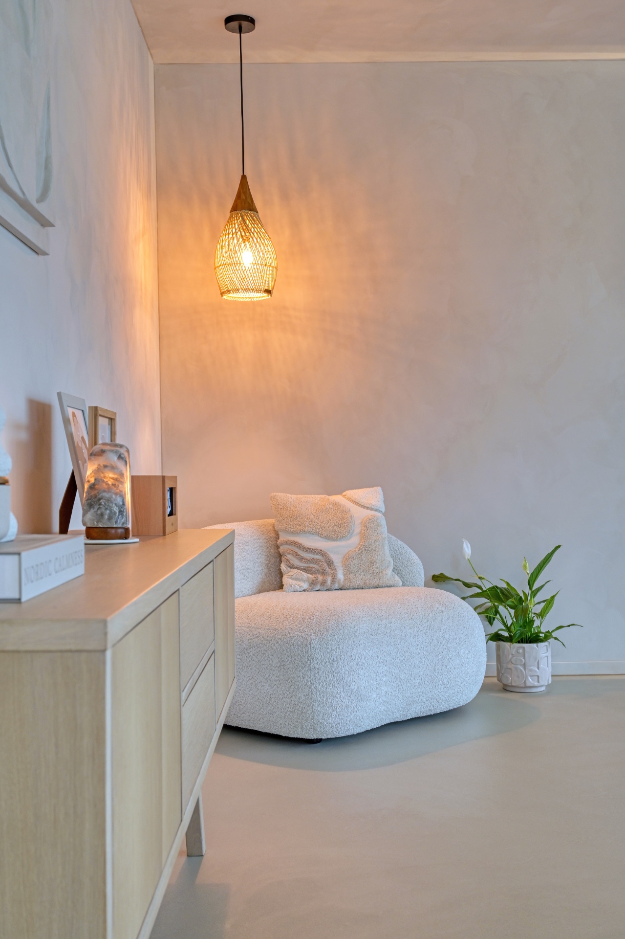
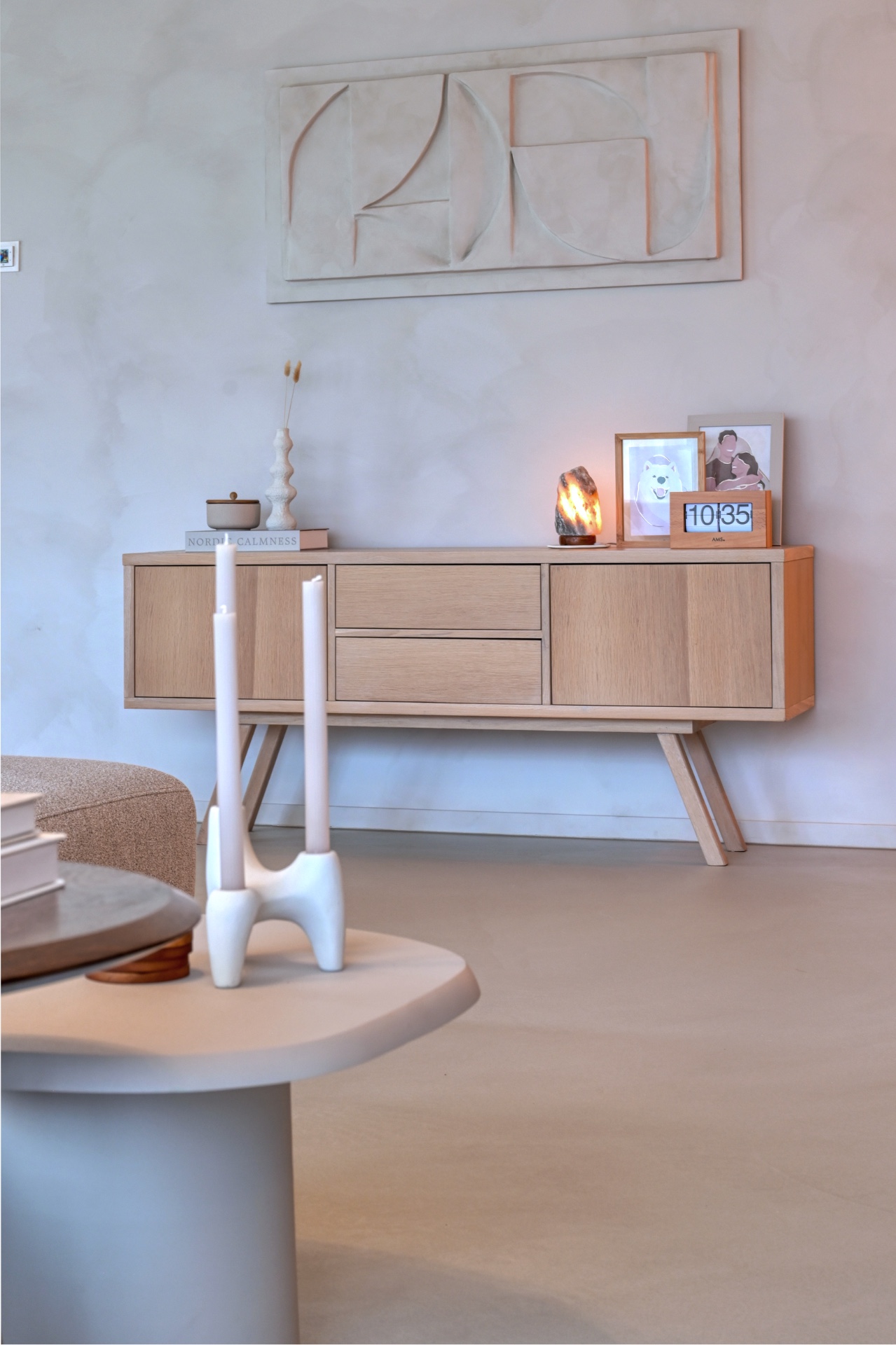
In the dining and sitting areas, the same restraint continues. A round pendant hangs over the table, and another dome-shaped lamp appears near the lounge corner. Their curves interrupt the straight ceiling lines in a subtle way. A large wall artwork, a low sideboard and upholstered seating keep the room grounded, with the seamless floor running beneath them as a constant base.
Light that stays close to the ceiling
Round recessed lights appear throughout the interior, often paired with larger hanging fixtures where the room needs a focal point. The ceiling remains quiet, which helps the floor and joinery carry more of the visual weight. In the kitchen, the downlights pick out the work surface and the vertical surfaces around the appliances. In the living area, they skim over the furniture and window line without taking over the scene.
That approach suits the project’s overall design. The rooms are not filled with decorative gestures. Instead, light is placed where it can describe the architecture: above the island, along the corridor, near the stair, and over the dining table. It leaves the material palette visible, which is where the interior has most of its character.
Bathroom surfaces kept crisp and legible
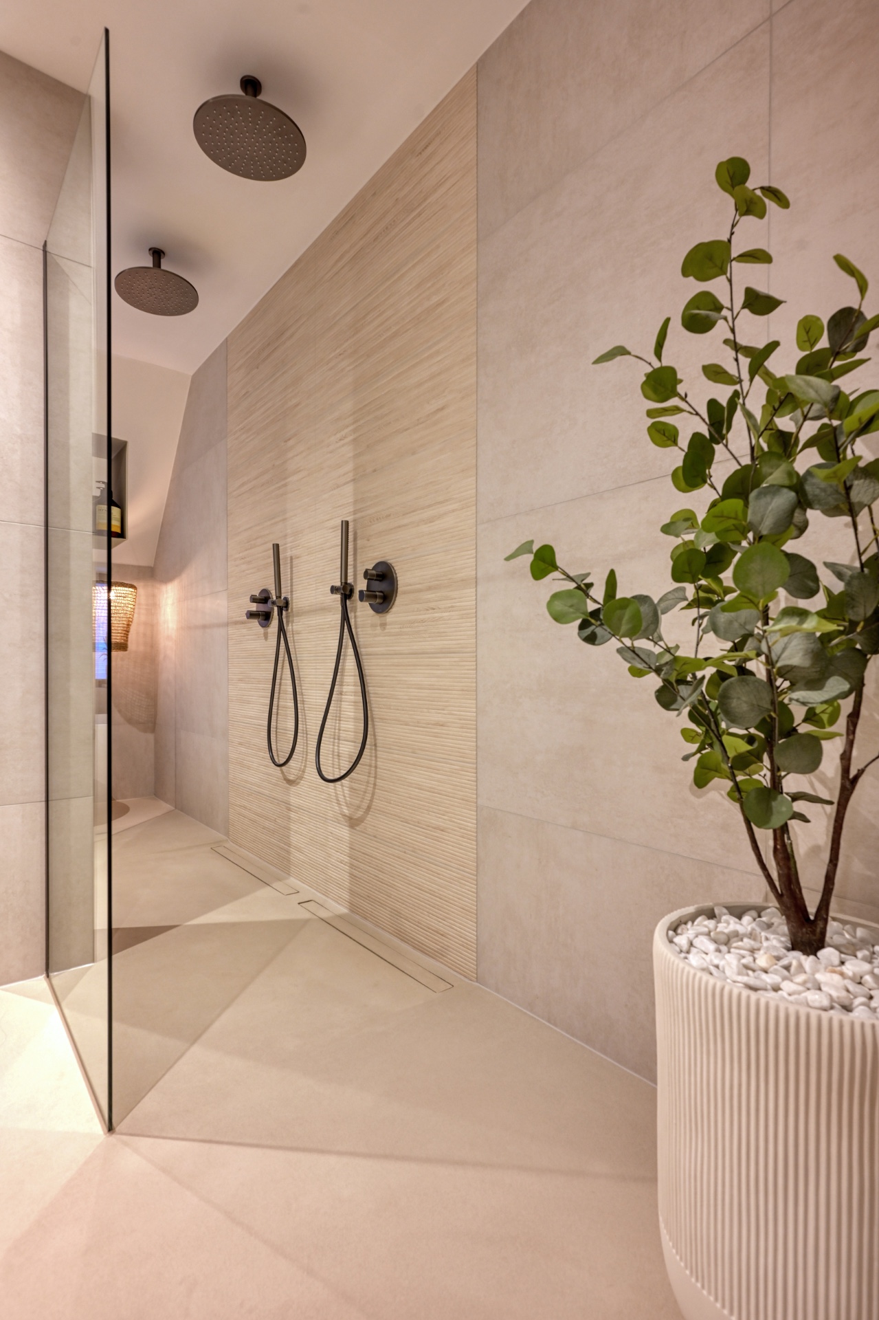
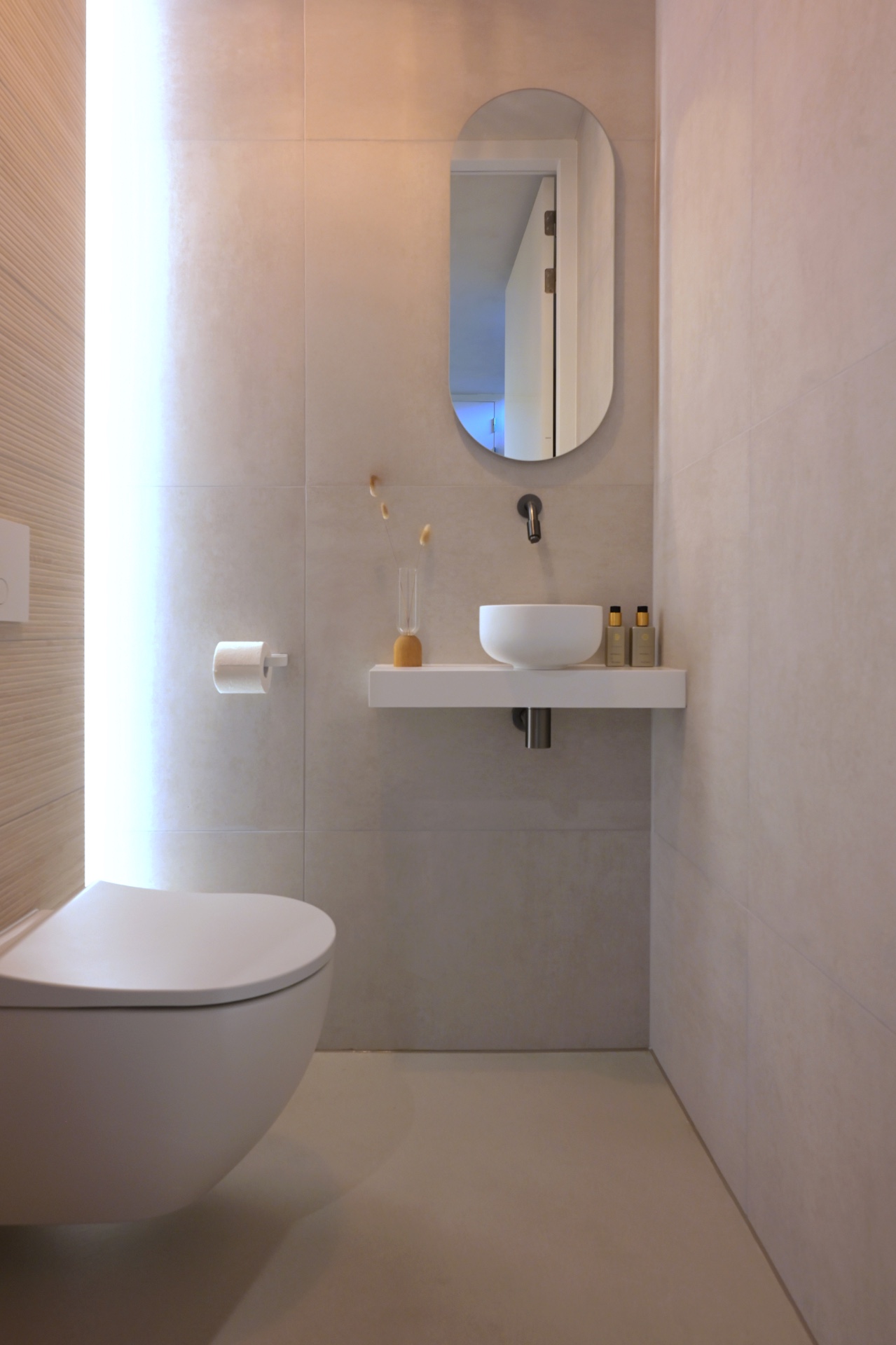
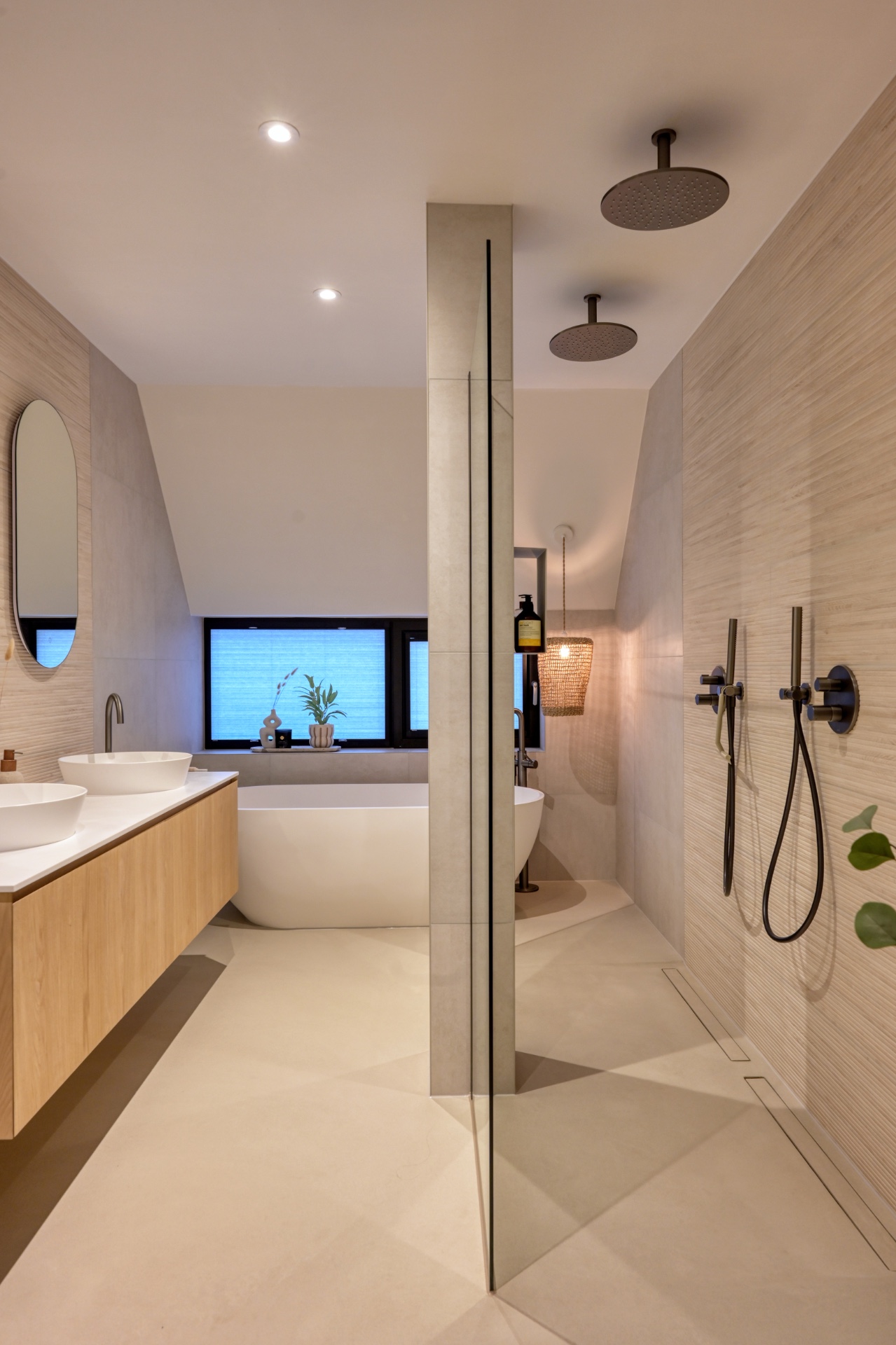
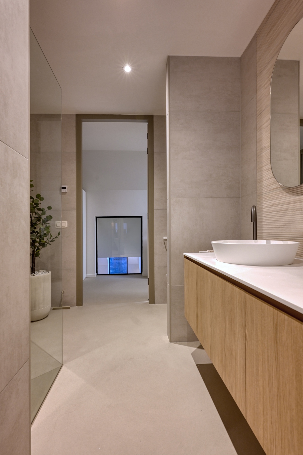
The bathroom follows the same discipline, though here the material shift is clearer. Tiled walls define the shower zone, and a glass partition keeps the walk-in shower open to the rest of the room. A rain shower sits against the clean tile surfaces, while the vanity uses wood-fronted storage to bring the palette back toward the rest of the house. The composition is compact, but each piece has its place.
Because the finishes stay pared back, the bathroom feels linked to the rest of the interior rather than sealed off from it. The mix of tile, glass and wood mirrors the broader project language: neutral colour, direct lines and practical surfaces left visible. Even in this smaller room, the design depends on what can be seen clearly, not on ornament.
A calm route through the house
What holds the project together is the way the eye moves. From kitchen to living area, from hall to stair, the same seamless floor keeps the route easy to follow. It works with the open plan interior, but it also gives definition to each zone by letting furniture, lighting and joinery sit against a consistent background. The house never needs a strong contrast to feel ordered; the materials already do that work.
That quiet logic is what gives the interior its force. The floor does not ask for attention every second, yet it shapes everything around it: the stair, the storage, the seating, the light. In a setting built around Scandinavian restraint, that is enough. The surface, the wood accents and the measured lighting create a clear reading of the home, room by room, without breaking the flow between them.
Photography – Jaro van Meerten
Contributors:
Floor finish – Pava Nederland
Applied by – Behaaglijk Wonen
Want to see more of Behaaglijk Wonen? View the page of Behaaglijk Wonen for even more great projects and company information.


NEW 2026 Jubileum Edition The Best Interior Designers Benelux
Order Now €125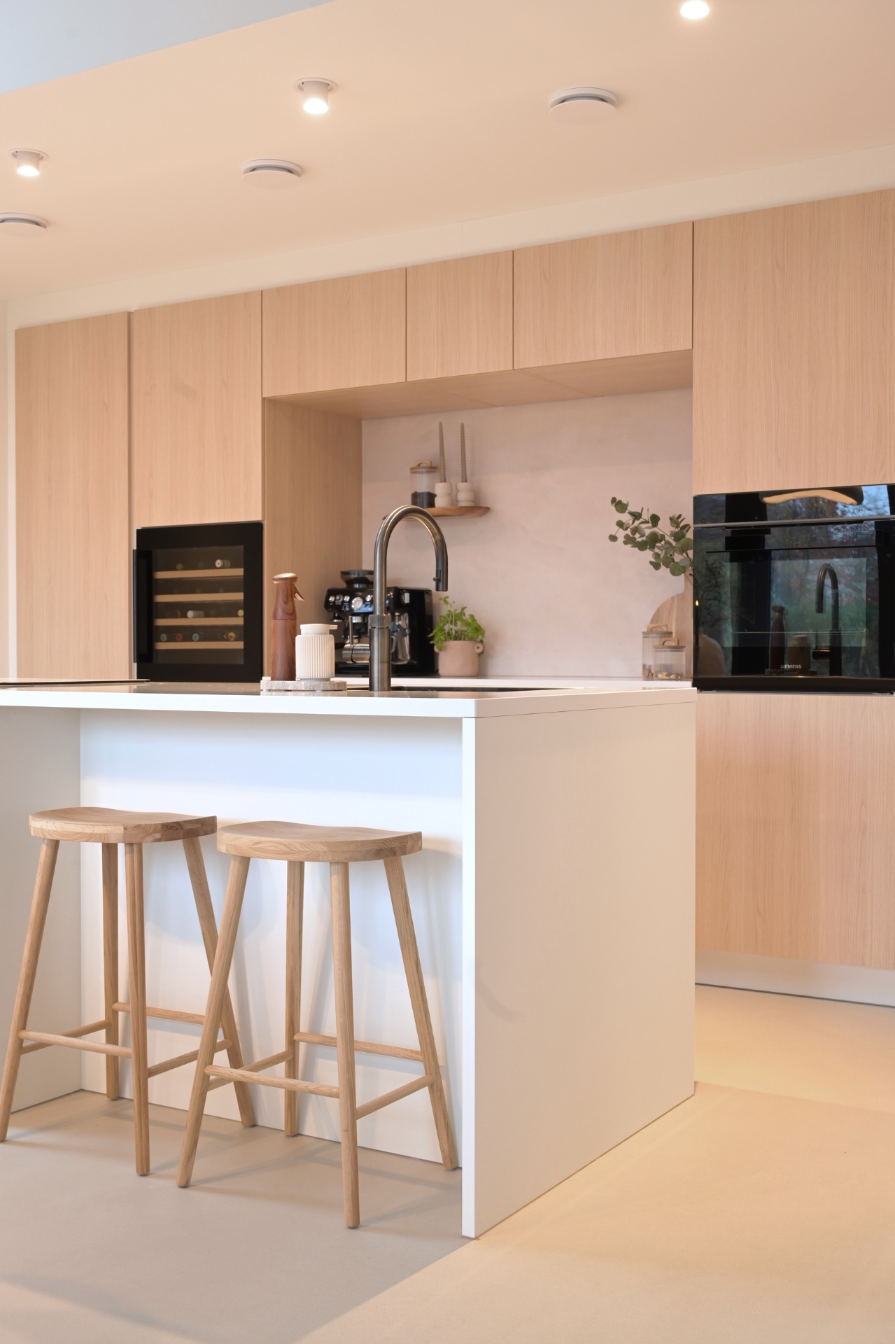
NEW 2026 Jubileum Edition The Best Interior Designers Benelux
Order Now €125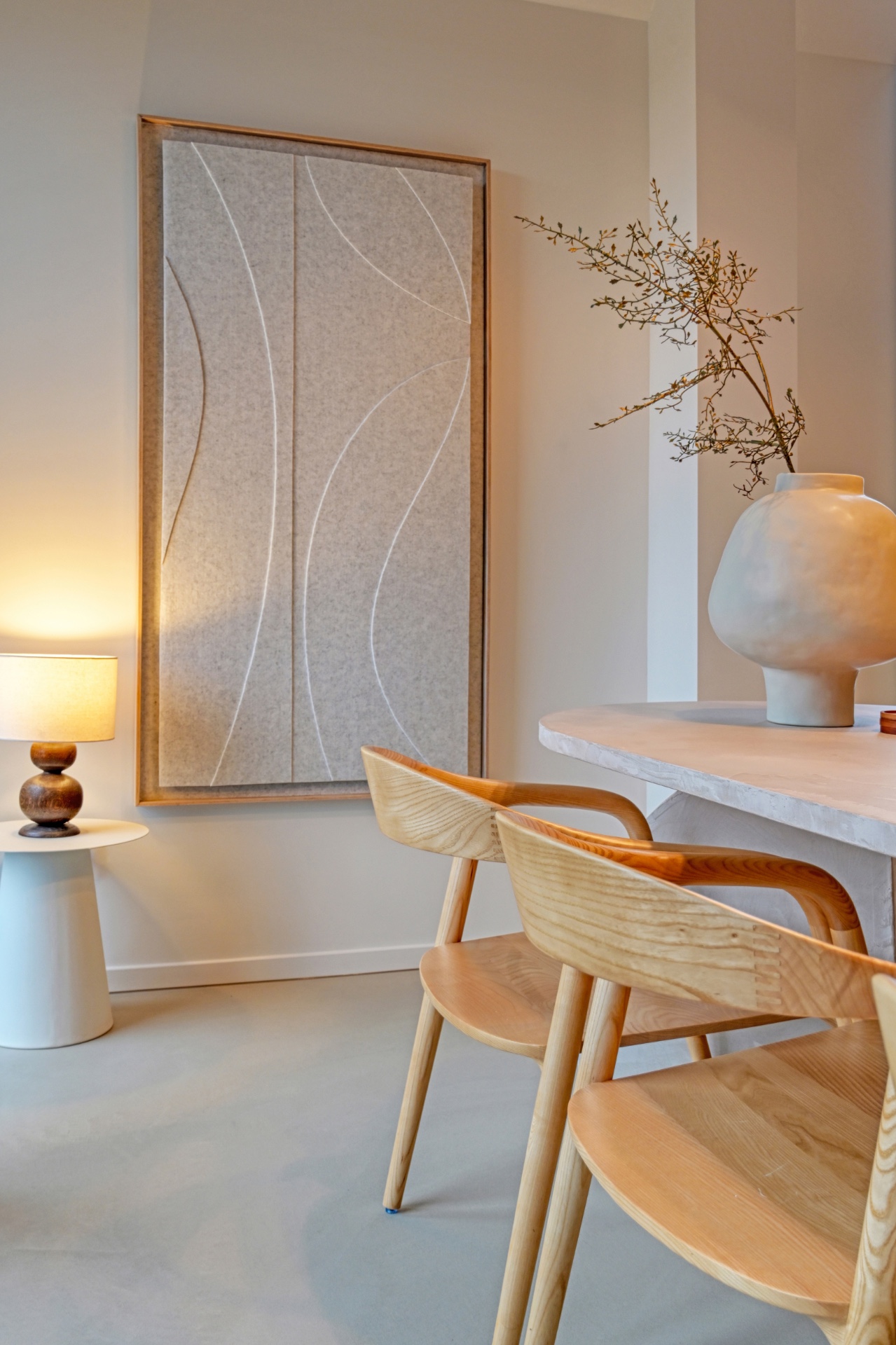
NEW 2026 Jubileum Edition The Best Interior Designers Benelux
Order Now €125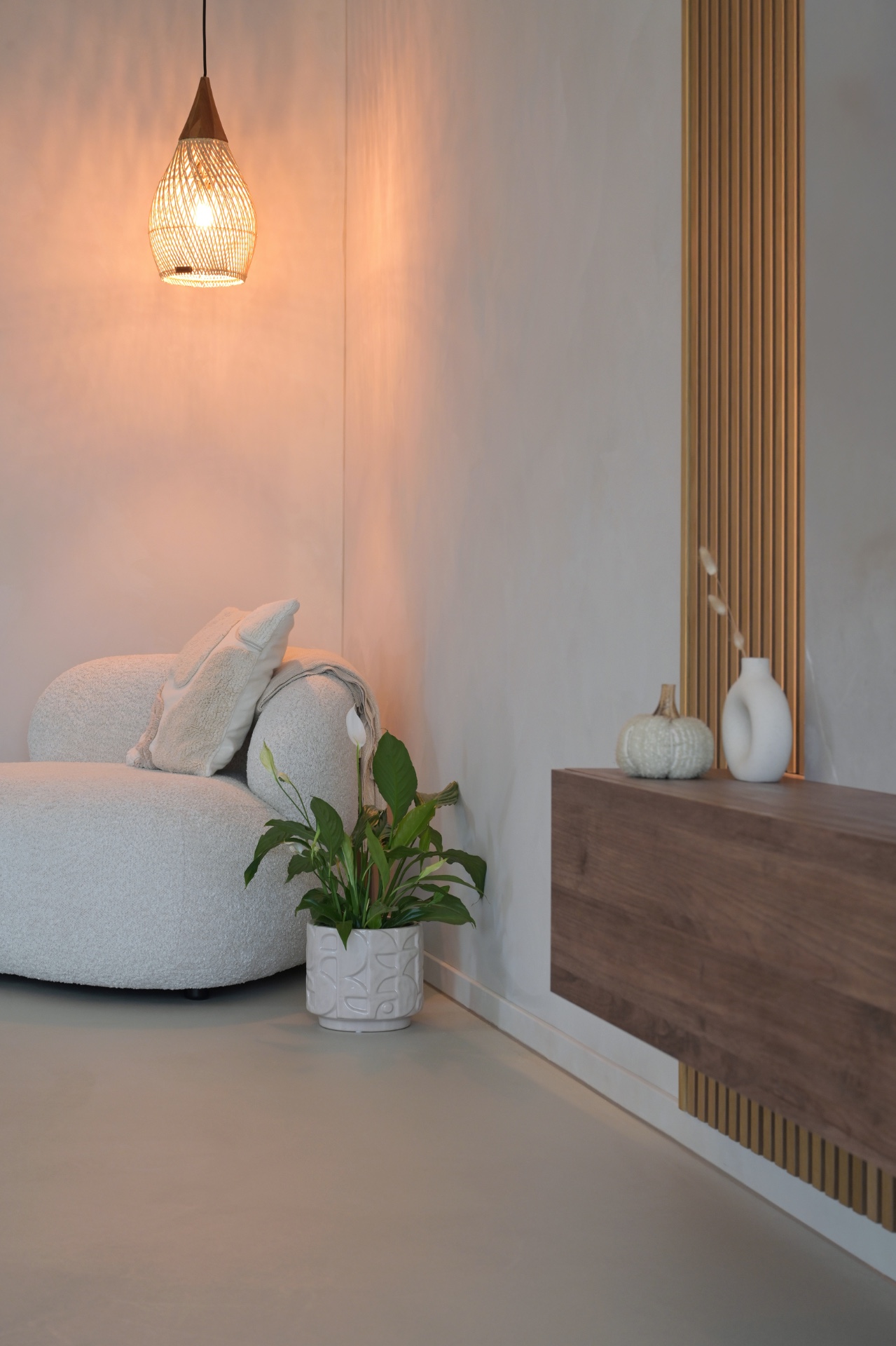
NEW 2026 Jubileum Edition The Best Interior Designers Benelux
Order Now €125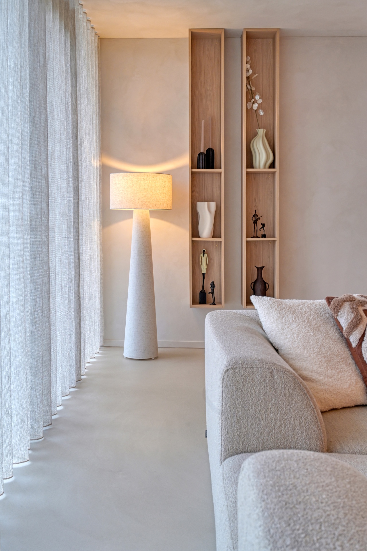
NEW 2026 Jubileum Edition The Best Interior Designers Benelux
Order Now €125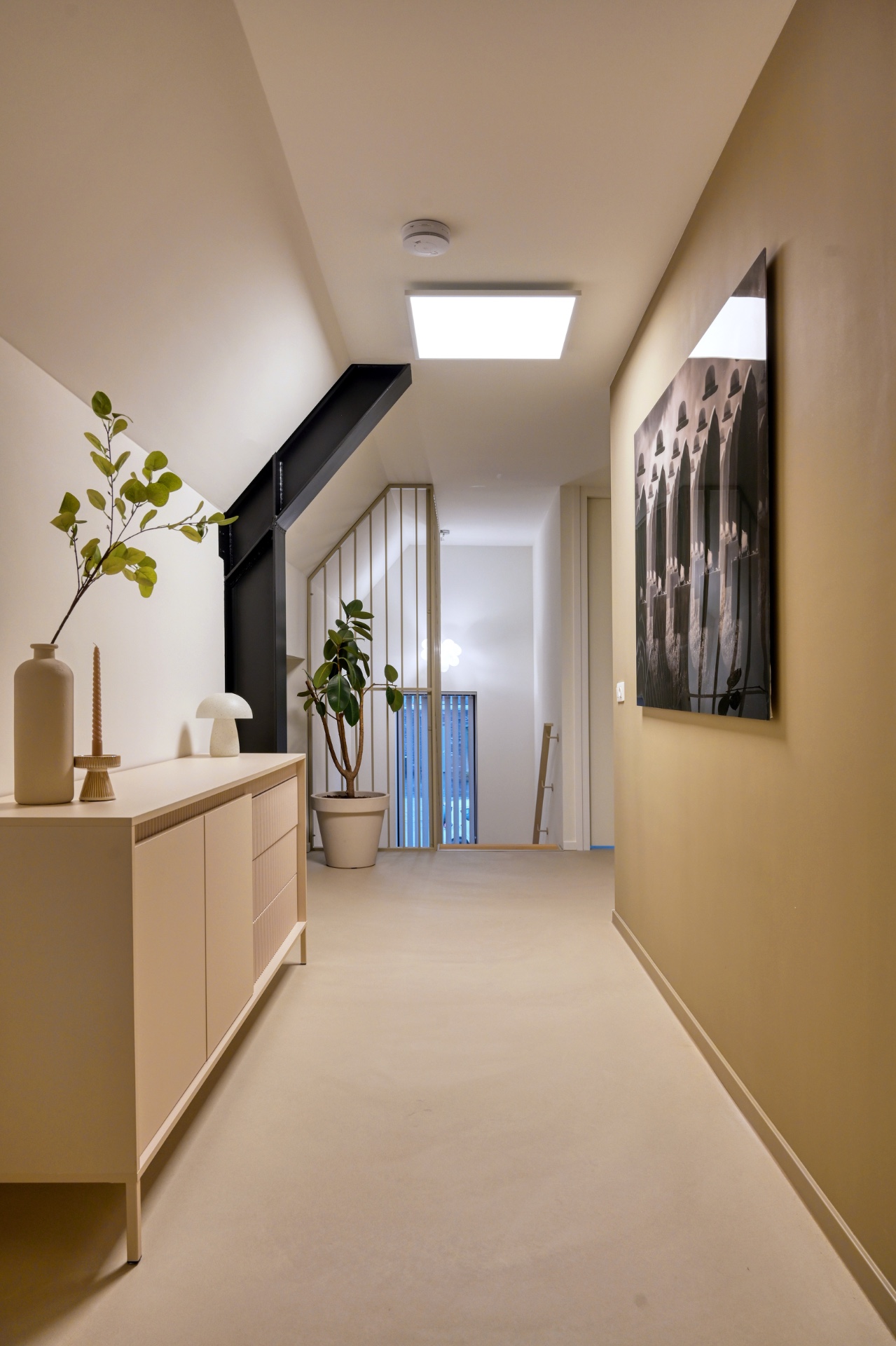
NEW 2026 Jubileum Edition The Best Interior Designers Benelux
Order Now €125