Energy-efficient renovation of a 1960s house
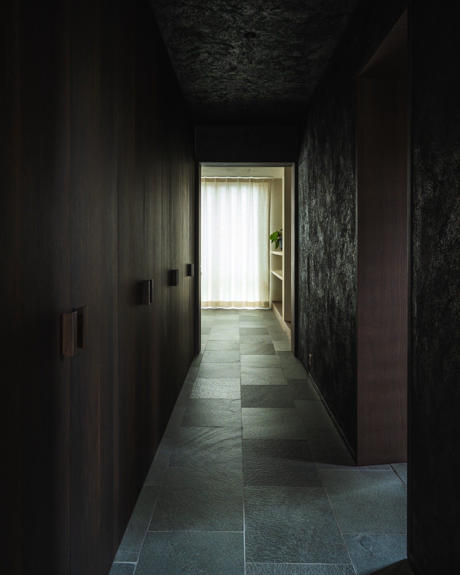
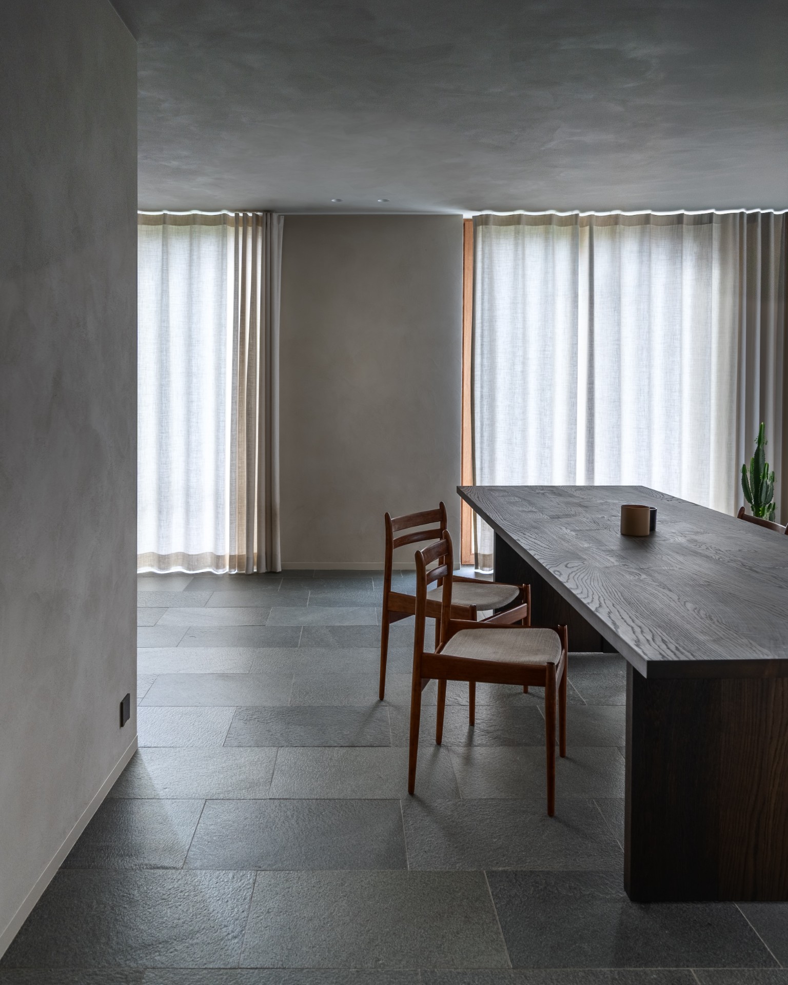
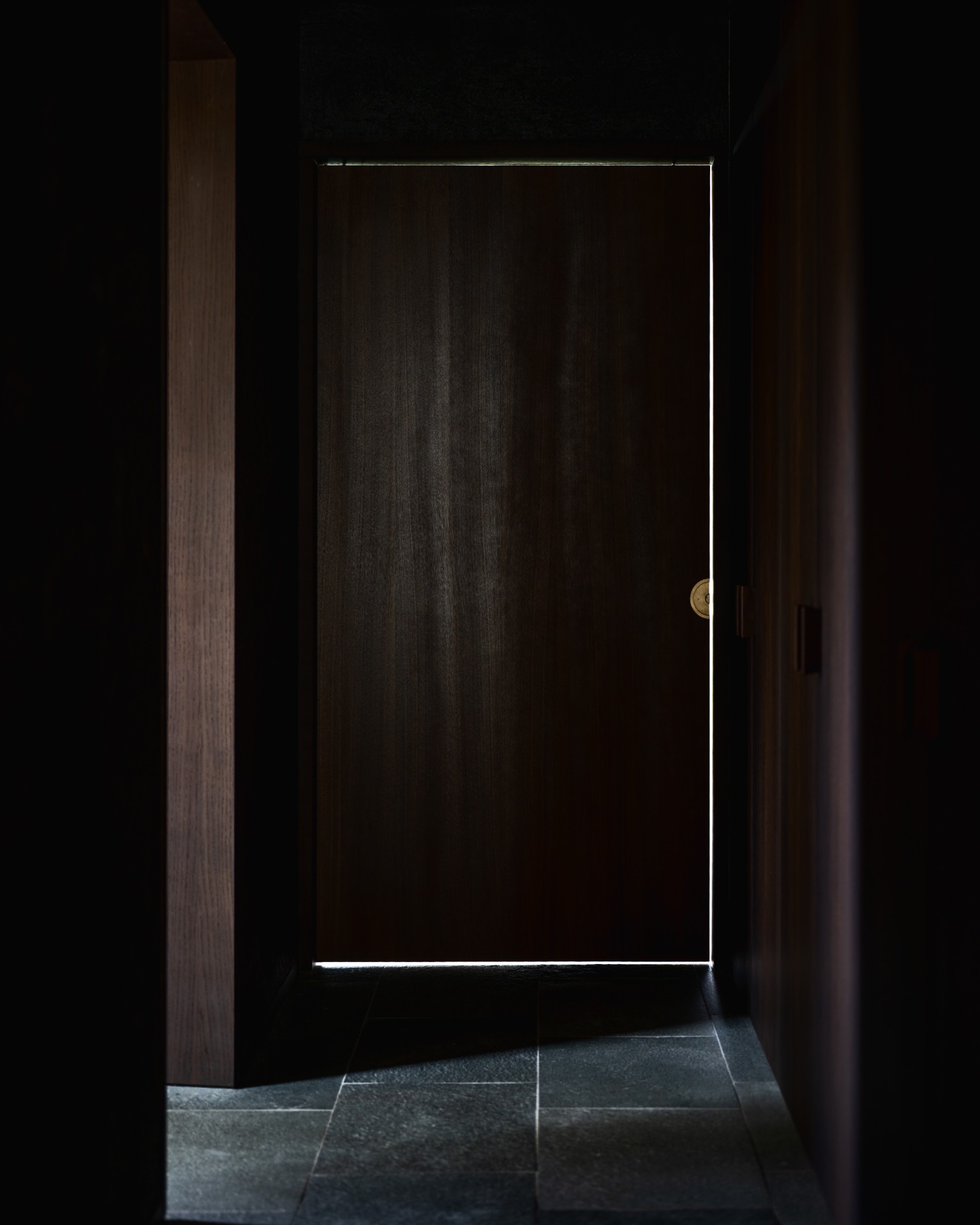
Dark joinery sets the tone as soon as you enter, but the real shift in this energy-efficient renovation comes from the way the house now pulls the eye forward. A long sightline runs from the entrance toward the living spaces, with pale wall surfaces, deep floor tiles and a restrained use of timber marking each transition. The original house, built in the 1960s, was reworked with insulation, minimal demolition and a new heating system tuned to the home’s current needs. Rather than starting from scratch, the project keeps the structure legible and lets the spatial changes do the work.
A clearer route through the ground floor
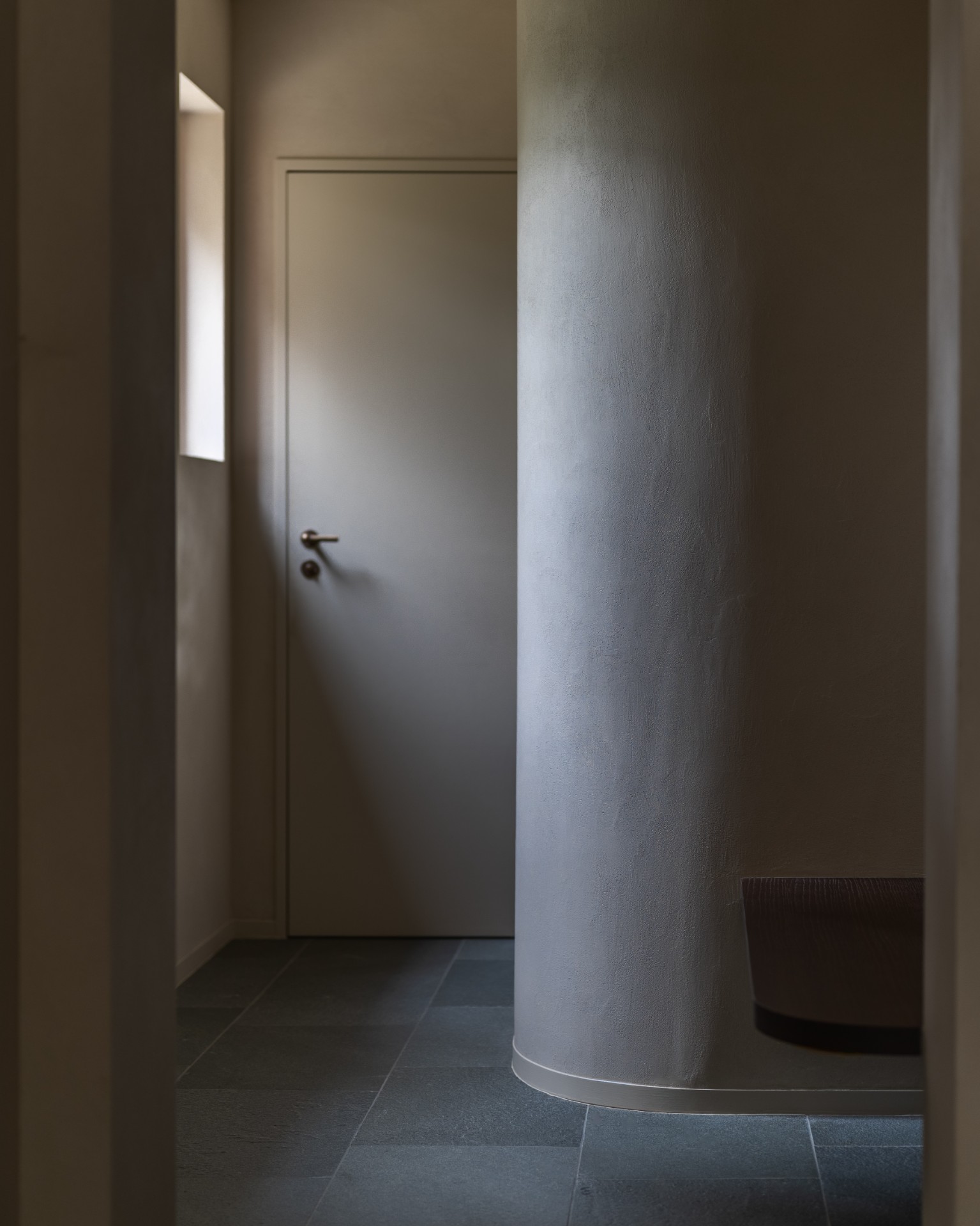
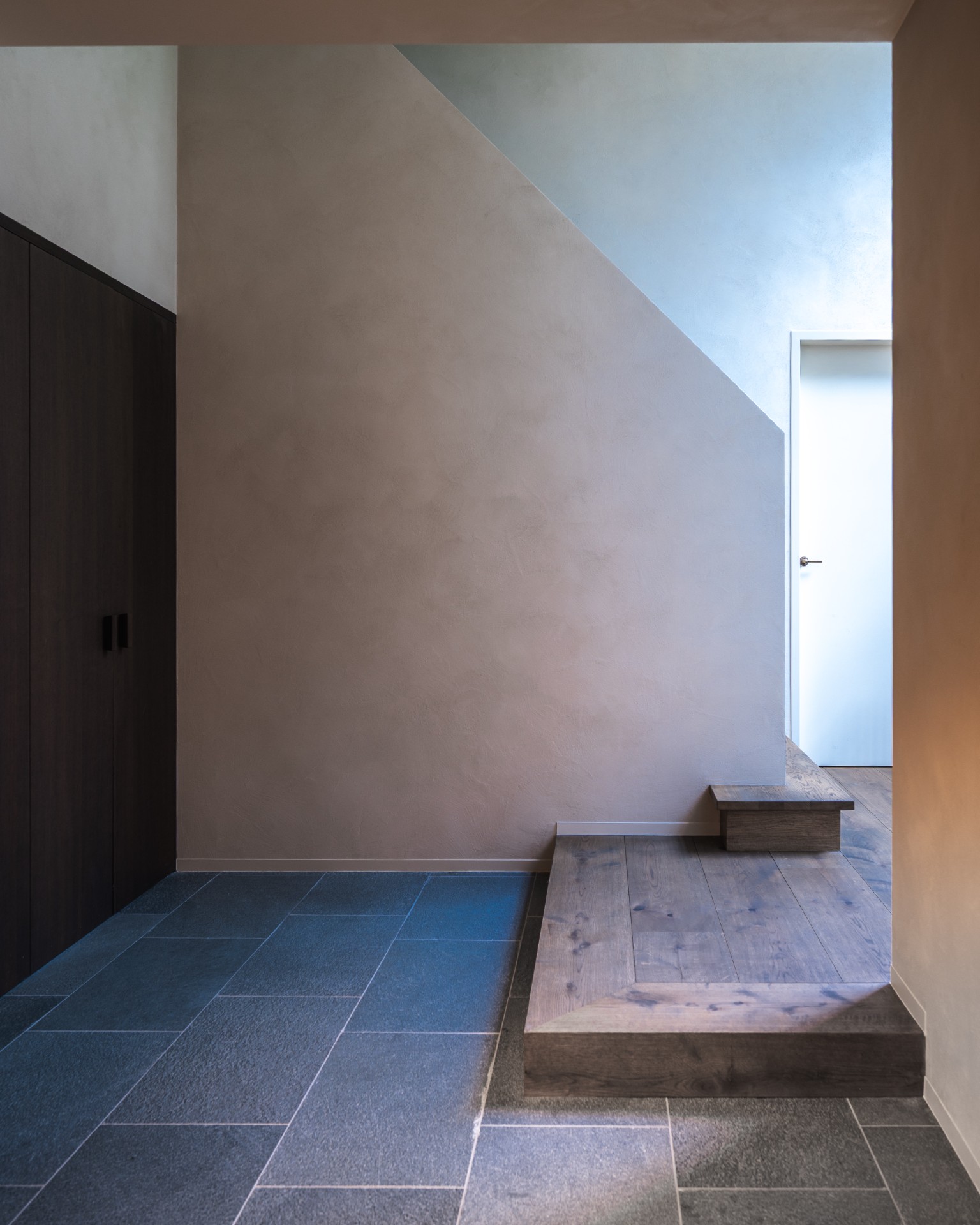
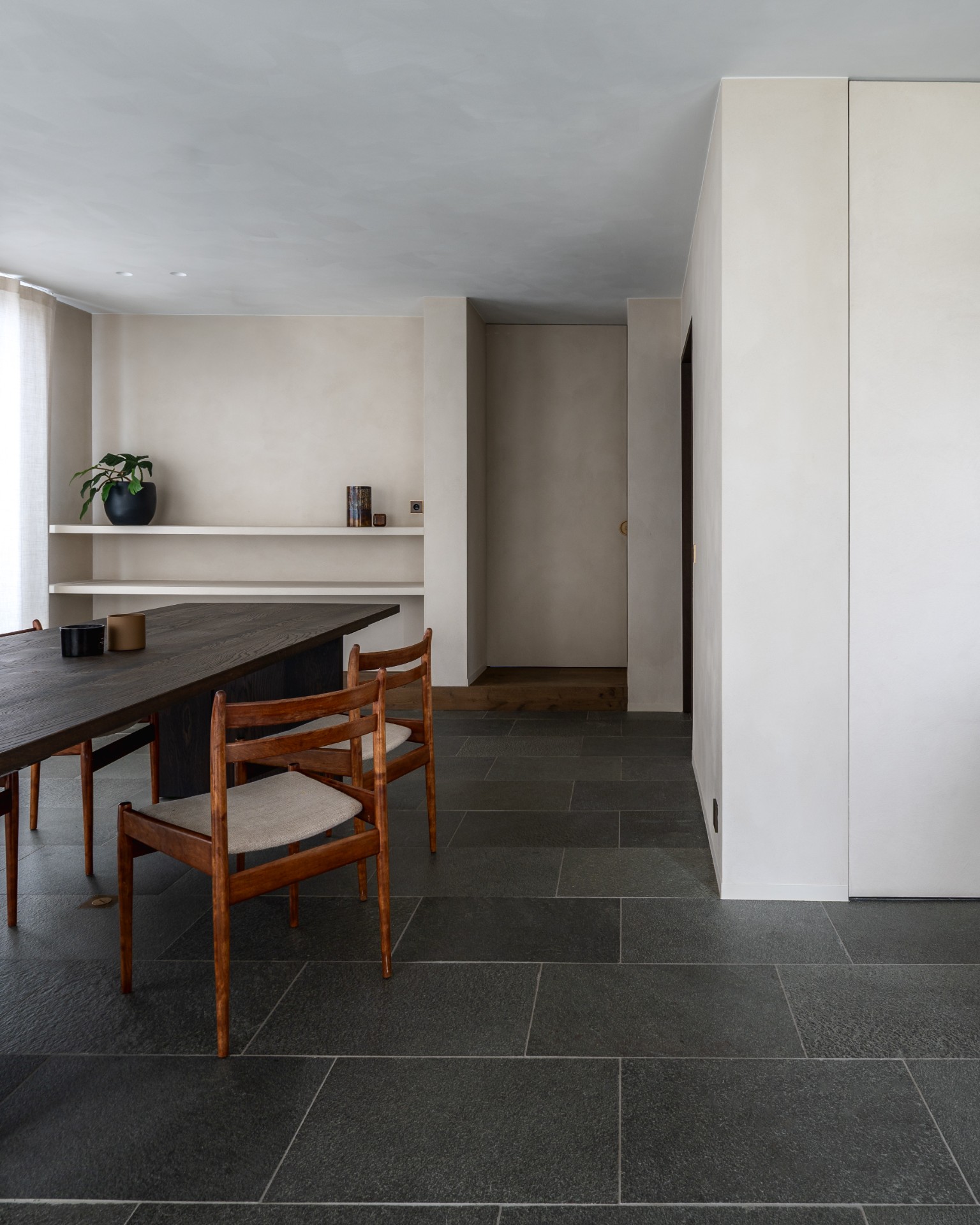
The existing entrance zone and generous stair hall were preserved, which gives the ground floor a sense of arrival that could be built around instead of erased. What changed is the access to the living area. Several openings that once competed with each other were replaced by one clear axis, and that single move makes the circulation read more calmly. Between the hall and the main rooms, a new intermediate volume now serves as storage and a utility space, its darker finish contrasting with the lighter rooms around it.
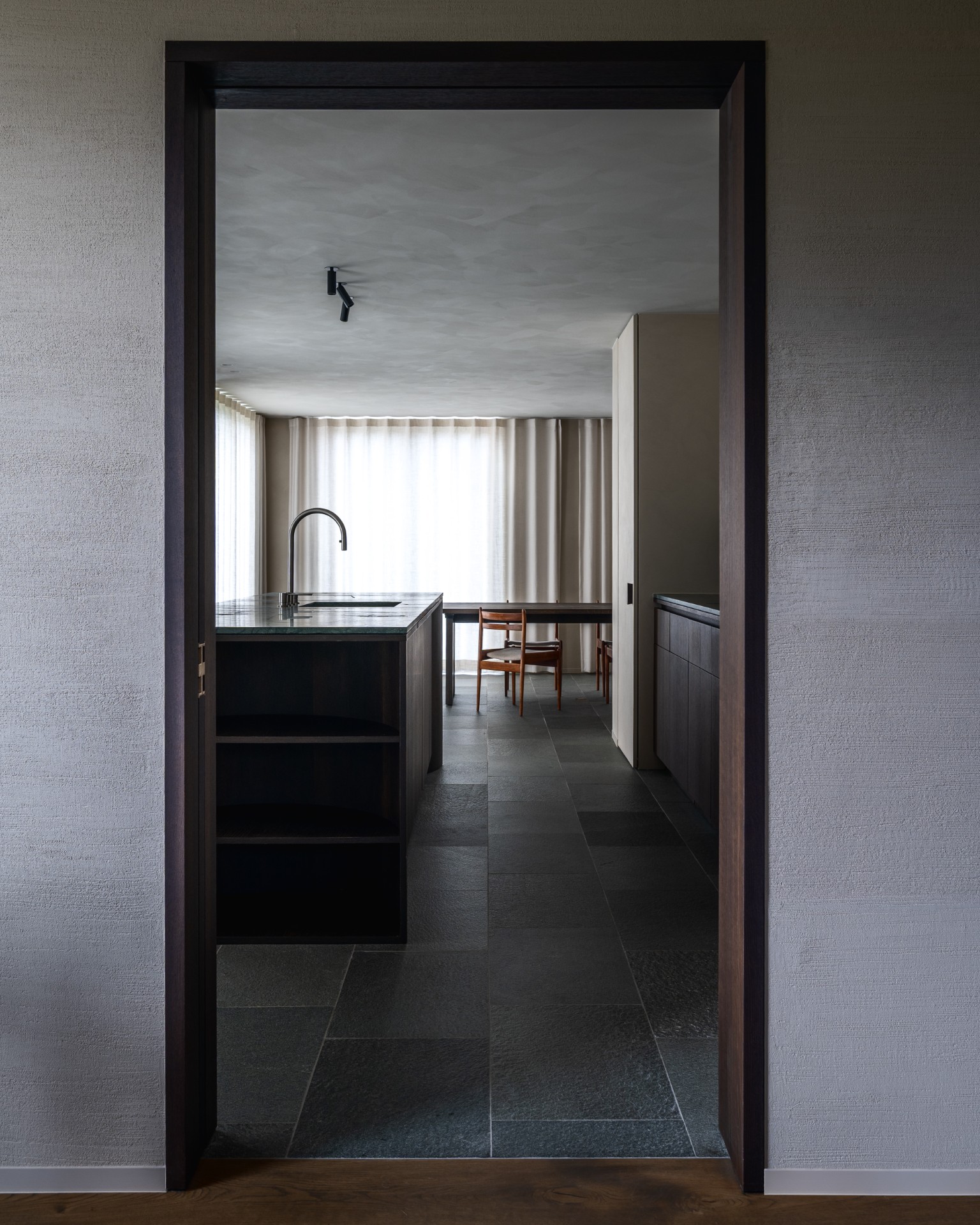
That contrast is not decorative. It helps separate service functions from daily living without adding bulk. The new passage feels compact, almost architectural in the way it frames the route to the back of the house. Behind it, the living kitchen takes the lead. It sits at the centre of the layout and connects the different zones through movement rather than through open exposure alone. The result is a house renovation that uses less sloop work than expected, yet changes the spatial experience in a decisive way.
The kitchen as central space
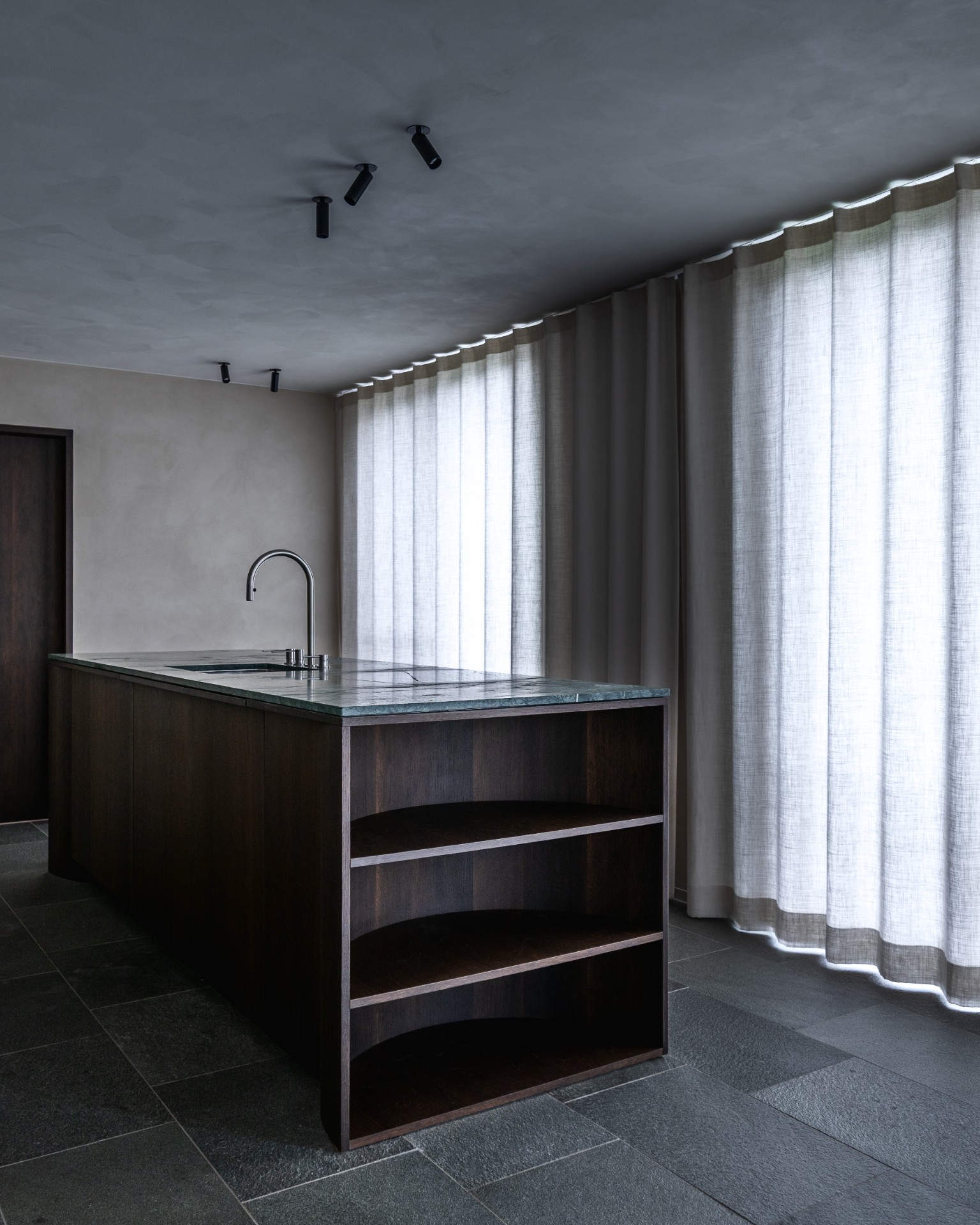
The kitchen now anchors the ground floor, with dark cabinetry and a work surface that read clearly against the lighter walls and adjacent rooms. In the photographs, the joinery is crisp and compact, with the sink and work zone arranged as one continuous field. This is where the layout redesign becomes visible in everyday use: the kitchen is no longer a room passed through, but a place that organizes the surrounding plan. It carries the weight of the ground floor while keeping the rest of the house open to quieter uses.
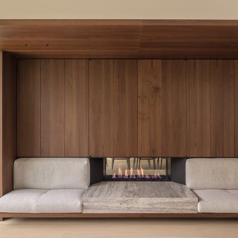
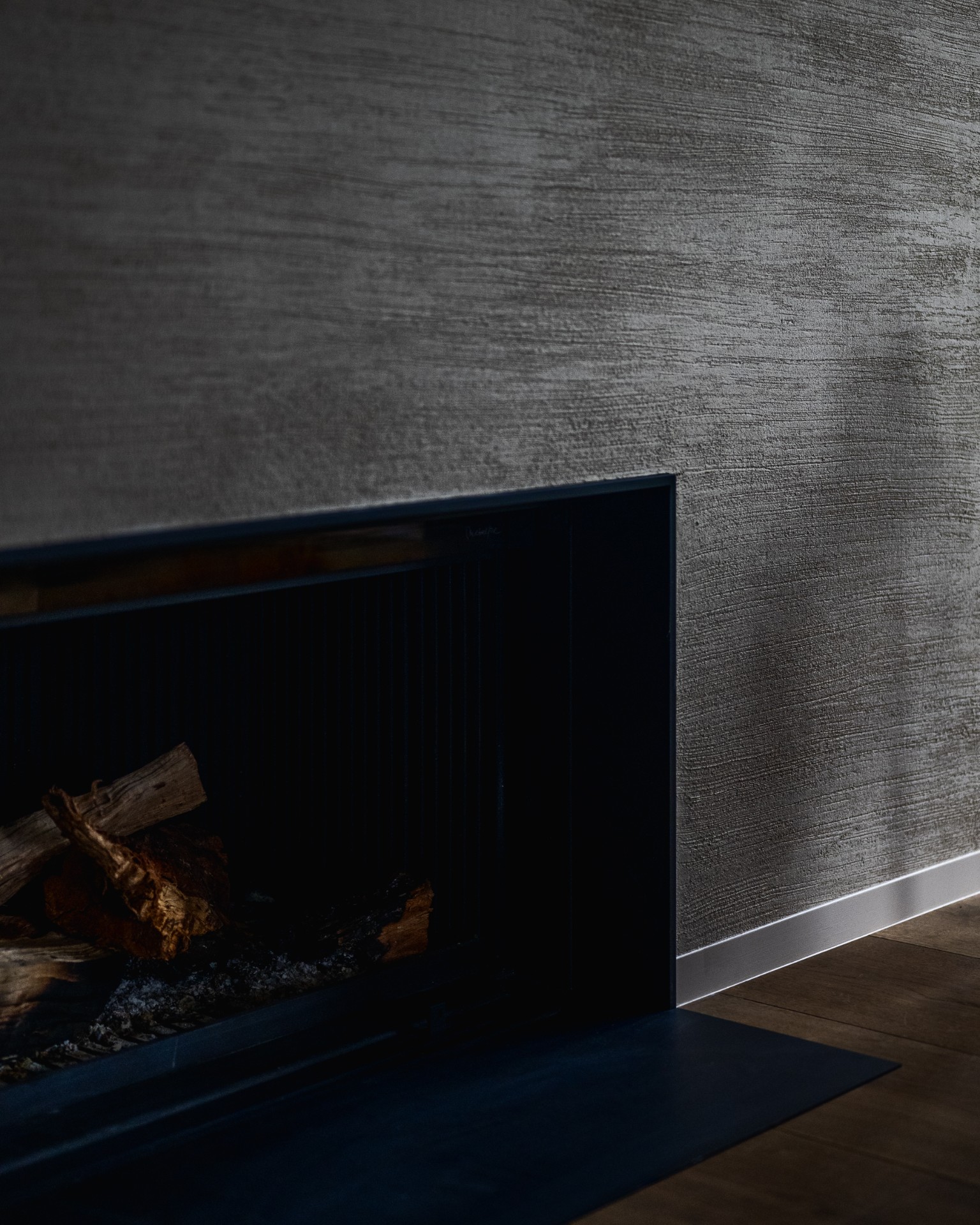
The living room, which keeps its existing fireplace, was made slightly smaller. That reduction gives it a more contained scale, and the two sliding doors allow it to close off when needed. It can function as an apéro corner or a room for slower moments, separated from the circulation that now runs more directly through the house. The former TV zone moved to a separate multifunctional room, which can also serve as a home office. In practical terms, the plan now divides use more precisely, with each room taking on a clearer role.
Dark and light surfaces working together
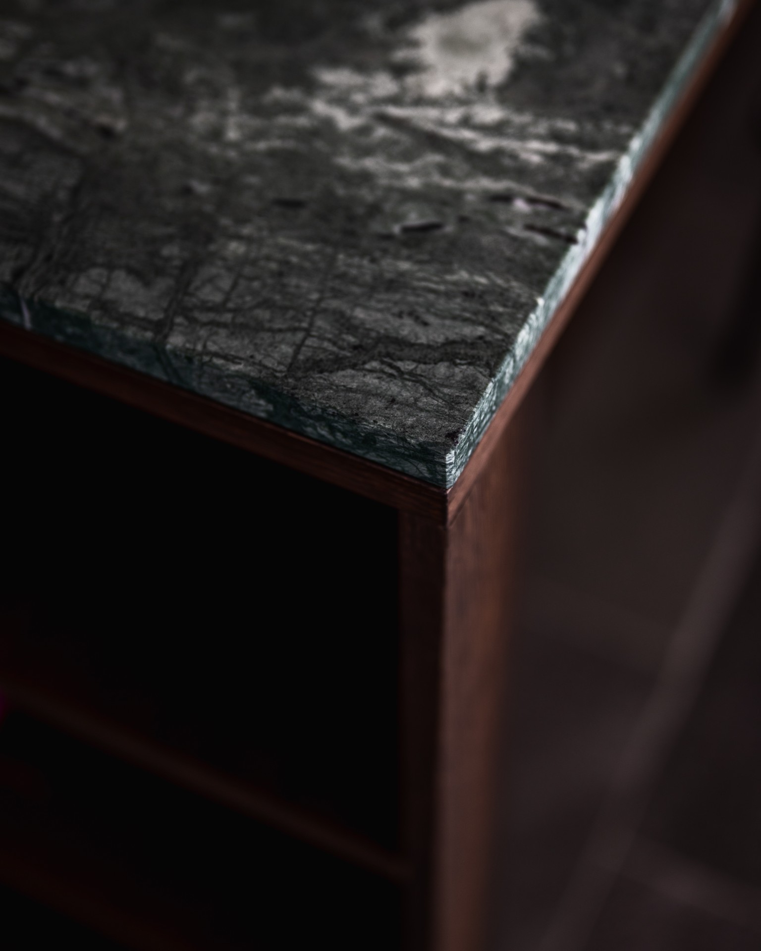
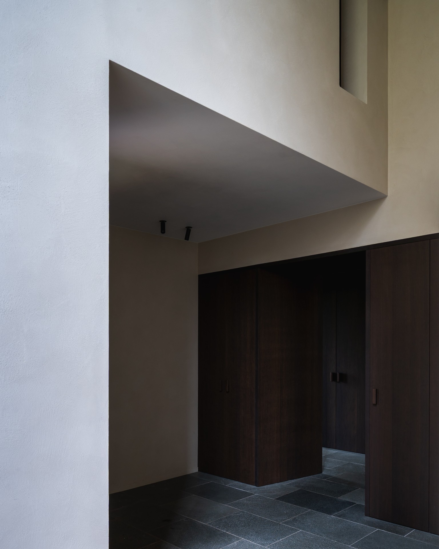
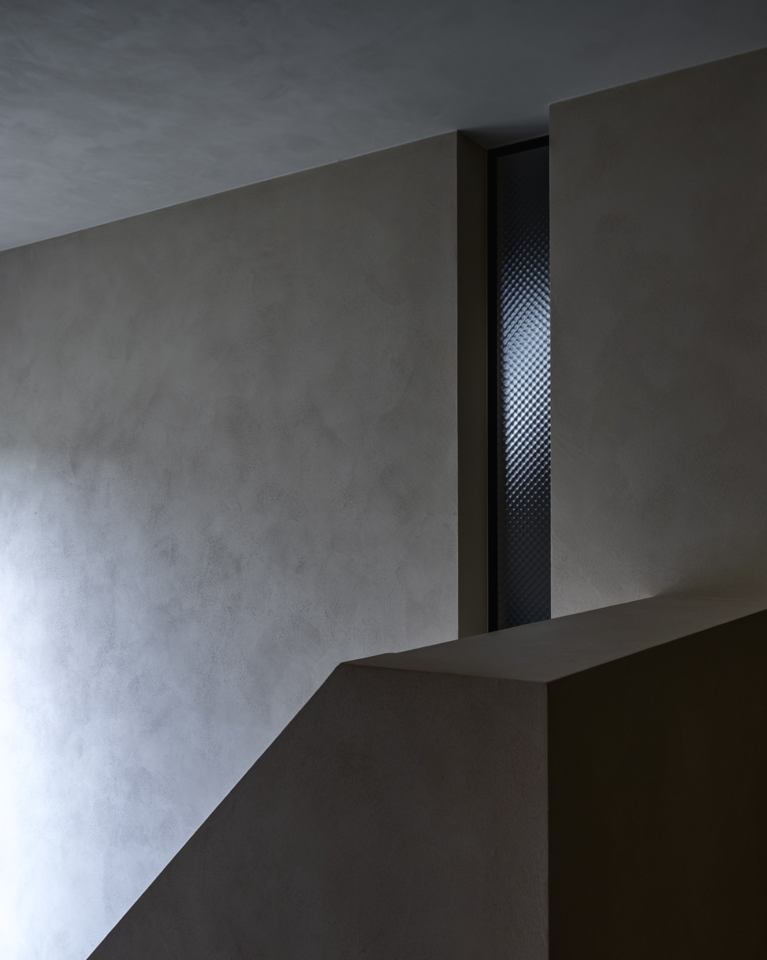
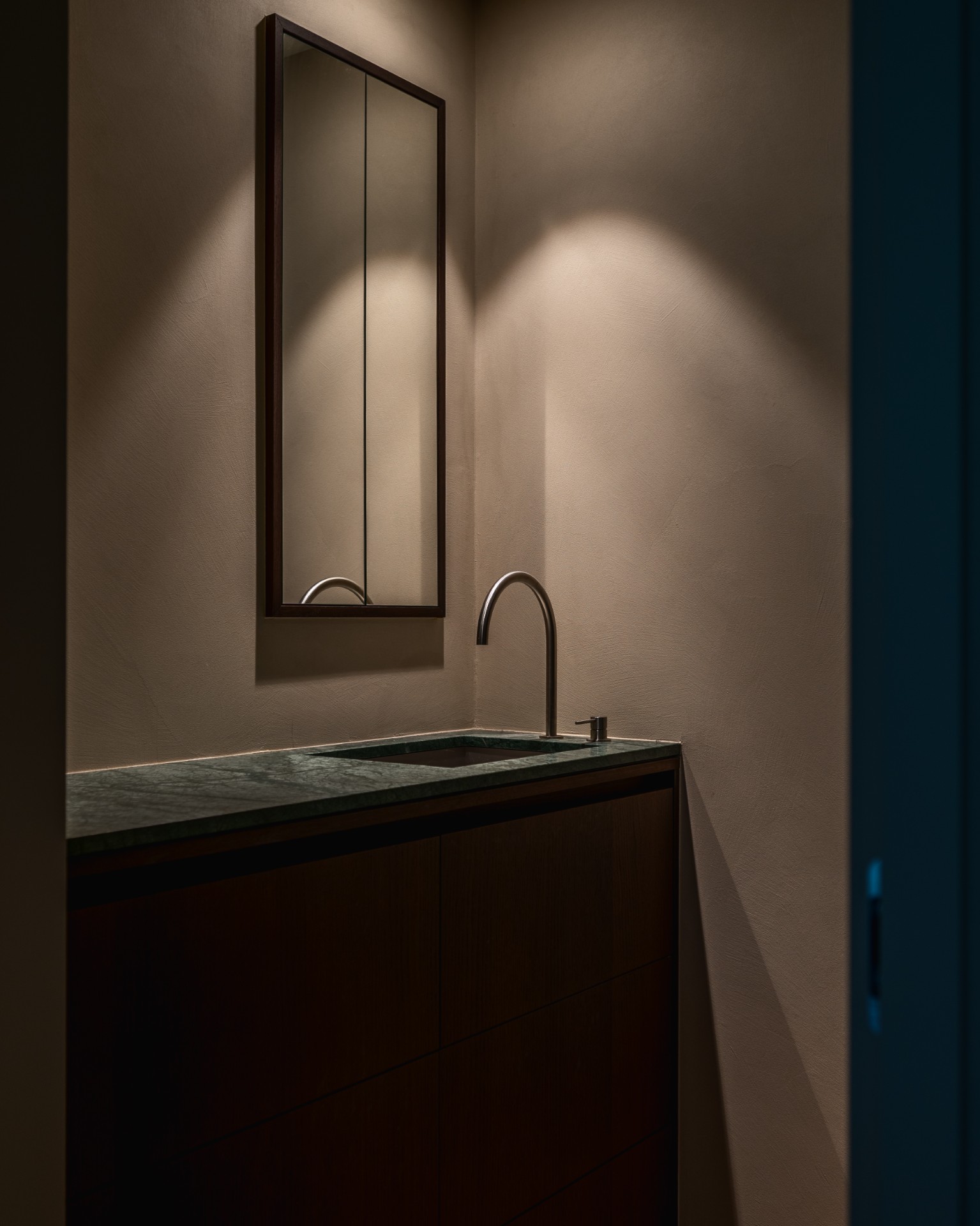
The strongest visual tension in the house sits between the dark service zones and the lighter surrounding rooms. Dark panels, deep floor tiles and shadowed niches give weight to the hall and utility spaces, while plastered walls and pale finishes keep the rest of the ground floor open and readable. The image set shows this contrast in several moments: a kitchen with dark fronts, a hall with built-in storage, and a niche detail where the shading is used as part of the composition. These are small moves, but they hold the house together.
That same material discipline continues in the custom cabinetry. Built-in storage appears where the plan needs it, not as an afterthought but as part of the wall thickness and route planning. In one image, a dark timber cabinet wraps the corner of the hall; in another, a shallow opening is framed as a niche rather than left blank. The custom joinery keeps the floor areas clear and lets the architecture carry the storage instead of adding extra volume.
Full-height windows and a stronger garden connection
Every existing window was extended down to the floor, a simple change that alters how the rooms meet the outside. The full-height windows open the living areas toward the garden and make the ground plane feel more accessible. Instead of stopping at the sill, the view drops straight to the terrace, and that continuous line strengthens the sense of connection with the outside without relying on spectacle. In the living and dining areas, daylight now sits lower in the room and spreads further across the surfaces.
Several terrace zones were integrated as part of the same move. That allows the occupants to choose orientation and atmosphere through the day, depending on where the light lands. The project does not rely on a single outdoor gesture. It uses a series of thresholds, each one linked to a different part of the house, so the garden connection becomes something you move through rather than simply look at. From inside, the glass, flooring and terrace edges work as one continuous sequence.
Bedrooms reshaped around the upper floor
Upstairs, the bedrooms were generous, but the bathroom was undersized. The solution was not to add square metres everywhere, but to reposition the bathroom and introduce a second children’s bathroom. That rebalancing gives the floor a more workable distribution. The main bedroom was then given the feel of a hotel room, with a bathroom that can be closed off and used separately when needed. The change is subtle in plan, but clear in how the rooms are now layered.
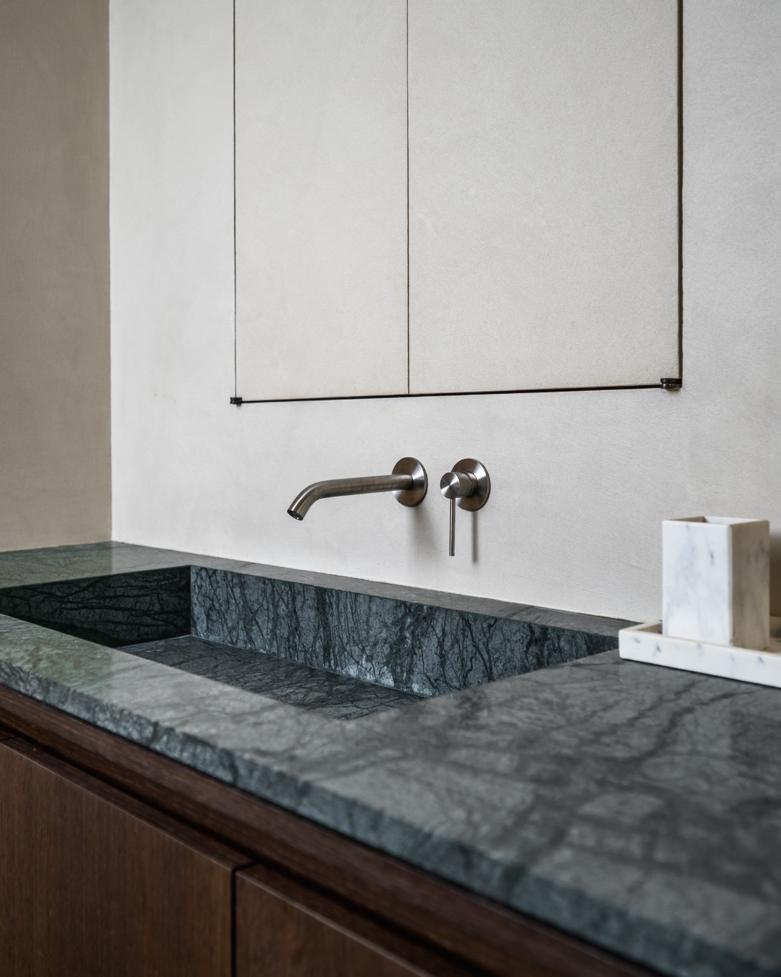
In the upper-floor images, the details stay restrained: pale walls, timber flooring and built-in storage set a quiet backdrop for the rooms. A large window brightens the landing, while the cabinetry runs flush and keeps the circulation free of clutter. Elsewhere, a stone washbasin and a recessed shelf show how the finishes were handled with the same discipline as the larger layout changes. The upper floor feels more settled because each room now carries a defined purpose.
Details that hold the renovation together
What gives the project its precision is the repetition of a few well-judged moves. A long axis replaces multiple routes. Dark materials mark the support spaces. Timber softens the transition between rooms. The kitchen becomes central space without dominating the whole floor. Even the small bathroom and washroom details echo the same logic, with stone surfaces, recessed openings and narrow frames keeping the composition tight. Nothing here depends on excess; the renovation is built from adjustments that reveal the house more clearly.
The end result is an energy-efficient renovation that stays close to the existing structure while changing how it works day to day. Insulation and a new heating system support the house quietly in the background, while the layout redesign, minimal demolition and full-height windows reshape the way light, movement and outdoor space connect. It is a house renovation defined less by display than by the feeling that each room now sits where it should, with the garden visible from deep inside the plan.
Photographer: Paul Lepoul
Want to see more of Stael Architect? View the page of Stael Architect for even more great projects and company information.


NEW 2026 Jubileum Edition The Best Interior Designers Benelux
Order Now €125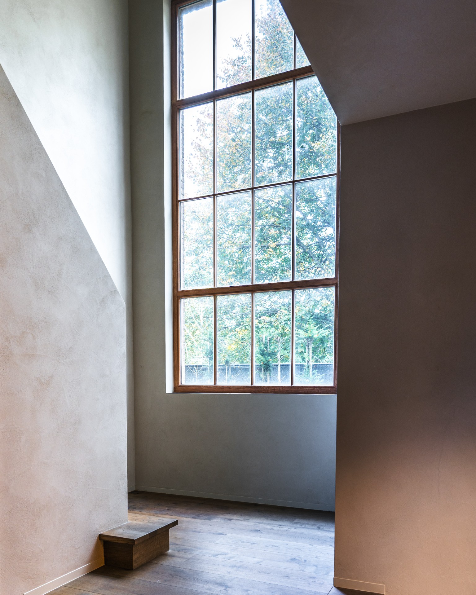
NEW 2026 Jubileum Edition The Best Interior Designers Benelux
Order Now €125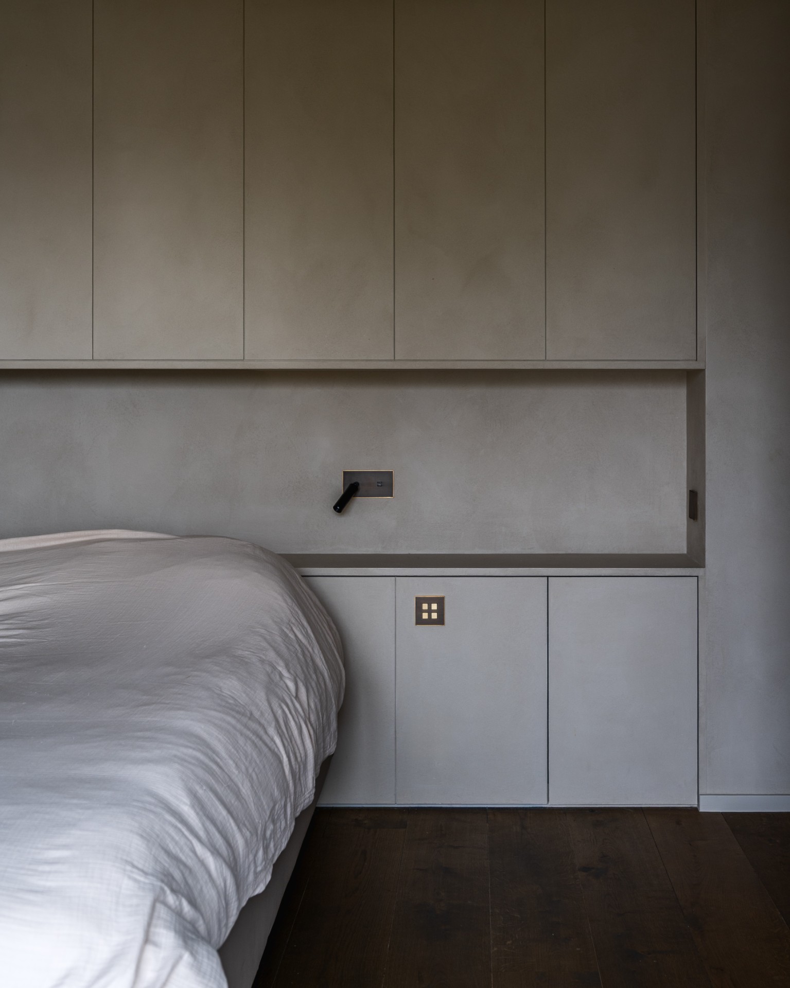
NEW 2026 Jubileum Edition The Best Interior Designers Benelux
Order Now €125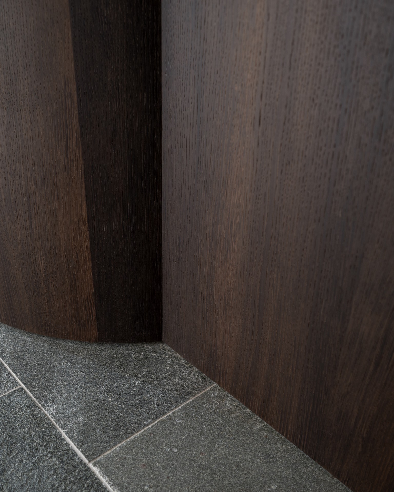
NEW 2026 Jubileum Edition The Best Interior Designers Benelux
Order Now €125