









Exclusive design: marble-accent kitchen with custom cabinetry
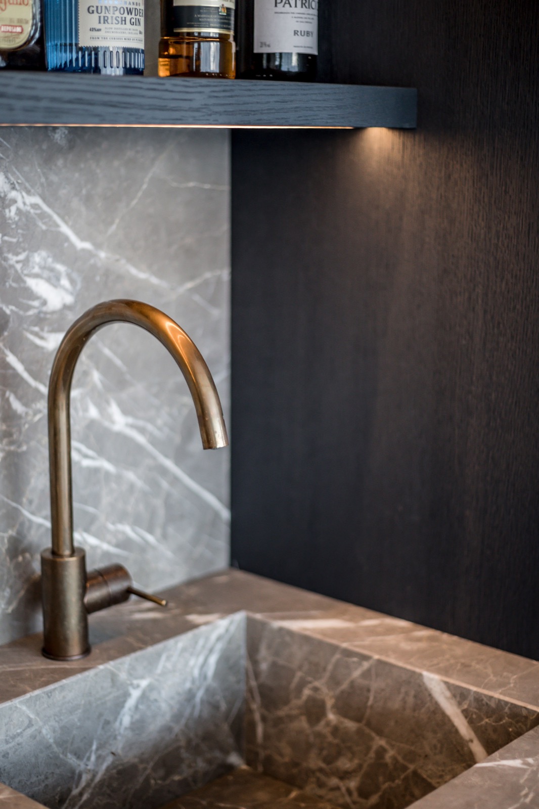
A polished marble kitchen worktop sets the tone at once. Its veining runs across the surface and continues into the backsplash, where the stone draws the eye upward to a gold/brass-toned faucet and the darker cabinet fronts around it. The room reads as a piece of modern luxury interior design, but the effect comes from visible decisions: matte finishes, clean edges, and a measured contrast between white, grey, black, beige, and wood.
Stone, metal and matte fronts in one view
The kitchen centres on a marble kitchen countertop that is not used as a show surface, but as part of the daily work zone. The stone edge is visible, the pattern is active, and the surrounding cabinetry keeps the composition grounded. Dark fronts sit beside lighter panels, while the metal faucet adds a smaller, brighter note. Nothing is overcomplicated. Each material has a clear role, and the eye moves from the worktop to the wall and back again.
What gives the space depth is the way the marble is repeated. It appears on the worktop, then again on the vertical plane behind it, so the kitchen feels cut from related layers rather than assembled from unrelated parts. That repetition is supported by the cabinetry: straight runs, closed storage, and a restrained profile that lets the stone remain visible. The result is not loud, but it is precise. Even the reflections stay soft because the fronts are matte rather than glossy.
Custom fitted cabinetry with open niches
Across the project, custom fitted cabinetry does more than store items. It shapes the walls. Open niches break up larger cabinet runs and introduce moments where shelves, recesses, and built-in openings pull the architecture forward. In one view, a seating niche is tucked into the wall and lined with cushions; in another, kitchen and storage elements are organised in a series of open bays. The layout feels designed around the room’s proportions, not forced into them.
Those recessed zones are one of the clearest visual threads in the project. Some are deep and dark, others lighter, but they all use the same language of built-in volume. The openings hold objects, frame empty space, and keep the walls from becoming flat planes. This is where the custom fitted cabinetry becomes most legible: as a sequence of measured voids and solid sections, rather than a continuous block of doors.
Warm cabinet niche lighting at the right depth
Warm LED niche lighting draws a fine line through the composition. It sits behind shelves, along recesses, and inside cabinet openings, where it grazes the edges of the materials instead of flooding the room. That cabinet niche lighting is especially effective in the darker niches, where the glow traces the geometry and reveals the depth of each opening. In the kitchen, it keeps the stone and cabinetry readable at night without turning the surfaces harsh.
The lighting also changes how the storage reads. A shelf without light becomes a shadow; with light, it becomes a small stage for the cut-out wall. In the bathroom niche, the same idea appears around the marble surface and the built-in basin area, where the lit recess gives the cabinetry a quieter frame. Across the project, the light is consistent in tone, so the spaces feel connected through one detail rather than through decoration.
Contrast holds the interior together
The palette stays within a controlled range, but it is never flat. White cabinets sit beside dark wall panels. Beige upholstery appears in the living area, while black elements anchor the kitchen composition. Wood adds another layer, especially in the bathroom cabinetry and some of the built-in storage fronts, where the grain softens the sharper stone edges. The contrast is strongest where materials meet: marble against matte lacquer, wood against stone, and metal against the pale surfaces around it.
That contrast is visible in the living room as well. A light sectional sofa sits against a darker fireplace niche, with a large rug tying the seating zone together. The room is quieter than the kitchen, but it follows the same logic of built-in structure and clear boundaries. The spotlights in the ceiling are discreet, leaving the furniture, the niche opening, and the floor texture to do most of the work.
A gold/brass-toned faucet as a small pivot point
The gold/brass-toned faucet matters because it interrupts the stone and dark cabinetry with a warmer metallic note. It is not oversized, but it catches the light at the sink and helps define the working edge of the kitchen. In the images where it appears, the faucet stands against the marble backsplash or wash area, and that small shift in colour gives the entire composition another level of detail. It is a practical piece, yet visually it acts like a hinge between stone, water, and cabinet line.
The same measured approach appears in the bathroom cabinet scene, where the marble countertop meets warm niche lighting and wood-fronted storage. The basin area is built into the joinery rather than placed on top of it, so the surfaces read as a single system. Light from the recess picks up the stone veining and the edges of the shelving, while the darker fittings keep the composition sharp. Nothing here is decorative for its own sake; each element supports the next.
Built-in storage keeps the walls active
Several images show how built-in storage can make a room feel more articulated without adding clutter. Tall cabinets, low runs, open pockets, and niche openings alternate across the walls. In the kitchen, this creates a rhythm of closed and open sections around the marble kitchen worktop. In the other spaces, the same strategy appears in deeper recesses, where shelves and benches occupy the built volume. The walls are not simply enclosing the rooms; they are doing useful work.
The material mix keeps that work from becoming heavy. Stone surfaces bring a crisp line, wood fronts soften the larger masses, and the dark cabinet planes give the lighter finishes somewhere to land. Even where the palette is neutral, the surfaces are not passive. The marble shows movement in its veining, the cabinet fronts hold a matte texture, and the illuminated niches add a thin band of warmth that prevents the storage from disappearing into shadow.
Kitchen and interior details read as one composition
Seen across the project, the strongest quality is the consistency between the kitchen and the surrounding interior elements. The same concern for recess, edge, and material repeat from room to room. A marble kitchen countertop appears in one image, then a marble bathroom built-in cabinet in another; both are framed by careful joinery and light that stays close to the surface. The result is a sequence of spaces that share a visual language without relying on repetition of form.
That language is built from small, legible moves: a light line inside a niche, a darker panel beside a pale one, a shelf pulled back into the wall, a stone edge catching daylight. Together they make the project feel considered in use, not just in appearance. The modern marble kitchen worktop remains the clearest anchor, but it is the custom fitted cabinetry and the cabinet niche lighting that give the interior its structure and depth.
Want to see more of Strakk Interior Design? View the page of Strakk Interior Design for even more great projects and company information.





NEW 2026 Jubileum Edition The Best Interior Designers Benelux
Order Now €125


NEW 2026 Jubileum Edition The Best Interior Designers Benelux
Order Now €125


