Farmhouse renovation with tone-on-tone facade composition
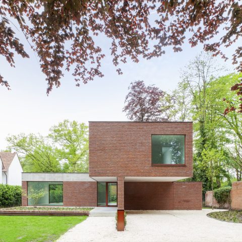
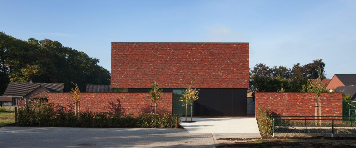
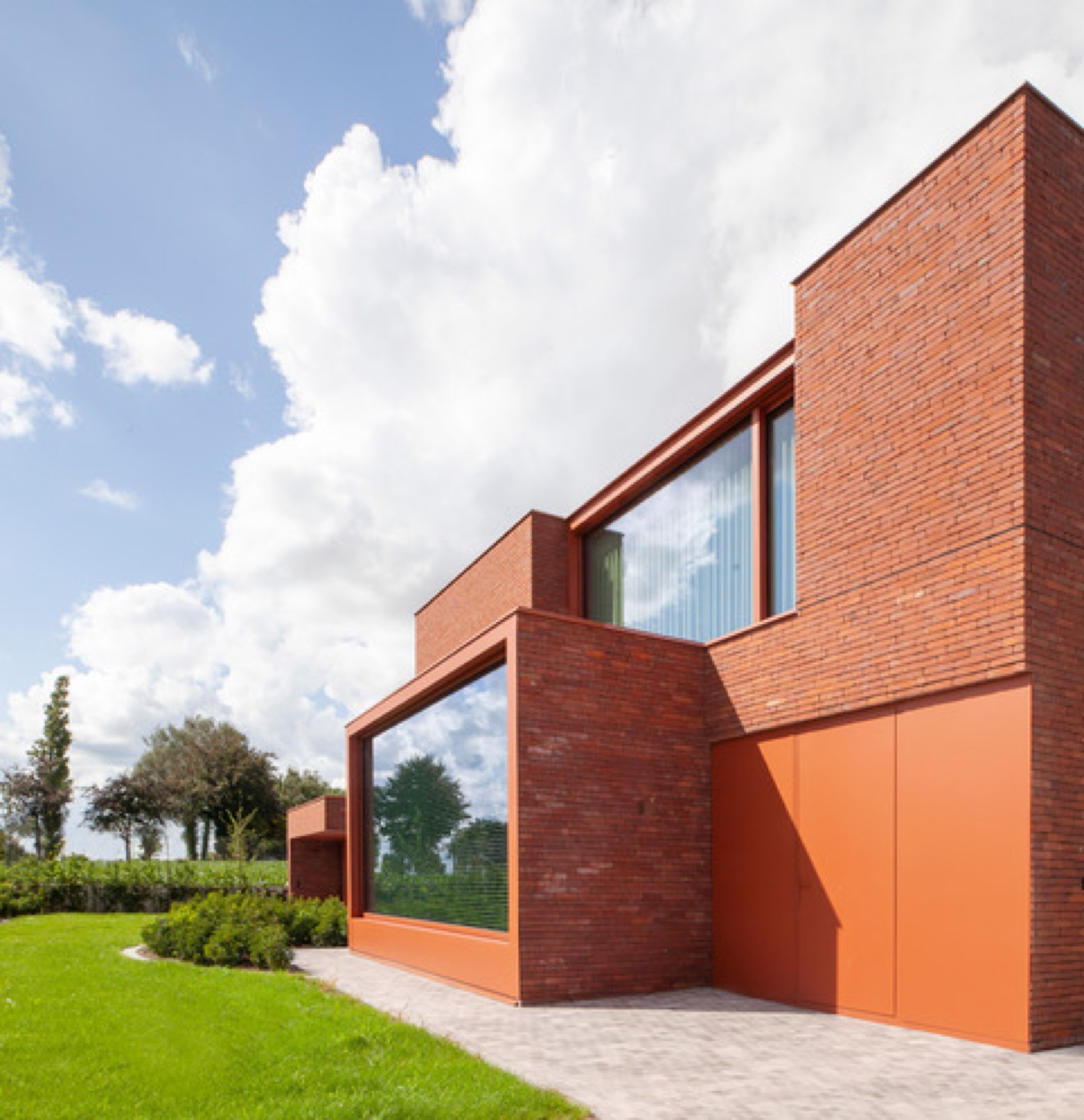
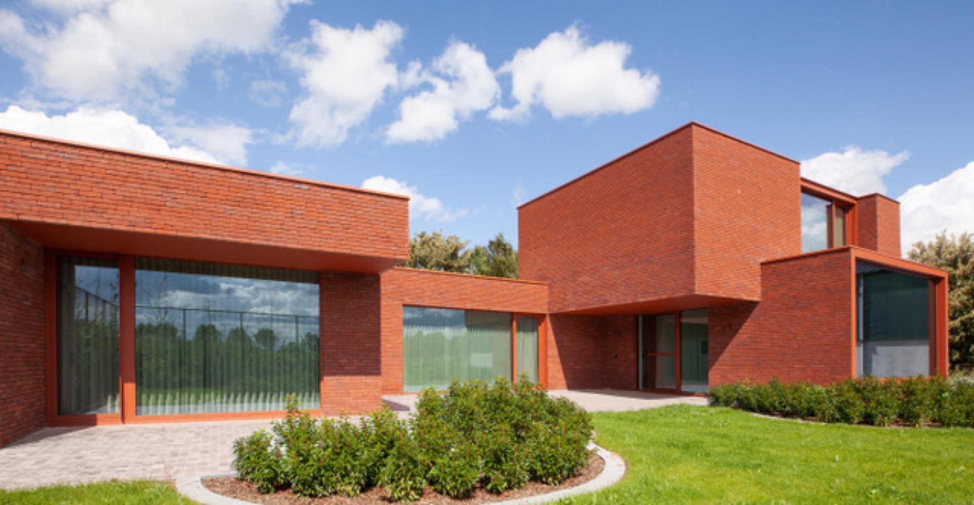
Brick, glass and trim are set in the same warm register here, so the farmhouse renovation reads as one composed mass rather than a patchwork of old and new. The original hoeve was reworked into a modern farmhouse with strong facade volume, and the first thing that stands out is how the planes shift in and out. Window openings sit back from the outer line, which gives the elevations a measured depth and keeps the profile sharp without adding noise.
Brick planes that meet at the corner
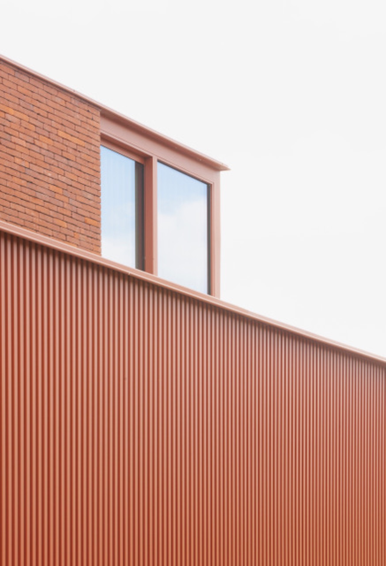
The tone-on-tone facade language is built from restraint. Red-brown brick carries most of the surface, while the window frames and roof edges follow closely in colour, so the openings sit inside the composition instead of interrupting it. That approach is especially clear where a roof overhang cuts across the corner of the front facade and meets the angle of a neighbouring window plane. The same logic returns across the house. The details stay consistent, but the volumes keep changing.
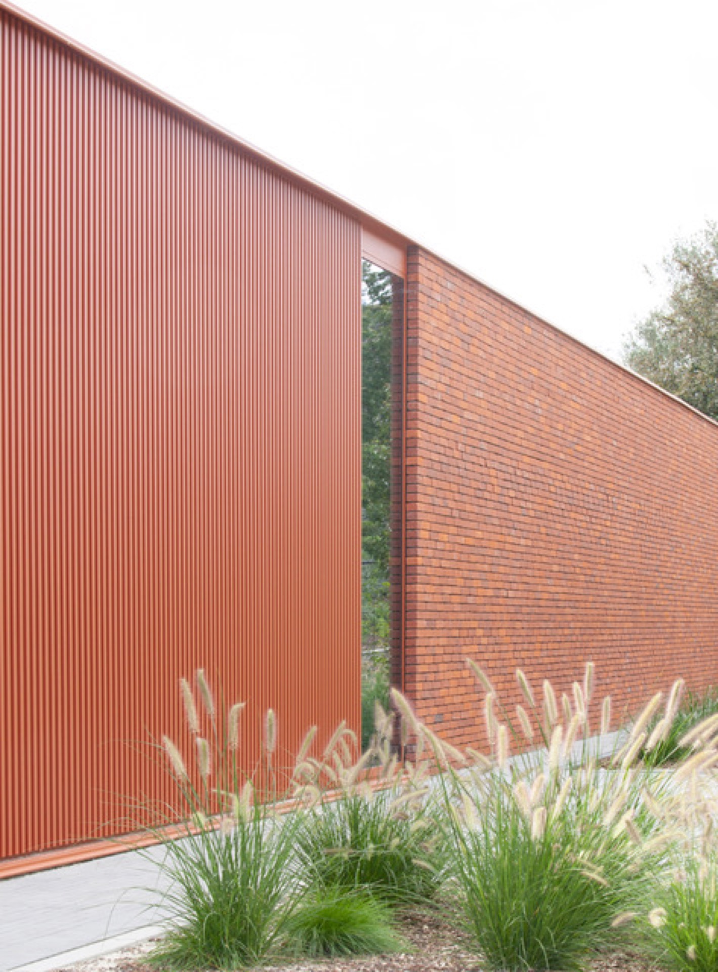
Seen from outside, the walls do not behave like a flat wrapper. One brick plane pulls forward, another slides back, and the recessed windows deepen the shadows between them. This creates a strong rhythm in the facade volume, with openings that feel carved into the mass. The brickwork itself does more than cover the house: it sets the pace of the composition. In the detail shots, the corner transitions and narrow vertical rib pattern add another layer of texture without breaking the calm reading of the whole.
Windows set back from the surface
The recessed windows are one of the clearest devices in the project. By pulling the glazing back, the architect turns each opening into a small shadow box. Light lands on the brick reveal first, then reaches the glass. That depth is visible even in the larger openings, where the dark line of the frame sits behind the outer skin. The effect is particularly strong on the elevations with broad brick fields, where the window openings appear almost suspended inside the wall.
The same controlled opening logic appears in the way the roof edges and overhangs are drawn. They project just enough to mark the outline, but not enough to dominate the mass below. A warm trim around the openings echoes the brick tone and keeps the transition between materials quiet. The result is not a contrast driven by colour, but a precise alignment of edges, returns and shadows. That is what gives the modern farmhouse its clarity.
A covered entrance between house and shed
The covered entrance is placed at a small square between the shed and the house, which gives the arrival space a very specific role. It is not a front porch in the familiar sense. It works as a threshold where visitors can be received before moving further into the house or toward the agricultural activity. A separate reception room near the entry helps divide those uses from family life deeper inside the home. The route is practical, but the spatial sequence is carefully drawn by the overhang and the sheltered pause beneath it.
That entrance position also makes the relationship between the two parts of the site legible. The house and the shed are close enough to share a forecourt, yet the entrance keeps the domestic side distinct. The covered zone gives the composition a clear centre of gravity on the ground level. From there, the plan splits in two, and the exterior volumes already hint at that division through their offset masses and their openings. It is one of the ways the farmhouse renovation links use and form without spelling it out.
Kitchen and dining on one side, living on the other
On the ground floor, the rooms are divided according to how they are used during the day. The open kitchen with storage and the dining area sit on the shed side, where the connection with daily activity is strongest. The kitchen extends into a bay window, and that projection opens the room toward the wider surroundings. In plan and in section, it acts like a small pause in the wall, pulling in more light and giving the kitchen a broader view than the main line of the house would allow.
Across the house, the living room and office are set apart from the busier side. That distance matters in the way the rooms feel when you move through them. The office is not pushed into the background, but placed where work can stay separate from the passing flow near the kitchen and entrance. Between the office and the street, an outdoor patio shields the view inward while still catching the evening sun. It is a narrow piece of open air, but it changes the relationship between the room and the street edge.
Upper rooms kept smaller than the base
The upper level is more compact than the floor below, which gives the house a stepped reading from outside. Rather than repeating the full footprint, the top floor holds only the rooms that are needed there: a bedroom with wet room and toilet, and a master bedroom with an adjoining bathroom. Because the level is smaller, the roofline can settle back over the main volume, and the facade volume becomes easier to read. The upper storey does not compete with the ground floor; it sits on it.
That smaller upper volume also reinforces the project’s material discipline. The brick base stays dominant, while the top level keeps the same tonal family in the trim and roof edges. Nothing is introduced to distract from the massing. Even the lighter openings remain tied to the same colour range, so the house keeps its tone-on-tone facade composition from the entry all the way up. The impression is of a building that has been edited down to the parts that matter most.
Details that turn mass into a readable composition
What gives this farmhouse renovation its force is the way each detail follows the same rule: keep the edges aligned, keep the tones close, and let the volume do the work. The brick corner detail where one plane meets the next, the repeated set-back of the windows, and the warm outline around the openings all support that rule. Even the ribbed brick sections in the imagery feel measured rather than decorative. They add a finer grain where the larger surfaces need it, especially near the garden edge where grasses and planting soften the line of the wall.
There is no attempt to hide the agricultural context, but the house does not lean on it either. Instead, the architecture uses the relationship between shed, house and forecourt to organise movement, privacy and view. The tone-on-tone facade ties the parts together visually, while the plan keeps each side of daily life in its place. That mix of clear routing and quiet material matching gives the project its lasting interest. It is a modern farmhouse, but the real subject is how the volumes are cut, how the windows retreat, and how the ground floor is made to work.
Want to see more of Egide Meertens Plus Architecten? View the page of Egide Meertens Plus Architecten for even more great projects and company information.



NEW 2026 Jubileum Edition The Best Interior Designers Benelux
Order Now €125