Fine dining interior with a refined upgrade
A lowered glow at the tables and a ribbed bar wall set the tone before a plate arrives. The room feels considered in layers: dark upholstery, round tabletops with a stone-like surface, curtains that soften the edge of the windows, and pendant lights that shift the focus down to the table. This fine dining interior was not built from scratch the second time around. It was refined, so the existing restaurant interior could move into its next phase without losing the character already in place.
What changed in the room
The brief for this interior upgrade was not a clean sweep. It asked for a careful adjustment of routing, seating comfort, bespoke elements and light. That kind of work shows up in the way people move through a room as much as in the things they notice first. The path between bar, seating and window line reads more clearly now, and the furniture sits with more breathing space around it. In hospitality interior design, those shifts are easy to overlook at a glance. They are felt when a guest sits down and the room begins to work around them.
What makes the project interesting is the decision to refine an existing fine dining interior rather than replace it. The room already had a clear identity. The upgrade builds on that base with smaller interventions that change the experience of staying longer, turning, serving and settling in. Tables are placed to support conversation. The seating zones feel more deliberate. The restaurant interior does not announce itself through volume; it does so through the way the layout now guides the eye and the body in the same direction.
Custom joinery with a clear profile
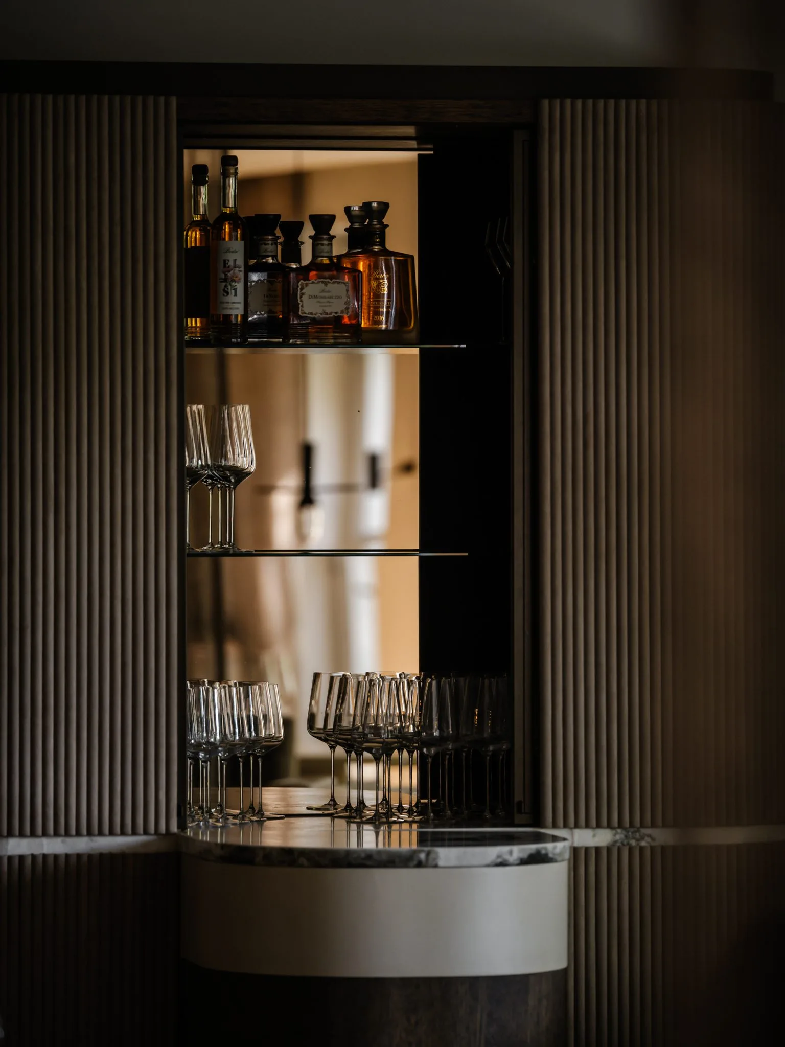
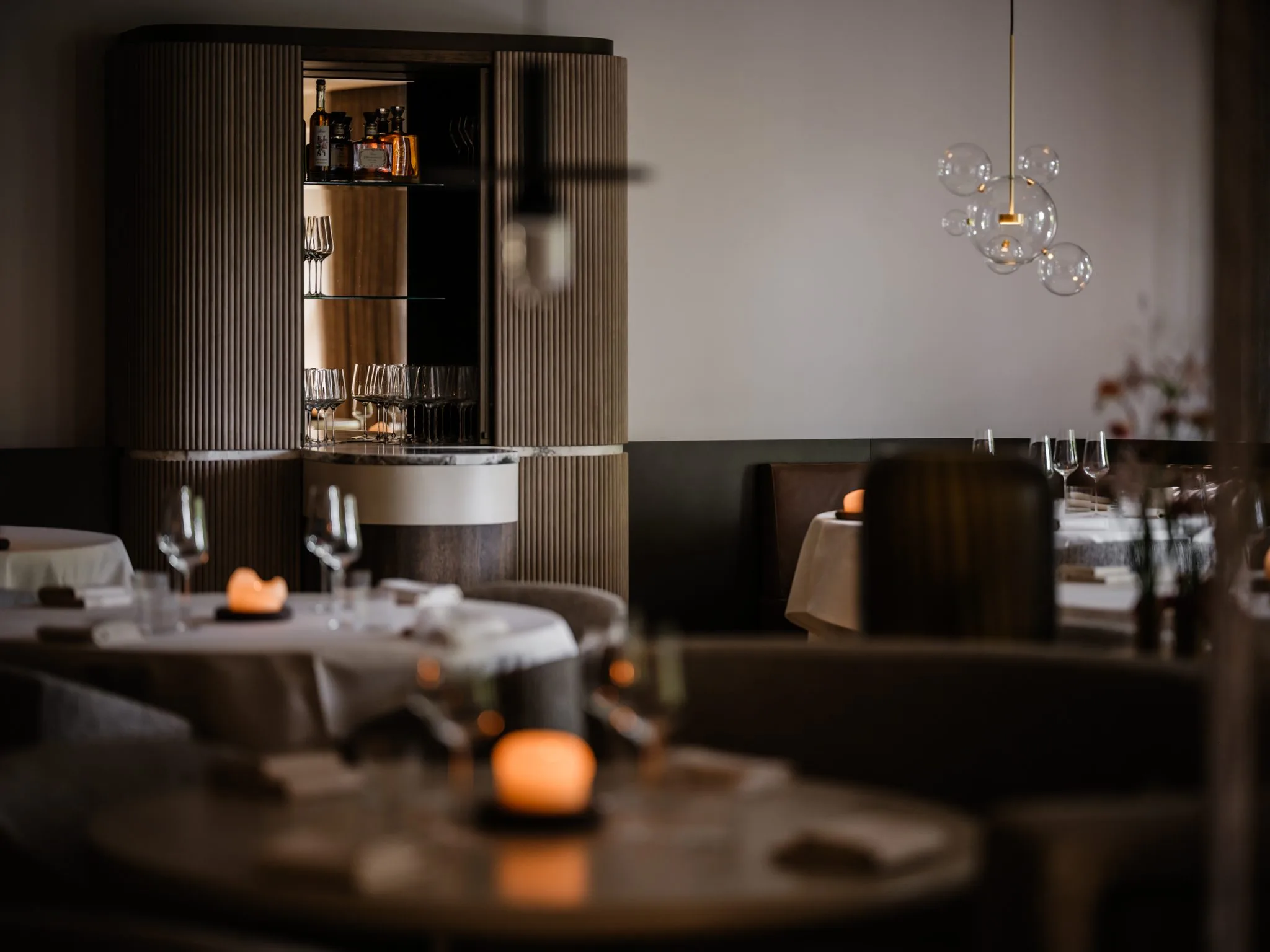
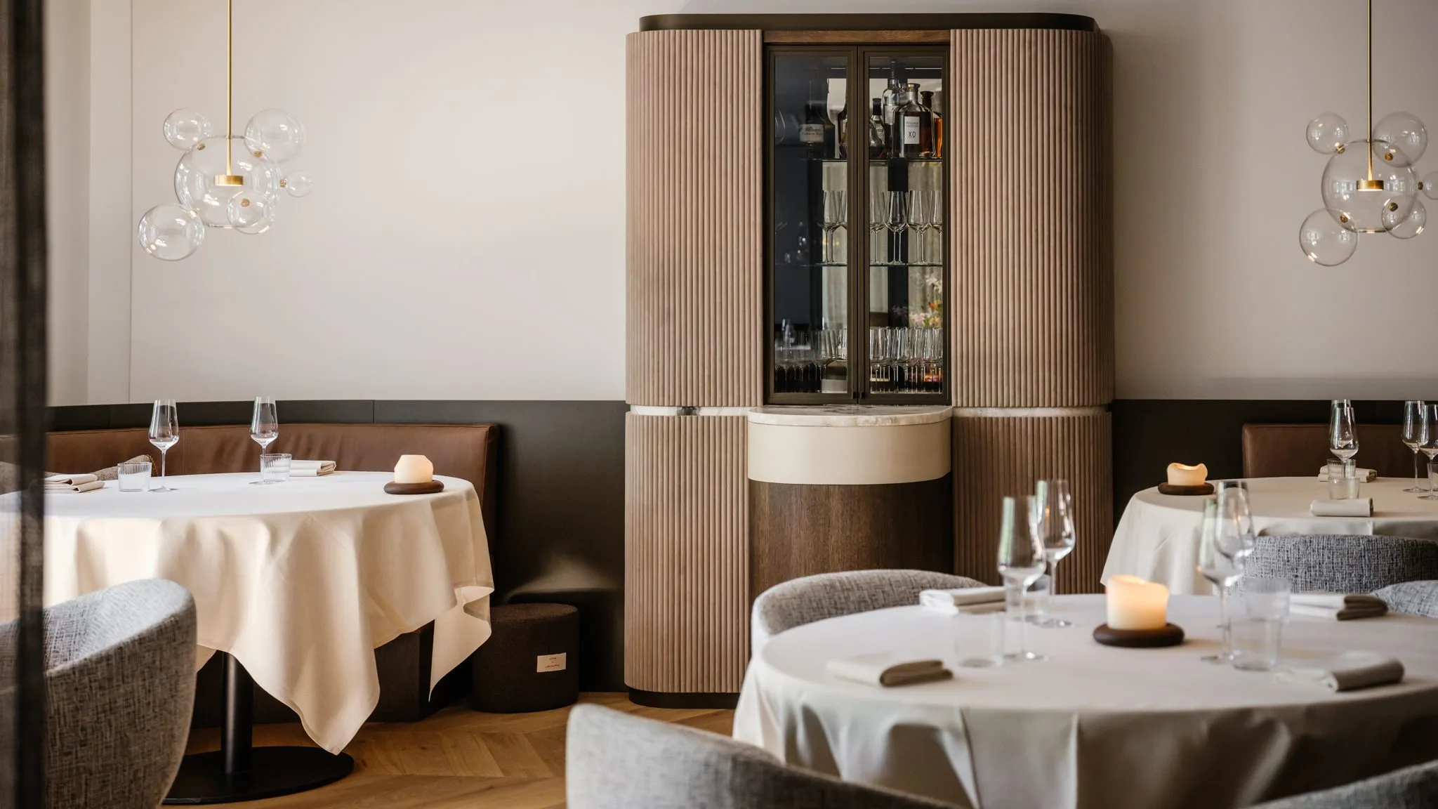
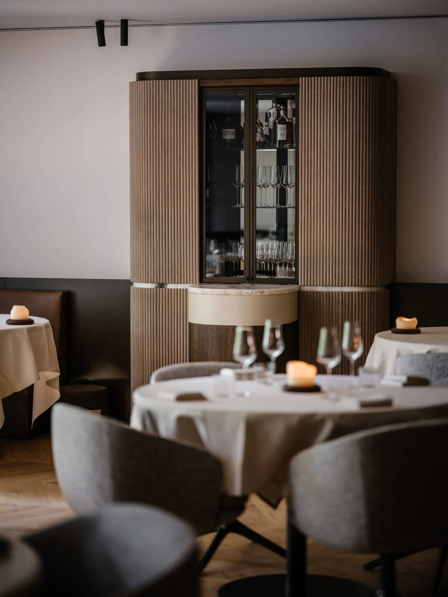
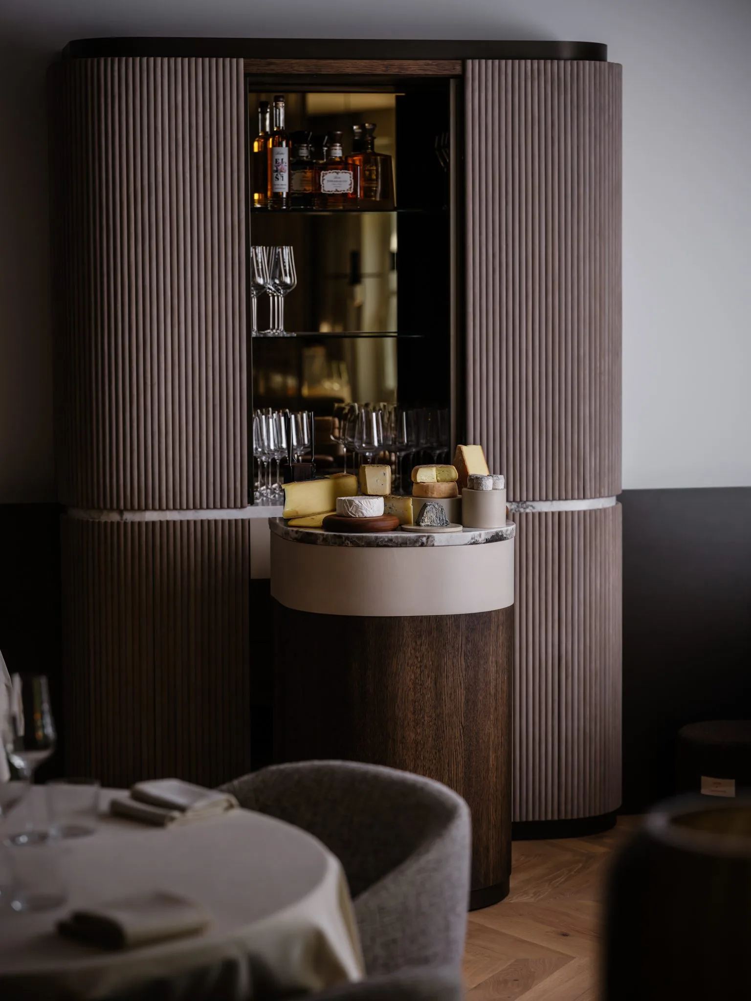
The bar wall is one of the strongest visual anchors. Its curved form and vertical ribbing give the surface a measured rhythm, while the integrated niche lighting cuts into the darker background and makes the built-in element read almost like a display piece. The joinery appears as part architecture, part furniture. In several views, a rounded cap with a marble-like surface finishes the bar line and brings a brighter edge into the composition. That contrast between dark timber texture and pale top surface is one of the clearest signs of the custom joinery in this project.
In close-up, the bar wall detail does more than hold bottles or define a service point. It introduces texture at hand height, where guests register a surface before they register a room. The vertical pattern draws light down the face of the unit, and the curved corners keep the mass from feeling heavy. This is where the interior upgrade becomes visible as craft. The built-in element is not decorative in isolation; it supports the flow of the dining room and gives the restaurant interior a stronger central line.
A service edge that reads quietly
The best supporting pieces in a fine dining interior often work from the background. Here, the bar area does exactly that. A glazed opening, recessed light and the rounded return of the counter create a service zone that feels organised without becoming dominant. The details are compact, but they help define how the room operates. That matters in hospitality interior design, where a clear service edge can keep the seating area calm and the movement around it efficient. The result is a restaurant interior that feels more settled because the working parts are visually resolved.
Lighting that stays close to the table
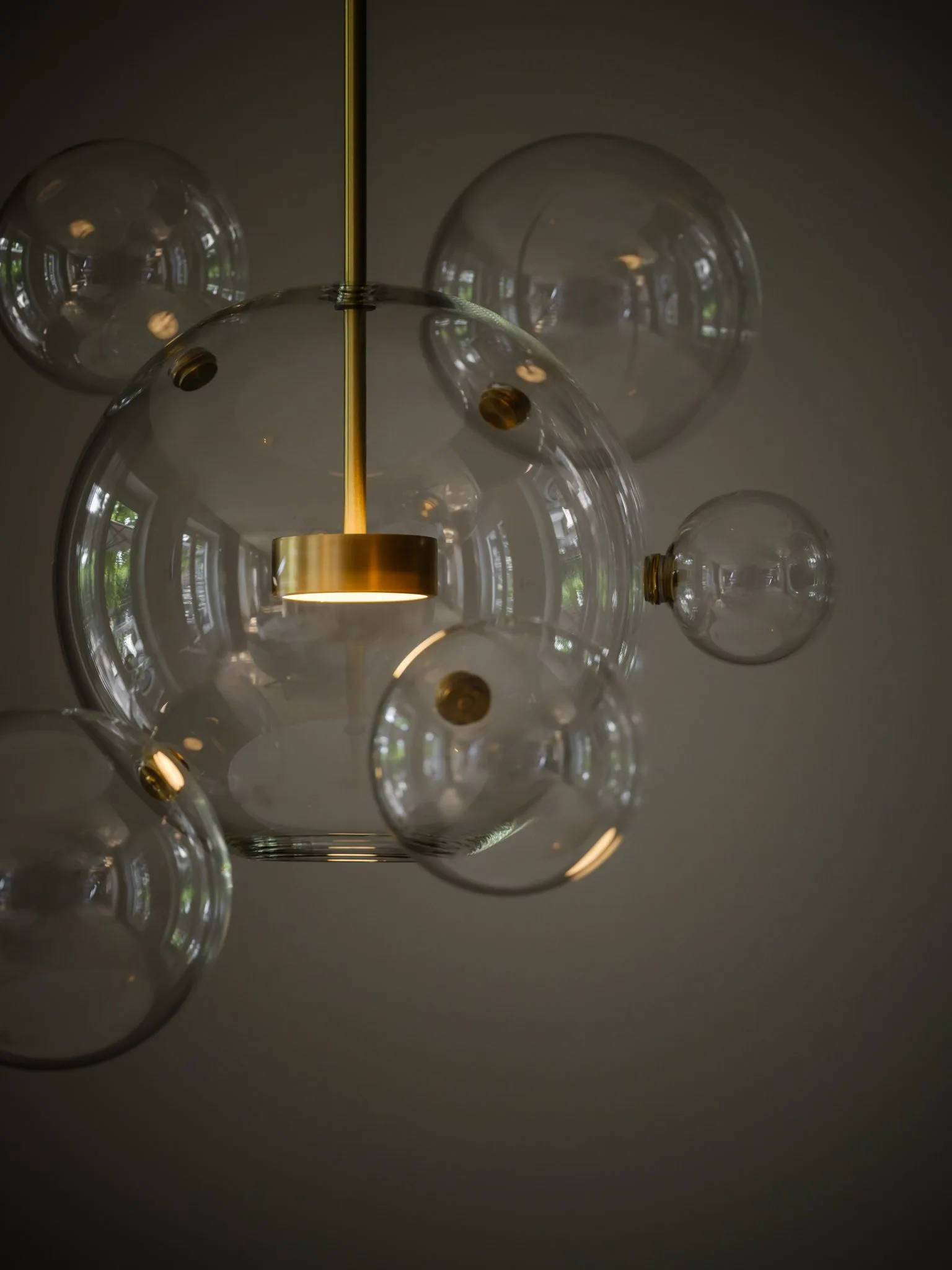
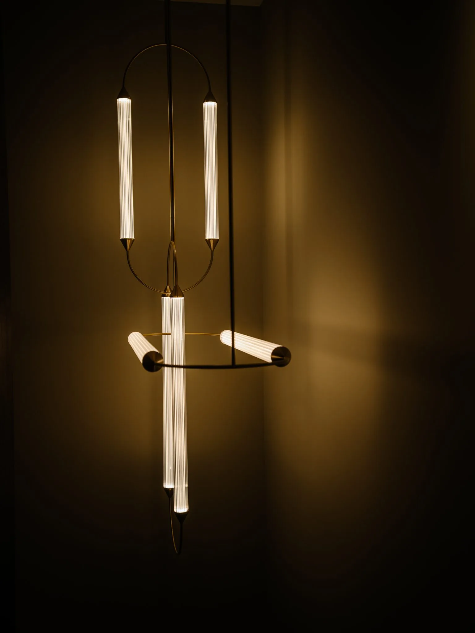
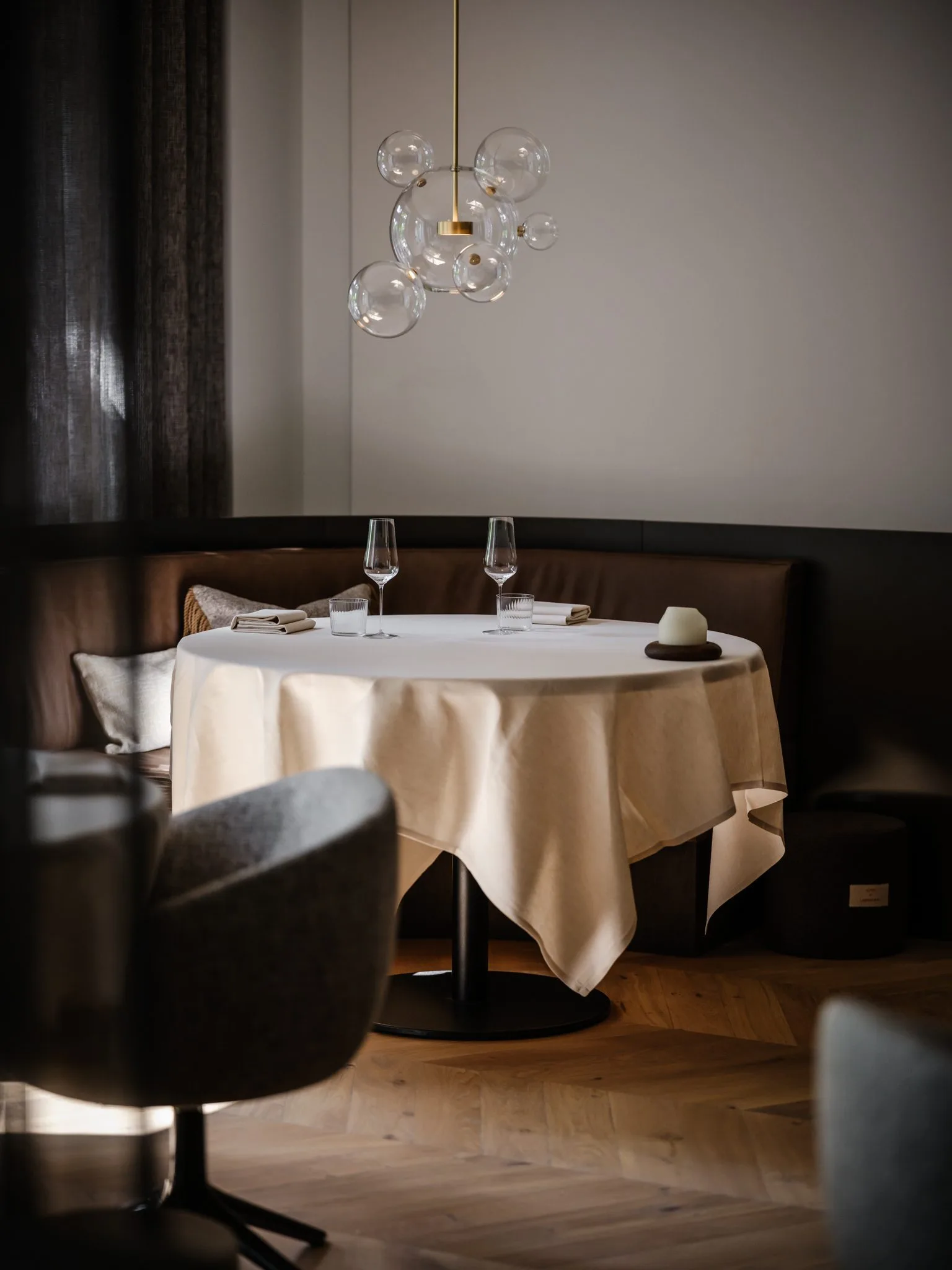
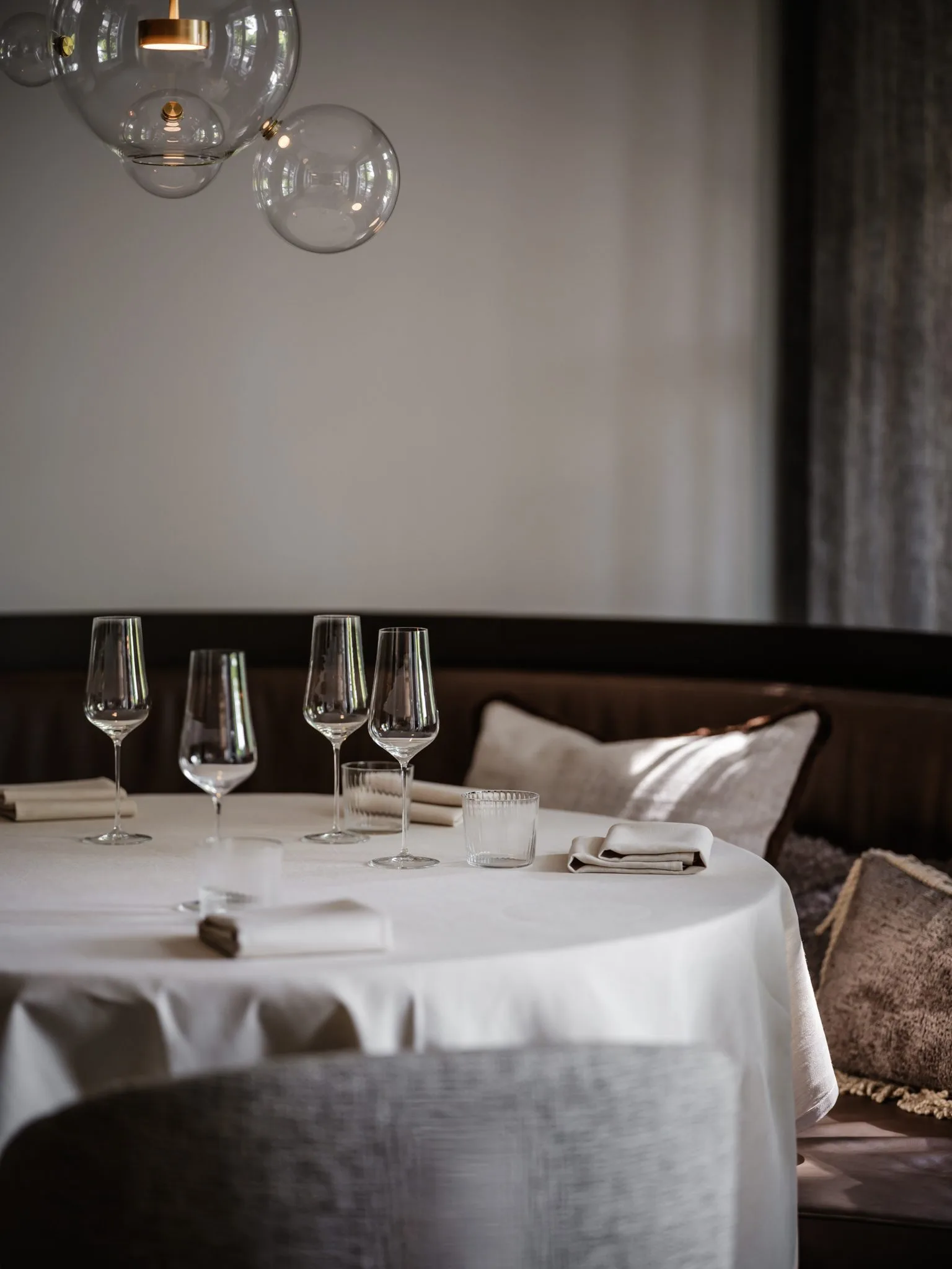
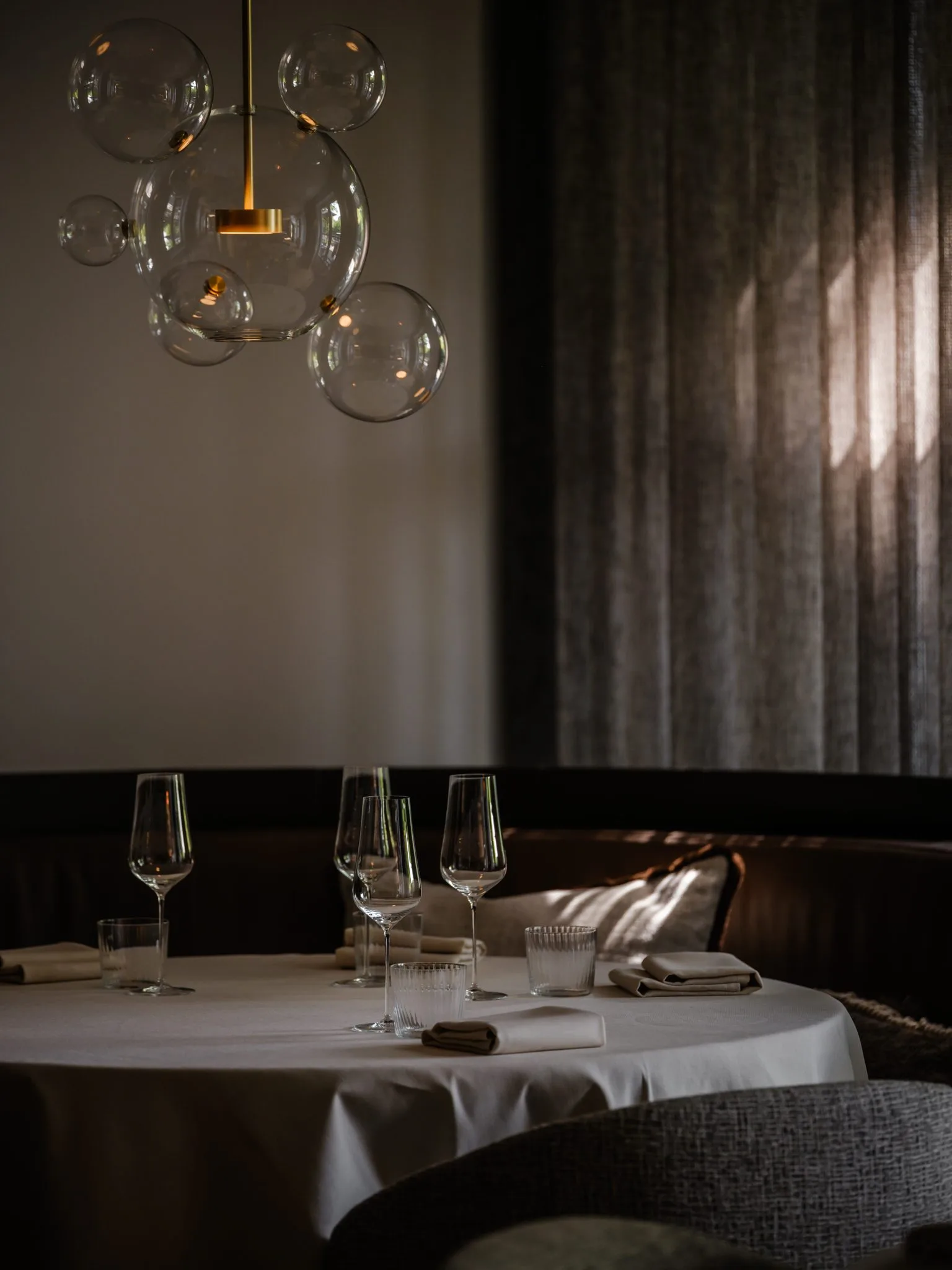
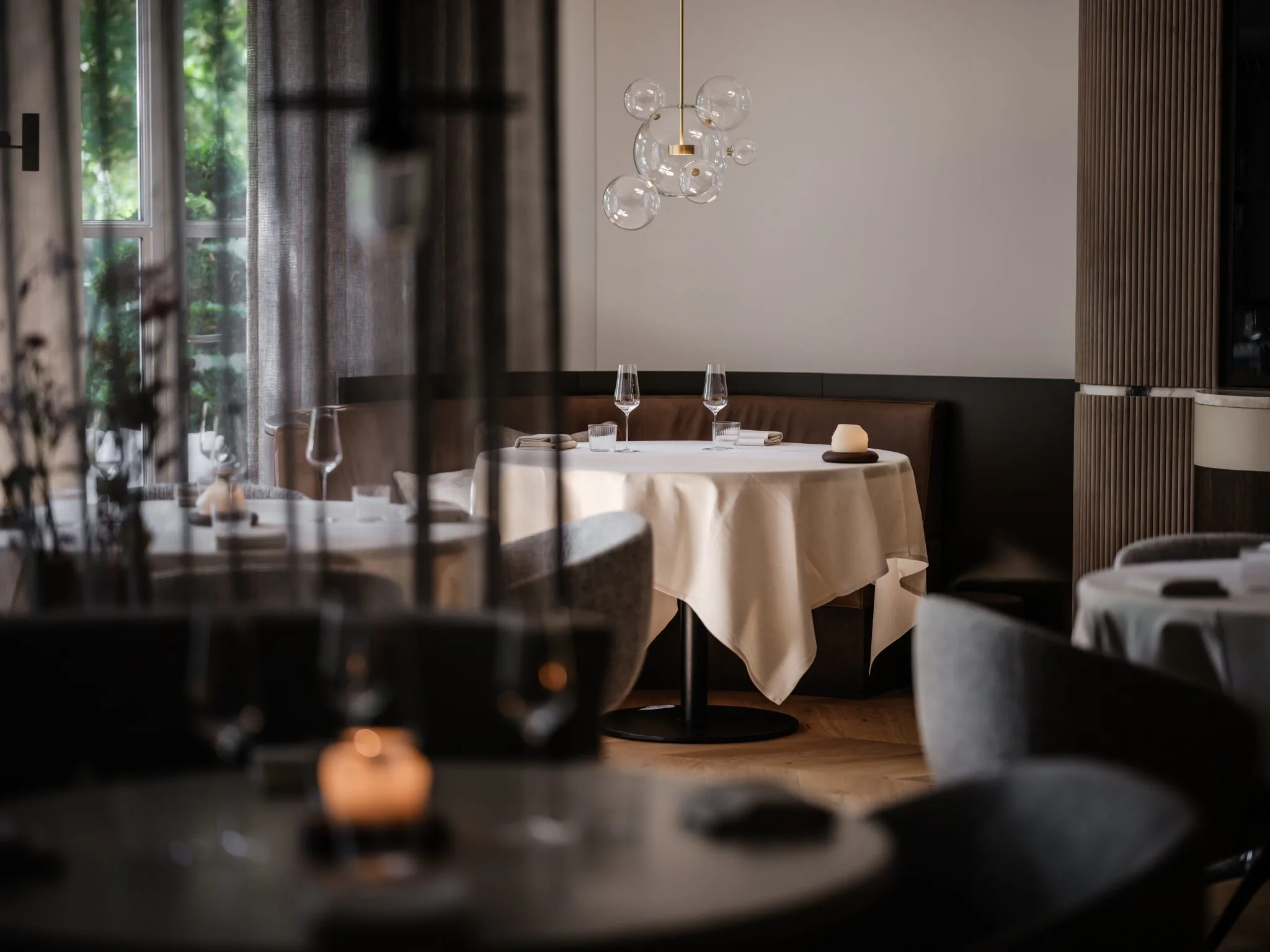
Warm lighting is used with restraint. Rather than flooding the space, the light follows the table surfaces, the bar detail and the edges of the seating area. Some pendants hang as clusters of glass spheres; others appear as vertical glass tubes in a sculptural frame. Both types draw the eye upward without pulling attention away from the dining setting below. The effect is intimate, but the more important point is control. The interior upgrade makes the room feel more precise because the light knows where to stop.
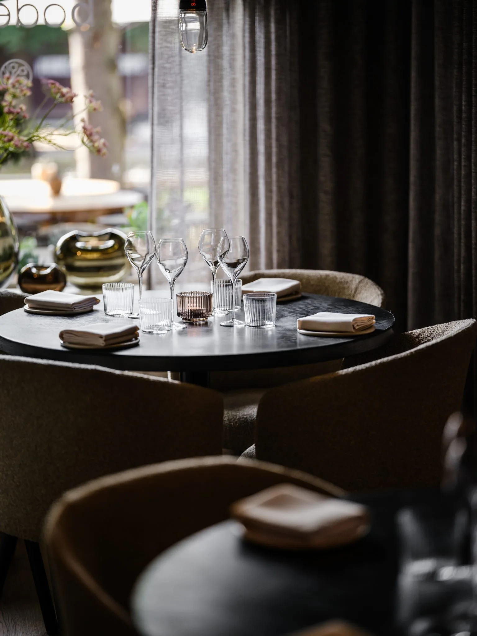
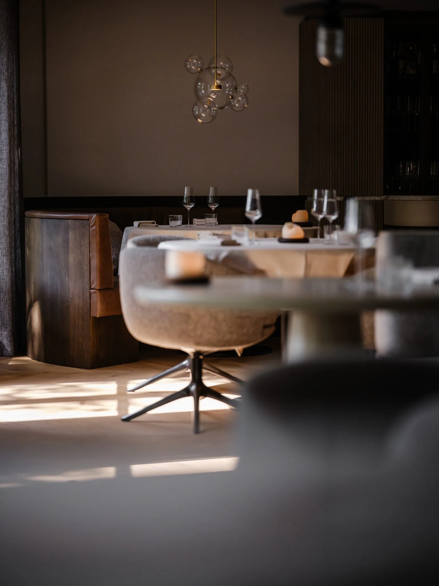
That precision is visible in the way light lands on a marble-look tabletop or catches the folds of a curtain beside the window. Even the darker wall finishes benefit from the layered lighting, which keeps the room from flattening into one tone. Warm lighting here is not a mood slogan. It is a tool that separates zones, softens surfaces and keeps the fine dining interior legible after dark. In a restaurant interior like this, the light is part of the routing as much as the furniture is.
Seating comfort shaped by distance and proportion
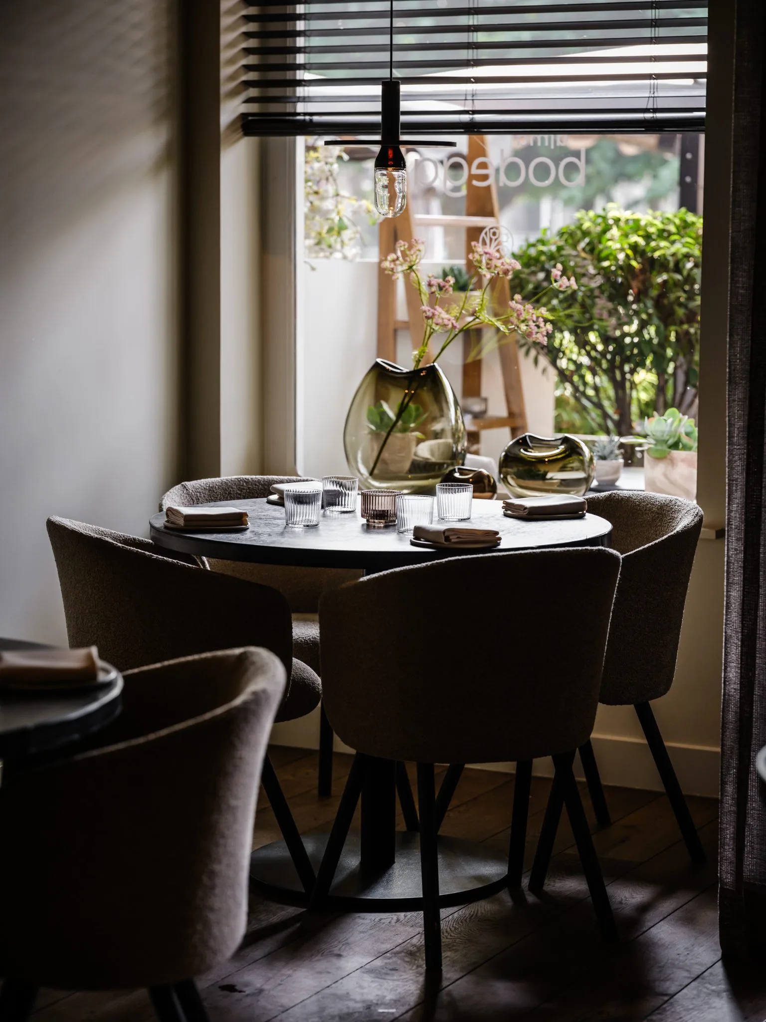
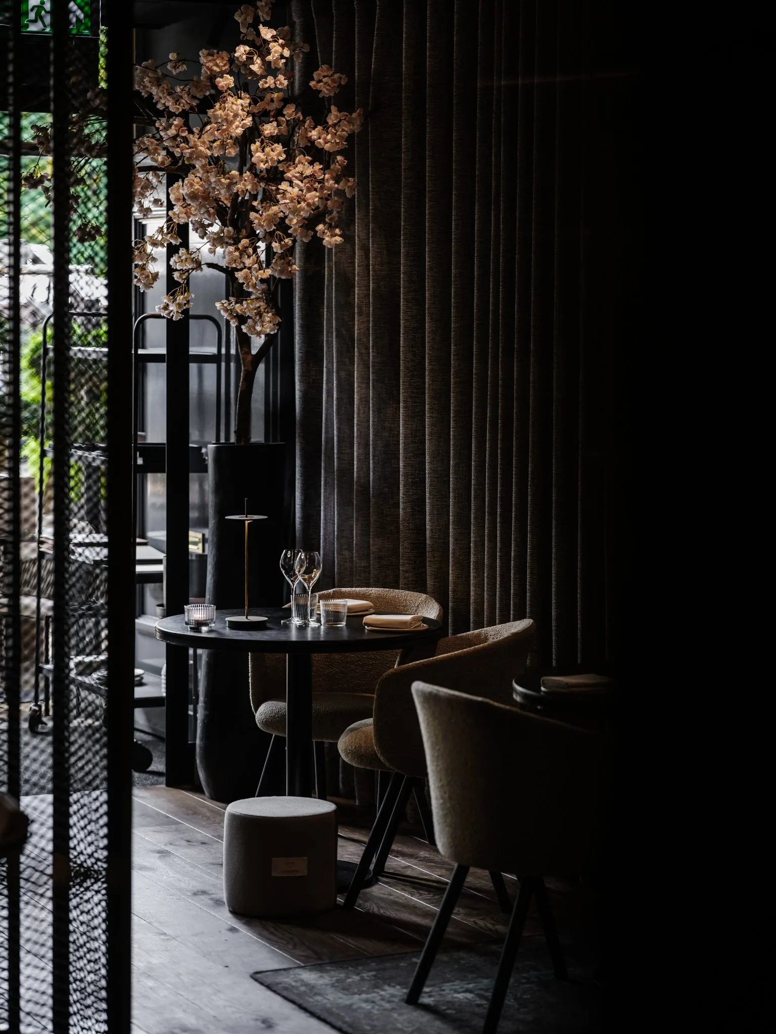
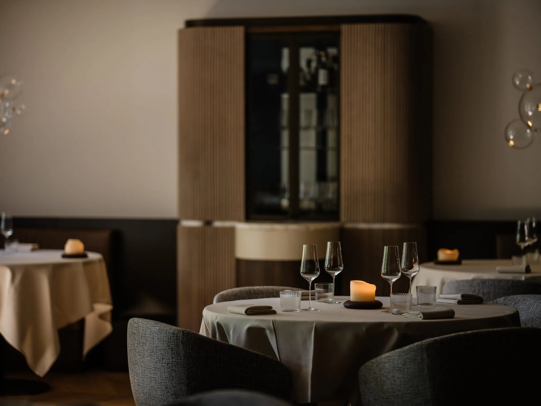
The seating areas rely on dark upholstery, higher backs and rounded tables that make the composition feel orderly without becoming stiff. The chairs and banquette-style seating sit close enough to support conversation, but the spacing around them leaves room for service and movement. That balance is what seating comfort looks like in a restaurant interior: not softness for its own sake, but a chair, table and circulation line that allow a meal to unfold without interruption. The upgrade sharpens that relationship rather than changing the room into something else.
Round tabletops help here. Their shape relaxes the edges of the layout and makes the dining groups feel less fixed in place. In the images, the surfaces read as stone or marble-like, which gives the tables enough visual weight to hold their position against the darker background. Combined with the upholstered seating, they establish a calm hierarchy: the table holds the meal, the seating frames it, and the room supports it. That may sound simple, but in hospitality interior design it is often where a project succeeds or slips.
Gordijnen, licht en zicht naar buiten
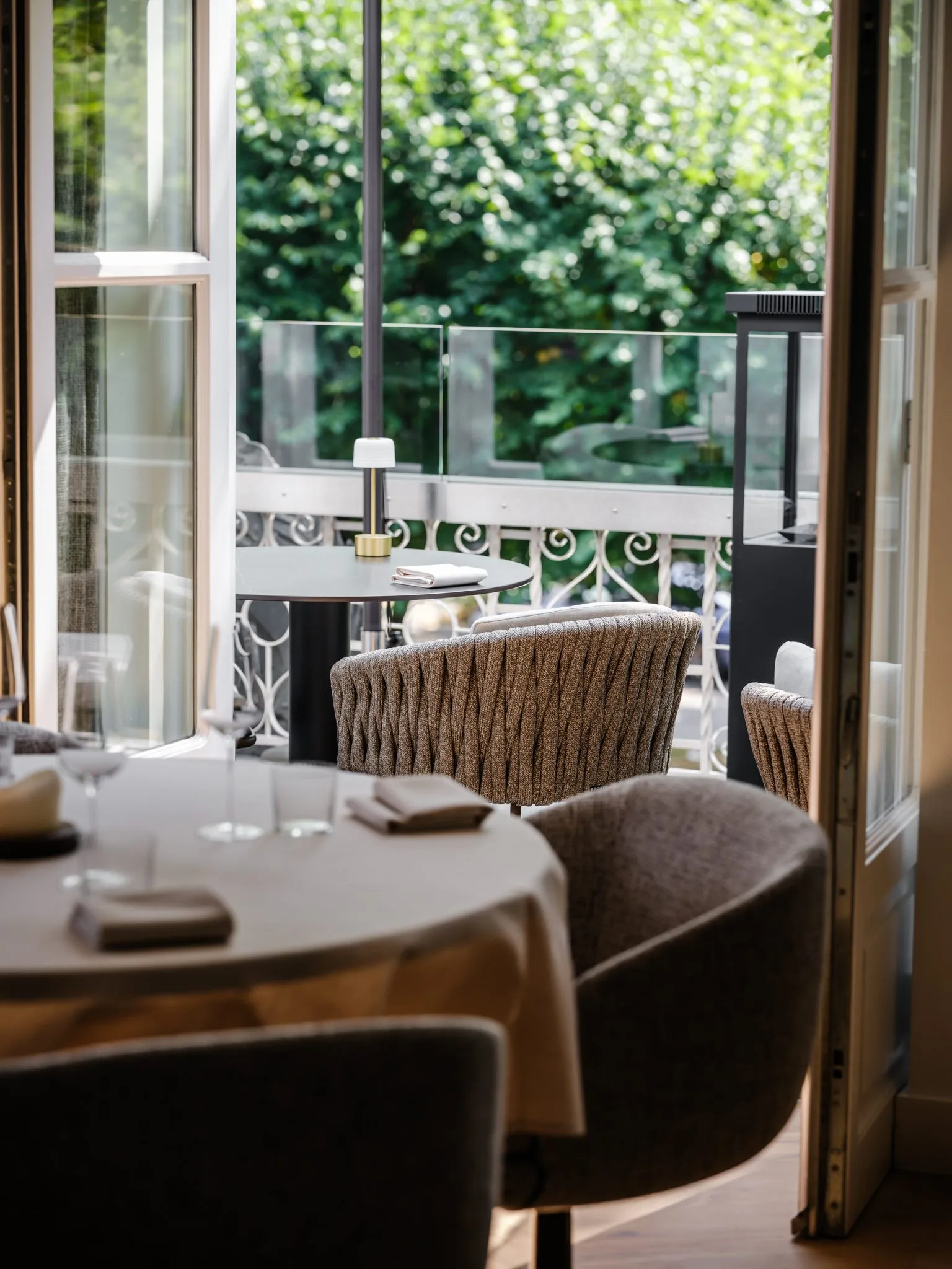
The curtain line is another quiet but effective layer. It softens the edge of the glazing and keeps the room from ending abruptly at the window. In several views, greenery outside appears only as a muted backdrop, which is enough to break the darkness of the interior without turning the room into a view-led space. The layered fabric, the reflected light and the table settings work together to keep attention inside. That restraint suits a fine dining interior, where the room should frame the meal rather than compete with it.
These edges matter because they affect how long a guest stays comfortable in the room. The curtains temper daylight during the day and reduce the hard contrast of the glass line after dark. The table with white cloth, glasses and compact place setting shows how the room can shift from broad spatial reading to close dining detail in one move. Nothing is overdrawn. Each element stays close to its task, which is exactly what gives the interior upgrade its clarity.
A restaurant interior ready for its next step
The strongest thing about this project is its restraint. The room was already defined, so the work focused on sharpening what was there: the route through the space, the comfort of the seats, the custom joinery and the way light falls across each surface. Those changes are small on paper and noticeable in use. They make the fine dining interior ready for a next step without forcing a new identity onto it. For hospitality interior design, that is often the harder task: improving a room that already has a voice.
Seen as a whole, the project shows how an interior upgrade can work through measured adjustments instead of broad gestures. The ribbed bar wall, the pendant lights, the dark seating and the curtain-softened perimeter all contribute to a restaurant interior that feels more resolved in use. It is still recognisably the same room, only more precise in the way it directs movement, frames the table and holds the evening together.
Want to see more of ZOUT Ontwerphuis? View the page of ZOUT Ontwerphuis for even more great projects and company information.



NEW 2026 Jubileum Edition The Best Interior Designers Benelux
Order Now €125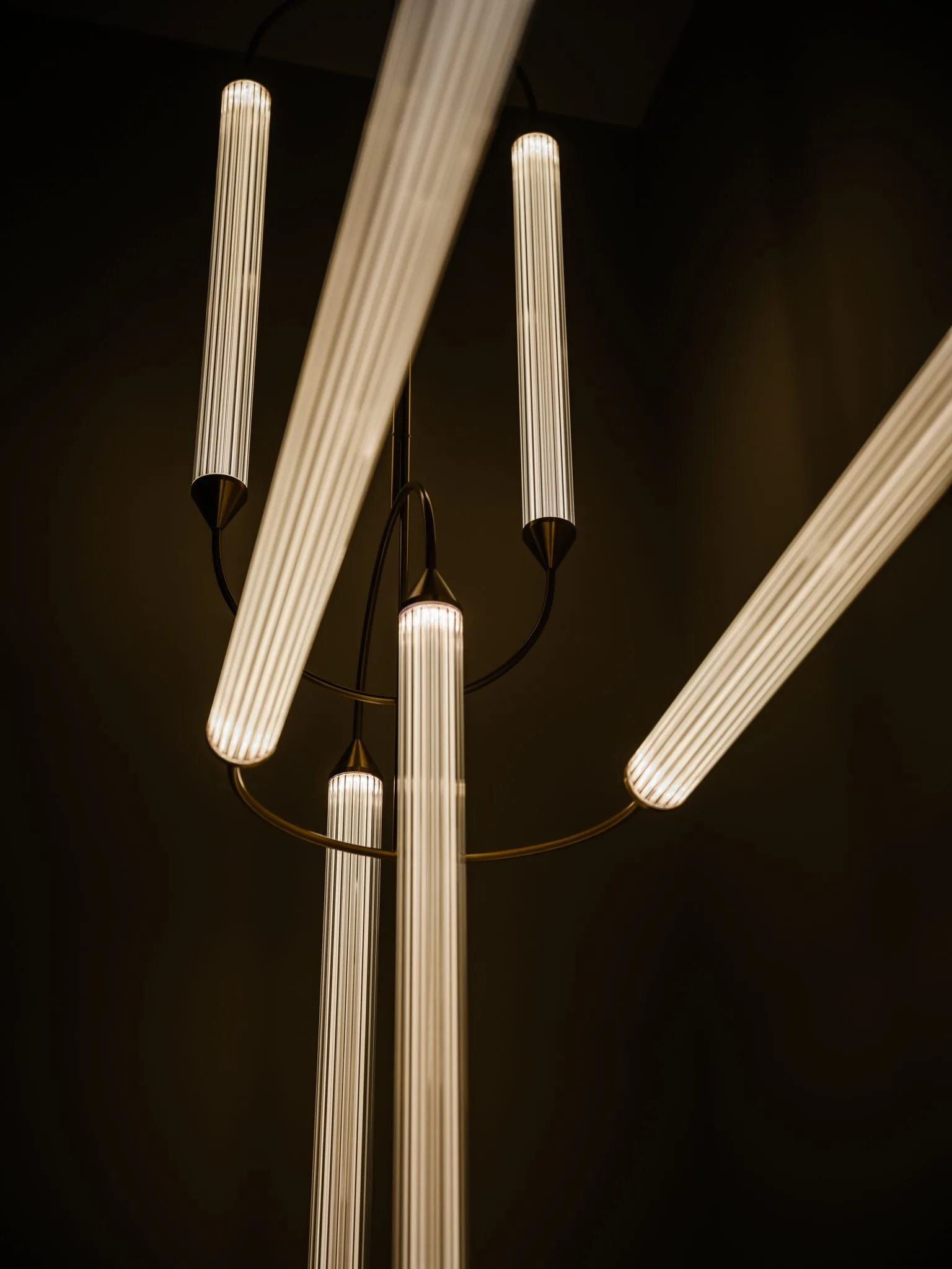
NEW 2026 Jubileum Edition The Best Interior Designers Benelux
Order Now €125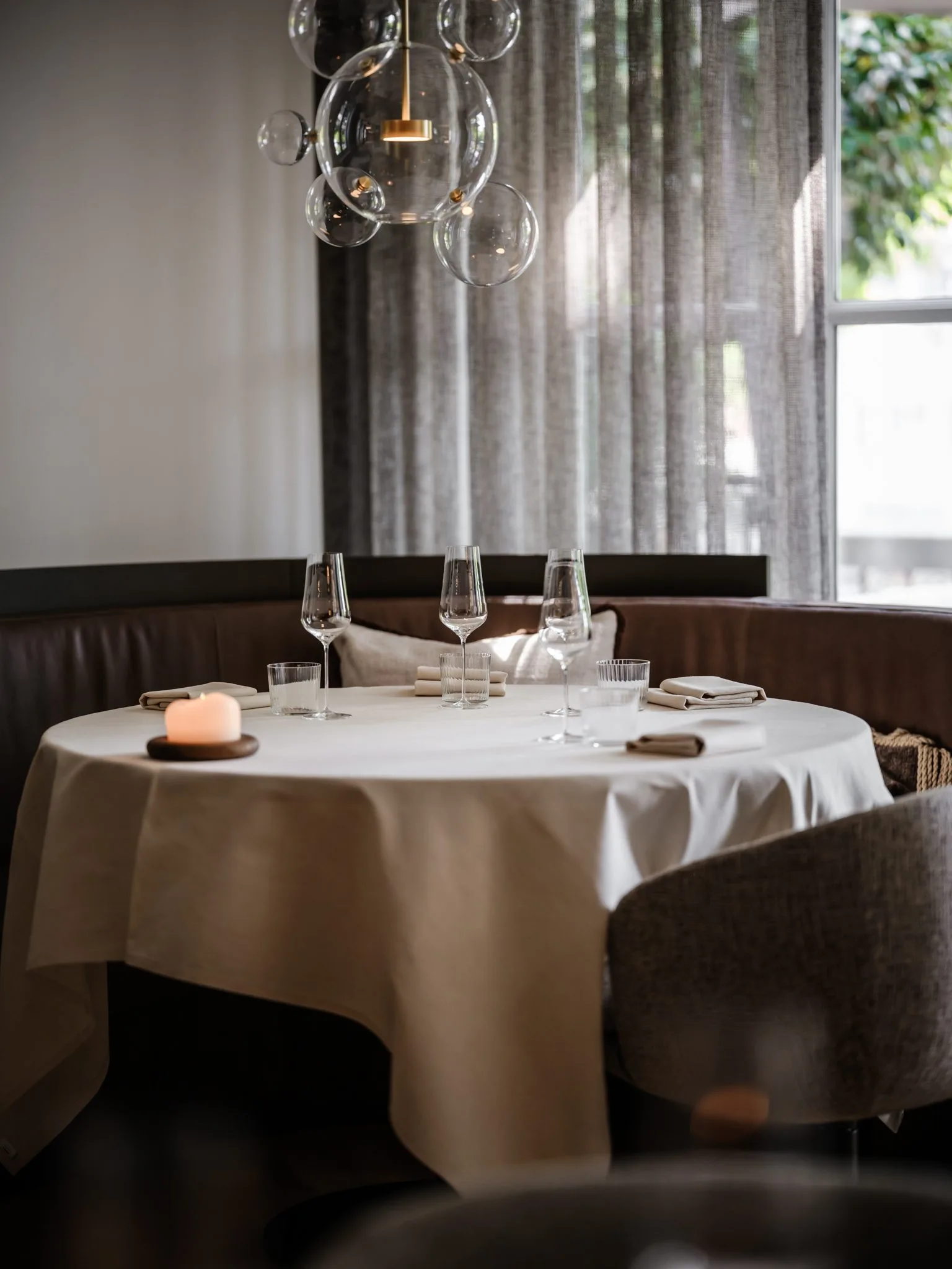
NEW 2026 Jubileum Edition The Best Interior Designers Benelux
Order Now €125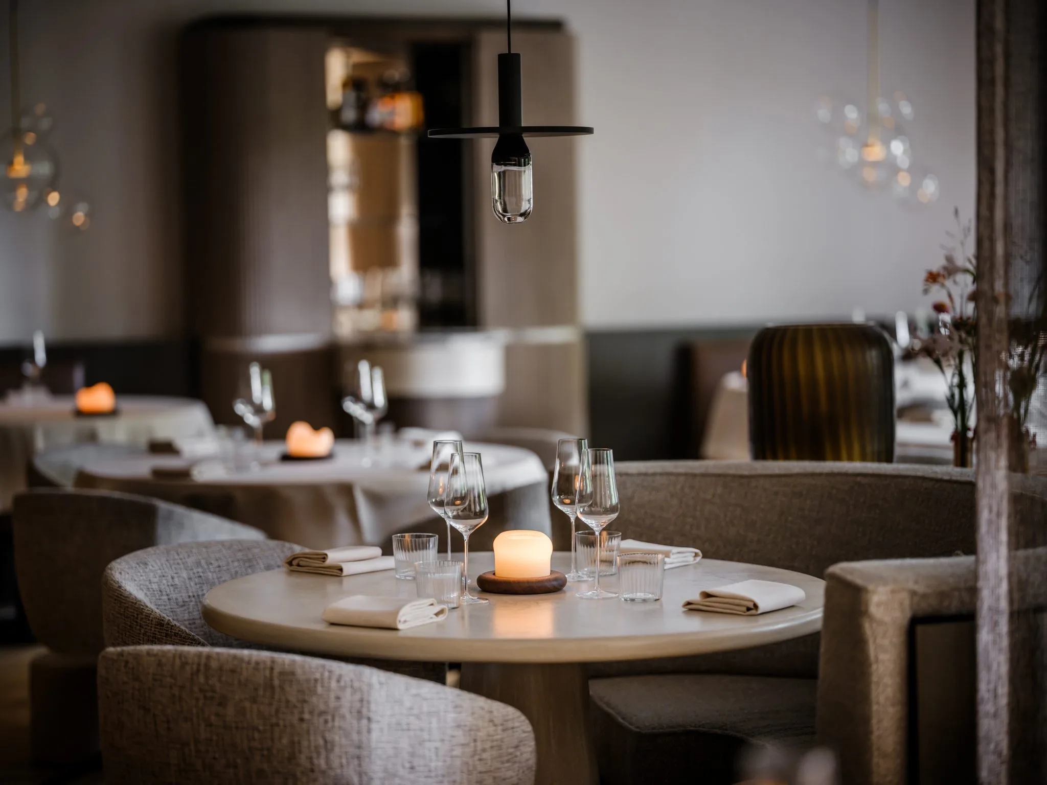
NEW 2026 Jubileum Edition The Best Interior Designers Benelux
Order Now €125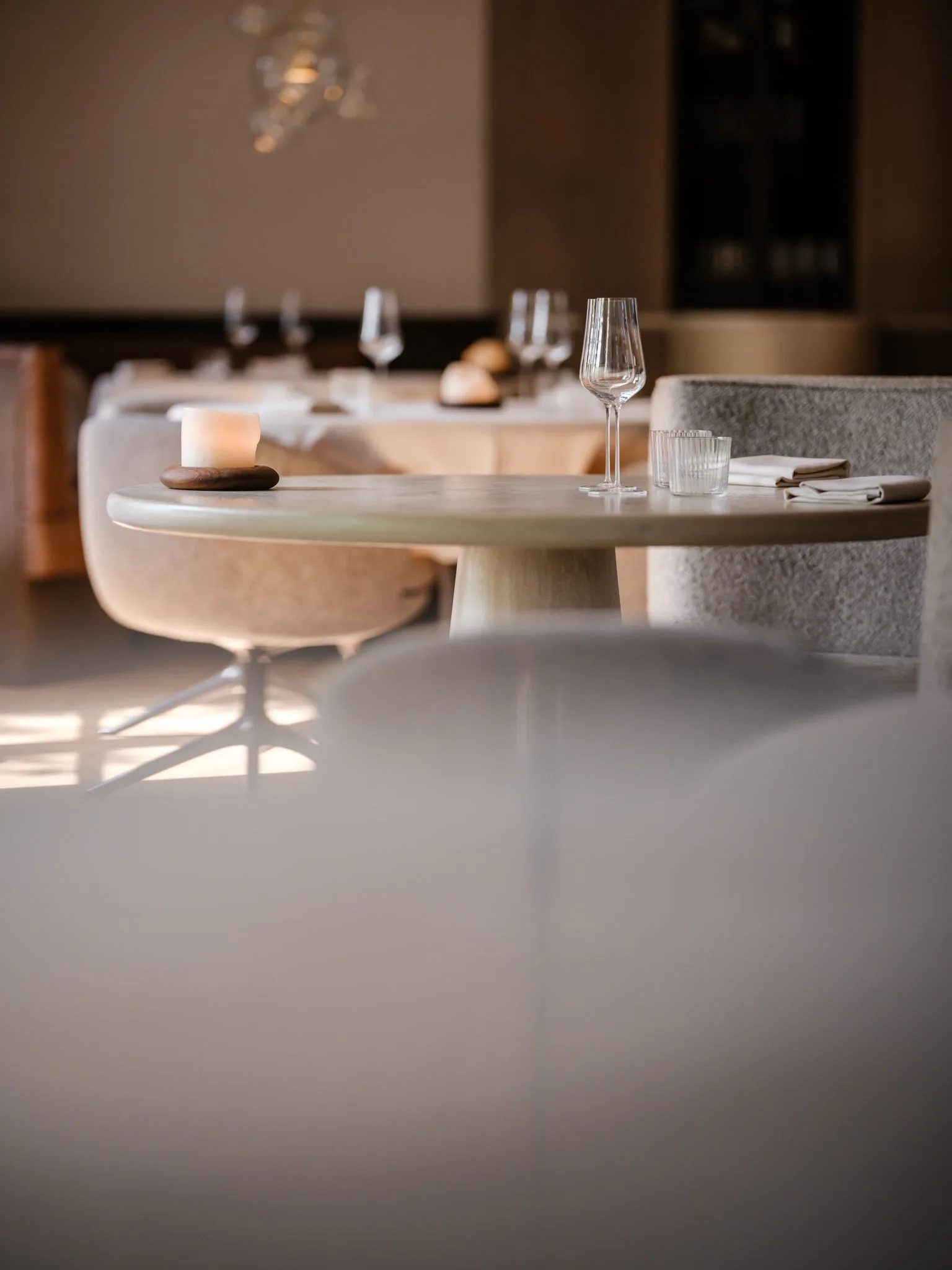
NEW 2026 Jubileum Edition The Best Interior Designers Benelux
Order Now €125