










Barn converted into a guesthouse and wellness
Dark surfaces set the tone the moment you enter the guesthouse and wellness. The room shown in the photograph is compact, but it does not feel cramped: a niche holds a minimal vanity, a natural stone top runs across the width, and a brass faucet catches the light against the dark wall. That restraint carries through the rest of the project, where the barn conversion is built on contrast rather than repetition.
A barn conversion built around contrast
The existing barn was transformed into a guesthouse and wellness area, while the house next to it keeps a quieter, lighter interior. That split is the core idea of the project. Inside the house, the palette stays sober and pale. In the converted barn, darker colours and richer materials take over. The two interiors speak different languages, yet they remain linked by one clear route between the buildings.
That route is made visible through material. Warm wood lines the connection, and brass details mark the transition from one volume to the next. The move from light to dark is not handled with a gesture of contrast alone; it is staged through surfaces you can read as you pass through. Wood softens the passage, while the brass introduces a sharper note that repeats later in the bathroom scene.
Natural stone in a narrow bathroom niche
The bathroom image focuses on a single wall opening, and that tight framing helps the materials stand out. A stone vanity top projects slightly from the niche, creating a clear horizontal line under the darker wall. Below and around it, the finish stays subdued, so the basin area reads as one calm block. The effect depends on proportion: little is happening, but each element has enough presence to register immediately.
The brass faucet gives the vanity its strongest accent. It is small compared with the stone slab, yet it changes the reading of the whole surface. Against the dark background, the metal has a warmer edge, and the reflection on the tap adds movement where the rest stays still. This is where the project’s interior contrast becomes tangible. The dark bathroom is not decorative in a superficial sense; it is built from a few deliberate parts that hold the frame together.
From sober daylight to deeper tones
What makes the project engaging is the difference between the two interiors. The house beside the barn uses light tones and a restrained approach, so the converted barn can move in the opposite direction without feeling disconnected. The darker interior gains depth from that relationship. Seen together, the spaces are not duplicates of one another. They operate as a pair, each sharper because of the other.
The contrast is not only visual. It also changes the way the route between the buildings feels. Light and dark shift as you move, and the transition is marked by the warm wood connection rather than by a hard break. Brass details appear again as small anchors along that passage. They do not dominate the architecture, but they keep the hand and the eye moving from one building to the other.
Material choices that stay legible up close
In projects like this, material detail matters most when it remains readable at close range. The stone top is plain in shape, but its surface has enough weight to hold the sink area. The dark wall behind it does the opposite: it disappears into the background and lets the vanity stand forward. That contrast gives the composition its clarity. Nothing is overdrawn, and the room depends on exact placement rather than decorative layering.
The same logic appears in the connection between the buildings. Warm wood is easy to read because it is not crowded by other finishes. Brass details sit within that wood, creating a measured rhythm along the route. It is a simple move, but it carries the whole project: the guesthouse and wellness take on a darker atmosphere, while the link keeps the ensemble from becoming closed off.
A guesthouse and wellness with a clear spatial idea
Although the project is modest in scale, the spatial idea is precise. A barn becomes a guesthouse and wellness, the neighboring house remains lighter and more reserved, and the connection between them gives the pair a shared axis. That structure lets the contrast do real work. It is visible in the bathroom, in the circulation between the buildings, and in the way material choices are repeated without becoming monotonous.
The result is a project that relies on a few well-placed elements: dark colours, rich materials, a stone vanity surface, a brass faucet, and warm wood with brass details in the link between volumes. Each one is easy to identify. Together they define the project more clearly than any single room could do on its own. The guesthouse and wellness is therefore not an isolated intervention, but part of a dialogue between two buildings with different interiors.
That dialogue is what stays with you after the first glance. One side is pale and understated, the other deeper and more saturated. Between them runs a material bridge of wood and brass. The bathroom image captures the same logic at smaller scale: a dark wall, a stone plane, a metal tap. Nothing feels accidental, but nothing is overworked either. The project keeps its focus on the contrast that the client asked for, and it does so through materials that remain legible in every view.
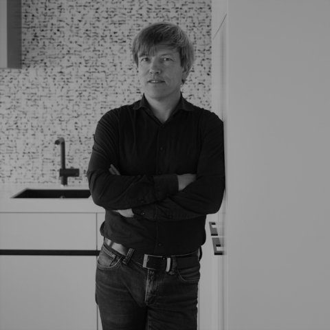
Want to see more of Steven van Compernol? View the page of Steven van Compernol for even more great projects and company information.



NEW 2026 Jubileum Edition The Best Interior Designers Benelux
Order Now €125


NEW 2026 Jubileum Edition The Best Interior Designers Benelux
Order Now €125


NEW 2026 Jubileum Edition The Best Interior Designers Benelux
Order Now €125


NEW 2026 Jubileum Edition The Best Interior Designers Benelux
Order Now €125


NEW 2026 Jubileum Edition The Best Interior Designers Benelux
Order Now €125


NEW 2026 Jubileum Edition The Best Interior Designers Benelux
Order Now €125


NEW 2026 Jubileum Edition The Best Interior Designers Benelux
Order Now €125


