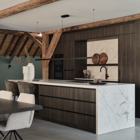
Handle-less kitchen with wood and natural stone
Dark steel fronts pull the eye straight to the long lines of this handle-less kitchen. Against the wooden ceiling and the stone wall, the composition feels measured rather than ornamental. The grain above, the rougher masonry at the back, and the smooth dark cabinetry set up a clear contrast that carries through the room. It is a modern kitchen, but one that takes its cues from the material palette around it.
Wood above, stone behind
The ceiling is one of the strongest visual elements in the room. Exposed timber beams and roof windows break the span into smaller zones, while the stone wall gives the kitchen a heavier backdrop. That mix of wood and stone kitchen materials shapes the atmosphere without needing much else. The cabinets sit low and dark beneath it, so the eye reads the room in layers: timber overhead, stone at the side, and the handle-less kitchen fronts in the middle.
Openings in the stone wall bring in daylight and create a direct line of sight beyond the kitchen. In the images, the frame edges and the rough wall surface sit close together, which makes the room feel set into the building rather than added on. The result is a space where the architecture and the joinery work on the same scale.
Dark steel fronts and long, quiet lines
The front finish is described as dark steel imitation, and that tone gives the cabinetry a firm outline. Without handles, the doors remain visually calm, so the length of the runs and the alignment of the joints become the main language of the room. This handle-less kitchen relies on those straight lines. The dark finish also keeps the appliances and work zones from breaking the composition into too many parts.
Seen from the work side, the kitchen reads as a broad, continuous installation. The counter stretches across the length of the room, with the darker surface carrying the weight of the materials above and below it. In a modern kitchen like this, the absence of hardware does not make the room blank; it makes room for the stone wall, the timber ceiling, and the light from the windows to do more of the work.
Cooking without a bulky hood
The cooking zone is fitted with an induction cooktop with extraction, which keeps the sightline open across the worktop. That choice matters in a room with strong beams and a stone wall, because there is already a lot to take in. By keeping extraction inside the cooking surface, the arrangement avoids another large object above the counter. The worktop stays visually clear, and the line from one end of the kitchen to the other remains uninterrupted.
The built-in steam oven sits in the cabinet wall on the right, tucked into the tall joinery rather than left standing apart. That placement makes the tall unit read as one compact block. On the opposite side, a niche with spotlights uses the spare wall area more carefully. The light in that recess adds depth at the edge of the kitchen and softens the transition between the dark cabinetry and the stone around it.
Built-in appliances kept inside the line
The appliance selection stays in step with the overall layout. A built-in steam oven, a dishwasher, and a fridge from the same integrated approach are all placed so the cabinetry remains the main surface. Nothing here fights for attention. Instead, the equipment sits inside the broader rhythm of the room, leaving the stone wall, the timber ceiling, and the long worktop as the dominant elements.
That restraint is visible in the way the kitchen handles storage and tall units. The right-hand cabinet wall collects the appliances vertically, while the rest of the room stays low and horizontal. It is a useful move in a space with a sloping roof and visible roof structure, because the kitchen does not compete with the architecture. It follows it.
A niche that changes the edge of the room
On the left side, the recessed niche with spotlights breaks the darker surfaces and gives the room a lighter pause. The detail is small, but it changes how the side wall reads. Instead of ending abruptly, the kitchen finishes in a shallow architectural recess that carries light and gives the eye somewhere to rest. The niche also helps the room feel less linear, especially when seen beside the long cabinet run and the open wall openings.
That kind of intervention matters in a handle-less kitchen, because the lines are otherwise so controlled. A lit recess introduces another layer without adding decoration. It shows up most clearly in the evening images, where the spotlights mark the side wall and draw attention to the depth of the room.
Granite with a dark, tactile surface
The granite countertop is an Arte slab in Black Indy Leather. Its darker surface works with the steel-toned fronts, but the texture keeps it from looking flat. As a granite countertop, it also brings a different kind of visual weight to the kitchen: denser, more grounded, and clearly distinct from the timber above. The worktop appears as one continuous plane, which suits the length of the cabinetry and the integrated cooking area.
Granite also comes with practical qualities that are visible in the way it is used here. The material is described as impact-resistant and hard-wearing, and each piece is a natural product with its own character. In the room, that translates into a surface that can carry the cooking zone, the sink area, and the daily movement of the kitchen without disappearing into the background. The stone does not just sit there; it defines the working line of the whole composition.
Maintenance remains straightforward: a cleaner and an impregnating treatment once or twice a year is enough to keep the surface in good condition. That detail fits the rest of the project, where materials are chosen for their surface presence as much as their use. The kitchen with natural stone keeps its strongest gestures simple: dark fronts, a granite countertop, and a stone wall beside them.
The wine cabinet as a focal point
One of the more striking built-ins is the wine climate cabinet. It has two temperature zones, room for 30 bottles, and LED lighting inside. Those features are not hidden away; they give the cabinet a quiet visual role in the kitchen. The illuminated interior reads almost like a display case, but the unit still stays in line with the rest of the joinery. It is a controlled detail rather than a showpiece in the usual sense.
Placed near the other tall elements, the cabinet adds another vertical note to a room otherwise driven by long horizontal surfaces. The contrast works well with the dark steel fronts and the stone wall, especially where the cabinetry meets the timber structure above. In a handle-less kitchen, this kind of built-in element does a lot of the visual work without needing extra framing.
How the room holds together
What makes the kitchen memorable is not a single feature, but the way the materials stay close to their own character. Wood stays visible in the ceiling structure. Stone remains rough and pale beside the darker cabinetry. The granite countertop bridges those two moods with a surface that is visibly solid and slightly reflective. Seen together, they form a modern kitchen that is more about weight, line, and texture than about decoration.
The project also benefits from the way light moves across the room. Roof windows pull daylight onto the beams, the niche spotlights mark the side wall, and the illuminated wine cabinet adds a controlled glow inside the joinery. The result is a handle-less kitchen that reads clearly from every angle: dark steel fronts, natural stone, timber overhead, and a set of integrated appliances that stay tucked into the architecture.
Want to see more of Tieleman Keukens? View the page of Tieleman Keukens for even more great projects and company information.




NEW 2026 Jubileum Edition The Best Interior Designers Benelux
Order Now €125