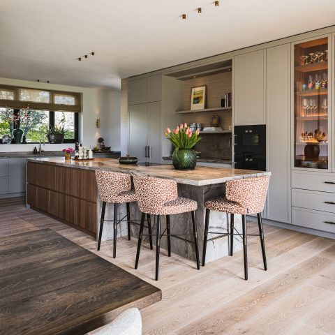
Handleless kitchen cabinets with marble and tall storage wall
The first thing you notice is the marble running across the kitchen wall. It catches the light, breaks up the pale front surfaces and gives the room a firm horizontal line. Around it, the handleless kitchen cabinets keep the composition calm and direct, while the tall storage wall pushes the equipment out of sight and up to a practical working height. The result is a kitchen that reads in layers: smooth fronts, framed openings, stone, and the dark edge of the table nearby.
Handleless fronts set the pace
The handleless kitchen cabinets are drawn with long, uninterrupted lines. Without visible pulls, the fronts let the panel rhythm of the tall units do the work. That shift is important here, because the project mixes a modern kitchen language with a more classic sense of structure. The tall kitchen cabinets hold the appliances inside the wall, so the eye moves from the work zone to the storage zone without breaking. You can read the kitchen as one composed surface, but the detailing keeps it from feeling flat.
Seen from the dining area, the kitchen sits in an open room rather than a closed block. A dark table edge, light seating and the herringbone wood floor give the kitchen a second register. The floor pattern softens the straight cabinet lines, and the grain of the wood adds movement under the stronger geometry of the joinery. Even in the wider view, the handleless kitchen cabinets remain the anchor: neat, pale and measured against the warmer tones below.
Marble gives the working zone its weight
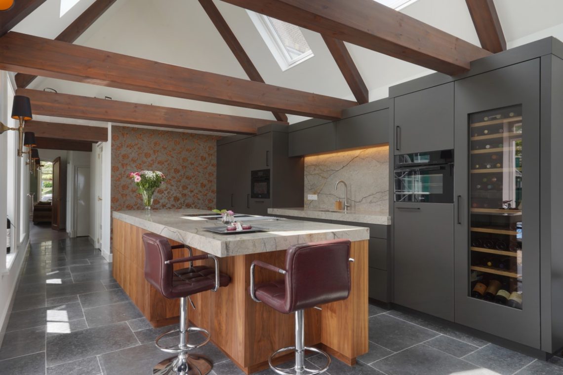
Stone is the most insistent material in the room. The marble countertop and the matching backsplash appear in several views, sometimes with clear veining, sometimes as a lighter marble-look surface that catches the under-lighting. It is not used as decoration alone. The marble frames the cooking and washing areas, reflects the ceiling spots and gives the kitchen wall a sense of depth. Against the pale cabinetry, the stone is what makes the room feel finished without becoming busy.
The project text refers to Calacatta marble, and that reference is visible in the way the stone carries the room’s more polished note. On the countertop detail, a gold-toned tap sits against the marble surface and introduces a warmer metal accent. In another view, the backsplash stretches behind the island and across the wall, so the stone works as both protection and backdrop. The kitchen reads clearly from a distance, yet the surface detail rewards a closer look.
A tall wall that holds the appliances
The tall storage wall does more than conceal equipment. Its paneled fronts and recessed niches give the kitchen vertical rhythm, especially around the built-in oven. That panel structure makes the wall feel architectural rather than purely functional. The appliances are integrated at a height that suits the user, which keeps the main working line clean and avoids interrupting the lower fronts. In a room with such a direct plan, this is where the discipline of the design shows most clearly.
There is also a quiet contrast between the smooth handleless fronts below and the more articulated cabinet wall above. The upper volume carries the heavier visual load, but the detailing stops it from dominating the space. Light from the ceiling spots falls across the fronts and highlights the joins, the niches and the flush alignment around the built-in units. That is where the kitchen gains its precision: not from ornament, but from the way each surface meets the next.
Between kitchen and dining area
The open layout lets the kitchen meet the dining zone without a hard edge. A broad table, lightly upholstered chairs and the visible floor pattern turn the room into one continuous sequence. The herringbone wood floor is especially effective here because it tempers the cooler presence of the marble and gives the room a slower visual tempo. You can feel the change from stone to wood, from the working wall to the seating area, without needing any change in level or enclosure.
That openness also changes how the handleless kitchen cabinets are read. They are no longer just storage units; they become part of the room’s interior field. The pale fronts sit beside the darker table top and the more reflective stone surfaces, so the kitchen keeps its own identity even while sharing the space. This is where the project’s mix of modern and classic becomes legible: not as a theme, but as a set of materials that keep adjusting to one another.
Small details carry the finish
Several close-up views show how much the room relies on detail at arm’s length. A marbled backsplash with visible veining meets the worktop edge cleanly. A gold-toned faucet stands out against the lighter stone. Power points are set above the counter rather than left as an afterthought. These are small things, but they prevent the kitchen from becoming a picture of itself. They show how the handleless kitchen cabinets work in practice, not only in elevation.
The same attention to material carries into the adjacent bathroom glimpsed in the imagery. A marble-look vanity top, a matching wall surface and another gold-toned tap repeat the kitchen’s language in a quieter register. The bathroom is not the main subject, but it confirms the interior’s material direction: stone, pale fronts, warm metal and controlled lighting. That repetition makes the kitchen feel part of a broader interior rather than an isolated room.
A calm palette, kept close to the surface
What stays with you is the way the palette is held close to the materials themselves. Pale cabinetry, marble, wood and metal are allowed to do the work without much interruption. The result is not bare. The paneled tall kitchen cabinets, the veined stone and the herringbone floor all give the space enough variation to stay readable from every angle. The kitchen feels edited rather than decorated, which suits the penthouse setting and the clear, measured way the rooms are connected.
Even in the wider open-plan views, the kitchen keeps its own centre. The marble countertop, the integrated appliances and the handleless kitchen cabinets remain the strongest signals, while the wood floor and dining furniture support the room without competing with it. The project uses restraint to sharpen the details, and that restraint is what makes the interior memorable: a kitchen that depends on line, stone and proportion, not on extra statement pieces.
Want to see more of Martin Van Essen exclusieve keuken? View the page of Martin Van Essen exclusieve keuken for even more great projects and company information.

Contributors



NEW 2026 Jubileum Edition The Best Interior Designers Benelux
Order Now €125


NEW 2026 Jubileum Edition The Best Interior Designers Benelux
Order Now €125