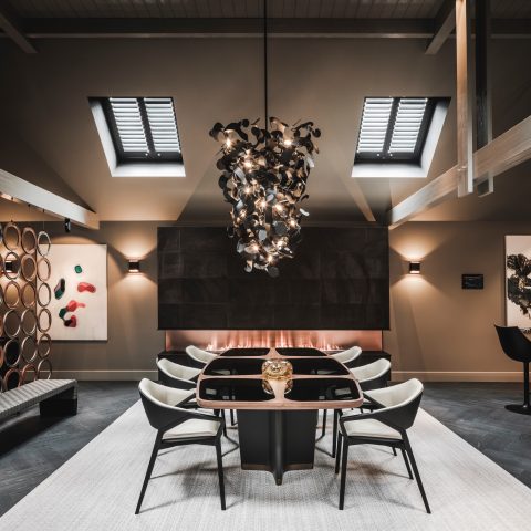
High-end interior with a stylish industrial-modern feel
Warm wood panels, dark cabinet fronts, and a concrete-look ceiling set the tone from the first step inside. The high-end interior reads as one continuous sequence of living, cooking, and moving through the house, with strong sightlines and a clear contrast between soft daylight and the harder lines of metal and structure. Large windows pull the outside light deep into the rooms, while the black details keep the composition grounded.
Open living kitchen with strong sightlines
The main room is arranged as an open plan living kitchen, and that openness is felt in the way the furniture, island, and window wall line up. A central kitchen island anchors the space, finished with a stone-like top that catches light differently from the darker base. Around it, pendant lighting drops low enough to mark the work zone without closing it off. The result is a room that moves easily from cooking to sitting, with each zone still clearly legible.
What makes the room work is the mix of surfaces. The ceiling remains visually active, with a concrete-look finish and exposed technical elements that are not hidden away but treated as part of the interior language. Underneath, the kitchen fronts stay calm and linear. The contrast between the overhead structure and the horizontal cabinet runs gives the space its industrial modern interior character without making it feel cold or rigid.
Custom cabinetry that runs through the house
Storage is built into the architecture of the rooms rather than added as separate furniture. A tall cabinet wall, recessed niches, and integrated fronts create a long line of built-in storage that keeps everyday items out of sight. In several views, the wood veneer carries across full-height panels and lower units, interrupted only by darker handles, open shelves, or appliance fronts. That rhythm keeps the storage practical while giving the walls more depth than plain cabinetry would allow.
The same approach appears in the living area, where a full wall of joinery frames books, objects, and a seating corner. Open compartments sit beside closed doors, so the wall can hold both display and storage without turning into a display case. Seen from across the room, the joinery reads almost like a second layer of architecture. It also softens the large volume, especially when the light from the windows shifts across the wood grain.
Wood, black accents, and metal in measured contrast
The palette stays disciplined: pale walls, dark frames, warm timber, and metal details. That combination gives the high-end interior its weight. Black accents appear in the kitchen fronts, lighting fixtures, and some trim details, while the wood brings a lighter note that keeps the space from becoming too severe. Because the surfaces are limited to a few clear tones, the eye reads the room quickly, from the cabinet wall to the dining area and back to the windows.
One of the most visible shifts comes from the way the materials meet. Wood panels stop cleanly against white walls; dark cabinet bases sit under lighter worktops; glass divides space without blocking it. Even the staircase and upper-level view use that same language, with a transparent balustrade that lets the eye pass through rather than stopping at a solid barrier. It is a practical move, but it also keeps the house visually connected from one level to the next.
Pendant lighting as a spatial marker
Lighting does more than illuminate the rooms. Pendant lamps above the island and dining surface mark where the main actions happen, while rail and ceiling lights spread more quietly along the structure. In the eethoek, the glass shades catch the daylight and soften the harder industrial backdrop. Elsewhere, the fixtures sit close to the ceiling and keep attention on the furniture and joinery below. That mix of hanging and integrated lighting gives the interior a clear hierarchy after dark, without relying on decorative excess.
A ceiling that stays part of the design
The concrete-look ceiling is one of the clearest features in the project. Instead of being concealed, beams and technical conduits remain visible and help define the volume of the rooms. This treatment suits the industrial modern interior because it gives the house a raw edge while still letting the wood and textiles do the softening. The ceiling also creates a strong horizontal plane, which makes the windows feel even larger when they cut through the walls below.
In several rooms, the ceiling structure works together with the large windows to stretch the interior visually. Curtains frame the glass without overwhelming it, and the daylight they admit changes the tone of the wood throughout the day. In a space with so many straight lines, that shift matters. It keeps the rooms from feeling static and makes the open plan living kitchen read as a lived-in interior rather than a display of finishes.
The bathroom follows the same disciplined language
Even in the bathroom, the material palette stays consistent. A glass shower enclosure keeps the room open, while stone-like wall surfaces and dark trim create a clean contrast around the wet area. The wash zone includes a double vanity, set into a compact arrangement that leaves the floor visually clear. A lit niche and mirror lighting bring attention to the surfaces rather than adding ornament. It is the same interior thinking seen elsewhere in the house, only condensed into a smaller space.
The bathroom also shows how storage and finish work together here. Recesses are used for bottles and daily items, and the joinery keeps the lines simple around the sink area. Glass, tile-like surfaces, and darker details echo the kitchen and living spaces, so the room feels related without repeating them. That consistency helps the entire high-end interior hold together as one sequence of spaces, each with its own use, but all sharing the same material discipline.
Light, storage, and circulation
What stays with you after moving through the house is not one single feature, but the way the spaces are linked. The open room, the cabinet walls, the staircase view, and the bathroom all rely on the same clear moves: use daylight, keep the lines direct, and let storage sit close to the structure. Large windows, custom cabinetry, and pendant lighting do the practical work, while the concrete-look ceiling and dark accents keep the interior visually sharp. It is a composed house, built around everyday circulation rather than showpiece moments.
Want to see more of Willuks Interieurprojecten? View the page of Willuks Interieurprojecten for even more great projects and company information.



NEW 2026 Jubileum Edition The Best Interior Designers Benelux
Order Now €125


NEW 2026 Jubileum Edition The Best Interior Designers Benelux
Order Now €125


NEW 2026 Jubileum Edition The Best Interior Designers Benelux
Order Now €125


NEW 2026 Jubileum Edition The Best Interior Designers Benelux
Order Now €125


NEW 2026 Jubileum Edition The Best Interior Designers Benelux
Order Now €125