








Historic home, modern family living
A round table on wheels sets the tone in the kitchen. It can be moved aside, pulled back in, or left where the morning light falls across the top. Around it, the house feels less formal than its history suggests. The project turns a stately interior into a historic home modern living story built around daily use: breakfast in the kitchen, music in the conservatory, and rooms that can take a little noise, movement, and mess.
From classic moldings to a house that can be lived in
The original shell still shows in the framed doors, paneled walls, and decorative ceiling details. Those lines give the rooms their structure, but they no longer dominate the way they once might have. A soft old-rose wall color reduces the formality in the adjoining sitting room, while the original sliding doors keep a trace of the house’s earlier rhythm. In the hall, a large mirror and a patterned floor sit beneath white ceiling ornament, so the entrance reads as measured rather than rigid.
That contrast is central to the whole project. Instead of stripping away the older elements, the interior uses them as a backdrop for family life. A dark wall treatment in the bedroom, for example, pushes against the classical detailing around it. In another room, the frame of a doorway or panel is left crisp and white, while the surfaces next to it are darker or more textured. The result is not decorative for its own sake; it gives the rooms a clearer edge and makes the furniture feel placed, not staged.
The kitchen as the daily anchor
The kitchen is the room that gathers everything together. It is described as the family’s quiet center, the place where everyone meets for breakfast before the day starts. The round kitchen table leaves no hard corners in the middle of the room, and the version here is practical as well as social: it sits on wheels, so it can shift when the layout needs to change. Along one wall, a built-in bench in an alcove is fitted with colored cushions, which soften the geometry of the kitchen without hiding it.
Across the table, the seating stays durable and straightforward, with upholstery chosen for everyday use. The room keeps its distance from anything too polished. That matters in a house like this, where the kitchen has to accept shoes, homework, cups, books, and the constant movement of a family. Seen from the side, the space links directly to the sitting room through the original sliding doors, so the daily route from one room to the next still follows the historic plan.
Small decisions that make the room move
What stands out in the kitchen is how many of the choices are about movement. The table can be shifted. The bench fills an awkward recess. The doors slide rather than swing. Even the color on the walls works as a practical softener, taking the edge off the architecture instead of masking it. This is where historic home modern living becomes more than a phrase: the room is designed for use first, but it keeps enough original detail to remind you where it sits in the house.
Statement wallpaper and darker walls in the shared rooms
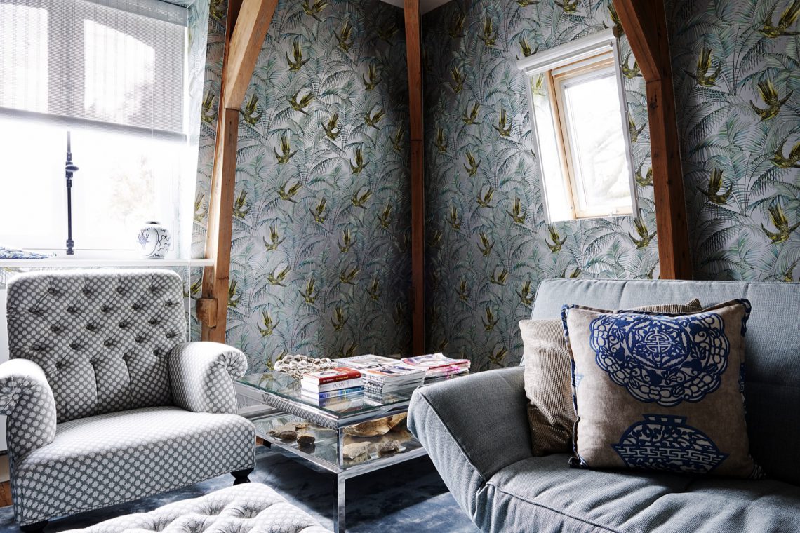
A muted pink wall is one way the formal rooms are loosened up; another is the use of two modern wingback chairs, which add a sharper silhouette against the older shell. Elsewhere, statement wallpaper takes over a sitting area with a stronger pattern, visible in the photos as a dense tropical motif that works against the white trim and the darker furniture pieces. The mix is direct. Pattern, paint, and upholstery each claim part of the room, so no surface has to carry the whole story.
Dark accent walls recur in several rooms, especially where classical molding and paneling might otherwise make the space feel too tidy. Here, the darkness is not used as a drama effect. It gives the room depth and lets lighter details register more clearly: a pale frame, a painted door, a cushion, a lamp. In the bedroom, a deeper black grasscloth-like wall finish provides a rougher surface beside the ornate envelope of the room. The contrast is visible before it is described.
A conservatory turned into a room for music and play
The conservatory, originally added in 1930, now has a different kind of life. It serves as a music room and a children’s room, which gives the glazed space a more flexible role than its earlier form might suggest. The photos show generous daylight, tall window openings, and curtains that soften the edges of the glass. It is easy to imagine instruments, toys, or a mat placed where the floor catches the light. The room keeps its own identity, but it no longer behaves like a separate annex.
That move matters in a family home of this scale. A conservatory can often feel like a leftover room, too bright, too exposed, or too formal to use well. Here it becomes one of the most active spaces in the house. The idea of a kids room in a conservatory is not treated as a novelty; it is simply a way to make the architecture useful again. Because the light is already there, the room can carry daytime play without needing much else.
Bedrooms with their own pace
The parents’ bedroom keeps the classical envelope visible, but the treatment inside shifts the mood. A dark wall finish, modern lamps, and a headboard with a surface that matches the painted details around it create a clear pause from the more open rooms downstairs. The bed is topped with a satin spread designed to sit against those colors rather than compete with them. It is a room of surfaces: soft fabric, textured wallcovering, framed panels, and a bed that holds the center without making a scene.
The children’s rooms follow their own directions. One room stands out because of its height and the wallpaper with tree leaves, which pulls the eye upward instead of filling the walls with a small repeating motif. That vertical emphasis matters in a room with taller ceilings. It gives the space a stronger outline and makes the walls feel less blank. Across the house, the rooms do not match one another, but they do share the same principle: each one is adjusted to how it will actually be used.
A house that draws people in
The people living here describe the house as something that has brought the family closer together, despite its size. That idea is visible in the way the rooms are connected. Doors stay original where possible, light moves from the kitchen to the sitting room, and the conservatory is pulled into daily use instead of being left apart. Friends and the surrounding environment are mentioned too, which suggests a house that opens outward through its rooms rather than shutting them off.
What remains after the restoration and final fit-out is not a display of period detail, and not a total reset either. It is a house where carved molding, paneled doors, colored cushions, dark walls, and statement wallpaper all share the same frame. Historic home modern living, in this case, is defined by use: breakfast at a movable table, play in the conservatory, a bedroom with deeper texture, and a plan that lets the old house hold everyday life without losing its lines.
Photography: Carin Verbruggen and Ferry Drenthem Soesman
Want to see more of Wonderstruck? View the page of Wonderstruck for even more great projects and company information.




NEW 2026 Jubileum Edition The Best Interior Designers Benelux
Order Now €125


NEW 2026 Jubileum Edition The Best Interior Designers Benelux
Order Now €125


NEW 2026 Jubileum Edition The Best Interior Designers Benelux
Order Now €125


