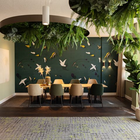
Historic House Converted into a Brasserie
A green wall catches the eye before the room settles into view. Soft daylight moves through sheer curtains, brushing the tables, the upholstered chairs, and the vertical wood slats that trace the ceiling line. In this converted historic house, the former parish building has been adapted as a brasserie for residents of the estate and outside guests, while the interior keeps one foot in its heritage setting. The result is a clear example of modern classic interior design, built from texture, light, and measured contrast.
From parish house to brasserie interior
The change of use is visible in the way the spaces have been opened and connected. Instead of a domestic layout, the rooms now work as a brasserie interior, with seating grouped around rounded tables and sightlines that lead toward the larger openings. The building’s old character is still present, but it is handled through new surfaces and a restrained palette rather than through decoration alone. That approach lets the converted historic house read as a place for gathering without losing its original mass and depth.
What anchors the room is the dialogue between heavy fabric, soft light, and the harder lines of the architectural shell. The green wall does more than color the space; it sets off the pale curtains and the warm upholstery in the seating area. The lighting plan is visible in the way the room avoids glare and instead spreads light across the surfaces. In a project like this, modern classic interior design is not a label but a sequence of decisions that make the old building work for a new program.
A ceiling detail that sets the rhythm
The most immediate gesture overhead is the arched ceiling with vertical wooden slats. It is the kind of detail that shapes the room before furniture or tableware do. The slats introduce a steady rhythm, and the arch softens the transition between wall and ceiling. From certain angles, the element also picks up the surrounding greenery outside, so the ceiling feels tied to the wooded setting rather than isolated from it. That makes the wooden slat ceiling the strongest signature in the project.
Elsewhere, the wall finishes stay quieter but no less considered. A stone-like surface appears under the arch and along the stair zone, giving the interior a rougher note against the smoother fabric and glass. This is where the project leans into interior finishes as part of the architecture itself. The surfaces are not treated as background; they frame movement, catch shadows, and give the brasserie interior a sense of depth that changes as you walk through it.
Stained glass, dark metal, and the stair landing
The staircase introduces another layer of detail. Wooden balusters line the run, with a dark metal handrail drawing a clear line through the frame. Above and beside it, the surfaces shift from smooth paint to a more textured, stone-like finish, which gives the stairwell a heavier presence than the dining room. This stair detail does not try to disappear. It becomes part of the route through the building, and it helps the converted historic house feel continuous from one level to the next.
A nearby window adds a more delicate note. The stained glass detail uses a diamond pattern with small yellow accents, set against the green wall and the upholstered seating below. It is a small element, but it changes the tone of the room by catching light in a different way from the curtains and painted surfaces. In close-up, the lead lines and colored inserts are precise and graphic, while from further back they simply register as a historic layer inside a contemporary interior.
Texture along the walls
One of the clearest signs of care in the room is the decorative wall detail running along the lower edge of the space. The tile inlay brings in geometric star and floral motifs, with light grout lines keeping the pattern legible. It is modest in scale, but it gives the wall a measured line that interrupts the larger, flatter surfaces. Combined with the green wall and the stone-like finish nearby, the tiles create a sequence of textures that keeps the eye moving.
That movement matters in a project where the view often shifts between inside and outside. The glass frontage opens the room toward the landscape, and the interior responds with colors that echo the wooded surroundings. Rather than copying nature literally, the design uses green tones, reflected light, and layered materials to suggest it. The result is a brasserie interior that feels tied to its setting through surface and alignment, not through themed decoration.
How the room handles light and view
Daylight is handled softly here. Sheer curtains filter the opening, allowing the room to stay bright without flattening the material contrasts. Chairs, tables, and the green wall read clearly because the light does not flood the space. Instead, it lands on the fabric, the wood slats, and the textured wall finishes in separate bands. The glass frontage then extends that effect by keeping the view open, so the interior and the landscape remain in conversation across the same frame.
The project’s relation to the estate is felt most in the way the room looks outward. The source material describes a wooded landscape with winding paths, and the interior reflects that through its dark accents, organic green tones, and the curved ceiling line. Nothing is over-described. The room relies on proportion and surface rather than on ornament. That restraint gives the modern classic interior design its clarity and keeps the brasserie interior grounded in the building that contains it.
Reading the converted historic house in details
Seen in close-up, the project is built from small decisions that carry the larger idea. The green wall, the stained glass detail, the vertical wood slats, and the stair detail are not separate effects. They form a shared language of repeated lines, filtered light, and textured planes. Even the round planting inset visible in one of the images belongs to that same logic, bringing a planted note into the interior without disrupting the room’s order.
That consistency is what makes the conversion legible. The old parish house no longer reads only as a historic shell, yet its weight still shapes the experience of moving through it. The brasserie interior uses that weight instead of hiding it, pairing it with cleaner lines, clearer routes, and a more open relation to the landscape. For a converted historic house, that is where the project finds its strength: in visible transitions, in surfaces that hold light, and in details that make the change of use easy to read.
Want to see more of DMD Amsterdam? View the page of DMD Amsterdam for even more great projects and company information.



NEW 2026 Jubileum Edition The Best Interior Designers Benelux
Order Now €125


NEW 2026 Jubileum Edition The Best Interior Designers Benelux
Order Now €125