Historic house renovation with custom interior
Ornamental plasterwork sets the tone from the first room onward. Ceiling mouldings catch the light, while darker custom frames and open shelving pull the eye back to the walls. The house renovation combines those classic details with a direct, contemporary arrangement of rooms, where each surface is kept readable: stone, plaster, glass, metal and timber. The result is an interior renovation that relies on proportion and detail rather than excess.
Plaster ceilings and framed walls
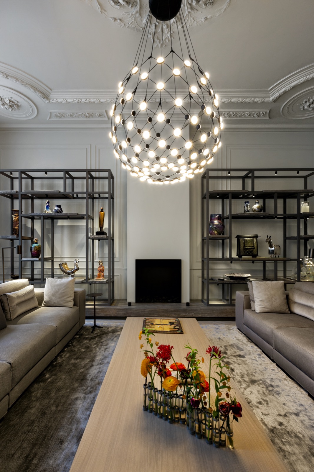
In the living areas, the ceiling does much of the work. Decorative plasterwork runs across the room and gives the upper plane a clear profile, especially around the central light feature. Below it, black metal shelving marks out the perimeter and introduces a sharper line against the softer wall and ceiling surfaces. The room keeps its furniture low and open, so the mouldings, the light and the shelving remain visible from several angles.
The entrance follows a different rhythm. White wall panels with moulded edges and shaped details bring a more formal layer to the hall, while a stone plinth grounds the lower part of the wall. That combination of panelled surfaces and inset lighting gives the passage a measured pace. It is a small sequence of surfaces, but it prepares the rest of the house renovation well, especially where the plan opens toward the main living spaces.
Living room built around custom details
The living room is organised around built-in elements rather than loose decoration. Open shelving sits in dark metal frames, leaving enough space between the verticals for the wall behind to remain legible. A large circular pendant with multiple light points hangs above the seating area and breaks the rectangular grid of walls and shelving. Two sofas sit low in the room, so the ceiling ornament and the custom interior details remain the dominant layer.
What stands out here is the way the room uses contrast without pushing it too far. The plaster ceiling has a classical profile, but the shelving reads as precise and lean. That shift keeps the interior renovation from feeling overworked. It also shows why bespoke details matter in a house like this: they hold the room together without closing it in, and they leave the original volume visible.
A kitchen cut from stone and flat fronts
The kitchen turns to mineral surfaces. A natural stone kitchen worktop runs across the main counter and carries two sinks, each set into a flat, restrained composition. The base cabinets use smooth, matte fronts, so the veining in the stone and the texture in the wall finish become the main points of interest. The back and side walls continue the stone look, giving the room a strong horizontal line from counter to surround.
This is where the house renovation becomes especially clear in use. The sink pair suggests a layout built for daily movement, yet the visual language stays quiet: straight fronts, clean edges and surfaces that reflect light without glare. The custom interior in this room is not expressed through ornament, but through the exact placement of the worktop, the joinery and the stone planes around it.
Bathroom surfaces with a stronger texture
The bathroom shifts to a warmer, denser material palette. A double vanity sits under two round mirrors, each with its own wall light, so the sink wall reads as one composed field rather than separate objects. The stone-like cladding behind the basins has a soft, mineral tone that takes the edge off the straight lines of the taps and cabinet fronts. It is a room where the finishes carry most of the visual weight.
Another bathroom wall uses a large textured panel, which gives the shower zone more depth than a plain painted surface would. The white wall finish around it keeps the room bright and clear, and the continuous lower trim ties the surfaces together. Seen as part of the broader interior renovation, these rooms show how a restrained material palette can still feel specific from one space to the next.
A courtyard garden drawn with one path and one strip of lawn
Outside, the courtyard garden is laid out with a directness that matches the interior. A narrow strip of grass runs beside a rectangular paving path, and the higher walls around it keep the space enclosed and legible. Young plantings sit in narrow beds at the sides, so the middle of the garden stays open and easy to read. The composition is simple, but it gives the house renovation a clear outdoor counterpart.
Because the paving is kept in long, even rectangles, the garden feels connected to the house rather than detached from it. The path creates a measured route through the court, while the lawn strip softens the hard edge of the paving. It is a small outdoor room, and the proportions help it read as part of the same custom interior language found inside.
Bedrooms with large windows and built-in storage
The bedrooms continue the same measured approach. Large window openings bring in a wide band of daylight, and pale curtains soften the edges without hiding the view. One room is kept especially quiet, with a bed dressed in grey and white and a ceiling fitted with small spotlights. The surfaces stay light so the frame of the room, rather than its furnishings, remains the main feature.
Built-in storage appears beside the bed in one of the rooms, where a wall niche and shelving unit take over the function of a freestanding cupboard. That choice keeps the floor clear and gives the bedroom a more ordered outline. It is a subtle but important part of the house renovation: storage is absorbed into the architecture, so the room reads as a single composition of opening, wall and inset detail.
Stone, light and metal in the same frame
Across the project, the strongest moments come from the way materials are placed against one another. Stone appears in the kitchen, the hall and the bathrooms; plasterwork defines the ceilings and wall panels; black metal returns in shelving and frames; glass and large windows keep the deeper rooms bright. None of these elements dominates for long. Instead, they shift from room to room, allowing the custom interior to carry the house renovation without repeating the same gesture.
The images show a property where each space has been edited carefully around its use, yet the details remain connected through proportion and finish. From the ornamental ceiling in the living room to the courtyard garden paving and the built-in bedroom storage, the project keeps returning to one idea: make the structure of the room visible. That is what gives the interior renovation its clarity, and what makes the whole house renovation easy to read as a completed project.
Want to see more of Villabouw Van der Windt? View the page of Villabouw Van der Windt for even more great projects and company information.




NEW 2026 Jubileum Edition The Best Interior Designers Benelux
Order Now €125


NEW 2026 Jubileum Edition The Best Interior Designers Benelux
Order Now €125