










Home extension with a spacious steel-and-glass interior
The rear home extension runs across the full width of the house and is tucked over a basement level, so the footprint works hard from the start. The result is not just more room, but a house that has almost doubled in size. Steel frames and large areas of glass keep the new volume open, while the layout draws the eye through several directions at once. From one room to the next, colour, light and depth stay visible.
A rear extension that does more than add metres
The house extension pushes out to the back of the property and uses the full width of the plan. That move creates a long interior line that connects living spaces without flattening them into one open room. Because the extension is also basemented, the gain is felt on more than one level. The source description is clear on this point: the house was almost doubled in size, and the extra square metres are carried through the plan rather than hidden in one oversized zone.
What stands out is the way the building expansion makes the interior feel larger without relying on empty volume. Steel keeps the structure visually slim. Glass opens the corners and frames the green views outside. The spaces between those elements are where the project gets its character: a room can lead into another, but a corner still holds its own pause, its own direction, its own light.
Steel and glass set the pace inside
The overall atmosphere comes from a clear steel and glass design. Black-framed openings, wide glazing and thin structural lines make the rooms feel lighter than their actual scale. In the living areas, large windows pull daylight across tiled floors and onto the furniture. The effect is especially visible where the walls carry warmer tones or printed surfaces, because the sharper lines of the glazing keep those details from disappearing into the background.
The plan is built around perspective. You do not take in the house all at once; you move through it. A sightline can catch a dark cabinet wall, then a bright opening, then a printed wall surface that adds another layer. That depth is one of the strongest parts of the project. It gives the interior a sense of sequence, which suits a home extension that had to make every metre count.
Custom cabinetry in dark blue and ribbed fronts
The custom joinery is doing a lot of the visual work. Dark blue cabinetry appears as a continuous wall in the kitchen and other built-in zones, with open shelves and recessed niches breaking up the solid surfaces. The kitchen fronts are ribbed rather than flat, so the light catches their texture instead of passing over them. That small change gives the millwork a stronger presence without adding ornament.
The dark blue custom cabinetry also helps the house hold its own lines. It anchors the room, especially where the glazing brings in a brighter edge from outside. Built-in storage is part of the design rather than an afterthought, and that is easy to read in the photographs. Cupboards, shelves and recessed sections all sit in the same visual language, keeping the walls useful while leaving the room open.
A kitchen island with a brass plinth
At the centre of the kitchen, the island is finished with a brass-coloured plinth that catches the lower edge of the unit. It is a small detail, but it changes how the island sits in the room. The metal base gives the block a neat line at floor level, and it works well against the tiled surface beneath it. Around it, the darker cabinetry and built-in appliances keep the composition compact and grounded.
The ribbed fronts and the kitchen island brass plinth are not decorative extras added at the end. They carry the same level of attention as the plan itself. That is why the kitchen feels integrated with the rest of the house extension. It reads as part of the architecture, not as a separate fitted room dropped inside it.
Printed walls add depth between the rooms
Where the plan connects one area to another, the project uses wallpaper and printed wall surfaces to add another layer of depth. Some of the images show botanical and landscape motifs; others shift toward graphic panels and more abstract marks in the hallway and stair zone. These surfaces are doing more than decorating a wall. They slow the eye down, especially after the straight lines of glass, steel and cabinetry.
The prints also support the idea of perspective that runs through the whole house. In one room, a mural opens into landscape-like scenes. In another, a graphic wall panel sets up a sharper rhythm beside the stair. The result is not repetitive. Each surface changes the mood of the space it belongs to, while still linking back to the wider interior narrative of a home extension shaped by layers and views.
Hall, stair and bathroom details continue the story
The stair zone is precise in a way that suits the rest of the house. White side panels, wooden treads and dark accents create a clear rhythm as you move upward. The hallway flooring runs through the space in straight lines, which keeps the transition calm even when the wall treatment becomes more graphic. A set of dark-profile doorframes and round handles reinforces that sharp, ordered feel.
The bathroom appears as a supporting space rather than the main event, but its details still matter. A double vanity sits beneath a marble-look countertop, and the dark mirror opening above it gives the wall a strong centre. The same attention to line and surface shows up here too: clean cabinet faces, a measured basin layout and enough space around the furniture to keep the room legible at a glance.
Light, colour and storage work together
Across the rooms, the project balances storage with openness. Extra cupboards are built into the design, yet the spaces never feel overloaded because the glazing, open shelves and recessed niches keep breaking up the mass. That is where the extension succeeds most clearly. It adds usable area, but it also gives that area a clear structure, so each room can carry colour and material without losing its place in the plan.
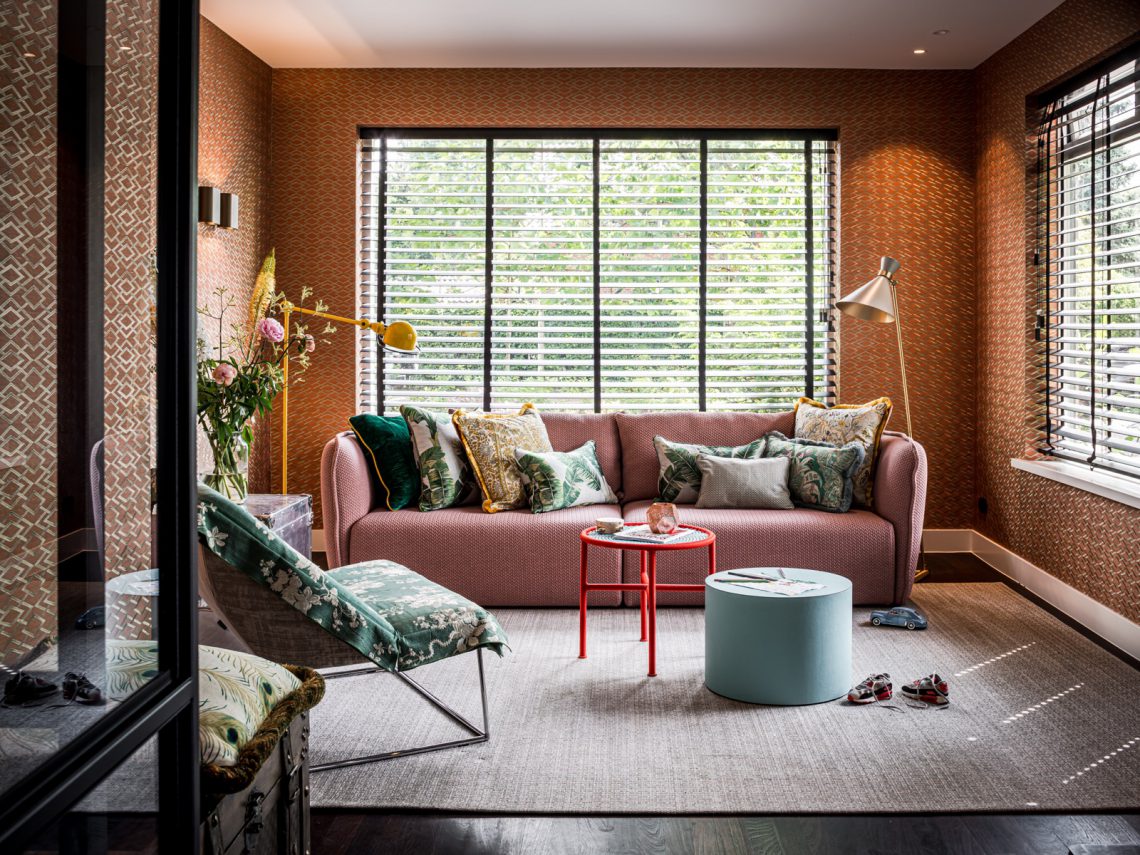
Lighting supports that structure. Ceiling spots pick out the edges of the joinery, while round glass pendants add a softer note above the table area. In the living room, a standing lamp sits near the large windows, and the furniture is kept low enough for the view to remain open. The whole interior feels built around movement, storage and sightlines, which is exactly what makes this home extension read as more than an added rear volume.
From basemented extension to layered interior
Because the rear addition is basemented and spans the width of the house, the project uses the available footprint with unusual efficiency. That fact shows up not as a technical claim, but in the way the rooms now connect. Large glazing, dark joinery, printed walls and the ribbed kitchen fronts all belong to the same spatial idea: keep the house open, but never plain. The extension gives the home more area, yet the strongest impression is still one of depth.
Photographs by Peter Baas.
Want to see more of Stock Dutch Design? View the page of Stock Dutch Design for even more great projects and company information.



NEW 2026 Jubileum Edition The Best Interior Designers Benelux
Order Now €125


NEW 2026 Jubileum Edition The Best Interior Designers Benelux
Order Now €125


NEW 2026 Jubileum Edition The Best Interior Designers Benelux
Order Now €125


NEW 2026 Jubileum Edition The Best Interior Designers Benelux
Order Now €125


