










Home renovation for a contemporary ground-floor interior transformation
Light lands first on the low wall with the built-in fireplace, then slides across the wooden floor and the white panelled surfaces around it. In this home renovation, the ground floor was reworked by shifting attention away from room size and toward the route between spaces, the way openings line up, and how daylight meets artificial light once evening falls. The original proportions were already workable; the update comes from the circulation, the details at the thresholds, and the new sense of order inside the house.
From a 1980s layout to a clearer ground floor
The house belonged to the language of the 1980s, when it could still read as modern. The brief was to transform the entire ground floor without changing the basic proportions. That meant working with what was already there: filtering out the unnecessary elements, sharpening the passages, and then adding back only what the spaces needed. The result is a renovation of the ground floor that feels measured rather than forced. Walls stay calm, lines stay straight, and the plan now reads more directly from one room to the next.
What changed most is not the size of the rooms but the movement through them. The renewed openings guide the eye farther into the house, and the transitions between hall, living area, and kitchen are handled with more precision. Every threshold was raised and finished with a more integrated closure, which makes the connections between spaces feel deliberate. In a project like this, circulation and sightlines do a lot of the work. They replace the need for extra decoration and keep the focus on how the rooms relate to one another.
An entry hall shaped by thresholds and storage
The entry hall carries much of that new clarity. It includes the toilet and the dressing area, both folded into a sequence that now reads with less interruption. Stone-like floor tiles set a firmer tone at the entrance, while the walls remain restrained and light. The hall does not try to announce itself with decoration. Instead, the details around the opening, the cabinet edges, and the controlled transitions show how the space was adjusted. It is a clear example of a home renovation working through proportion and routing rather than through added volume.
Built-in storage appears where the plan needs it, not as a separate object. In the dressing zone, the cabinet fronts sit flush and the corners stay sharp. A brick accent wall near the circulation area breaks the smoother surfaces without becoming dominant. The effect is quiet, but it gives the entrance a recognizable sequence: floor, wall, niche, and passage. The renewed hall is one of the clearest parts of the house renovation because every surface seems to answer the next one.
Raised passages and integrated closures
The raised passages are one of the most visible interventions. They lift the transition between rooms and create a stronger architectural line across the ground floor. Instead of loose openings, the house now uses closures that sit more firmly in the wall plane. This kind of adjustment changes the way the interior is read. A corridor no longer feels like leftover space; it becomes part of the composition. In the evening, the integrated lighting along these routes adds another layer, tracing the edges of the passage without overpowering them.
Living spaces organized around one central fireplace wall
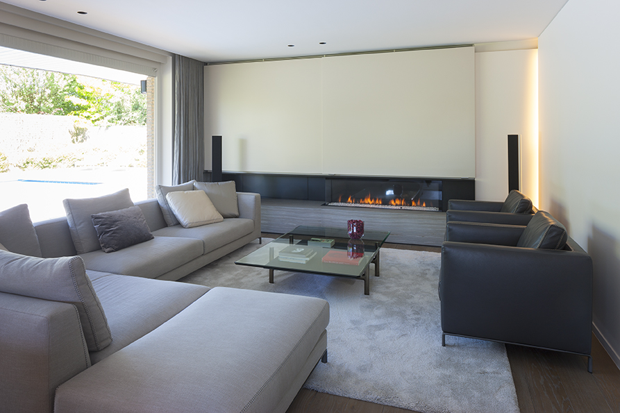
The two-part living area is where the renovation becomes most legible. A built-in fireplace anchors the room in a low, matte wall build-up, with the television set into a niche above it. The arrangement keeps the vertical surface compact and avoids the scatter of separate pieces. Around it, the room opens toward large glass panels, so the eye moves from fire to seating to the garden beyond. This is where circulation and sightlines matter again: the room works because the furniture, the opening, and the fireplace wall all hold the same direction.
Custom wall panels extend that idea. Their vertical joints and integrated lighting introduce rhythm without making the room busy. The panels sit beside the fireplace and continue the architectural language across the living area. A long light bar above the dining zone marks another line in the room, while the wooden floor keeps the different zones visually connected. The interior does not rely on ornament. It relies on a few carefully placed elements that are easy to read from a distance and even clearer up close.
Daylight and artificial light working together
Daylight enters through the large windows and spreads across the pale surfaces, but the project is just as attentive to artificial light. That matters in a ground-floor home renovation like this one, because the spaces need to hold their shape after dark as well. The integrated lighting in the wall panels and the smaller ceiling spots near the circulation zone keep the surfaces legible without flattening them. Light is treated as part of the architecture, not as an afterthought. It marks edges, emphasizes depth, and keeps the hall and living spaces visually connected.
The effect is particularly noticeable where white panel surfaces meet darker inserts. The contrast is modest but useful. It gives the room a clearer reading and prevents the larger surfaces from becoming blank. In the living area, the television niche above the fireplace is one of those details that depends on light to work properly. During the day, it sits quietly in the wall. In the evening, the surrounding illumination gives it more definition and keeps the room from feeling visually heavy.
A kitchen update that keeps pace with the rest of the house
The kitchen only received a limited update, but that was enough to bring it in line with the renovated ground floor. A dark countertop runs against a white cabinet wall, creating a direct contrast that matches the rest of the interior’s restrained palette. The kitchen does not compete with the living area or the hall. It stays aligned with them through the same clear surfaces and measured detailing. That decision matters in a house renovation where one zone has been reworked more deeply than another.
What makes the kitchen relevant here is precisely its restraint. The change is not about replacing everything. It is about removing any visual exception between the kitchen and the rest of the floor. The dark work surface, the pale cabinetry, and the straight-edged composition keep the kitchen inside the same language as the entry hall and living spaces. In a project focused on renovating the ground floor, that continuity is more persuasive than a dramatic gesture.
Materials that keep the rooms grounded
The palette stays close to neutral tones: white, light grey, darker inserts, and the warmer grain of wood underfoot. Against that background, the brick accent in the circulation area and the stone-like floor in the entrance add texture without changing the overall register. The house relies on surfaces that can carry daylight and artificial light in different ways. Painted plaster walls soften the reflections, while the glazed openings bring depth by pulling the garden into view. Inside, nothing feels overloaded. Each material has a clear task.
That restraint also makes the custom elements more visible. The built-in fireplace reads as an architectural volume rather than a separate object, and the wall panels hold the integrated lighting without drawing attention away from the room. The same applies to the cabinet work in the hall and dressing area. These are not decorative add-ons. They are part of the spatial logic of the house, supporting circulation and keeping the ground floor organised after the transformation.
Views that reach beyond the room
At the far end of the interior, the large glass opening pulls the eye toward the terrace and garden. The connection is direct and unforced. Outside, the rectangular swimming pool and the continuous paving slabs extend the same strict linework seen inside. The exterior is not the focus of the project, but it reinforces the interior reading by continuing the geometry. From the living area, that long view helps explain the entire renovation: the rooms are now arranged to hold sightlines, not to block them.
Seen as a whole, the home renovation is less about replacing a style than about reordering a floor. The passages are lifted, the closures are drawn into the architecture, and the main rooms are joined by clearer routes and more disciplined light. The entry hall, dressing area, and two-part living room carry most of the change, while the kitchen stays in step with a limited update. What remains is a ground floor that reads with more precision, room by room, surface by surface.
Photography: Liesbet Goetschalckx
Want to see more of iXtra interior architecture? View the page of iXtra interior architecture for even more great projects and company information.





NEW 2026 Jubileum Edition The Best Interior Designers Benelux
Order Now €125


NEW 2026 Jubileum Edition The Best Interior Designers Benelux
Order Now €125


NEW 2026 Jubileum Edition The Best Interior Designers Benelux
Order Now €125


NEW 2026 Jubileum Edition The Best Interior Designers Benelux
Order Now €125


