










Home renovation with a modern farmhouse interior
Light moves first across the living space, catching the white cabinet fronts, the dark countertop and the black frame of the glazed opening between rooms. The home renovation reshapes a stripped-back house into a clear sequence of entrance, seating area and kitchen, all set out in a modern farmhouse interior that keeps the lines straight and the surfaces calm. Nothing feels overdrawn. The focus stays on what is visible: millwork, glass, matte black accents and a layout that lets one room lead naturally into the next.
An open living area built around fixed lines
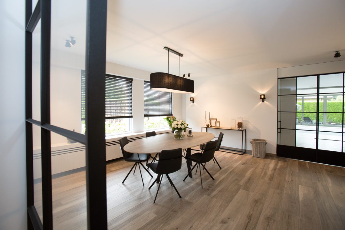
The ground floor now reads as one open-plan living zone, but the room still has distinct moments. A built-in fireplace with a black surround anchors the seating area, while the dining table sits nearby as a low, oval shape against the longer wall planes. Large windows pull daylight deep inside, and the ceiling spots add a second layer of light once the day fades. In this home renovation, the open plan is not left bare; it is framed by custom millwork and clear sightlines that keep the room legible from one corner to the next.
Material changes are subtle and effective. Pale floors run under the furniture and soften the contrast between the white wall surfaces and the darker details around the fire opening and window frames. The result is a modern farmhouse interior that feels defined by edges rather than decoration. A glass partition to the kitchen keeps the connection open, but it also marks the shift from seating area to cooking zone without closing off the view. That balance gives the lower level its structure.
A kitchen with white cabinets and a dark worktop
The kitchen follows the same straight logic. White cabinets line the space in a tidy run, set off by a dark countertop that creates a stronger horizontal line across the room. Open shelves and fitted storage keep the surfaces clear, while the black framing at the adjacent opening ties the kitchen back to the rest of the interior. For a home renovation, the effect is practical without feeling plain. The room is doing several jobs at once: cooking, passing through, and holding a visual link to the living area.
Seen from the dining side, the kitchen becomes part of the overall room composition rather than a separate block. The glazed transition allows views through to the cabinet wall and the work surface, so the room feels measured from both sides. This is where open-plan living with custom millwork becomes more than a label. The built-in storage is doing the work of keeping the room quiet, and the darker countertop gives the white fronts a sharper edge. The materials are simple. The effect comes from the way they are placed.
Glazing, black framing and the route through the house
Several details repeat across the ground floor and give the home renovation its rhythm. Black framing appears at the glazed division, at the fireplace opening and in the window surrounds, setting a consistent line through the interior. The stair hall continues that language with white finishes, glass sightlines and a run of built-in storage along the wall. Even the transition areas are treated as part of the plan, not leftover circulation. That keeps the route through the house clear, from entrance to living room to kitchen and up toward the private rooms.
The entrance itself stays calm and direct. White panelled walls, a low built-in cabinet and the transparent edge of the glass partition make the first impression feel measured rather than decorative. The same restraint carries into the landing, where the staircase opens beside a glazed side and a long fitted cabinet wall. Here the custom millwork is not just storage; it shapes the corridor and controls how the eye moves. The sequence of doorways, glass and solid panels is one of the most noticeable parts of the renovation.
Upper-floor rooms redesigned with cleaner use of space
Upstairs, the work shifts from shared living to private rooms. The bathroom and shower area were fully renewed, and the finishes are noticeably sharper: a glass shower enclosure, mosaic tile accents and a vanity with a long, continuous line. The room is compact in expression but clear in layout. Transparent surfaces keep the shower from feeling boxed in, while the tile detail gives the wet area a more defined edge. In this part of the home renovation, the emphasis is on making a small zone read cleanly and to the point.
The shower wall and the surrounding tilework bring texture into a room that otherwise stays restrained. Mosaic tiles are used as an accent rather than a full covering, so they punctuate the larger smooth surfaces instead of competing with them. The glass shower enclosure keeps the room visually open, and the light bounces off the pale finishes. It is an easy room to read, which matters in a home renovation where the upper floor had to be completely renewed rather than simply updated.
From bedroom to dressing room
A former bedroom was turned into a dressing room with built-in storage, and the change is visible in the wall line. Paneled cupboards run across the room, turning one side into a storage surface rather than a loose arrangement of furniture. A small work area appears in view, making the dressing room feel more like a fitted interior than a spare room with wardrobes added later. The custom dressing room built-in storage keeps clothing behind closed fronts and leaves the centre of the room open enough to move through without interruption.
The room still carries traces of a bedroom in its scale, but the fitted elements change how it functions. Accent wallpaper and a tall upholstered bed are visible in adjacent views, yet the dressing space itself is defined by cabinetry and straight panel joints. This is where the renovation moves from shared domestic space to a more ordered private zone. The storage wall takes over the architecture of the room, and the surfaces stay consistent with the rest of the house: white, measured and pulled into a clear line.
What holds the renovation together
Across both floors, the strongest thread is the way materials repeat without becoming repetitive. White joinery, dark surfaces, black frames, glass and pale flooring appear in different combinations, but they stay connected through the same disciplined layout. That gives the home renovation its reading pace: a fitted living room below, a renewed bath and shower zone above, and a dressing room that replaces a bedroom with storage. The modern farmhouse interior language is present, but it is kept lean and architectural rather than nostalgic.
What stands out most is the control of sightlines. From the entrance, past the glazed divider, across the kitchen and back to the fireplace, the house keeps opening and closing in measured steps. Upstairs, the glass shower enclosure and the dressing room cabinetry continue the same approach on a smaller scale. This home renovation does not rely on excess to make its point. It uses straight lines, fitted elements and a clear room order to let the house read more precisely than before.
Want to see more of Interieurburo Claeys & Verbeke? View the page of Interieurburo Claeys & Verbeke for even more great projects and company information.





NEW 2026 Jubileum Edition The Best Interior Designers Benelux
Order Now €125


NEW 2026 Jubileum Edition The Best Interior Designers Benelux
Order Now €125


NEW 2026 Jubileum Edition The Best Interior Designers Benelux
Order Now €125


NEW 2026 Jubileum Edition The Best Interior Designers Benelux
Order Now €125


NEW 2026 Jubileum Edition The Best Interior Designers Benelux
Order Now €125


NEW 2026 Jubileum Edition The Best Interior Designers Benelux
Order Now €125


NEW 2026 Jubileum Edition The Best Interior Designers Benelux
Order Now €125


NEW 2026 Jubileum Edition The Best Interior Designers Benelux
Order Now €125


