Home restoration with a light, white interior and glass overlook
White plaster, pale floors and a run of glass set the tone from the first room. In this home restoration, the interior is drawn in clear lines: openings stay generous, the walls remain bright, and the eye keeps moving between levels. The result is not about display, but about how the restored mill house lets light travel through its rooms and across the void.
A bright interior where the structure stays visible
The light and white interior gives the main spaces a measured calm. Rounded wall openings interrupt the straight edges, and those curves echo the older shell of the mill house restoration without turning it into a museum piece. In the ceiling, recessed ceiling spotlights sit almost flush with the plaster, so the surfaces stay clean and the light source remains discreet. The rooms read as connected, but each volume still keeps its own outline.
Glass plays a practical role here. Instead of closing off the plan, it draws sightlines from one level to the next and makes the void part of the composition. A glass overlook void opens the centre of the house, allowing the staircase, upper landing and lower rooms to remain visible at once. That transparency gives the interior a clear route, especially where the white walls and bright openings meet at sharp angles.
The staircase becomes the main connector
The open staircase with white steps sits almost like a folded strip through the house. Its position is straightforward, but the visual effect is stronger than that. From one side, the treads appear to float; from another, the stair becomes a frame for the space around it. Because the steps are white, they merge with the surrounding plaster and leave the handrail, openings and shadows to define the profile.
Seen from above, the stair relates directly to the glass overlook void. The upper edge of the opening traces the route of movement, while the lower floor stays partially visible through the void. That layered view makes the circulation legible without adding visual noise. It also ties the restored interior to the rest of the project, where cut-outs, windows and glazed panels keep repeating the same idea of looking through rather than stopping at a wall.
Rounded openings and framed views
Arched openings give the interior its softest lines. They appear in the way the wall is cut, in the framing of certain views, and in the rounder geometry that runs through the mill house. Those curves are paired with flat planes of white plaster and glass, which keeps the composition from becoming too literal. The eye catches the shift from solid to void, then from void to glazed edge, and the sequence feels carefully edited by space rather than ornament.
The same logic appears in the glazed partition pieces and the internal sightlines. A room can be seen across another room; a landing can be read from the stair; a ceiling cut-out hints at the floor above. The project depends on those partial views. They make the restored house feel open without erasing its structure, and they give the white interior a sense of depth that comes from transparency, not decoration.
A bathroom detail with clear surfaces
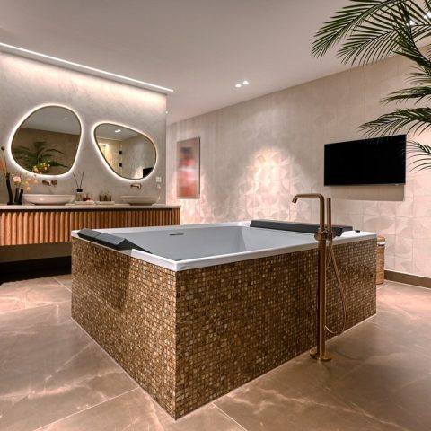
The bathroom is handled as a quiet pause in the sequence. A freestanding bathtub sits against the white room, while a glass shower wall keeps the shower zone visually light. The material shift is subtle: smooth ceramic, clear glass and painted surfaces share the same restrained palette. Even here, the room stays connected to the rest of the home restoration through the brightness of the finishes and the clean edge of the partitions.
What stands out is the way the bathroom uses reflection and transparency rather than enclosure. The glass shower wall catches light without blocking it, and the tub reads as a separate object in the space. It is a small room, but the same visual discipline remains in place. No extra trim, no heavy framing, only surfaces that keep the room open to the daylight coming from elsewhere in the house.
Outside, the old round core meets a glazed addition
The exterior changes scale quickly. A round tower with arched openings gives the restored mill house its strongest silhouette, and the dark slate roof sits above it with a clear, weighted line. Beneath that older core, the modern extension with large glass panels introduces a different rhythm. The glazed volume is lighter and flatter, so the contrast between masonry, roof and glass is immediate when the two parts are seen together.
That exterior composition matters because it echoes the interior strategy. The tower keeps the rounded, historical reading of the building, while the extension opens the house to large panes and straight edges. Seen from the outside, the project shows how the home restoration holds two languages at once: the curved body of the mill house and the more open glazed addition that extends it.
How the view moves from core to addition
The best reading of the building comes from the transition between the two volumes. The round tower with arched openings anchors the composition, while the modern extension with large glass panels lowers the visual weight on the other side. The change is not abrupt. It is paced by openings, roof lines and the shift from masonry to glass. That movement, more than any single detail, gives the project its spatial clarity.
Inside and out, the same features keep returning: white surfaces, glazed passages, open vertical connections and rounded openings. The mill house restoration does not hide the older form, but it also does not freeze it. Instead, it lets the stair, the void and the new glazed volume work together, so the house can be read in layers. The photographs capture that progression from room to stair to tower, and from compact interior moments to the broader outline of the building.
Want to see more of AbS² Architectuur bureau Stefan Soenens? View the page of AbS² Architectuur bureau Stefan Soenens for even more great projects and company information.



NEW 2026 Jubileum Edition The Best Interior Designers Benelux
Order Now €125


NEW 2026 Jubileum Edition The Best Interior Designers Benelux
Order Now €125


NEW 2026 Jubileum Edition The Best Interior Designers Benelux
Order Now €125


NEW 2026 Jubileum Edition The Best Interior Designers Benelux
Order Now €125


NEW 2026 Jubileum Edition The Best Interior Designers Benelux
Order Now €125