










House Renovation with Void and Cedar Slat Facade
The first thing you notice is the light. It moves across white walls, a pale timber floor and the edge of a double-height opening in the living room. In this house renovation, a 1960s home was reworked from the inside out, with ENZO guiding a layout that opens the ground floor, pulls the garage into the plan and extends the rear of the house by one and a half metres. The result is calm, but not empty. Every line seems to answer a spatial move: a void, a wider opening to the garden, a new route through the house.
A living room shaped around a void
The living room void gives the main space its scale. Instead of a low ceiling carrying the room from end to end, the eye is drawn upward to the open volume above the sitting area and toward the upper landing. That change does more than create height. It links the floors visually, so the large overloop upstairs looks back into the living room. The arrangement is simple to read, and that clarity suits the minimal interior design throughout the house. White surfaces, dark window frames and a restrained palette keep the attention on the volume itself.
At ground level, the rear extension pushes the living area toward the garden. The extra metre and a half is visible in the broader connection to the terrace and the large glass openings that frame the outside. The extension is not treated as a separate addition. It reads as part of the same spatial sequence, from the sitting area to the garden edge. Large panes and dark window frames sharpen that transition, while the open structure gives the room enough air to feel connected without becoming exposed.
New routes through the ground floor
ENZO’s work in this house renovation is clearest in the way rooms now relate to one another. The former garage was brought into the house and given a new use as a guest room and workroom with a bathroom. That shift changes the entire ground floor. What was once a closed-off side volume now supports daily life and occasional visitors. It also gives the plan a practical depth: a place to stay, a place to work, and a direct link back to the main living zone. The garage converted to house is no longer an annex, but part of the domestic rhythm.
Details hold the plan together. The front door is handled with the same discipline seen elsewhere, and the electrically operated shading sits neatly with the horizontal cedar slats. Those slats run across the composition and soften the long surfaces without breaking the geometry. Their rhythm is visible from outside, but it also affects how the house reads from inside, where daylight comes filtered through generous glazing. The effect is not decorative for its own sake. It controls the pace of the facade and gives the house a clear outer skin.
Cedar slats, dark frames and a new outer skin
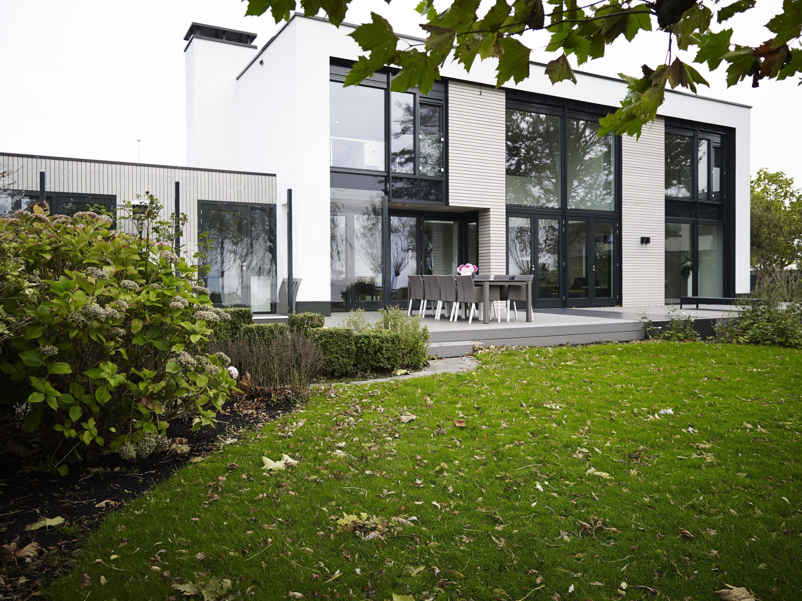
The cedar slat facade is the most immediate sign of the renovation from the street. The original 1960s shell has been replaced with a tighter, more measured layer of timber and glass. Vertical cedar battens sit against dark window frames, and the contrast gives the house a sharper outline. In the images, the facade reads as a sequence of solid and transparent parts: slatted surfaces, broad openings, and dark trims that set the glazing in place. It is a modern home renovation that changes the house without erasing its compact residential scale.
That outer layer also connects to the terrace and garden. A raised platform, an overhang and wide openings create a direct line from living room to outdoor space. The garden is not treated as backdrop; it sits close to the house, with grass and planted beds running along the edge of the terrace. From inside, the view reaches through the large panes to the green strip outside. From outside, the timber and glass sit in a steady rhythm, with the cedar slats giving the facade depth rather than flatness.
Upper floor rooms around an open landing
Above, the large landing opens to the living room void and gives the upper floor a clear centre. The parents’ bedroom and an adjacent bathroom sit on one side, while two children’s rooms and a children’s bathroom complete the level. The plan avoids wasteful corridors. Instead, the landing becomes a space of connection, lit by the opening below and the glazing around it. It is an efficient arrangement, but also an expressive one: the void below keeps the upper floor from feeling cut off, and the house reads as a single interior volume divided by height rather than by closed hallways.
The staircase contributes to that reading. In the photographs, the open stair structure appears light, with white surrounding surfaces and darker treads that make each step legible. Its placement next to the void means it is never just circulation. It becomes part of the visual field, linking the lower living area with the landing above. That is where the house renovation feels most resolved: in the way movement, sight lines and rooms overlap without crowding one another.
Light, restraint and a plan that leaves room to look out
Inside, the house leans on light rather than ornament. White walls, pale wood flooring and large window openings give the rooms a quiet surface, but the spaces are not plain. The double-height opening and the long view to the garden keep the interior from closing in. The minimal interior design works because the material choices are few and consistent. There is enough contrast from the dark frames and stair treads to define edges, while the timber floor brings a softer tone underfoot.
The bathroom visible in the imagery follows the same logic. A dark tiled floor, a wood-look vanity and a crisp white basin keep the room grounded in simple parts. It does not try to compete with the main living spaces. Instead, it continues the project’s preference for direct materials and clear surfaces. Across the house, ENZO’s intervention is less about adding features than about editing the plan: widening the back, opening the centre, bringing the garage into use, and giving the facade a new outer layer that matches the new interior order.
The finished house renovation feels measured from every angle. A new layout, a living room void, the rear extension and the cedar slat facade each do a different job, yet they speak the same language. Outside, the timber battens and dark frames set the tone. Inside, the void, landing and open staircase keep the house connected across both levels. It is a strong example of how a 1960s home can be reworked through spatial decisions first, and through material detail second.
Want to see more of ENZO architectuur N interieur? View the page of ENZO architectuur N interieur for even more great projects and company information.





NEW 2026 Jubileum Edition The Best Interior Designers Benelux
Order Now €125


NEW 2026 Jubileum Edition The Best Interior Designers Benelux
Order Now €125


