Indoor-outdoor living in a warm, light interior
Long views to the greenery outside set the tone as soon as you enter. The rooms open up instead of closing in, and the light reaches deep into the plan, catching the wood grain, the stone-look surfaces and the textured walls. In this interior, indoor-outdoor living is not treated as a gesture at the edge of the house but as the way the whole layout is read: open, calm and connected by sightlines that keep pulling the eye outward.
Rooms arranged around light and distance
The open-plan interior gives each zone room to breathe. Furniture sits low and deliberately, leaving clear routes across the floor and preserving the view through the glass. That openness is what makes the project feel measured rather than sparse. The seating, the kitchen and the transition spaces are all placed with the same discipline, so the layout supports quiet movement and a constant awareness of what lies beyond the windows.
Warm earth tones carry through the main spaces, but they never flatten the surfaces. Wood finishes, stone-look panels and organic textures give each wall a different reading when the light changes. On a bright day, the glazing draws reflections across the room; in the evening, the same surfaces absorb the warm light from the built-in fittings and the space becomes more enclosed without losing its visual link to the outside.
Material layers that stay close to nature
An interior with natural materials often depends on restraint, and that is visible here. The palette stays close to wood, glass and stone-like finishes, with textured accents breaking up the smoother panels. Rather than chasing contrast for its own sake, the design uses material shifts to mark a passage, a niche or a wall. That keeps the light luxury living space grounded and avoids turning the room into a display of isolated features.
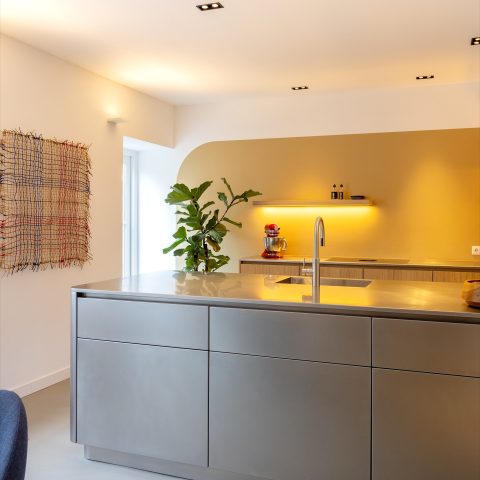
The kitchen shows this approach clearly. A central island with a pale stone-look top sits against darker timber cabinetry, while integrated lighting picks out the edges of the joinery. Open niches cut into the wall give the cabinetry depth and prevent the taller storage from feeling heavy. The result is a custom interior that relies on proportion and surface rather than ornament, with every line helping the room feel more settled.
Built-in light as part of the architecture
Lighting is handled as structure, not decoration. Rail spots, recessed lines and softly lit niches work across the rooms, tracing the joinery and washing over the textured walls. Because the light is warm and carefully aimed, it shapes the mood without taking over the view. In the kitchen and work zones, it marks the surfaces that need clarity. In the living areas, it lingers along the wall recesses and keeps the room legible after dark.
That same attention appears in the custom joinery. Tall cabinets, wall openings and inset shelves are arranged so the light can settle into the breaks between volumes. The cabinetry reads as built into the architecture rather than placed on top of it. This is what gives the interior its quiet discipline: details are present, but they do not compete. They support the space, allowing the materials and proportions to do the work.
The living room keeps the view in play
In the living room, a pale corner sofa sits opposite a dark media wall with an inset niche, and the composition is anchored by the long horizontal line of the room. The media wall is not treated as a separate object; it is folded into the interior with stone-look texture, vertical window treatments and a low table that keeps the eye moving. Indoor-outdoor living is reinforced here by the large glazed openings, which frame the greenery outside as part of the room’s everyday backdrop.
The floor pattern adds another layer without making noise. The herringbone-like surface gives the room direction, especially when paired with the straight lines of the cabinetry and the glazing. It is a useful counterpoint to the softer shapes in the furniture. Instead of a single dominant focal point, the room offers several: the wall recess, the view, the texture of the flooring, and the quiet shift from daylight to the warm artificial light.
Thresholds, niches and the move from public to private
Between the main living areas and the more private rooms, the project uses small spatial changes rather than hard breaks. Glass panels, timber framing and wall recesses create a sequence that feels open but not exposed. In the corridor and transition zones, the built-in niches become part of the route. They catch light, hold shadow and make the walls look thicker, which gives the interior more depth than a simple open plan would have on its own.
A hallway scene with timber doors and a stone-textured accent wall shows how the material story continues away from the main rooms. The wall surface is rougher here, and the ceiling lights pick up its uneven face. That contrast between smooth cabinetry and tactile wall finish keeps the route from feeling like a leftover passage. It becomes another part of the custom interior, with the same calm control over line, light and surface.
Private rooms keep the same quiet language
The bedroom carries the same palette into a softer setting. A textured headboard wall rises behind the bed, while large windows open toward greenery and water. Light curtains temper the view without hiding it. The room feels composed through material rather than colour: muted upholstery, timber tones and the darker wall finish give the bed a clear setting, while the daylight keeps shifting across the surface through the day.
The bathroom follows that same logic with a lighter touch. A freestanding tub sits beside a glass shower partition and a stone-look wall, and the vanity continues the timber note seen elsewhere in the interior. The glazed division keeps the room open, while the warm under-lighting in the joinery prevents the harder surfaces from reading cold. Here, too, indoor-outdoor living is present indirectly, through brightness, outlook and the way the space stays visually connected to light beyond the room.
What holds the project together
Across the interior, the strongest thread is not one material or one room, but the way light moves through the plan. Glass doors, open sightlines and carefully placed furniture let the rooms stay linked to the outside without losing their own identity. The natural materials are steady rather than loud, the joinery is precise, and the warm lighting gives every zone a clear role after sunset. That is what makes the project read as a single composition.
Even where the surfaces shift from smooth to textured, or from timber to stone-look finish, the transitions stay controlled. The project never relies on decorative gestures to prove its point. It uses proportions, views and built-in elements to make the indoor-outdoor living experience feel convincing from room to room. The result is a light luxury living space that holds its calm through material detail, measured planning and the steady presence of the landscape beyond the glass.
Want to see more of Studio Do’s? View the page of Studio Do’s for even more great projects and company information.



NEW 2026 Jubileum Edition The Best Interior Designers Benelux
Order Now €125


NEW 2026 Jubileum Edition The Best Interior Designers Benelux
Order Now €125